Don't wanna be here? Send us removal request.
Statistics
We looked inside some of the posts by dmooreproject5research and here's what we found interesting.
Average Info
Notes Per Post
0
Likes Per Post
0
Reblog Per Post
0
Reply Per Post
0
Time Between Posts
18 hours
Number of Posts By Type
Photo
13
Text
3
Link
1
Last Seen Tumblr Blogs


Fun Fact
Tumblr has 4 main sources of revenue.
Photo
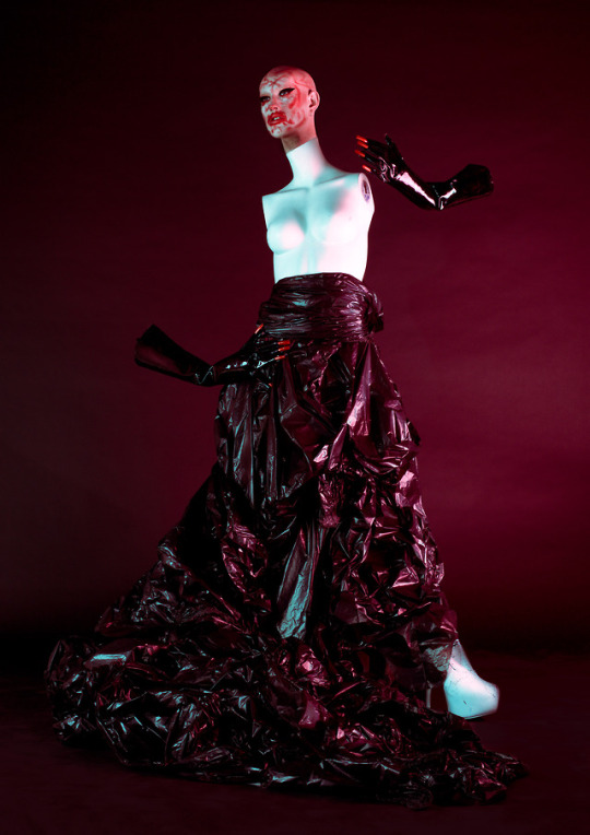
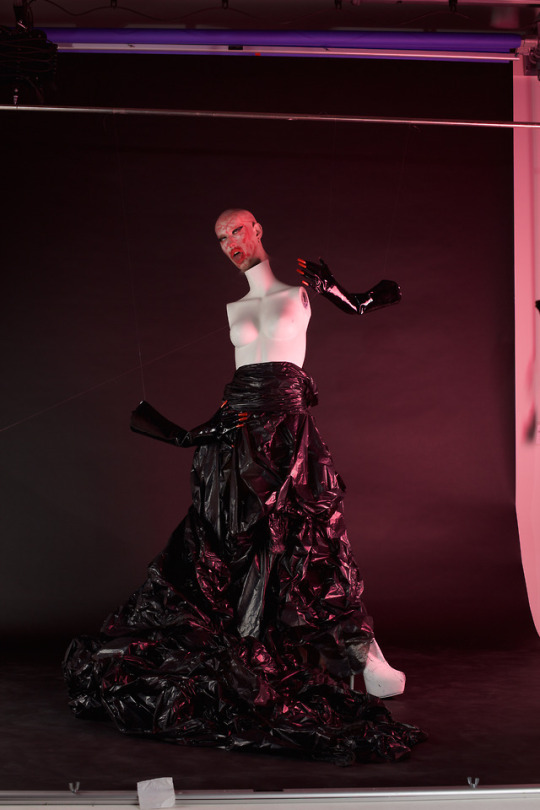
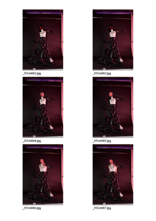
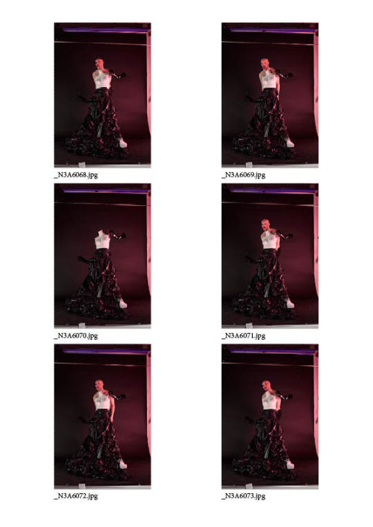
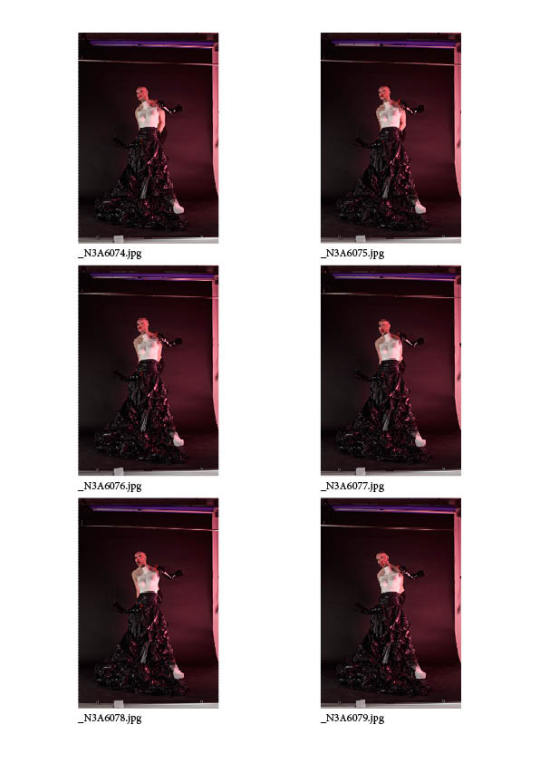
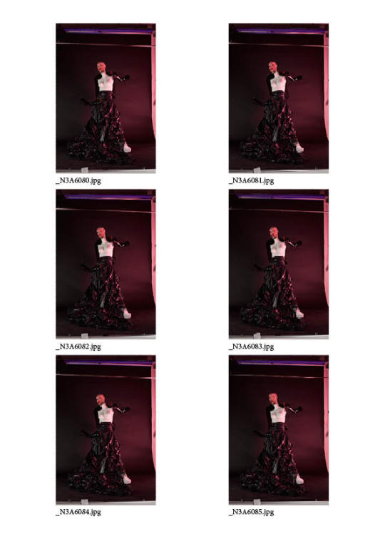
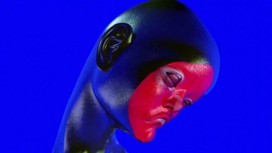
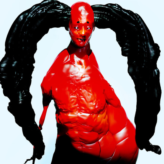
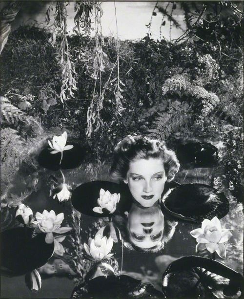
POST ASSESSMENT WORK: The final image. I’ve chosen this image as I felt that as grotesque as it is, it has a certain campness to it because it is so ridiculous - it’s not something that I intended to be taken very seriously in the first place. In post production I have accentuated the makeup and colours, and added a blue tone to the highlights just to add a bit more colour. Unfortunately I feel that the extreme makeup somewhat detracts from the lighting I tried to create on my face, which was a main focus point in analysing McBeans work - however I’m happy with the image and feel that as a self portrait it captures an aspect of my personality and my point of view creatively.
0 notes
Photo

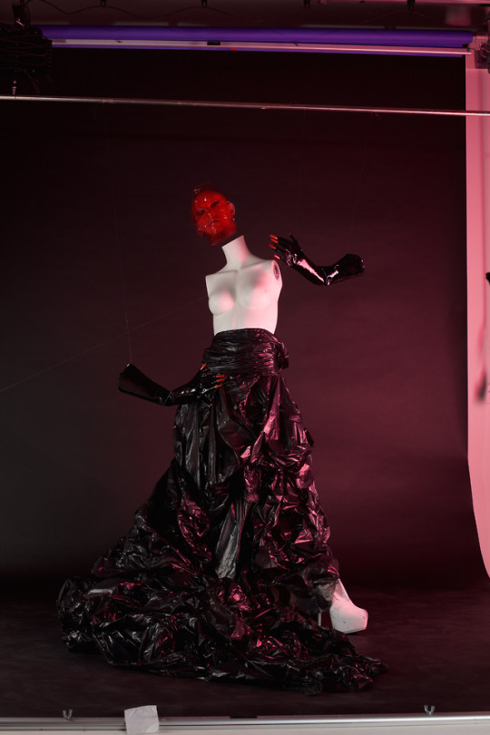
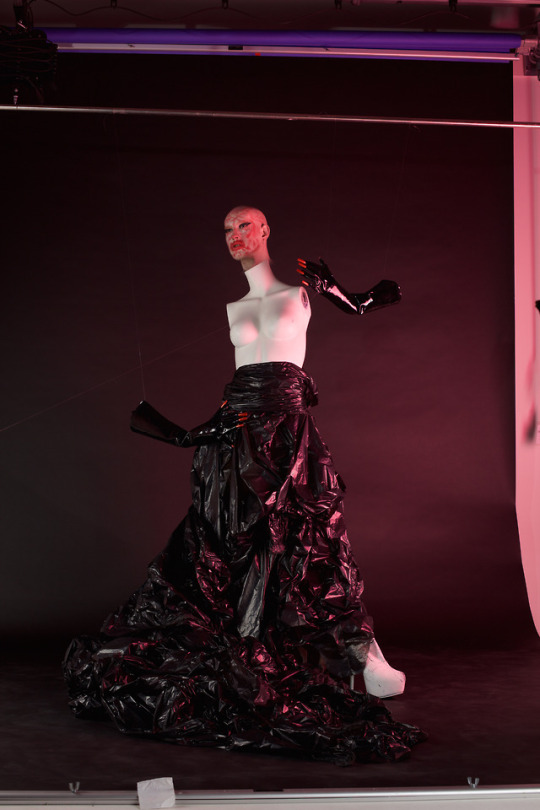

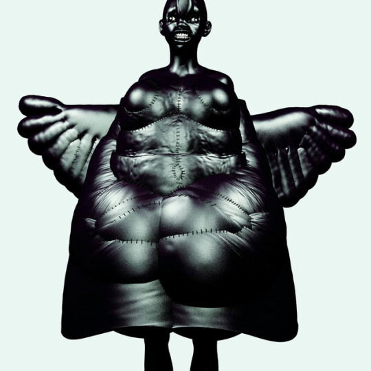
Using an image taken without me in it, I was able to remove everything but my head from the top layer in photoshop referencing the images of McBean. Having done this, I’ve narrowed it down to either the first or third image shown here - however, as much as I like the first image with the red film over my face I still feel this is maybe too obscured. This image would also be far more difficult to manipulate as I would need to cut out all of the film material exactly and this may end up looking quite clunky - the thing I’m most concerned about at this point is making sure that it doesn’t look like bad photoshop
0 notes
Photo
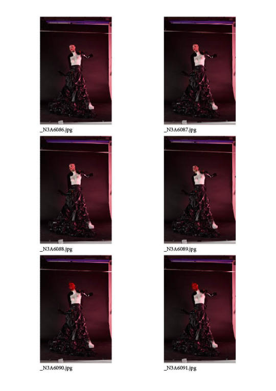
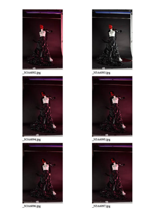
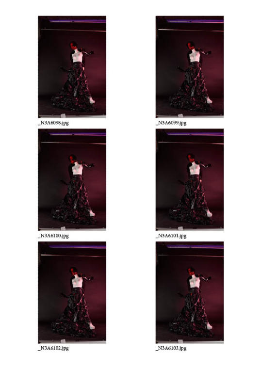
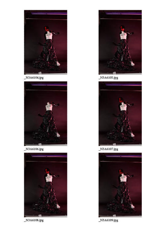
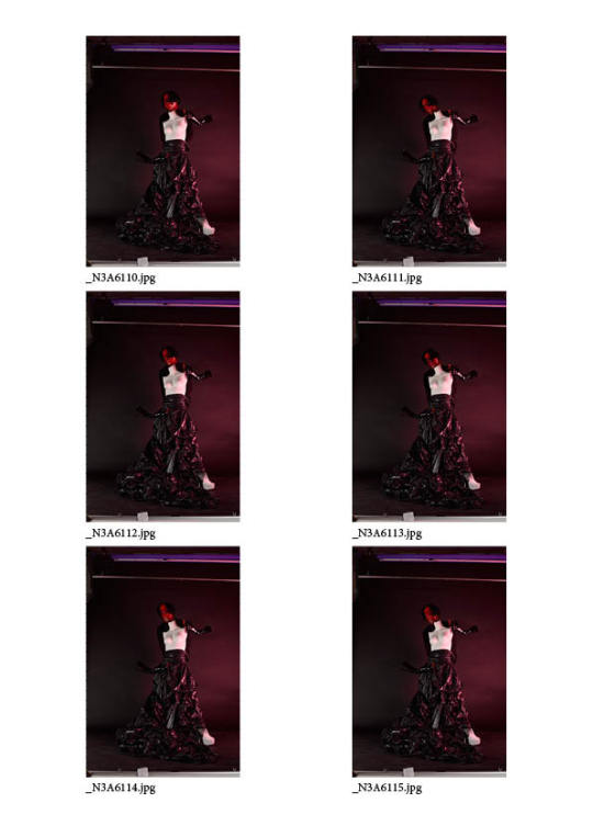
For my part of the self portrait I experimented with several different looks - film covering my face to create a sort of alien feel, the film + a wig to create a darker sort of fashion image, and one with my face covered in lipstick to create a deliberately ugly mannequin. I don’t feel like the film + wig worked, as my face is too obscured and at that point I don’t feel like the image is really a portrait anymore at all. In terms of editing, it’s quite easy to rule out a lot of these photos as managing to position my head in the right way in relation to the mannequin bust was quite difficult so a lot of them are off. I did as if anyone would be free to help me take the photos but no-one was, it would probably have been much easier that way. It’s quite hard to tell what the final image will look like, so I’ll do some rough post production on a few of my favourites to get a better idea before selecting a final
0 notes
Photo
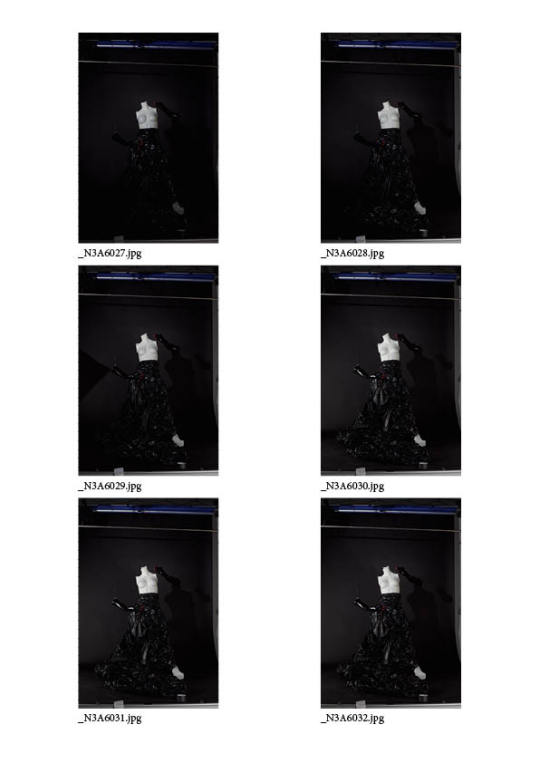
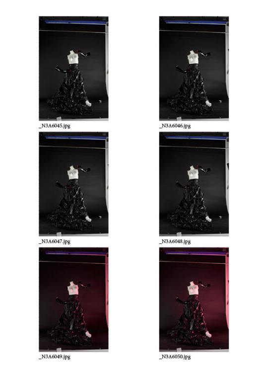
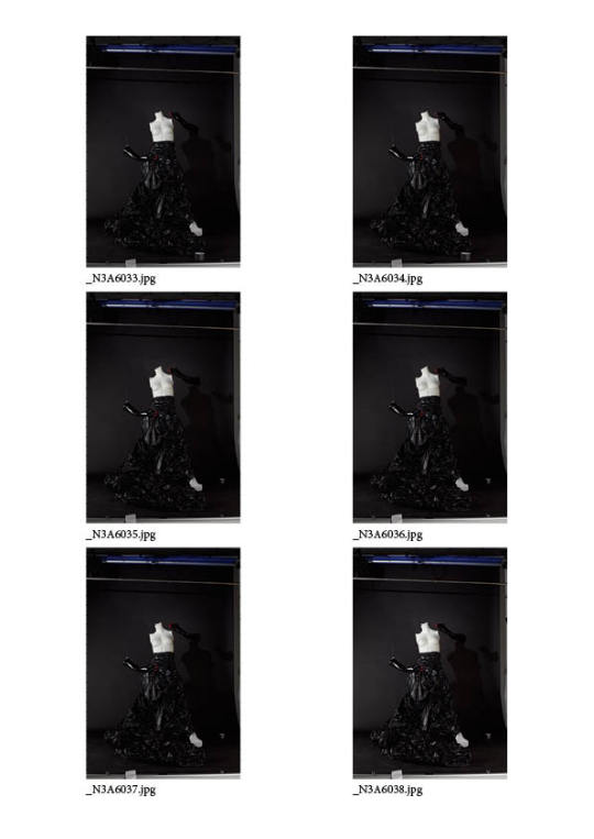
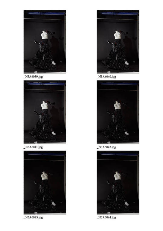
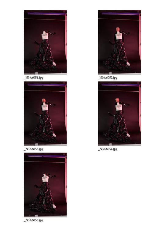
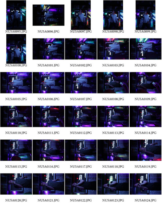
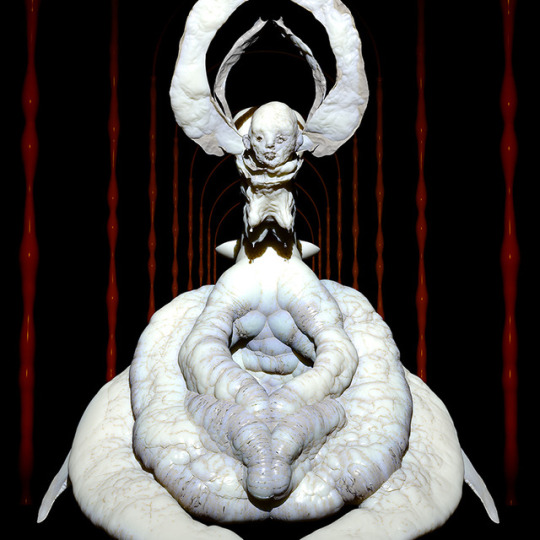
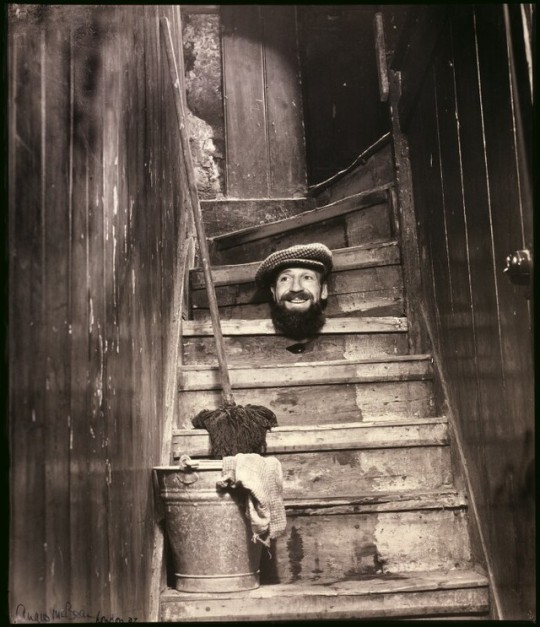
POST ASSESSMENT WORK: Lighting set up I knew upon arriving at the studio that I wanted to create an image with my own head placed on top of the mannequin bust, and gloves also detached in a gesture using fishing wire I had left over from the set design project. I had several kinds of fabric and some coloured cellophane and intended to just experiment. I had originally intended to just have the bust on the plinth to make it look like a scultpure, like some kind of gargoyle type thing, but when constructed I realised I could create some sort of dress so that it looked like a whole person/creature. I bought bin bags, and used them to construct a skirt around the plinth that I knew would give a reflective/liquid feel like Jesse Kanda’s work. I spent around an hour setting up the lights and testing it until I managed to achieve the dramatic lighting which I wanted to emulate from McBean’s photo. Unfortunately the directional light would not go high enough to highlight my face in the way that I wanted, but the effect was somewhat achieved. I had to use more lights that I originally thought to highlight the material of the skirt and make sure the gloves did not disappear into the background. Towards the end of the set up I thought that the black and white felt quite stark, as I tend to gravitate towards colourful work and so I utilised some red gels to add some colour and more atmosphere to the image.
0 notes
Photo
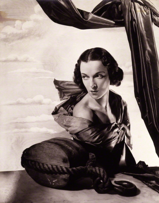
POST ASSESSMENT WORK: In terms of the technical aspect of McBean’s work, I really admire the lighting in his images. This is something that I’ve not yet really tried to master and this would be the perfect opportunity to focus on this. Although I have worked in the studio many times, I usually just use soft boxes to light the scene but never try to create any sort of dramatic lighting. I keep coming back to this image as I think the lighting here is so beautiful. In my set up I will try to light the studio similarly, using a directional light shining down onto my face from one side, and softer lighting coming from slightly behind on the other to light the rest of the scene. I’ll book the studio for a good few hours so that I have time to just experiment with the lighting - this is the benefit of doing a self portrait in that I have the freedom to be playful in my image making, as I am not working around anyone else’s schedule.
0 notes
Photo
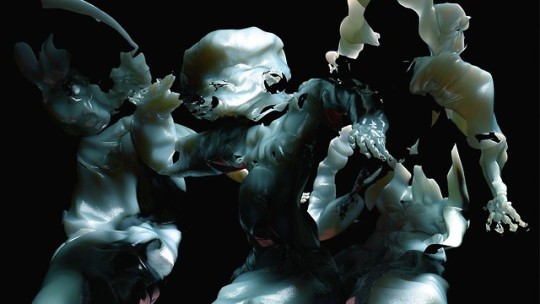
POST ASSESSMENT WORK: Angus McBean frequently referenced surrealist art in his work, and in my exploration of ugly/beautiful I’ve come back to one of my favourite artists - Jesse Kanda. Kanda’s work is grotesque and yet beautiful, creating alien forms in liquid-like textures. I particularly love the textures that he uses in his work as I am drawn to using similar materials in my own work - things which catch and reflect light. For my self portrait I want to create a form that is maybe not entirely a portrait of myself, but a characterisation of something quite dark and other-worldly. I don’t currently have very much money to spend on this at all, and so will have to use what I have available. Luckily I have a lot of props left over from previous personal projects I have worked on and can use cheap materials to construct something interesting - I often find that I am inspired by materials so it may be a good idea to just collect everything together and see what I am able to construct.
0 notes
Photo

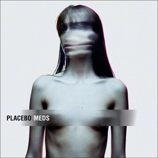

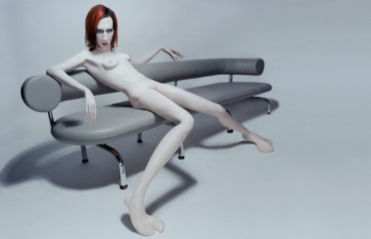
POST ASSESSMENT WORK: Given the creative rut I’ve been in recently, I’ve been thinking a lot about the route of my inspirations and trying to get back to that. Thinking back to when I was younger and where my interests in gender performance and dark/monstrous beauty first sparked, this mainly came from music - two main influences being Placebo and Marilyn Manson. I vividly remember the album artwork for Marilyn Manson - Mechanical Animals, and was fascinated by him as a person and the grotesque nature of his music videos. Whereas McBean primarily photographed beautiful woman, I tend to photograph males or non binary individuals. Given the surrealist style of McBean’s work, this could be an opportunity for me to create an image that is perhaps quite grotesque but also romantic or beautiful, a comment on what beauty can be. I really like the mannequin-like photographs of Manson, and I have a mannequin bust which I’ve wanted to use in a shoot for a while so this could be the time to do so.
0 notes
Photo

POST ASSESSMENT WORK: I think that McBean’s portraiture work is great, but in some ways too perfect. In my own work I like to focus on things that aren’t necassarily always beautiful, I like things that are slightly darker or have an ugliness or garishness to them. I’m drawn to his self portraits as I feel like there is a lightness about them in comparison to his other work. It’s as though he is more carefree because it’s his own image and he is not capturing someone else. I often use self portraiture as a way of experimenting with techniques, materials and themes and think this would be good opportunity to do so. Several of McBean’s images feature heads seperated from the body, and this is something which I’ve actually been wanting to try - this will obviously be easier to do now by utilising post-production techniques
0 notes
Photo
So I’ve realised that the reason I’ve been struggling so much with emulating Dijkstra’s work is because I should never have chosen to do so in the first place. I really admire her work, however it’s so far removed from the style that I’m interested in and I feel like I’m forcing all of my ideas - I don’t feel like I’m doing my own work, as though I’m trying to make images that I think are expected of me within the course. I think that the elevator idea is interesting - but it’s not something that represents me or my point of view in any way. I’ve decided to double back and emulate the work of Angus McBean instead. I like staging photographs, paying attention to set and styling, and trying to tell a story. I realised this after working on the set design project, and feel like this realisation has gotten me out of my creative slump. I’m actually excited about working on a project for the first time in ages now! At this point, I only have 3 days until the summative assessment so it’s unrealistic to think that I’m going to have it done on time. I’ll aim to have this project finished by the final crit, and at least will be able to show work that I am passionate about.
0 notes
Text
Another failure...
Spent and hour and a half in the Mitchell library today, asked 7 people if I could take their photograph (briefly explaining why) and they all said no. I then went to Buchanan galleries, was rejected by 5 more people, and was then told by security that I wasn’t allowed to take these photos without prior permission. I’m feeling pretty disheartened with this project now. I don’t really like/have the confidence to approach people I don’t know and take these kind of portraits - I feel like I’m not comfortable in these environments. I feel like maybe I should try to come up with a new idea although I’m running out of time for this project. Feel like I don’t really have any ideas left on how to relate to Dijkstra’s work...
0 notes
Text
Public places with lifts I can go to
Buchanan Galleries St Enoch centre Car parks of both of the above Cineworld Princes Square The Vic The Mitchell library
0 notes
Link
Was reminded of this short film when considering my idea. Here, the awkwardness and comedy comes from the intensity of being in the lift with the subject - and over time you gain a sense of their character. I’m set on photographing people in elevators - it would suit the ‘dead on’ composition I aim to emulate and will also provide interesting lighting in some cases. I guess what I’m thinking of doing is the opposite of this film - I’m hoping that by staying on the outside of the elevator, the intensity of having your photo taken is removed a little by the distance and the knowledge that the interaction will only last a few seconds.
0 notes
Text
Back to original ideas
I think the kareoke thing is a nice idea but don’t really see it working out. I’m going to return to my earlier idea about photographing people who are in a physically transition between places - elevators, escalators, possibly bridges. I’ve been inspired by the interview with Rejke where she talks about how it’s hard to take an authentic portrait of someone these days because everyone is so aware of what a camera does - so I’m hoping that by taking a portrait in a fleeting moment (as the elevator doors close) I’ll have more chance of capturing something real.
0 notes
Photo

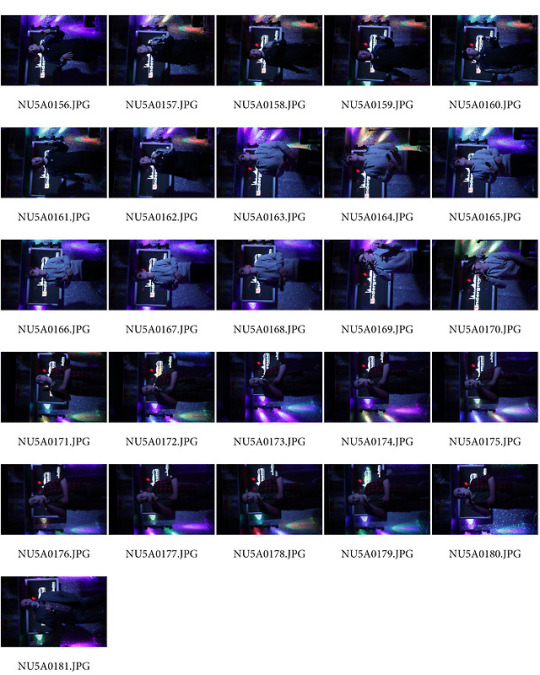
Went to take photos of people doing Kareoke but I don’t think I’m feeling this idea anymore...I didn’t really capture what I intended to. It’s also too difficult to frame the picture due to people in front of the stage, and the lighting is too dark. There’s too much going on in the back ground which is distracting. I feel like this concept would maybe only work if it was more staged, and I invited people to do Kareoke, but it would lose it’s meaning then if it was just being performed to one other person. Feeling quite stuck with what to do. Will consider other ideas.
0 notes