
Doug Djuritschek--University of SalfordGraphic Design & Illustration Year 3
Don't wanna be here? Send us removal request.
Statistics
We looked inside some of the posts by drawitschek and here's what we found interesting.
Average Info
Notes Per Post
0
Likes Per Post
0
Reblog Per Post
0
Reply Per Post
0
Time Between Posts
2 days
Number of Posts By Type
Photo
16
Link
1
Last Seen Tumblr Blogs


Fun Fact
Kazakhstan’s Minister of Communications and Informatics has blocked the Tumblr site because it contained 60 sites of terrorism, extremism, and pornography in 2015.
Photo
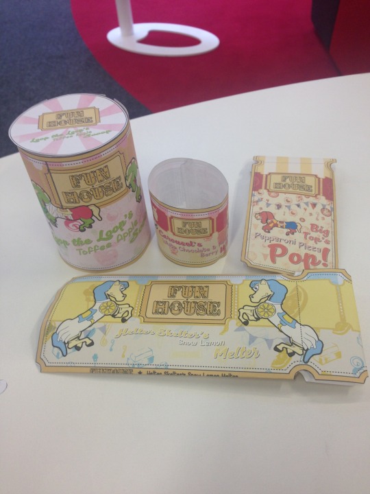
These are my mockups of my final designs. I tried to make them actual size so that they would look realistic on a shelf, but some do and some do not I think. If I had more time, I would have put a bar of chocolate inside the chocolate packaging as a test, and I would have found a bottle to wrap the label around, although as mockups, they folded together fine and look as though if they would fit in well on a shelf.
0 notes
Photo
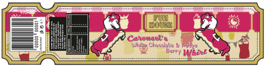
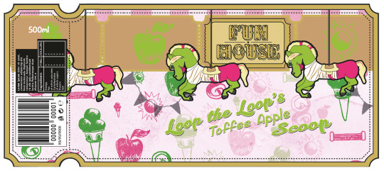
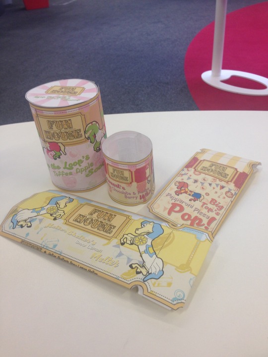
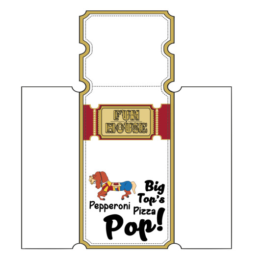
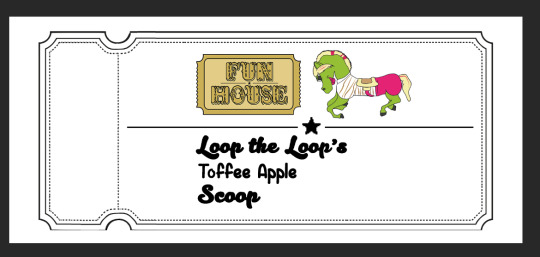
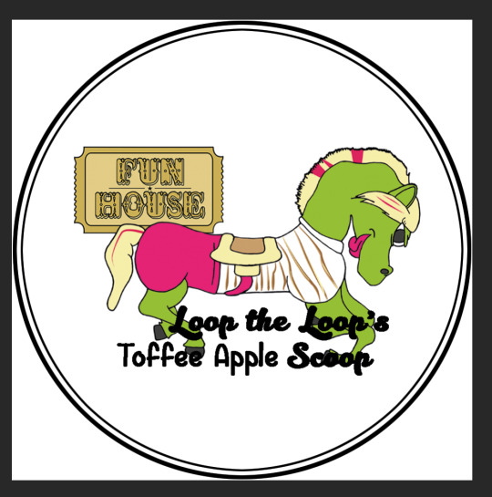
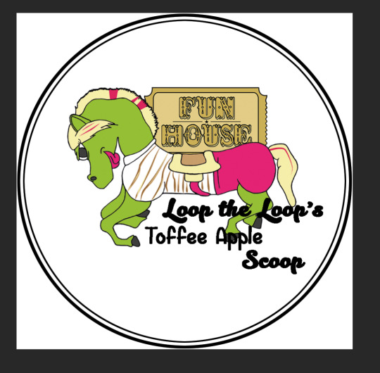
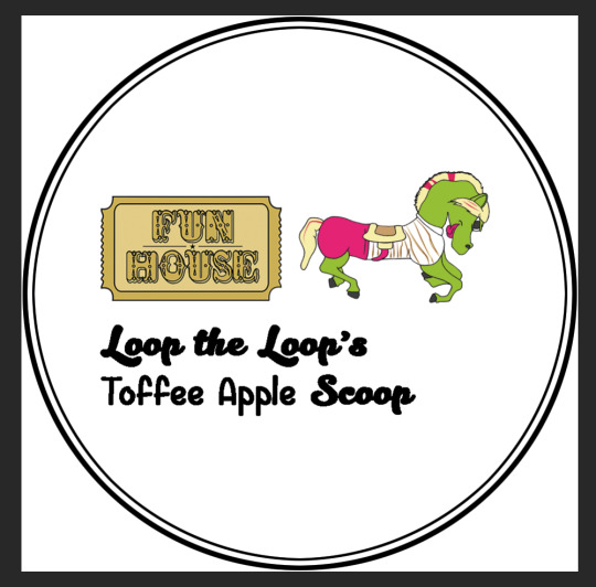
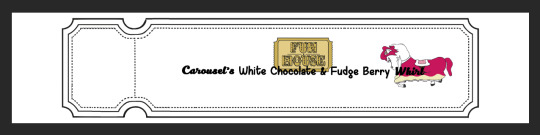
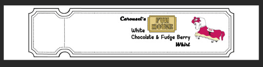
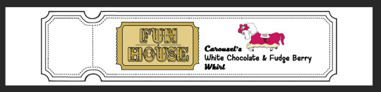
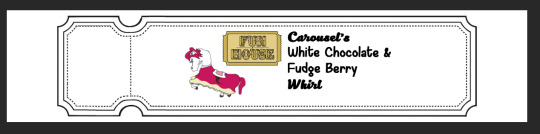
These are my final packaging designs, with every single necessary piece of content included, even the nutritional info, barcode, ingredients, everything. I believe that I have made every single piece of information work in harmony with one another, and I have made a theme to the products that is completely distinctive - I am very impressed with my final designs!
0 notes
Photo
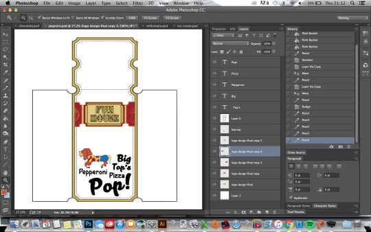
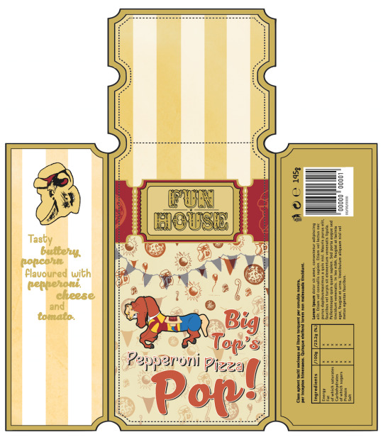
Using similar techniques to the chocolate packaging, I started to construct the rest of the packaging, starting off with the popcorn bag.
0 notes
Photo
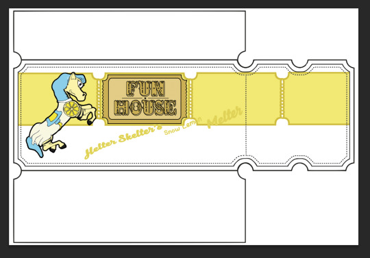
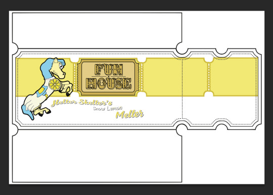
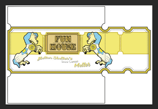
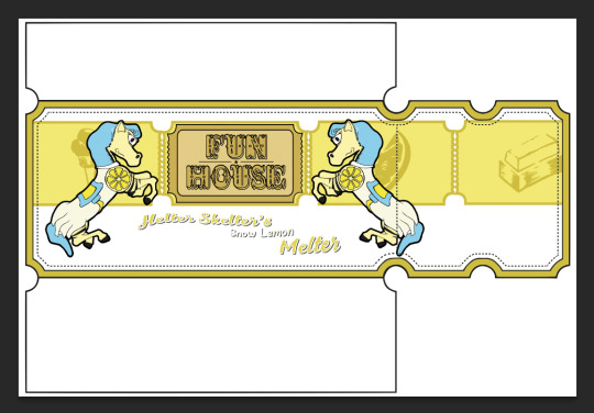
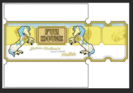
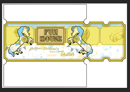
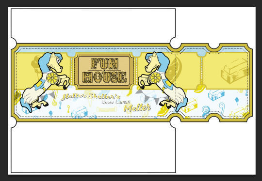
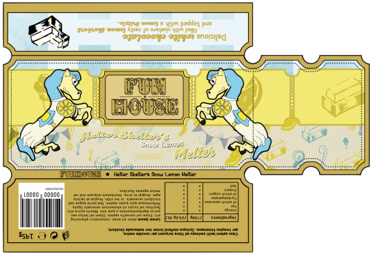
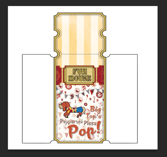
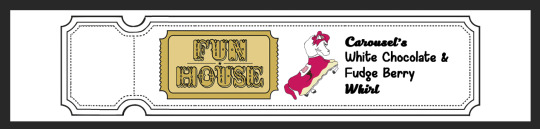
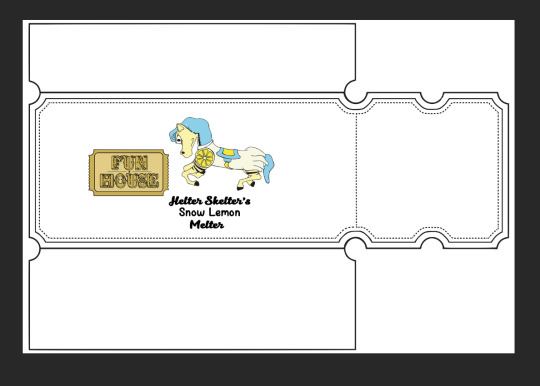
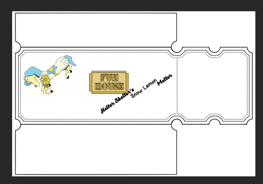
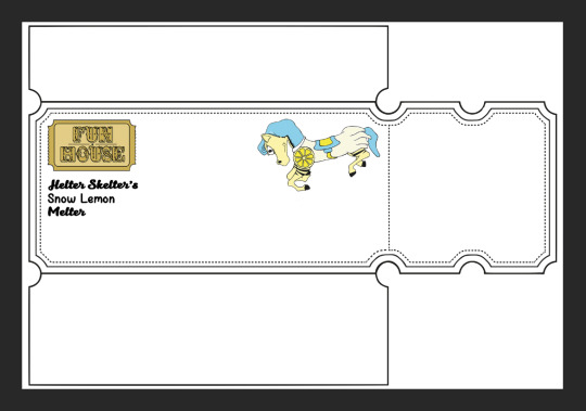
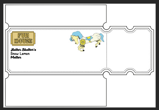
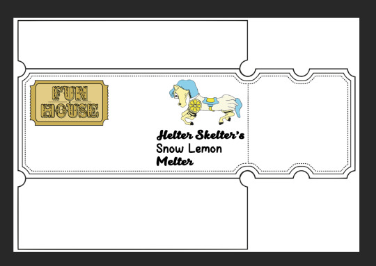
These are the stages of construction of the chocolate packaging, which I have chosen to start off with as I feel that it would be the most popular item and the easiest to purchase on the shelf, therefore display is important. I have taken one of my layout experiments to help me as a base for the most important content, although as more and more things were added, the layout had to include minor changes to support the new content.
I included my brushes all around the packaging. I like the tickets which I added in the background by duplicating the logo, erasing all the content in side, enlarging it slightly and moving the layer behind the logo and duplicating it several times, laying each layer out in a line. I then added a fill to each ticket by selecting the shape and contracting the selection, filling in a colour that would fit into the existing colour scheme of the characters and the type, although it still works with the logo. I then added a brush to each ticket in the line, once again fitting in with the colour scheme.
I also made the type fit in with the content by using the warp transform tool to distort edges of the text and make the type a shape as such, just like with some of the packaging I found in my research which gives a flow to the type. After adding a white stroke and a drop shadow to the existing type, I feel that it stands out very much from the other content, and because each item stands out, I am impressed with the result.
Finally, for the background, I made a collage of brushes that relate to the product in blue, to go with the mascot’s hair, and yellow to go with the main colour scheme of the packaging. I then pasted this into the section below the tickets, the main body of the packaging, and erased around the text with a low opacity brush to blend it all together. I then duplicated this result of the brushed layer, erased over the brushes around the type again, and set the layer to Overlay for a stronger finish.
With all this complete, I added a blue texture to the top section to add that finishing touch of colour.
0 notes
Photo
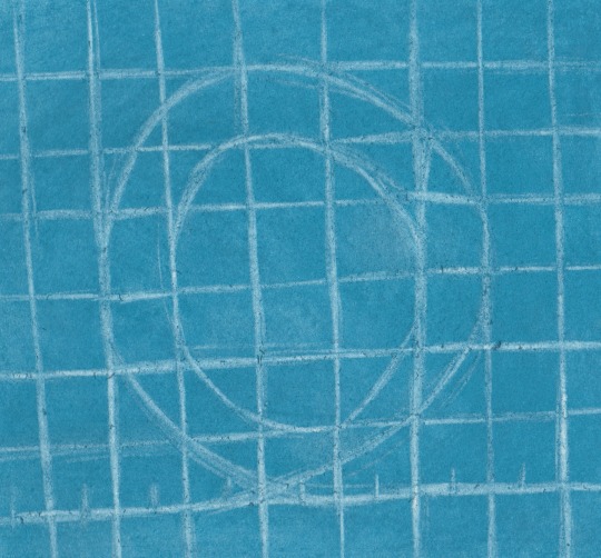
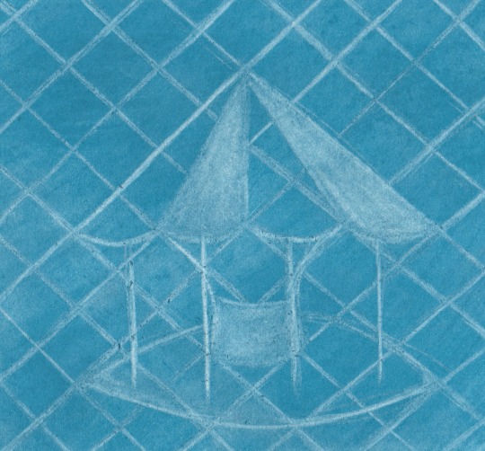

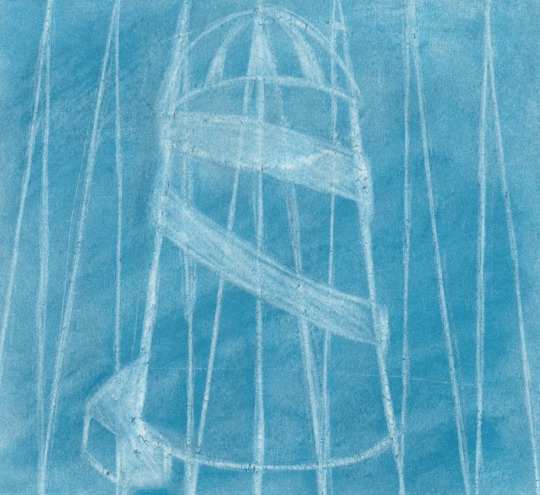
I thought it would be cool to design some blueprint-esque illustrations that could also be used to go on the packaging, be that the background or boxed off on an uncrowded section of the design. These attractions are based upon the names of the mascots, so that each one could have a design used on their packaging that they represent.
I created these illustrations using blue chalk, two different shades, to create the background, and using a ruler I made lines to simulate the structure of a blueprint, and with the structure in place, I used the edge of the ruler to form join sections of the grid together and form the shapes in and around the attractions.
I think that with a bit of photoshop manipulation to create more contrast between the white and the blue, these could be viable for use on the design, although it is important to try and make them fit properly if I choose to do so. Mixing traditionally created work with digital designs is tricky, but it’s something that I’m used to and enjoy.
0 notes
Photo
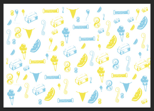
To go on the packaging, I have designed some brushes based upon content relating to the flavours and the theme of the products. I have tried to get a variety of foods that go into each flavour of the products, so that each product will be made even more clear of what they contain, although there is more funfair content involved as they can be used on every single piece of packaging.
With the brushes scanned in and saved as presets on Photoshop, I think they look brilliant and I do love how Photoshop can take hand-drawn imagery and use it to work with the tools that they have.
0 notes
Photo
Layout experiments for the ice cream packaging, including the label and the lid.
0 notes
Photo
Layout experiments for the milkshake packaging. The label would be just wrapped round a bottle, so there wouldn’t need to be a lot of cutting and sticking involved for this one, although being a small strip, it is paramount to make sure that all these pieces of content don’t take up so much space that the barcode and nutritional info would not be able to fit. It is also necessary to make sure not to make everything too small, as while there is not a lot of space compared to the other items of packaging, everything still has to be seen.
0 notes
Photo
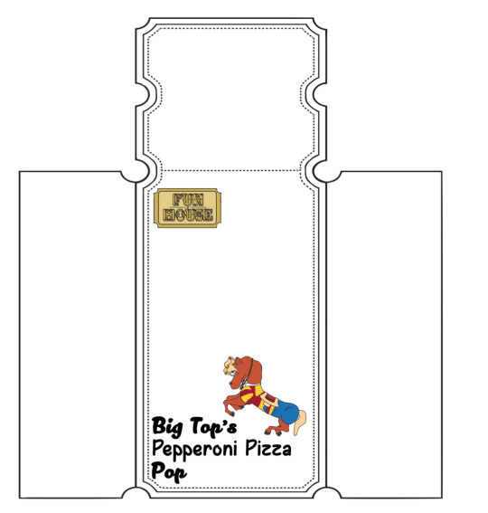
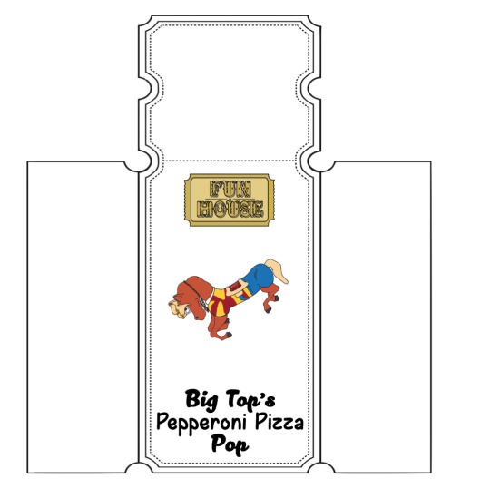
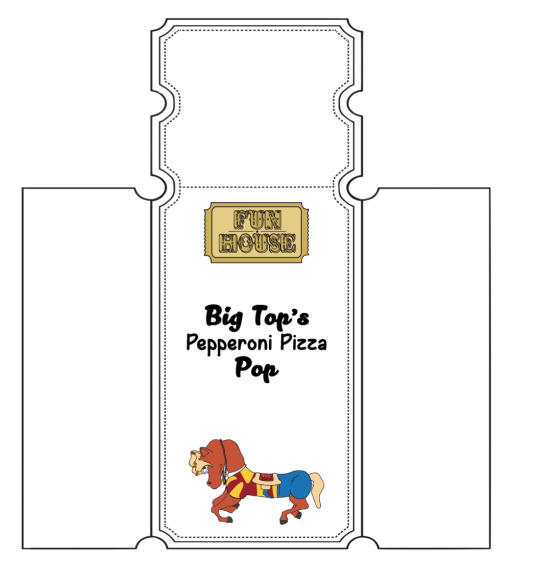
Content layout experiments for the pepperoni pizza popcorn packaging. Being vertical, the alignments would be different to the chocolate packaging, as content would be allowed to be stacked rather than fit into different corners, although I have still done the same in places on some of these ideas, as well as in fact considering whether the back could be horizontal, then the packaging would be similar to the chocolate packaging.
0 notes
Photo
Some layout tests for the chocolate bar packaging, linking back to the layout sketches I created in my sketchbook. I added the logo, mascot and the name of the confectionary piece so that I would be able to know where the most important pieces of content would best fit, as it’s important that all three aspects are clear amongst the crowd.
0 notes
Photo
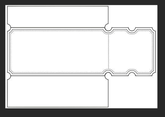
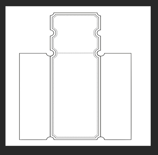
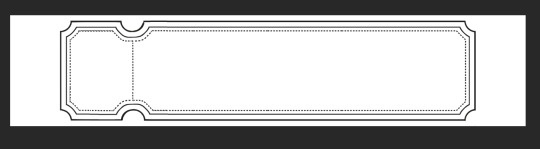
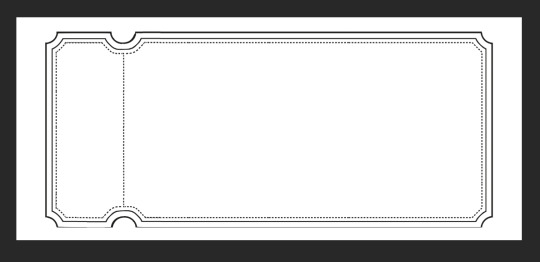
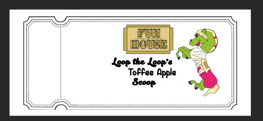
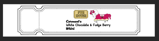
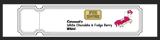
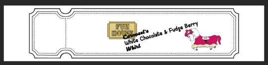
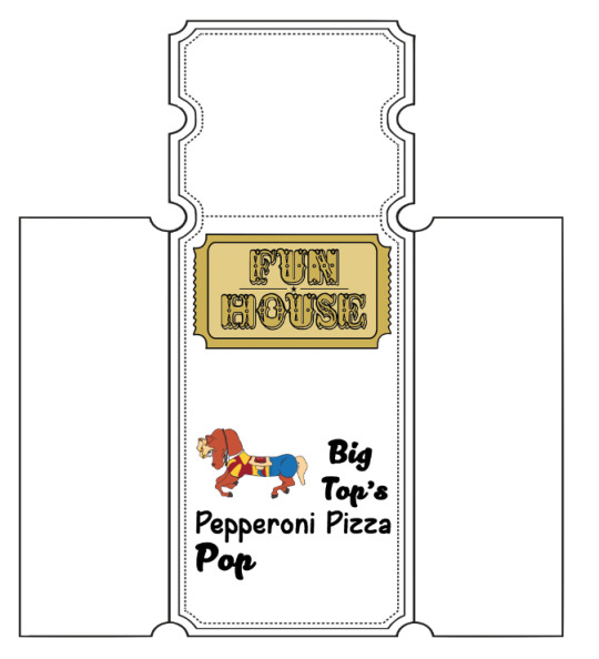
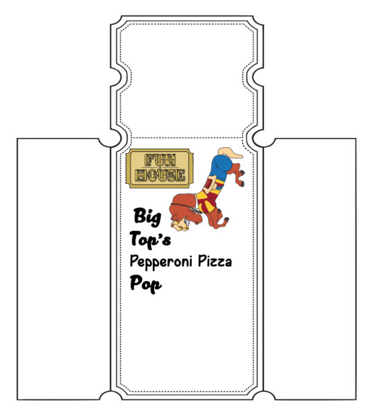
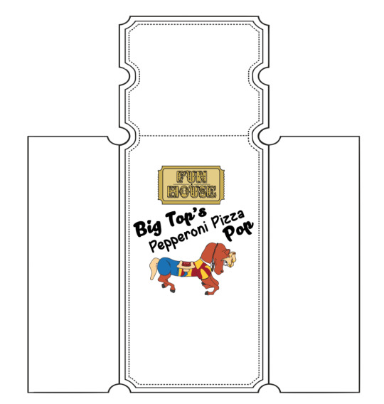
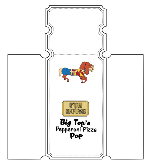
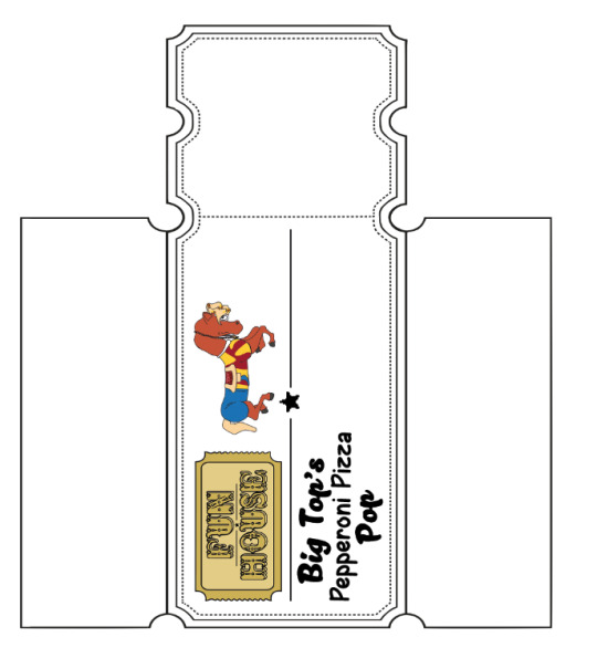
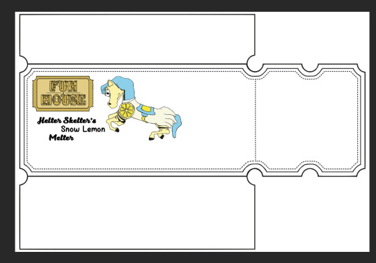
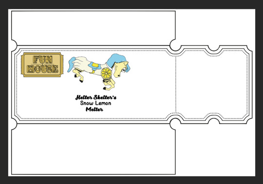
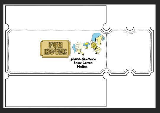
These are the nets for my packaging. As stated in my sketchbook, I have designed my nets like this because of how the ends of the tickets can be torn off and resealed for packaging on the chocolate, which integrates design aesthetics with practical use to make everything mix together perfectly. For products like the milkshake label, the end of the ticket would just be torn off so that the product could be recycled, so the end of the ticket is useful for reasons dependant to the product.
0 notes
Photo
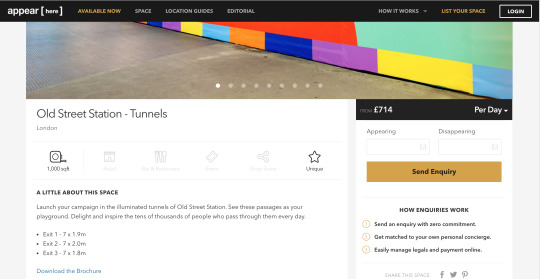
I would like to own a pop-up shop in a year’s time, so I decided to have a look at some properties that host pop-up shops for all kinds of business ideas, illustrators in particular. That is how I found Appear Here, a London based agency who rent out properties nationally and internationally, but mainly based in London.
The website is very easy to use and locating all the necessary information about a particular place is a breeze. You can search for properties in different areas through the menu at the top, and when you find somewhere that you like, you can click on the property to check out rent prices, dependant on how long you wish to hold your idea; pictures of the property, to find out whether there really is enough space to host your idea and whether you feel like the mood of the place is correct, and much more.
I emailed Appear Here my concept of running my own business selling my own prints, printed merchandise, T-shirts and all the likes, and I got an email back saying that once I have finalised my idea and have money to start the business, I should let them know and then my idea can be put to practice! Hearing this information really makes me excited to get started with my illustration venture!
0 notes
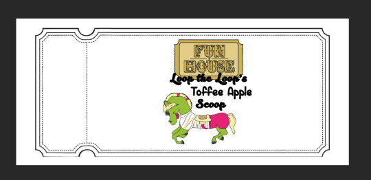
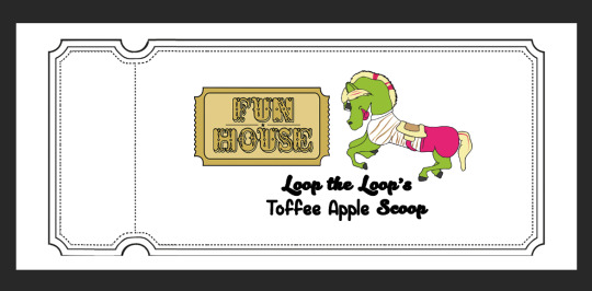
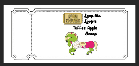
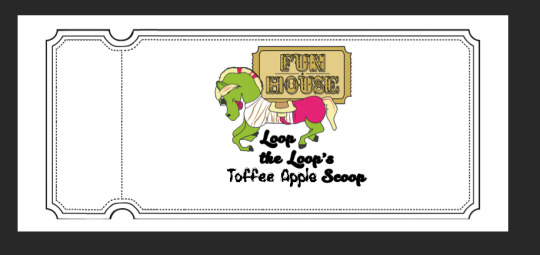
Photo
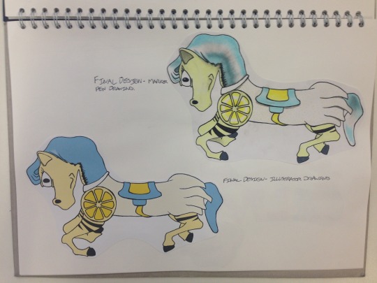
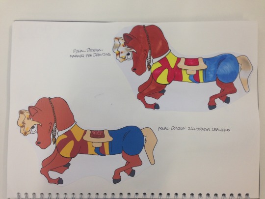
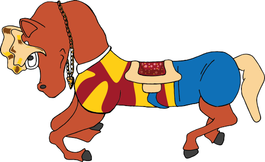
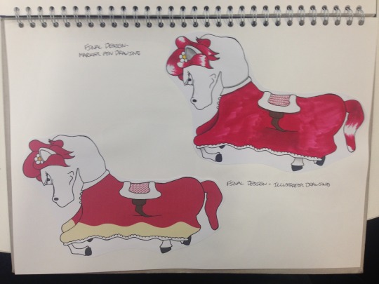
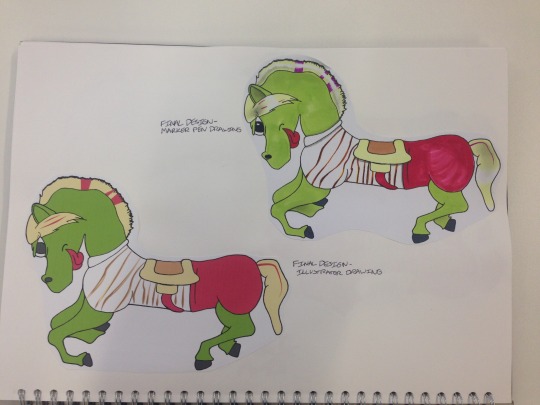
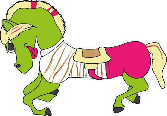
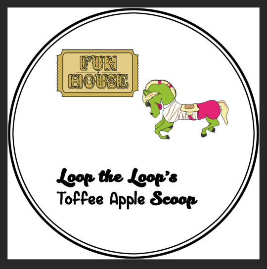
These are my final mascot designs. I have created a hand drawn design coloured in with copic markers, and a digital design coloured in on illustrator just to see what would look better. I am very impressed with both - in terms of what looks better, the hand-drawn designs are more detailed and took more work, but I still think the illustrator versions would be more appropriate for the packaging which is going to be designed digitally.
I chose the colour, hair and outfit choices based on experiments with different content in my sketchbook. I made sure to work with as many relating images as possible, just like the logo.
0 notes
Photo
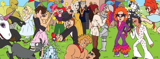

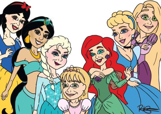
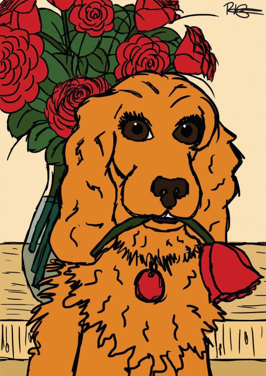
One of my biggest inspirations in Illustration is actually my older sister Robyn, who graduated from the University of Bolton in 2013 in BA (Hons) Animation & Illustration. Her main inspiration is Walt Disney, and this is clear in her use of strong cartoon-style illustrations with big eyes and charming faces. She loves to draw animals as well, and whenever she does work for other people, particularly birthday cards, she includes animals such as dogs if they have any.
We have been told that we should work together, but she told me that I need a bit more work first! I suppose I can wait...
0 notes
Photo
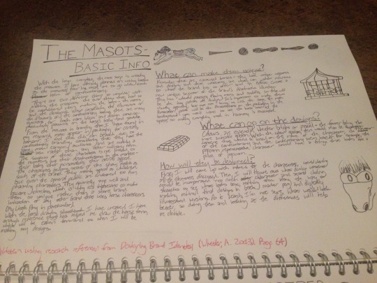
This is the intro page to my mascot design section, highlighting everything that needs to be considered.
0 notes
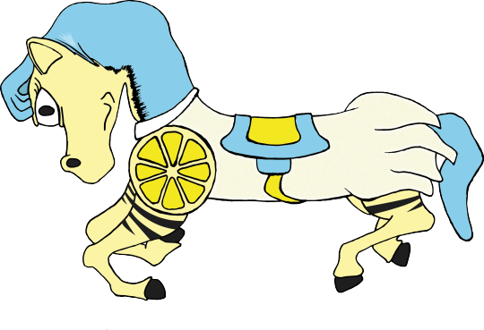
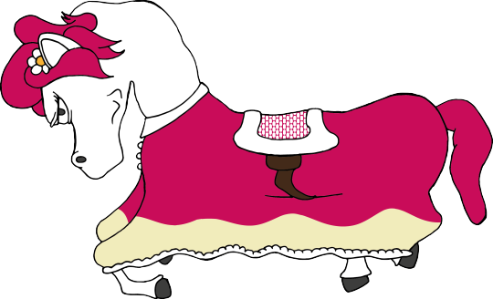
Photo
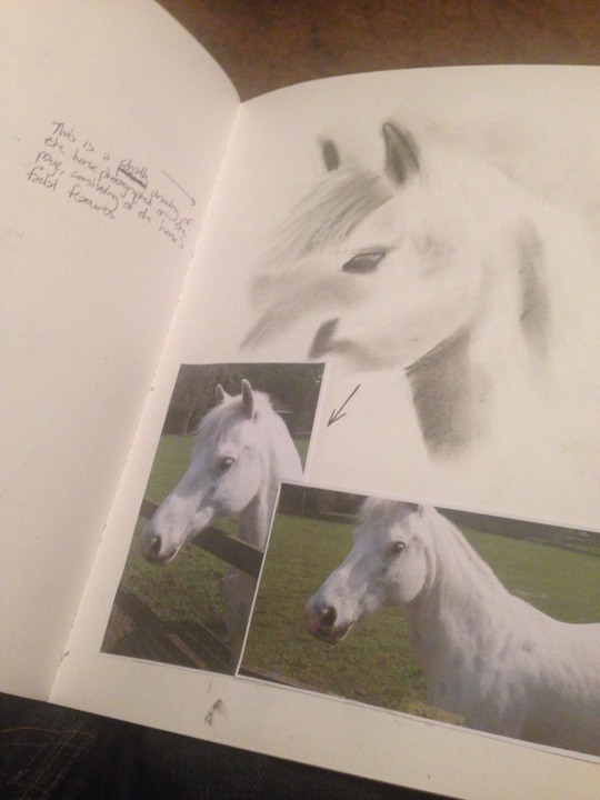

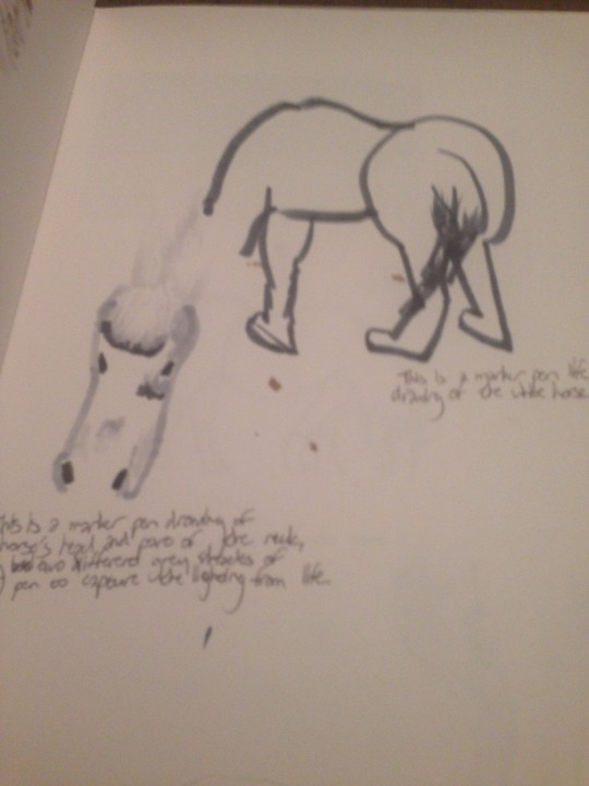
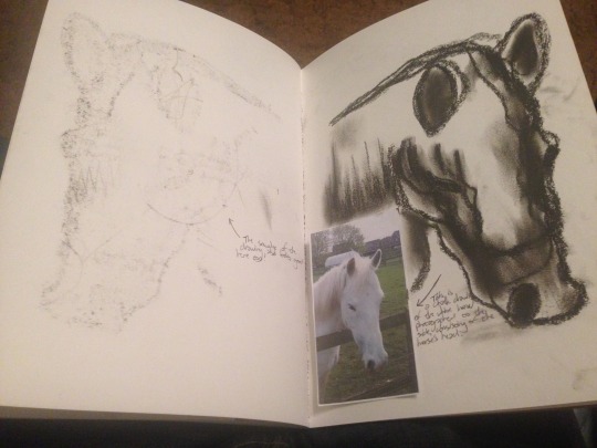
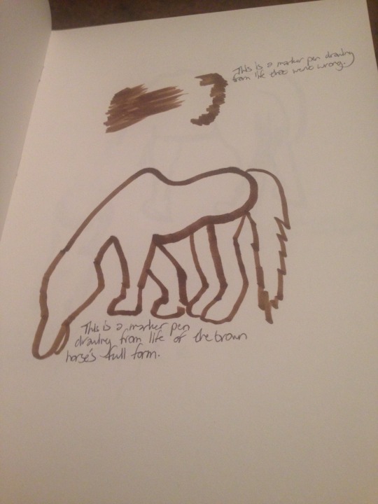
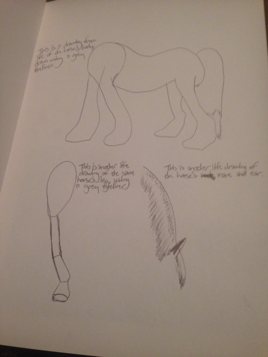
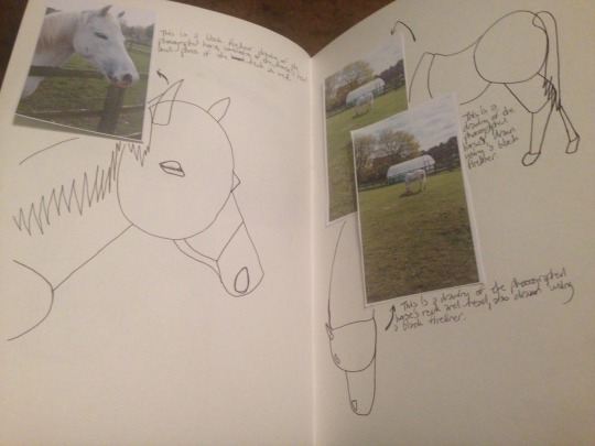
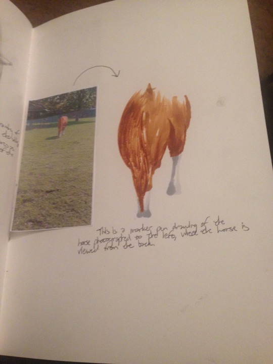
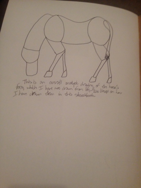
Some more pages from my horse drawing sketchbook, using the same forms of media that I listed on my previous post.
0 notes