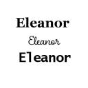
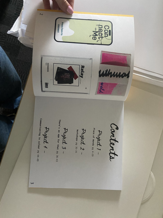
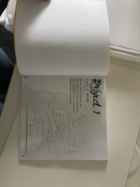
Place of WordsProcess BookWorkshopsCommunicating in ColourThere's an App for That
Don't wanna be here? Send us removal request.
Statistics
We looked inside some of the posts by eleanorbriarsterm3 and here's what we found interesting.
Average Info
Notes Per Post
0
Likes Per Post
0
Reblog Per Post
0
Reply Per Post
0
Time Between Posts
4 hours
Number of Posts By Type
Text
17
Last Seen Tumblr Blogs

Fun Fact
Tumblr Inc. is funded by 13 investors.
Text
Final Group Crit
Week 8
Small text adjustments
Change all pull quotes to light blue
I think it looks even better with these small changes. Printed out and cut down, makes it seem even more like a real magazine and professional. I love what I have made this term, and didn't think I would at one point, like anything I made.
0 notes

Text
Final Magazine Printed out and ready for submission
Week 7

I printed it out for the final submission and to double check it all works. I think it has come together really well, considering the obstacles this term. Each page links to the next, in a cohesive way, suitable for a magazine. Overall I am really happy with it, and just really happy I have an outcome that works!
0 notes
Text
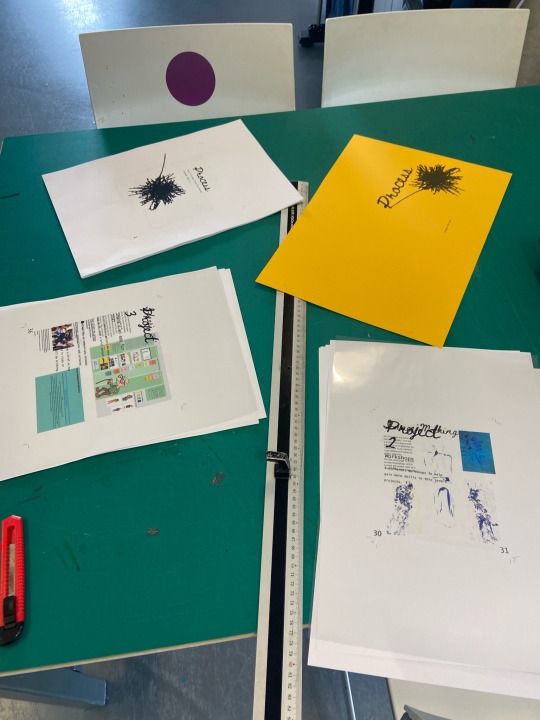
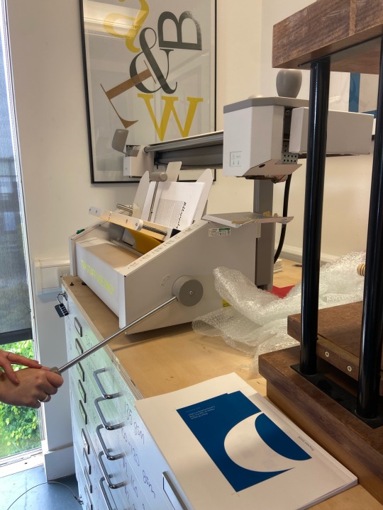
Printing and Binding my Process Book
Week 7
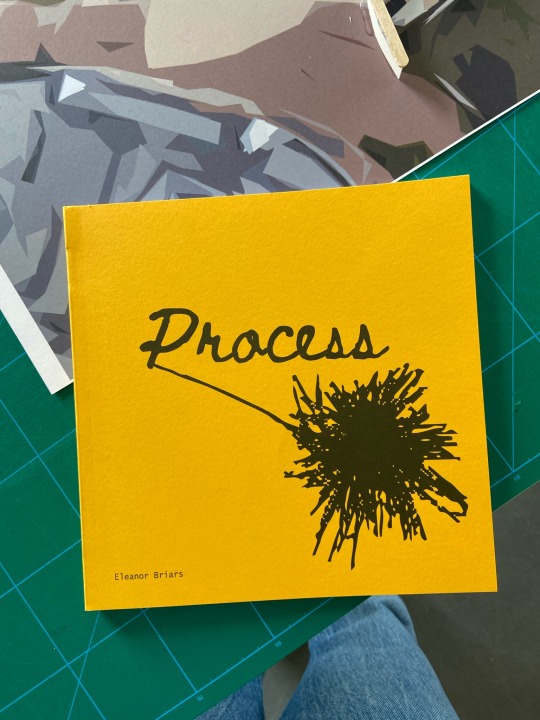
Binding the process book was actually kind of long as I had different types of paper and sizes in the book. There wasn't enough orange/yellow card for the inside pages and it would be too thick for the pages. There also wasn't any orange card like the shade I wanted. The acetate project pages worked really well, and so did the smaller pages, they just had to be cut down before binding.
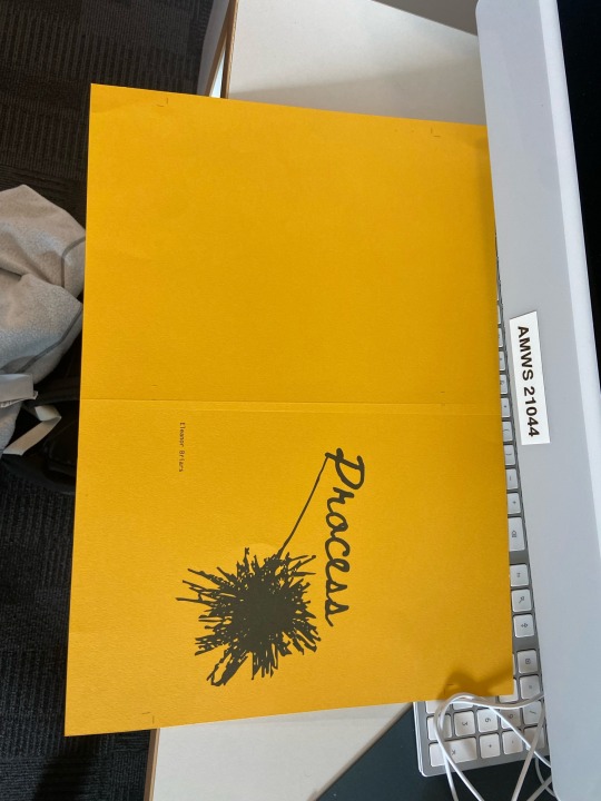
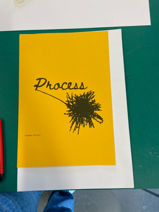
Overall, I think it turned out pretty well. I love how I have different types of paper and size in the book, it makes it more interesting and interactive even. The bright yellow cover looks simple but effective, I don't think it needed much as the illustration says everything about creative processes in general.
There are a couple things that are annoying, mainly with page numbers, one page doesn't have on and the page numbers on the project pages aren't on the right side. Aside from that, I think I quite like it.
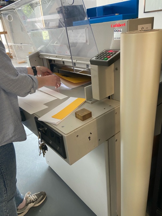
0 notes
Text
Russell Cotes Museum
Week 6
I visited the Russell-Cotes Museum in my spare time and came across a lot that related to my project. The Painting below is about sirens which as it says: portrayed by Greek art as heads of women and bodies of birds. I found that kind of interesting. There were also a lot of female statues, most statues were actually quite small but I still felt like they related to my theme. Lastly, the glass ceiling had zodiac imagery on which is really cool, as they are showing the constellation through the sky light.


0 notes
Text
Research Presentation from this term
Week 1-7
Link to it below:
0 notes
Text
Last Minute changes to Process Book
Week 7
Now that I have all my work, I can fully add everything in. I also forget some things, like the colour theory workshop and bibliography etc. Now all I need to do is print and bind. I like the process book, it truly reflects how I worked, and my ideas behind everything. It is really cool to see my process visually in one document/book.


0 notes
Text
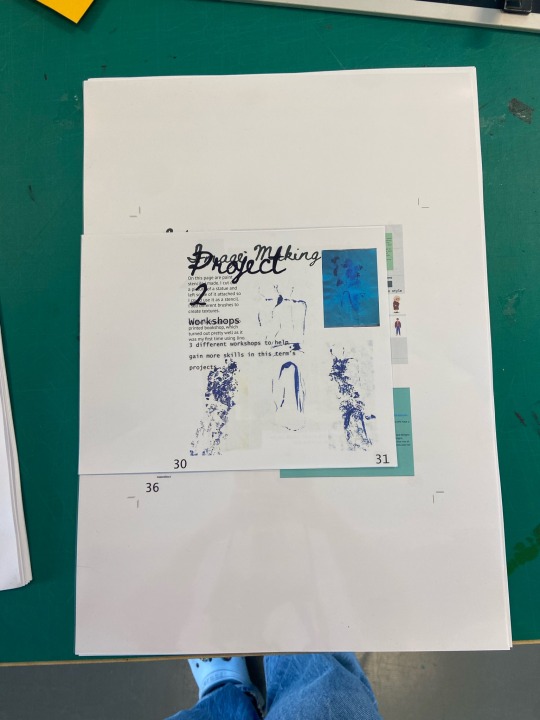
Process Book
Week 7
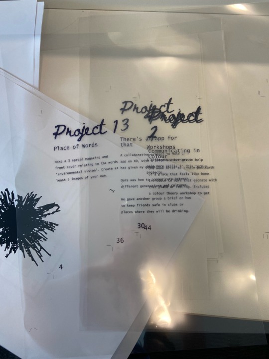
I put all my final outcomes in, including any text I missed, my contents with page numbers, my page before the contents and final magazine mock ups. I really like my process book, I just need to make more changes and switch some pages around and then it is done.


0 notes
Text
Magazine Mock ups
Week 7
Now I have finished the magazine, I put it into issuu so that I can flip through it, and used Graphic Burger to make mock ups of it. I love how it turned out, especially having multiple brain blocks and trying so many layouts that I was not happy with. It all works perfectly and looks like one magazine article instead of each page not really matching up with the other.


0 notes
Text
Magazine 4
Week 7
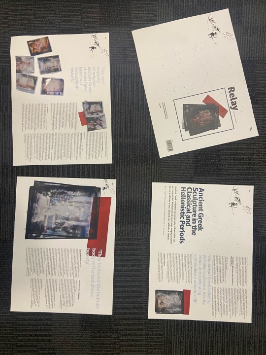
After printing out the magazine, I realised that it needed to be more simplified to show the images, instead of taking away from them and the article. I had a lot of trouble with the second spread, so I re designed it completely, adding in a photo with all of the instax. I love this photo, it shows them off so well, with the lighting and textures, you can see they are transparent. I also like that the only other thing with it is a quote, in a matching colour. With all the spreads the imagery is on the same side, I did this on purpose so that it is easy to follow the article.
Lastly, I changed around the last page so that it fit everything in perfectly.


0 notes
Text
Test Printing Process Book
Week 7
I test printed my process book, and went through it and annotated anything that I thought needed changing. I then went through each page on InDesign and made the changes. It was so useful doing it as it was like a checklist for everything that needed to be done still.

0 notes
Text
Test Printing magazine after edits
Week 7
I printed out my magazine after all the feedback edits, and then got Ellie to peer review it. I agreed with the fact you can't see the patterns and images properly with the dark blue.


0 notes
Text
Magazine 3
Week 7
After my tutorial I tried out adding in more colour, the issue I had is that, although I had removed the background on Photoshop it still showed up on InDesign. It looks okay, but I don't know if it is too much. I already have a pattern going on, and I don't want it to take too much from the actual article. I really like my third spread which has the bigger image and text. It really shows the photos properly and their texture. I will print it of and see how it looks.
The feedback I was to change the sub-headings, to make them bolder and bigger and to change the paragraph spacing, so that it is indents instead of spaces.


I also added the dark blue to my front cover but had to make the photo 'multiply' on the effects panel. It doesn't show up too well though. Also, I put in the barcode and price to make it more authentic.
0 notes
Text
Feedback from tutorial
Week 7
Make indents instead of spacing
Try a dark blue background
Bigger images
Bigger and bolder sub-headings
rotate and cut out some of pull quote

0 notes
Text
Test Printing Magazine
Week 7
I printed this out and made annotations to what needed to be changed, it helped to see small errors I otherwise wouldn't. How it looked on the computer wasn't exact to how it looked printed out, so I am glad I did this.

0 notes
Text
Process Book 4
Week 7
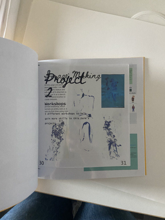
I now need to finish my magazine, as that is really the last thing I need to put in. I also need to put in the final postcards and write about them. It is so nearly done, I have been thinking about paper and I think for the project paper I will do it on acetate, the small pages on the same orange as the cover (if I can) and the rest on normal paper - I think it is 120gsm glossy for the process book.


0 notes
Text
Process Book 3
Week 7
Continuing on from the previous post...


0 notes