
Don't wanna be here? Send us removal request.
Statistics
We looked inside some of the posts by elliepearcefcp-blog and here's what we found interesting.
Average Info
Notes Per Post
2
Likes Per Post
1
Reblog Per Post
1
Reply Per Post
0
Time Between Posts
5 days
Number of Posts By Type
Text
14
Photo
3
Last Seen Tumblr Blogs


Fun Fact
BuzzFeed published a report claiming that Tumblr was utilized as a distribution channel for Russian agents to influence American voting habits during the 2016 presidential election in Feb 2018.
Text
Experimenting with perfect book binding
I realised last year that if a booklet is too thick it can't be stapled, without it looking wrong and bulging in odd places. So when it came to my industry file I decided to learn how to perfect bind a book.
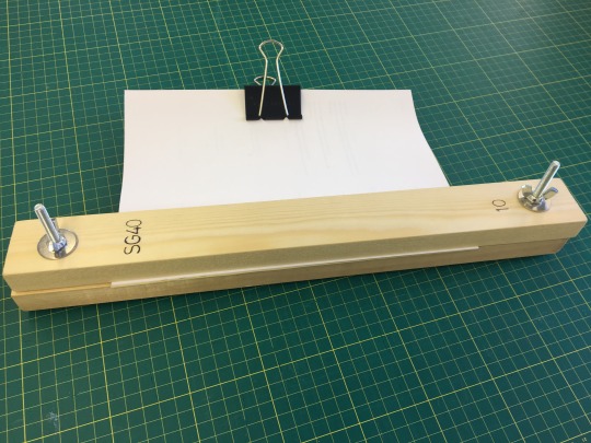
At first it seemed difficult but it went quite smoothly, although a very timely process as I had to apply multiple numbers of PVA glue. For me, the most difficult part was when it came to measuring out the cover and ensuring that it fit the booklet snug. Trimming the edges to ensure everything was aligned. Yet the process before this of sticking the pages together was surprisingly easy. I found this a very successful way of binding and will definitely use it again with other booklets. As well as realising I could have used many more pages so will be able to do it with thicker booklets using thicker pages in the future.
0 notes
Text
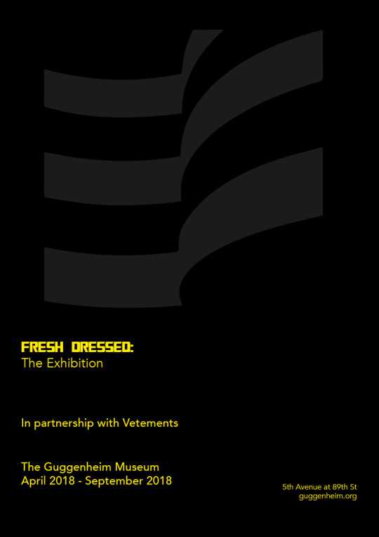
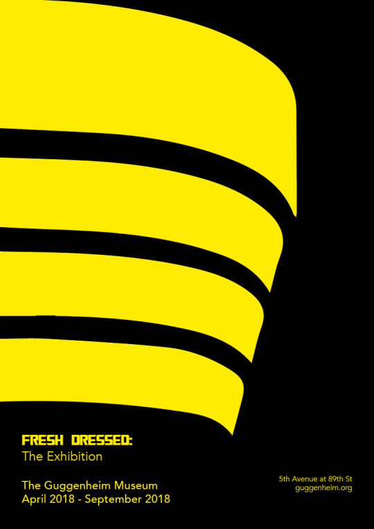
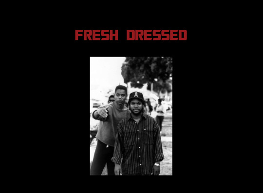
Final poster Decision
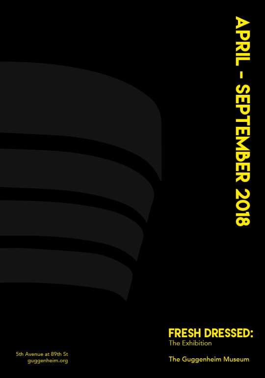
I thought that this poster was the most appropriate for the guggenheim. If the colours were different such as white and maroon it would look more stylish and high class much like the guggenheim usually is. By changing the colours to black, grey and yellow I was able to put a different hip-hop spin on it. Hopefully attracting both type of audiences.
The type face chosen isn't too different and is still simple while still being rounded and suited to the Fresh Dressed audience.
0 notes
Text
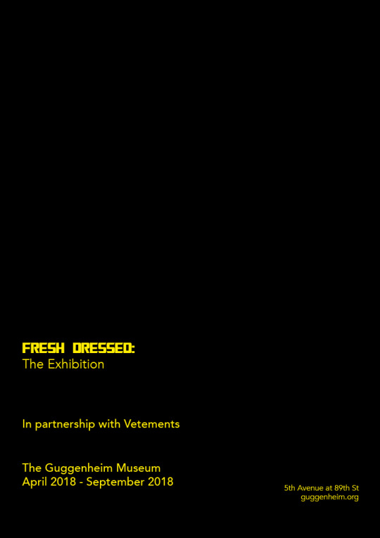
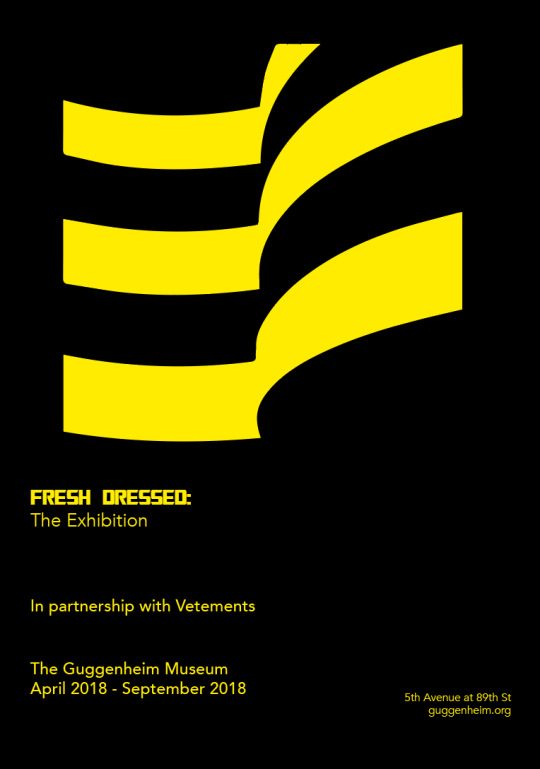
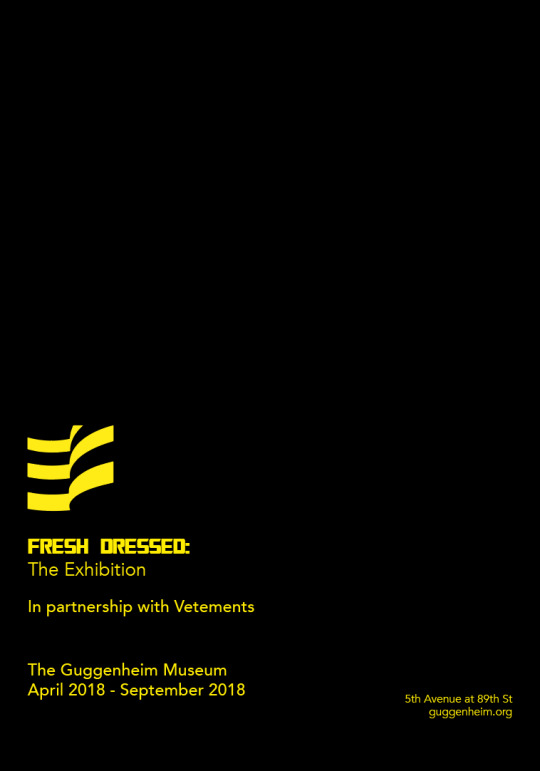
Further development on poster ideas
I decided that the previous poster ideas with pictures of rappers and other hip-hop related images. Although then were planned for the V&A, were not appropriate for such a eminent museum. I wanted to create something slightly more respectable and simple while still being ‘cool’ and attractive to the younger eye. I chose to do this through less things on the page yet with contrasting colours, as I experimented with different ideas below. Combining black, yellow and the guggenheim Logo.
0 notes
Text
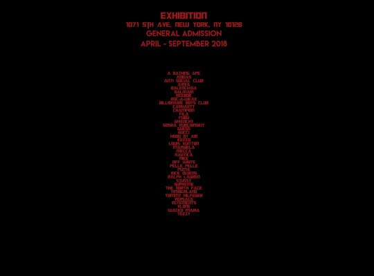
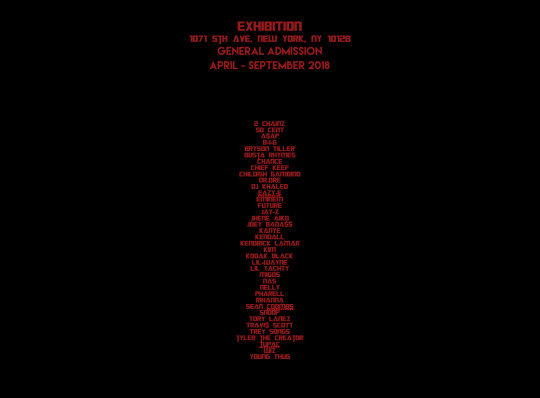
Merchandise: T-shirt final Decisions
I Decided to stick with the transformers type face and images that I looked at previously. Along with the black t-shirt and red type. As often merchandise t-shirts are promoting/belong to a tour, there is a list of places the tour is going on the back. I have created two t-shirts, one with a list of Style Icons, Designers, Rappers and other celebrities and the other with a list of hip-hop brands. Reinforcing the meaning behind of the exhibition and its contents as well as it looking and being appropriate as a t-shirt.
First Design
Front:
Back:
Second Design:
Front:
Back:
0 notes
Text
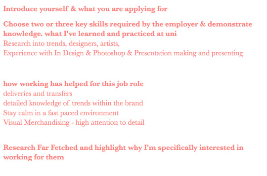
Merchandise: T-shirt design
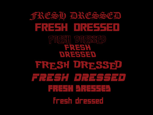
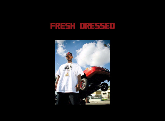
Looking at Different type face’s, I wanted to look into type face’s that people would recognise. For example the first type face, “Old London” has been used recently for Kanye Wests Pablo pop up merchandise. Others including Back to the Future, Transformers and Pokemon. This would almost hit an emotional recognition, it may not be obvious for a lot of people why they recognise the type face but the fact that they do is important. Using this technique also works similarly as some Vetements ideas, almost copying other peoples clothing and designs and making them their own. The second type face from the top is the transformers style. I think this is the most understated font while still looking appropriate for the Fresh Dressed style.
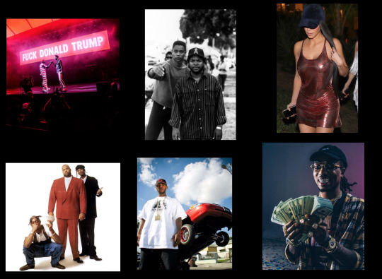
Along side text on the t-shirt I wanted to add an image, something that shows off the exhibition. Using Images that would be featured within the exhibition. Above are some of the images that I thought could be appropriate.
0 notes
Text
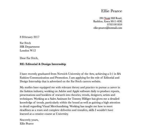
Writing a Cover letter
A cover letter isn't something I've had to write before, the pressure of forcing your personality into an email sounds impossible and thats before even looking at why I want to work for why that company.. and why on earth would they want me to work for them?!
So I went on a search for a good template. Where I found a good one through Manchester Metropolitan University. Shown below:
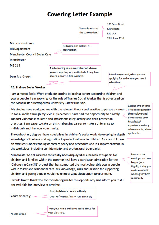
From this, mainly using the directions within the pink boxes, I created my own plan and bullet points. Using my own experience and what the job application listed they were looking for. In hope I could write a successful email/letter.
However, before beginning to write I found an interesting article.
http://fashionista.com/2014/07/cover-letter-tips
Where the third point said “You get one paragraph- one.” I realised I needed to put all of my information within one larger paragraph.
0 notes
Text
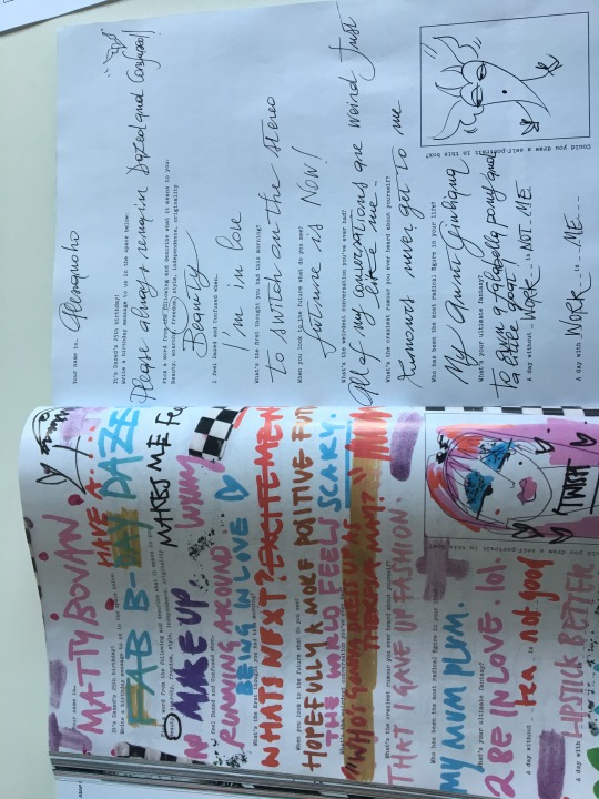
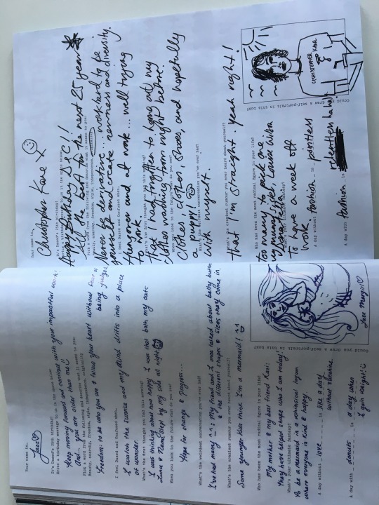
Hand Rendered text: In Dazed
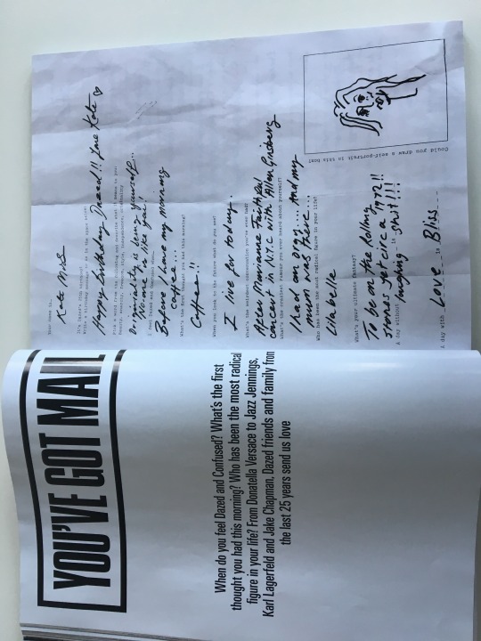
After choosing to design my reflective journal with hand Rendered text I found pages within the latest Dazed magazine. Where they asked celebrities “Why do you feel Dazed an confused?” where there were pages and pages of hand written questionnaires from celebrities.
In this case, the hand rendered text has helped the reader to feel more connected to the person writing it, compared to a typed interview it is coming from the person themselves. A feeling that I want to reach through my front cover of my reflective journal too. However these did make me think how I could be more creative with it in the future, possibly foiling or using different colours.
1 note
·
View note
Text
Reflective journal: Design
This project I struggled to get in touch with my feelings and emotions when it came to writing my reflective journal, I needed to get deep and so I reached out to my friends and family to talk about my learning curves, health and university experience. From this I decided to use some notes and letters from friends, family and tutors to help create the front cover of my reflective journal.
Yet because of this hand written more casual approach as well as the more chatty, informal tone of the text within I wanted to make the graphic layout much more organised and simplistic so that it wasn't over crowded. I stuck with black text, white background and small amounts of baby pink to liven it up slightly.
Front Cover:
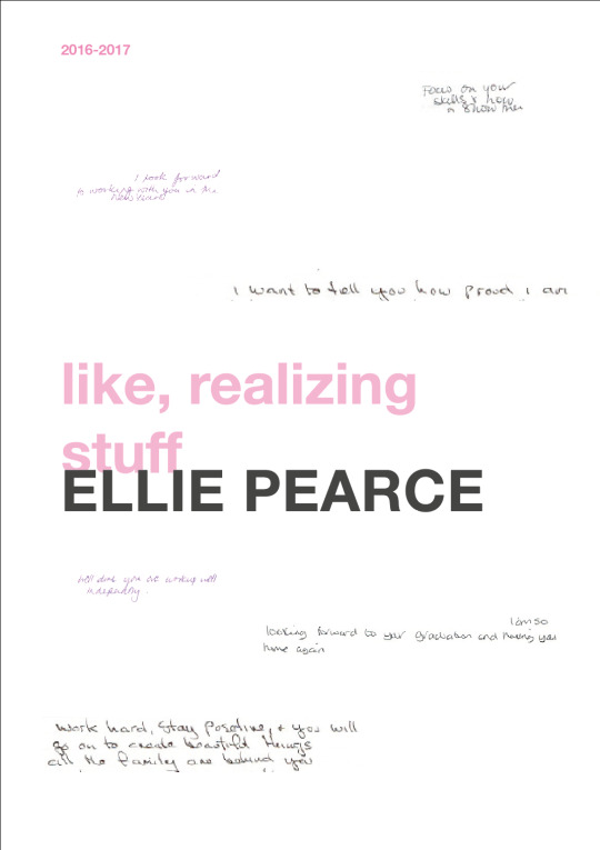
The colour scheme and type face is followed throughout however the hand rendered text is only for the front cover. I called this publication “Like, Realizing stuff” because of the t-shirt that Kylie Jenner had in her recent merchandise collection that blew up the internet world with millions of bloggers and fans wearing the t-shirt which was created from a recent interview with Kylie. I used it for my reflective journal because that is what I have been doing through the duration of the project. Realising things.
Contents page:
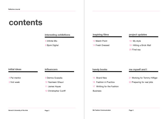
I had many different sub sections within my reflective journal so I did struggle at first to create a contents page that looked nice while was still organised. I didn't want to scrap the idea of having sub sections as it would then be a long unorganised mess. My final design is above, using the numbers in pink and the rest of the text in black to hopefully, be subtle.
Inside Pages:
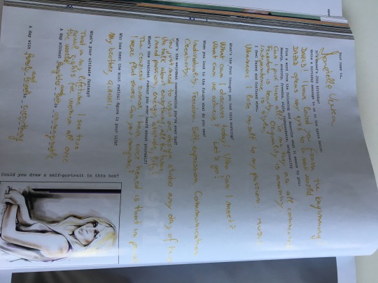
For me, the blank space was important for these inside pages. especially as it is an A5 booklet I didn't want them to look over crowded.
0 notes
Text
Industry File: Design
When looking at the design for my industry file the thought process was reversed compared to my reflective journal. The information within was formal therefore I wanted to play around slightly with the design aspects. I mainly did this through colour, the contents page and the front cover.
Front and back cover:
Contents page:
Inside Pages:
0 notes
Photo
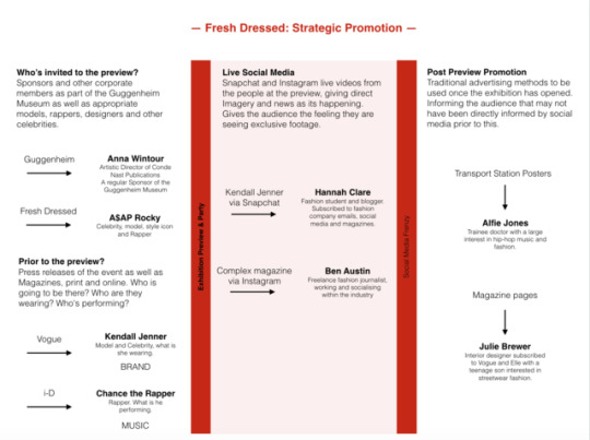
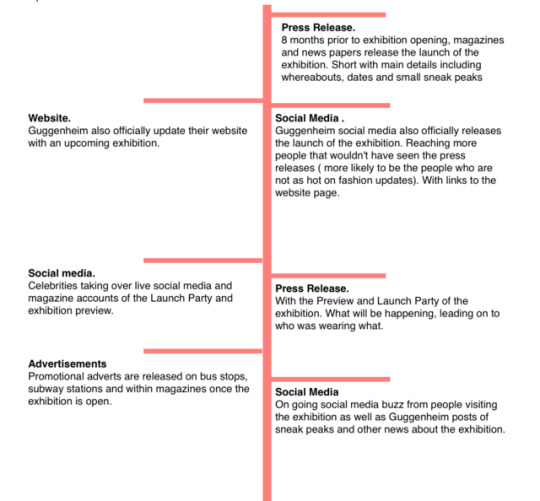
Flow Chart, showing a strategic plan of promotion for the exhibition with examples.
0 notes
Text
Budget
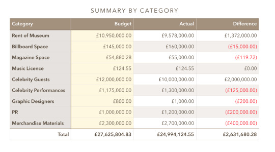
Workings out:
Rent:
30,000 per night
Estimate 10,950,000 annually
Billboards: NYC subway: 40,000 for 200 stations on platform NYC Bus: 3,500 per ad x 4 weeks. x 30 = 145,000
Magazine advertisement pages: all specified full single spread Vogue: 36,130 Dazed: 6,902
LOVE: 11,748.28
= 54,880.28
Celebrity Performances: Travis Scott: 15,000 Chance the Rapper: 35,000
J.Cole: 125,000
Jay-z: 1,000,000 =1,175,000
0 notes
Text
Tracking an exhibition, Balenciaga: Shaping Fashion
Source: Vogue.co.uk Balenciaga Womenswear SS17 Ready to Wear
Before now, looking at the marketing strategies for exhibitions has been difficult do the fact they are mostly past exhibitions. While researching fashion brands I came across an article in ID magazine releasing the dates for new exhibition “Balenciaga: Shaping Fashion”.
The exhibition is being shown at the V&A from may 2017 until February 2018, leaving 6 months until I would be able to visit. At the moment there is so clear paid marketing; no advertisements, posters, social media, neither is it shown on the V&A website yet. Giving me the opportunity to watch what is released first and when and giving me a better structure for what I need to create for my exhibition. I found it interesting how the articles were released before any official advertising from either the V&A or Balenciaga.
For now I have been looking into what PR is occurring. Noticing articles from websites such as Dazed Digital, Vogue, Harpers Bazaar, Allure and The standard. Harpers Bazar releasing a short yet detailed explanation of the exhibition:
“The V&A has announced that it will stage a fashion exhibition centred on the work of Cristóbal Balenciaga. The retrospective, entitled "Balenciaga: Shaping Fashion", will mark the first UK exhibition ever dedicated solely to the designer.
Around 100 garments and 20 hats will be showcased to represent the work of Balenciaga and his successors, along with sketches, photographs and fabric examples to show an in-depth look at the craftsmanship.
While a number of the pieces on show are iconic in their own right, there will also be garments that have never been seen before.The exhibition will mark the 100th anniversary of the opening of Balenciaga's first fashion house in San Sebastian and 80 years since he opened his Paris salon."Balenciaga: Shaping Fashion" will run from 27 May 2017 until 18 February 2018.”
While some articles I read were short and sweet like the Harpers Bazzar one above, other websites like The Standard have taken the opportunity to also write about the most recent collection while Allure have written about the history of Balenciaga, making the article not just about informing the reader but engaging them further.
At the moment there is no talk of the exhibition on Instagram or Twitter from the V&A or Balenciaga however magazines are again talking about the release.
0 notes
Text
Merchandise: What information is on it?
List of tour locations:
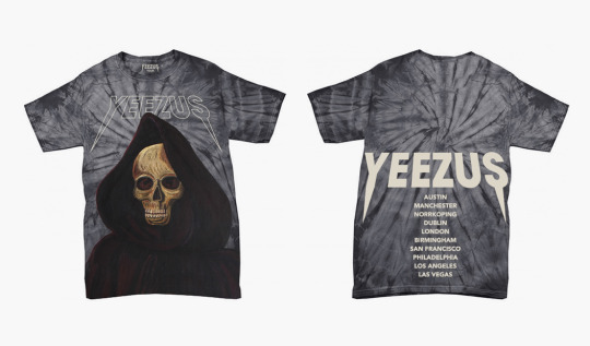
Kanye West: Yeezus Tour
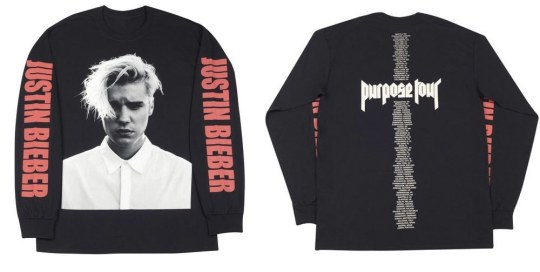
Justin Bieber: Purpose Tour
Tour name / Title or Slogan:
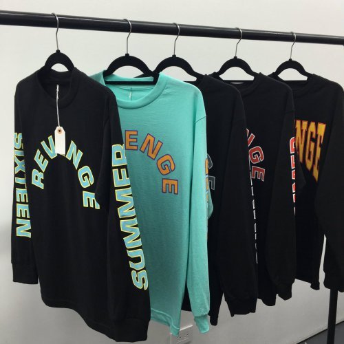
Drake: Summer Sixteen Tour

Beyonce: Formation Tour
An Image:
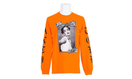
Rihanna: Anti Tour
1 note
·
View note