
Don't wanna be here? Send us removal request.
Statistics
We looked inside some of the posts by emmagillandersgradedunit and here's what we found interesting.
Average Info
Notes Per Post
0
Likes Per Post
0
Reblog Per Post
0
Reply Per Post
0
Time Between Posts
1 hour
Number of Posts By Type
Photo
17
Last Seen Tumblr Blogs


Fun Fact
Tumblr.com rank in the US is 25.
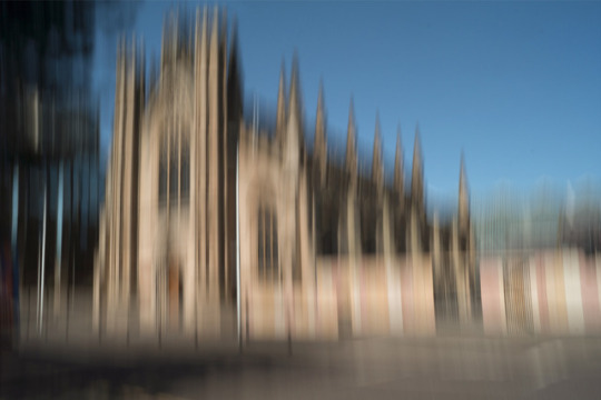
Photo


Evaluation
This is my Graded Unit Evaluation, where I have reviewed and analysed my personal project and its successes, as well as some of the improvements which I could have made, and what I have learned.
Alongside my final 20 images, this marks the end of my Graded Unit.
0 notes
Photo


Zoom Burst of The City Chambers Archways
This shoot was a good addition to the continuation of the theme of archways in my zoom burst shoots. This particular structure was nice in that fact that it had three archways, and therefore was a new challenge to shoot. That path which runs under the arch is busy, and so there was generally a person in frame, In image 1, this is quite interesting, as the figure is centrally composed, and merges well with the zoom. The gradient of light is also an interesting feature of this photo, as the left building is cast in the shadow of the one on the right.
Image 2 is taken from further back, and so has more in frame. I like how the road acts as a leading line, and is well positioned to emphasise the zoom. Being able to see through each arch is also interesting, as the light is slightly different in the far background of the shot. Image two has maintained the general positives of the first image, but because it is a bit tidier, partly due to the nature of the zoom burst, I have decided to choose it as a final.
0 notes
Photo


Zoom Burst of Glasgow Cathedral (With Speedlights)
I like image 1 because of its good positioning, it is very symmetrical, and the focus is where I want it to be. The zoom burst really goes well with the shadowy areas, and the use of lighting has made an interesting scene. The arch also manages to be quite imposing in the dark, and the zoom burst adds enough movement to suggest something almost eerie. I like the details retained in the doorway of this image.
Image 2 has quite a different feeling to it. The zoom burst has made a number of light trails, and the overall colour is nice, bringing out the actual colours of the building. It is also clearer what the front of the building looks like, as you can see the windows on either side of and above the main arch.
I will use image 1 for my final however, as I think the imposing nature of it, combined with the good symmetry, will make it sit nicely with my other finals. Image 2 unfortunately contains less flash from the speed lights, so the details of the door is lost. I managed to get the lights working effectively in image 1, which is another reason why I will use it.
0 notes
Photo


Zoom Burst of the Cattle Market
I chose the first image here because I felt it was a really strong zoom burst, with a great deal of depth, and a nice composition. The dark blocky buildings on either side are really weighted, which contrasts well with the lilac of the person who is walking from the foreground. This added human element has been rare in my project so far, but here I felt it added to the scene quite well. The archway is quite classical, which really contrasts with the much more modern, blocky buildings behind, which is significant as these parts of the photo are central and easiest to make out, and so the viewers eyes are drawn to them.
Image 2 was taken from a closer spot, to try make the arch fill the frame more. This has made an interesting photo, and I think it is nicely composed. However the zoom has made to picture a little too blurry, and so the image is quite hard to look at. This is perhaps also due to the lack of blank space in the image, whereas image 1 has a portion of blank pavement and sky to prevent the image from being too overwhelming. Because image 1 achieves this whilst still acting as an effective use of technique, and fitting the theme, it will definitely feature amongst my finals.
0 notes
Photo


Zoom Burst of The Barrowlands
I am happy with image 1 as it captures the shape and colours of the Barrowlands sign in good detail, and yet is also an effective zoom burst. By photographing at a time of day with little light, I was able to make the scene quite dusky, which contrasts well with the bright reds of the sign. I also like how the centre of the sign is in focus, which helps to merge the starbursts depicted on the sign with the zoom burst.
Image 2 is much busier and disjointed than the first. The zoom makes a confusion of layers, as the sign is really brought from the distance to the foreground. This helps to add to my theme quite well, as the photo is disorientated, and makes one question what is going on.
I will use image 1 as my final photo, as I feel it is a much stronger image. While image 2 is definitely interesting, it’s zoom burst is not as apparent as the first photo, and I feel the frame is slightly cluttered; it does not help that there is a large ‘taxi’ sign visible. Image 1 is also nicer in colour, as the darker sky helps to emphasise the sign well.
0 notes
Photo


Panning of St Andrew’s Cathedral
I was happy with the St Andrew’s Cathedral images because of the interesting colours which I managed to capture. In the particular lighting of the day, some of the building appears subtly pink, which is emphasised with the vertical panning. The sky is also a nice blue, and helps to set the building forwards in the frame. It was a difficulty photographing across the road because of traffic, but the absence of any in both image 1 and 2 is a real benefit, giving some relatively blank space at the bottom of the frame, which offsets the sky nicely.
Image 1 will feature as one of my finals, as I feel it was the most successful of the two. It benefits from having the entirety of the top of the building in frame, while image 2 slightly runs off. This achieved while also allowing the building to take up more of the frame, which increases its presence. The shadows in image 1 are less harsh, and this helps to maintain a nice colour balance.
0 notes
Photo


Panning of The Ramshorn Theatre
The Ramshorn Theatre was difficult to capture as the road between the camera and the building was very busy. Image 1 however does manage to avoid including many cars in the foreground. I was happy to have included the blue sky across the entire length of the photo, which helps the building stand out much more. The panning technique worked well with this photo, as the many spires of the building are painted across the frame.
Image 2 focused much more on the scale of the building, and I was attempting to get the whole structure in shot. Again, there is a good amount of sky, and I have avoided getting anything on the road in shot. There is a little more green in image 2, which sits nice with the blue of the sky.
I will use image 1 in my final selection as it is more centrally composed, making the building the more prominent part. This also means that the trees are less in frame, which I am happy with, as although they look nice, they are a not a necessary part of the photo.
0 notes
Photo


Panning of The Technology and Innovation Centre
The innovation centre was an interesting location, because there were photo opportunities from almost every angle. Images 1 and 2 were both taken from the rear of the building, where two walls came together. I really like how the shadow falls differently on each surface, which adds an interesting element to the photo. Having a clear sky also helps to break up the picture, as any clouds would have merged with the structure on the left. The panning technique worked well, and really captures the scale and height of these buildings.
I have chosen to use image 2 as my final as I think its lighter colouring makes it more representative of the time of day, and also avoids the slightly murkiness of the building on the right, which appeared as quite brown in image 1. Image 2 also has slightly nicer reflections in the windows, and the building to the right almost appears transparent. This idea sits well with my themes of distortion and confusion, and so I will use image 2 in my finals.
0 notes
Photo


Panning of Templeton on the Green
I like image 1 of this shoot because of its impressionistic feel, which I definitely think sits nicely with my theme. The various greens and blues, sitting alongside the browns and reds, make this picture rather painterly, which I think makes it successful. The panning method worked very well, and I managed to keep the whole subject matter in frame and nicely positioned.
Image 2 was an attempt at looking closer at the details of the building, which I think worked to an extent. The yellows of the brickwork are much more visible at this range, but due to the shot being more zoomed in, it has been harder to keep it in frame. Combined with the fact that the cars are quite visible and distracting, I don’t think image 2 will be the one I shall choose to print.
Image 1 manages to keep the whole building in shot, melts the cars into the rest of the image, and benefits from a nice array of colours. It will therefore be the final from this shoot.
0 notes
Photo


Panning of Glasgow Suspension Bridge
I feel that image 1 is one of the more successful of my panning shots from the project. It is quite different from the other buildings I studied, and the angle from which it is taken means the beams of the bridge it nicely in the frame, adding a sense of depth, which I consider important in a photo using a technique which emphasises mostly a vertical plane.
However I think that image 2 is an improvement on the first, as it is much straighter, and was taken without the distraction of three people in frame. The intentional blur from the panning is more even, almost giving the suggestion that the image involves reflection. Because of its better composition and more successful use of panning, I shall use image 2 as my final from this shoot.
0 notes
Photo


Multiple Exposure Layering of The COGC Riverside Campus
Doing a layered photo from quite a distance was really interesting, as it was intriguing to have a layer of something within a few meters of the lens, and something right out in the distance. This can be seen in in image 1, where the bridge I was standing on is repeated, but so is the large building far behind it. The very geometric and square shape of the riverside campus worked well with the layering technique, and it is nice to see it in increasingly larger layers.
Image 2 is far brighter, and taken from an angle which just includes the tops of the buildings. This makes the sky a main feature of the image, which is effective when it is subtly covered by layers of buildings. The image is reminiscent of a pattern, as each layer is clearly visible and set apart from the next. I think this makes this photo really stand out from the others in the shoot.
I really like the lighter feel of the second image, and so image 2 will become one of my finals. The first photo is really nice, but its really shadowy feel isn’t something I want to overdo. Image 1 is perhaps a little too cluttered and dense for my liking, and so I will use image 2 as a final.
0 notes
Photo


Multiple Exposure Layering of The People’s Palace
The composition and positioning of the People’s Palace in both images is something I am happy with, which is why it is similar in both. The mixture of trees, glass, and bricks adds a really interesting texture and colouration to both shots. In particular, the glass roof is repeated and layered to a dizzying extent, which works well for an image which would otherwise be very static. Both photos have an interesting layering of the domed roof of the structure, as it increases in size as it fades away. I felt this was a really dynamic and interesting element to the pictures.
Image 2 will feature as my final because I think it is a nicer colour and depicts the building in a better way. Image 1 is just a little too dull, and has a bit too much focus on the greenery in the foreground, and the landscape to the left. I prefer how image 2 is a bit more cropped in, and so it will become one of the final 20 images.
0 notes
Photo


Multiple Exposure Layering of Hutchesons Hall
I was really pleased with image 1 from my shoot, and feel it is one of the stronger ones from this project. I am happy with the central composition and symmetry of the shot, which helps to emphasise the building I was focusing on. The white colour also really makes the building stand out from the ones around it, and the blue sky ensures that the steeple does not merge with any clouds. The road in the bottom third of the frame adds depths, and sets back the white building, which I really like.
Image 2 was taken from much closer, looking up at the steeple alone. It is interesting to have the steeple compared against the much bolder and darker building on either side, which adds an interesting weight to the image.
I do however much prefer the composition of image 1, which has the whole building in frame. I think it benefits from being in portrait, as it emphasises the height of the steeple, and allows a good amount of sky to feature. Image 1 also has much more depth than the second, which I feel makes it better to look at.
0 notes
Photo


Multiple Exposure Layering of The Gallery of Modern Art
The colours in image 1 are deep, and really help to bring out the intricate detail of the architecture. The angle is quite steep, which adds an interesting element to the photograph. I also like how the blue sky matches the banner hanging amongst the pillars. The constant stacking of the images makes the building seem really heavy, which I think is very nice when coupled with the angle photographed from.
Image 2 had much more of a focus on the pillars at the front of the building, as I felt it was interesting to layer them. The focus on vertical lines in the composition of this image is something I really like, as it emphasises the height of the structure. I also like how the sky is broken up by the repeated layering of the facade.
I have chosen to use image 2 because I was really fond of the height of the building. I feel it is more aligned with my theme than image 1, as it is clearly taken from the perspective of a person on the pavement, rather than higher up and only of the top of the structure. It is also a bit busier, which helps to emphasise an overwhelming feel which I was aiming for.
0 notes
Photo


Multiple Exposure Layering of The Old COGC Building
Image 1 contains a lot of colour, as much of the old college building is in frame. It is a strong contender for a final image, because I feel the bright structure is certainly the main focal point. Zooming in whilst using the burst has kept the image looking neat and contained, even though many photographs are layered. I find it interesting how you can see figures and cars in the foreground, which appear through the transparency of the buildings on top of them. This adds to the concept of feeling lost in the surrounding environment.
I have chosen image 2 as a possible final, because I feel the composition is strong, and the layering has worked effectively. The statue in the centre is an interesting architectural addition, and I like how the college building sits off centre. The editing of several photographs with various opacities has meant that the subject matter looks staggered, like you’re dizzy and everything is spinning. What also attracts me to this image are the blocks of colour which are separated across the frame, which I feel draws the viewers’ attention over the entire image. Although I prefer the composition of image 2, the college building is more much more apparent structurally in image 1. I also believe there is greater depth to the photograph. The longer you look at the image, the more hidden details you can pick out. I like how you cannot figure out what you’re actually looking at, which adds to the surreal nature I was aiming for.
0 notes
Photo


In The Round at George Square
I feel that image 1 was one of the more successful in the rounds of the project, as the editing has really allowed the lines and patters of the buildings around the column to be shown. The monument itself is well depicted, and has managed to remain central.
Image 2 of the Scott Monument has a significant emphasis on the trees and people around the square, not to mention the large flock of pigeons. This does add something interesting to the photo, especially seen as the column pushes through the trees into the foreground, however I prefer the emphasis on the architecture around the monument in image 1.
Image 1’s focus on the buildings, while still having subtle depictions of people in the foreground, makes it a really nice photo. I think it is a positive that the trees are not visible, as this allows some blank space in the sky to break up what is otherwise a very busy shot. For these reasons, image 1 will be one of my finals.
0 notes
Photo


In The Round at The Necropolis
For this in the round, it was interesting to not be able to capture the full 360 degrees of the building, as it sat on a ledge. The layering of the images really helps to emphasise why this mausoleum is nicknamed ‘the carousel’. The patterns on the outside are quite intricate, and having them repeated in layers really adds to the complexity of the surfaces. In image 1, the top of the structure has also been interestingly edited. The various layers add some new shapes and lines to the building. I also think that image 1 works well within the rule of thirds, having a good balance of grass and sky, which helps to lighten the image as well.
Image 2 captures the building from a different angle, with the entrance arch much more in focus. The layering has made the doorway much more pronounced, which is an interesting variation to the building. This particular edit has resulted in rather smooth surfaces, as the carvings are visible, yet are somewhat flatter than in image 1.
I have decided to use image 1 as a final as I feel it is a more successful in the round compared to image 2. It appears much more textured in the layering, and has nicer colouration, especially in the grass on the bottom third of the frame. I prefer the darker version of the structure in image 1, as the shadows make it look ghostly, and also sets it out from the sky behind it.
0 notes