
Don't wanna be here? Send us removal request.
Statistics
We looked inside some of the posts by ericlishdesign-blog and here's what we found interesting.
Average Info
Notes Per Post
4K
Likes Per Post
2K
Reblog Per Post
1K
Reply Per Post
4
Time Between Posts
2 days
Number of Posts By Type
Text
6
Photo
11
Last Seen Tumblr Blogs


Fun Fact
China blocked Tumblr because of pornography and censorship problems in 2013.
Text
3/6/18
The relationship of spoken language and written language is one that is only of extension. The written language relies upon the spoken language, the spoken language merely relies upon written language as an extension for further recognition. Typography exists as written language and the relationship that typography has with spoken language is trying to communicate a feeling just like tone is conveyed in spoken word. In Fellow Readers, there is mention of Saussure and his lectures on language, which he used to just mean ‘spoken language’. Saussure did not recognize written language within the same degree as spoken language which I found to be interesting. In Letter to Robin Kinkross, Andy de Fiets goes on long tangents and towards the end of the letter admits that writing his letter to Kinkross has helped him through a cathartic self discussion which brought him to a few life realizations. The written language and the semiology that is presented within typography extend what spoken word cannot. There is a difference in our minds when we read a word rather than hearing it even though these words, both written and spoken, trigger a connection to something. I find it interesting that even though spoken language and the auditory language itself is the originator of the foundation for language, I still believe that the visual component is just as necessary. I say this because neanderthals created images of their surroundings just as we record things graphically and this instigates in me the realization that these two forms of communication and language are separate but equal under the umbrella of language.
8 notes
·
View notes
Text
2/27/18
2/27/18
The content of a work is said to be the premise of the outcome for the design which will encompass the work. This reminds me of the crystal goblet in which typography is to act as a see through holster for the text to express itself through (the color and taste of the liquid in the crystal goblet remains the same, it is just held up from the ground). The author as designer ethic challenges the previous notions of authorship and the collaborative effort that is book making or print publication in general. Without designers, authors would not be able to present their work in a fashion that is considered professional to the standards of contemporary design. Designers putting their own names on the front of covers parallel to the author of the words within a book they designed is monumental for the visibility and credit that designers desire. The readings speak on the DIY ethic and the process of making as a reward/reaction to the limitations of printing on demand. I feel this is a very interesting topic as DIY publishing allows a designer to experiment with different printing processes to convey a physical relationship with the text rather than relying upon a homogenous method of printing to adhere to. Even as homogenous methods of printing are designed and simplified for non designers to adhere to it will never replace the crucial role that designers play in communication and constructing the world around as. As we continue to create and experiment through reactionary DIY methods, challenging the standards of our own practice and continue to propel ourselves to create, we find the validity in our plight to be sedimentary in an unknown future of communication.
0 notes
Text
Frankenstein Typeset Drafts
UNIVERS
https://drive.google.com/file/d/1fZrr_4REDxy8cdSAc3teqhbvA-Ucfbd5/view?usp=sharing
AKZIDENZ
https://drive.google.com/file/d/1dzbICJaputYF_tdTjyZ4lElcNgPnj1jZ/view?usp=sharing
4 notes
·
View notes
Text
2/20/18
Design and Future of Publishing
Electronic Publishing
The difference in typesetting and design in regards to print and electronic publishing is that print has more free range where as electronic is confined to scale through the various devices used to house electronic books. Physical prints are malleable in terms of scale and allows for more diversity when designing a book/magazine. There are standards for print sizes, (8x11, 5x7) but in print you do not have to adhere to this as you would with electronic text because that text would have to be optimized for the various screens in which they would be displayed upon. Text laid upon the screen loses an individuality that is unique with the print that it is laid upon. The fonts may be the same and convey the same attitude but depending upon how the physicality of a book is transferred to an electronic platform is another matter because it could compromise how the text is laid out, i.e., a square book that must be condensed to fit a rectangular frame of a phone. This I feel is the most challenging transition from print to electronic publishing as both consume energy, one in the process of being made (print), the other while being used (electronic) and print has a unique feel to it in addition to the look. Magazines convey an attitude that helps to appeal in print and usually there are added aspects to convey this attitude, texture of paper used, fold outs or included posters as keepsakes. This allows for there to continue to be a market for print because the physicality of print, this attachment to the physical world is crucial to the experience of text and consuming that.
0 notes
Photo

«Vers Univers» 4, Edited by Frans Vanderlinde, with Paul de Vree, Pierre Garnier, and Ian Hamilton Finlay, 1967, M HKA Ensembles (Private Collection, Antwerp)
51 notes
·
View notes
Photo
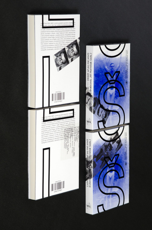
LS – Uklidit az po me smrtiwww.facebook.com/Kolektiv.studio http://ift.tt/2GnxLVH
35 notes
·
View notes
Text
2/13/18
The history of typography is an interesting subject to me as I have found from the readings that there is a very layered history to the formation and understanding of what has become typography as we know it today. Typography is and has always been associated with print and whether that originated in Europe or in China is regardless of this association. In Modern Typography the discussion that typography itself is a modern invention and to call a certain phase of typography “modern typography” is to distinguish an irrelevant distinguishment in typographic history. Contemporary typography could be a more suitable name that Kinross may have preferred rather than “Modern” but considering that this essay was written in 1992 and how things have changed for typography and its rights as an art piece and a utility, I believe that now is a time to determine typography as “modern”. I offer the usage of typography now being regarded as modern because of the environment that typography largely inhabits, this being the digital spaces in our laptops. The final product of most typography is tangible and whether it is printed on a billboard or in a book it still does not sanction typography to still hold ties to the physical world as it had when typographers of historical merit would have composed and printed typography by hand. Increasingly typography is becoming even more digitized, a current trend in typography is that of posters that move and interact. This is not feasible in the physical world and only exist in the digital realm displayed through social media and other media outlets. We are beginning to move typography into an environment where it is no longer tangible, as Jurg Lehni expresses in Typeface as Programme, that computer technology has again changed the way in which typographers jobs are performed. The discussion unfolds further with the distinguishment between where or not typefaces are works of art or if they are utilities
1 note
·
View note


Text
Reading Response 1/30
In the digital realm we have to be cautious about what we see and consume as fact for manipulation of information is easy to achieve. In the “Hear, All Ye People” article in the New York Times Errol Morris conducts a study on the believability of a typeface. The research conducted from this test provided that certain typefaces engender a belief more strongly than others. This belief is just that; a persuasion to trust that because an article is written in Baskerville means what you are reading or seeing is fact. We’ve become adjusted to certain aesthetics that queue a response of relief from us. These aesthetics are affiliated with professional and established sources which we derive reliable content from. However, when platforms such as Google and Facebook give access to all websites this standard of viable design (“extreme minimalist style that features text and blank white space above all else”) it endangers users to be susceptible to fake news and illegitimate websites.
Sleek and thoughtful design has been ingrained in our psyche to be recognized as a reputable source. In the past we’ve been able to see the distinction between a fake news source and real one, these new generated themes for mobile websites provided by Google and Facebook have compromised that. We should also take into account how gullible we are to consume certain media by the sheer outrageousness. The Trump Gorilla Channel is an excellent example of us perceiving things in a particular font as truth.
Our responses to homogeneous design and typography has remained consistent amongst websites that share similar design aspects. The emotional response that is engendered in us from typography has become that of a commodity, a repetitious dose of the same reassurance as we read news article after news article in similar font, (Georgia, Baskerville, Times New Roman). We’ve set an expectation for the typeface and considerate design to be the beholder of truth. With new technology blanketing all websites to share a homogenous design, the opinion and individuality we get from different sources is extinguished.
0 notes


Photo


Poster design with Ezra Miller + fun lil alternate hero image
131 notes
·
View notes