Statistics
We looked inside some of the posts by extraland and here's what we found interesting.
Average Info
Notes Per Post
396K
Likes Per Post
204K
Reblog Per Post
192K
Reply Per Post
171
Time Between Posts
4 months
Number of Posts By Type
Text
9
Photo
8
Last Seen Tumblr Blogs


Fun Fact
In 2020, Tumblr had 29.4 million users in the US.
Text
waiting
site / prints / newsletter / other links
112 notes
·
View notes

Text
AHIS Week 6: What Even Is “Avant-Garde” Any More?
In my opinion, contemporary art is hard to pin down. After movements like Dadaism and Abstract Expressionism, we’ve come to the conclusion that anything can technically ‘be’ art, no matter how you label it. Therefore, whatever you label as an innovative and interesting idea is entirely subjective. You might come up with a fantastic, wonderful new piece of work, and then have it compared to things like this.

Study of Perspective, Ai Weiwei, 2003 Yep, that’s Ai Weiwei, a contemporary artist who I absolutely despise, flipping off a cruise liner and calling it a piece of art. He didn’t just do this, in fact. He took hundreds of them! He flipped off different places in the world, compiled them into a book, and made huge amounts of money off it. This brings us to our problem: how we decide if an idea is considered innovative or ‘avant-garde’. This may be a new idea! I wouldn’t be surprised if such a thing has never been done before. But I personally don’t view the artistic merit in an act which doesn’t require any degree of creation. When I first found Weiwei’s book in the library, I was dumbfounded because I remembered something I’d done earlier in the year as a joke.

Britney Spears, Alex Ferries, 2017 So the argument I’m making here is essentially “My kid could do that! If my kid could recreate a piece of contemporary art, then that piece shouldn’t be shown!” I realize this argument isn’t the greatest, but here’s what I have. In my personal opinion, a piece of art should either reflect some kind of meaning or display a strong technical skill, preferably both. Having ‘art for art’s sake’ no longer stands unless the piece is visually or technically interesting. We’ve all seen Dadism and LHOOQ. Making something to say ‘this can be art’ and only say that is a waste of time. I’m not saying that the piece needs to be beautiful, or even invoke a particular emotion, I’m just saying that things like the above and this new piece need to stop.

Comedian, Maurizio Cattelan, 2019. Though I think this one may have been a money laundering scheme. In conclusion, I don’t believe that artists are rebelling against what came before them because there is no longer anything to rebel against. They’re free to take inspiration from whomever they like, they’re free to use any medium and style they want and label literally anything as ‘art’. The only competition they have are other people doing the same, who may be less talented than them but may draw the public’s interest through other means. I personally would like a return to the days of Surrealism, where artists were interested in breaking the boundaries of reality to create dreamlike images with their art. No matter what it is or where it comes from, I don’t want to see something half-assed, I want to see something good.
4 notes
·
View notes
Text
AHIS Week 5: Ridiculous Rococo
Jean-Honoré Fragonard, The Swing, 1767, During any time of political or cultural upheaval, there’s always a certain push back, one towards happier, brighter themes which one might call escapism. Rococo was in the early 1700s what the Kardashians are today. Wealth, luxury, a focus on trivial imagery and excess. The gowns are always flowing, the gardens are always lush, opulence flows through the piece and there are always babies.

François Boucher, “Allegory of Music” 1764. Seriously, why are there always babies? I don’t think I’ve ever seen an art movement with as many babies. Cherubs and other angelic imagery are another common theme of Rococo art, just as much as the bright sunrise-colored skies and elegant drapery of clothes. There’s a continual theme of sunlight, carelessness and happiness. Conflict is almost never shown in Rococo paintings, and when it is shown, it’s only to draw attention to something trivial or silly, not allowing the subjects of the scene to break their calm state.

Jean-Honoré Fragonard, The Swing, 1767. The central conflict of this piece is that a trick is being played on the woman, so that her lover might (shocker!) look up her skirt. The woman’s expression reflects mild bemusement. I enjoy the look of abject horror on the face of the baby beneath her. Really, the emphasis in the painting is on the elegant drapery of the woman’s clothes, the overall beauty of the elements in the image with the fine details only helping to accent it. Beauty, wealth, happiness, and relief from conflict; all of these are present in the piece. Something incredibly trivial is made the subject of the piece. Everything is emphasized, from the beauty of the background to the woman’s expression to her many, many layers of clothing. In a way, Rococo paintings reflect a celebration of excess.

“Please make it stop.”
0 notes
Text
AHIS Week 4: Baroque Still Life, Still Going
My favorite piece of artwork from the Baroque module would definitely be Willem Kalf’s Still Life with a Silver Ewer (1660), which I also ended up recreating with props from around the house as a separate assignment. This painting stood out to me because of how it elevated something simplistic into something beautiful and preserved. There’s a sort of naturalism to the piece, making it feel less like a painting and more like a snapshot of something in motion, even though the objects in the painting were carefully arranged and lit to give the optimal result. Even though the elements aren’t naturally arranged, they feel as if they were, everything from the half-peeled fruit to the bowl balanced against the alcove with the clumps of fruit inside it.

Willem Kalf, Still Life with a Silver Ewer (1660). I was also drawn to the incredible detail put into the colors and textures in the piece. The metal shines, looks fluid, embossed, while with the painted bowl I really get the impression that a pattern of dried paint was inscribed upon it, even though the bowl is only a piece of a larger painting. The still life is depicted with such skill that it tricks my brain into assuming that the textures are real, and I personally think that’s incredible. Every single element of the still life does this; from the fruit to the plants to the metal, and even the stone of the alcove, and that’s before you even get to the incredible level of ornate detail! I think that this piece is a technical marvel, and it left me thoroughly impressed. In my opinion, Kalf was able to achieve some truly lifelike qualities in his piece.
0 notes
Text
Weirdness
Letters keep showing up at the beginning of my posts and I can’t edit them out. I don’t know why. Tumblr is a magical place.
0 notes
Text
AHIS Week 3: Contemporary Technology and Art
BNItWhen I was younger, I was obsessed with futurism. Well, more retrofuturism than just futurism, the kind of ideas of the future that we’d find in the Sixties. I really believed that everything was going to be some kind of futuristic Tomorrowland paradise, with houses that looked like this.


Charles Schridde for Motorola, 1961. Unfortunately, we didn’t get that. I don’t really know why. It might be because we were expecting a technological revolution, and we got an information revolution instead. Back in the 60′s, we believed that we would have the technology and energy available to revolutionize everything, from science to architecture to art. Artwork of the time emphasizes that. They were also seeking a cultural renaissance, and it is possible we’ll get one in future, but it will come from information and not technology. The main thing that has changed in our lifetime is that the sharing of information has made everything accessible. When you want to learn anything, you can look it up on the internet, share your findings online and work with people in different countries to solve your problems. We’re now dealing with the world on an immediate global scale, and every single person has the potential to achieve global reach. World issues feel even more striking, even more personally connected when we have the capability to see what’s happening there, even to talk with people in different countries via video calls and texts. We all inspire each other, and now, we have the capability to help each other from across the world. Help each other to achieve what we’re looking for, to bolster each other up and improve in our creative endeavors. As far as I’m concerned, we have everything we need to achieve a cultural and artistic renaissance right here at our fingertips. All we need to do is take advantage of it.
0 notes
Text
AHIS Week 2: Venus Gives Birth To Herself
LBotticelli's Birth of Venus is undeniably recognizable and beautiful, and that’s exactly why people want to reuse it. Although it’s (debatably) not as recognizable as something like the Mona Lisa, I’m willing to bet you could pick the Birth of Venus out of a catalogue the moment you saw it. When I went looking for appropriations of Venus, I was expecting to find something like Duchamp’s L.H.O.O.Q., a reworking of the image combined with a commentary on art itself. Instead, I found Miss Piggy.

Muppet Masterpieces, Kermitage Collection, 2000. Here, we have nothing more than a straight-up parody, something made to invoke that recognizable image and then put it in a ridiculous context. It’s hard to take such a beautiful thing seriously when the subject matter has been replaced with the Muppets. Then again, couldn’t that same principle be applied with the Mona Lisa and L.H.O.O.Q.? It’s possible. I think it’s harder for me to take this one seriously, because it isn’t invoking a commentary on art as much as it is trying to sell a product. It doesn’t feel like Jim Henson, creator of the Muppets, is really trying to ‘say’ anything here. But maybe I’m reading too far into it.

LHOOQ, 1919, Marcel Duchamp. I also found a rendition of Venus as a cover for the New Yorker.

Untitled, Susan Davis, 1992. This piece is unrelated to a product. It’s in no way trying to sell the New Yorker; the character is not associated with the New Yorker as a franchise. Rather, it’s applying Venus to a contemporary setting, and doesn’t strike me as an inherent parody. Rather, it’s showing that the beauty of Venus can be found even in a contemporary setting, even with benign objects. Possibly it’s claiming that beauty can be found in anything if we allow it to, and appreciate it. This rendition feels quite a bit more respectful to the original piece than the Muppets’ rendition, in my opinion. Of course, I could be reading too far into it!
1 note
·
View note
Text
AHIS Week 1: Black Death and Covid and More Death, Oh My
Wow, I think this is the first time I’ve used Tumblr as an actual blog discussing my experiences. For anyone who’s following my reblogs of artwork, culture, et cetera, these posts might look a little different! I’m sharing my experiences as part of an assignment for Art History class. Getting to the actual content, it’s undeniable that the threat of the Plague had an extreme impact on art in Europe. Social structures were completely overturned by it, which had a varied impact on culture itself; on one hand, countless merchants, craftsmen and workers were killed off by the Plague, on the other, the hierarchical society of the times began to grow more fluid. It’s argued that the Plague helped inspire the Renaissance, thanks to the Medici family’s support and establishment of artists such as Michelangelo (under the premise that the Medici family would not have been in power without the threat of the Plague.) With death literally wherever you looked, artists couldn’t help but channel it into their art. Death, pain and suffering became common themes of art of the time, as well as penitence, religion and despair. I found it interesting that arrows were also a recurring symbol in these works, possibly a representation of divine punishment. With circumstances like these, it’s easy to see how the populace felt they were being punished, and that was certainly reflected in their art.

Fresco in the former Abbey of Saint-André-de-Lavaudieu, France, 14th century, depicting the plague personified as a woman.
0 notes

Photo
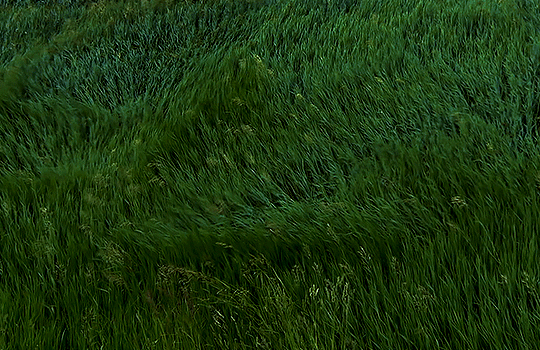
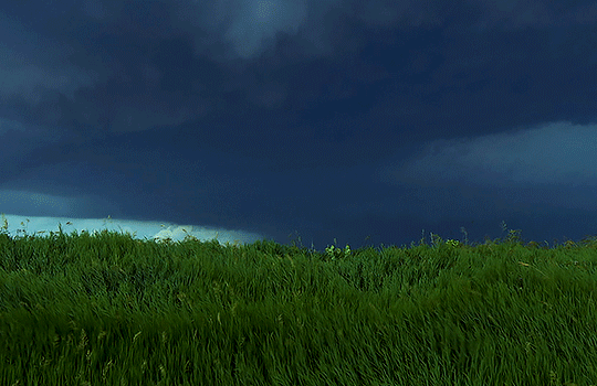
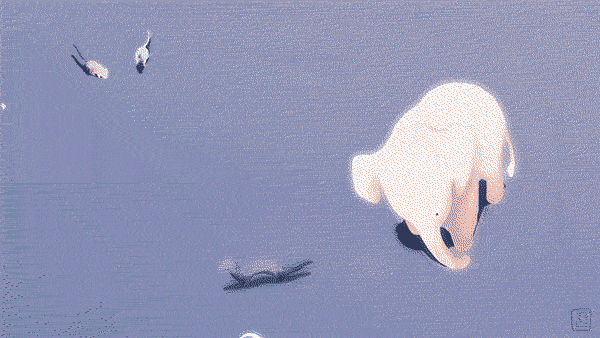
Planet Earth II (2016) Episode 05 “Grasslands” Directed by Chadden Hunter
250K notes
·
View notes
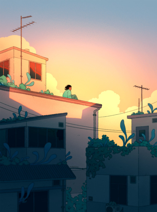
Photo


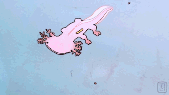
https://www.instagram.com/harriorrihar/ https://www.facebook.com/Harriorrihar/ https://harriorrihar.myportfolio.com/
4K notes
·
View notes
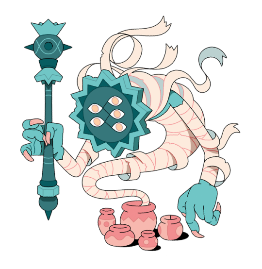
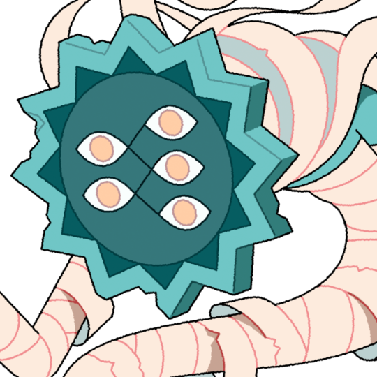
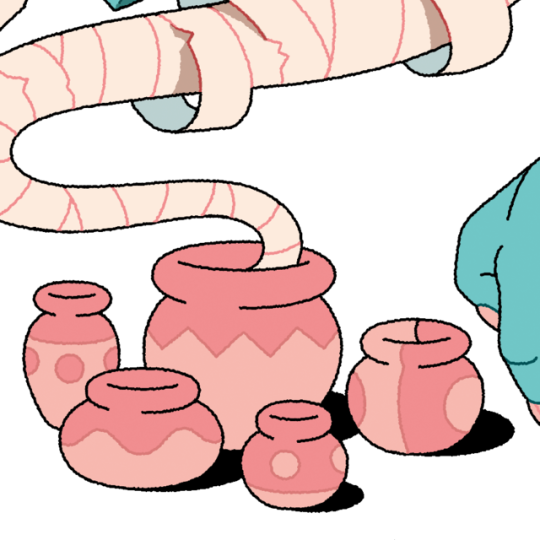
Photo


Art of the Toxic Jungle: Nausicaä of the Valley of the Wind - Dir Hayao Miyazaki (1984)
23K notes
·
View notes