
Don't wanna be here? Send us removal request.
Statistics
We looked inside some of the posts by fearingear-blog and here's what we found interesting.
Average Info
Notes Per Post
8
Likes Per Post
7
Reblog Per Post
1
Reply Per Post
0
Time Between Posts
22 days
Number of Posts By Type
Photo
1
Text
4
Video
1
Last Seen Tumblr Blogs


Fun Fact
Tumblr was acquired by Yahoo for $1.1B in 2013.
Photo
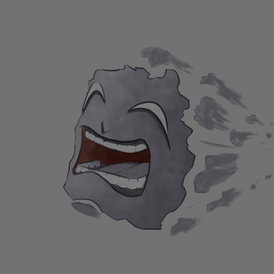
Had to google the definition of Existential to try and get an idea of what illustration I thought of that represented the word, after doing that I still had no real idea of where to go with it. I decided to stretch how I interpreted the word and went for existential dread/ dreading existence. I chose an expression that shows some form of discomfort or agony, making sure the teeth were as visible as possible which is often occurring during agony/pain. Initially I thought of doing a space themed illustration to represent an existential ideology of other being existing among the stars; existential in the sense of questioning whether we are the only intelligent life in the universe. I kept some form of a space vibe with having the face hurling forward leaving behind pieces of itself as it moves almost like space debris (something like that).
Everything with this was very experimental, including the program used to make it.
0 notes
Text
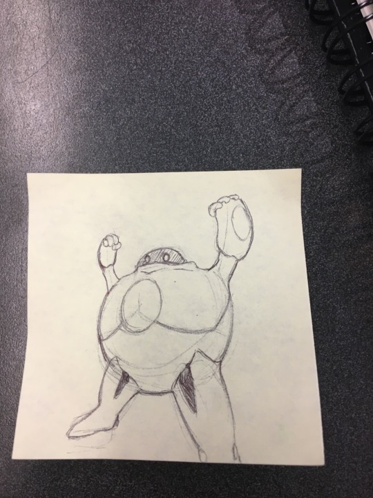
Magically I did SOMETHING

For those of you who still use this (I rarely count as one of them tbh), I felt obligated to share the one thing I created from an idea during this break. Aside from covid and lethargy I found the motivation to create a new work on a platform I have used so rarely I barely even know how to use it even though I paid nearly 30$ for it.
The file name is ‘creature’ as that’s all I see this as at the moment. The character came from a creature my wondering mind fabricated while falling asleep or daydreaming, I forget which. When I first thought of it there were no joints; the arms and legs had no pivots and were essentially stilts for it to move on. It kept its bipedal figure, but the altercation is I gave it thicker legs and actual joints. When I first saw the creature there was no design on the mask, just a blank beige surface worn by a dark, lengthy figure so black that it was reflecting a blue-ish hue.
It’s been a work in progress for days with not a ton of progress by the day, but this is also me getting back into doing any kind of work in general, let alone work for myself. Well see if it keeps up. Hope anyone seeing this had a restful break.
0 notes
Text
Works in Process
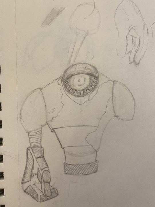
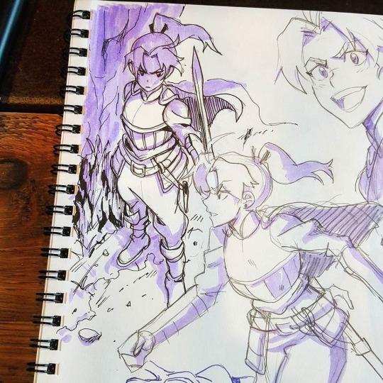
Pertaining to semester based projects and artworks I mainly have projects being done in Maya. For my into to modeling course I have just recently finished up a room assignment where I created a cave space (images pending). The cave was a culmination of multiple source images where I gathered inspiration to create the space and assets for the environment (First set of images). After having wrapped up the room we moved onto the creation of a character to either place within the created space, or to have as a stand alone model. The model idea I decided to create was for the cave I worked on, the character being a robotic miner. The idea for the cave was that it was long abandoned and devoid of living humans. In my mind the robot had a more intricate design that at the moment would not be viable for me to create as it would not directly fulfill assignment requirements as far as I’m aware of, but one day I may revisit the idea in my free time. The robot miner/explorer that I decided to fit the cave with has a human figure with padding and such for protection, an iron jaw, and a collection container strapped to its back. The idea behind the robot being there is as an observation and exploration robot rummaging through the remnants of what the human miners left behind. This concept came from a show that I used to watch around 2017 getting a new season this past September, the show being Made in Abyss. The theme of the show is cave exploration and traversing an unknown space that very few have gone to with no chance of returning to the surface.
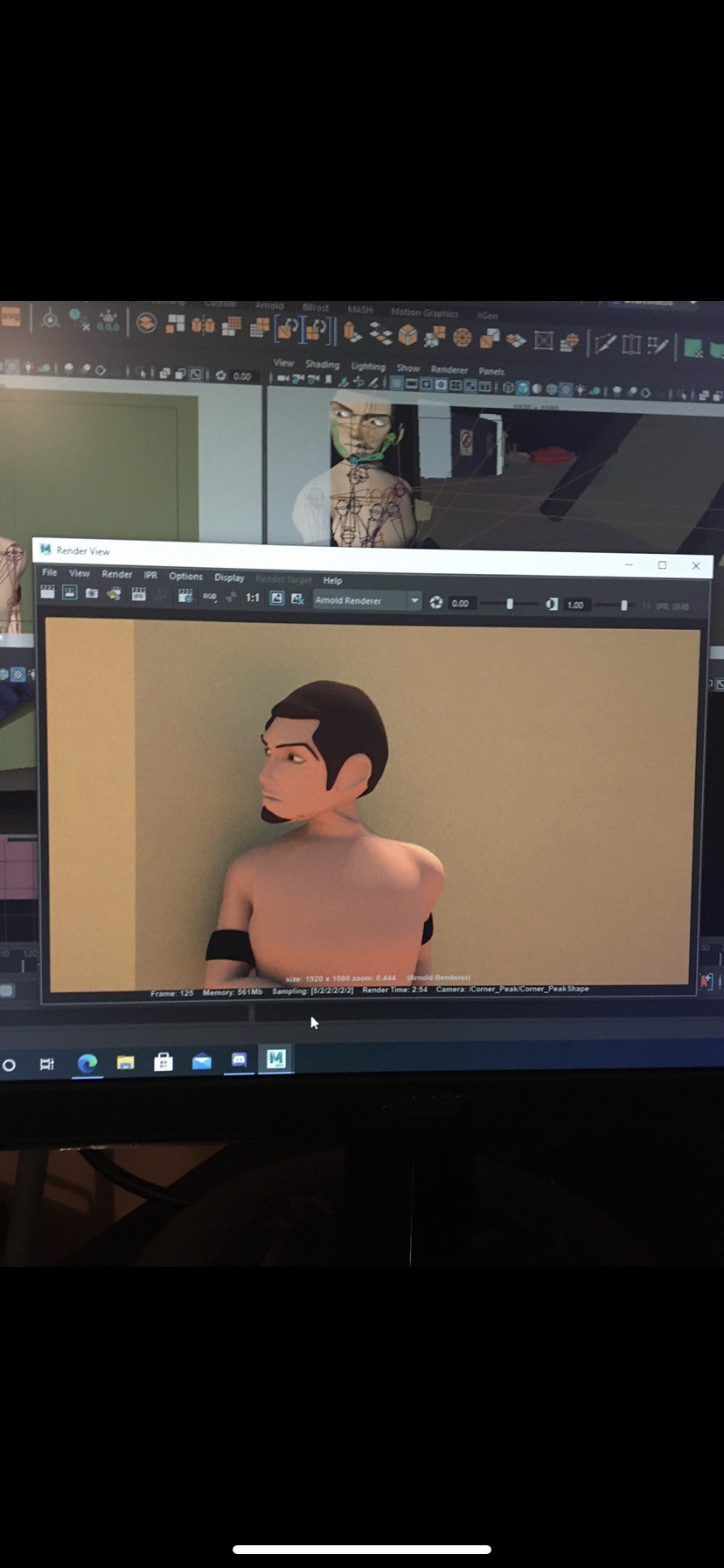
Another course project I am currently working on is my Character animation course. My portion of the course had just wrapped up an assignment where we have a character run from a standing position, jump over an object or hole, land and run after the landing then coming to a stop. This was a challenge as I haven’t animated in nearly a year and a half, but I was able to successfully complete the assignment and I’m proud of the result. The next assignment is to have a character running, picking up an object and throwing it.
A side project I've given myself is to fix relatively minor issues with the model I am using. The model I chose for these assignments is one that I created for my thesis, he has some deformation issues with his joints and body solids where they over extend. It has taken a while to get fixed to a point that I feel comfortable with but part of what I enjoy about my artworks at times is the aspect of problem solving and the gratification of getting the result you wanted or an even better one.
Aside from these projects I occasionally do small sketches/drawings and origami. Coming to school again has given me the lost drive to do more origami like I used to, but that could honestly be an escape from cognitively facing other tasks while being physically present. Sometimes when folding the paper I feel mentally absent and able to pass the time at a speed otherwise not possible. Its also an easy medium to put down and start back up after being gone for some time. I also occasionally sketch flowers, but that occurrence is SUPER rare. I personally like darker colors and shades, but I thoroughly like pink for objects that typically aren’t pink when someone mentions the thing; tree tops for example are predominantly green world wide with the fall colors happening in the fall, but rarely pink. I feel like I am drawn to it because when it belongs to a natural occurrence because its like the true vibe of pink. I think as a summary: I like pink in nature far more than, or as opposed to, a manufactured items colorway.
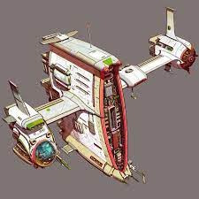
The two first robot images are what I did in around 2018 during a shift. Every once in a while I revisit themes and types of drawings and this semester for the assignment may have been that kind of time.

This image is the robot miner concept. It showcases a front and side view, which is customary for modeling characters, for clarity of what I want the design to be. The note on the bottom was left just in case I wanted any changes in its design later down the line.

This image is a closer representation of how I wanted the robot to be, less human and more of a golem style build. My initial idea for the robot was to have it be this big build for a more durable design to deal with the heavy materials in the cave. The body is like a hulk-esque size with metal plates covering the fragile components and gears. I wanted to have it covered in minor rust and some greenery to show age in the metals.
This scene is a portion of my thesis project showing the character that I modeled. I don’t have any in progress images for fixing the body issues, but just as reference the character is here to give a visual idea of what I am working with. This is the same model I am using for the animation assignments.
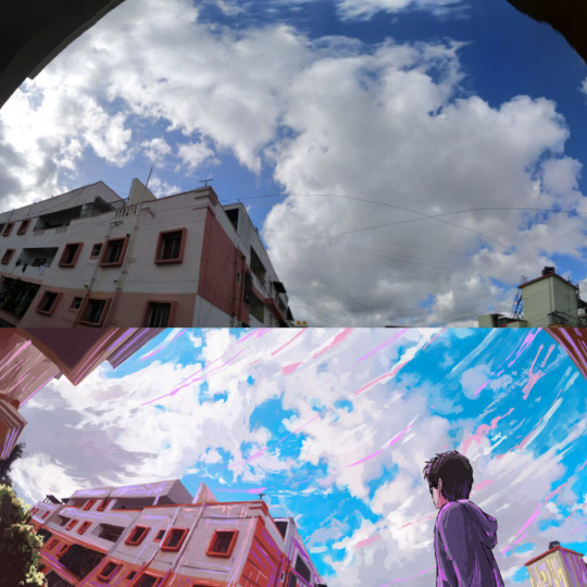
This image was taken years ago and I had completely forgotten that it was still in my photo album until this weekend. I was walking home from my daily walk and saw this blooming from a nearby houses bush. I took the picture because it stood out so much and around this time was the best time to get an image of blooming plants before the wilt of weather or age was visible. I had planned to draw it when I got home, but I never did and ultimately forgot about it. This is unedited, just look how vibrant it is and its natural!
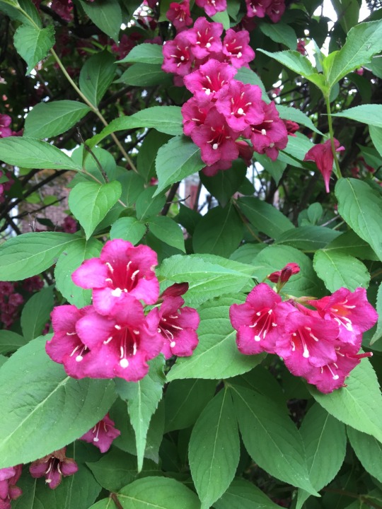
This was done on Monday, the 24th, during the end of my shift. I drew this as my own flower style after having stared at artwork that utilized peonies as the main subject of the pattern. The initial idea behind the design was to imitate the flower itself, but I kept leaving and coming back to it to the point of the flower taking its own shape as an entirely different thing. I feel like it was an unconscious experience to remembering I had the image of flowers without remembering it and my mind wanted to draw it that badly even after that many years. The flower in this sketch is a similar magenta/pink tone as the picture I took, but with a bit more of a tint of white.

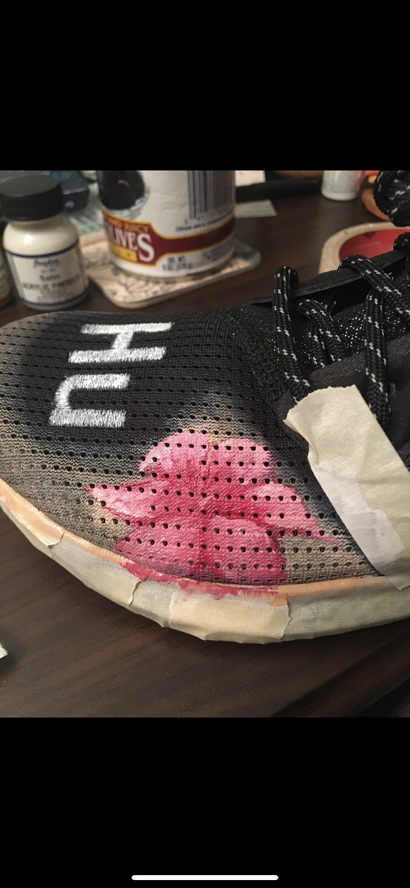
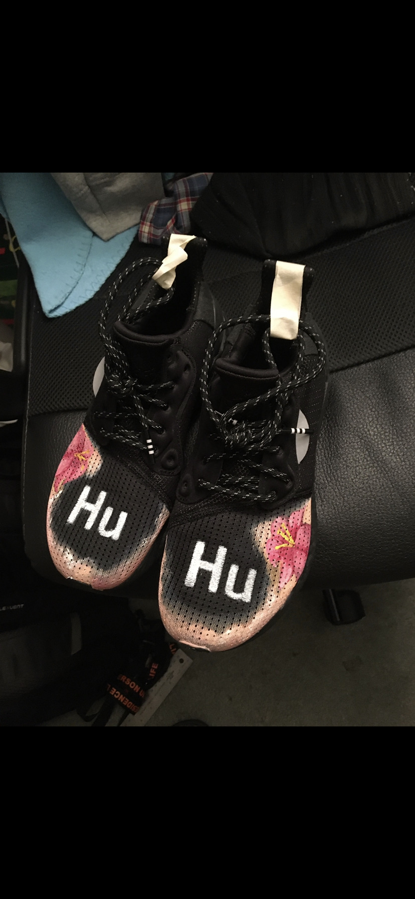
These shoes were “customized” by me about a year or two ago. I am not great with gift ideas and forget I know how to do art, so initially I just purchased these ready to pass them on. I felt lazy and decided to paint on them, and this would be the first time I have done anything like this so I was nervous. The first attempt was a huge flop so I covered it with white and the mixture of red/white/yellow that I did. The outcome started to look like clouds so I rolled with that, later making me think of Hawaiian sunset commercials. Thinking of Hawaii made me feel like it should have some form of a floral design, so I started going in with magenta and red until I had a base shape. I should have used image reference but was too lost in the sauce to go back for one so I kept going until I felt comfortable with the shape. I layered white in small increments to get highlights and give more depth and body to the flowers followed by the yellow innards. Not wanting to ruin the gift I stopped myself before I did too much and felt way better with this outcome than the previous. Sadly the giftee doesn't wear them much :’)
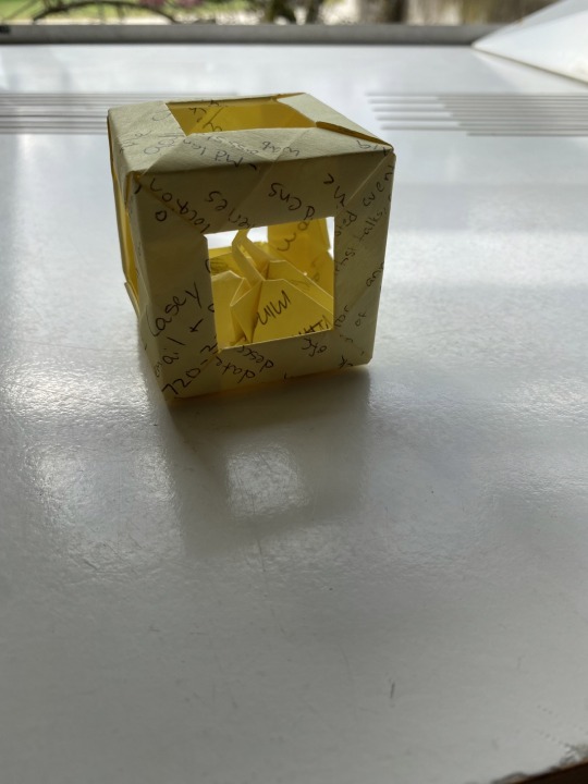
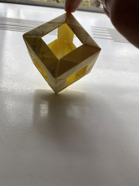
This box is made of 12 post it notes combined together. There is no glue involved nor is there any tape or cutting (against Origami rules). The cube is held together by nothing more than folds that align in such a way that allows for a solid grip. Within the cube is a pair of swans I made days prior to this which made me think of this combined work as a bird cage. The initial idea was to use used sticky notes instead of throwing them out so I didn’t use fresh ones, and its worked as a desk art piece and a convenient way to keep previously written down bits of info for me to look back to.


2 notes
·
View notes
Text
This is a showcase of artwork that gives some resemblance a theme of Clarity vs. Clutter. Clutter is often used when referencing the state of a space being unkempt or maintained while clarity is often used when speaking of an individuals cognitive state. This showcase utilizes the two words in a matter of speaking about the space within the work; Clarity referring to if the artwork has a “quiet” voice where the attention is given in a calm manner whereas clutter speaks to the depth, detail, and density of content within a work. Within this theme there lies another, fiction and non fiction.


http://instagram.com/the_most_gallery
RIP Kim Jung Guis
#Gallery
2 notes
·
View notes
Text
This is an update in format to my list of last week, I had struggled to work with Tumblr (first time) so here is the revision that HOPEFULLY works:
Domo Stanton: Comic artist
https://twitter.com/domostanton?lang=enhttps://www.marvel.com/comics/creators/12774/domo_stanton

Slimane Aniss: Animator
https://www.artstation.com/slimotion

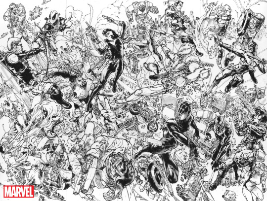
Jim Lee: Comic artist
https://www.dc.com/talent/jim-lee
https://twitter.com/JimLee?ref_src=twsrc%5Egoogle%7Ctwcamp%5Eserp%7Ctwgr%5Eauthor

Bryce Kho: Concept artist
https://www.brycekho.com
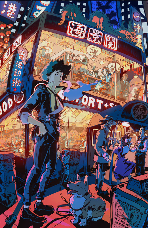
This was the illustration that actually got me to follow Bryce. The colors to the building of the environment were just an amazing composition. If you know the characters featured in the show, then it's an even more in-depth illustration as it goes from a simple drawing to a mini where's Waldo.
Peter Han: Concept designer
https://www.artstation.com/peterhanstyle
https://www.instagram.com/peterhanstyle/?hl=en

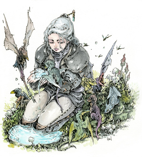
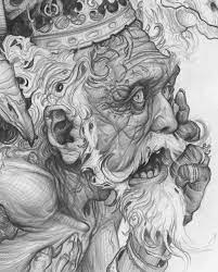
Kim Jung Gi: Illustrator
This guy is just an animal, had to follow for the raw talent.
https://www.kimjunggius.com
https://www.kimjunggi.net

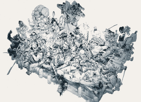
I don’t think he has used blocking methods how other artists traditionally do within his professional career. He draws almost as if he sees the shape beforehand, almost like an Italian sculptor whose name I blank on.
Derek Domnic D’Souza
https://www.instagram.com/derekdomnicdsouza/?hl=en
https://www.artstation.com/derekdomnicdsouza

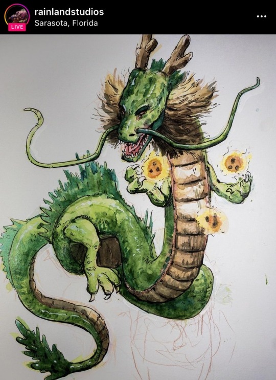
Peter Sakievich: Concept artist
https://petersakievich.com
https://www.artstation.com/rainlandstudios
Eugene Lee: Story board
https://www.instagram.com/unagidonburi/?hl=en
https://twitter.com/_unagidon?lang=en
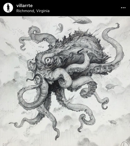
Gary Villarreal: Illustrator
https://www.artstation.com/villarrte
https://www.instagram.com/villarrte/?hl=en


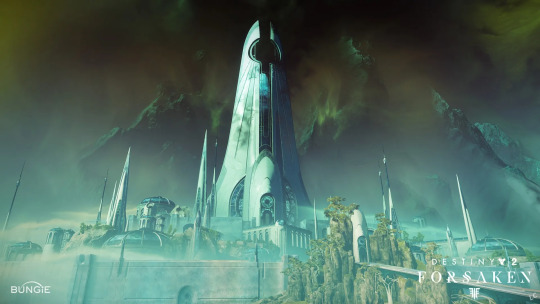
Destiny 2: Fantastic graphics paired with theme/scene fitting music and soundtracks
https://www.youtube.com/watch?v=qBIJFTPPp-8


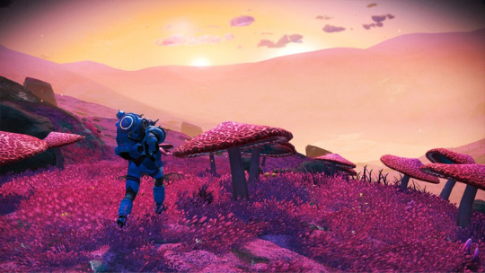
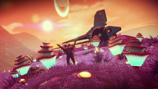
No Mans Sky: Excellent scene construction done “procedurally” as on passes by locations of the celestial bodies.


4 notes
·
View notes