
Visual Communication in Context 2Level 5BA (Hons) Visual Communication
Don't wanna be here? Send us removal request.
Statistics
We looked inside some of the posts by felicityhicklingviscomlvl5 and here's what we found interesting.
Average Info
Notes Per Post
0
Likes Per Post
0
Reblog Per Post
0
Reply Per Post
0
Time Between Posts
12 hours
Number of Posts By Type
Photo
16
Text
1
Last Seen Tumblr Blogs


Fun Fact
In 2020, Tumblr had 29.4 million users in the US.
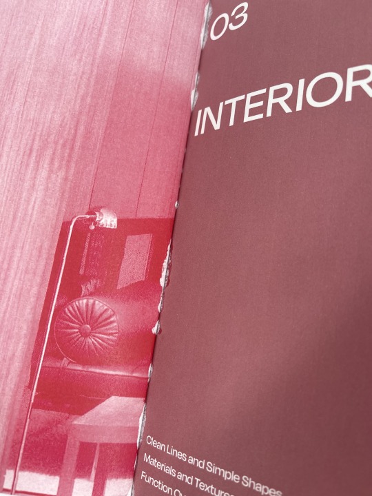
Photo


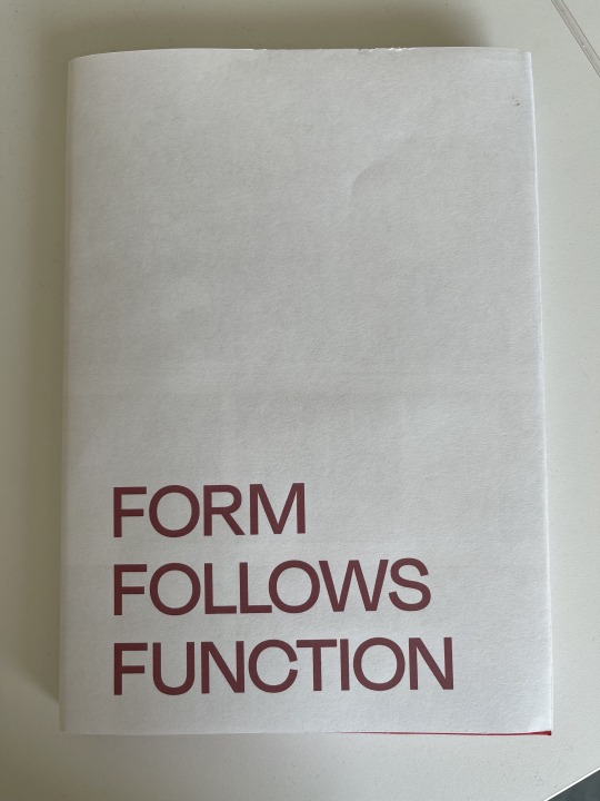
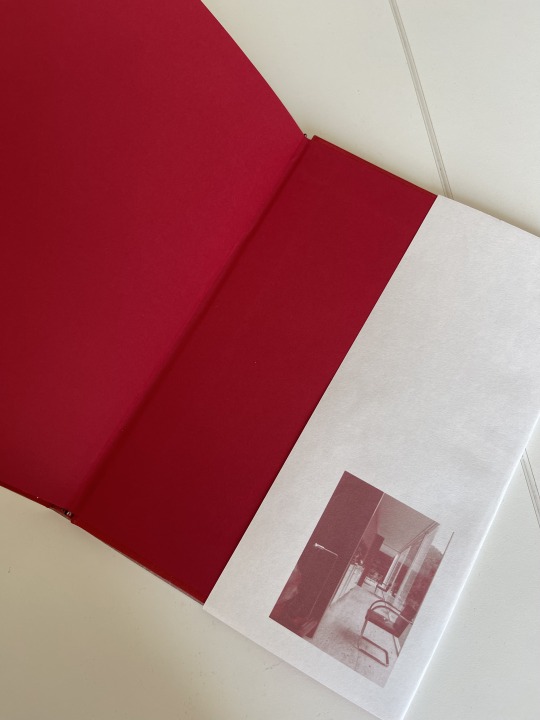
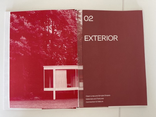
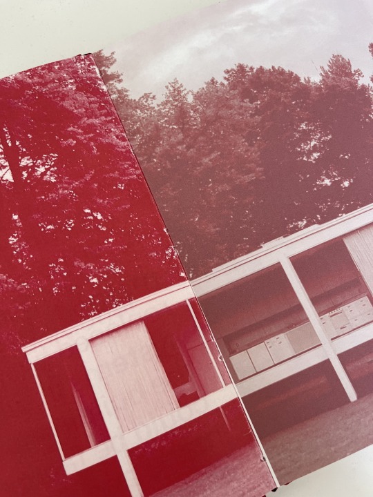
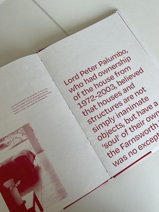
Final Outcome: Form Follows Function: A Book on The Farnsworth House
0 notes
Photo


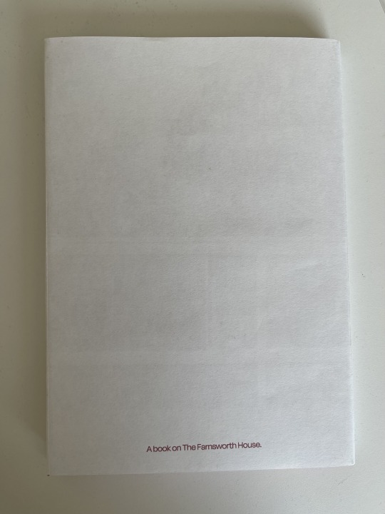
Final Outcome: Form Follows Function: A Book on The Farnsworth House
0 notes
Text
Term Reflection
I am proud of myself for what I’ve achieved in this unit, I feel I have improved my editorial skills massively which is what I wanted to do. This term has been heavily focused on what I wanted to do which I really enjoyed, but I think also gave me limitations in getting started on the project.
EP//M was a great experience and I think I connected with this a lot more than I thought I would, as I tend to not do enough UI/UX designs and concepts to realise how much I enjoy them. Since our final presentation, as a group, we chose to refine ‘Fakeaway’ using the feedback we received because it was coming from a professional agency which we thought was a good idea to get into the habit of responding to. We ended up sharing our refinements with them and actually landed ourselves an opportunity to present again down at EP//M and we also were asked to be in an article they were writing, where we answered a few questions they gave us. So, overall this experience was very eye-opening and really fun which was good to have at the start of term.
The CVL project this term was quite taunting compared to others as we had a lot of freedom to do what we wanted (in preparation for our FMP). I struggled with the shorter time we had to do this project, as it felt like I was behind at times because struggled with getting started since there was so much we could do, so the process of generating ideas for me was difficult. Once I found a general direction from some help it became a lot more of an easier process, and so I took the opportunity to focus on what I wanted from the end of the unit. Which was to improve my editorial skills and lean into something I'm interested in and value.
At first, during this project, I was less refined with my idea for a while which impacted going deeper into contextual research and problem-solving. I later figured out my direction when I went back through the general research I’d already done, where I found the term “form follows function”. This allowed me to learn theories within the term and how they became to be combined into Mid-Century Modern architecture and influence many architects to come.
One problem I was having throughout my project was my target audience which is where I felt I lacked when problem-solving. I originally wanted millennials as my primary audience but later changed it to gen z. My problem was I couldn’t pinpoint why and what I wanted the audience to take away from my outcome. I think I started to define my audience more as I was experimenting with imagery, leading me to lean into the duo-tone trend which when collecting visual research, I saw a lot of it, signifying that it was trending and appealing to gen z. To delve further into why gen z, I went back to the problem with architecture books, which is that they’re almost too simple. The text is small and in one large block, which gen z looks at and thinks “I’m not reading all that” since gen z prefers straight-to-the-point information and unique information. So I wanted to create an architecture book that would be editorial allowing me to apply information that encourages learning and value for them.
Deciding to create a physical book was challenging especially since I wanted to try something new by doing a clothbound book, but without the end result being physical it would’ve had the same effect if I just added my spreads to a mockup. Since I also looked into coffee table books when refining my audience, the whole idea of them is that it holds what you value, physically, and you can display it and show people who you are. Also, the way I laid out my spreads is all equally displayable, allowing for the other point of the coffee table book, which is “they look pretty and cool”. Before my final crit, my book was still quite simple from what it ended up being, as I needed to explore more things I could do with it that could add an interactive element. To support this I looked into how gen z feels about physical books and they actually prefer them, so the interactive elements became an advantage since it would create more of an exciting experience when going through the book. I added fold-out pages which would fold out to an image of the Farnsworth House and also create a clear navigation of a new section of the book. My final addition was a cover sleeve, which you see a lot on hardback books. The sleeve doubles as a poster which I felt gen z would appreciate and could add to their maximalist walls.
Overall, this term was a challenge for me but I finished with an outcome I’m extremely proud of which makes up for a lot of the struggles I dealt with this term, but I’m glad this mini FMP was a chance to have an idea of what our actual FMP will be like.
0 notes
Photo
Final Outcome:
Overall I’m super glad I committed to doing case binding, as I wanted to create a coffee table book which shows value in and interests someone and this is the topic I value.
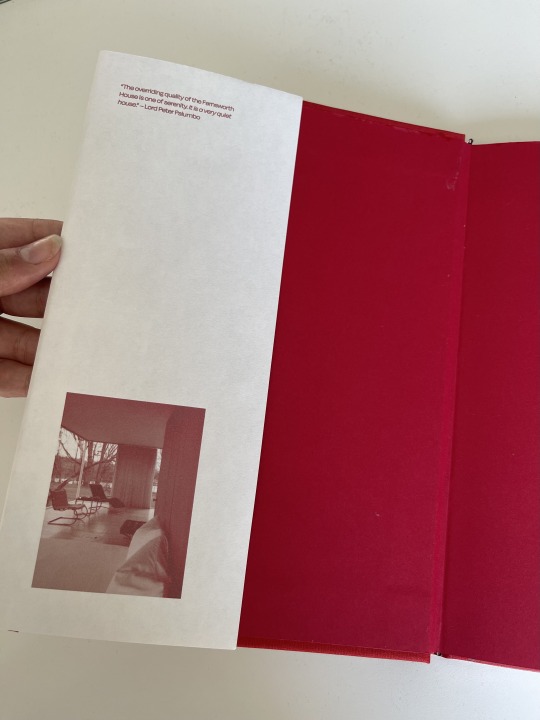


Cover sleeve + poster: In my final crit it was suggested to me to think about other additions that would appeal to gen z, and to maybe do a sleeve that the audience can take off to then reveal a poster which they can put up.
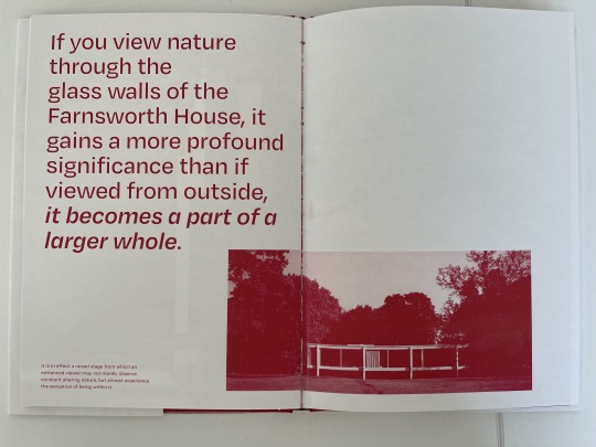
Spreads: These are some of my most successful where I played more with the compositions or stripped-back content which I think worked really well for this outcome.
The mistakes:
Firstly, I knew doing this for the first time may have caused some faults in the outcome, but overall I’m still really pleased with it. Also, if I wanted to do something like this again I know what things to do and avoid for a more successful outcome.
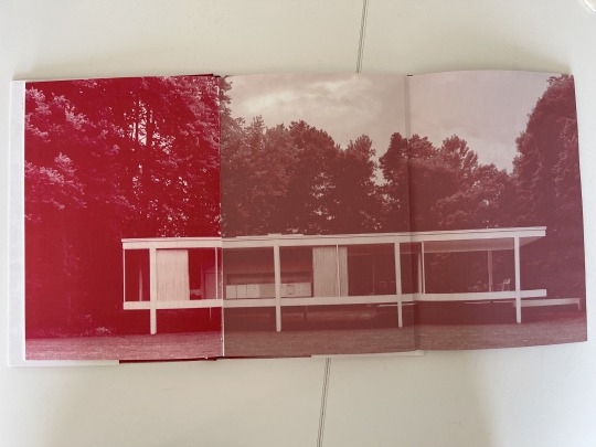
I chose to add fold-out pages to my book to create sections and navigation, which needed to be large format printing since the spread was too long for standard A3. And because the large format printer is an ink printer the colour came out completely different to what it should have been. Also, the printing was very complicated since I needed to paginate the pages, but now that I’ve done it and had help doing it, it should become more understandable the next time I do it.
Another thing was when I went to bind, I was told that I should’ve made the middle page in the fold-out spread shorter too, along with the actual fold-out page since when cutting it would be cut off the edge and the fold-out would no longer be a fold-out. So, to avoid that and instead of having to re-print, we decided to trim the fold-out page quite a bit and fold it right to the crease and ignore that the other side of the page was over the fold. I did end up just refolding it to the correct place once I’d done which didn’t look as bad as we thought it would.
One annoying thing I realised was on one spread had forgotten to delete the start of the text which I’d copied and pasted to the small body of text. So it’s there twice which I the most annoying thing since I double-checked it multiple times, but I must have just missed it.

The final mishap was when the glue had already finished drying on the spine, it stuck one of the fold-out pages to the image which we dried to pull apart but it was obviously ripping the red off and looked bad so I decided to leave it. The good side to the mishap is that it became a French fold and I remembered it was suggested as an idea in my final crit, so you could say it was totally done intentionally... The only thing is that the part of the image you can see is just the cabinets in the Farnsworth House which is annoying.
Again, these things happen especially when it’s your first time doing it. And again overall I’m happy with it and the process was part of it which created a very satisfying feeling once I’d finished it.
0 notes
Photo


Process Book printed and bound. I went quite simple with the layout throughout the book since I was already doing an editorial book. I used the same typeface and colour that I used in my book which connected them without making them the same. I’m happy with how this process book came out and I refined it quite a lot but I think next time I could be a little more sparse with the placement of imagery. And I think text isn’t always needed on every page to support the imagery.
0 notes
Photo

I was wondering about referencing since I wanted to use some of the information in the eBook I’m also using the images from so I wanted to know if it was a problem because of copyright, but Susanna said that because it’s not for commercial use etc. it should be fine as long as it references the eBook which I can put in the back of the book. I’m also going to be adding the online imagery I’ve used to the back.

This is the final spread with all the referencing. I made sure to have the eBook reference large since the majority of my content is from it. Since there was a lot of extra online imagery, to fit it all I have to make it quite tiny which is fine since no one wants to sit there and read it all.
0 notes
Photo


Here I’ve just designed a basic cover sleeve for my book which also doubles as a poster on the other side. I will make sizing changes once I’ve bound my book, this will also have to be large format printed.
0 notes
Photo


Adding Halftone:
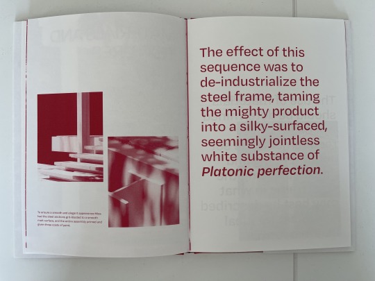
I did the top two images in Rasterbator and the differences are just 3mm and 4mm grid size which look a lot better than the one below which I did in Photoshop. The ones done in Rasterbator are a lot cleaner and less static looking, the Photoshop one looks fuzzier and blurred. Since Rasterbator is more time-consuming I wanted to try and figure out how to get a similar outcome in Photoshop.

I ended up figuring it out in Photoshop and it was the order in which I added the halftone and then the gradient map. This is with 6px circles which create the same look as the one done in Rasterbator.


I did a few images and applied them to my book and printed them, but they are all different-sized dots even though they’re the same px size and I don’t have the time since I have all my text to add and final changes. Also, I think overall I prefer just the duotone as you can see more detail in the images and I want them to be clear because otherwise, it’d take away from what I want to convey.
0 notes
Photo


Gradient Maps:
It was also suggested I look at adding another pop of colour and instead of using the duo-tone effect, I should try the gradient map which allows more control and play. I think lighter colours work a lot better as purple is a lot more successful than the other two.
I’m glad I’ve now had a chance to play more with my imagery and I now want to try a couple of the successful outcomes in my book – I think I’m most likely to use the halftone but I’d also like to apply the purple to them too.
0 notes
Photo


Online Editing:
It was suggested that I use these two online editing sites to explore more than just duo-tone. Rasterbator was more successful as it was still detailed and you can depict what you’re looking at. With Plotterfun it was less precise and on certain images, you could barely tell what the image was.


0 notes
Photo


From the feedback given to me in my final crit, I wanted to start off by looking more into gen z modernism, since my target audience is gen z. I also need to figure out what I want gen z to do with my outcome which I’ve struggled with quite a bit.
Gen Z aren’t exactly into modernism as much as I thought, they’re more into maximalism and combining that with the Y2K interior style. Even though this is a big trend within gen z, still their own personalities are shown through this style. Collecting is a massive part of how they show their personalities, random trinkets and trinkets with memories, art found in a thrift store that you can relate to or it just ‘fits your vibe’. Thrifting (especially in America) is huge for gen z so a lot of the stuff they’re finding won’t necessarily match, which creates the maximalist/mix-match style.
“The style encourages a curated hoarding of meaningful elements and an ornate display of personality. Colors, patterns, and shapes are layered to create spaces unique to the individual. Through maximalism, homes become museums of personal interests, hobbies, and precious memories.”
https://www.archdaily.com/986167/make-way-for-maximalism-gen-z-says-less-is-a-bore

https://www.widewalls.ch/magazine/anti-design-italian-movement
This research also leads to the anti-design movement which emerged in Italy during the 1960s that used exaggeration, bold colours and embraced ornamentation and decoration which is the complete opposite of what modernism consists of. You could say gen z is anti-design with their new obsession with maximalist design, which has to do with COVID-19.
“As we collectively spent more time in our homes than ever before—and they began having to double, triple or quadruple in their purposes—they needed to be modified to accommodate our changing priorities.”
https://screenshot-media.com/the-future/trends/maximalism-new-minimalism/
Millennials have more of a connection to modernism which makes them value their collections of coffee table books more. They don’t display the book just cause it looks good, they display it cause they value the topic more. Gen Z tends to display it more because it’s cool to look at which is where I’m slightly stumped.
Also, regarding mid-century modern or modernism, it’s important to think about structure within any style and think of the basic needs and necessities. It can become lost with the maximalist style, which is why I think those types of spaces need elements of function otherwise they can become just cluttered with no actual system.
The spreads I’ve done so far, appeal to gen z as they’re contemporary which I think would entice them to actually open it and read it. I think they’d see that it’s not an effort to read with the way I’ve laid it out and included selective information. I want them to end up learning and possibly become interested in it, then it would become a valued piece to them and a topic they’d look more into beyond the book.
So, I want my audience to be enticed into the book and feel inspired about the topic, and for those that do, I’d hope they’d collect their own insight and expand and grow their own knowledge.
0 notes
Photo


Final Learning Agreement:
The final change I made was that my outcome would be a clothbound book which was my ideal outcome when I decided I wanted to create an editorial piece.
0 notes
Photo


Case Binding Workshop:
I’m really pleased with how this went and this has confirmed that I definitely want to do this binding for my book. I think I’m also going to use the same colours as I did here for my outcome as it conveniently matches perfectly.
0 notes
Photo

Supporting research:
Since deciding to add fold-out pages I wanted to look into how interactive elements would engage the audience more and found Gen Z actually prefers to read a physical book than online. It allows them to focus more which is compelling since it’s a very digital generation. Also with the rise of BookTok more young people are into reading and it has become ‘cool’ to read instead of stereotypically ‘nerdy’. From the article above they found out that 1 in 4 young readers had used BookTok.
0 notes
Photo

Responding to feedback:
I’ve decided I really like the fold-out page within the book so I’ve applied it to the same points in the book which is at each part. Since a fold-out page includes the other side too, I decided to just have the image in the fold and the title page on the back which you’d see first and then open to see the image.
This is also found imagery applied instead of the imagery from the eBook because some were low resolution.

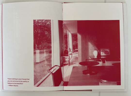
I also have tried the title page in a red background instead of the off-white which I think brings a contrast between the title page and the topics within it. It also creates a clear divide since they’d be printed on the same side.
I hope this is successful during printing as this elevates my book compared to existing architecture books and also allows readers to interact with it which I think gen z would appreciate. After my case-binding workshop, I’ll know how to print for case-binding which will help me figure out sooner rather than later, whether I may need to use large-format printing which I may have to get uni print to do.
0 notes
Photo

Going back through some of the imagery I’m using, some of them aren’t in high resolution like the above. Also, the eBook I’m sourcing them from has a limited selection so I think I may have to use some of the online images I originally was using.
0 notes
Photo


Book examples for editorial layouts:
It was suggested to me to look into the top two books, the first one I found in the library and the second one I bought since it was cheap. But looking through both I’d wish I’d thought to collect some visual research from these. These books also reminded me that I owned Turning Pages, I found a lot looking through this again which I hadn’t since the first year. I found a couple examples of duo-tone throughout all three of these books which supported why I was wanting to use it. I found examples of sparse information and how it’s laid out to create a hierarchy, and I also found examples of fold-out pages or leaflets which were used a lot to expand the imagery. So looking through these supports the changes and developments I want to make.
0 notes