
Don't wanna be here? Send us removal request.
Statistics
We looked inside some of the posts by fjbfmp2 and here's what we found interesting.
Average Info
Notes Per Post
2
Likes Per Post
2
Reblog Per Post
0
Reply Per Post
0
Time Between Posts
2 days
Number of Posts By Type
Text
17
Last Seen Tumblr Blogs


Fun Fact
The Tumblr office adopted Tommy, an 11-year-old Pomeranian.
Text
Presenting My Work

For the presentation, it was important to keep a consistent theme throughout so I went for a plain white background, which I took from my presentation research, and a border with broken corners, as I use with all of my presentation for this project, I tried to fit as many as looked good onto one page but I inevitably had to separate them

I felt as if adding some text on the creation of the characters was also good to have as it showed the creative process behind the character, I feel like organising the page like this makes it look more natural and as if they belong there together it almost looks like a comic panel strip in a way

I then felt as it was important to add the tileset instead of a finished level so that all of the work I have done on this tileset is visible and apparent to the person viewing it and, again, I added some text to show what I’ve done in regard to the tileset, colour choice, composition etc
0 notes
Text
Exporting For Engine

When exporting for import into Unreal I basically had to produce a sprite sheet that could be easily read by my partner and also used, so what I did was lay the sprites out so that all of the walk animations were on the left side and I also separated them into the different perspectives and then on the right I did the same thing with the walk animations, then in the middle I added the portrait of the character so that they also had access to that

They didn’t all look the same as, for example, Aki only has a forward facing sprite in the game so I only needed to create a forward facing sprite, making this sprite sheet much smaller

But the sprite sheet for the Maiko is much bigger as she, only having an idle animation, has different perspectives that would be used throughout the game and both of them I added in their portraits as they will all be talking
0 notes
Text
How Work Is Presented / Exported

The way pixel art work is usually presented in the industry is through a sprite sheet when it comes to characters, or a portrait type presentation like in the image above, this way the person viewing the piece can see all of the character, every iteration of them to get a full view and feel of the character(s) or environment and have everything presented there in one place

When it comes to exporting work to use in-engine, the standard way of doing this is through sprite sheets which is basically a grid where all of the frames of an animation are placed and this allows the engine to grab these frames and create an animation from them to use in the game, they’re easy to make and also are a good way of presenting animations as well

I think, when it comes to pixel art, simplicity is the best way forward as it allows for the actual art to shine and pop. The main thing I will be using from what I’ve learned here is the use of sprite sheets and simple backgrounds which I can use in my slides and in exporting the work for my partner to use in game so that the animations all come out as I have intended
0 notes
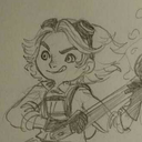
Text
First Title Screen Background
The main title screen that really came to mind when thinking of a RPG Horror game title screen was the title screen from Misao, I like having a character on one side and keeping it simple, having the main antagonist on the side is probably the best thing as well because it gives the player that feeling of ‘oh this is the bad guy’ so when they meet them in-game it feels that bit more tense

So the first thing I did was begin to create an outline for Miran using a big brush to create the bust, head and neck- it’s how I draw pretty much all of my characters so I thought why not translate that into pixel art, I kept with the dark purple background so that- for her hair, I could use highlights to create that horror glow look

I then went into placing where the hair, eyes and mouth would go on her, this allowed me to have a clearer guide when making the facial features so that they don’t look bug eyed or too weird but I still wanted them to feel uncanny

Looking into eyes, I was having a look at what makes eyes look creepy, and what I found was having a small pupil in widened eyes always made the face look crazy/scary as if they never blink, which is what I was going for with Miran, having someone who always looks off, and the wide eye look would also cement in that idea of her always watching

After a lot of iteration with the eyes and mouth I came to this conclusion with the face, I added the dark eyeliner and made her pupils big but not too big so that she looks cute or something, just big enough so that she almost looks infatuated with the player, and the small smile adds to that creep factor, the dark shadow through the eyes is something you see a lot in anime and manga when a character is trying to appear as creepy or scary

I then had to develop the hair and kimono so what I did for that was look at images of Geisha and they all obviously have the same look as they’re all supposed to be kind of a mass of people who aren't solely identifiable so all I had to do was attempt to mimic that look in Miran

What I ended up with at the end was this, I took away some of the hair at parts to make it seem as if she was emerging from the shadow behind her, I kept the kimono pretty simple using the same purple colour as I have for her sprite and I think that it turned out pretty well in my opinion

0 notes
Text
Dialogue Box
In creating this RPG game, it’s fuelled by narrative so I needed to create a dialogue system which meant I needed to create a font, dialogue box and portrait image for the characters, I had some trouble with how I wanted it to look exactly, I knew that I definitely wanted it to sit in a box at the bottom of the screen

This dialogue system is from a game called One Shot and I like how the character’s face is just a small icon in the corner of the box instead of taking up most of the space as it did in my initial design, this way allows for more text to be printed on the box. The main thing I like about this design is the lack of outline which makes it feel cleaner and I feel like the lower-poly design for the image is a nice change of pace from the 16 bit sprites on screen

This was my outcome, this is displaying one of the Maiko speaking, you have the white face, orange lipstick and orange headband so it’s clear to the player who is speaking, I was having issues with getting the hair to show as the colour we use for the hair on all characters is the same colour as the background of the text box so what I did was use a lighter shade for the hair to act as a highlight and have the actual hair colour be the shadow in the other corner so that the background and hair didn’t blend together

This style of text box is from Undertale, Undertale is one of my favourite games and one of my biggest inspirations so, of course, I wanted to look at the way that Toby does text boxes in this game but, to be honest, it’s quite bland which is the whole style of the game. But for the art style I’m using it’s a lot more detailed that Undertale so I didn’t think it would work, regardless I tried it anyways but added a box around the portrait instead of leaving it open to add that little bit more detail

This is the outcome of that test, I really don’t like this, there’s way too much space and the player will end up looking at all of the text printed in this box and get discouraged from reading it as it would look like so much, I also don’t like how lost the portrait looks in the box, it works in Undertale as black and white is their entire colour scheme for the UX but in this style I don’t think it works

This style is used in a lot of games that come out of the RPG Maker MV engine, I think this style looks good, you get to see the entire bust of the character and the way that it fills up the whole bottom corner of the screen draws the player’s attention to the dialogue instead of what's going on on the screen in the background which often is not much

I really like how this turned out, instead of having the portrait emerge from the bottom of the screen I made it a part of the dialogue box, the only main issue with this is that, depending on the colour of the background at the time of speaking, the head of the characters could blend with the tile set. I do love this one though, but I think the first one is more compact and stylized and I’ll go with that one
1 note
·
View note
Text
Map Creation
When creating the map I felt confident that I could create something decent with these assets that I had made, all I needed was a main room, a reception, some hallways and some extra rooms for the player to explore in, I’ve tested these tiles in Aseprite and I can get some cool room designs from them

So the first thing I do is create the floor shape and then add walls to all of the top of the floor tiles, this gives the impression of depth, its always better, in my opinion, to have a more dynamic room shape instead of just a box which can get boring- I then placed random items everywhere in places that make sense to give the room character and add things for the player to interact with

I did this for a few other rooms and ended up with a labyrinth of rooms that are connected with hallways in a way that makes sense, they’re not connected so that we can have the player go through doors and teleport to new rooms so we can get that transition effect to work, I feel like this works really well and gives the player an interconnected area to explore

0 notes
Text
Interior Objects
One of the main things I had loads of issues with was what interior objects I could have in the game, since I needed something that I could add to the world to fill empty space but they also needed to make sense in the space

The first thing I did was just up and create these sprites of things that I think would make sense in a bathhouse without using really any reference, the issue I had at first was trying to get the art style correct in reference to colour and perspective, also outline. But eventually I got something that looked good after iterating a lot

In this example, I was attempting to create a bench and had issues at first with where the light is supposed to be, but by changing the shape and where the light hits I was able to get something that looked much better and also actually fit the style of the rest of the game

So from this, I saw that we have benches, small tables, lockers, plants, buckets, pots etc. This is pretty much what I did for the rest of the objects, I also looked into other objects you would typically find in Japanese houses and structures such as Kimono Racks, Katana Holders, etc and ended up with a more comprehensive tile sheet of objects

I also added some pipes and cogs and stuff to the tilesheet too, to make the environment feel more interesting and to add that dieselpunk aesthetic
1 note
·
View note
Text
Wall Tiles
When going and creating the wall tiles, I already had walls in mind that I wanted to use from my Tatami research, I wanted to go for those traditional Japanese Dojo walls that you see in a lot of anime and games surrounding Japanese culture, even the hotel section of Little Nightmares has the Tatami sliding doors in the same style

In tern from getting these references, I tried to create something that had more than jus the blank tiles on the walls because I feel like they’d get very boring to look and and the whole level would just look quite bland so I broke it up with alternative walls

I feel like the alternative walls makes the whole room look more detailed instead of just having those plain walls there, they could also be used as doors for some cool dynamic shots of silhouettes walking past, but I definitely feel like this looks good and I’m happy with it off the bat
0 notes
Text
Floor Tiles
In creating the floor tiles for the bathhouse I’ve definitely run into a lot of issues, I can’t get something that looks good with the colour palette that I’ve chosen, I definitely want to go with white for the walls and perhaps orange for the floor, but I’m struggling finding a good floor that works with the rest of the environment

This was the first floor tile that I had and I liked it, but the floor seemed way too ‘bricky’ and doesn’t really match the japanese theme I have going with the bathhouse, it all felt a bit too clunky and big
So I looked into traditional types of flooring you’d find inside Japanese bathhouses and I remembered about Tatami Flooring

Tatami is made out of compressed wood chip boards with rice straw sewn over them to create the soft feeling, nowadays they have a foam base but the way that they’re traditionally made, they use rice straw. They’re typically used in Dojos and other important indoor areas and so I thought maybe these would be good to use for the flooring in the bathhouse

Tatami Floors are made twice as long as they are wide and usually follow this spiralling pattern with a square tile in the middle so I followed the pattern like this in my work, I feel like this works much better than my original flooring and you’re able to tell right away the area that this type of environment would be set just from the floor, however I still feel that it’s too plain and blends with the walls far too much

Then, as I was browsing through flooring as further inspiration, I came across these floor tiles which I thought looked really nice, I always had second thoughts about the flooring with the Tatami mats because they wouldn’t really work well with water as they’d just end up soggy and damp, realistically. And furthermore bathhouses have wooden floors so it makes a lot more sense

And in the end ended up with this design for the flooring, all in all I think this one is so much better, the colours also are like nothing else I have in objects or walls and so nothing major really clashes with it, also I just personally prefer the pattern

Even looking at this, I definitely think that the final one looks better, the first one looks too clunky and big and the orange that I use for the wood blends in too much, the Tatami floors look too much like the walls, so the final one is just perfect!
0 notes
Text
Obstacles
I’ve been struggling with getting the tilesets to look right, at first I was happy with it but as I’ve been away and come back to it I’ve realized that I don’t like how it looks as the outlines makes the scene look too noisy. So I’ve gone away and removed the outlines of the background and given the outlines that need to be there a lighter tone so that the characters and important objects stand out more and I am actually really pleased with how it has turned out

0 notes
Text
Object Tests

I had a lot of trouble designing objects for the scene, I couldn’t find many resources that gave me ideas of what kind of things I could find in a bathhouse so I had to take some creative liberty. But what I have here I am happy with. The main thing I’m struggling with is weather or not to give the objects outlines, on one hand giving objects no outlines would allow me to give interactable items an outline however on the other hand, with such a limited palette, having no outlines could make the objects get washed with the background I’ll have to test this further~
0 notes
Text
Tilemaps

Tilemaps are probably the most efficient way of building a level, what it includes is creating a sheet of every possible tile you could need to build a level and exporting it, then when you go into your game engine, you can use that tilemap to create a level- this method is a lot faster than having to draw out each level individually

Another thing that tilemaps help with is collision, if you were to draw out a level pixel by pixel and then export that into a game enginge, you would have to edit the collision of each pixel so that it matches up to the level, whereas with tilemaps you can just set the collision of that tile and it’s set every single time you use it

Furthermore you can also edit each tile as you want and it will edit that tile for your entire level once you save it again, the only drawbacks of tilesets and tilemaps is that you can’t be super creative with level layout as everything you want to do must conform to your tileset, but you can get around that by making a really flexible tileset, this is what I’m going to use for my game
0 notes
Text
Tilesets

I was playing around with the interior of the rooms whilst still trying to stick to the colour palette. I ended up with these two designs (with the characters for reference of size) I plan on having each tile be 16 pixels by 16 pixels so that it can be tiled At first glance I prefer the Design 1 but I will play around with both and try and have a room with tiles that you can reuse
0 notes
Text
Other Tilesets
The main thing I’m having trouble with right now is creating a tileset, I tried creating a wood tileset and a traditional Japanese carpet tileset but neither of them I’m completely happy with right now


I really like these two tilesets as they both don’t use that much shading but still get that perspective done really well, each object mainly use one colour for the base, one highlight colour and one shadow colour
I want to use the tiles for a 16*16 for each one as you can then create loads of levels with just those few tiles but I feel like it’s going to be a lot of trial and error There’s then another option I could try which includes actually building each individual room in Aseprite and then dividing it up into layers so that it can then be used in a game space, this approach will allow me to create more fine tuned levels however it will most likely take longer than my initial tileset option. I will create two different maps and see what one looks better in the near future
0 notes
Text
Miran Face

After taking another look at my research for Geishas and what makes them so creepy I felt as if I needed to make Miran look more creepy to get that across, I created these 3 designs, one of them being the design I already have for her when I first made her and the other two I played around with the lips and eyes. I think the most creepy one is the final one as she looks as if she’s almost faking a smile which adds to the theme of not really knowing weather or not the enemy is hostile or not
0 notes
Text
How To Scare
One of the best methods of creating a ‘scary moment’ in games or a spooky atmosphere is tension and release which is a method where you build up loads of tension through shadows, falling objects etc, sound such as a droning sound getting louder or more high pitch over time and then all coming to a simple jumpscare or something like that. Sometimes you can just not have any jumpscare at all, all of that tension build up will still make the player feel ‘scared’ or apprehensive which is the vibe I want throughout the whole game I got a lot of this research from a video by Extra Credits:
youtube
I feel like there’s a lot I can do with subliminal animations such as white eyes in the darkness, silhouettes walking past walls and things like that which will make the player feel uneasy in the environment, it’s not all about jumpscares for me but more creating an environment where the player genuinely feels creeped out or spooked.
0 notes
Text
Yurei vs Yokai
In Japan there are two types of spirits, Yurei and Yokai- Yurei are spirits of dead people and/or animals that have come back with ‘unfinished business’ ergo a classic ghost; whereas Yokai are simply weird monsters that don’t really have any deeper meaning or religious connection
As far as it goes, gameplay wise, I’m thinking of having the Yurei be referenced in the NPCs that you can talk to in the other world whereas the Yokai will be the enemies that chase you and kill you, having the Yurei as NPCs will allow me to give them goals such as finding peace so that they can finally move onto the afterlife through puzzles but maybe also just conversation, making them work through their grief

A great thing about Yokai is that they can be anything at all, including personified objects like an umbrella or a lantern, this makes character design really easy as I can pull from anything to create a monster and can even have a mechanic in-game where random objects turn into Yokai
0 notes