Statistics
We looked inside some of the posts by florasearlethirdyear and here's what we found interesting.
Average Info
Notes Per Post
0
Likes Per Post
0
Reblog Per Post
0
Reply Per Post
0
Time Between Posts
10 hours
Number of Posts By Type
Text
17
Last Seen Tumblr Blogs


Fun Fact
Tumblr has 4 main sources of revenue.
Text
FMP: Gradshow Preparation. LO2.
Discuss with Modelmaking:
Physical mockups of signs
Physical mockups of badges
To develop:
Food packaging, merchandise and more posters
Directional signs
Welcome sign
Show Contributions:

0 notes
Text
FMP: Final Reflection. LO4.
Week 12
My journey with this project has been both exciting and challenging. I found great enjoyment in exploring a new type of design that resonates with me, even though it presented its share of obstacles. Despite encountering setbacks, I intend on refining my work beyond the submission deadline to create work I am proud of for the grad show. The current outcomes are merely a starting point in the myriad of work I envisioned for this project. I cannot emphasise enough the dedication I have poured into this project; countless hours spent contemplating, sketching, and seeking inspiration through long walks and research. It was truly the worst artistic block I’ve experienced, particularly given the timing. While I have concerns about how these artistic blocks will impact my career as a designer, my time as an intern has taught me that delivering results to clients sometimes requires patience and persistence. Ideas evolve over time, and I want to use this experience to further refine my skills and approach in future endeavors.
0 notes
Text
FMP: PDF Portfolio. LO2.
Week 12


For my PDF version of my portfolio, I selected my favourite project outcomes, which are also on my website (https://florasearleportfolio.squarespace.com/). I didn't write too much as to allow the viewer to focus on the art itself.
0 notes
Text
FMP: Final Presentation. LO2
Week 12


Final presentation feels lacklustre and I am sad I haven't achieved as much as I wanted but look forward to really giving my all into the gradshow.
0 notes
Text
FMP: Business Card. LO2.
Week 12


I had seen the first image online and felt inspired to take on an alternative design, while also incorporating my site logo. For inspiration I looked at old train baggage tickets. As I feel inspired by Atkins work to take the same route in my career, I wanted to reflect this in my cards.

However, I didn't like it stylistically and used a simple format instead. I also noticed I used the wrong Instagram handle and adjusted it in the new card:


Going forward as I develop my portfolio, I would like to continue making work like Atkins, but at the moment the use of the first business card doesn't line up to my current portfolio.
0 notes
Text
FMP: Study Skills. LO3.
Week 12
Advice from study skills on my process book writing:
Ensure to reference each research point
Most points need answering 'why'

Feel we have met the LO's 1 and 4 in this writing but need to ensure I evidence LO2 and LO3, most of which will be seen in my Tumblr blog.
0 notes
Text
FMP: Week 11 Reflection. LO4
There are some outcomes here that I am really happy with. The poster and tickets are my favorite outcomes as I feel they reflect what I wanted to achieve with this project. With my concept idea revealing itself in the very last minute, I feel saddened I've wasted time having an artistic crisis. I also fear it doesn't look like I have produced much, but the poster alone took two days. This type of design is extremely time-consuming and it's not realistic that I'll be able to produce a large body of work in the time I have. I am working against time now and my process book needs to take priority.
0 notes
Text
FMP: Improved Website. LO2.
Week 11
Bought my initial Indesign template into an actual website format with a link to the parks Instagram. Felt this to be much more effective, holds onto 19th century elements but still feels contemporary.
0 notes
Text
FMP: Site Map: Second Attempt. LO2.
Week 11

Another attempt at a map but at this point I considered if a map was even needed, considering how small the park is. Map also reflected more of a street map than an amusement park.
0 notes
Text
FMP: Initial Website Design. LO2.
Week 11


I began with making my website on InDesign, however, it proved difficult fully demonstrate what I wanted with the little screen space I had.
0 notes
Text
FMP: Park Signage. LO2.
Week 11


Feedback from Amy:


I didn't like my initial signs as I thought they didn't look quite right, so I reached out to Goodwin to identify why. I'm happy with these designs but would like to see one transformed into a physical sign.
0 notes
Text
FMP: Improved Poster, Process Documented. LO2.
Week 11


Poster feels like a turning point for me and complements what I had envisioned in my head this entire time. Next step is to transfer this into other outcomes.
0 notes
Text
FMP: Further Merchandising. LO2.
Week 11
Badge Designs:


To keep the brand content, I extracted elements from my pre-existing designs to be converted into bages. My plan is to have physical versions of these in enamel form for the grad show,
0 notes
Text
FMP: Improving Merchandise: Postcards. LO2.
Week 11


Updated my designs to the new colour palette.
0 notes
Text
FMP: Improving Tickets and Cementing Colour Palette. LO2.
Week 11
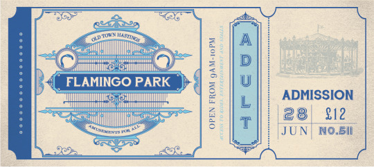

Found previous designs to lack visual interest so tried again. I felt these to align more with the Victorian aesthetic I was trying to achieve.
0 notes
Text
FMP: Week 10 Reflection. LO4
Overall I am not entirely happy with the designs, and this was my reasoning for reaching out to others for additional advice. After viewing Atkin's work, I feel more motivated to design something that reflects old processes. At this point, I do not have the time to create my outcomes by hand, but I can find ways to reflect handmade techniques digitally to speed up the process.
0 notes
Text
FMP: Inspiring Artist: Annie Atkins
Week 10
Annie Atkins was the artist suggested to me by Amy and turns out, I actually have her book on prop making! Atkins creates graphics and typography for film.
This not only includes movie posters, but any props and set pieces required for a period film such as signage, letters and invitations, and currency. Her work has included prison escape maps and telegrams to help create Wes Anderson’s fictional State of Zubrowka in his stunningly visualized film, The Grand Budapest Hotel, as well as neon shop-front signs and fake passports for Spielberg’s Cold War spy thriller, Bridge of Spies.

With degrees in Visual Communication and Film Production, she joined the crew of the Emmy-winning series The Tudors. She loved working on a historical drama and began to specialize in the reproduction of antique graphic design for the screen, creating stained glass, scrolls, telegrams, vintage cigarette packaging, book covers, signage, and calligraphic documents for all kinds of period filmmaking.
Typography and lettering play a huge part in the creation of many of these props.

Strizver, I. (2016). Annie Atkins: Graphics and Typography for Film. [online]. Available from: https://creativepro.com/annie-atkins-graphics-and-typography-for-filmmaking/ [Accessed 23rd April 2024]
vimeo
0 notes