
Don't wanna be here? Send us removal request.
Statistics
We looked inside some of the posts by flrgrsd and here's what we found interesting.
Average Info
Notes Per Post
0
Likes Per Post
0
Reblog Per Post
0
Reply Per Post
0
Time Between Posts
3 days
Number of Posts By Type
Text
17
Last Seen Tumblr Blogs


Fun Fact
Total funding amounts to $125.3M.
Text
EVALUATION
I feel that I did try my hardest with my final and it was incredibly difficult for myself to work in a non academic environment. I feel that my final would have been better if I could have sourced a model however due to the lockdown restrictions I was unable to do this, I think by using a model my work would have looked more professional and streamlined .By changing my initial idea perhaps I gave myself more work than was necessary but I felt so certain on what my final would have looked like with that initial idea I did not feel I could produce that in the comfort of my own home. I also think that if I had more advanced skills on InDesign then I would have found it easier to produce a higher standard of work as I found it difficult to use in the start of my final and it did get easier but it is definitely a skill I want to improve on. However, when I look at my work as a whole I do feel proud that I have achieved work with a certain level of professionalism especially as how difficult I have found this new situation we find ourselves in.
I think that my imagery was good and clear. My still life showed a variety of subjects. I used typography in my editorial and used some filler text to fill areas which I would have text in. My first page shows clearly my theme and the route I have chosen to go down. I do feel slightly disappointed with my work that has been produced but in all honesty I know under normal circumstances I can produce work to a much higher standard. I also think that with time and experience I will be able to use my skills more effectively.
As Bear Grylls once said “Improvise, adapt and overcome”. I do feel like I bodied this as I had to make so many changes and I just went with it and did not let it affect my work or motivation. I hope that in my second year I can create content and work that is at a high standard and develop my skills even further. I have thoroughly enjoyed this brief and how it is similar to something we would be faced with in the industry. I feel very focused and motivated to expand my fashion knowledge and to keep on learning and improving my skill.
and with that, I am signing off for what I feel will be an interesting summer with time to reflect on myself and my practise. ☺️
0 notes
Text
Screenshots of final
As some of the images were too large to post onto tumblr I screenshot my final on InDesign and will post them here:


0 notes
Text
Chosen Imagery for my final
I went through my contact sheets and chose some of my imagery that could be used in my final piece. I have inserted them here, I did not use them all however some of the files were too large to post on this format


0 notes
Text
STUDIO - Styling Task
This was one of my favourite tasks given this year. We were assigned a designer and told to create and style a garment in the style of this designer. Ours was Molly Goddard, well known for her puffball dresses. We found some interesting inspiration images and began sourcing materials and various garments we could use for the task. Here are our inspirational images:


We began by using this huge coat that had been made by a past student. We tried it on and felt that it was too thought out for us already if we used this and so wanted to create something more unique and individual.
Since shooting this task I have miss-placed the final images of our best shots but have got one from our high key set up where we used the jacket over the top of our design. We used bubble wrap and layers of mesh to create a large underskirt and sleeves. By using the same mesh we were able to add layers and create a large puffball moment.


0 notes
Text
STUDIO - Still Life
I missed the still life day but my friend was able to send me the images that I had missed. They worked with the idea of balance and ended up using a fried egg as the still life shoot. Here are the contact sheets, mindmap and final images:


0 notes
Text
STUDIO - High key & low key
We had a day in the studio where we practiced high and low key photography set ups for our editorial shoot. We were instructed to find our own examples of high and low key photography so I made this quick mood board showing the contrast between both:

We then moved onto the health and safety of the studio, the three hazards I listed was:
1. Wires and other trip hazards
2. High voltage lights
3. Spillage of liquids onto lights
We then had some rules that were to be followed when working in the studio:
1.No drinks whilst photographing
2.Wipe shoes before stepping onto backdrops
3.Do not change backdrops or the settings on the lights without asking a technician
We discussed as a group that when working with the cameras we should work with it in manual mode and keep the following settings: ISO to be at 200 to keep images less noisy, shutter speed at 125th of a second and the aperture at 7%. We then went over some of the lighting equipment and discussed their uses and names, such as the snoot, beauty dish, soft boxes, flash triggers and reflectors.
Here are our best two shots from each set up:

LOW KEY

HIGH KEY
0 notes
Text
STUDIO - InDesign workshop
We did an InDesign workshop to give us practice and experience in using the programme. For the gentle woman document it is 23 X 30cm, I worked in this format for my mock up and based it on the recent London Fashion Week. I have included screenshots of my final mock ups and the stages I took to get to there:

Making the document.

Inserting images.


Inserting text and formatting it.


Here are the screenshots to show my final InDesign mockup pages:


0 notes
Text
Contact sheets
Here are the contact sheets from my still life and styling shoots:


0 notes
Text
Inspiration
My next hurdle was to look at how I could shoot my garments, as I live with just my mum and my dad neither of those were willing to wear my “different” sense of style (as they always call it in a very endearing way), I also don’t think my 5″9 (and a half he says) dad would look that great in size 10 jeans. I could have used myself I am certain you are thinking but my confidence was greatly lacking.
I began my search on clothing sites to see how they were showing their garments without the use of models and how they had adapted on a large scale to the current lockdown guidelines. I did not want to look at the major fast fashion brands such as PLT or missguided as it seemed they were only promoting a “buy now, pay later” scheme which did not sit well with me. I looked at ASOS which I guess is not all that better in the world of fast fashion but upon my first scroll I found the inspiration I needed. ASOS were hanging their garments to show them in the “new in” section. Here are some screenshots I got:


I did not want to fully take this idea and so I put my own spin on this by folding and placing my garments on a white bed sheet to photograph them.
0 notes
Text
Revised Mood Board
When creating my new mood board I had to take in things around me that could be easily accessed and used for my final piece. I wanted to create something bright and colourful, I have lots of lovely flowers in and around my garden and my starting point was these. I knew I could use those a still life to create a warm, summery, holiday feel to my editorial piece. My summer clothes were already at home in the wardrobe so again I knew my idea was coming together of creating an editorial piece that showcased spiring/summer. For my still life I also found some inspiration by looking at beauty products that I used just in the summer and spring and I had a bit of a ‘eureka’ moment where I thought ‘In summer and spring, I always feel happy so I should make the effort to hold onto such items and integrate them into my winter life in hope to maintain this annual happiness’.

This is my second mood board. I created it on photoshop and got to work on getting imagery for my editorial based on this.
0 notes
Text
Mood board
I created these posts on tumblr and have had to go over them and change details due to the current circumstances we find ourselves in.
This was my initial mood board. I went for a tudor type theme with the colours and makeup and looked at still life along the narrative of Henry VII.

I felt really confident with my idea and had it thoroughly planned out in my head and could envision the final piece. Unfortunately this had to change quite quickly and I moved back home from Liverpool and had to re think my whole idea. It would have been difficult to have carried out my initial plan due to being on lockdown so I was unable to source any garments from charity shops etc so I had to think of what I had that could be used to create some sort of professional looking final piece. I do not feel 100% satisfied of the work I have produced (which I will go on to showcase) as I had to create my new idea which is on the other end of the spectrum to my initial idea, I had no one to model my garments so had to use a kind of virtual stylist idea to show them in my final and I had to use what I had around me for my still life. On top of all of this the current situation I found myself in hit me rather hard at first which I am sure it did for most. I struggled finding motivation in a none academic situation and had to adapt very quickly to how I would tackle my altered brief. I do feel however that I did try my best and adapted to the best of my abilities which is what I would have to do if I was working in this industry, I felt it was best to share this as I do feel this is not one of my strongest pieces of work.
0 notes
Text
Design Partner
When having my initial conversations with Emma, me design partner, it was clear to see where she had found her inspiration for her design. Her sketchbook had many filled pages of ideas and inspirations which had been taken from city life in Liverpool. I have included some photos of her sketchbook which later influenced my initial mood board:


I then looked at Emma’s garment in detail and saw her ideas come to life in the flesh. This garment is going to be styled in my editorial shoot ( unfortunately due to Covid this garment was not used in my shoot and I had to change my whole concept).


0 notes
Text
Digital Brief - Research Task
Fashion Stylist - Historic
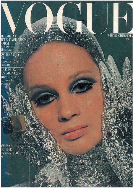
Edward Enninful - Enninful is the editor-in-chief of British Vogue and has helped t shape a new vision for fashion media. Enninful has placed “diversity of perspective” into the industries core. His vision for Vogue is “about being inclusive. It’s not just about the colour of your skin but the diversity of perspective”. I love this idea and that diversity in the industry takes many forms and not just in peoples physical attributes but also intrinsically and the perspective you have. Enninful began his career as a fashion director of i-D magazine. Enninful’s digital prowess and drive to push Vogue to a new coverage areas has seen the publication reach new, younger audiences across social media, online and video. Digital traffic of the magazine grew by 7.8% to 14.8 million monthly users in 2018. Ghanian born Enninful moved to London at a young age and was scouted to be a model at 16 for Arena ad i-D magazine to then go on and assist Simon Foxton and Beth Summers in fashion shoots.


Diana Vreeland- Vreeland is even more vital and relevant today than at the time of her death in 1989. While her reputation in the fashion world is well known, the actual breadth of her career and extent of her reach is most definitely immeasurable. The true gold standard of fashion and style credibility, Vreeland is responsible for launching many iconic careers, establishing countless trends that have stood the test of time, and bringing an unprecedented and incontrovertible perspective to the fashion world that has scarcely been seen since. Long before her death in 1989, Vreeland was already a cultural legend at Harpers Bazaar and Vogue.


Judy Blame- Blame began his career as a stylist and accessory designer. Blame began his career in the 1980s as a member of the late photographer Ray Petri’s working group, Buffalo Boys. He later went on to contribute to i-D magazine as well as working as an image-consultant for Neneh Cherry, Björk and Boy George. Blame's punk aesthetic was influential for magazines including The Face and i-D.Blame collaborated with designers including Richard Nicoll, Gareth Pugh, John Galliano for Christian Dior, where he acted as creative consultant, and with Rei Kawakubo at Comme des Garçons, where he designed men's accessories.


Fashion Stylist - Contemporary
Alize Demange - Alizé is one of the most in-demand stylists in London right now, with her roster of figures dominating the music, television and fashion industries.When Alizé isn’t collaborating with artists and designers she is developing another side to her career – curation and consultancy. Further to this, she paves the way for young creatives in her city through working on a number of workshops and panels.Last year saw Alizé found self-development lifestyle brand and creative network ‘NOTE TO SELF’ a space dedicated to young women in creative businesses. Additionally, she launched her first fashion brand ‘1991BABESTORE’, an upcycled nightwear collection for the London girl. She has worked with the likes of WSTRN, Maya Jama, Aitch and Young T & Bugsey. I find her work, talent, and motivation really inspiring and has pushed me to even consider a career in styling.


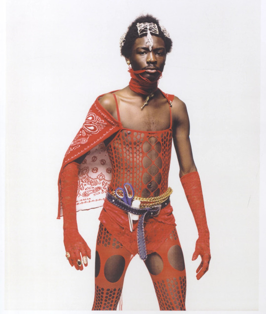
Akeem Smith- Akeem Smith is the Jamaican-born, NYC-based stylist and creative director who’s spent the past few years defining fashion’s underground. Whether it’s styling shoots starring muscle cows or recreating bedroom scenes inspired by Caribbean households, Smith’s cross-cultural references have seen him style Yeezy Season 2, work magic with Claire Barrow, create stunning imagery with photographer Eloise Parry and help smash gender and beauty ideals with Hood By Air, where his vital styling and casting contributions helped cement the brand’s striking visual identity.In fact, it’s Smith’s very specific references, drawn from a childhood spent observing his grandmother’s dancehall atelier in Jamaica, that’s given him an eye for the visually spectacular.


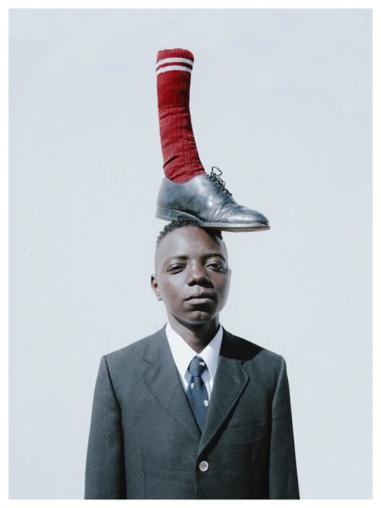
Ibrahim Kamara- Ibrahim Kamara is a British stylist who challenges conventional notions of menswear and masculinity with his distinctive styling and art direction through his work for the likes of Stella McCartney , Burberry and Dior. In June 2018, Kamara joined i-D as fashion editor at large, before being promoted to senior fashion editor at large in July 2019.Born in Sierra Leone, Kamara grew up in the Gambia before moving to London aged 11. He attended Central Saint Martins, where he worked on a project entitled “2026,” which explored what black masculinity could look like 10 years in the future, and was exhibited at Somerset House as part of the show “Utopian Voices Here and Now.” For the exhibition, he dumpster-dived in areas of Johannesburg with photographer and long-time collaborator Kristin-Lee Moolman, searching for discarded outfits and refashioning them into new clothes.


0 notes
Text
Digital Brief - Research Task
Fashion Photographer - Historic
Nick Knight - Nick Knight is a British fashion photographer who has worked for the likes of Alexander McQueen, Louis Vuitton, Dior and Dazed & Confused. Knight is also the founder and director of showstudio.com. I find Knights work very dark and eerie, there is a gothic feel to them and the colour palette is very abstract. There is lots of editing that happens post production with heavy makeup and hairy styles. Knight uses props like smoke and colour jellies over the lights in the studio to create more drama and tension with colour. The images that Knight creates show motion and each one creates a bold statement. Knights work is incredibly bold and bashful. I could take inspiration from his work by using low key lighting with my model in colourful garments and with lots of editing to happen in photoshop post production.


Tim Walker - Born in England in 1970, Walker has worked for both British, American and Italian Vogue. After recently seeing Walkers ‘Wonderful Things’ exhibition, you can see why he has won multiple awards. Walkers work is so unique and he captures stories throughout his imagery. In 2008, Walker won the Isabella Blow award for Fashion Creator from the British Fashion Council. By using colour, angles and a wide lens, Walker creates emotions and sets a mood whilst also telling a story through his work. I really love the set of work which takes on a modern approach to Alice in Wonderland. Walker uses his signature wide angle lens to create a distortion and can alter the height and length of what is being shot. This can also create a sense of movement. For me, Walker takes the idea of editorial fashion imagery to a whole new level. It is so imaginative and gives a lot of inspiration to how far the spectrum of fashion photography can be really stretched.


Fashion Photographer - Contemporary
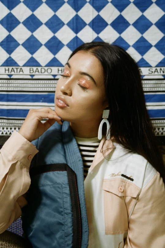
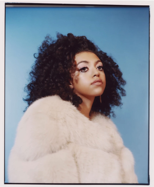
Micaiah Carter - Micaiah Carter mainly focuses on head and shoulder shots. Carter treats his models like sculpture and introduces bursts of colour by keeping the overall tone of his imagery very neutral or to a singular colour palette. This keeps his work feeling very balanced. Carter has created editorial work for companies like Playboy, American Vogue and Highsnobiety. Carter tends to use people of colour as his models and focal point of his work. I really love that all of Carters work has a sunshine-y, haze-like feel to them. The bursts of colour don’t distract from the model as the shots are all taken to create a sense of drama to engage the viewer.


Tyler Mitchell - At just 23, Tyler Mitchell did a shoot with Beyonce for American Vogue and is amongst one of the youngest to shoot for Vogue. Mitchell began his career by shooting music videos for indie and off-the-radar rappers like Kevin Abstract. Mitchell has been commissioned to shoot for brands like Converse and Marc Jacobs. In Mitchells work he tends to reveal the backdrop to his shoots, this makes a sense of almost deconstructed photography. The tones are all very natural and neutral, I really like how the backdrop is revealed and sometimes not even used as it creates a relaxed feel to them. This is something I would definitely like to use in my own work and campaign shoot. I also like how his work is very balanced and are nature based.


0 notes
Text
Digital Brief - Research Task
Still Life - Historic
Edward Weston- Edward Weston looks at lines and shape. Weston’s work mostly focuses on using low key lighting to enhance the lines through tonal black and white. By focusing on still life which have such unique textures, Weston creates tension, drama and enhances the form of every day objects like shells, cabbage leaves and trees. The contrast between light and dark makes Weston’s still life imagery appear as something they are not. An example of this is the cabbage leaf which reminds me of an editorial shoot of a dress, flowing and billowing out. I like the idea that something as simple as the lighting and angle can transform a still life object into something very different. Weston’s early work had a soft focus and pictorial style which was later developed into what we see now in this set of imagery. A new emphasis on abstract form and a much sharper resolution of detail. Weston’s work has appeared in many articles such as American Photography Magazine.


Madame Yevonde - Madame Yevonde was an English photographer in the early 20th century and was the first woman to give a lecture to the Royal Photography Society. Yevonde pioneered the use of colour in portrait photography. By using head mannequins to showcase various still life props. By doing this, a scene is created and a story could be made to run alongside with the imagery. Yevonde also experiments with filters and other photographic techniques. There is some bold and bright splashes of colour with more neutral tones as the majority of the imagery. I really like the collage effect and how all of the props collectively tell a story. Through the 1930′s, Yevonde had many commercial commissions. These were all executed in an innovative way through her use of colour. Convinced that photography was both an art and a science, Yevonde began looking at more technical research and discovered the vivex process which she used up until the second World War. Vivex is a wash off process using three negatives on waxed cellophane.


Still Life - Contemporary
Anna Lomax - By taking inspiration from pop culture, Lomax creates colourful and bold work. “Inspired by the old, the new, the mundane and humorous...”. The clients that Lomax has worked for are mostly commercial and include the likes of Hermes and Selfridges. Anna Lomax has also created experimental events for Converse in collaboration with the Hong Kong Mall, moving image projects for Another Magazine, Nike, Kenzo and even SquareSpace. Key elements of Lomax’s work is block colour and complimentary hues. I really love the pastel and primary colour palette that is used throughout Lomax’s work. The still life imagery sometimes feel as though it is random however it works as though it is very well thought out. An example of this can be seen in the image of the bag strap and perfume bottles. This works really well and creates a really exciting piece as it is such a unique concept. I love how all the colours work so harmoniously and takes a really fun approach on editorial shoots.


Bela Borsodi - By blending fashion and art, Borsodi made a name for himself by creating fresh and original still life’s. Based in New York since 1993, Austrian born Borsodi, has worked for some major magazines. Shooting for magazines such as Wallpaper, Wired and WAD. Other commercial clients include brands like Nike, Hermes and Swarovski. Bela Borsodi is also starting to make fashion films for brands like H&M. Borsodi says “The photo is the final result but I am more fascinated by what happens before and the ideas behind it”. I find Borsodi’s work very exciting and totally unique. It appears that a lot of work goes on post production which takes a lot of practise and technique. The colour palette varies from bold splashes of block colour to a mixture of neutral tones with some flecks of colour. Shape and form is very key to the imagery that Borsodi creates. When looking at the form that most of his work takes it is very sculpture like and flowing. They all have a feeling of movement and structure. Some imagery is angular and some is more curved, each taking on all of the unique signature qualities of Borsodi’s work.


0 notes
Text
BBC Merseyside
We were the contacted by BBC Radio Merseyside to feature on their 7pm show with Jermaine Foster to talk about LJMU’s collaboration with Scope and what sustainable fashion means to us. Myself, Marc, Sophie and Dawn appeared on the show which was a great experience and something I really enjoyed.

To be given the opportunity to be able to voice my own opinion and knowledge on this topic and also on such a platform was something I am incredibly grateful for. It also led onto more opportunities via the LJMU journalism team which I was contacted by and did a short interview for one of the students to appear on their 4 o’clock bulletin.
0 notes
Text
The Window
When the window had finally been put together, members of the digital marketing group were able to go down and take photos of everything going on for the behind the scenes segment on our page. I unfortunately was not able to be there but got forwarded an image of the final window.

0 notes