Don't wanna be here? Send us removal request.
Text

The first design I chose was the sunset logo. The denotative meaning of this design is that the name of the brand is "sunset" and it is a produce company. It was made to represent the brand and what they sell.
The connotative meaning of this design is that the brand is growing and happy. The design contains a sun within it to get viewers to feel warm inside, like they should feel when they eat their product. They want their viewers to relate sunsets with their product, which may make the viewer want to buy them.
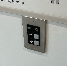
3. The up and down arrows of the elevator buttons are a perfect example of an iconic function. It tells the viewer literally what each button does, up and down respectively. The arrows are intended to resemble what the elevator will do if you press the button.

4. The fourth design I chose was the button for temperature on an air fryer. The temperature buttons indexical function is that it representing the temperature, rather than putting the numbers there. The button is the signifier and is related to the signified, which is the numbers at the top of the air fryer.

5. The fifth design I chose was this stop sign. The symbolic function of the stop sign is to tell the person to stop. As a culture, we know that the red octagon with white letters means to stop, making it have a symbolic function.

6. The final design I chose was this poster for the play Moulin Rouge. I think the design is referencing a modernist style because of the use of primary colors as well as the text conforming to the grid. I think the reason it is trying to signify this is style is because it is trying to capture that retro feel that the modernist style has because the play is set in the early 1900s.
0 notes
Text

This infographic is showing millenials and their media consumption. The underlying agenda that I believe this infographic is trying to say is that millenials are using screens too much. The whole infographic is filled with different images/symbols that have something to do with using a screen and all the numbers are focusing on what they are doing with their screens, rather than everything else that millenials do off of the screen.

2. This piece of design is apart of a larger identity system, which is the whole packaging for the toilet paper. The brand achieves consistency with the packaging of this product because all information seen on this is on one side, which allows for easy stacking in the store. Also, within the design of the packaging, they use the same colors throughout with green, purple, and yellow, with red at the top to signify that there is something different about this product, which is that it is a deal. The alignment of the elements is consistent because they are all either in the center of the design, or in the corners, sticking to the grid, and are not all over the place. All text is in caps except for the logo and recycled word, which shows consistency. The imagery is illustrative giving the viewer a soft feeling from the packaging, which the toilet paper company wants.
0 notes
Text
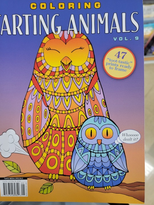
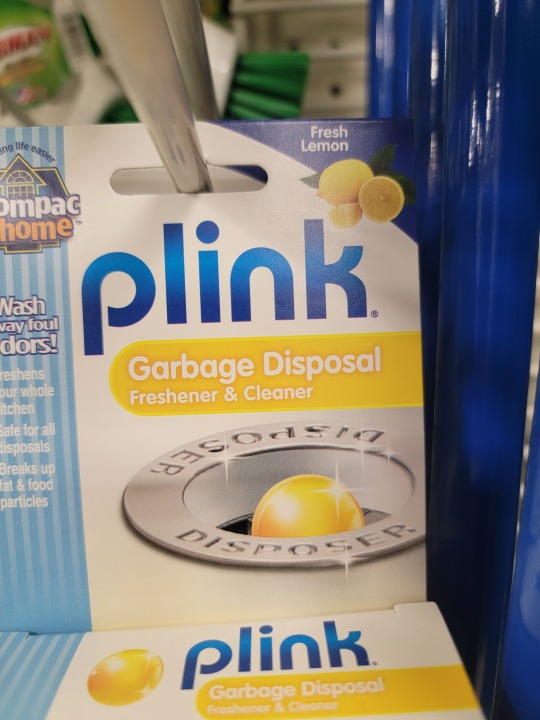

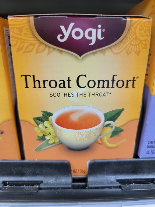
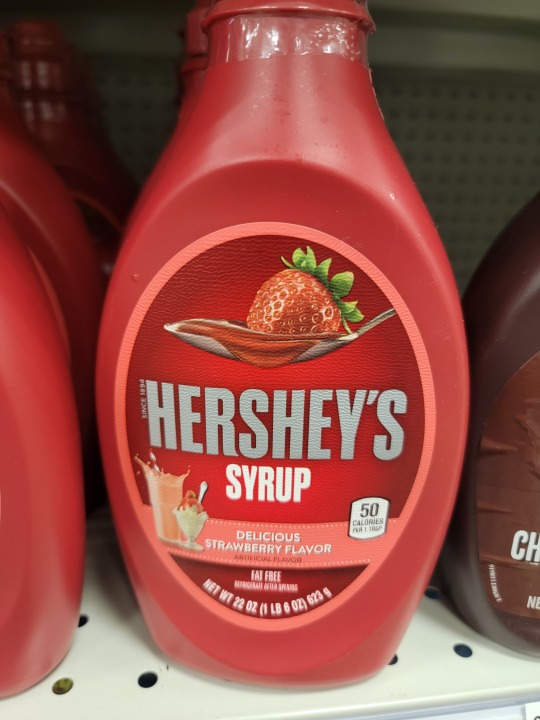
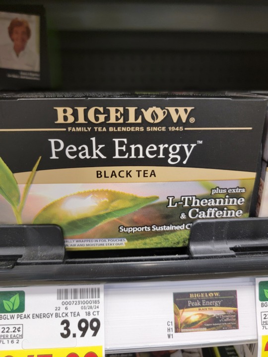
The first design is the cover of a coloring book. The cover shows rhythm with the feathers of both the owls have repeating elements within them. Also, the interior of the book matched the rhythm of the cover with all the pages having the same layout.
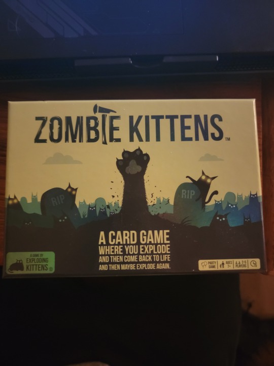
The 2nd design is the box for the game "Zombie Kittens". The design on the front of the box shows typographic hierarchy to establish importance with the title of the game being the largest and other text being shown small as it is of less importance.
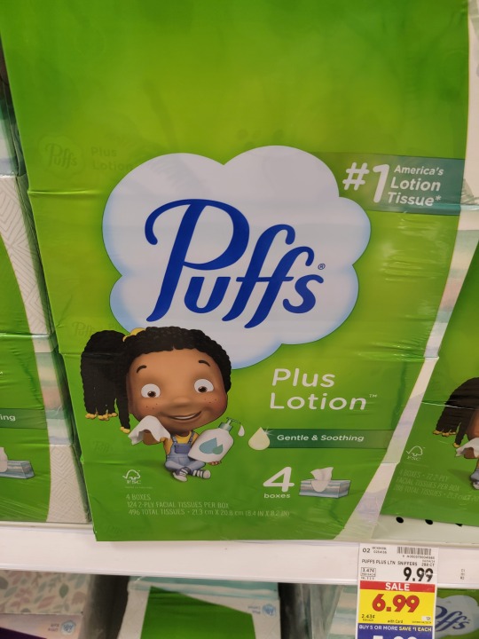
The third design is the "Puffs" logo. The f's in the typography have ascenders.
The fourth design show the work "plink" with the p containing a descender.
The "O" and the "A" in Tazo contain counters.
The "t"'s and "f" in Throat Comfort contain crossbars.
In the seventh design, the word "Hershey's has a large x-height.
In the eigth design, the word "Bigelow" has a small x-height.
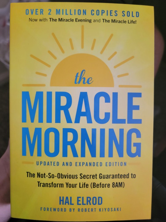
The book cover for the book Miracle Morning appears to be a "Modernist" design. I think this because of the use of bold, primary colors, as well as the design sticking to the grid.
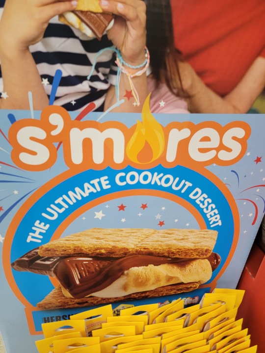
In the final design, the typography used for the work "s'mores" contain an "o" that is replaced with a flame. The font is trying to connote that s'mores is more than a food, but an experience of making them around the fire.
0 notes
Text


Design 1: Ritz Logo: The Ritz cracker logo uses complementary colors of blue and yellow to draw your eye to what the product is. When someone sees a ritz box, the first thing they see is the logo and the big "Ritz" text, which is exactly the point of the design.
Design 2: Mio design: The Mio bottle uses anagalous colors of red a violet to make the whole design of the bottle seem subtle. The colors create a soft tone throughout the design.
Design 3: Faith Book: The design on the cover of the faith book uses cool colors such as different shades of blue and a hint of violet. The cool colors give off a calm, relaxing feeling to the design. This is perfect for a cover of a book about faith, as many relate faith to be calming.
Design 4: Coffee cover: The cover of this coffee uses warm, vibrant colors, such as different shades of orange and yellow to bring a bright feeling to the design. The use of warm colors in this design is perfect because it associates coffee with bright colors, just like the morning when you drink coffee. Also, coffee is used to wake people up in the morning, and the warm colors reflect that.
Design 5: Boston Celtics logo: The design of the Boston Celtics logo uses contrast between green, white, and black to make it really pop off the page. The contrast between the green outer circle and the white inner circle makes the viewers eyes go directly to the lepracaun in the center of the design.
Design 6: Coffee Bag: The design of this coffee bag uses the gestalt principle of continuity. This can be seen with the lines that make up the design. They intersect into each other, but still make it feel as if they are all apart of one cohesive design.
Design 7: Flash sticker: The flash sticker is a perfect example of an active figure ground relationship. The silhouettes of the flash create the active figure-ground relationship.
Design 8: Car graphic tee: The design of the graphic tee is created to make it feel like a retro car from the 60's with the images of classic corvettes. This design is trying to communicate that retro feel to the viewer.
0 notes
Text


Image 1: 2024 Planner: This piece of graphic design shows contrast between the texture of the different components. Each rectangle starts bold, but the weight gets lighter and lighter as they move across the page.
Image 2: The Woman in the Window Book: This piece of graphic design shows contrast with the spacing between the blinds of the window. Starting at the bottom of the word "Woman" the blinds spacing condenses and by the time the blinds reach the top of the word "Woman" the spacing is very large, to represent someone peeking through the blinds. This is showing progression within the design.
Image 3: Mom and Me Book: This piece of graphic design shows contrast between the scale of the different components, which is created using passive lines. The lines of the different rectangles are all passive lines as they do not change much within the lines, but by combining these lines, the designer was able to create contrast using the different sizes of rectangles the lines created.
Image 4: Gleanings Book: This piece of graphic design shows contrast with progression of the different faces in the hoods. As the faces move across the page, they get smaller and smaller, giving the effect that they are standing in a line. Also, each face is different, showing contrast within the progression of them getting smaller.
Image 5: Paint by Sticker Book: This piece of graphic design shows contrast with the scale and rotation of the different components. The fish on the cover is made up of a mixture rectangles and triangles, all with different sizes and rotation to create depth and contrast within the design.
0 notes
Text
Design Scavenger Hunt Module 1


Image 1: Wendy's Logo: The main design for Wendy's that appears on the bag. It uses both image and and hidden type in the collar that spells "MOM" to appeal to the customers pathos and make them feel like they're at home.
Image 2: Hot One's Truth or Dab game: Box cover uses high contrast colors of red, black, and yellow to catch the viewers attention and tell them what is inside the box. The cover uses both image and type, in multiple different fonts, to convey the message of what the game entails.
Image 3: Italian Beef seasoning packet: The cover of the packet uses red, green, and white, which are the colors of the italian flag, to show the audience what the seasoning packet contains without reading the package. The package uses both image and type to convey the message of what is inside, and what it can be used for.
Image 4: Japan book cover: The cover of this book uses both type and image to convey the message of what the book is about to the viewer. It uses the Japanese flag as a background to a person bowing to show that the book is about etiquette in Japan.
Image 5: Gatorade Bottle: The logo on the Gatorade bottle uses Gatorade's classic green and orange colors, and inlcudes the lighting bolt, to show that Gatorade is for recharging your body. The logo on the front conveys the message of what is inside the bottle, Gatorade, to the viewer.
1 note
·
View note