
Statistics
We looked inside some of the posts by grad503-13-ruby-bird and here's what we found interesting.
Average Info
Notes Per Post
1
Likes Per Post
1
Reblog Per Post
0
Reply Per Post
0
Time Between Posts
22 days
Number of Posts By Type
Text
17
Last Seen Tumblr Blogs


Fun Fact
1,644 Tumblr posts in 1 second.
Text
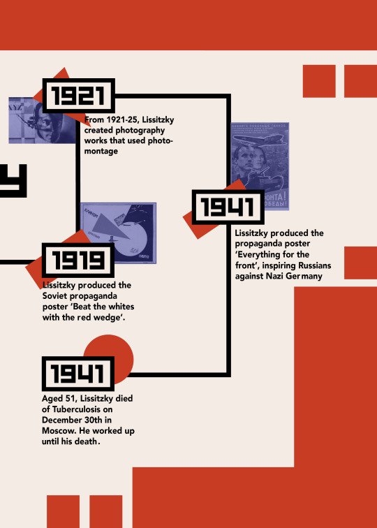
Week Seven - Speech Transcription + Background
https://www.hollows.org.nz/our-workThis week there was no in-person class due to ANZAC Day. Instead, we were provided with the list of speeches and asked to research and transcribe our assigned speeches, and research kinetic typography. The speech I have been assigned is an excerpt from an interview with Fred Hollows where he discusses the human motivation of looking out for others.
Transcribed Speech
“I was sitting beside Nick Greiner once, and ah he said um, of course, self motivation, or self gain, is the basic human motivation. And I thought, I don’t really have to put up, with this ah shit. So I said, you’re wrong Nick, that’s animal motivation. Human motivation is looking after the halt, the lame, and the blind. The people less fortunate than yourself. That’s human - basic human - motivation.”
- Fred Hollows
Nick Greiner - Australian politician, 37th Premier of New South Wales
Full Interview Video
Fred Hollows Interview on 60 Minutes
https://www.youtube.com/watch?v=DnrM58c466Y
Research
- Fred Hollows was an eye surgeon from New Zealand
- He restored sight and vision to thousands of people around the world
- Born in Dunedin in 1929
- Moved to the UK to study ophthalmology
- Moved to Australia in 1965 to work as a professor
- When visiting small indigenous towns in Australia, he was shocked at the bad conditions, particularly of eye health, and began his fight for access to eye healthcare for at risk people around the world.
- Fred visited Nepal, Burma, Sri Lanka, India and Bangladesh on behalf of the World Health Organisation in 1985. Two years later he visited Eritrea.
- In Nepal and Eritrea, he founded factories to produce lenses for cataract surgery, making the lenses far cheaper and more accessible.
- After a cancer diagnosis and being given only a few months to live, Fred travelled to Vietnam to train over 300 eye specialists
- Fred Hollows died on the 10th of February 1993 and was given a state funeral in Australia
- The Fred Hollows Foundation now works in more than 25 countries and has restored sight to over two million people worldwide, continuing his legacy
- The foundation is committed to ending avoidable blindness, through carrying out eye surgeries, training specialists, conducting research, and supporting health systems.
Resources
https://www.hollows.org.nz/longform/freds-story
https://www.hollows.org.nz/our-work
0 notes
Text
Week Twelve - Final Publication
Before printing my final, I did some test prints so I could practice folding, stapling, and trimming. Due to a printer fault, the pages did not centre properly, which made the assembly difficult. The centre line on one side of the page did not line up with the other side of the page, which caused some pages to show the other side at the join. I wanted to make the timeline fold well and be continuous, so I made sure this was lined up properly. When I tried cutting the pages with a guillotine, it left a rough edge that I didn’t like. Instead, I cut the pages down with a craft knife and ruler, which left cleaner edges. I also noticed that the colours changed slightly over the different print trials. I think if this was printed more professionally the colours would be more true to what I wanted, however my colours are how I wanted them in my final booklet. If I was to do this again I would experiment with printing on a thicker paper stock and maybe with a different bind instead of the staples. Overall I am happy with my publication because I can see how much I have improved with the Adobe Suite since last year.
0 notes
Text
Week Eleven - Printed Draft
After making a few adjustments to my spreads, I printed a draft of the publication to proof and check for any more adjustments I could make. I followed the printing procedure shown by David to print, however I haven’t trimmed or cropped the publication.
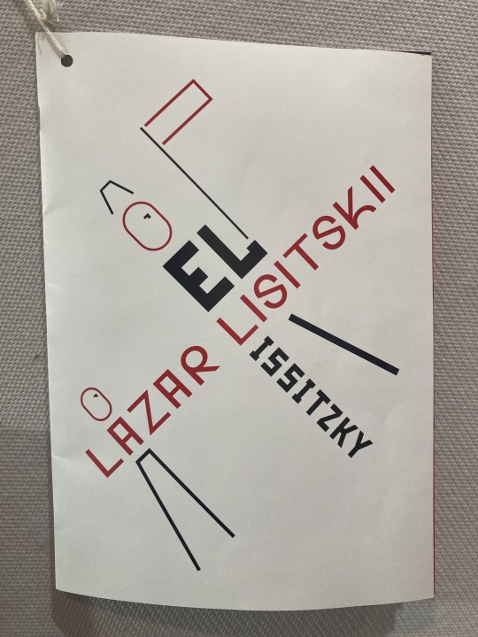
FRONT COVER
The cover looks a bit odd with the bleed still visible, however the colours printed very well and the lines and shapes are bold enough to be viewed from a distance, which is good for a front cover
INTRODUCTION/QUOTES + IMAGES
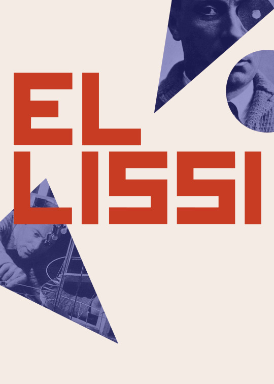
This page looks cleaner and more cohesive with white text for the second part of the title than when it was black. The body text as 12 point is also a very good size and fits well with the rest of the page. The images aren’t the best quality, but it was very challenging to find high quality images of Lissitzky considering the time when he was alive and working. I tried to hide some of the low quality images by pasting them into shapes, which worked a bit and I think looks better than full size images.
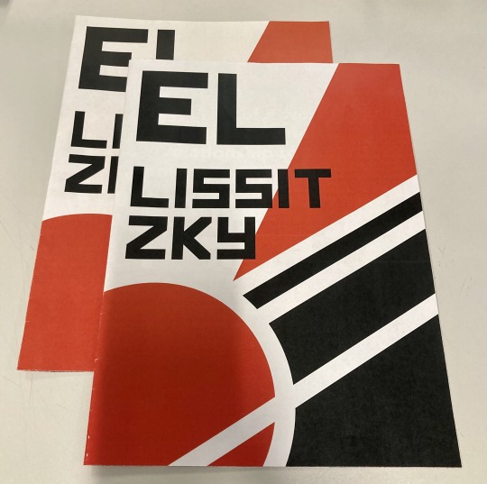
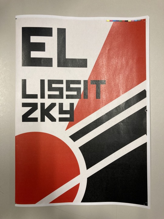
TIMELINE
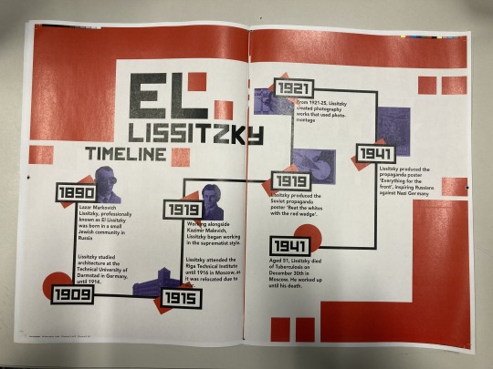
The timeline poster printed well, but I’m not sure if it was accurately centred in the page because when I lined up the edges to fold the page, it wasn’t in the middle. This created a red line through the centre which is quite distracting. There is quite a lot of black on this page, which works for the timeline but I’m not sure if it fits as well with the other spreads.
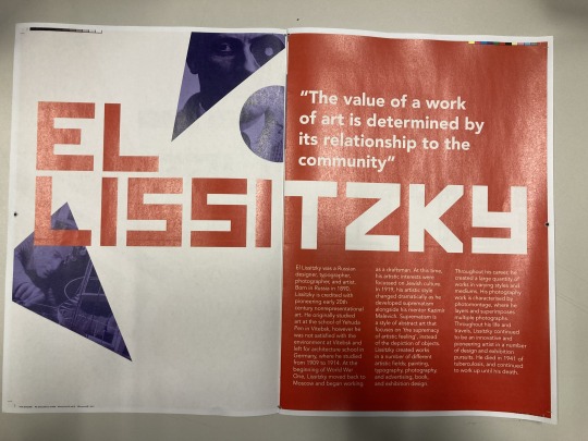
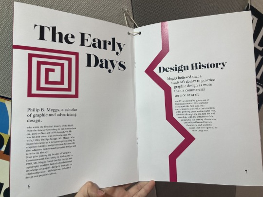
ARTICLE SPREAD 1
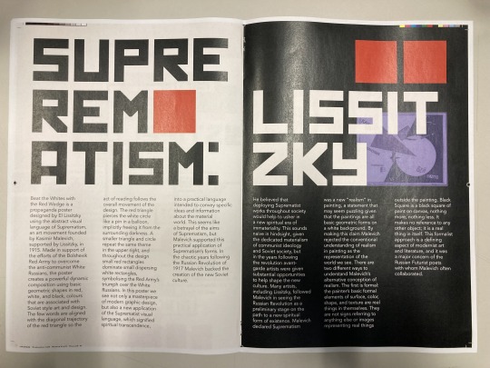
This spread looks good printed, and I like the boldness of the title. However, the word ‘EL’ didn’t print, even though it appears on the PDF I printed from. I’m not quite sure why this is, but I will investigate before printing my final. The red colour when printed contrasts well against the black and white, which is good

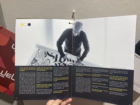
ARTICLE SPREAD 2
I like the point size of the body text in this spread, and I’m glad that I reduced it from 14 point as this would have been too large. The title text going across the join printed well, as I made sure not to put a whole letter across the join. I might experiment with increasing the title size so it goes up higher on the page and aligns with the margins used on other pages.

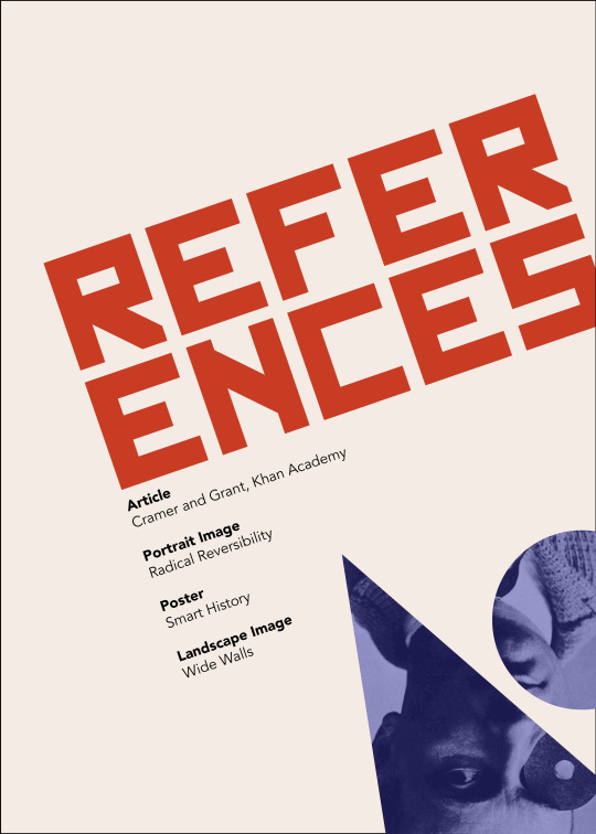
ARTICLE FINAL PAGE / REFERENCES
This spread is probably my least favourite of the publication. The sizes of each heading are very different, which gives an uneven appearance. The angle of the reference text doesn’t match with the article page either. I think I need to make the pages more different, maybe with colour choice, or change the headings so they go together better.
BACK COVER
I like the boldness of the back cover. The front and back covers fit together very well, so the booklet looks good folded out flat. The untrimmed bleed marks look a bit odd, however the final copy will obviously be trimmed.
0 notes
Text
Week Ten - 12 Pages Draft
Here is a draft version of the 12 pages for the publications. Before printing, I will make edits and adjustments as needed.
Front Cover

Introduction / Quotes and Images page 1
Introduction / Quotes and Images page 2

Timeline page 1

Timeline page 2
Article page 1
Article page 2
Article page 3

Article page 3
Article page 5
References
Back Cover

0 notes
Text
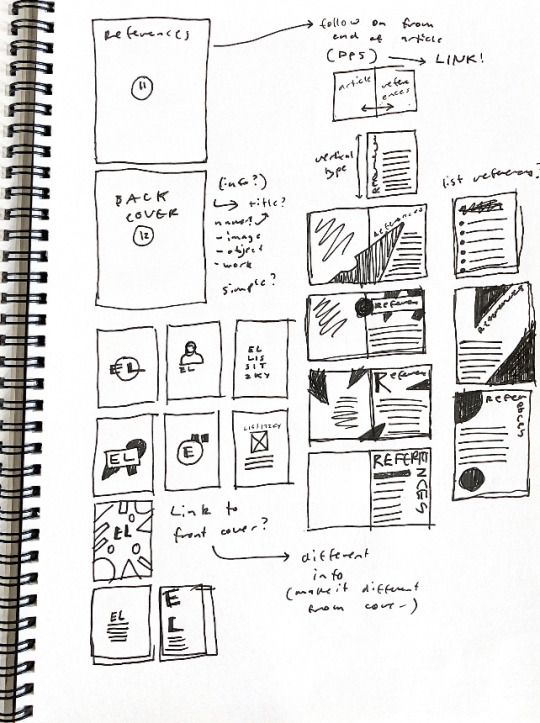
Week Ten - References
This week I worked on some spreads for the last page of the article and the references page. To begin with, I drew a few rough sketches to get some ideas down. Then I used InDesign to create some concepts for this spread.
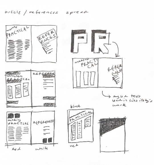

I really liked the angled text for the references page as this is something that Lissitzky does in his own design work. It is also something that I haven’t used much in the publication and wanted to experiment with. Because there is minimal text on this page, the angle doesn’t take away from the legibility, so it works well for this page.
0 notes
Text
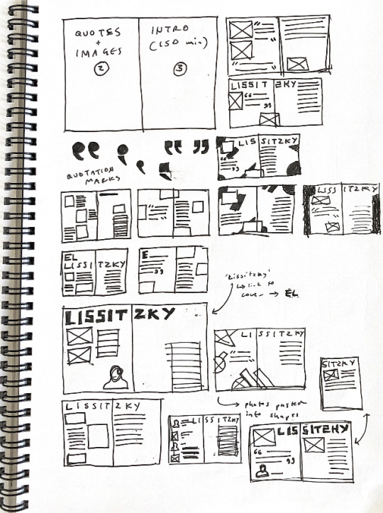
Week Ten - Developing Assets
Based on this concept for the quotes and images/introduction spread, I created a few alternate versions as I felt the image placement was a bit random, and there wasn’t much link to Lissitzky’s own work.


I pasted the images into geometric shapes that Lissitzky uses in his work, which links to the designer. The image placement also seems less random and more considered which is better. However from looking at this I felt that the black background was too overpowering so I wanted to experiment with a different background colour.

This spread looks much lighter and brighter with the red background instead. The white text contrasts well against the red as well, so it is still clearly legible. Without any black the spread doesn’t fit in as well with other spreads, as black is used throughout my other spreads. Black is also an integral aspect of Lissitzky’s colour pallet and Soviet/constructivist style art and design.

To add black back into the spread, I made the second part of the word ‘Lissitzky’ black. This contrasts well against the red, and changes the hierarchy of the page as not all text is the same colour. I think this page will be used in my final publication, with some further refinements.
0 notes
Text
Week Ten - Class Content
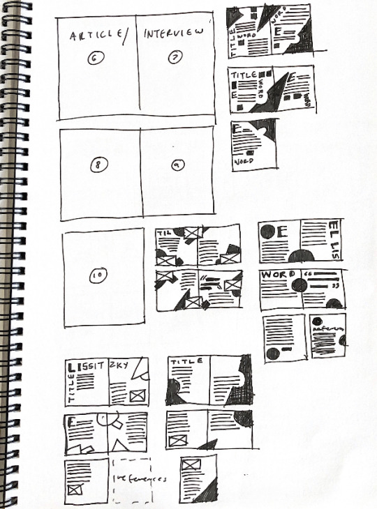
This week in class, Karol gave us a brief introduction to using the printers on campus, and how to set up documents for printing. We were shown an example publication, with a reformatted timeline poster. After this, we were given time to work on our own publications. I created some more concepts and thumbnails for spreads in the publication, for the image and quotes page and the article. I also made a quick concept for the reference page.

Final page of article and reference spread. This needs more work as the spread isn’t cohesive. I like the reference page as the angled type is interesting and links back to Lissitzky’s work. The black background creates interesting contrast, but it doesn’t go well with the reference page. It is also quite boring and the title needs more work.

Concept page for a spread in the article. I like the red letter monograms in the background, and how they bleed off the page. I also like the simplicity of the spread. I want to keep body text consistent in the publication, with 3 columns of text. I like how the 3 columns looks here.

This is a thumbnail spread for the quotes and images/introduction page. I like how the title spreads across both pages and links them, despite the background colours contrasting strongly. The image and quote placement could be improved, as well as the text formatting of the quote as this is unconsidered.

This spread is a draft of the first spread of the article. I like the 3 columns of text and


0 notes
Text
Week Ten - Research
To continue researching for the publication I looked at some past student work on Level 5. These students were given the same brief, however that pages they made are slightly different than what we are doing. These images are of front cover designs. The second image is from a student who was given the same artist as me. It was interesting to see how other students approached the same brief.

All the students used elements and styles from their given artists on the front cover. The colours and other elements from the cover were also used throughout the rest of the publication.

This spread is the image and introduction page of the student given El Lissitzky. I like how the introduction paragraph is angled, as this is something that Lissitzky uses a lot in his own work. The halftone filter on the image is also interesting. I like the amount of white space on the introduction page, and the contrast between the full bleed image and the smaller introduction paragraph.
I like how the black box with text extends across both pages, along with the image above it. This creates a landscape orientation, which breaks up the repetition of portrait pages. The yellow colour for questions/subheadings is a good choice as the yellow contrasts nicely with the black. These colours are used throughout the publication.
I like how the text is wrapped around the pink shape. The pink line is a motif that appears throughout the publication. I am not sure if this student used a grid system or not, as this spread has very different layouts on each page. The use of page numbers is something I could consider for my own publication, however because we aren’t making a contents page these may not be as relevant.
This page is the introduction page. I like how the title text is offset, with words starting at different points. The red colour for the subheading helps to create hierarchy, making the subheading bolder and contrasting with the body text. The negative space around the design allows the type to stand out, creating a very clean and minimal layout. I like how the colour of the background is different to the other page in the spread, and I like how the white text contrasts against the black.
0 notes
Text
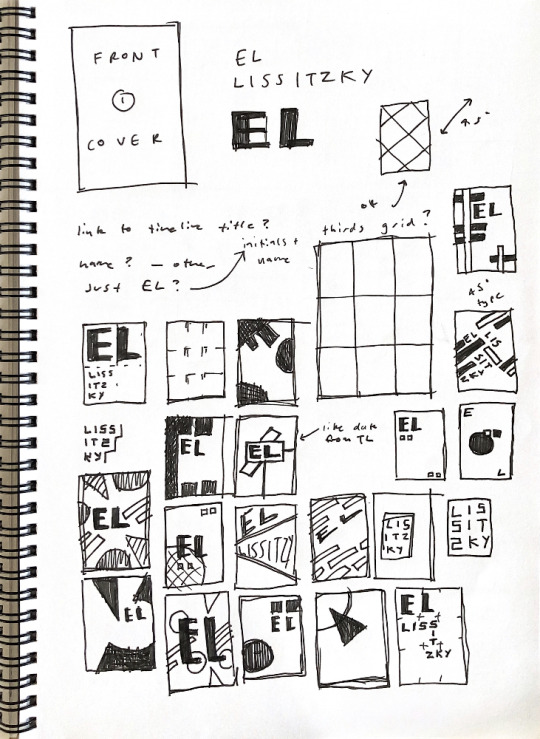
Week Nine - Developing Assets
Front cover design - developing concepts

These are some small thumbnail concepts I made for the front cover of the publication. I experimented with using ‘EL’ his first name and his initials, as well as his full name for the title. I used elements from Lissitzky’s work such as the geometric shapes and angles. I also used elements from some of his more famous works, such as beat the whites with the red wedge, to create some concepts.

This page is of some sketches I created to help me develop another title concept. I wanted to use shapes from Lissitzky’s work (circle and triangle) as well as constructivist and suprematist ideas (colour pallet).

These are some digital thumbnails based on the sketches I made.

My favourite cover design option. The shapes used link to his famous work and suprematist style, and the typeface has Soviet elements which link to his background.
Using the text I found for the article, I started developing some concepts for the article section (pages 6-10) in the publication. I worked mainly on the first spread (6-7) of the article, as I want to keep the theme consistent throughout the 5 pages.

I like the title of the bottom 2 layouts, however I think there is too much text in some of the spreads. I also think the positioning of the image could be improved.

These spreads are ideas for the quotes and images/introduction spread. I tried a range of different layout options, however I want to experiment more with background colour and different heading options. I need to work on text placement and alignment, as I think it could be improved.
Back cover designs

I wanted the back cover to link with the front, so I used elements from the front cover when designing the back. I didn’t want to put text on the back cover as there was no relevant information to include. This back cover (on the left) is very simple - possibly too simple. Because this front cover concept is so simple, the back would look out of place if it was too busy.

Two different options for back covers that link to the front cover I created - the circle shape continues onto the back.

My favourite back cover design laid out next to the front cover - shows the continuation of shapes.
0 notes
Text
Week Nine - Article Content
In this post I will include the content I will be using for pages 6-10 of the publication; the article. I decided on this text as it gives an overview of El Lissitzky’s involvement in working with the suprematist style. It discusses some of his most famous works, which I felt important and especially relevant to the publication. The colour pallet used in the publication is inspired by some of Lissitzky’s suprematist works, so the article links well with the visual style of the publication. If this article is too long I can shorten it by removing some paragraphs and abridging the text.
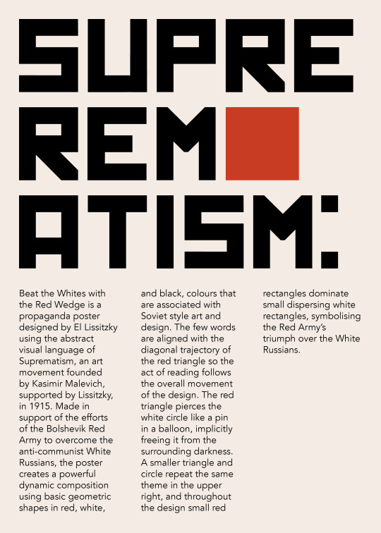
Suprematism: El Lissitzky
Beat the Whites with the Red Wedge is a propaganda poster designed by El Lissitzky using the abstract visual language of Suprematism, an art movement founded by Kasimir Malevich in 1915. Made in support of the efforts of the Bolshevik Red Army to overcome the anti-communist White Russians, the poster creates a powerful dynamic composition using basic geometric shapes in red, white, and black. The few words are aligned with the diagonal trajectory of the red triangle so the act of reading follows the overall movement of the design. The red triangle pierces the white circle like a pin in a balloon, implicitly freeing it from the surrounding darkness. A smaller triangle and circle repeat the same theme in the upper right, and throughout the design small red rectangles dominate small dispersing white rectangles, symbolising the Red Army’s triumph over the White Russians.
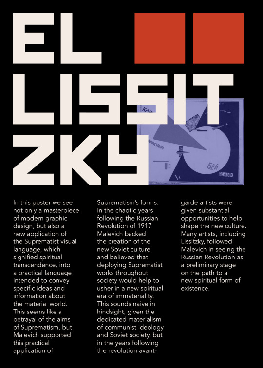
Towards a practical Suprematism
In this poster we see not only a masterpiece of modern graphic design, but also a new application of the Suprematist visual language, which signified spiritual transcendence, into a practical language intended to convey specific ideas and information about the material world. This seems like a betrayal of the aims of Suprematism, but Malevich supported this practical application of Suprematism’s forms. In the chaotic years following the Russian Revolution of 1917 Malevich backed the creation of the new Soviet culture and believed that deploying Suprematist works throughout society would help to usher in a new spiritual era of immateriality.This sounds naive in hindsight, given the dedicated materialism of communist ideology and Soviet society, but in the years following the revolution avant-garde artists were given substantial opportunities to help shape the new culture. Many artists, including Lissitzky, followed Malevich in seeing the Russian Revolution as a preliminary stage on the path to a new spiritual form of existence.
UNOVIS
After the Russian Revolution the art education system was re-organised, and many modern artists took teaching positions in the new art schools and workshops. In 1919 Malevich was invited to teach at the art school in Vitebsk, where he promoted his Suprematist ideals and acquired many followers among the teachers and students. They formed a group, UNOVIS (Affirmers of the New Art), dedicated to disseminating Suprematism as the visual language of world revolution. In keeping with communist ideals they saw themselves as a collective and signed works as UNOVIS. Most of their works have not survived as they were temporary installations or ephemeral works like posters, brochures, and signs. They used Suprematist forms to decorate public buildings and meeting rooms, such as the facade decoration and curtain design for the Committee to Abolish Unemployment in Vitebsk, which was celebrating its anniversary with a festival in 1920. This is a new stage of Suprematism, one that sees it moving out of the cloistered confines of avant-garde art exhibitions and into the real world, to test its viability in front of a general public.
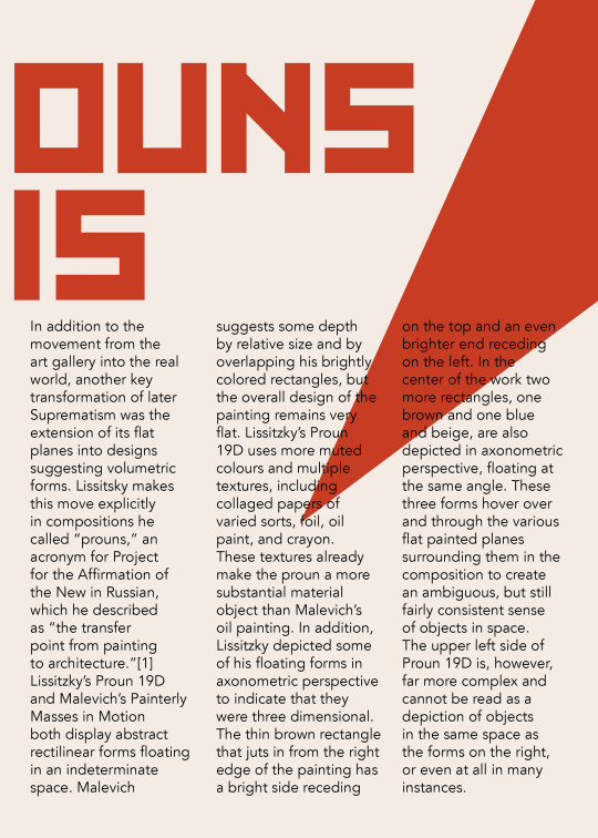
Prouns
In addition to the movement from the art gallery into the real world, another key transformation of later Suprematism was the extension of its flat planes into designs suggesting volumetric forms. Lissitsky makes this move explicitly in compositions he called “prouns,” an acronym for Project for the Affirmation of the New in Russian, which he described as “the transfer point from painting to architecture.”[1]Lissitzky’s Proun 19D and Malevich’s Painterly Masses in Motion both display abstract rectilinear forms floating in an indeterminate space. Malevich suggests some depth by relative size and by overlapping his brightly colored rectangles, but the overall design of the painting remains very flat. Lissitzky’s Proun 19D uses more muted colours and multiple textures, including collaged papers of varied sorts, foil, oil paint, and crayon. These textures already make the proun a more substantial material object than Malevich’s oil painting. In addition, Lissitzky depicted some of his floating forms in axonometric perspective to indicate that they were three dimensional. The thin brown rectangle that juts in from the right edge of the painting has a bright side receding on the top and an even brighter end receding on the left. In the center of the work two more rectangles, one brown and one blue and beige, are also depicted in axonometric perspective, floating at the same angle. These three forms hover over and through the various flat painted planes surrounding them in the composition to create an ambiguous, but still fairly consistent sense of objects in space.The upper left side of Proun 19D is, however, far more complex and cannot be read as a depiction of objects in the same space as the forms on the right, or even at all in many instances. For example, several of the black rectangles suggest the sides of three-dimensional geometric forms, but they are not consistently drawn, so they metamorphose into flat shapes or altogether different objects as you examine them. Which planes are receding? Which are flat? It is impossible to tell. This lack of rationally-defined space is another instance of the Suprematists’ preference for ambiguous, otherworldly spatial constructions over practical, real-world applications.
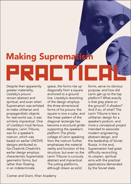
Making Suprematism Practical?
Despite their apparently greater materiality, Lissitzky’s prouns remain abstract and spiritual, and even when Suprematism was enlisted to make utilitarian and propagandistic objects for real-world use, it was similarly impractical. One of Lissitzky��s most famous designs, Lenin Tribune, was for a speaker’s rostrum, which was based on earlier UNOVIS designs attributed to Ilia Chashnik.Chashnik’s earlier design employs characteristic Suprematist geometric forms, but rather than floating in an indeterminate space, the forms rise up diagonally from a square anchored to a ground line. Lissitzky’s reworking of the design employs the three-dimensional forms of his prouns: the square is now a cube, and the linear pattern of the diagonal rectangle has become a structural girder supporting the speaker’s platform.The photo collage of Lenin speaking from the rostrum further emphasises the material reality and function of the structure, but even so the Lenin Tribune is curiously abstract and impractical. The jutting platforms, although drawn as solid forms, serve no obvious purpose, and how did Lenin get up to the top platform? What exactly is that grey plane on the ground? A shadow? And if so, of what? The Lenin Tribune is less a utilitarian design for a speaker’s podium, and more a conceptual project intended to associate modern engineering, abstract design, and the leadership of Soviet Russia. In the end, Suprematism had great difficulty reconciling its utopian, spiritual aims with the practical applications demanded by the Soviet state.
Dr. Charles Cramer and Dr. Kim Grant
https://www.khanacademy.org/humanities/art-1010/cubism-early-abstraction/russian-avant-garde/a/suprematism-part-ii-el-lissitzky
1 note
·
View note
Text
Week Nine - Grid Research
To continue getting assets prepared for the publication design, I wanted to look at the grid systems used in different spreads. From looking at these spreads and analysing the grid systems used in each DPS, I can see that the grid systems often stay very consistent for each page in the spread. The grid used is one of the aspects that helps to make pages link in DPSs. Images and text are placed within the same grid constraints, which helps to link the different elements used. Most of these grids divide each page into 3 sections horizontally or vertically, however the division isn’t always even.

0 notes
Text
Week Nine - Class Content
This week in class, we looked at different publication styles and layouts with Karol. Different styles such as recipe books, magazines, traditional books, trade, bespoke, and popular design were shown to us as different examples of publications. During the Lab time, David went over different typographic tools and type formatting tools. We learnt how to create and work with paragraph styles, columns of text, text frames, leading, tracking, and more. With the skills and tools we used in the lab, we were then given the type roulette task to complete. Each person was given 4 random typefaces; one display, one sans serif, one serif, and one dingbats font. With the text and images provided, we had an hour to create a DPS.

My finished DPS created in the type roulette task. It was quite challenging working with typefaces that didn’t work well together. It was especially challenging using the dingbats font, as I found it hard to find a symbol that would suit the design of the spread.
For SDL we are continuing to work on assets for our publication design
0 notes
Text
Week 8 - Develop Assets SDL
For this week’s SDL, we were asked to develop assets for use in our publication design. I created a few digital concepts of title pages, and researched quotes that I could use in the quotes and images DPS.
Quotes
Here are my favourite 3 quotes that I could use in the DPS
- The room is there for the human being - not the human being for the room
El Lissitzky (1968). “El Lissitzky: life, letters, texts”
- Art can no longer be merely a mirror, it must act as the organiser of the people's consciousness ... No form of representation is so readily comprehensible to the masses as photography.
- The value of a work of art is determined by its relationship to the community
El Lissitzky, 'Ideological Superstructure' 1926 - 1941,

These images show some concepts for the front cover design to be used in the publication. These will act as a starting point for further development and experimentation

This image shows my timeline converted to a landscape format fitting the dimensions of a DPS to be used in the publication. This is not the finalised design, however by converting the timeline to a landscape format, it will help my develop other ideas and make adjustments as I am able to visualise it.
0 notes
Text
Week Eight - Class Content
This week, class was in person for the first time. At the beginning of the lesson, Karol went through a presentation about the publication design and showed us some past student’s work and planning pages. We then moved onto an InDesign tutorial with David, which focused on frames for text, image, and colour. We learnt how to make different shaped frames for images, and how to place images at the correct ppi. We also learnt how to fill a frame with text, and how to shape text around an object. After class I repeated the exercise to help me remember the different tools.


Screenshots of some of the activities
For SDL we will be developing materials and assets for our publication design.
0 notes
Text
Week Eight - SDL Thumbnails
To begin planning for the publication design, I started creating rough thumbnail sketches of the page layouts and brainstormed different options.

0 notes
Text
Week Eight - SDL Research
Over the break I conducted some research into bespoke publications and what other designers had done in this area.


0 notes
Text
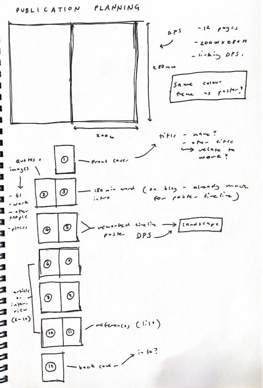
Week Seven - Class Content + Publication
This week the class was focused on Adobe InDesign, with the next publication project to be made with this software. Using InDesign, we will be creating a bespoke 12 page publication about the life, works, and inspiration (oeuvre) of our designers assigned to us earlier in the course. The 12 pages will be as follows, with most consisting of double page spreads (DPS). The size of the pages is 200mm W x 280mm H, with a 5mm bleed.
Pg 1 - Front Cover
Pg 2 - Quotes, images
Pg 3 - 150 word minimum introduction
Pg 4-5 - Reworked timeline poster
Pg 6-10 - Feature article/interview
Pg 11 - References
Pg 12 - Back cover
Assets will be created in Illustrator and Photoshop, with all layout design on InDesign. InDesign is the industry standard program for layout and publications, both for print and online use. In the tutorial, we were shown a number of important features of InDesign, such as master pages, grids and guides, and a large number of typography tools. Work created for the publication will be laid out in InDesign to create a PDF digital journal. The digital journal will show the development of our ideas and research undertaken. In class we set up our InDesign preferences to make it suited for the designs we will be making. This included changing units, quotation marks, optical type, and greeking.
Over the mid-semester break we will be doing some work to continue with the project. I will be researching bespoke publications, and creating thumbnail sketches of some page layouts.
0 notes