
Don't wanna be here? Send us removal request.
Statistics
We looked inside some of the posts by grad602alistudiosem2 and here's what we found interesting.
Average Info
Notes Per Post
0
Likes Per Post
0
Reblog Per Post
0
Reply Per Post
0
Time Between Posts
2 days
Number of Posts By Type
Text
1
Photo
16
Last Seen Tumblr Blogs


Fun Fact
US Tumblr user growth rate is estimated to slow down to 4.1%.
Text
Reflection:
This has been one of my favourite projects to date. I have struggeld with this year’s briefs which have been largely focussed around publication and typographic layouts, so having a completely new aspect of design to work on was exciting.
I think I did well at getting involved with the design and made many contributions to our group. As it progressed into individual work I had even more fun redesigning and testing my packaging/brand for what could be improved upon. I battled with the struggles of printing and made many different iterations of my packaging before arriving at the final one.
Over the course of the project I am very happy with my effort and how the final product came out. I would have liked to have spent even more time working on different packaging styles and designs as I found creating physical mockups with different weighted card/paper made the designs come to life, being able to see my work in physical form.
I would like to thank all the tutors for their continued help and encouragement in progressing my studio and overall design work.
0 notes
Photo

Packaging Iterations:
Here are (some) of the packaging models from start to finish. This shows a pretty good sense of how I progressed with the pacakging as the semester continued, making minor changes to each one.
0 notes
Photo


Brand Booklet:
My completed brand booklet for my proposal/redesgin for Tipu. I am happy with the result of the brand book and believe it showcases the design and features well.
0 notes
Photo


Packaging Photos:
Some final pacakging photos to display the design. I am very happy with how these have turned out and the overall design looks clean and complimentary to the different aspects.
0 notes
Photo


Garden Situ Photos:
Final design dislpayed in garden situ for string use
0 notes
Photo


In Situ Photos:
Some more photoshopped imagery of boxes instore in contrast to other packages.
0 notes
Photo


Wings and Wobblers Situ:
Here is a photoshopped in situ of the advertisments and how they may be presented.
0 notes
Photo

Wings & Wobblers:
For my chosen advertisments I made wings and wobblers which offered information and some teter seeded petals for customers to take home and trial.
These would sit in store among the aisles the product would sit in.
0 notes
Photo


Final Packaging Update:
This is my final packaging design. It dfifers slightly to the last design as it relies more on the belly band for the product itself. This was to combat the information that was invisible when the band was around the packaging initially.
I am happy with the final design, as it incorporates the starting design idea with some updates which are better suited to the brand visual system.
0 notes
Photo


Online Wobbler/Wing Examples:
My chosen advertising mediums are Wobblers and Wings. Before starting I did a quick image search for some ideas of how they are designed and where they are situated in store.
0 notes
Photo
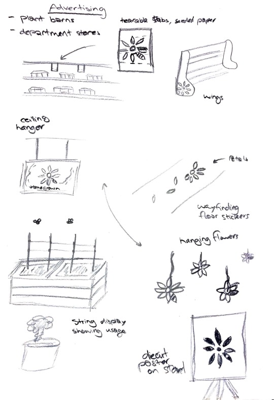
Branding Sketches:
From the quick drawing exercise done in class I came up with a few ideas which I can employ for my advertising aspect of the string branding.
Woblers and wings are what I aim to create, and by taking photos of my box in situ I will be able to demonstrate how they would work.
0 notes
Photo

Updated Packaging 2:
The updated design for the box includes the new logo to better suit the weighting of the typeface for Tipu, as well as some additional text about the seeded paper. This further balances the box, and I believe it is close to its final design.
0 notes
Photo

Logo Update:
Another logo update done to better pair with the weighting of Tipu. The heavier line thickness gives the logo a bit more strength and can stand alone better too.
0 notes
Photo


Box Updates:
Here is a physical update of my packaging. As you can see I have employed the diecut areas mentioned previously, which I think add to the overall clean look, with the green showing below to balance the colour scheme even more.
I changed the weighting of stock to a 200gsm which remains sturdy as well as easier to create.
I am quite happy with the current progress of my box.
0 notes
Photo


Die Cut Work:
A new addition to the box is the use of diecuts. I wanted to include diecuts as I wanted to address the issue of not being able to open the box easily, and believe it would give the box more depth.
0 notes
Photo


Packaging Development:
From group work here are some developments I have made for my pacakging.
I included the updated logo and worked with the scale of both the Tipu and logo which utilised the spacing better.
Including the flower cutouts for easy lifting of the box and giving the full box a better texture and depth to it.
This is a good start for where to go in the future of the packaging.
0 notes
Photo

Chosen Updated Logo:
I chose to update the logo in response to the feedback received from formative. I too agree that the logo/workmark choice conflicted with the other areas of our design system.
Now I believe I have found a better all round design for the logo whilst also including imagery of both flowers and bees to match our brand system and values.
0 notes