
Don't wanna be here? Send us removal request.
Statistics
We looked inside some of the posts by gs-art-foundation-blog and here's what we found interesting.
Average Info
Notes Per Post
5
Likes Per Post
3
Reblog Per Post
2
Reply Per Post
0
Time Between Posts
2 days
Number of Posts By Type
Text
17
Last Seen Tumblr Blogs


Fun Fact
In Q3 of 2020, 31% of US users access the Tumblr app daily.
Text


I tried doing two samples based off Preston paperboys art but they didn’t go to play and I have up on them.


I ended up going back to the glitch photos I made and also handing up a piece of fabric to see if people write on it.


First photo is Gouche paint and the other one is acrylic paint that sent back do I added sharpie.
0 notes
Text

To go with my artists Antoine Stevens I edited this from the scared reactions I got.


I needed to experiment with different types of painting techniques to I decided to do little samples of eyes.


These are three samples I did using acrylic paint and they’re natural colours blended, natural colours unblended and then unnatural colours with sharpie on top. My factory one I’d the sharpie and unnatural colours one.


These are three samples the same as the ones before and with this one I love the blended one and unnatural one but the unblended one looks terrible.

Last sample was a water colour one which didn’t go to play because all I wanted was for there to be drips but that did t even really happen.
0 notes
Text


I did another sample of the photo but for this one I painted onto a decorated background. Was going okay as i made it messy like the last one.

It started looking a little funny so I ended up outlining the whole thing in biro pen which is soemthing I tend to do when I don’t like how something it looking.


I tried the grid method to enlarge the photo as I thought that may be the problem but I just didn’t like how it was looking because it looked funny so I gave up.
0 notes
Text


I wanted to try one more sample using charcoal to sketch but it didn’t t work out; for this one I did a sketch by looking at my reflection in my phone camera.

It’s a shame i don’t like the way it looks because I like the way it works with the paint when you paint on top of charcoal because it makes it darker and makes it bled nicely.

I decorated another background of a canvas but I plan on using this one for my final piece.


These are some more figure photos I took to show insecurities on the way we look and how we try and hide ourselves.
0 notes
Text


I needed to experiment with penguin more to find out eggs it is I actually want to do for my final piece so I did a little sketch of the photo on the left to then paint it.


The first try didn’t go too well so I painted over it in white acrylic paint. I had given up at this point so I was just adding adding in music colours in an uncaring way without blending them.


With the sone eye I made it less proportionate and more chaotic looking which I actually really like. I needed more samples based off my artist so I chose to add blinds of wet paint and sails them up to match Emilio Villalbas work.


I got inspired on tiktok as I saw someone who sketched an outline in charcoal and then painted over the top so I’d echoed I’d do it. I feel like the outline as okay but painting was terrible.


I did another one just to see but with this one I did it so I only outlined the features, don’t know what I was thinking because by o my having the features I dont fully know where everything is so I just gave up.
0 notes
Text
I wanted to experiment with burning parts of a canvas like my artist perishedsoul so I tried it out on my gouache painting and this is the video of it.


These are two photos of what my painted canvas looked like after I had finished burning it. I ended up with two areas burned a smaller one and a bigger one and because the canvas is so small the burns sort of just take over the canvas and make it so you can’t see the painting as it’s basically all gone.

For another project I made a rib cage out of wire and string and to keep the string together I poured hot wax over the top; I wasn’t sure how I’d incorporate this into my work but I wanted to experiment with it and then somehow attach it to a canvas so I could distress and distort the canvas itself. It didn’t go as planned and since I wasnt fully sure of how I would make it work with the canvas I just left it and experimented with something else.

For my other project with the rib cage I also added stuffing onto the wire and string and added hot wax to it which made it look like liquid was dripping as the wax dried as it was dripping. I also wanted to try this out as I thought it would be a nice way to distort the canvas and mess it up and i had more of an idea on how to add it to the canvas.

Since I burned the gouache painting I decided I’d use it as my experimental canvas were I’d try things into. Once I had added wax to the stuffing I placed it over the holes as a way to partially fill them up and then I pored more hot was over them while they were on the canvas so they’d stick. I do like how this turned out as it adds texture and makes the painting look even weirder however if I was going to do this again I’d do it so that I’d colour the stuffing either with paint or ink such as red so it would look less mold like and more like dripping blood.
0 notes
Text


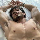
These are a few photos I’ve taken of myself where I’m basically naked and my body has been contorted and manipulated to make it look distorted. What these images represent it body dysmorphia, which is a disorder where you spend a big amount of time worrying about your appearance, and insecurities. The last one can represent body dysmorphia for people who are transgender or non-binary as you can see certain areas being covered up/ hidden forcefully as if they aren’t wanted there; this can represent how transgender and nonbinary people feel as they may feel uncomfortable and don’t identify with the body they have and may want to remove certain things. I like how these photos turned out and I plan on working from them at some point.


I tried taking some photos of me putting on my clothes wrong as a way of distorting reality by doing things wrong. I don’t like how these three photos turned out as they look a little funny and maybe it’s due to the clothes I used but it’s too dark and it just looks messy and hard to see what’s going on.


These are another set of photos I took of me putting on clothes wrong. These photos definitely look a lot better as you can clearly see what the items of clothing are and that they’re being used wrong. I prefer the last two images as there’s more to them due to the arms acting as if they’re trying to hide what’s wrong but I don’t really like how they turned out.
0 notes
Text


These two photos are experiments I did where I applied paint to my face and then I squished my face onto a piece of paper to make the two pieces above. I decided to this this to see how they would turn out and I felt like if I painted lines on my face then the prints would come out similar to some of the artists I’ve looked at who paint so you can see each brush stroke and the colours are unblended. This didn’t turn out as I had planned and they do look a little funny but they do partly look like a face so in a way it is another form of distorting the face.


These are another two prints I made but for this one I tried showing where the darker and lighter areas are on my face by using certain colours. I used a yellow for the lighter areas such as my cheek and tip of my nose, I used a brown for the darkest areas such as the side of my nose, under my chin and slightly above my eye and then o used green and red from the last print to just fill in the rest of it. I do prefer how this one turned out than the other one but I’m not too sure how I feel about them still.
0 notes
Text


Since I did an experiment using gouache as a background and painting on top of it I decided to do an acrylic one to compare the two. For the acrylic one the paint stuck to the canvas a whole lot better so I’d definitely use actually for the background.

I was originally planning on painting realistically like moonlumps does with her messy background and refined painting on top but this one wasn’t going well so I decided to wing it and go crazy with applying the paint. Despite it going wrong at the start I do like how this one has turned out because there isn’t much tone or realistic colour however it still looks really realistic.

I felt like something was missing so I decided to go around the painting with a fine liner is a messy careless way and I also added bits of detail such as the texture In the underwear and the rope as well as adding bits of tone. Overall I really like how this piece turned out as it looks realistic but as the same time the colours are unusual and the image is distorted due to the photo used for the piece.
0 notes
Text
This is an artist I found on tiktok called @its_tiggy and her art work involves starting with an outline of a female body in charcoal and then she paints on top in precise strokes of paint. I really like this way of painting because it looks so simple and not stressful to do yet it looks beautiful and out together. This is the sort of painting I want to experiment with for this project and possible do for my final piece.
0 notes
Text
Here is a screen recording I took of a video on Pinterest that shows someone how to use gouache paint; I might re try using gouache using this technique but I’m not sure if it’s worth it due to me not knowing how to use it too well where as with acrylic paint I know how to use it.
0 notes
Text

To start off the week I did my usual weekly plan so I had an idea of what I should do but this weeks didn’t go to plan at all. On Monday I originally planned to do a painting that I didn’t get the chance to do the week before but I ended up rethinking my project and changing my plan on the whole project a little bit. From now on instead of focusing on how the mind can be distorted I’m going to focus on how the mind being distorted can distort our reality; for example how mental illness ,that distorts the mind, can distort our reality and the way we live.

This is a photo of my weekly plan changed and what I’m actually going to do that week.


Among the work I actually did I found an artists called Adam Lupton who’s work is pictured above; his work is either manipulated by layering arms and limps on top of eachother to simulate movement or painted in lines that don’t join up. I really like this artists work and I’d like to try something like doing a painting that looks like movement or one where I paint in strips but they don’t match up.

My plan is to test out gouache paint in the way moonlumps uses acrylic to create her backgrounds to see if it works the same.
Above is a video of me mixing gouache paint with water to then chuck at my canvas. What you can see is that because gouache reacts with water well it’s purely water based and so when I Chuck it at the canvas it’s acts the same as water colour paints would by just dripping off the page and not really sticking.

This is a photo of my canvas after I chucked the paint in it and I realised it wasn’t drying so I had to dab it dry with a paper towel.

This is a photo of my canvas once I had dried all of the water; the paint didn’t stick well to the canvas as it all dissolved into the water so it just turned into coloured water instead of paint diluted with water like when you use acrylic paint.


After the red I added two more colours which were green and blue but I experimented with them by adding more or less water and more or less paint. The green turned out the best and it had the most paint so if I were to use gouache as a background I’d use more paint and less water.

On top of the coloured background I started painting the photo I had took in bright add colours in gouache paint. I wanted to do it with bright colours so I could get the hang of painting and blending with gouache as I’ve never used it before. I feel like parts of this are well blended such as the red and orange leg but other bits like the green on the arm didn’t go well. I think I just need to get used to using it or maybe just stick to something I know how to use such as acrylic paint.
0 notes
Text


These are three other photos I took but for these ones I took photos of my body instead of my face. I’m not sure whether I want to focus on the face entirely because I do want to look at things such as insecurities and body dysmorphia as it distorted the mind but it can’t really be represented through portraits so I think I’m going to play around with this idea a little.
0 notes
Text


These are a few more photos I’ve taken of me manipulating my face with my hands.


For another set of photos i I incorporated rope by tying it around my face and neck and me pulling at is as if I’m trying to escape. These photos represent being trapped by something and trying to escape but not being able to; these can be things such as a situation or mental illness that’s stopping you from doing things so you feel trapped and like you can’t escape.
0 notes
Text


These are a set of simple photos o took where I just wanted to show how the face can be distorted everyday through things as simple as being seen from a different angle or different lighting.


Another set of photos I took to show distortion in the face is just me squishing,pulling and stretching my face to make it look manipulated. I do plan on using these photos for experimenting with different medias and techniques. What these photos represent is being manipulated and hurt by the people around you; represents them pulling you in and keeping you in an uncomfortable position but you can’t/don’t want to leave because of who they are.
0 notes
Text


These two pieces of art have been done by the artist Ruprecht Von Kaufman who paints figures more instead of portraits. I found this artist inspiring because of the way he paints like swipes of a pallet knife; I’d like to paint with odd objects such as a pellet knife or my fingers instead of a normal paintbrush.


These art pieces have been done by the artist called Jeff Simpsons and this artist and the one above have something In common as they both paint humans and if they paint faces they don’t add in the features. Unlike Kaufmann, Simpsons does not use bright colours and he uses dark browns and neutral colours. I like this artists due to the first image looking wispy and like the body is floating away or maybe there’s movement. I like how it sort of looks like a bunch of brush stokes have just been put together but it still looks put together.


These two portraits have been done by Daniel Ochoa who typically paint portraits in the same brushstroke technique I keep seeing in all of my chosen artists and he doesn’t really paint the eyes on his portraits.i like how he does a rough painting of the eyes but he doesn’t go into detail; I like this because it can represent loads of identity as a face doesn’t really look like a face if it’s missing eyes.


These two pieces have been done by the artist Robert Del Naja and he does paintings involving skeletons and It often looks like he paints so his art has a spray paint sort of affect. This art is very different because it does humans but they do the skeleton instead of skin and flesh like the other artists I’ve looked at. I’m not too sure how I could describe this artist work but I do like how it looks and I may try painting like them by making it more simple and with less detail and tone than I usually do.


One of the last artists I looked at was called Antonia Showering and she mainly focuses on multiple figures walking. The image on the left is a one off piece for Showering as she doesn’t usually do faces that up close and she usually does body’s from far away. I feel like her work is quite blocky as if she starts with a base colour and puts it everywhere and then she adds in shading and adding highlights in after. I’ve never painted this way before but I may try it.
5 notes
·
View notes
Text
This is another artist found on tiktok and they’re called @mintyyolk and I decided to include them into my research because of what they did at the start of the video. Usually people want to paint on a nice flat surface with no bumps or lumps in it however this artist specifically added something to make their paint thinker and have some sort of texture so that when they added it to the canvas there was little lumps. I’m not sure how I feel about this but I may experiment with this and adding things to my paint to add texture.
0 notes