
Don't wanna be here? Send us removal request.
Statistics
We looked inside some of the posts by hamish-spatialtype and here's what we found interesting.
Average Info
Notes Per Post
0
Likes Per Post
0
Reblog Per Post
0
Reply Per Post
0
Time Between Posts
2 days
Number of Posts By Type
Photo
12
Text
5
Last Seen Tumblr Blogs


Fun Fact
In February 2021, Tumblr had 518.6 million blog accounts.


Photo


Sign is now completely finished and ready for exhibition on Wednesday!
In terms of securing it to the ground in order for it to stand upright we are currently using an old umbrella stand. However may potentially change it if we find something a little better.
0 notes
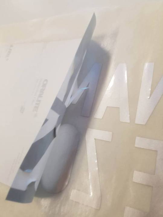
Photo

Finished sign! In the end everything came together and all in all has been pretty successful. Vinyl went on with no hitches at all - despite peeling off the wrong piece and trying to transfer it that way. Other side went down perfectly.
In terms of presentation we are currently looking at a way to mount this in way that reflects how it would look in situation. Simply because of the nature of the metal we ended up using it wouldn’t have been practical to extend the metal to the ground how it would be in a finished product.
As of now we are experimenting with plastic piping just from bunnings to get the pole to stand. This will be attached to the metal with a simple clasp.
0 notes
Photo


To get the very particular look of a street in situation we sourced some commercial grade vinyl. Initially we picked up a highly reflective prism vinyl however this would have proved to be too tough to cut on our vinyl cutter. Instead we opted for a thinner alternative which is still reflective however does not have the same prism effect which we thought wasn’t a huge loss for a purely demonstrative model.
0 notes
Text
Beginning of sign construction!


We used 0.07mm sheet steel for our sign this was then bent around a pole in order to get that nice curve. To get that particular blue we thought about potentially anodising however didn’t have a tub big enough to submerge it -- spray paint was our other option which proved to be just as effective and a lot easier too. To get that nice shine we just added a layer of clear coat
0 notes
Photo


Revised our signs to a final format and started working on just polishing them off as well making full size mock ups.
Logo height is still undecided though however we have currently placed it at eye height..
as marked by the three pins in the wall

0 notes
Text
Week 10
Got feedback on our project and concluded that our sign was far too big. As well the hierarchy with how it fits within the environment in relation to other street signs. To remedy this we have drastically reduced the size of our sign in general as well as the font size and corrected the padding / leading to fix the legibility at a distance.
From here we reflected our design into the end point sign.


0 notes
Photo


After measuring a street sign we translated the measurements into our own work to ensure the readability at the correct height etc.
Also we started to think about our end point sign and how it would correlate with our navigation sign in a cohesive manner while still being able to be differentiated.


0 notes
Text
Exhibition Brainstorm
For our exhibition piece currently, we are thinking -- A full size large format print of a poster. This will have:
User journey - including renders of signs in perspective
Specification sheet
Small blurb / description - What, why, etc.
0 notes
Text
Week 9
Casual presentation in Space D today where we caught up with the lecturers about where we were in regards to finishing our projects as well as polishing off some last few things. The most notable change for us is the alterations to the design of the sign itself whereby there is some confusion around the sides facing the viewer and why, and consequently the shape of the curve.
Justification for all caps --- existing street signs
Experiment more with the justification of type + two line layout and padding.
0 notes
Photo

Looking at existing systems for signs and what they mean. It’s important to note that you may not know specifically what they mean however there is a level of subconsciousness that you recognise in context what they represent.
For our logo we have looked at different ideas as well as testing out which colours work best and why. Although the white may be more aesthetically pleasing the yellow adds a definite level of caution to the viewer while still maintaining a high level of contrast.
Our direction signs are basically complete at this stage so we are beginning to change our focus to the destination signs and where they would be located. Currently we are looking at placing these at the major intersections especially where the safe zone dramatically drops back from Ghuznee Street to Dixon Street.

0 notes
Text
Week 8
Confusion around information being presented both vertically + horizontally.
Keep continuity with Blue Lines Project - import systems into space
Make new systems for B.L.P that can translate both in the suburbs and the CBD
Research existing signs that represent Tsunami (Danger + Hazard zone)
Idea of Tsunami safe zone + hazard zone --- one sign for each to let the viewer know how to get there then let them know they have arrived.
Show direction + distance + safe zone
To finalise
font
signs
size
Look @ guidelines for street signs. NZTA site

A look at where we are currently
0 notes
Photo


Today we met up as a group and we made full size paper prototypes of our signs - from this we were able to test the eye height of our different information as well gain some general insight as to the height of our structure and how it would fit into a given environment.
Following this we made some smaller paper prototypes to test the fluidity of our curves in the sign - what may or may not be possible given the width of the sign etc. These were made by spaying water onto the area we wanted to bend then securing them in that position using bulldog clips and letting dry overnight.

0 notes
Photo

Week 7
Moving away from sketchup for our prototyping and into physical paper prototypes this was hugely beneficial as it gave us a no constraints on our curves etc. Further consideration of spatial type needs to be implemented.

Back to Basics
In studio today we discussed the function of the sign and how it operates within a space. For our project we are torn between making something that is too simple like the existing Civil Defence signs that no one really notices or being too abstract and being mistaken for an art installation.
As tsunami’s are an emergency situation we need our signage to be blunt and straight to the point however it is still very important to generate interest within the public eye to create a memorable moment when passing so that if the time comes people are instantly reminded where the safe zones are.
0 notes
Photo


Moving forward with our designs we have started thinking about how people will interact with the object and how it will fit into a given space. Also beginning consideration of how people in cars will interact with it seeing as they would view it differently based on the angle + speed.
0 notes
Photo

Week 6
Our current thinking for this project is a series of lamp posts that would be arranged to show distance from and to the safe zone. Given that lamp posts are an abundant existing structure we would have no issues colour coding them to convey our idea.
In studio today we had guest lecturers come and watch our presentations which gave us a second opinion and a fresh look at our projects. Nick gave strong emphasis on reminding the class that this is a ‘spatial type’ class and to give more focus on building our projects around this idea and to continue to read the brief.
0 notes
Photo


We looked at the existing blue lines project to move forward with our project and incorporate existing design. Using lamp posts a system would be created using different colour codes for different areas of the safe zone. On these poles would feature the existing logo design for the Blue Lines Project as well as a relevant slogan to create a memorable experience for the public that would pass these poles on a daily basis.
To promote our idea to the public and gain awareness for this we would run an event on the waterfront using our poles. This would be a simple projection that would show the safe zone map on the ground with an animation showing the potential distance of the tsunami

Zones: If you are not in an evacuation zone, you don’t need to evacuate to higher ground. Some areas may be cut off if your normal access goes through a tsunami evacuation zone.
Journey Map: How do we get the public to interact with our installations. Light displays and sound get the attention but touch often is a more personal and engaging sense.
Provocative Questions: “im going to be O.K are you?”
0 notes