
Don't wanna be here? Send us removal request.
Statistics
We looked inside some of the posts by hamishmcphie-blog and here's what we found interesting.
Average Info
Notes Per Post
53
Likes Per Post
31
Reblog Per Post
22
Reply Per Post
0
Time Between Posts
5 days
Number of Posts By Type
Text
7
Photo
10
Last Seen Tumblr Blogs


Fun Fact
The total number of visits Tumblr.com received during January 2021 is 327 million.
Text
Link to completed work:
Youtube link:
https://www.youtube.com/watch?v=dHDBUIoCfYk
6 notes
·
View notes
Text
ADAD Sem 2 - Assessment 3
Name of Project: Conflict in Collaboration (Community and Collaboration/Interference)
Job Roles: Hamish - Research Anna - Screen Recording and Editing Neha - Reference List and Research Kye - Research
Materials Used: Computer screens Screen recording software (Quicktime Player)
Other Artists:
Emile Zile Emile is an performer, filmmaker and artist that specialises in creating art through digital mediums. He dabbles in many forms of digital creation, such as re-using and re-encoding media broadcasts, communication protocols and online platforms etc. Building on a background of live and single-channel video, his work utilises site-specific performance, portraiture and filmmaking to capture the traces of humanity within an accelerating digital culture. His work concentrates on a disturbed humanity within the modern transcendence of digital communication, a concept we wanted to adapt through conflict in communicating.
Work: Desktops (2015) Solo Performance For his exhibition Desktops at Fort Delta, Zile further explores our attraction to communications technology and their ability to translate and encode our lived experience through a series of collections. This work focuses on communication in particular through our screens, an aspect we adopted into our work through documenting a group project on social media.

An Xiao: The Artist Is Kinda Present (2010)
As a response to Marina Abramovic’s The Artist is Present, which was taking place at MoMA at the time, An Xiao developed a performance piece held at the New York Zen Meditation Center called The Artist Is Kinda Present.

Visitors received the following instructions upon arrival: “Sit down with the artist. Find a comfortable position. Be present with the artist in any of the following ways: A text message to a phone number A tweet to @anxiaostudio. The artist will respond. When you have reached a satisfactory connection, or you simply grow bored, you may leave.��
This performance provided us inspiration through the piece simply being communication between individuals. The things that people say through texting provide an interesting glimpse into community and collaboration. All people have different ways of communicating to form connections and conclusions, and we wished to explore that in our assessment as well.
Tom Smith: The New Spirit of Capitalism 2015
https://vimeo.com/147025369
Tom Smith’s “The New Spirit of Capitalism” uses technologies such as sound and the internet to produce artwork and music. This performance piece consisted of Smith shopping online for costumes and fast cars, all while his voice is distorted by auto tune. While he was shopping, he plays drum beats and music samples to make a song. The combination of auto tune, music samples and the visuals of Tom Smith shopping creates an entertaining sensory overload. Our video work utilises similar components such as layering of sound and a recording of a computer screen. As we layer sound bites throughout the video we too create a sensory overload.
Kusum Normoyle
Kusum Normoyle is a creative practitioner who works with her voice and sound. Her works typically involve her screaming into a microphone which is plugged into an amplifier. She works with the feedback that comes from the amplifier and uses it to her advantage which creates distortion within her voice and performance. In this artwork she edits in glitch effects which distorts the background as her voice changes. Similar to Kusum Normoyle our work explores noise and the glitch. We do this by layering sounds on top of each other to create a somewhat overwhelming experience. We also play a certain sound bite when a gif of a person appears on the screen and this acts like a glitch.

Rachel Maclean Rachel Maclean is a multi media artist from Scotland that word in the fields of photography and film, using various characters and artistic creations to explore and pose social commentary on politics, society and identity. Maclean uses herself in her work and plays every role in her films herself. She often constructs narratives that have comedic undertone, or touch.
After seeing her work at the Artspace Public body exhibition, we took inspiration from her work and used it to influence the way in which we approached creating our event. Her use of imagery surrounding social media and the emojis brought us into the sphere of using a social media platform to address our event and underline an element of social/political commentary and its conflict with identity.
https://www.artspace.org.au/program/exhibitions/2018/the-public-body-03/
4 notes
·
View notes
Text
ADAD Sem 2 - Assessment 3
Group: Anna McLennan, Hamish Stewart Mcphie, Kye Barnes, Neha Ponnala
Reference List
Davis, B, “"SOCIAL MEDIA ART” IN THE EXPANDED FIELD.“. in Artnet.com, , 2010, <http://www.artnet.com/magazineus/reviews/davis/art-and-social-media8-4-10.asp> [accessed 22 October 2018].
M. Almusaly, K, Painting our conflicts: A Thematic Analysis Study on The role of artists in peacemaking and conflict resolution. in , Florida, Nova Southeastern University, 2017.
Pizzo, J, “15 Works of Art Inspired by Social Media.”. in Complex, , 2014, <https://www.complex.com/style/2014/10/15-works-of-art-inspired-by-social-media/> [accessed 22 October 2018].
Smith, T, “Tom’s Website.”. in Thomaswilliamsmith.com, , 2018, <http://thomaswilliamsmith.com/> [accessed 22 October 2018].
Spence, A, “Art Is Conflict.”. in Othercinema.com, , 2018, <http://www.othercinema.com/otherzine/art-is-conflict-on-the-cinematic/> [accessed 17 October 2018].
Unknown, “Accord With Air: Tjentiste — Kusum Normoyle”. in , , 2012, <https://kusumnormoyle.net/Accord-With-Air-Tjentiste> [accessed 23 October 2018].
Unknown, “Conflict and Contradiction in Art | Tate | Partner content |Khan Academy”. in , , 2015, <https://www.khanacademy.org/partner-content/tate/conflict-contradiction> [accessed 17 October 2018].
Unknown, “Six contemporary artists making a statement about social media — Acclaim Magazine”. in , , 2017, <https://acclaimmag.com/art/six-contemporary-artists-making-a-statement-about-social-media/#2> [accessed 19 October 2018].
Unknown, The Art of Argumentation. in , 2016, <https://www.dvusd.org/cms/lib011/AZ01901092/Centricity/Domain/4781/ArgumentationPPt.postrevised.3rdq.pdf> [accessed 17 October 2018].
Zile, E, “Emile Zile.”. in Emile Zile, <https://emilezile.com/> [accessed 22 October 2018].
2 notes
·
View notes
Text
Creating the event
To make our event come to life we all had to sit down together and record our drastic and satirical group chat. In it, we are sort of examining Politically Correct culture on the internet through a satirical lens. Alongside this, I though that it would be prudent to make the effect of this satire even more powerful, with the combined addition of glitch sounds and a bit of drastic editing (actually quite challenging when editing a group chat- which is naturally not highly awe-inspiring).
Here are some process shots showing how our video got down from 20 mins to 4 min 30sec, and then back up to 5:04min, and how glitch was incorporated to really make the event more powerful in a different way.

Because the video would otherwise we incredibly long, I had to edit out even tiny gaps where no one was speaking, and layer many layers of sound effects to create the right degree of noise pollution.

I created sounds on garageband, but also gather up some typing sounds. We wanted the video to almost accelerate and become even more bizarre to highlight the conversation happening within. I looped the gifs and sped them up to crazy levels to really make them stand out.
5 notes
·
View notes
Text
Finding inspiration...first steps
When we were initially deciding what event we wanted to do, we decided to start by choosing an interesting week topic and see if this gave us any inspiration. We initially chose the Glitch week, but we moved away from this pretty fast when we came together to brainstorm events.
We then initially chose a event that has kind of political inspiration. This would have had people coming together and writing on butchers paper, a jumble of words to do with politics to show the conflict between them. We would have created a video where people wrote on the paper (in red and blue), slowly coming together, to make a purple jumbled mess.
It was after this idea had already been technically settled, and we had planned the logistics together (when to meet, what materials to bring etc.), that we came up with a new one.
Here are some extracts from our group chat which details the idea that we had earlier overlooked:

We later came back to this idea and started thinking about how exploring the ��group chat’ dynamic as an event could be really interesting- especially if we wound in ideas about politics or other aspects that interest us.
So, this was how our idea became loosely based around the collaboration week topic, but we also wanted to incorporation elements from other weeks (ie. glitch etc.)
5 notes
·
View notes
Text
tumblr
Signal interruption part 2
Hamish and Anna
4 notes
·
View notes
Text
tumblr
Signal interruption part 1
Anna and Hamish
3 notes
·
View notes
Photo


Final Work; Their September Issue
For assessment 2 I wanted to refine the work I put forward for the first assessment, and see how I could continue to explore a similar avenue but present a more refined depiction of my topic. I took much of what I initially discovered from my practiced based research and experimentation and applied that to developing the second work. This time I used the influences of several artists that look a both ‘the body’ and ‘erasure’ within their work as well as the value we place on physical beauty and attributes. These artists included John Baldessari, Joe Cruz, Martin O’Neil and Helena Almeida.
With their work in mind I appropriated aspects and components of each to explore the various avenues of my piece. Rather than using found images like the previous assessment (a technique used by Baldessari and Cruz alike), I went and selected portraits I had photographed (including a self portrait) and honed the focus in on the faces of individuals that depicted the features that are often categorised into traits of masculine or feminine energy. Things such as lips, eyes, jaw structure, facial hair etc. Then continuing with the multi media approach I used the 3 primary colours to break down the barriers and structures of those masculine and feminine attributes, exploring how these facets are more or less constructed ideals of a narrow view on gender. The primary colours act as a visual metaphor for both the construct of gender and simultaneously the multiplicity of gender in its spectral nature, as every colour in existence is made up of that original primary triplet.
I drew a great deal of inspiration from each of the artists I researched and tried to pay tribute and adapt some of their own practiced based techniques. Baldessari explores the depiction of human body parts in his pop art works, which often highlights and brings attention to the fascination that we as humans have with categorising and labelling people based on features and attributes. His use of bold colours that hide faces was something that greatly influenced my choice to use geometric shapes and how I layered them. Cruz similarly used bright and outlandish pops of colour to draw focus in on old photographs to give them new life, much like I have used similar bright pops of colour to draw attention to the aspects of each photograph that has been erased. Much like his work I hoped to depict a complimentary and contrasting presentation. The influence of O’Neil is illustrated through my use of strong geometric imagery along side the multi media approach to collaging the images I photographed. I continued to develop my process further by manipulated the printed images further, by cutting and re-arranging - presenting a dysmorphic view on the traditional depictions of the human face and its many features. This technique of O’Neils, much like Almeida, draws attention to a specific notion due to its variance from the norm, or absence. Almeida also influenced my work in the way she both used herself as a subject but also her approach to erasure, once again, as a means of drawing focus in on something due to its absence. The work has a strong sense of minimal design and blends that contrastingly with the black and white photographs to highlight the contrast between the structured ideas surrounding gender, and how there is always the ability to ‘re-arrange’ and change that structure.
Baldessari, J. and Welling, J. (2009). John Baldessari. Parkett, [online] 86, pp.30-35. Available at: https://www.parkettart.com/downloadable/download/sample/sample_id/529 [Accessed 6 Sep. 2018].
Bray, C. (2014). Joe Cruz. [online] People of Print. Available at: https://www.peopleofprint.com/solo-artist/joe-cruz-3/ [Accessed 13 Sep. 2018].
e-flux. (2016). Gender fluidity and the waning power of men. [online] Available at: https://conversations.e-flux.com/t/gender-fluidity-and-the-waning-power-of-men/3841 [Accessed 10 Sep. 2018].
Le Jeu de Paume. (2016). Helena Almeida. My Work is My Body, My Body is My Work. [online] Available at: http://www.jeudepaume.org/index.php?page=article&idArt=2648 [Accessed 13 Sep. 2018].
The AOI. (2014). The AOI - Martin O’neill. [online] Available at: https://theaoi.com/2014/07/31/martin-oneill-industry-insight/ [Accessed 14 Sep. 2018].
1 note
·
View note
Photo


Experiments with b/w portraits contrasted and complimented by the minimal primary colour designs. I am quite fond of the ‘crying’ image, however I thing the use of geometry compliments the discussion of structure and social boundaries in the context of gender.
1 note
·
View note
Photo


Inspiration/Influence/Research
Above are several works by the various artists that influenced me in the development of this project. They include, Joe Cruz, Martin O’Neil and Helena Almeida. Between them they cover the use of photography, the found image, self portraits, collage, painting and multi media. This incredible array of disciplines also explores notions of value, erasure and body politics. The research of these artists developed my own approach to my work.
1 note
·
View note
Photo


Experimental Process
Developing off my first assessment I wanted to further explore and develop my exploration of gender and binaries. Moving forward with the use of the Baldessari-esque covering of faces and features and playing more with the primary colours. This time trying to continue and develop the nuances of the work. Exploring the affect and body politics of the images and the exploration of their value when considered in reference to gender binaries and traits of masculinity and femininity.
1 note
·
View note
Photo

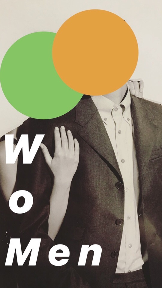
Assessment 1: Poster - Final Work
For this assessment I chose to explore and research the 4th question, “Contemporary art and design often looks at the idea of constructed binaries. Considering the history of these ‘pairs’, how can art and design interrogate these binaries and offers new insights?”
Throughout the development of the assessment I undertook several avenues of research, much of which was practice based and lead. This included viewing the various depictions of men and women as represented through fashion magazines, with a specific focus on the Vogue publication. But cutting out these images and comparing them against one another I began to see how the depiction of binaries became very clear and evident, and its specific focus on the genders of man and women, and also the sexual binaries surrounding their engagement with one another. More often than not, men and women were paired together and would be seen wearing various attires, stereotypically associated with their gender. Even key features are prevalent, such as soft features, poses, hair length, makeup etc. are used to highlight the various binaries. An interesting one, on the sexual binaries front, is the placement of the models in regards to one another; often interacting through sexualised touch, which brings into question the binary of sexuality and what that looks like in a visual sense.
After developing my research further, and specifically looking at the work of John Baldessari, I build on the collage and mixed media I began with and continued in the digital form. Still using mixed media, I used found imagery in the form of black and white photos from various Vogue issues. The photos I selected had to depict both a man and woman, as I was exploring the ways in which we challenge those polarised binaries. From there I began to obscure the components often associated with their gender, mainly the visual queues of their facial features. I also selected a somewhat androgynous image to once again play on the challenging of binaries, since the clothing of each model is similar and nondescript. With the minimal geometric shapes used to cover the models faces, inspired by the work of Baldessari, I chose to use the three primary colours, as they when used in combination can be used to create any combination of colours which allows us to reflect on the spectral nature of many things often placed in binaries in the first place. For a finishing touch I coloured the text ‘wo|man’ (which has been divided into the two sections of the word, playing reference once again to the binaries) in the same colours, in a different combination and used a font specifically designed off of the font used for the title of Vogue magazine. Finally, I played around with the asymmetry of the coloured rectangles in proximity to the photo as means of highlighting the gradual shift, and discomfort that begins to occur when we challenge these regimented binaries.
9 notes
·
View notes
Photo


Refining Practice
Refining the overall aesthetic of my poster, in developing the final version. Using shots that have both men and women in them and using the geometric shapes to obscure those features that most often are linked with more traditional binaries. The use of colour is also very intentional, however I will discuss that in my final statement.
3 notes
·
View notes
Photo

Practice Lead Research The development of deconstructing and challenging binaries as influenced by the later work of John Baldessari. This work uses mixed media; found imagery, photography, collage and graphic illustration to play with the fashion industry’s representation of sexuality and gender and questioning the way it is depicted. Adding in colour as a means of contrast and text, however linking and paying homage to minimal design.
3 notes
·
View notes
Photo

Research - John Baldessari
American conceptual artist, John Baldessari, explores the use of the found image and its appropriation. His later work, which focused on a variety of medias but particularly photography, explored the communicative power or imagery; although he diverges from the traditional forms of conceptual art with his whimsical references to pop art and minimalism.
"I think when I'm doing art, I'm questioning how to do it."
When exploring this notion through the lens of structured binaries we can see how Baldessari challenges a structure of the norm, in is automated assumption. The instant hegemonic distinctions we make, based on various sensory queues; for example the use of the visual indicators to determine an individuals gender or sexuality. With the use of the coloured forms in his work, we can see how, through a contemporary lens, the way in which it challenges binaries and structures of gender and sexuality, by drawing focus to the absence of those visual indicators that we often use to define those categories.
1 note
·
View note
Photo


Practice Based Research Once again playing with the collage and layering of images from fashion magazines. Specifically dealing with the stereotypes and binaries of gender and sexuality when presented in mass consumerist culture of the fashion industry. Although it is not an immediate focus of this poster, the binary and exploration of race is one that is starkly obvious when viewing the repetition of imagery in these contexts. Playing with not only the cutting and layering of the images but specifically their proximity. The centre couple has had the female head replaced with that of another male model, whilst keeping (as I coined it) the “sexy fashion hands” which seems to be a visual trope in these high editorial campaigns.
1 note
·
View note
Photo

Practice Lead Research Cutting out and re glueing faces and body parts from a Prada campaign in a magazine to explore and highlight the binaries of male and female, and how we make assumptions and snap judgements on what we assume or believe should be the ‘norm’. Working with collage initially with this assessment, which is nice due to the tactile format.
3 notes
·
View notes