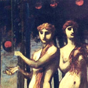
"Dieser Garten sei, so Prometheus, von vier Hesperiden bewacht, die die Töchter des Atlas seien."
Don't wanna be here? Send us removal request.
Statistics
We looked inside some of the posts by hesperidengarten-blog and here's what we found interesting.
Average Info
Notes Per Post
155K
Likes Per Post
75K
Reblog Per Post
80K
Reply Per Post
64
Time Between Posts
7 hours
Number of Posts By Type
Video
3
Photo
11
Text
3
Last Seen Tumblr Blogs


Fun Fact
12.7% of mobile users access Tumblr.
Video
youtube
How (not) to behave in a museum
148 notes
·
View notes
Photo

Hollow frame, Robert Lehman Collection
Medium: Oak lower moldings and feather keys; lime upper moldings.
Robert Lehman Collection, 1975 Metropolitan Museum of Art, New York, NY
http://www.metmuseum.org/art/collection/search/461090
4 notes
·
View notes
Photo


Illustrated Timeline Presents Women’s Fashion Every Year from 1784-1970
As a versatile art form, fashion illustration is intended to showcase the material, colors, and design of clothing. In addition to acting as a study of style, these drawings also inadvertently offer a glimpse into the history of fashion design and social pop culture of the time, as evident in this collection of delicate and detailed illustrations.
Meticulously compiled using a number of historic fashion plates, this timeline showcases the many shifts in styles that occurred in women’s fashion over the course of nearly 200 years. The chronological presentation begins in the year 1784, when frilly, floor-length hoop skirts were all the rage. It then meanders through the next several decades, depicting a gradual tendency toward slimmer silhouettes in the early 1800s, a preference for over-the-top headdresses in the 1830s, and the re-emergence of the fuller ballgown in the 1860s.
By the 20th century, however, a-lines were in again, until loose-fitting, knee-length frocks stole the show in the 1920s. For the next 50 years, styles remained relatively short and slim—until 1970, when pants finally make their much-anticipated, grand debut.
The timeline ends here, perhaps because high-fashion photography proved such sketches to be obsolete. While fashion illustrations may not be as widely created or used today, some contemporary artists continue to keep the craft alive with their dazzling designs and dedication to documenting today’s styles.
42 notes
·
View notes
Text
Academic writing: 1% inspiration 12.51% perseveration 13% omission 30% citation 50% procrastination 90% nonnegotiable deadlines
1K notes
·
View notes
Photo

A preserved human heart in a leaden case, discovered in the medieval crypt of a church in Cork, Ireland and collected by General Pitt Rivers in the 1860s.
18K notes
·
View notes
Photo

Wreath frame via Robert Lehman Collection
Medium: Spruce
Robert Lehman Collection, 1975 Metropolitan Museum of Art, New York, NY
http://www.metmuseum.org/art/collection/search/461704
24 notes
·
View notes
Text
Lady Olenna: Tell Cersei I killed your demon child
Jaime:

20K notes
·
View notes
Photo

The Sea at Fecamp 1881
Claude Monet
227 notes
·
View notes
Text
one thing I don’t think people realize is that in arguments about human rights, it’s not about trying to persuade the other party. it’s not about them at all. they’ve already made up their mind.
it’s about persuading the audience.
if I call out my teacher on being homophobic I’m not trying to change his opinion. I’m trying to convince any closeted kids in the room that they’re not the monsters he’s made them out to be.
if I argue with my aunt about how racist she’s being it’s not because I expect to change her mind. it’s because I’m hoping to god my cousin’s kids hear and learn that maybe skin color doesn’t mean what she says it means.
people will try to hush you and say “they’re not going to change their minds, don’t bother” but it’s not about them. it was never about them.
113K notes
·
View notes
Video
vimeo
A great documentations about the creation of a panel painting with historical recipes.
0 notes
Photo

This is a thing I have never seen when I was in Italy.
Long story short: sometimes you may need to reline a painting. That means that the original canvas is too weak and too damaged to support the whole artwork, so a new canvas needs to be glued on the back of the painting.
I won’t waste time explaining how relining is a risky procedure because it subjects the painting to a lot of humidity, pressure and heat that could damage it. In Italy it is highly recommended NOT to do it, unless it’s strictly necessary, while apparently in England and in the USA conservators do that as often as they change their own socks.
ANYWAY, once they’re done with the relining, English conservators also glue a strip of brown paper (the one you see in the picture) over the painting’s border. This paper has no reason to be glued there. It’s there just for aesthetic reasons. It’s completely useless. Plus if you cover the entire border I cannot analyze the conditions of the original canvas and a bunch of other things.
The thing is that sometimes they glue that goddamn paper OVER THE ORIGINAL PAINTING’S LAYER and then they VARNISH EVERYTHING so that it is IMPOSSIBLE TO REMOVE IT WITHOUT ALSO REMOVING THE ORIGINAL PAINT.
TODAY I WASTED MORE THAN ONE HOUR TRYING TO TAKE THIS USELESS PAPER OFF THE PAINTING BECAUSE THE PAINTING’S BORDERS NEEDED TO BE REINFORCED AND TO DO SO I NEEDED TO TAKE THE PAPER OFF AND THAT HAS BEEN SO FRUSTRATING WHY DO YOU GLUE THIS PAPER OVER THE ORIGINAL WHY DO YOU GLUE PAPER IN THE FIRST PLACE WHY CAN’T YOU RESPECT THE FIRST RULE OF CONSERVATION THAT SAYS “EVERYTHING YOU PUT ON THE ARTWORKS HAS TO BE EASLY REMOVED IF NEEDED”
STOP GLUING USELESS THINGS ON PAINTINGS FOR GODS SAKE
60 notes
·
View notes
Photo

Identifying Craquelure on Paintings
Top Left: Typical 14th and 15 C Italian panel, grain vertical; Cracks on 15th C Italian panels can have two distinct generations or widths, tend to be jagged and have a predominant direction perpendicular to the wood grain.
Top Right: Typical 16th C Flemish panel, grain vertical; Cracks on 16th C Flemish panels tend to be small, orderly, of uniform width, and parallel to the wood grain.
Bottom Left: Typical 17th C Dutch canvas, warp horizontal; Cracks on 17th C Dutch canvas paintings may be straight, jagged, and perpendicular to the warp.
Bottom Right: Typical 18th C French canvas, warp horizontal; Cracks on 18th C French canvas paintings are more random, curved, large, and are usually connected.
None of these statements are always true, but can be used as a general guideline; many characteristics depend on the artist’s individual methods and materials.
Source: directly quoted from Conservation of Easel Paintings, Joyce Hill Stoner and Rebecca Rushfield, 2012.
71 notes
·
View notes
Photo


First look at a hidden Rembrandt.
We’ve known about the young man lurking underneath Rembrandt’s An Old Man in Military Costume since the painting was first X-rayed in 1968. Now science has finally caught up to (some of) our questions, allowing a tentative color reconstruction of the hidden painting.
1K notes
·
View notes
Photo

Our conservators took an X-ray of Francis Bacon’s Painting (1946), currently on view in the exhibition Solider, Spectre, Shaman: The Figure and the Second World War. Find out what they discovered.
[X-ray image of Francis Bacon’s Painting. Photo: The Museum of Modern Art, Department of Conservation]
772 notes
·
View notes
Video
youtube
Yves Klein: How texture affects our perception of color in Blue Monochrome | AT THE MUSEUM
Restoring Yves Klein’s “Blue Monochrome” (1961) is about more than finding a match for the artist’s particular brand of blue, dubbed International Klein Blue. MoMA paintings conservator Ellen Davis corrects surface texture alterations from previous conservation efforts with surgical precision so that the color is perceived as the artist intended.
454 notes
·
View notes
Photo

Our conservators used digital restoration to see how Francis Bacon’s Painting once looked before light-sensitive pigments in the composition began to degrade.
[Francis Bacon. Painting. 1946. Oil and pastel on linen, 6′ 5 7/8″ x 52″ (197.8 x 132.1 cm). Purchase. © 2015 Estate of Francis Bacon/Artists Rights Society (ARS), New York/DACS, London. From left: a photograph of the painting from May 2015; Digital restoration of Painting (1946), 2015. Photoshop was used to digitally manipulate the background colors, suggesting how the painting may have looked prior to fading]
353 notes
·
View notes
Photo


Restoration reveals hidden whale in 17th-century Dutch painting
168 notes
·
View notes