
Don't wanna be here? Send us removal request.
Statistics
We looked inside some of the posts by hncproject and here's what we found interesting.
Average Info
Notes Per Post
2
Likes Per Post
1
Reblog Per Post
1
Reply Per Post
0
Time Between Posts
4 days
Number of Posts By Type
Text
17
Last Seen Tumblr Blogs


Fun Fact
BuzzFeed published a report claiming that Tumblr was utilized as a distribution channel for Russian agents to influence American voting habits during the 2016 presidential election in Feb 2018.
Text
✦ DRILLS
I conducted several drills in InDesign and Illustrator in order to improve my skills and recall controls.


Both of the drawings at the bottom are what I made using the steps above. I also tried making my own variation, hence the design on the right. I prefer "twilight" colours over "clear sky" ones.

0 notes
Text
Feedback

My last and most important piece of feedback. I reviewed it and made changes to my project, such as showing more of my thought process and technical process, as the feedback said.
0 notes
Text
ᚐ҉ᚐ✦⸻ Different eras and sides of me
------------------------------------------------------------------------------
✦⸻ People are exceptionally complex. This brief is more challenging than it appears, since picking one aspect of myself to base my brand on is like looking for a needle in a haystack.
I'll start by considering the youngest version of me I can remember. When I was younger, I loved spending time alone and playing with dolls. Although I made entire stories, I would never voice them, almost as if I was mute. I was extremely quiet and avoidant of interaction. I think a brand like that would take a Horror Coquette appearance. Coquette and lolita fashion are similar, and appeals to any girl that likes cute and stylish appearances. I suggest the horror aspect since, a kid playing alone with dolls, shielding herself under desks is a little creepy. Almost taking the appearance of an adorable haunted doll herself.


A brand I could research if I were to take this approach is Plushie Dreadfuls. Although this brand makes stuffed toys, they are not intended for children. Their plushies often tackle dark subjects and mental struggles, or any other topic children wouldn't understand. If I research this brand I would just focus how they combine creepy and cute, rather than the dark topics. This would allow my brand to marketed to every age group.


Another notable era of myself, is who I was around 2016-2018. I was rougher and more tomboyish. I liked all the trendy stuff during that time, but everything from 2016 is really just out of date now. The fashion trends are expired, and the personalities are deemed "cringe" by the internet. In more simple words, awkward and embarrassing. This era is worth avoiding. There is no nostalgia during that era either, besides for the people that always went on vacations or beaches or partying. But I wasn't one of those people. I don't wish to base my brand on this side of me.


Although 2016 doesn't have anything I could make a brand out of, it introduced me to my first alternative aesthetic: Grunge. I felt like being interested in that aesthetic is rebellious and cool, so I wandered deeper into alternative aesthetics, and even started liking things I was told to avoid, such as Metal, Goth and Emo music and fashion.
✧✧✧✧✧✧✧✧✧✧✧✧✧✧✧✧✧✧✧✧✧✧✧✧✧✧✧✧✧✧✧✧✧✧✧✧✧✧


Goth is a style that's very culturally significant. I think the goth fashion is beautiful, interesting and sophisticated. Even the architecture is stunning. There is one downside, however. The music is a little boring to me. The dreadful personality is also not something I enjoy. I like the dark themes it harbours, but the negativity and monotony is not something I could live with for all of my life.


Emo is also a very negative style, however it's a genre that encourages yelling your troubles out, expressing them and judging those who make you feel bad. It's more active, jumpy, funny and silly than goth is, and it's something I resonate with deeper.


Metal is similar to emo, in the sense that it addresses issues, it just does so with more anger and vigour.
I enjoy all of these things, and resonate with them on different levels. Since they're things that influence me in the present, I think I should base my brand on these themes. I don't have the best memory, so thinking about who I used to be is hard, and I'd have to grasp at straws trying to make a brand out of my history.
Since I mentioned Goth, Emo and Metal are things that influence me, I think I should make an open ended brand, that has qualities from all of these styles.
------------------------------------------------------------------------------
0 notes
Text
ᚐ✦⸻ MORE SKETCHES

------------------------------------------------------------------------------
✦⸻ I had a few ideas. Let's go through them slowly:
✧ I added the sketch of myself from the previous post and added some earrings to her. She looks erratic and crazy because I'm a little like that too.
✧ This page includes my first owl design. I thought I could draw an owl facing one side but I ended up not liking it. I thought I should draw a front facing bird if I try it again
✧ I tried a swan and pomegranate design. I thought This design was nice and unique, and linked back to my divine feminine beauty/iele idea. However, does it really represent me? the swan and the pomegranate are symbols of the goddess Aphrodite, but that doesn't really resonate with me at all. I made another design with a pomegranate seed inside an eye and a swan made out of zebra stripes before realising I've got to try something else.
✧ The zebra was interesting to think about, But i felt the shapes are too complicated to make a good logo
✧ I drew a few ribbons since they're cute. I'm pretty cute too and that represented me more than swans or pomegranates, but I knew I could challenge myself to make something more complex
------------------------------------------------------------------------------
✦⸻ I wanted to make another portrait, this time inspired more by caricature exaggeration
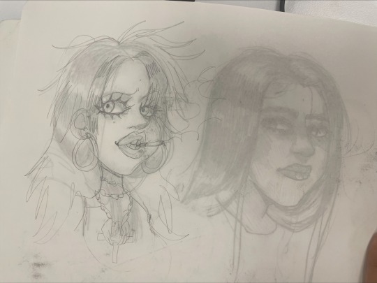
✦ I traced the back of the page to created my "hidden self". Don't take it at face value however, dying my hair, smoking and wearing big hoop earrings aren't activities I wish I could do. Rather, they represent my rebellion and accepting side of adventure.
------------------------------------------------------------------------------
✦ From this post I got some ideas: try more owl designs and explore more sides of me
0 notes
Text
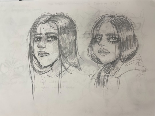
ᚐ҉ᚐ✦⸻ SKETCHES
------------------------------------------------------------------------------
✦⸻ Below are some of the sketches I made to get me inspired. I thought that, since this is a brand about myself, I could make my logo be my face. I simplified the shape of my face again and again to make it more cartoonish and easy to understand smaller details and shapes
✦ When simplifying the initial sketch, I had the Emily, the corpse bride, in mind. I thought aiming to make a design that will loosely resemble her would aid in my goth presentation

------------------------------------------------------------------------------
Before settling on this design I thought I should try to come up with more ideas
0 notes
Text
ᚐ҉ᚐ✦⸻ Research on Contemporary practices
✦⸻ For this brief, I should demonstrate my ability to create brand style guides, letterheads, business cards, and anything related to branding. Together, they are called contemporary practices. I will research them, so I can be knowledgable in these practices before it's my turn to produce the respective pieces of work.
✦⸻ Brand style guides


------------------------------------------------------------------------------
✦ A style guide is a rulebook for everything you create. This means it includes instructions for typography, colours, logo variations or placements, and rules for any piece of work that will be made by the brand. This means it may include photography or packaging rules if the brand requires it. It displays all the design elements that should be known.
✧ When including typography in a brand style guide, the typeface should be displayed clearly, along with the dimensions of the text. Typography is split into sections: headings, subheadings, body texts and footnotes. The headings should have the biggest dimensions, while subheadings should be a little smaller. Body text should be smaller than subheadings. For reference, most body texts measures between 16px to 20px. The measurement depends on where the text is displayed. For example, print text is usually smaller, measuring 10-12px, while body text on websites can be somewhere in the previously stated range.
✧ Colour codes should also be shared, in order to keep the brands colours consistent. Hex codes, CMYK and RGB are usually stated.
✧✧✧✧✧✧✧✧✧✧✧✧✧✧✧✧✧✧✧✧✧✧✧✧✧✧✧✧✧✧✧✧✧✧✧✧✧✧✧
✦⸻ Business cards


------------------------------------------------------------------------------
✦ Business cards are small memos containing names, companies and occupation. They advertise and market oneself by putting the contact details right in the hand of a client. Your name, company and occupation are the highlights of a business card
✧ Business cards usually measure around 85mmx55mm. Since they're so small, the text may varybetween 8 to 11pt
✧ Business cards should follow your brand guideline
✧ compared to other kinds of advertisement, business cards may be the cheapest form of advertisement. They're convenient both for a client and the brand
✧✧✧✧✧✧✧✧✧✧✧✧✧✧✧✧✧✧✧✧✧✧✧✧✧✧✧✧✧✧✧✧✧✧✧✧✧✧✧
✦⸻ Letterheads


------------------------------------------------------------------------------
✦ A letterhead is an A4 sheet of paper including the company's name and contact details. Companies may share letterheads to give information you may need to know, such as appointments or information of your purchase
✧ Paper letters are decreasing in demand as more people opt for digital copies instead. I'd hope my brand will use digital letters since they're more environmentally friendly by reducing paperwaste
✧✧✧✧✧✧✧✧✧✧✧✧✧✧✧✧✧✧✧✧✧✧✧✧✧✧✧✧✧✧✧✧✧✧✧✧✧✧✧
✦⸻ Newsletters


------------------------------------------------------------------------------
✦ Unlike letterheads, newsletters are more like a single page out of a newspaper. It includes news such as breakthroughs and sales for a brand
✧ When making my own newsletter I should take inspiration from newspapers and other professional letterheads
✧ As I mentioned, they're useful for sharing news. They look beautiful even in digital or paper format.
------------------------------------------------------------------------------
0 notes
Text
ᚐ҉ᚐ✦⸻ Feedback


------------------------------------------------------------------------------
✦⸻ This is some of the feedback I got during my project. I responded to it by doing everything I could
✧ I started explaining my decisions on my brand colours, as the feedback asked
✧ I rewrote a few paragraphs to sound more professional.
✧ I've been more attentive to capitalise all my " i's " and use better punctuation. I proofread my posts and corrected several writing mistakes and grammar mishaps.
✧ I went back to my research and explained why I picked certain artists and why they inspire me
✦ MOST IMPORTANTLY, I related everything back to my brief, project and brand. That was a big thing I was missing and this feedback made me realise that
------------------------------------------------------------------------------
0 notes
Text
ᚐ҉ᚐ✦⸻ First Animation - Including Owl
------------------------------------------------------------------------------

✦⸻ I knew I wanted to make an animation with my logo, So i came up with 2 storyboards. A version where only the title of my brand is present, and another, where Selfie pops up to greet the viewer.
✦ Due to tumblr restrictions, I can only add one video per post. I will attach a link with the resources I used
✧ I started by making a new 1980x1080 composition. I changed the background to black and added a new layer with the title of my brand in the middle, in the colour white
✧ I added a waving effect to the text. It starts off slow, and then gets more erratic, then slows down again. This is supposed to represent the timeline of getting flustered: it might start slow, but once it sets in, it's hard to control
✧ Once the text was edited, I overlayed this marbling video on it and animated the marbling effect, sliding it over the text. Although the marbling video is rippling too, making it move added just a little bit more movement and a point of interest for the viewer
✧ When Selfie shows up the text begins to slow down. It's as if she calmed the title and viewer. However, I made a second version where selfie never showed up. It represents that you don't always need someone to comfort you, or that sometimes people can be inaccessible. You have to help yourself sometimes
------------------------------------------------------------------------------
✦ The animations turned out exactly how I wanted. I know I will use these animations for future promotional art and for the face of my brand.
------------------------------------------------------------------------------
0 notes
Text
ᚐ҉ᚐ✦⸻ Brand Style Guide

-----------------------------------------------------------------------------
✦⸻ I started my brand guidelines by making a few art boards, giving them a black background and putting a few things I already designed onto the pages. The style guide progress was very slow, since I wasn't sure what to add. I noticed the mascot I made did not stand out on a dark background, so to enhance its silhouette I changed the background colour to white.


✧ I had the idea to name the colours, add a few notes on how to use colours, a few notes on how to use fonts, and a few logo variations just to make the pages seem a little more filled. Giving the colour names gives the brand just a little more personality, allowing you to understand it's perspective and values. I chose these names based on the aesthetic I wanted to communicate. "Bat wings", "sleepless eyes", "pretty bruise", "lips" and "angel wings" are meant to convey a melancholic feeling.

✧ Similarly to how Duolingo's owl is named Duo, I thought I should name my owl. Naming my mascot would add a little bit more personality to it an, in turn, make people find it cute and endearing. In order to name it I thought of slang words popular during the 2000's. Nostalgia attracts people. I named my owl "Selfie" since it was such a popular, cool and new word in Y2K. Selfie is an easy word to say with a memorable history, and is pretty cute for a name.

✦ For the fonts, I chose the usual Old English MT for headings and subheadings. I thought it'd be too unreadable as body text however. I didn't know what to change it though! I tried to get inspired by other pictures such as this.


✧ I noticed the Blackletter fonts, the family Old English MT is part of, are often paired with thin, clear texts. I tried Avenir, like in the picture above, but it just didn't feel right paired with a word like "flustered". I tried Luminari, but that wasn't easy to read. Although Luminari was a strong contender for the fantasy feel, it would be hard to focus on as a body text. I tried Arial but that was too basic! I wanted a thinner font than that.

✧ After these attempts I tried Courier New. Courier is used for technical documentation... I thought it's a good idea to use this font for my brand since the only people familiar with technical documentations would be nerds. I mentioned Flustered is a brand that welcomes anyone, and nerds are no exception. I would give them something familiar to look at. I also mentioned several times Flustered uses familiarity to market to it's audience and this is no different. I am appealing to this group of people by showing them something they see most days.
-----------------------------------------------------------------------------
✦ I added my final touched and my style guide was done. There's just one issue when displaying it on tumblr... the footnotes and some of my notes are very small. almost unreadable. Clicking on each page might make it easier to read.


-----------------------------------------------------------------------------
✦ Although the Style guide has everything it needs to have, it feels a little empty. It communicates what it needs to communicate but the last page is really lacking. Maybe a adding the pink marbling effect on it like on the other pages would've pulled the look together.
✧ After proof reading, I noticed a mistake too. I forgot to name the green colour! It's something I can't fix either, but I can try to rename it while I'm writing now. I thought of "Matcha" at first but that did not suit the aesthetic at all. "Absinthe" would be another contestant, since absinthe alcohol is associated with the goth subculture. However, Absinthe has a strong green colour, whereas my brand's green is much more muted. As a final decision, I think "Mould" is a better fit. It's rancid enough to fit the aesthetic, while also pale enough to resemble real mould.

-----------------------------------------------------------------------------
0 notes
Text
ᚐ҉ᚐ✦⸻ Business Cards


------------------------------------------------------------------------------✦⸻ Business cards are small memos containing your name, occupation and contact details. They're left behind to advertise and market yourself by putting your contact details right into the hand of your client.


✦ The cards measure 85x55mm, the standard size for a business card. The designing of business cards had a slow progression, since I was focused on something else: making posters and the brand guidelines.
✧ Initially, I started with 1 design. But since I love exploring possibilities, I made 3 more designs. I wanted to try more colours and placement, similarly to how I experimented with my brand's title and marbling inks.
1✦ My initial attempt is a little dull due to the dusty colours. I really wanted a black background, but that forced me to change the outline of the owl from black to mauve. I only used this attempt to learn what to do and not to do for next project. I discovered a few things
✧ Adding more text just wasn't going to work. An email address or a website was not as readable as the usernames.
✧ I won't change the black outline of the owl. It seems it's what brings the most contrast.
✧✧✧✧✧✧✧✧✧✧✧✧✧✧✧✧✧✧✧✧✧✧✧✧✧✧✧✧✧✧✧✧✧✧✧✧✧✧


2✦ My favourite. Its pink, its bright, it's sleek and perfect. It really feels like a fashion brand, and I have no complaints. The only thing I could comment on is my choice of words. You might notice "fashion for dreamy owls" under my title. All the other business cards have "fashion for night owls" . I changed night to dream because this card isn't very dark - it doesn't feel like night. I alluded to daydreamers since that's what I am too; I love fantasy and love to daydream.
✧✧✧✧✧✧✧✧✧✧✧✧✧✧✧✧✧✧✧✧✧✧✧✧✧✧✧✧✧✧✧✧✧✧✧✧✧✧


3✦ I thought I could reuse the technique i used for the last business card - the marbling on the side. I also wanted to see what my title would look like with a white outline, as if its stitchwork into the card. It looks nice but almost blends into the background. The back of the card feels a little empty, so for my last attempt I will try something else.
✧✧✧✧✧✧✧✧✧✧✧✧✧✧✧✧✧✧✧✧✧✧✧✧✧✧✧✧✧✧✧✧✧✧✧✧✧✧


4✦ I only like the front of this card. The chromatic look of the title is very beautiful, and the way Selfie seems to peek over a desk at me is just adorable. The back of this card isn't anything special. I do prefer the layout, but I should've chosen a different background, or make an illustration specifically for this card, rather than re-using one of the posters I already made
------------------------------------------------------------------------------
✦ If I were to choose a business card, I would choose the front of card 4 and the back of card 2. I think that would look nice
✦ My business card is effective since it has my name, my occupation and some contact details. I really wish I could've added an e-mail address too, I think that would've really pulled the look together.
✦ Also, somehow, I only discovered I should put my name on them just before I was ready to export these cards. I'm not sure how I made that mistake, but it did not slide past me
✦ I wanted to print them and discover how they look like as a physical copy, but I just did not get the time. So I edited some pictures instead.


✧ After seeing these edited pictures, I actually prefer card number 2, both face and back. I also find it interesting that the S looks like it has a strikethrough. Yes, I've seen that before but now it looks like the center of attention. It seems purposeful, even though that's just how the font is.
------------------------------------------------------------------------------
0 notes
Text
ᚐ҉ᚐ✦⸻ Letterhead

------------------------------------------------------------------------------
✦⸻ I tried keeping my letterhead professional and clean, so the writing space would be clear and concise. But I wasn't going to give up on the grunge! I added texture to my owl, the bottom left corner of the page, and behind the writing space. I made this letterhead in Photoshop, since it was easier to work with than AI, and had much more brush options. The brushes is what allowed me to add texture.
✦ I made a second version, with my logo, address and contact details. However, the address is blocked out for privacy reasons.
------------------------------------------------------------------------------

0 notes
Text
ᚐ҉ᚐ✦`,'INNER DIMENSION'.`✦ᚐ҉ᚐ
✦⸻ Introduction ⸻✦
Hello.
Welcome to my page, where I will tell you all about the project I'm working on.
"ID", as in "Identity" or "Inner Dimension" is a branding project which will showcase exactly what it says... me. My task is to create a brand identity that reflects me. But what does "me" consist of? Personal values, visual identity and personality are some of the things that make up a person, and some of the things I will need to communicate through my brand. This project will challenge my visual communication, planning and graphic skills.
In this project I will conduct artist/brand research, develop experiments with various materials such as ink and acrylics, experiment with new software, create logo drafts and a final logo, design a brand style guide, along with business card, letterhead and, at last, reflect and conclude.
My brand "Flustered" is an alternative fashion brand. It is named flustered due to my tendency to become agitated and panicked, but also due to my passion for expressing and analysing emotions. Being flustered is a natural emotion that's hard to suppress due to the impulsivity it comes with. Many would prefer not to express being flustered though, due to shame and fear of embarrassing oneself. That's the thing with my brand, the name is supposed to normalise being flustered. Alt people are often thought to be too serious and sensitive. Making a lighthearted brand might diminish that reputation, especially if it's a jab at their personality. It's a beacon in the light in the dark.
I am unlabelled, due to how many subcultures I find myself being a part of. Flustered might be the same. It's a brand that takes elements from several cultures, but mainly making it's target audience goths and emos. Being unlabelled is very liberating, and I wish more people didn't constrict themselves to those kids of things. Labels only create segregation. I understand how labels also creates unity by finding people with the same interests, but think broader. Here at Flustered anyone is welcome.

Flustered's mascot is an owl, a mysterious creature of the night. I'm pretty mysterious due to my habit of keeping to myself. Although I love being secretive, this project is forcing me to go against that. I don't appreciate that very much. It's making me feel a little.... Flustered! I was inspired to choose an owl after doing brand research and discovering not many brands use owls as their logos. Flustered's mascot is memorable thanks to its "broken heart" shape and big, beady eyes. In myths and legends, owls are also considered mystic or bad omens. This resonates with goth culture, targeting exactly the audience I intended. I secretly alluded to devil horns in my design too, to reinforce that "wretched evilness" (sarcasm). The pokey black silhouette is what represents the horns and the evil, but the cute eyes distract from that.
✦⸻ Tumblr Structure
a title marked with " ᚐ҉ᚐ✦⸻ " is of high importance
a title marked with " ᚐ✦⸻ " relates back to the post above it
" ✦⸻ " Marks a subheading or the first paragraph of a post
" ✦ " Marks the start of a paragraph AND topic.
" ✧ " Also marks the start of a new paragraph, but on the same topic as a solid star
A divider that looks like " -------- " marks the end of a topic
A divider that looks like " ✧✧✧✧ " marks the end of a section, on the same topic as the section above it
✦ I set these rules to help with presentation, clarity and cohesiveness. It's very much like me to set these kinds of rules: I'm very attentive, love organising and love presentation.
------------------------------------------------------------------------------
✦⸻ Software I'll be using
✦ Adobe Illustrator ✦ Adobe XD ✦ AfterEffects ✦
✦ InDesign ✦ Photoshop ✦ Media Encoder ✦
✦ OpenBrush ✦ FireAlpaca ✦ ✦
✧ Adobe Illustrator is what I will use the most. I will create a brand style guide, business card, letterheads, posters and logo with Illustrator. I have lots of experience with it, and this project will only improve my illustrative skills.
✧I don't use Photoshop as often, but It is still useful and I still have lots of experience with it. I will use it to edit photographs, refine and retouch traditional drawings and create mood boards and mind maps.
✧XD is software used for web design. I have not used adobe XD before. When it comes to branding, designing a store frontpage doesn't sound too bad.
✧ OpenBrush is an app I will be using to draw in VR. OpenBrush is another software I haven't used before, and will be a learning experience. I want to draw in VR to expand my skillset.
✧FireAlpaca is a raster drawing program I use at home. I plan to use it to draw posters. I can then refine them in Illustrator or Photoshop, if need be.
✧AfterEffects is my favourite program to use for animations. I will make moving images using AfterEffects, and using MediaEncoder to render the animations out.
✧InDesign is a software used for page layouts like magazines and newspaper. I will use it to create brochures and promotion work
------------------------------------------------------------------------------
✦⸻ Contents
I ordered and arranged the post in this table. please skim over this section and reference back to it when needed.
1 ✦ Brand Style Guide
2 ✦ Business Cards
3 ✦ Letterhead
4 ✦ Poster - £$%^ , Poster - JS
5 ✦ Animation, Animation - with owl
6 ✦ Brief Response
7 ✦ 2nd Project - Innovate UK
8, 9, 10, 11, 12 ✦ Research: Initial, Paul Rand, Arcane - Victor Maury, Various artists, Fashion and Nature
13✦ What represents me?
14 ✦ Marbling, Lucy McGrath
15, 16, 17 ✦ Myths and Legends, VR+Response, Masks
18 ✦ In&Out Painting
19 ✦ XD
20 ✦ Moodboard
21, 22, 23 ✦ Draft Designs, Initial designs+Refinement, Marbling Revisited
24 ✦Pivotal Point
------------------------------------------------------- read this section last
✦⸻ Final Conclusions ✦
✦ I effectively communicated values and personality traits in my brand through the choice of shape and colours. There's dull and bright colours, sharp and soft corners. This represents the duality and complexity of a person, something I wholeheartedly believe in.
✧ The colours I used are black, mauve, red-violet, green... They're popular colours in emo and goth fashion, easily appealing to the target audience. As proof, here are some of the results when looking up emo or gothic colour palettes.


✧ Although I communicated through use of colours and shapes in my logo, I could've also communicated through the types of posters I made. I didn't venture too much when making posters, and only conveyed melancholy. Yes, it's very gothic to be sad, but I could've used shock elements, perspective and even more colours to convey some of my other views, such as love for rebellion and rejection of reality. This wasn't possible due to time constraints. I spent a lot of time being uninspired, rendering my project into a standstill.
✧ I resolved the standstill by discussing with my tutors, reviewing my research and doing self reflection. So even if I did not use my time to the fullest, it's not the worst outcome. I don't consider it wasting time, I considered it "charging up" and preparing myself for something greater.
✦ I used subconscious marketing effectively, learning from other brands such as Starbucks and Maserati. Starbucks made use of a mermaid logo while being situated in a port city. That's using the familiarity of the locals to it's advantage, until it eventually became a very big brand.
✧ Flustered uses owls to grow and reach it's target audience. Owls are big symbols in witchcraft, paganism and gothic culture. The people familiar with gothic culture would see my brand, find it familiar, and hold it close to their heart, enough to make my brand become loved and popular.
✧ Owls are symbols of wisdom and spiritual guidance too. This is the technique used by Maserati. Let me explain: It's logo is a trident, Poseidon's symbol. People subconsciously strive to be as strong and charming as Poseidon. This applies to Flustered similarly. You'll want to be associated with an owl logo, as owls are wise and symbols of spiritual guidance. Believing you will be spiritually guided by Selfie would make people keen to wear Flustered products.
✦ I was successful in using traditional mediums. I used paint, papier-mâché, pencils, pastels, markers, clay, inks.... the ink art even made it into my final brand, which feels very fulfilling. However, I wasn't as successful when using digital means. I used XD, and never revisited it again. I proposed using InDesign, and I never even opened it. I used OpenBrush only once. I stuck to familiarity, AI and AE. It's a little ironic, since my project uses familiarity to it's advantage, but making a successful design in InDesign or XD would've been beneficial to my project. Although I did not use the mentioned projects enough, I improved my traditional painting skills, and my AI/AE skills.
✦ I have done initial research, but there's several other artists and sources of inspiration used throughout my project. It's something i do very consistently, as I always try to think what makes other brands successful. This broad amount of knowledge and consideration displays my intricate thought process effectively.
✦ My project is unique. I was the only one to mention Myers–Briggs Type Indicator, Yameii, Kris Dreemurr... I'm sure certain views like disliking Myths and Legends isn't something very popular either. Uniqueness comes from authenticity and being true to yourself. I'm not afraid to be myself with myself, but I do worry about being true with others. If they think I'm weird, they're underserving of fully knowing me. Therefore, I was brave to share my unconventional interests. This project is very much me and about me, which checks a requirement.
✦ Some things didn't make it into the final write-up of the posts, such as "which philosophies describe me". One of the reasons is that I wouldn't know how to include it into my design, into the advertising, and this post would be reduced to just sharing things about me, with no relation or link to the final product. One of the philosophies however, is determinism. Determinism is a philosophy that believes everything is pre-determined. No matter what course of action you take, the outcome will be the same.
✦ I had checklists I always tried to refer back to. It kept me in line and kept me prepared for each new task.
✧ Reviewing the checklist, I forgot to mention the acting exercise my class had. It was meant to improve presentation skills and confidence. It did improve mine. I recited my script confidently with enough emotion, trying not to think about how I'll get judged. This made my performance stand out among everyone else. The acting exercise made me realise I should believe more in myself and the work I put out. I am most passionate, inwardly. I don't show it, but I love to work. I love to share my work.
✦ One thing I wish I could've done more of is animations. Last year, I got to make many animations, but this project lacked that. The animations I did make also lack sounds, a feature I thought would be vital to my brand. I should've thought of making more, and that certainly would've made me feel more determined and inspired.
✦ I loved this project, I loved researching and I loved creating work. I created a detailed brand with detailed views. I was not confident throughout, but I am confident now, at the end, looking back at everything I created. I tried to be consistent with reflection and conclusions throughout the project which is a major requirement for a good grade. I achieved everything I wanted to.
------------------------------------------------------------------------------
0 notes
Text
ᚐ҉ᚐ✦⸻ Brand Poster

------------------------------------------------------------------------------
✦⸻ I made one more drawing, using my model JS. I dressed him in alt clothes and used layering techniques I learned while making my moodboards to achieve that grimey grungy feeling.
✦ The purpose of this poster was seeing how versatile the logo is. Will it change colours based on content? I think that's the best thing to do. I changed it from mauve to red, because it looked out of place otherwise. I also incorporated it in the background because I thought it'd look nice. When looked at from afar, I shouldn't have done this. It's just a little too pale, seeming unimportant


✦ I tried a few title placements. I think the best one is the 1st, simply because it's in an unconventional place. It's awkward, like it didn't know where to put itself. Like it ran away, Flustered, perhaps? Yes, the whole placement of the title is a pun.
✦ I should mention: I really don't want lifelike models. When it comes to photography, the models human features would be stripped, only displaying the clothes. like this

✧ This may seem discrediting to models, but it's not. It's offering modelling jobs. It's promoting graphic artists. It's promoting mixed media. It's all sorts of good.
✧The reason I don't want lifelike models and would prefer having fictional characters is simple. It's a personal preference, while also a marketing strategy. I always prefer fantasy over real life, and singers like Yameii Online and Gorillaz use digital mascots over real life people. Yes, there's life behind it, but what's put forward is digitally altered. People find it easier to connect to characters over other people for some reason. Online shopping would feel more fun with digital models too. I never connect with the human models. Human models are just some people... They have no history and no meaning to me.


------------------------------------------------------------------------------
0 notes
Text
ᚐ҉ᚐ✦⸻ Posters and advertising

------------------------------------------------------------------------------
✦⸻ I mentioned last post I should try making my brand a clothing brand. I made this poster to visualise what my brand would sell, using the already existing characters I mentioned as models. Can you deduce their personalities just by their clothes?

✦ From left to right
1 ✧ SS: Serious, Choleric, Fashionable
2 ✧ ST: Vampiric, Goth, Melancholic
3 ✧ YB: Friendly, Outgoing, Confident
4 ✧ JS: Blunt, Sardonic, Indifferent
✦ Although they're just models, saying their names might help the audience connect with them. I've only listed their initials, since I'd prefer keeping their full names secret. We are mysterious! like owls.
✧ They're all distinct from each other because they represent various parts of me and parts of the subcultures. They shouldn't all look the same, dress the same or behave the same, because that would be generalisation of the alt culture. This variety is in place to prevent generalisation and humanise the people that take part in this aesthetic. Alt people are sometimes demonised or not taken seriously. That's not right, and should change.
------------------------------------------------------------------------------
✦ I changed the background from red to yellow, since the previous background seemed cluttered. I kept the backdrop a bright, eye-straining colour to symbolise my unbearable passion for the characters I make.

------------------------------------------------------------------------------
✦ Changing the purpose of my brand was the best decision I could've made. Making this poster will also help me decide the final look of the brand style guide. I can already see the colour palette expanding: I added brighter pink and muted grey to my colour selection following this drawing.
------------------------------------------------------------------------------✦ I did a style study of my characters on paper. I wanted to recreate the Arcane art style. The most successful drawing is the first model, SS. The art style is definitely hard to recreate, it takes a lot of time to layer the shadows. I will keep referencing Blackvelox instead, as well as my own art.

0 notes
Text
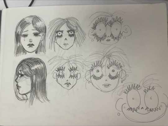
ᚐ҉ᚐ✦⸻Back to Owl Girl

------------------------------------------------------------------------------
✦⸻ I told myself I would revisit her once I make progress on my brand identity. I finished her in a sketchy style inspired by Tonocha's art (example showed below).


✧ I was also inspired to turn animals into humans by Rinotuna's art. Rinotuna is a character artist, and I mostly know them for their personalisation of animals and objects. I studied their art before so I could see what feature they focus on and bring forward.


------------------------------------------------------------------------------
ᚐ҉ᚐ✦ I'm faced with one issue
⸻✦ I adore designing characters. But I really don't know how I would advertise a brand that makes characters. I haven't even heard of such a brand before. Maybe animating studios would fit the description, but even studios focus on more than just character art. Designing characters takes a whole lot of effort and time, and by now I'm running out of enough time, so that's also an issue.
✦ I thought I should re-use characters I've made for a previous project, and expand on them on this project. That would mean changing my brands purpose.
✦ Changing my brands purpose was no issue, though
✦ If I don't want to do character design, I could do clothes design. It still falls under the design category, now I just get to use the faces of already existing characters. The characters are still mine, so I will know what outfits fit them best.
------------------------------------------------------------------------------
2 notes
·
View notes
Text
✦⸻ I edited the marbling print in Adobe AfterEffects, putting a waving pattern on it. I plan to use this for future animations.
✦ The wave pattern is there to represent the moving water I used to create this marbling print, and my brands versatility.
0 notes