
Statistics
We looked inside some of the posts by i-told-u-sooo and here's what we found interesting.
Average Info
Notes Per Post
129K
Likes Per Post
82K
Reblog Per Post
47K
Reply Per Post
158
Time Between Posts
4 days
Number of Posts By Type
Text
17
Last Seen Tumblr Blogs


Fun Fact
Mobile US users spent an average of 115.8 minutes on Tumblr app monthly.
Text


i want that cookie so effing bad… (she’s straight)
15 notes
·
View notes
Text
new crush alert
i’ve dreamt about her three nights this week actually get me out of here
7 notes
·
View notes
Text

h-hey tumblr…. this is my debut and contribution to the Yellowjacket’s fandom. hi fellow lesbians!!!!
got this sick idea of jackieshauna as Who really cares album cover sooo this didn’t turn out as planned and I’m making like 3 more version of this. hope y’all enjoy
also fun fact! the woman in the original cover and book was pregnant in the photo so yeah that’s why Shauna’s the pink one. thankyou
85 notes
·
View notes
Text
sitting in the exact same spot where i felt closest to her but now she isn’t there and there is a massive void to fill :(
#i miss bro#but i cant tell her#because she knows it’s not as a friend#i cant believe i told her#and she said no#sapphic#wlw#lana del rey#girl interrupted#girlblogger#lesbian girlblog#wlw girlblog#lesbian#girlhood#girlblog
2 notes
·
View notes
Text
tell me why im bawling over the fact that she likes a fictional man more than me
#i don’t even know#lover you shouldve come over started playing and i started crying#i am not okay#sapphic#wlw#lana del rey#girl interrupted#girlblogger#lesbian girlblog#wlw girlblog#lesbian#girlhood#girlblog
3 notes
·
View notes
Text
god forbid a girl is in love with her best friend and a little insane
238 notes
·
View notes
Text

my gay guy bsf supporting my delusions that she does like me
#sapphic#wlw#lana del rey#girl interrupted#girlblogger#lesbian girlblog#wlw girlblog#lesbian#girlhood#girlblog
3 notes
·
View notes
Text
as a bi girl i love what u created 🩷💜💙
as a bi person, the bisexual flag brings me infinite joy and always puts a smile on my face, however as a person who has a Passion for Graphic Design, that undersaturated shade of purple infuriates me when it's used digitally
like, on an actual flag - which was its original purpose - it looks great!

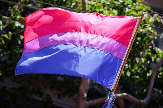
those look fine! lovely, even! with the semi-transparent fabric, the way it catches the sunlight, it looks beautiful!
but now look at how it looks digitally

the pink and blue are so vibrant compared to the sad, lonely lavender!
and let's look at this statement from Michael Page, the creator of the bi flag:

(sidenote: he created this flag in 1998, so if his takes on bisexuality is different from yours, it's okay to notice that! a lot has changed since the 90s when it comes to lived experiences and the way we describe them. but, it's also important to respect his thoughts about this and the way he presented them, even if today, we'd probably not say that bi people "blend unnoticeably into both the gay/lesbian and straight communities.")
so in pantone colors, the pink is 226 C, the blue is 286 C, and the purple of the flag is 258 C.
but...here's the deal
Michael talks here about how the key to understanding the symbolism is to know that the purple blends into both the pink and blue. and on a physical flag, I think you can see that!
but digitally, it absolutely does not blend. it clashes badly, and looks oddly separate from the other two colors.
which got me wondering...what purple do you get if you actually blend 226 C and 286 C?
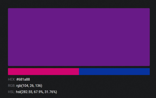
oh! oh, my god.

look at that! look at how nicely it fits between those colors!
look at it next to the original color scheme! look at how much more vibrant the purple is!
and friends. this is just blending through rgb! you get even more purple variations when you use other color spaces!
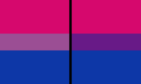
let's compare all of them:


(top: original, lab. middle: lrgb, lch. bottom: rgb, hsl)
look at all of the different purple options you can get just by combining these two colors!
if you want almost too-vibrant saturation, you can go hsl, if you want something more relaxed that's closer to the original, you can go lab or lrgb. and if you want to split the difference, lch is bright and violet, while rgb is there with its saturated but darker purple.
anyway, I guess I don't really have a point here? this isn't so much an informational post as it is Me Getting Weird About Colors, but I think it is a useful lesson about how colors look very different on screens compared to how they look on objects in real life.
and sometimes, I think it's okay to compensate for that.
out of all of these, this is my favorite bi flag:

it's the one where the colors were blended in lab color space. for me, the lighter, softer purple is close enough to the original bi flag purple, while also feeling like a smoother blend of the blue and pink
but that's just me! and it might not even look the same to you, since every screen is different, because technology is a nightmare!
anyway, thank you for coming with me on this colorful journey! I will now retreat back to inkscape and make pained sounds about inkstitch gradients until something tangible pulls me back into reality
22K notes
·
View notes
Text
me and WHO

THE WAY SHE’S SOFTLY STROKING HER HAND‼️
991 notes
·
View notes
Text
i read the seven husbands of evelyn hugo before realizing i was gay (i couldnt finish the book the first time around) and after realizing i was gay (i cried) and like.. that was life changing
Do you ever just sit and think, how different a person you would be if you hadn't read that one book or watched that one show? The one who gave you that one thing you were looking for but just couldn't find?
Coz I do... All the time
163 notes
·
View notes
Text
IM THROWING UP BAWLING THROWING MY PHONE ACROSS THE ROOM AHDIWIDHEOOSPDOWIAJJEWIOSJDKWOAODPPEPQUAUIDOEOI
“She looked at me. And the way she did it made me feel as if no one had ever really looked at me before.”
323 notes
·
View notes
Text
i just shit HELLA BRICKS because i realized this account isnt super duper secret like the way i blog is very distinct and she probably knows abt it 😧
#i’m cooked#i audibly screamed#sapphic#wlw#lana del rey#girl interrupted#girlblogger#lesbian girlblog#wlw girlblog#lesbian#girlhood#girlblog
1 note
·
View note

