
Don't wanna be here? Send us removal request.
Statistics
We looked inside some of the posts by imanunit06 and here's what we found interesting.
Average Info
Notes Per Post
1
Likes Per Post
1
Reblog Per Post
0
Reply Per Post
0
Time Between Posts
11 hours
Number of Posts By Type
Text
17
Last Seen Tumblr Blogs


Fun Fact
Tumblr has a 66 index score for customer satisfaction in the US.


Text
Evaluation
The reason I have chosen this specialist practice is that I find it to be a very broad and versatile, yet an exciting and growing field of practice. Graphic design is something fun, enjoyable and a field that allows you to use both creativity and technology, combining it into one and making the most of the two subjects. I personally love both, which is why the specialist practice I have chosen for this specific project combines both traditional, hands-on creative work alongside digital, moving image work. The materials are recyclable, while digital work is low on material usage, a positive use of ethics.
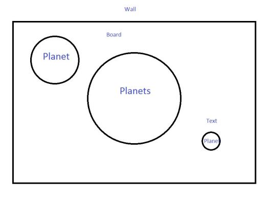
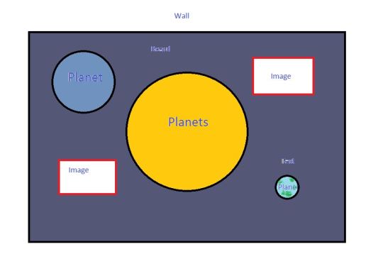
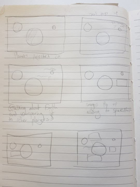
My reason for choosing the concept of space is that I’ve always been interested in it for a long time. I would love to show that interest in my final project, as I believe it’s so interesting, unreal, yet it also is an educational topic that allows us to progress further. Creating a physical installation would be perfect for an exhibition, and the projection would enhance the professional level and challenge myself further. My concept has slightly changed throughout the project though, as I was originally going for hanging planet installations. I ended up changing it to a board with the planets stuck onto it, as it was much more do-able. I’d say my work falls under moving images and a bit of 3D art when going beyond just Graphic Design.
Research has been a very important part of this project, since it’s crucial to look into the work of others to help influence and enhance your work. Research is something that does not stop, rather continues throughout the whole project. For primary observations, it involved going to art exhibitions and experimenting myself. For secondary research, I looked at videos, websites and online artwork as research. I found interests in them through their appearance and the incredible work that is put into it. They have a great way of drawing you in. Usually, they were also ethically fine and not controversial either, so there weren’t really any ethical worries that would get in the way. They supported my development by giving me ideas and reference material to look at to help enhance my work. It gave me methods, themes and tutorials to use. I would not have been able to create anything that I have without the tutorials guiding me and showing me what to do.
A lot of the skills I used throughout this project were associated with digital work and moving images. I had a lot of workshops for those, for example, PNG sequences and collage GIFS. I think they really helped me learn Adobe software so that I could use a higher range of skills in my final piece. While working on the piece, I watched many videos to help me create what I wanted to. I was working with Aftereffects and moving imagery/animation. I learned methods and techniques that I originally didn’t know before. I believe that if I hadn’t stuck with this concept, I wouldn’t have reached out and learnt how to do these techniques. I believe it will help me out a lot in the future too.
I had many ups and downs throughout my final piece. It ended up being a success in the end, for it projected well onto the board, but there were issues that came up. I had to do some quick thinking and resort to problem solving. For example, when one of my planet’s deflated, I had to fix it up with some plaster that I molded onto it. I first tried newspaper before that, but it wasn’t as successful. When it was a different colour than the original plaster, I had to spray it with white acrylic paint spray. I’ve adapted well, trying out different solutions and thinking fast with little time left. The more I’ve solved a problem, the faster I can come up with solutions. I was also able to switch to a planet board when hanging planets wasn’t an option anymore.
Originally my final outcome was going to be hanging planets, which I wanted because I thought it would be similar to actual planets floating around in space. I switched to the board because it would look better for my planet shape and would be a lot more possible. The board allowed space for the projection to go onto. For the audience, it would look good and be easy for them to look at in the exhibition.
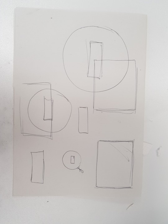
When I presented my final outcome, I introduced it using the title to start us off. I talked about the concept I was going for. What it was about, what I was making, including a diagram to visually see what it was going to look like. I talked about why I care about it, followed by why anyone else should care about it. It would help give my topic and project further meaning and purpose to it. I communicated the ideas well in my presentation, as I explained everything well and showed a diagram. I also provided references to other artists who had similar work. It helps to show my inspiration and give a better idea of what I am going for. I kept my colour scheme in a dark blue to compliment the theme of space.
My aim at the start of the project was to create an installation of planets with a projection onto it. I wanted it to spark curiosity in the viewer, making them feel small in the universe, yet questioning their feelings. Do we just let ourselves feel insignificant or do we make the most of our life? I think I captured these feelings well, because I talked about them throughout my projected video. I also showed Earth looking tiny next to Jupiter, so I believe I also accomplished the feeling of being small. I made sure to ask questions too, so that it would spark curiosity and cause the viewer to think.


0 notes
Text
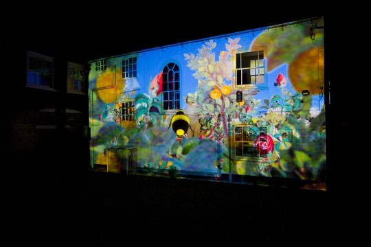
Planet projection test run
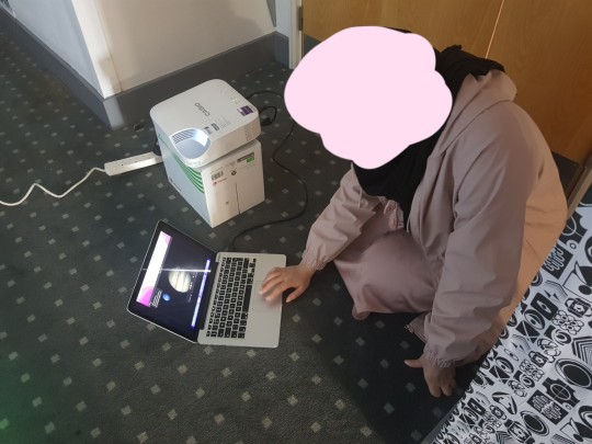
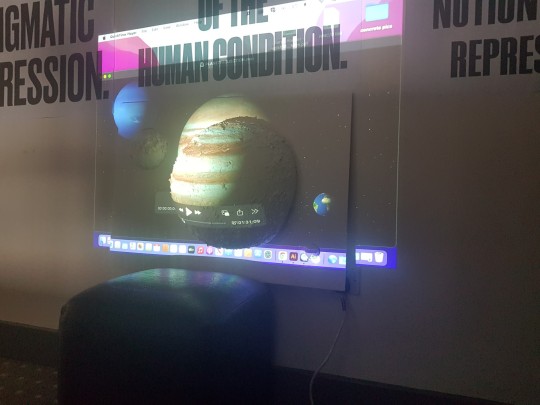
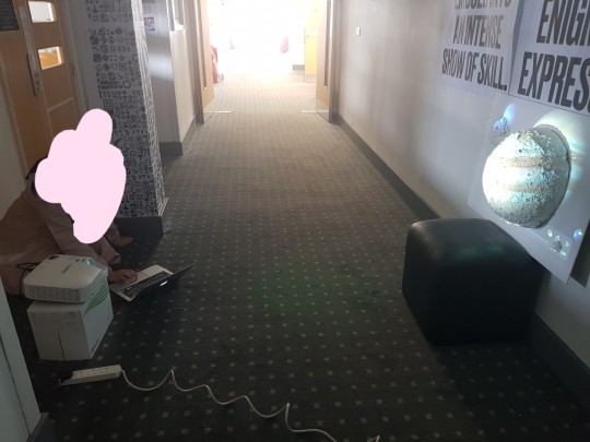
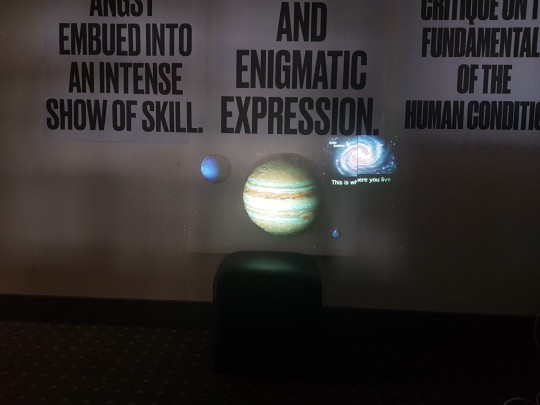
I gave my planet projection a test run to see how it would look projected on the board. It looked really good, better than I had expected it to look. I just had to line up the Neptune and Earth planets better. I took images of it, then went back to AfterEffects and lined it up in the same place. I was also told to change the typeface, because it didn't look good. With some assistance on which one to pick, I picked a different one and played around with how the text appears, so that it would look much nicer. Overall, I am very pleased with this and hope it looks great it in the exhibition too. The lights there will be darker, allowing the projection to be brighter and show better.
0 notes
Text
Ethics
Something that is very important in the creative industry is considering the ethics of your creations. Usually, you should be careful of your every action and make sure what you are doing is ethical, otherwise you are at the risk of causing environmental or social issues.
In my project, I have taken close consideration into the ethics of my work. Most of the material that I have used is recyclable. For example, when creating my planets, I chose to use things such as bubble balloons made of rubber, which is recyclable. The newspaper I used for the paper mache part of my project is also very easily recyclable, even with the PVA glue all over it. In addition to that, I chose to use recycled newspaper to create the paper mache for the planets in the first place, so it becomes an endless loop of recycling. It's really good for the environment because instead of just sending it to waste and contributing to pollution, I get to use it over and over again. When it came to the medium and large ones, I used foam and a ping pong ball. I didn't just want them to go to waste though. When I put paper mache over the medium ball, I had to cut it in half, but I didn't want to cut through the ball and have to throw it away afterwards. Instead, once the paper mache and plaster had dried, I used a craft knife to carefully cut through the newspaper and plaster, removed the top and then carefully squeezed out the ball. I got to keep the ball for personal use, while still having the part of the planet I needed. For the ping pong ball, since I didn't cut through it, I can just take it out, wash it and reuse it again after the project. I prefer reusing and recycling things because it saves on costs, your items don't go to waste and it's a lot better for the environment. The plasterboard and foam board is also recyclable, which is great because it's such a huge object and would really damage the environment if it wasn't recyclable. When it comes to using the recycled plaster that was on the planets, you have to be very careful with how you recycle it. There is a specific way you need to do it by law, otherwise it can cause toxic gases that harm us, thanks to the gypsum in it. However, it is possible to remove the gypsum and then recycle it back into raw material to be reused. If you want to be ethical, it's more important that you use this method instead. When it comes to the projection, it can be considered more ethical because it does not require any physical material other than the projecter, since it is digital. However, it will require a lot of energy if it is being played on loop. The energy is also non-renewable, which can cause ethical and environmental issues. My experimental work using the balloon and paper mache is also recyclable too, thanks to the materials used.
0 notes
Text
Creative Boom
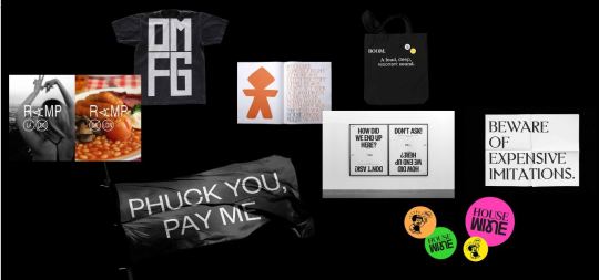
Creative Boom is a company who brands and creates their own items around their name and things they believe in. They have a distinct, recognisable style. There is a lot of simplicity in their work, feauturing a lot of black and white colour usage. I do quite like their work. I think the simplicity is nice and modern. It's nice to have simple things, as it isn't over done. They seem a little rebellious too. One of their designs has a bunch of rules on it, but it says stuff like "wear what you want" or "don't act your age". I think this sort of attitude is good and I support it. Maybe there's someone out there who wouldn't agree and would get offended, so that could hurt their ethics. They may get upset at the materials being used and their costs, but everything they use looks to be recyclable, like paper and fabrics. There isn't really an issue. The composition of the pieces is alligned well and neatly, supporting the idea that it's nice to look at and easy on the eyes. I like the little artwork on the circles too. The style is cartoon-ish yet simple. I like cartoon styles. It's quite funny too.
I think the style of their clothes can suit anybody, regardless of who they are. For that reason, I would go for wearing it.
This is a good reference to look at when we brand for our exhibiton too. Maybe we could take their style and go on a simple route, being low on colours and with minimialistic designs. Or we may go the opposite, with bright, bold colours and detailed designs.
0 notes
Text
Putting everything together
Since I had changed my idea to a board, I needed to assemble everything together. I was given a big plasterboard, which works well for the plaster balls. It was a rectangle which is nice for projecting onto, since my projection is also a rectangle format.
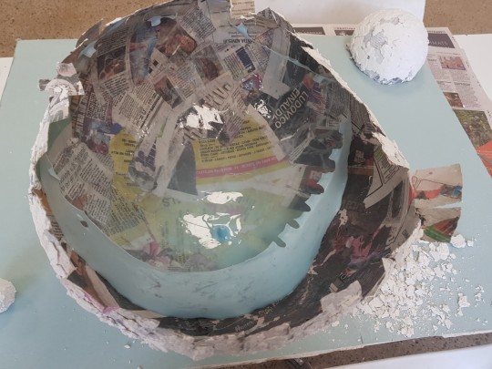
I had decided to cut the balls into halves and stick them onto the board. I was quite scared to cut the big one in half, because when it pops, it might deflate the entire thing and my progess would be lost. However, when I cut through it, there was no pop or deflation. Instead, I found that the bubble underneath had stuck onto the ball and stayed in place as it was cut through. Gradually overtime, it slowly peeled itself off. The ball did not deflate at all, so everything turned out well. For the medium sized ball, I wanted to recycle the foam ball underneath. So I cut the plaster layer through the middle, took the top off, and squeezed the foam ball to try and pull it out. It was quite difficult, but eventually it worked. The ping pong ball was left as it was, since it was very solid and small. To stick them onto the board, I cut flaps around them all so that they could easily stick on with PVA glue. I also had to remove the plaster too from those parts.
The board was quite messy though, and I wanted it to be smooth for the space background. I was given a foam board to place on top of it. It was a little larger than the plaster board, so it could look like it was floating in space because the board went past the edge. I needed to create holes though, so that the planets could fit through them, and that the flaps would not be visible when I stuck them on. However, I stuck one flap on the plaster board when I realised I should figure out the placements of everything on the foam board first so that I can cut through the right places. It was fine though, because I just carefully ripped it off and put another piece of newspaper under the flap that glue on it.
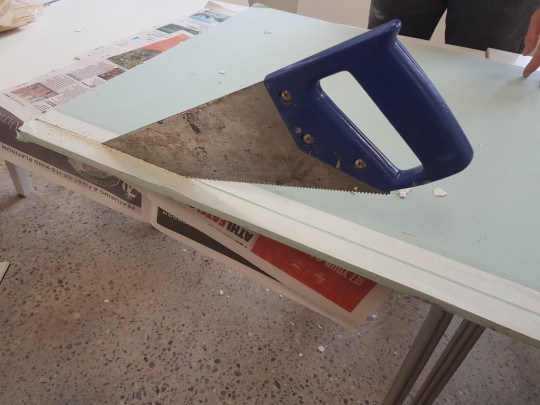
The plaster board was slightly too big. I used a saw it cut the top of it off. Using tape, I was able to mark the place it needed to be cut through with, making sure I don't go off the line. I slowly used the saw to go through the board, being careful that my finger wasn't too close to it. When halfway done, you must break off the piece you have already sawed off, so that it doesn't go flying when the whole thing is cut off. It also makes it easier to do. The end part is tougher to saw off than the rest of the board.
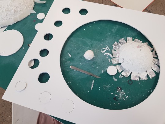
I had to draw the circles to cut out with a craft knife for the places for the planets to fit into. I also did use a protractor to get the circle shape. It was quite difficult though, because the sizing took lots of tries to get it right, especially for the tiny one. It took a lot of trial and error for me to eventually get it right. It was also very difficult to get a smooth circle that wasn't jagged. The smaller one was again the toughest, despite being so much smaller in size compared to the others. The medium one was the easiest for me to do. After many tries, I got another foam board. The previous one became my practice board. I traced and cut out the correct circle in the places I needed them to be. Unfortunately, the big planet's circle was still too small to put the board through. To fix this issue, I placed the board down first and then put the planet through it, which worked out well.
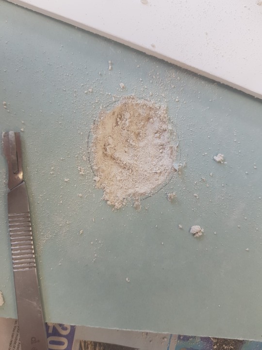
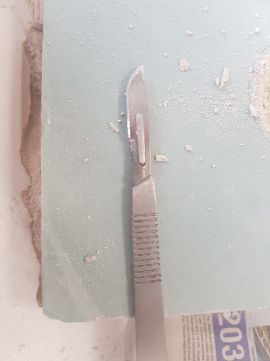
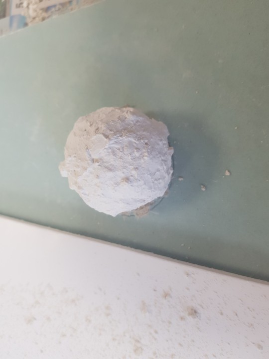
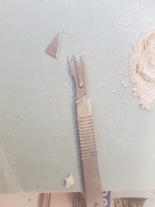
For glueing down the smaller ball, it was a slightly different process. Since it was not cut in half, I had to cut a hole into the plaster board so that it could sit nicely in there. I traced out the circle, and used a craft knife to dig and cut out the pieces of the board. Unfortunately, the blade ended up snapping off and breaking. I then realised that I needed a different blade. I needed a rounder one for this task. After changing to that blade, it was much better and more efficient. I used it to dig out the hole and it came out very well. I added glue to the planet and into the hole, and placed it there. When everything was in place, I applied glue all over the plaster board and the bottom of the foam board, as well as under the flaps of the planets. I stuck everything in place and let it dry.
I was trying to touch up the plaster on the planets and reapply the fallen parts, when something bad happened. The medium sized planet started to deflate partially. It was terrible, I really needed it to stay up as a proper planet. I tried to fix it but it wasn't working and kept deflating. So what I decided to do was mix up some more plaster and mold it into place, like a filler. Wet plaster would only make it worse, so I had to make it drier. When I put it back on, I wet my hands a little bit to try and smooth parts out. It did the job. Sadly the new plaster was an off white compared to the other, whiter plaster. I tried spraying on some white acrylic spray paint to make it lighter. It would probably look better under the projection anyway.
Thankfully, foam boards are completely recyclable, so that is good for the ethics of this part of the project. Same goes for newspaper. The plaster is not the same story however, as mentioned before. PVA glue may damage environments sometimes, but it can still be recycled.
Safeguarding is very important here. I have to be careful with the craft knives, for it can cause many accidents. When the blade broke, it did jump a bit. This could be dangerous if it flies towards someone, or if the part gets lost. Luckily it didn't, so I just threw it away. I also used a saw too, which is dangerous and should be used carefully. You should probably wear an apron, gloves and eye protection. Children should be supervised, or don't let them do it at all. I wore gloves a lot, because the plaster and glue was very messy. It broke the gloves a lot through, ripping holes through them, making me change them again
0 notes
Text
Planet making
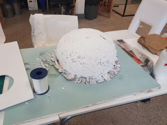
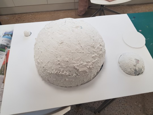
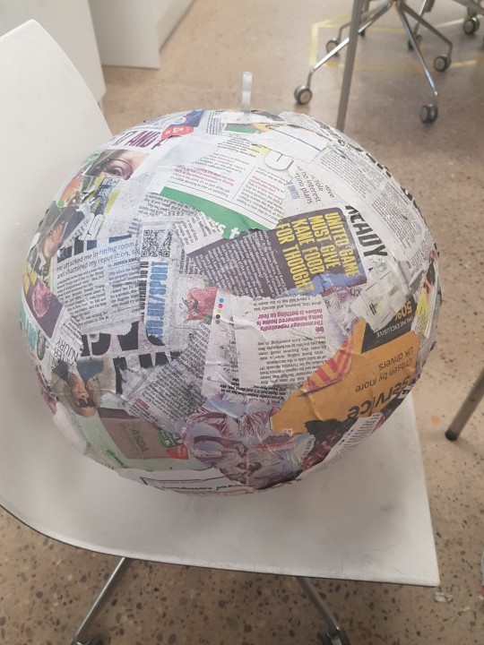
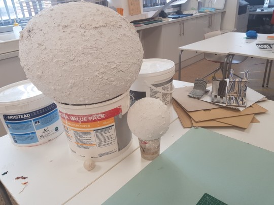
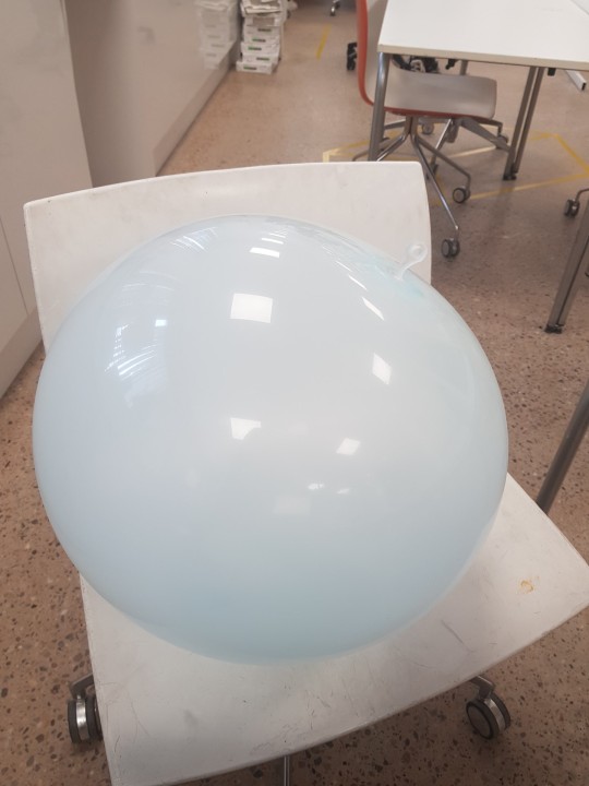
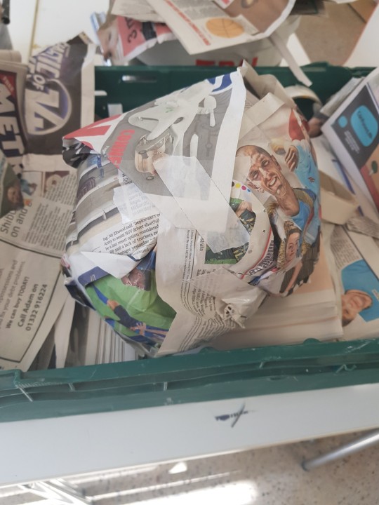
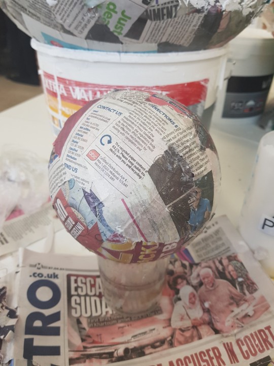
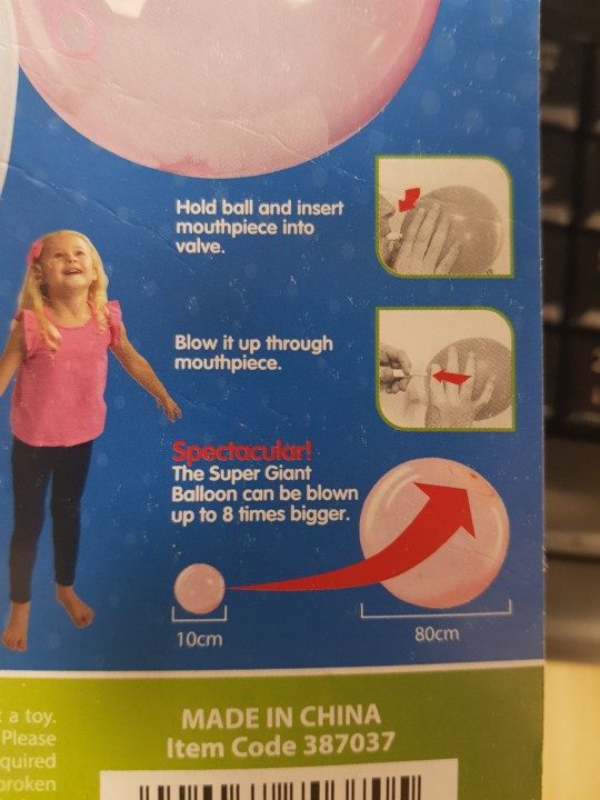
To create the planets I needed to use, I started with the largest one. I needed a big ball to use, and unfortunately styrofoam balls, while a great option, were out of my budget. I had to comprise and bought a big bubble. It stated that it can grow up to 80cm and was very durable. All you had to do was blow into it. It also sealed itself. So I just blew it to the desired size. To make it sturdier, I used paper mache over it. Using newspaper and PVA glue and a brush, I applied it on top, covering the whole thing and waiting for it to dry. Something I find difficult with doing layers with newspaper is that it's hard to see which layer is the one you've already done, and which is the one you are currently working on. The easiest way to tackle this problem is to make sure the newspapers you are working with are different as the layer changes. For example, texture and colour can really help out. I had two newspaper types, a traditional newspaper one and a shinier, smoother magazine one. The colours were also different and brighter for the magazine one. It took very long to do the whole thing, but I found that pouring PVA glue directly over the ball, followed by placing newspaper onto that works a lot faster, especially if the newspaper pieces are large (but still suitable enough to fit into the curves)
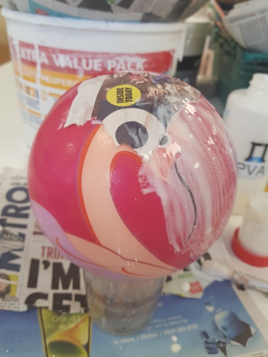
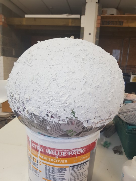
Instead of painting it with regular paints, I decided to go over it with plaster. The benefit of this would be that it looks more professional and better, giving it that planet texture. The issue with the last experiment was that it was too small, oval shaped but also that it looked to similar to a school kid's work. I needed it to look more professional for my project. This plaster can help with making it look that way.
Just had to mix the powder with water and then spread it onto the ball using a butter knife. It had lumps in it which really helped with the texture of the planet. I had to make sure I covered every part so that the newspaper wasn't visible. Some of it did crack off when it dried, but I just went over it again. The big planet took a lot of time, but the smaller ones were faster.
For the medium sized planet, I did the exact same thing. I used a foam ball instead for this one, since I didn't need it to be as big. For the tiny one, I used a ping pong ball instead. It's a little hard when it comes to covering it, because I didn't have anything to hold something so small in place. Instead, I just held it in my hand, which was a little annoying because I'd end up smudging parts I needed the plaster on and it would come off. I placed it on the table and it stayed in place after a while and it worked out. I got it covered with plaster.
The ethics here are that plaster and plasterboards are very hazardous. You cannot place them in skips and they are banned from landfills, making it hard to recycle The reason for this being is that they have a high gypsum content and it has a high putrefaction risk ("the process of decay or rotting in a body or other organic matter"). When they get wet and mix with other waste, it creates hydrogen sulphide, an odorless gas, a pungent colourless gas which is very flammable and toxic. Luckily, newspaper is a lot more recyclable, but the PVA glue can also be bad for the environment and has a very strong smell.
I had to practice safeguarding by making sure I wore an apron and gloves. It was a very messy experience, and so I had to make sure I cleaned up everything afterwards, scrubbing off glue and plaster from surfaces. You should also make sure you don't swallow anything.
I also tried to experiment with making a ball completely out of newspaper by scrunching and wrapping them over each other continously while taping it in place, but it didn't really work out. It kinda worked but it wasn't the right shape. Nice experimenting though.
0 notes
Text
Planet board
I ended up changing my idea from hanging planets to a board with planets stuck onto it. It was suggested to me by tutors. Instead of hanging them from the ceiling, I would have the planets cut out into halves, which are then stuck onto a board that is hung on the wall and projected onto. This was decided because hanging planets would be difficult to do, this would be much more easier and doable. You don't know if the weight will hold or not either. It would better for projecting onto and having images appear too. Also, the big planet would be able to become a circle better too, matching the planet shape.
0 notes
Text
Planet projection
Since I was projecting onto planets rather than painting over them, I had to create my own projection for it using Adobe AfterEffects, as it was the best suitable program for creating a video projection with effects. I needed to figure out a way for creating rotating spherical planets that looked good and realistic enough. I came across a video that showed me how to do this. I used the video as a reference and tutorial to follow.
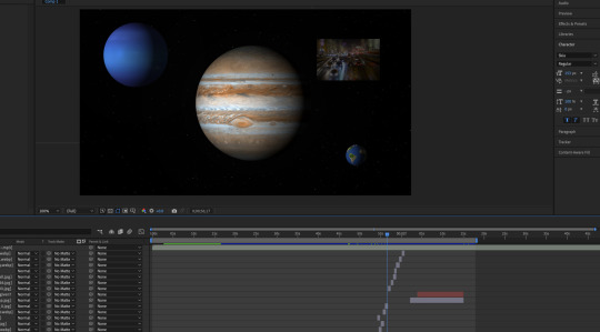
Firstly, I had to download the planet textures from online at solarsystemscope.com. After importing them into aftereffects, I used CC Sphere to instantly turn them into spheres. I used a bit of glow with the radius to 100, and some colour correction curves to change it a little so it would look more realistic. Luckily for me, it instantly gave the planet a shadow on the side when converting it to a sphere, which is perfect and realistic just like an actual planet would be. I was also able to make the planet spin too. By going to the rotation Y setting, I typed into the timeline "time*5" to make it spin slowly. I decided to change it to 7 to make it a little bit faster, but it was supposed to be slow since planets are like that anyway. I did the same thing for Earth and Neptune too. The good thing here was that I can drag and move the planets around whenever I want, so I can always adjust it to fit onto the board properly.
To create the stars moving in the back, I created a new, completely white solid layer. Then I went into simulation, CC star burst to turn it into moving stars. I lowered the size and grid spacing so they wouldn't be so large, and slowed down the speed too.
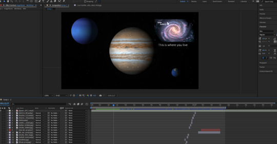
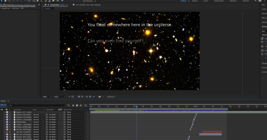
I also wanted there to be text and images popping up too, so it could get a message across. The text would be talking about how small we are in the universe and how insignifcant and worthless we may feel. Like the text popping up next to Earth saying "you are here". But then there would be images of Earth showing us how it doesn't matter and that we should just enjoy and make the most of what we have and be happy. I got images from online of things including people enjoying life, doing activities, animals and nature, as well as space. I made them pop up throughout the video, fading in and out. However, my tutor came over and said that it was too slowly popping in and out. It needed to contrast the slow spin of the planets. I was told to make it faster and increase the number of images, which I went ahead and did by gathering more images and making them go by faster by decreasing the time they stayed there and showed the next image. I realised it would take so much time though, but time was running out and I had to be faster so I could finish everything. After some looking at Youtube, I realised there was another way. I could just duplicate the timeline slots of the other images popping up. Then, I would drag in new images into AfterEffects. From the side, I just hold down option key while dragging it onto the image I want to replace in the timeline. And it worked. This saved me a lot of time, because otherwise I'd have to constantly drag in each image, adjust the position, scale, change the duration all the way down and adjust the duration position, as well as adding in fade in and out. Doing this with so many images that only pop up for a short while would take so long. This really sped it up for me.
I also tried to make some images pop up in the spinning planets too. I did that by duplicating the planets, replacing the planet texture with an image using the same method as before, and keeping it there for a few seconds with fade in and out.
At the end of the video, I also lowered the brightness on everything except Earth, so it would stand out with the message of 'how are you going to spend your time here?' I did this so it would give some time to think about it, focusing only on Earth.
I also had a problem where I accidentally lost some of the images when trying to drag them all into a folder. This ruined the video because the images all disappeared, and I couldn't have the video like that because it was incomplete. But then I went into my recents in finder, and they were all there, so I just dragged them all back out again and the images were back. I had to carefully place them into the folder to avoid losing them again. I also decided that I needed some music to bring the whole atmosphere together, so I got some space music downloaded and added in. Music and audio always helps to complete pieces.
It could be argued that ethically, some stuff is stolen, like for example, planet textures, images popping up and music. People might say that the work is not original enough or fully made by me because of these things. I think it's fine, because I am using it for educational purposes only and am not making any profit off it. If it doesn't break any copyright laws, then there isn't an issue. On top of that, there is also royalty free work you can use whenever you are unsure. Royalty free means that it's free to use however you want to, so you don't have to worry about copyright. Also, I am not a music composer so I cannot make my own music.
For safeguarding practices, I had to make sure I get enough breaks throughout, otherwise I could strain my eyes if I don't look away enough. I could also get back pain if I slouch, sit in a bad position or don't get up and walk around enough. It's also very bad for posture. I should make sure that water doesn't spill or equipment to damage it or cause an electrick shock. I need to be careful around the computer. I need to make sure it doesn't overheat too.
0 notes
Text
Planet spinning experimentation


I experimented with a possible method I could have used to make the planets spin. I searched for a tutorial on youtube and followed through with it. I used 2D flat planets that I had made on illustrator, using a circle base for the water, pen tool that I used to make the floor and a shadow. To make it spin, I went into after affects, duplicated the water and placed it above the map, and then on Alpha matte "MATTE' mode, I used a track matte to place the map in the blue parts only. I used the timeline to make the map move so it looked like it was spinning. The issue with this however, would be that I didn't know how to make it loop, because the map completely comes off and doesn't play again. I tried to make it come back for another spin but it just looked off and didn't match up well. It also looks very basic and simple. It's too cartoon-y and not realistic enough, so I would need something more realistic. Another issue I faced is that the track matte option wasn't there at first. I didn't know how to make it appear, because I really needed it for this to work. After searching for a solution on youtube, I figured out that I just needed to press 'toggle switches' and it appeared. The method then worked fine and it was a success.
youtube
youtube
0 notes
Text
Reflecting on previous projects
The last project I did was Counter Culture and Studio Culture. Counter culture was a self project that was done individually, whereas Studio Culture was done as a group. Counter Culture was about creating an artefact that refelected me in someway. I decided to create a magazine about what it's like to grow up with the internet. As you always hear negativity about it, I decided to put it under a positive light as a refreshing new look, hoping to change negative minds. I believe it was a success, and I really liked the visual aesthetic of it. It had a retro, early 2000's look which is exactly what I was going for. I learned lots of technical skills from it. However, I would have preferred if I was able to bind it together and have it printed on a better paper type as I had originally intended.
Studio culture involved us creating a brand for a studio. We decided to go with an open studio where anyone could come in and use the space to be creative. We named it Plan C, creating the brand name, logo, website and merch. We also worked with BILA Law Academy to design them a leaflet. It was successful and was interesting to work with a team. It was also beneficial to do some actual industry placement too, getting an idea of what the industry is like.
Another project I did was talk show. It was a group project that involved creating any sort of talk show. We went for a pilot episode of a series in the style of 'The Office'. It involved a bunch of students attempting to create a puppet show, wasting the expensive budget, fighting each other, getting into arguments and creating a terrible show. The camera quality was also supposed to be bad to reflect the low budget and skills. It was fun and exciting to do and we had to work hard since we were also acting too, which was something new. Everyone had to work together and we were all given our own roles, such as editor, creative director etc.
0 notes
Text
Ross Ashton Artist Research
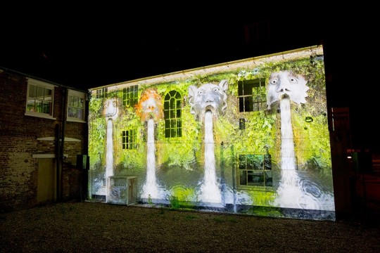
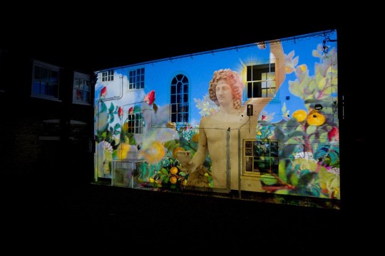
Ross Ashton is an artist born in Sheffield. He is someone who trained in photography and theatre, later on shifting to moving in video and slide projection. He then went on to specialising in High Power Projection, which is what he does now and is the focus of my research.
This specific piece is called 'The Garden of Eternal Spring', which is a projection in which he created for an arts festival. The images being projected onto here are images from original Roman mosaics, frescoes, (a process which requires painting with water based paint onto plaster so that the paint becomes an important part with the plaster) and statues from Pompeii and Herculaneum in Italy. Included in the work are interiors of villas with birdsong environment recordings made in the Garden of the House of Octavius Quartius. From this you can see that the artwork stands up to its name well. It's projected onto a wall, using projection mapping, where you plan out and manipulate where the projection will go onto, so that you can get it exactly where you want it to be. I think it looks really cool this way and gives it a nice aesthetic.
It's a very bright and colourful work of art. There is a blend of many vivid colours together and bold images. For this reason, I really enjoy looking at the piece. It has a happy and playful feel to it, to where it almost feels like something you would see on the wall of a playground for children. It very well carries out its intention of feeling like a garden of eternal spring, since it's the first thing my mind runs to when I see the work. Even if I didn't know the name of the piece, it would still scream a spring garden regardless. Being a projection allows it the chance to be animated, so that objects can move and the water can flow as if it was real. This gives it an opportunity to feel more realistic and authentic, as if you were really there. It allows it to stand up to its name a lot better.
I want to use projection in my own project. Since I am going to create a video of moving planets and images, I want to project it onto my planets and board that I will make. I can use this as inspiration, since there is a very distinct style here where the theme is clearly made. Here it is gardens, whereas mine is space. They are projecting onto a wall and mine is a board, which is basically just a smaller version of the wall. It's going to be moving too, which is a great use of projecting.
I think that projections are good ethically, because it's not a physical material that goes to waste. Instead, it is digital and can be used whenever you want, wherever you want. However, the issue here is that projection requires a lot of electricity, which requires energy. That energy is not renewable, so it cannot be reused once it's gone. Although my projection isn't as intense as his, Ashton's projections are very high power, so the energy that is used up is very high. Some people would argue that it isn't worth the waste of materials just for a projection. I think it looks very nice though, and that sometimes it's worth the energy for something so cool. They could also argue that his concept is just stolen from the mosaics, frescoes and statues. Personally, I don't think it matters because they are old pieces of history which deserve to be given recognition. Since they are so old, it also doesn't matter if someone uses it for something like this either. For safeguarding practices, you would have to be careful that nobody is directly underneath or close to the projector, in the case that it explodes or falls on their head. You would end up with serious damages and lawsuits from something as heavy as that. You also have to be careful that wires are pushed away from where the crowd is, as well as being taped to the floor so that nobody trips over it, injuring themself, equipment and ruining everything. You'd also have to keep food and drink away from the electrical equipment, in the case of spillages, resulting in fires and electric shocks.
1 note
·
View note
Text
Artist research
Ralph Helmlick
Ralph Helmlick is an American artist and sculptor who focuses on design works at the intersection of art, science, culture and new technologies.
This piece is called 'Arbor'. It is a hanging installation art In this art piece, he displayed 692 pieces above the computer hub at John Jay College of Criminal Justice. They are all very different from one another varying from size and their style, whether they are clocks or watches, to how vintage they all are. All of them together form the scales of justice. You can see this when you look at it from a specific place at the building's entrace. The phenomenon is known as anamporphosis, which is where images appear to look distorted at a vantage point that is specific and strategic. Yet, it appears normal when viewed from another specific angle.
His reasoning for choosing clocks to create this art piece is that time can be seen as both constant and elastic, especially when it comes to our legal system. He says that "Arbor is an expression of the interplay between the temporal and the judicial, grounded in an individual’s experience of time and space", further showing his intentions being both about the legal system and time.
I like this piece of work because it looks so unique, captivating, unusual but also quite enchanting. There are some very beautiful clocks in this piece of work, and I really like how they form the scales when all brought together and viewed from the right angle. It definetly makes you stop and stare. It looks like a delicate piece of work. The strings that hold the piece together are invisible from further away, so it looks like everything in floating mid air. I find that it would be something I'd see in a fairytale, because of it's unusual but magical feel. Perhaps something that would belong in Alice in Wonderland. It also feels intimidating, since the scale is so large. On top of that, clocks and time slowly ticking by, alongside your fate being measured and decided by the scales is nerve wracking and intimidating too. I believe that the piece serves its intention well.
I would like to take inspiration from this in my own work. My first plan was to create hanging planets from the ceiling as an installation piece. This work also has items which hang from the ceiling. In this case, it is clocks, while mine would be planets I create. They use string to hang them up, so I would also use string too for mine.


0 notes
Text
Into the Spiderverse
Spider-man: Into the Spiderverse, is an animated film that uses PNG sequencing as a technique. PNG sequencing involves taking frames from a moving image piece, and then converting it into still images, allowing you to do whatever you want with it before putting it together again.
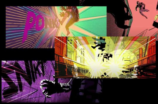
In this case, into the spiderverse used this technique in a visually exciting way. They took individual image frames from the movie, gave them to artists who drew over them in their own comic style, making it fully hand drawn, and then put them back into the movie. The result of this was having flashes of individual styles in the film. It gave it that authentic comic book feel, despite being a movie. It's a method that allows you to include accurate movement, angles, perspective and emotion into the illustrated and hand-made outcomes.
I love this style of animating a lot. It visually looks fresh and appealing. It's a style you don't often see a lot in animated films, and after seeing it, it makes you wish there were more films like this. It feels authentic and true to the spiderman comics, even when animated. The pop of hand drawn comic frames in just like something you'd see in a comic, mixed with the high quality animation and backgrounds. I used this technique myself when I was creating my own PNG sequence, where I altered the individual frames. I can also do it the same way as they did in into the spiderverse, where I take the individual frames and draw over them myself, putting them together to see an animated piece but with realistic, fluid movements. I could also follow their technique even closer, by handing out each frame to different artists, allowing them to draw over each frame in their own style. After bringing them all together, you would be able to see how each artist's style varies. It would be the same animation that moves in flow, but the style would constantly be changing. It's a nice way to represent different artists in one animation. It also shows that you don't need to create super detailed or realistic pieces of work for it to look good. Even the simpler, hand drawn things look great and are still needed for creating good work.
youtube
0 notes
Text
Flashback

Flashback is a game that was made in 1992. It uses rotoscoping to create fluid, realistic animations. It was one of the first ever video games to use this technique. Rotoscoping involves recording real life motion footage of someone doing the animation you want in your game or film, followed by carefully tracing over each frame to create the animation. When all frames are played together, you will have your character doing the same animation as the real person was. Rotoscoping helps for realistic movements, and also provides help for when you are struggling to create certain movements. It's an easyier method and can help with more efficient and faster production in games and film animation. It gives you lots of control and you also get to alter the imagery however you want and place it in any scene you like. I really like this method of animating, because it's very easy and looks so smooth. Whenever I try to animate people, I often struggle with it because it can be difficult, frustrating and repetitive to animate every frame. It's also a very lengthy, mundane process which I do not have the patience for. Rotoscoping is an alternative method that is easier to cope with because it's not as difficult and is much faster. I would personally prefer this because someone like me would not get frustrated as much as I normally would. I would also have more patience for it as it is a faster method. I think it's also especially helpful for acrobatic movements and turning movements, which are normally very difficult to animate from scratch. In rotoscoping, the real life movements are all natural and easy to do, and then you can easily trace over them without having to think too much about how it will work.
Since then, rotoscoping has been used everywhere, including heavily in Disney movies, such as Cinderella, Alice in wonderland and Snow White and the Seven Dwarves. It links to my PNG sequence experiment, because in there, I also used real life footage and edited each frame to become animated. It opened an opportunity for me to experiment with individual frames however I wanted, including drawing over them just like in rotoscoping. It then combined all the frames back together to create the animation.
youtube
0 notes
Text
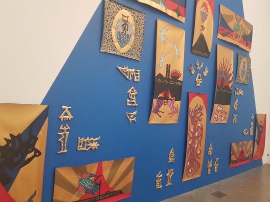
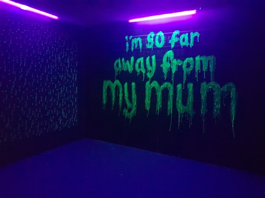
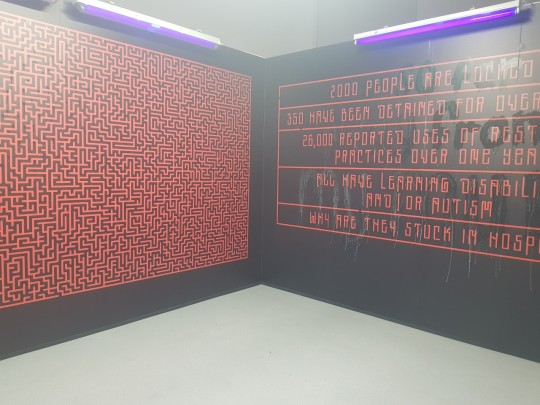
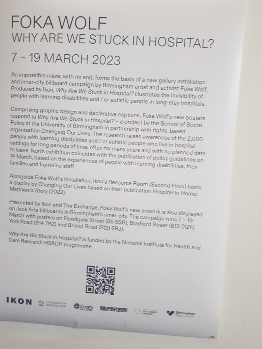
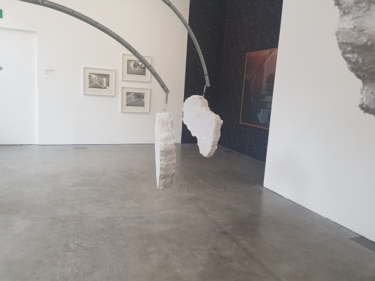
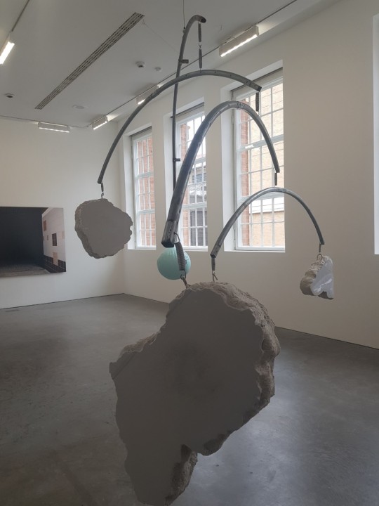
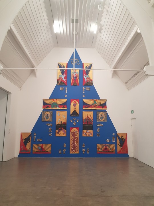
As a part of primary research, we visited the fokawolf exhibition as a class. It was a good opportunity to take a look at some of the artwork they had created in person and gave us a chance to take inspiration from the exhibition into our own project, work and even the exhibition we will be creating. A personal favourite of mine was the glow in the dark piece. It displays a board that shows glowing text when dark, and text when there is light. It talks about the unfortunate struggles disabled children have as they are locked in hospitals for long times and are often neglected. The glow text shows how they are far away from their parents. It hits close to the heart and makes you upset, because people can empathise with how difficult this situation can be for children, as they deserve to be close to them. The text in the light shows information and facts about this situation. The board next to it shows a maze that is impossible and has no exit, symbolising how they are trapped and have no escape. It does a good job at getting the intention along, as the darkness, low purple lighting and green glowing text with the drip effect look creates a eerie and unsettling horror theme, which represents the unfortunate situation for these people. The atmosphere is created to resonate with us who look at it. The scale is also very large and in its own seperate room, so that we can really indulge into the piece as we look into it. The pyramid artwork was also very large in scale. It feels overwhelming but also replicates a real pyramid. I believe it is a historical piece of artwork that exists to educate. It shows hyroglyphics, which is 3D and art in the style of anicent Egypt. I think that the blue and gold go really well together and compliments the style of the piece well. I also saw installations of things hanging around. The sphere especially caught my eye, as I had planned to create hanging spherical planet installations and could have used this method. It seems to be attatched to another piece and the sturdy metal allows it to hold itself together and be held up.
0 notes