
Statistics
We looked inside some of the posts by imirage and here's what we found interesting.
Average Info
Notes Per Post
219K
Likes Per Post
157K
Reblog Per Post
62K
Reply Per Post
354
Time Between Posts
21 days
Number of Posts By Type
Text
16
Photo
1
Last Seen Tumblr Blogs


Fun Fact
Tumblr has a low social media market share in South America.
Text
empire got good after rhonda died
0 notes
Text


link to the article
siraj's tumblr blog
siraj's gofundme
14K notes
·
View notes
Text
i’m trying to get into independent journalism.. not sure how to start. i have a substack but i want to have more structured newsletters and everything. i’m trying to get in the habit of writing, then editing, then making it look pretty, then posting but it’s hard lolllll what’s the tea guys
0 notes

Text


Josef Mandl (Czech, 1874–1933) and Jaroslav Panuška (Czech, 1872–1958)
3K notes
·
View notes
Photo
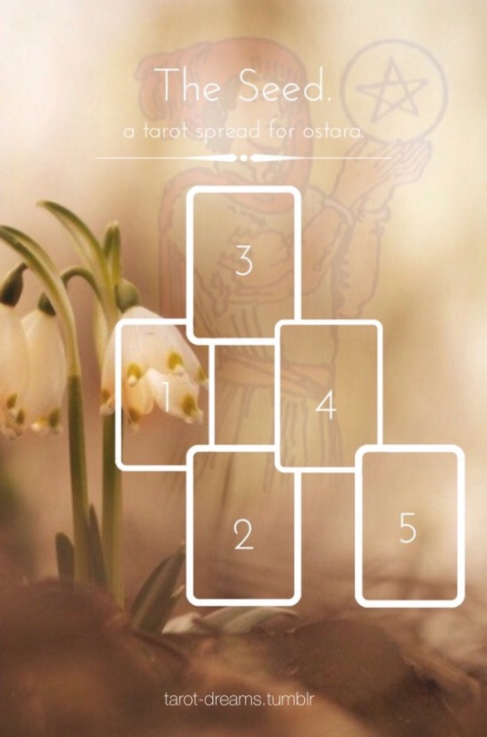
The Seed. a tarot spread for ostara.
1. The Soil.
Where have you grown? While it most certainly is the dawn of a new day, keep in mind your roots are proof that you have already come a long way. The soil is your past. What lesson can you learn from days gone by?
2. The Weed.
You wish to flourish and grow strong, but there is undoubtedly something that is stunting your progress. What are your obstacles, what’s holding you back?
3. The Seed.
Within your immediate future, which area of your life will you first see signs of growth? Which seed has taken hold?
4. The Sun.
The love and support of others is helpful. But the will to grow comes from within. Let the sun be a reminder of what you need to keep in mind in order to help yourself grow.
5. The Rain.
A blessing in disguise. Understand that not all things are always as they seem. Grey skies can sometimes bring you down, but like the sun, rain too is necessary. Through struggle, you will find strength. What blessing in disguise is upon your horizon?
10K notes
·
View notes
Text
so tired of these people not choosing support when every other person is either a dps or a damn tank and even then now niggas wanna play tank i cant do this im tryna get lord ororo and sue
0 notes
Text
How to Master Color Theory in Graphic Design – Easy Tips for Students

Introduction
Color is perhaps the most influential graphic design element. It can evoke moods, express emotions, and enhance visual appeal. Whether you're a beginner or an aspiring designer, learning color theory is crucial to achieving professional and stunning designs. In this blog, we simplify color theory and provide easy tips to help students learn it effectively.
Knowing the Fundamentals of Color Theory
Before diving into advanced techniques, it is essential to understand the basics of color theory.
1. The Color Wheel
The color wheel is a diagram that shows colors arranged according to their relationships. It includes:
Primary Colors: Blue, yellow, and red – these cannot be created by mixing other colors.
Secondary Colors: Green, orange, and purple – formed by combining two primary colors.
Tertiary Colors: Created by mixing a primary color with a secondary color (e.g., red-orange or blue-green).
2. Color Harmony
Harmonious color combinations are essential in graphic design. Common color schemes include:
Complementary Colors: Opposite on the color wheel (e.g., blue and orange) and create strong contrast.
Analogous Colors: Placed side by side (e.g., blue, blue-green, and green), producing a calming effect.
Triadic Colors: Three colors evenly spaced on the wheel (e.g., red, yellow, and blue), offering a rich and balanced look.
Monochromatic Colors: Different shades and tints of a single color, creating a clean and simple appearance.
Easy Tips to Master Color Theory in Graphic Design
Now that you understand the basics, here are practical tips for effectively applying color in your designs.
1. Learn About the Psychology of Colors
Colors influence emotions and perceptions. Here are some examples:
Red: Urgency, energy, and passion – commonly used for sales pages and call-to-action buttons.
Blue: Calmness, professionalism, and trust – frequently used in corporate branding.
Green: Health, growth, and nature – ideal for eco-friendly and wellness-related designs.
Yellow: Warmth, happiness, and optimism – great for grabbing attention.
Purple: Mystery, luxury, and creativity – often used in beauty and fashion branding.
Select colors based on the industry and the message the brand wants to convey.
2. Utilize Contrast for Readability
Proper contrast ensures that text and design elements stand out. To enhance readability:
Use black text on a white background for maximum contrast.
White text on dark backgrounds (like navy or black) creates a sleek, professional look.
Avoid using analogous colors for text and background, as they can be hard to read.
3. Apply the 60-30-10 Rule
A well-balanced color scheme follows the 60-30-10 rule:
60% – Dominant color (background or major elements)
30% – Secondary color (complements the main color)
10% – Accent color (highlights key areas)
This technique is widely used in branding, web design, and UI/UX design.
4. Experiment with Different Color Schemes
If you’re unsure about color combinations, use online tools like:
Adobe Color
Coolors
Canva’s Color Palette Generator
These tools help generate visually appealing color schemes with ease.
5. Test Colors on Different Backgrounds
Colors appear differently depending on the background. Always test your design against both light and dark backgrounds to ensure consistency and readability.
6. Stay Updated with Design Trends
Color trends evolve over time. Stay current by exploring design platforms like:
Behance
Dribbble
Observing professional designers can help you stay inspired and refine your skills.
Why Learning Color Theory is Important for Graphic Designers
Mastering color theory is crucial for creating professional designs, whether you’re working on logos, websites, posters, or branding materials. If you’re serious about becoming a skilled graphic designer, consider enrolling in a structured course to enhance your skills.
If you’re looking for graphic designing classes in Yamuna Vihar or graphic designing training in Uttam Nagar, choose an institute that covers advanced design concepts, including:
Color Theory
Typography
Composition
Many reputed graphic designing training institutes in Yamuna Vihar and graphic designing coaching centers in Uttam Nagar offer hands-on learning with expert guidance.
For those interested in multimedia courses in Yamuna Vihar or multimedia training in Uttam Nagar, learning to apply color across multiple media, such as digital design, video editing, and animation, is essential. Mastering color theory allows you to create visually striking designs that capture the audience’s attention.
Final Thoughts
Color theory is a vital aspect of graphic design that every student must learn to create effective and visually appealing designs. By understanding color psychology, contrast, and harmony, you can elevate your design skills. Keep experimenting, practice regularly, and stay updated with design trends to enhance your expertise.
If you are searching for a graphic design course in Delhi or the best graphic design institute near you, opt for a course that provides hands-on experience and industry-specific knowledge. With proper training and guidance, you can build a successful career in graphic design. Visit us:
Suggested Links:
CorelDraw
After Effects
Canva Using AI Tools
7 notes
·
View notes
Text

Kiyoshi Awazu, Contemporary Japanese Art, (lithograph), 1983 [MoMA, New York, NY]
670 notes
·
View notes
Text


Doechii "Denial Is A River" posters inspired by The Sims 2 Advertisements
29K notes
·
View notes
Text


10 weeks of poster illustrations for my weekly challenge this year. honestly 2025 is shaping up to be the most I've ever drawn consistently in my life
21K notes
·
View notes

Text
told myself i was going to start being more authentically connected with the people i meet online—and i think i need to do it here.
i got an email about an old satosugu fanfic i wrote 3 years ago and they said i hoped that i updated… i think i just might update it.
7 notes
·
View notes


Text
a moment of peace before the whole world shatters 😇
get your own print here ❤️
44K notes
·
View notes