
Statistics
We looked inside some of the posts by indiexp and here's what we found interesting.
Average Info
Notes Per Post
43
Likes Per Post
41
Reblog Per Post
2
Reply Per Post
0
Time Between Posts
2 months
Number of Posts By Type
Text
11
Last Seen Tumblr Blogs


Fun Fact
70% of Tumblr users say the Dashboard is their favorite place to spend time online.
Text
Alto’s Adventure

Hi everyone! Today I’ve got another really popular mobile game to talk about, Alto’s Adventure. Created by Noodlecake Studios, Alto’s Adventure is a snowboarding game with beautiful minimalist landscapes, crisp and clean UI, and llamas (super important).
On this journey we follow Alto on his quest to bring back the escaped llamas to his village. Lets get into it!

First off, the menus are a delight to look at. The art direction on this game is top notch and the UI compliments everything nicely. Shown above is the character selection menu with minimalistic gradients and box elements.

The tutorial is integrated on the first level, and I really appreciate the approach that was chosen here - the game doesn’t pause but slows down considerably, until the player clicks after having read the speech bubbles. It’s a relatively small tutorial but the mechanic is fairly simple, and it works perfectly.
The player performs tricks to gain extra points and the more tricks the more Alto’s scarf grows - remind anyone of Journey?

The levels are divided by lists of goals. As a goal is fulfilled, the item gets scratched off the list, and even if Alto falls and starts over, all the level progress is saved. Once the three goals are completed, a new level starts even if the player is on the same snowboard run - this is a great time saver and player reward.
These text goals (as shown above) eventually disappear once Alto starts sliding down the mountain, only appearing when one of them is scratched. The minimal UI really works here as the scenery is so beautiful, and arguably the main focus of this game.

The pause menu is also quite simple, showing the goal progress in the level, Settings options and the customary Home, Restart, Resume complete with a Photo Mode.
One of the things I really appreciate on this interface is that even if it’s understated it doesn’t mean it wasn’t well thought of. The colour coding is a great little detail and it works really well in distinguishing different UI options.

As I’ve been mentioning in a few past reviews, monetisation can make a huge impact on how the user sees and reacts to the game. Here it’s not terribly obtrusive, with a few well placed add watching options, and a store with an add-free upgrade + soft currency purchases.
This makes the game feel even more friendly and organic.

One other thing I’d have to mention is that 50% of my playing time on this game was spent on Zen mode. The developers kindly introduced this option for the player who just wants to enjoy the scenery. As the game puts it: “No score, no Game Over, no distractions. Just you and the endless mountain”.
As it turns out, this was my personal favourite way to enjoy Alto’s Adventure. The sceneries are ever changing, together with the weather and time of day, which makes the game really enjoyable as a relaxing visual experience.
I’ll definitely be keeping this one on my phone for the more stressful days, and I look forward to playing the sequel, Alto’s Odyssey!
14 notes
·
View notes
Text
My Oasis

Hi everyone! Today I’ve got a mobile game for review. These are becoming increasingly more common on my blog here, so I though why not keep it up?
My Oasis is a relaxing simulation game by Buff Studio Co focusing on sounds and relaxation. The player upgrades the Oasis and buys new creatures to thrive in it. So let’s get into it!

The game itself is fairly simple, the player taps to collect the soft currency (hearts) and completes small challenges to receive the hard currency (diamonds). These challenges vary from upgrading the Oasis and diverse Virtues to completing musical mini games.
When it comes to the HUD, the visuals itself are clean and quite fun, but the game screen is perhaps a bit too busy.

The rest of the menus keep to this simplistic style, both in game and on external menus.

There’s a huge variety of ground or flying animals that the player can buy, either with soft or hard currency depending on the rarity of the creature. These animals then roam the Oasis, singing songs or communicating with the player from time to time.
There’s also a few weather options like making it rain or thunder.

The animals sometimes will show speech bubbles which the player can reveal, or reveal new tunes that play and show up at the bottom of the game in the form of musical notes. To complete these musical challenges the player has to listen to the sounds played and try to match it to the notes at the bottom.
Unfortunately, this is one of the features of the game that falls a bit flat, personally - the music stave is visually distorted in the HUD and the notes are much bigger than possible to fit in the stave. In the screenshot above, taking into consideration that this is a Treble clef the C should be in the upper middle position but in seems to be on the bottom middle, and the general note placing is just confusing due to their size. This is not a problem if you’re just trying to play the sounds by ear, but it’s a bit frustrating for a player that is musically trained. (I also don’t entirely understand the decorative Bass clef).

Another thing that has to be pointed out about this game is that their monetisation model is very add-heavy. Taking into account that this is supposed to be a relaxing game, having our Oasis animals pushing loud adds onto us isn’t perhaps the best option. I would have been happier to see the adds restricted to unlocking rewards chests, it feels like a fairer exchange than having to watch adds no matter what from x time to x time.

My Oasis is overall more visually pleasing than it is relaxing, taking into account elements like loud adds, constant tapping, fast moving goals etc. Still, it can be beautiful at times, immensely versatile, and I love the addition of the several virtues.
I will definitely keep playing and evolving my Oasis!
1 note
·
View note
Text
Oxenfree

Hi everyone! Today I’ve got a game review that’s been long coming. I’ve been meaning to talk about Oxenfree on here for a while, it’s one of my favourite horror/thriller indie games, and the user interface is really interesting on this one.
Created by Night School Studio back in 2016, it’s part coming of age part adventure/thriller, and has some really original ideas both in the writing and the actual UI.

In case some of you haven’t played it, I’ll try not to spoil too much of the story. Our main character is Alex, a teenage girl meeting up with her stepbrother and childhood friends to spend a night at a local island. Things get progressively weirder as the game advances and reacts to the players earlier choices.
The mechanics are very simple. The player interacts with other characters by choosing from speech bubbles, interactions that are saved and later have an impact on Alex’s relationship with her friends.

To commands are WASD to move and Enter to interact with objects (displayed with a small circle and text for clarity). This makes it possible to do several things at once, like responding with a speech bubble as you keep exploring the different sets.

One of the most interesting interactions in the game (and the main way to communicate with the freaky radio spirit world) is using the radio.
By pressing Shift Alex opens up her radio and begins tuning it (mouse press+drag) until the right frequency is found. The player can find the right radio frequency by listening to the sound cues and detecting changes in colour on the radio dial - red meaning they’re close. This is a really interesting mechanic, and given that it takes a bit of time to adjust the frequency, the player has enough time to begin feeling a bit uneasy. This combined with the haunting minimalist synthpop music and static sound effects really makes for an unnerving experience and gives the game a lot of atmosphere.

The menus are simple - I quite like the choice of font, it’s very teenager-y. Even if I’m not a huge fan of the layover the game has in a few pop-ups, it’s nothing too confusing.
The options shown above represent also one of the greatest things about Oxenfree. If I were to describe it in any visuals, I’d say this game is a circle (a triangle could work as well). It can be played as a one off, and enjoyed like that, but given that the game never really ends, it can be played back and forth, where the end feels like the beginning and the beginning feels like the end. All the players choices are saved in a timeline and unlock new features and stories.
Oxenfree has a really suspended in time feel to it, and this is one fo the reasons I’m so fond of it.

The map feature is very simple and visual. There aren’t too many details, but the language is clear: the colouring represents where your character is, and the faces represent all of Alex’s friends. Missions are highlighted by an arrow and text, as shown in the screenshot above.

Another great feature that ties the story quite nicely, are the polaroid photos the group keeps taking as the game progresses. They serve as benchmarks and by the end of the game they leave a big impact.


A bit further into the game, a new mechanic is added. Alex gains the power to turn back time on certain occasions, and as the symbol of a rewinding tape appears the player can use the same motion that’s used in the radio to undo actions and go back in time a few minutes. As Alex affects time over and over, the glitches seem to worsen, which makes it feel like there are consequences to these actions.

Overall, I would really recommend Oxenfree, especially to anyone that likes horror/ghost stories/thrillers with an 80′s twist. The story is heartfelt and tremendously well written, the soundtrack is haunting and the characters are remarkable. More than finding out what happened in the island, the player will find out more and more about the protagonist Alex and what haunts her.
Get it here: http://nightschoolstudio.com/oxenfree/
0 notes
Text
Monument Valley and UX

Hey guys! Today we’re in for a bit of an oddball review. That’s right, I’m talking about Monument Valley, poster child of mobile game design done right.
The creator studio Ustwo is at the forefront of innovative UX solutions and design thinking approach, and Monument Valley has the been the game that popped in my mind whenever I thought about great game UI/UX for a while now. So this won’t exactly be a review per se, but more of an exploration of the user experience themes in MV, and how they make for a successful game - with a successful sequel launched just last year.

In case anyone has been living under a rock for the last few years, Monument Valley is a meditative puzzle game that relies on perspective tricks, Escher style, to solve spacial challenges. It goes without saying that this game is breathtakingly beautiful, and there’s a lot to learn on how a seemingly simple design can be so eye catching (this is a theme in MV). All the artistic details like the palettes, gradients and small bits make it simply enchanting, and more than that, memorable.

The main menu on MV is the level selection menu, where a few of the mechanics/cues are introduced. The other options/usual settings are tucked away where the user can access if needed, but they don’t interfere with the level selection.
The tutorial is also very quick an only introduces one mechanic. I think one of the reasons this choice was made was so that the player can learn more about the playing style than the specific action, as a lot of actions are introduced later without a tutorial.

In the gameplay itself I can find some very interesting user experience principles, the kind of concepts that are great reflections on both game design and interaction design. These are the sort of ideas that are at the forefront of current design trends, and that I believe will be even more relevant in the future.
So in no particular order are some ideas I took away from my play-through this time:
Human Centered Design is more complex than we think
With the rise of user focused design as an increasingly relevant concept in games, sometimes we as designers can get caught up in trying to make the experience as easy and fast to learn for the player as possible.
Monument Valley proves that while this is important, there are more aspects to what make a great user experience. Namely going beyond just making it easy on the player, and exploring more complex questions like “How do we learn?” and “What do we get excited about?”.
For this specific reason, this game teaches you not how to play the game, but how to think. And the psychological reward is much more valuable for that.

Simplicity + complexity makes for a richer experience
Less is more. We all heard this quite a fair bit in our lives, and if you’re a designer this was practically drilled in your brain during your educational journey. I do believe, however, that this saying should come with an additional *if*, should we mistake this for the advice holy grail of design.
While we should always aim to cut down on the clutter, we should also be constantly aiming for more value in our product/app/game, and the way to do this is to be able to distinguish the clutter from the extra steps that will make our experience richer for our user.
So for this reason, while this game cuts down on a lot of UI elements, specific mechanic tutorials, and keeps the visuals very minimalistic, it doesn’t let go of a lot of more complex interactions and themes.
The value of the game is significantly raised by complex level endings, mind challenging puzzles that come without previous explanations (that first time you have to rotate the whole puzzle to use a perspective distortion to get Ida across a bridge is pure magic) and the challenge of deep, intuitive learning.

Establishing the Rules and the importance of cues
Now, where this game really shines is on how intuitive and responsive it feels. The sound is a huge part of the equation here, and I’m a big fan of how it reacts to the players manipulations of the architecture and the world, making MV feel like a living, breathing thing.
This is introduced right at the start, in the level selection menu, and is a constant throughout the levels. Sound cues give the player intel on if something can be interacted with, if it’s moving, or if it has shifted successfully.
The abundance of visual and sound cues as an alternative to a more direct approach, prove that this sort of concept can work beautifully. By doing this you’re giving the player a real chance to take the reigns so to speak, and to really feel in control. This again makes solving a puzzle all the more rewarding, because if you’ve provided the player with independence, you’re also given him a heightened sense of accomplishment.

This is all I have for now on this game, but I’ll be finally playing MV2 soon-ish and I’m looking forward to doing another review. As always, playing anything by Ustwo is a delight.
What did you think? Are there any specific games you look up to in UI/UX terms? I’d love to know!
7 notes
·
View notes
Text
NIVA

Hi guys! This week I’ve finally played a game that had been on my list for a while. NIVA, a game made as a student project and available on itch.io - https://twitter.com/NIVAgame.
Niva is an exploration game where you get to play as a Forest God, wandering through your realm and taking care of it’s residents. It’s an original, solid concept and I have to say that I adore the forest god’s character design.

Beautiful, crisp, simple loading screen.

The game itself is pretty low on content, there are a few puzzles to solve here and there but it’s mostly about enjoying your time strolling through -your- forest and taking in the ambience. The player gets two main actions, to exude positive aura or negative aura, which either nurtures the wildlife or withers it.

One of the first things upon starting the game that were noticeable was that the font colour/glow used in the tutorial has a few readability issues, so much that if I moved my character sometimes, it would be impossible to read - as shown on the screenshot above.
As beautiful as a glow looks sometimes, if it’s an essential piece of a tutorial/HUD, readability should be priority number one. I would even go so far as to suggest cutting down on the text, or at least make it less horizontal - maybe just trim it down to “R2 to Nurture” etc?

(Here’s a screen of the forest god nurturing a plant that gives fruit to the little forest creatures - have I mentioned that this game is adorable?)
The controls are fairly simple, but I still haven’t tested the game with a controller (which the creators recommend) so I can’t comment too much on it. I wouldn’t advise playing it with a mouse/keyboard as I did if you want to play Niva for more than 15 minutes, because I assure you you will grow frustrated with the mouse pan/walking controls.

As far as the rest of the game goes, the player will have no difficulty finding out where they’re meant to go, the game architecture guides you easily along for the ride, and it creates an immersive, pleasant experience.
It’s a very interesting concept too, and something I would love to see expanded. The Nurture/Wither mechanic is so simple and beautiful, and Niva truly deserves the recognition it’s getting. As soon as I heard “you can play a forest god” I was in.

A lot of very interesting art decisions were made on this game, and a few of the stronger points are the character design, palette and the game logo. Even the game icon (one of the bigger logo’s leaves on a white background) is beautifully simple. The fact that the graphic language is so strong on Niva is what makes me sigh when I see their menus. Not only is the menu pictured above in contrast to the graphic language of the rest of the game, but it once again presents readability issues. Not as flagrant as the tutorial, but once again, not ideal on a menu.
As it is a student project, I wouldn’t be discouraged to play it even with the interface issues, as it’s a really beautiful immersive game with an original concept. Still, if I were to score it I would give the mechanic a solid 9/10 and the UI a 3/10 (and that’s because I’m really digging that logo!).
What did you guys thing, have any of you played it?
Give it a go and support the creators @https://slyce.itch.io/niva !
1 note
·
View note
Text
HEARTH


Hi everyone! So I’m finally back on Itch.io searching for new and eye catching indie games to play and review!
This week I’m reviewing Hearth (https://twitter.com/feedthehearth), a survival/exploration game that uses a burning fire as the way to sustain the player’s life. Wintery forests, simple mechanics, spooky creatures and original hand drawn UI elements - what’s not to love?

The game’s mechanic is simple enough: once an item becomes available to collect the players clicks on it to pick it up. To craft recipes or feed an item to the fire, you pick it up from the inventory and click on the destination to use it.
The fire has to keep burning to sustain the player’s energy, and the forest around the hearth provides all the materials to burn, craft, and defend yourself with.

The UI is interesting, going for a very visual representation of all the items as they are in-game, making memorising recipes and what the player has to pick up very effortless. I might be a bit biased for the hand drawn “rough” look when it comes to icons, but I really do believe they work here. The recipes are very easy to access and quite simple to make out as well.
On the left you get an energy bar - that works as a life bar here - that shifts to red once you hit a low energy level. Again, great choice without being too heavy handed on the UI, as this is probably the most important metric of the game.

The monster design in Hearth is terrific. None of the characters are very detailed, but the way they move makes them absolutely menacing.
As the player, you can also use the fire to fend off creatures, destroy the Rot that’s taking over the forest and burn anything your heart desires. This exploration side has to be carefully weighed with the need to tend to your fire everyday.
This makes Hearth a very interesting experience on where you depend both on the fire that keeps you alive and on the forest that provides you with the resources to do so. The delicate balance between survival and destruction is very apparent in the way the game was built and it’s what makes it stand out without a doubt.

Hearth is still in development, and as so it is bound to come with a few bugs and problems. This is fine. However, there seems to be a problem with quitting the game on a Mac as you can’t Esc to a Main Menu or quit. I’m sure there’s an alternative somewhere here, but I still haven’t been able to figure it out. As so, I had to Force Quit this game on my Mac.

Overall it’s a beautiful game the focuses on a very interesting concept and simple -yet engaging- mechanics. So far I’m really enjoying the look and feel of the UI as well, and the way it keeps it’s simplicity and rawness. It’s amazing to see a fully developed and solid project come to life with an interface to match it!
I also checked the FeedtheHeart Twitter account, and the developers seem to be adding even more interesting features, creatures and mechanics, so I’ll keep my eyes peeled for an updated build on Itch.io!
Get it here:
https://milanimal.itch.io/hearth
4 notes
·
View notes
Text
Leo’s Fortune

I’ve recently played through the HD Edition of Leo’s Fortune, a platformer/adventure game by Swedish developers 1337 & Senri and published by Tilting Point.
This game was developed for mobile devices and then later released for PC. The controls are well adapted (I did this play through with an xBox 360 controller) and the game runs seamlessly throughout.

Leo’s Fortune has fantastic art direction, every set is absolutely breathtaking and magical, and the textures are extremely realistic. Even the main character, the scrooge-like Leopold, grows in you throughout the game. My favourite thing about Leo were his exclamations that are both funny and quirky, and give the player instant feedback.

Since the game is a pretty straightforward platformer, the controls and UI are very simple, which works in its favour. When there are any player directions, and there aren’t many of those, they are presented in simple drawn pictograms as not to break immersion completely. Above is a good example of how well it works: to descend into the water, we have to push the main character down, and to lift him up we have to press the jump button which makes Leo turn bigger and “poofier”. As a direction, this works very well with simple drawings.

The puzzles revolve mostly around physics, and here is where the controls really shine. By building up speed Leopold can run through ramps and loops, and by poofing up he can slow down his falling speed (as shown above) or press buttons in tight spaces (as shown below). The timing and response together with the animations provide an excellent game experience, especially on the higher level, most difficult puzzles.

Even if Leo’s Fortune is a short game, running on about 2h for the first playthrough, and its levels are generally very simple and easy to figure out, the greatest difficulty and challenge lies in the Star System the developers included. To unlock further levels and other difficulties, the player has to either complete several levels in less than 4 minutes, or to do a run through of the game without dying, earning more stars per level. For completionist players this is an interesting challenge, but seeing as the bonus levels are a rehash of the previous ones, I doubt it will be worth it for the more casual players.

One of the few and most glaring problems is that even if the game plays much better with a controller, it isn’t so controller friendly, seeing as the player has to use the mouse to restart a level. It also seems that it doesn’t work with the Steam Controller, so I hope these things are fixed in the future.
Even so, it’s a fun game, very suitable for children and platformer fans alike, with a surprising level of attention to detail and excellent playability. For such a short running time, I really recommend giving Leo’s Fortune a try, as it’s as entertaining as it’s beautiful.
6 notes
·
View notes
Text
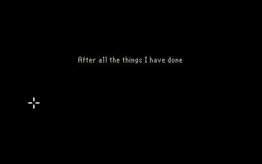
The Last Door
Everyone who knows me knows I’m obsessed with 19th century occult societies, lovecraftian horror, classical music and a good dramatic story. So here it is, a game I’ve been playing for about a year and a half now, on a very biased review of The Last Door.
Made in Spain by The Game Kitchen, this is a game that combines pixel art and classic lovecraftian horror with a compelling and genuinely unsettling story.
I’ve played through all 2 seasons, both on mobile and on my mac. For review purposes and because I don’t want to spoil this amazing game for anyone, I will be using only examples from the first episode, The Letter.

This chapter begins with one of the most striking moments of the whole series for me, a prelude with the man our character will be investigating committing suicide.

They could have just told us what happened, or showed it in animation, but the fact that the player has to be the one staging and executing the suicide for poor Anthony Beechworth is quite unsettling. By giving the player no other options than to click these specific objects in succession, the game pretty much drags you kicking and screaming to do it.
I also really enjoy the spacing of Beechworth’s last words, appearing every time the player gets him closer to his suicide.

One of the first things that are noticeable while playing this game is that the pixel art really works when we’re talking about mystery/horror. The fact that everything is not crystal clear and explicit works in favor of The Last Door, and it doesn’t hurt either that it has some beautiful environments.
The game also works well on both mobile and pc, since the controls are so easy.

Reviewing this game without mentioning the music would be making it a huge disservice. Carlos Viola composed an original orchestral soundtrack such as you very rarely see in these games, especially mobile ones. It’s so mindblowingly intense and complex that I find myself going back to it again and again, and I regularly listen to it.

The game also leads you very easily through the tasks, without offering them up to you too easily. It’s a really well crafted point and click, and even in pixel art all the objects are inteligible and the objectives clear.

Apart from the main font used, you also have a dyslexia friendly font you can enable on the menu, as well as a variety of other languages.
In short, even if The Last Door doesn’t offer much in the way of innovative UI, I think it manages quite well to craft a seamless experience combining narrative, visuals and sound, to create a horror game that will live forever in our dark little horror-loving hearts.
1 note
·
View note
Text
The Long Dark

Today I’m posting about a game I’ve started playing almost exactly a year ago. It’s a survival exploration game made by Hinterland Games called The Long Dark. It is still only available in Sandbox version, but it will *hopefully* soon have an available story mode.
The gameplay works very in the same vein as Firewatch. The UI is also quite simple and intuitive, and the landscapes and music combine to create a very wholesome environment.


When starting the game, you can choose between 4 different levels of difficulty, and the way this menu is presented really makes the whole experience more immersive. I went with voyageur, since I find that the next two levels are way too stressful (and difficult) for me.

Hinterland Games, masters of inserting beautiful relevant quotes.

The higher quality graphics in The Long Dark are quite heavy on my computer (an old MacBook Pro), so I turned them all the way down. Thankfully this doesn’t affect the quality of the game much at all. The landscapes are still beautiful, and the visuals really shine in this game.

The UI is minimalist in style, almost never really appearing until the player needs it. One thing I’d say though, it would be great to have a screen at the beginning just explaining the keyboard shortcuts for the Backpack, Map, etc.

On the character menu, the iconography really shines. I love the Sun and Moon detail at the top right of the screen, which sees the sun and the moon setting and rising in the horizon as a way to tell time. Which is pretty accurate, since our main character is stranded without a watch.
There are arrows on the right side of each icon signalling if something is going up or down, and a space reserved for temperature + windchill which is a big component of what makes this game challenging.

Objects are easy to select and interact with, with a circle that fills up as you press it for a certain amount of time. This makes the response feel real and intuitive, as opposed to having just clickable objects to interact with.

Crafting menus are also very accessible. In this example the player has three options to work with: Making fire, cooking and boiling snow/water.

There’s also a stats menu in the journal, with again, very simple and clear iconography and infographs.

Overall, one of the things that strikes me immediately in this game is how much the sound design and music contribute to the player’s experience. The sound is always top quality, the timing is flawless, and it brings an extra layer of feedback for the player to work with. Apart from that, the music is absolutely breathtaking, changing effortlessly from soothing beautiful instrumentals, to desolate sounding guitar compositions with an eerie atmospheric layer underneath.

This game for me is so immersive and soothing, and the amount of thought put into the visual and auditory feedback, simplicity of the UI, and overall artistic quality, place The Long Dark on one of my top games of these last two years for sure.
Pictured is the landscape I saw while leaving my cottage the morning after a huge snowstorm, beautiful sunrise and all. How can you not want to go out and explore?
4 notes
·
View notes
Text
Totemori

Today I have another game I’d like to talk about, Totemori. It’s a local multiplayer for pretty much every one, created by Mito Studio. It’s a brawler where you have to build totems to get points, while toppling the other player’s towers.
I’m a huge fan of these kinds of party games, and I think Totemori looks visually stunning. As far as the gameplay goes, the mechanic itself is very simple and successful. I had a great time playing this on several occasions as it’s a really fun casual game. Now, to the menus!

Beautiful low poly art, simple and clean menu with a sprinkle of playfulness.


The fist thing I noticed playing around with a few menus were the amount of options you have as a player. Not only do you have the very useful “clumsier bots” option for children, but you can also customise the mood of the level with several options including “Nite”, “Tuesday” and ““. You also get quite a few game modes and beautiful arenas to choose from.

On the character selection menu the interface offers a very succinct rundown on controlers.

On the controller settings menu, the player gets to customise the buttons following the instructions above. I am a huge fan of these types of settings menus, for several reasons:
- Younger children can customise their buttons more easily without having to fumble around in lengthy menus;
- An entire customisation is faster for the player because she/he is thinking instinctively;
- It’s gamifying a “boring” task for players.
This of course only works with simple gameplays that don’t have a lot of buttons or specifications, but nonetheless on this case I’d say it was a very good call.

During the game itself, the characters are highlighted by symbols associated with colors, doubling the visibility of the characters, and making it easier for colorblind players to identify them.

The one thing I loved about this game was the attention to detail when it came to customising and making it user-friendly. Everything was thought over and probably reiterated quite a few times, but the end result is stunning, and most of all super easy to get into and just play!
3 notes
·
View notes
Text
We Were Here
We Were Here is a co-op Horror/Adventure Escape game from Total Mayhem Games, where all you have is a walkie talkie to talk to your team member, and each other’s wits, to get out of the castle you’re both stranded in.

The gameplay is divided in two roles, the Librarian and the Explorer. As a Librarian you’re in charge of helping your team mate by solving puzzles, reading maps, searching through books, browsing paintings etc. As the Explorer you solve puzzles together with your team mate, run around, open gates, and almost die a lot.
This mechanic of being in two different places in the game but having to communicate to each other through voice to solve the puzzles makes for a very fun bonding experience.

One of the Librarian rooms.
I have to go ahead and say that the UI is not great. It’s very chunky and overall too big. It distracts from the beautiful art of the game and makes it feel a bit dated. Of course, that doesn’t mean it doesn’t work. I know UI issues a lot of times come down to personal preferences or what’s in fashion at the moment, but the size and look of the mouse pointer, bars, and the player’s “hand” contrast heavily with the delicate nature of a lot of the puzzles the player is working on.
If a player decides to play with the textures on low for performance reasons, be warned that the puzzle involving books will be hard to finish since the books will be pretty much unreadable. The game is still in it’s early days though, so here’s to hoping they’ll remodel the GUI and fix some readability issues.

Ye olde loading bar
Going into the user experience part of the game, I have to mention that We Were Here at this point is still having some server problems, bugs and general issues, such as the walkie talkies not working. When I played this game through with A we were in the same room, but as a substitute you could also play it with a friend through Discord or Steam.
I think that what this game does beautifully is force the players to develop a common language with each other. It has very specific visual puzzles and it makes the player think visually, get very descriptive and a lot of fun ensues from trying to describe symbols, rooms, places and paintings. The choice of using the walkie talkies (pressing V to talk) is very soundly justified at it makes the player feel immersed in the experience without encumbering them too much.

There were a few problems relating to feedback, namely on the chess puzzle, when the Librarian has to rewind a film, yet has access to turning the handle before the power is on, and then there is virtually no audio feedback on actions going forward. If a game is geared to VR, especially, the feedback has to be clear, immediate, and concise. Overall this is what We Were Here most suffers from.
In the same puzzle, there should also have been given the chance for the player to star over (ie. dying). The puzzle is so long that, understandably, the time between the start and the end with the Explorer freezing to death had to be too, but if you make a mistake, you should be able to start the puzzle over without quitting and reloading the game or waiting 5 minutes for the player to die. You never really want to hear your team mate say “Are you dead yet...?”.
This is exactly what they solved on the last big puzzle, at the theater, and it worked really well. The final puzzle is absolutely delicious to play. I have 0 faults to point here, since the purpose of the game is clear, the setting is beautiful and the puppet character is terrifying as it looms closer and closer to the Librarian as the play advances. It’s definitely one of the most rewarding moments of the game, and I don’t want to spoil anymore of it.

Overall, We Were Here works quite well as a virtual escape room, testing players under stress and how good they are at communicating with each other. Apart from some UI ubiquity and feedback problems, it has a lot of fun and challenging moments, and I’d be very interested in playing this game and similar titles in the future.
2 notes
·
View notes