Statistics
We looked inside some of the posts by itsleahflanagan-blog and here's what we found interesting.
Average Info
Notes Per Post
40
Likes Per Post
30
Reblog Per Post
10
Reply Per Post
0
Time Between Posts
18 days
Number of Posts By Type
Photo
17
Last Seen Tumblr Blogs


Fun Fact
Tumblr was attacked by a cross-site scripting worm deployed by the Internet troll group GNAA on Dec 3, 2012.
Photo

First Draft of my poster to bring in for critique.
2 notes
·
View notes
Photo


Project 3 Brainstorming Exercises
Above are two of my brainstorm exercises. I chose to use a mind map and a zoom.
The most reoccurring ideas are using certain items as showing what the play will be about through themes. Also since it is about a men’s bathroom, I hope to use the stereotypical male washroom symbols such as the bathroom man shape, the colour blue, and the urinal itself. For texture I hope to take photos of pipes and tiles. I will decide between the two and use it for texture and possibly colour.
To be decided is the style of poster. If I want to make it a digital collage or a more simple design.
1 note
·
View note
Photo


Photo 3
Graffiti Building
1: The Shots U Dont Take
2. Urban Pattern
3. Trashy Pop
2 notes
·
View notes
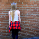
Photo


Photo 2
Bicycle in an Urban Setting
1. Reflection
2. Faded Brick
3. Golden Ticket Bike
2 notes
·
View notes
Photo


Picture One
Freight Elevator Control Panel
1. Scattered Circle, numerical
2. Rustic Minimalism
3. Hooked on Orange
25 notes
·
View notes
Photo

Every Day Design:
A 3 canvas (each 16 x 22) art piece I designed. It’s medium consists of collage, sequence, and acrylic paint.
2 notes
·
View notes
Photo


Second Design Thinking Tool
For this thinking tool exercise, I decided to do the coaster layout. I used the mind map and the zoom tool to brainstorm. This helped to narrow down ideas and not have so many clusters.
For the coasters I decided to use the circular layout is best and use the shape to my advantage. After being to many restaurants, I pulled from my knowledge of design and decided I like the idea of promoting the place itself, a special, and also becoming a conversation starter when people are struggling to keep their date from flunking. This would involve a funny quote, a truth/dare question, or a special that happens, such as the idea of having a “Half price booze tuesday” or half priced bailey’s hot chocolate on a Wednesday.
I thought it would be a youthful idea to use the owl and rooster as a humorous piece as well. It will give people another thing to talk about. On the coaster It will be in the middle with the logo and the information of the cafe below it. This will allow people to hear more. I am still deciding whether to make the back side a QR code or to put other information, like i said before the specials, on the back.
0 notes
Photo


Thinking Exercise 1: Tea Labels
Through this exercise I was able to narrow down what it was I wanted to show on the tea label but also the brand itself. One that I will include in the final I really liked the idea of is using the logo as the shape of the tea label. Since it is so small, this saves space of having to do this. If it was left out it would not give off the same level of branding. The questions helped me to form a sense of what the cafe is going to look like. By having a vivid image it is easy to imagine what is needed in order for the cafe/ bar to succeed for many years. In my exercises I decided something interesting would be to have a lot of local artists put their art up for sale and have prints for sale to support other local businesses.
One contrast I wanted to focus on is that cafes are seen as a day activity and lager is seen as a night thing. I thought out many opposites. My favourite was the difference between a rooster and a night owl. From this I am now doing some design mock ups of whether to have the wings spread or together.
In regards to the actual tea label, I decided it is important to include the title (Lift Tea), the logo, and a small description of the tea (whether it is decaf, caffeinated, black, green, etc.). I originally branched towards the idea of a board game cafe but here we can see it is more focused on the fact that there are multiple purposes for this safe haven. I also decided that in theory it would be 24 hours. That way students can study all day and have a place that serves food, drinks for after studying, and where all-nighters are welcome.
0 notes
Photo


Design Post
I did some doodling in my notebook and was inspired to see what could come of it when using illustrator. I make bizarre face outlines (as you can see the inverted nose, outer lips, ear and wide chin). I have learned that duplicating can make interesting shapes. This image could be a cool logo.
1 note
·
View note

Photo


Exercise 2 blog post
Repetition is the first word I chose. It has always been a word that reminds me of basic traits and more childish ideas.
Repetition 1:
In this piece I used complimentary colours of blue and orange along with some shapes to show the simplicity I associate to repetition. They are used in a pattern. In the background the word is repeated as another means to show this.
Repetition 2:
The second piece was inspired by using the letters in the foreground instead of back. The circles were measured out precisely to fit the 10 letter word. The colours are also repeated. The blue is consistent with the other piece too.
The second word I chose was migration. Through this word I wanted to stick to a greyscale piece to see what I could do without colour.
Migration 1:
The first piece uses a minimalist approach to show how an eye can move through different opacities or tonal changes. I also slanted everything to suggest gravity, as though the words will just slide off the end if it were to move.
Migration 2:
In the second piece I used the element of design of movement. In this one I used the vectored word and separated the letters. I made them appear to be falling and moving away from the main word, as though they are migrating. Again, I used a colour variant to show the solid from the moving ones.
Overall, the design work came directly as I thought of the words along with the drawings. You can see from the drawings that I decided for the first one on shapes and reusing the words over and over in different ways. For migration, I had many ideas of something moving or flowing in a pattern or organically.
0 notes
Photo

Reflecting on Design in Everyday Life
From my everyday environment I chose a magazine that was purchased recently as an example of good design. It shows strong design by appealing to its demographic visually, symbolically, and textually. Design is created by a vast amount of ideas put into one final product. Here we see Cosmopolitan Magazine for their October issue.
On the cover is Lauren Conrad who is a great design choice as she has a large following of loyal fans, is well known, and has a positive reputation in the media at this time. She appeals to the demographic purchasing the magazine (which is usually women 18-34) as being a successful entrepreneur. For this she could be called a symbol of feminism which the demographic accepts and appreciates. She is also placed in a visual hierarchy place, located large in the centre, making it the first place the viewer’s eyes go. The outfit she wears creates a pallet for the other colours used on the fonts such as the purple and a complimenting colour of pink. The black text is also used throughout to create consistency. Here they use sans-serif fonts in different sizes to show what is most important to their demographic. It is also a youthful, feminine font to catch the potential buyers’ attention. It is very minimalist and uses blank space as a positive feature to make it look neat and bright. Also the look of minimalism is very popular in the design world at this time making it seem trendier than other magazines. Compared to other magazines it is usually placed next to such as “people” it is much more visually attention grabbing for not having too much on the cover. This is why it stood out for me when deciding on a magazine to purchase as a form of entertainment.
2 notes
·
View notes
Photo


Reading Response 9: Michael Connor “Hito Steyerl's 'How Not to be Seen: A Fucking Didactic Educational .MOV File'”
Introducing: The invisibility cloak by Leah Flanagan
After watching this video, I realized how recorded our lives are. This piece shows some of my amazing adventures but if my identity was removed to it, notice how the rest of the photo is so enhanced!
0 notes
Photo

Reading Response 8: Paul Dean “Tropes vs Women in Video Games: Why it Matters”
Introducing: Wii Can Do It! by Leah Flanagan
Reading the Feminist Frequency article, I was very sad to actually see how many male characters there are over female characters and even then, they are all very girly with lame super powers. This photo is a drawing of some of my favourite ones banding together to help break the stereo types of females by being the heroes of the game.
1 note
·
View note
Photo


Reading Response 7: HONOR HARGER “Drone's Eye View: A Look at How Artists are Revealing the Killing Fields”
Introducing: Everyday War by Leah Flanagan
Reading this article made me think about how this could be any place which puts all of our lives at risk. The following are made of pastel or pencil and show different weapons being aimed at people doing their regular routine.
0 notes
Photo

Reading Response 6: Andrew Norman Wilson "Workers leaving the Googleplex"
Introducing: Ice Ice Sky by Leah Flanagan
After reading Wilson's interview, I was curious of the photos that were posted in the article and decided I wanted to attempt to make a piece of art like this. I decided to try to do a take on his piece labeled "Ice Ice Baby" which can be viewed for comparison Here.
1 note
·
View note
Photo

Reading Response 5: Jennifer Chan
Introducing: The Selfie Cloud by Leah Flanagan
In one of the articles on Jennifer Chan, it says, "If you do not want your image to travel somewhere far away, do not release it to the cloud." This is an image of photos of myself that are posted online I have released into the cloud that anyone can save.
0 notes