
Don't wanna be here? Send us removal request.
Statistics
We looked inside some of the posts by jackyjianggg and here's what we found interesting.
Average Info
Notes Per Post
0
Likes Per Post
0
Reblog Per Post
0
Reply Per Post
0
Time Between Posts
7 hours
Number of Posts By Type
Link
1
Photo
12
Video
3
Text
1
Last Seen Tumblr Blogs


Fun Fact
Tumblr was attacked by a cross-site scripting worm deployed by the Internet troll group GNAA on Dec 3, 2012.
Link
Final Pitch Video
Overall quite happy with the pitch video. I don’t sound sick in the video but I was when recording.
0 notes
Photo

Pitch Video Assembly
I decided to create my pitch video in Premiere Pro as I am most familiar with the program. I did have to film some extra bits at a film camera store as well as at the beach.
0 notes
Video
tumblr
Film Stock Selector + Add to Cart
The process of the film selector is very similar to the camera selector tool. I also wanted to show off the add to cart feature at the end.
0 notes
Video
tumblr
Film Stock Browse + Comparison
This shows off the comparison bar as well as the key information. By providing key information without having to go into specific pages, this makes comparing more efficient.
0 notes
Video
tumblr
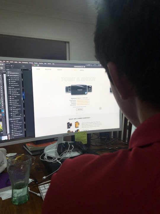
Home Screen + Film Camera Selector
This introduces the film camera selector tool. Which is the main feature of the website which makes it unique.
0 notes


Photo

Browse Film Stock + Drop Down Menu consideration
These pages are probably my personal favourite out all the screens. It contains the same layout as the film camera pages but I also started thinking about the drop down menus that will appear. From previous user testing I learnt that the beginners may get confused and lose track of which page they are on if the menu takes up the whole screen, therefore the solution is to have a slide down menu that users can close.
0 notes
Photo

Pitch Video planning
After completing the screen recordings I decided to plan out the order of introducing the features. At the same time I wrote the script and got classmates to read over it to make sure I covered all the points.
0 notes
Photo

Final Principle File Layout
The process of making the pages work definitely was a huge struggle. It was time confusing and very confusing at times. If I did it again I would make sure to rename the Sketch files better. This is probably an overkill. I recorded the walkthrough on principle before the pitch video.
0 notes
Photo
User Testing/Legibility Test
Before moving on to the animation stage of the design I decided to have users check the legibility of all the screens. This is useful because I did identify a few little things I needed to change before bringing into Principle. For example, for the graphs as seen in the pictures, the outline underneath the yellow was a light grey which was barely legible. Everett picked up on this.
0 notes
Photo

Final Screens High Fidelity Design
I made minor design tweaks during the process, improving on the menu navigation was one of them. I kept the body text to the green and yellow for selected titles. The beige background to me feels easier on the eyes. I did explore the background white a couple weeks back, I wish I did this earlier, but hey its done I can’t change whats happened already.
0 notes
Photo


Major Changes to High Fid Colour Choice
Within the last Monday class with Tanya, I showed her the prototype and she questioned whether the green background across all the screens were a bit too much. During the user testings, when asked about the colours, participants did not express they had any issues with it. I went home and explored with a beige/green option with yellow accents which I have not previously explored.
0 notes
Photo


Colour Switch User Testing
As I was at home, I needed some none biased opinions quickly, so I asked on social media with screenshots attached to get feedback. The beige ended up being the more favourable option but not by much. I had the choice to keep it green, but personally I liked the white more, so I knew if I kept it and handed that in I woudn’t have been happy with myself. So therefore, I decided to redo all the colours across all the pages.
0 notes
Photo


Penultimate User Testing
Overall the feedback I received was positive! I can see the end! Most users enjoyed the colour combination of the green and yellow. The colour is described to be easier on the eye than the yellow and purple. Although some users said that the text can sometimes be swallowed within the colour, therefore, the title at the top can sometimes be ignored.
Users preferred the images with shadows over the ones that didn’t have shadows as they thought the ones with shadow felt more anchored to the page making it seem more interactive.
Another feedback was to have arrows in between switching products as right now most users did not know you could click between different images to select cameras, that needs to be made more obvious.
I was encouraged to play around with more weights and sizing of text as some users were still confused about the hierarchy order of some pages.
0 notes
Photo

Contextual Document Printed
I decided to focus heavily on completing the contextual doc ages before hand in because I wanted it be out of the way for me to focus on the actual design.
Edit 20/10/10: Now looking back at it, I could’ve have left it for a few days and I feel like I rushed into, there were a couple of changes I wanted to make a few days later but i ran out of time.
0 notes
Photo

Struggles...
One of the most challenging aspects of the website is how to make images look good on a coloured background? I asked people to shoot this photo and have them scanned in. This look ok. different but ok. I would like to explore options of how I could develop this design.
0 notes