
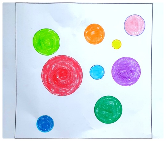
Earth without art is just 'eh' ~ Jagath Narayan NID 2020-23 Photography Design
Don't wanna be here? Send us removal request.
Statistics
We looked inside some of the posts by jaggugram and here's what we found interesting.
Average Info
Notes Per Post
49
Likes Per Post
49
Reblog Per Post
0
Reply Per Post
0
Time Between Posts
19 hours
Number of Posts By Type
Text
17
Last Seen Tumblr Blogs


Fun Fact
70% of Tumblr users say the Dashboard is their favorite place to spend time online.
Text
FUNDANENTALS OF VISUAL DESIGN
The course was a real eye opener for me and has changed my perception of seeing things around me. It has influenced me a lot in a way that, now a days I am finding Gestalt laws in everything around me. I am noticing the colour wheel arrangements of colours in nature. Finding complimentary colours has became my favourite observation activity. Also I started looking the Logos of brands and the Colours and shapes they are using to attract their potential customers or creating interest in people with the feelings hidden in the colours. I started understanding why KFC is painted red and Federal bank office is painted blue. Also i started relating the sounds in movies and their corresponding emotions and colour gradings that connects the audience. I started observing and understanding modern art better now. I can find Rythm, Patterns, Balance, Point of interest and all those stuffs within it now.
All these have influenced me and my personal life a lot that it has started reflecting in my daily life as well as my artistic life.
5 notes
·
View notes
Text
BTS : Recording Audio (Music Video Project)
Recording audio from real world environment was my first ever experience. It was actually fun and interesting. I was luck enough to get a Professional quality audio recorder which my friend bought yesterday for his personal project. And it really helped us in creating an extraordinary audio for our Music Video Project.

2 notes
·
View notes
Text
BTS of Final Project Video
Creating set

Lighting setup
3 notes
·
View notes
Text
ASHES - Final Group Project
youtube
A narrative about transition of a News paper from a source of information to waste paper and ends up becoming into Ashes.
5 notes
·
View notes
Text
MINI PROJECT BTS
Creating colourful explosions with Acrylic colour paints and syringes were fun and very much oddly satisfying to watch
Recording sounds from real world environment was a blissful experience. I was lucky enough to use a professional Audio Recorder which i borrowed from my friend for this project
Behind the scenes of my Part in creating music video

0 notes
Text
MINI PROJECT : MUSIC VIDEO
All the senses come together to create the perception of a colour.
Each colour has an emotion attached to it which evokes memories and past experiences.
ULTA is an attempt to question the relationship between sensory emotions to the corresponding colours.
youtube
Group:
Aswin Raveendran
Neena P
1 note
·
View note
Text
COLOUR JOURNAL
A Self Exploration in the World of Colours

My first experience with Colour Journal

After learning about Colours in my FVD module, I started looking around my sorroundings to find examples. And the first thing that had my attention was The Tibetan Prayer Flag with different colours and each colour becoming symbols of natural powers.


My other exploration was finding complimentary colour combinations around me

I tried mixing and creating my favourite Turquoise colour was very much satisfying


Creating colour palettes was also a very interesting stuff. The Analogous colour palette and the pepsi logo was interesting to experiment


Experiment with water soluble oil palette was a different experience
-
After doing the colour journal, my outlook on seeing Colours had changed a lot. I started noticing the Colours from a different perspective. As explorations never ends, I am going to take it along in my routine.
2 notes
·
View notes
Text
COMPOSITION and PRINCIPLES
Deriving Principles of Visual Design Within a Composition
#1 Word: PAST
PRINCIPLES DERIVED
Pattern
Scale and proportion
Symmetry


#2 Word: FRIENDSHIP
PRINCIPLES DERIVED
Symmetry
Balance
Scale and Proportion
Point of Interest


4 notes
·
View notes
Text
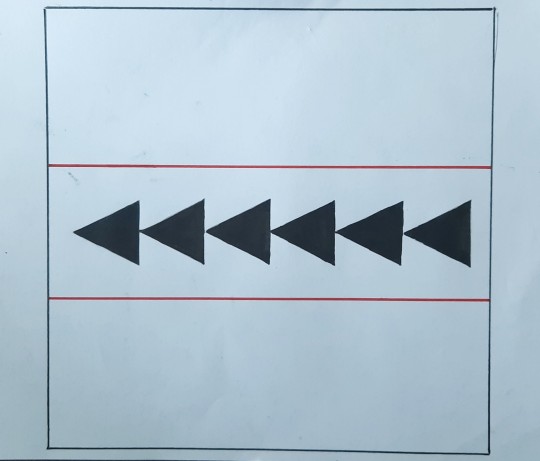
RYTHM, BALANCE AND POINT OF INTEREST
Here, Principles of Visual Design is represented using a dot having 5mm dia and a line with 3.5cm long and 2mm thickness is used inside a 20*20cm square on an A4 size paper.
The compositions I made were inspired by real world objects, art and music

The LHS composition is inspired from one point perceive drawing which has the centre point as the Point of Interest
RHS composition was inspired by a light source aka light bulb (Point of Interest) which emits light

The LHS composition is balance as per the Rule of thirds
The RHS composition is inspired from famous painting called 'Starry nights' By artist Vincent van Gogh which has a balance

Here, both the compositions were inspired from music notes which has a Rythm.
Fundas of Visual Design
3 notes
·
View notes
Text
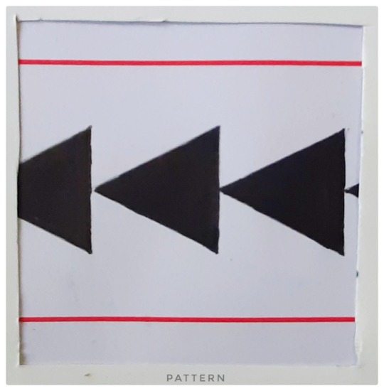
Understanding Principles of Visual Design with Lines and Dots (Thumbnails)
In this activity, the principles of Visual Design such as Pattern, Rythm, Balance, Scale and Proportion, Point of Interest, Unity and Diversity are created just using lines and dots.
The thumbnails are shown below


Fundas of Visual Design
2 notes
·
View notes
Text
Cross Sensory Perception #4
#4 Lime Juice
The energy of a chill lime juice is the idea behind the form and obviously the lemon yellow too. And blue chills the mood.
Audio is also full of energy and and pleasant sunny vibe for a glass of lime juice
4 notes
·
View notes
Text
Cross Sensory Perception #3
#3 Vanilla Ice cream
The blue colour is obviously the coldness of the ice-cream. The light blue was induced from the sweet taste of vannilla Ice cream. The beats associated is kind of a chill beat with mood of a summer vacation where more ice-creams are tasted out of all the seasons.
1 note
·
View note
Text
Cross Sensory Perception #2
#2 Dosa, curries + filter coffee
The blue represents morning blues before breakfast. It is getting covered with light yellow colour form filter coffee sipped in between Dosa (ochre yellow) mint chutney (green) and sambar (red). The audio here by colonial cousins band is connected with the Bru coffee ad in 90s. Because the breakfast is incomplete without sipping filter coffee which makes my day.
2 notes
·
View notes
Text
Colour Music and Cross Sensory Perception
An activity to understand cross sensory perception which includes Taste, Smell, Sound and Visual senses.
Here i found a relation between Food Music and Painting.
#1 Palada Payasam with Pappadam
The colour of banana leaf on which the payasam (dessert) is served made me paint green as an outline. The yellow represent sweet warm palada payasam. Brown was inspired from salty pappadam. Slight red colour is the spicy leftovers of the sadya. The audio is from an old malayalam movie which has the scene of sadya that hooked me to select for this particular food.
Contd...
2 notes
·
View notes
Text
Gestalt Principles
Gestalt Principles are principles/laws of human perception that describe how humans group similar elements, recognize patterns and simplify complex images when we perceive objects.
1.SIMILARITY The Principle of Similarity states that when things appear to be similar to each other, we group them together.

All those guitars looking similar is creating a group by it self.

All the similar fishes forms a group.
2. PROXIMITY
The principle of proximity states that things that are close together appear to be more related than things that are spaced farther apart.
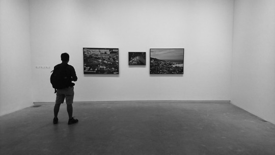
All those frames which were placed close together appears to be related
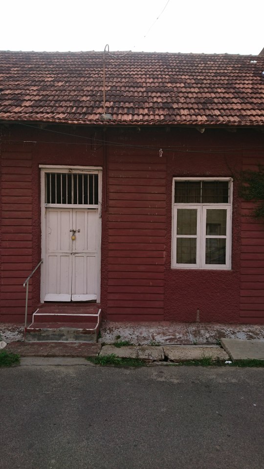
The doors and windows are lying close to one another creates proximity

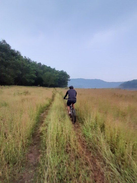
The group of cyclists together creates a relation apart from the background landscape.
3. CONTINUITY
The law of continuity suggests that we are more likely to perceive continuous, smooth flowing lines rather than jagged, broken lines
The line of path creates a continuity in the image

It is easy to perceive the continuous path in the image rather than the forest in background

The leading lines of light catches our attention more than all the other elements
4. CLOSURE
As per the Principle of Closure, We tend to perceive forms and figures in their complete appearance despite the absence of one or more of their parts, either hidden or totally absent.

Here, the tree tends to create mystery by covering most portion of the frame, leaving the viewer to fill the gap in between

Here, the view through the open window completes the gap formed by the shady foreground
5. SYMMETRY
Symmetrical elements in an image are perceived as part of the same group. The relationship of both sides helps us to perceive the elements as a united figure.

Here, the reflection on the glass window divides the image into 2 equal parts creates a symmetry

The horizon divides the image equally in the above frame creates a balanced symmetry of 2 different textures
6. FIGURE TO GROUND
The figure-ground principle states that people instinctively perceive objects as either being in the foreground or the background. They either stand out prominently in the front (the figure) or recede into the back (the ground).

Here, the gap in between the strands creates a figure

Here, the main interest is the figure in the foreground
CONCLUSION
Studying The Gestalt Principles was a great eye opener for me in my entire life so far. It has helped me a lot to understand a visual from a different perspective. From now I am automatically trying to find Gestalt in every single object around me!
Fundas of Visual Design
5 notes
·
View notes
Text
Colour wheel with water colours

Making colour wheel by mixing water colours was very interesting. It was very interesting to do and see how Primary colours mixes and forms secondary collours. I had almost forgot this experiment done back in primary school classes. Now i understood the importance of understanding colours not just for design education but has changed the way I see and perceive colours around me in my everyday life.
Fundas of Visual Design ❤️
4 notes
·
View notes
Text
COLOUR INTERACTION
Every colour is seen in relationship to another colour. When you see two or more colours together they have a profound effect on one another. The study of colour interaction helps us understand and predict how a colour will be influenced by its surroundings.
Below are some examples
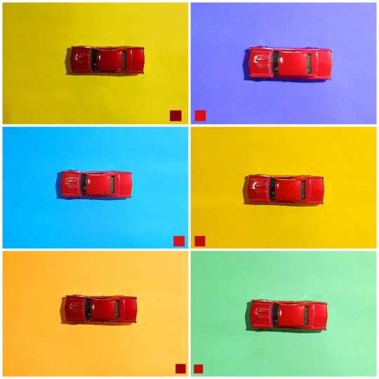
Interaction of the colour Red with other colours as background
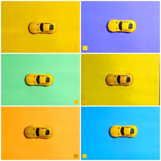
Interaction of the colour Yellow with other colours as background

Interaction of the colour Blue with other colours as background
From the above examples, we can see the contrast of colour changes when the background colour was changed.
Fundas of Visual Design
4 notes
·
View notes