
Don't wanna be here? Send us removal request.
Statistics
We looked inside some of the posts by jamesaoverton and here's what we found interesting.
Average Info
Notes Per Post
1
Likes Per Post
1
Reblog Per Post
0
Reply Per Post
0
Time Between Posts
6 days
Number of Posts By Type
Text
12
Last Seen Tumblr Blogs


Fun Fact
US Tumblr user growth rate is estimated to slow down to 4.1%.
Text
Extreme Capturing of Skateboarding by James Overton
This blog documents the progression of my photography project.
Link To Project website:
https://jimboboverton.wixsite.com/mysite-1
Link to Project Photos:
https://drive.google.com/open?id=1rDJCkU3AMIE5AjBag4QGThjowdldKKxu
0 notes
Text
Creating my Photography Brief#11
Coming up with an Idea for this project wasn't that hard to start with as I knew I wanted to do action/travel photography as this is something I was really interested in. I took a lot of inspiration from Gopros instagram accounts as they are always posting pictures and videos of people using their Gopros to create some really cool content. But when it came to narrowing it down I found it really hard, especially trying to find a way to make my project stand out from all the other Gopro content.
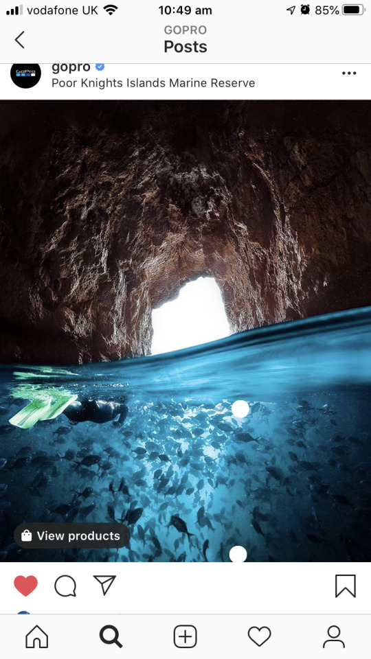
The turning point in my project was when I realised I should do it on skateboarding as this is something I am really passionate about and my passion for skateboarding suddenly made the project a lot easier to focus on and properly experiment with ideas to make it unique and stand out. This is when I decided to use a Gopro as well as this is a camera that I personally really like using, and with a bit of creativity it could help me get some really unique shots for my project. After doing some research into Gopros social media posts and creators that use Gopros such as Chris Rogers I decided that my photography project will focus around capturing unique points of views within skateboarding.
Photography Brief:
Title of Project - Extreme Capturing of Skateboarding by James Overton
Photographic Genre - sport/lifestyle/travel/equipment
Outline (1 paragraph) -
For this project I will be focusing on capturing photos of extreme sports, mainly focusing on skateboarding and how I can use cameras like Gopros to capture unique points of views and display them as photographs.
Who is your audience? -
The target audience for this campaign would be anyone who is interested in skateboarding or interested in capturing photos of extreme sports. The targeted audiences age range would be 16 - 30 years old.
Tag-lines - skateboarding, POV, Go Pro, Extreme POV
Rationale - Im doing this project not only because I'm passionate about skateboarding but because I like to push boundaries and find new innovative ways to capture extreme sports.
Inspiration/Research -
My inspiration for this project would be Chris Rogers (WEBSITE?). He is a filmmaker that purely uses Gopros to make his films and take photos with. He also likes to film extreme sports like wakeboarding, surfing and snowboarding often using the Gopro to capture unique shots. A lot of my research for this project will be done through the Gopros Instagram page as it is very useful to see all the different creators that they feature on their page.
Will your project be unique? -
My project will be unique because I will be focusing more on getting pictures from the skater's point of view and some third person style shots where as a lot of skateboarding photographers focus on getting pictures of a skateboarder in a wide shot as they skate an obstacle.
What will be your visual consistency and format - all shots will be shot on a Gopro using a wide angle lense to create a fisheye effect.
Implementation - this project will be implemented throughout my social media accounts and will also be posted on a website.
Website/Social Media /Equipment -
All photos will be on website and used on Instagram
I will be using a Gopro Hero 7 to capture the photos, this will help me a lot in my project as Gopros are made for capturing extreme sports. I will be using a head mount or mouth mount to get some of the POV style shots.
Location -
I will be taking these photos around different parts of Portsmouth and Southampton. I will mainly be looking for flat locations such as Southampton's guild hall.
Assistants/Crew/Props/Models?
Throughout the most part of this project I will be working alone but there will be certain shots where I will need crew members to help out with taking or to be in the shot.
0 notes
Text
Social Media Use And Integration Of My Work#10
When it came to uploading my pictures to social media I didn't know if I should make a seperate account purely for this project and other projects to come in the future or use my personal one. Eventually I decided to use my personal account as I already had followers and pictures on this account, I also think that having other pictures adds a bit more character to the account. To make the most of instagram when exporting my images I made sure to crop them to 4:5 as this takes up the most screen space on Instagram. However due to the technicalities of the shots some photos couldnt be shot vertically because of how the camera was held during shooting.


This is a travel photographer called Benjamin Ortega and as you can see from this post it has been cropped or shot vertically so that it takes up the whole screen when viewing it on a phone. As I talked about in a previous blog post this has become a common trend with influencers and photographers to shoot verticle photos to better optimise them for social media.
To ensure that these photos have the option to reach people that are not followed by me I will be adding hashtags that relate to the image. I am also going to make sure that I don't post all these images at once as this could result in some people not being bothered to scroll through all of the images. A lot of social media influencers do this is, if they withhold some photos and spread them out it allows them to have a steady stream of photos to post between projects. Instagram will be the main social media application to promote my work but I will also have a link to my Linkedin account on my website as well so if people are thinking about hiring me for a job they can look more into my experience with work outside of photography.
0 notes
Text
Branding and Implementation#9
To brand myself as a digital creator I wanted to have a very minimalistic logo as this would fit in well with the theme of my portfolio site. My original Idea was to have some typography inside a shape and I did this in Adobe Illustrator using a white outline of a rectangle and having a white font in the middle of it followed by a baby blue background. The font used was called Tuesday Night and it looked like someone's handwriting, I thought this looked really good as it made the logo seem more personalised.

The inspiration for this logo came from a youtuber called Casey Neistat as the logo that he uses for his personal brand is his name printed out in his hand writing. But when it came to testing this logo on my website I wasnt a fan of it and much prefered to keep it simple and just use text that was easy to read because this font looked nice but isn't the easiest to read. And this especially doesn't work on instagram when the logo is really small it makes it even harder to read. I tried to solve this issue by increasing the stroke on the text but as the lines are so close together they just started to merge into one.

The decision was then made to change the font on the logo to something more simple that will stand out and be easy to read. The font was changed to a font called Open Sans and two styles were used Open sans bold and open sans light, the light font was used below the bold font and the font size was reduced slightly smaller. I was very happy with this logo as it is very minimalistic which is consistent with the site but when the logo is being used on the site I think it looks a lot better without the rectangle.


I personally think this logo works really well on the website but when used on instagram it doesn't have the same effect as it makes the profile picture look boring. And I think using a picture of myself has a bigger impact on the brand as it gives a more personal effect. I have also seen a lot of creators do this rather than using their logos on Instagram.


This research shows that even though creators have their own logos they all use images of themselves on their social media as it makes the account look a lot more friendly and personal especially if they are an independant creator.
0 notes
Text
Post Production/Software #8
I decided to start the post production photo editing after the 3rd shoot. This was done because the process of getting all the photos was taking a lot longer than expected so to make sure that everything was ready to be completed on time I started to edit the first half of the photos. This was really good as it allowed me to experiment with the style of the photos so that by the time all the shoots are done I will be able to easily edit the photos and add them to my website. To edit these photos I will be using Adobe Lightroom, I was undecided on how I wanted the photos to look, so for the first style I decided to have it in black and white so I dropped the saturation down to 6 and increased the contrast, shadows, whites and blacks to to turn the image black and white. To make this image stand out a bit more I increase the clarity to 50 to add a bit more detail.

I personally really like how this turned out however I want to try another style to see how it looks just to give me a wider view of what works best for this image. So for the second edit I still decided to go with a desaturated image but left some color in. I did this because I thought that trying to make these images look really colorful wouldn't really fit in well with the theme of the project and the colors in the locations shot were pretty plain as well, so going for desaturated images worked really well.

After experimenting with the different photo styles I eventually decided to stick with the black and white images as I thought this looked really good with the shadows.
0 notes
Text
Pre Production/Behind the scenes #7
To ensure that I could achieve the shots I wanted to get and complete them to the required standard I asked a few friends to help out by being in some of the none POV photos as this would be a lot easier than me having to set up a tripod and taking photos of myself skating. However due to the current situation with COVID-19 I won't be able to go to Southampton and shoot with those people so all the skateboarding shots will have to be taken on my own. This causes a slight challenge as it means I will have to use a tripod for all the none POV shots and shoot them on my own making it a lot harder and more time consuming and time outside is very limited at this time, however this could be a good thing as it can give me the opportunity to focus more on the POV style shots. I will try to do some POV shots in my back garden and that combined with the brief period of time that we are allowed out to exercise in I should be able to get some more photos taken. If it turns out that this isn't doable I will change my project to doing POV photos of everyday life within the lockdown and try to integrate some skateboarding into that as well.
The POV shots were taken using a makeshift mouth mount for the Gopro and were shot using the wide lense which creates a little fish eye look to the shot, this also allowed the camera to capture a lot more of the environment because in this shot the camera was just focusing on the ground.

The third person styled shots were just achieved by holding the Gopro in my hand and facing it towards me. This only turned out well because of the wide lense which allowed the camera to capture a lot more than a normal camera. However it was very hard to skateboard and try to hold a good camera angle for the shot.
On the first day of production I went out to do some test shoots, I mainly tested out the best way to capture the POV shot. For this shot I was going to use a mouth mount for the GoPro and do a varial kickflip or just a kickflip to see what looked the best, I tried doing this in my back garden but it was very hard as there's a lot of cracks in the patio. So to get this shot done I decide to use up my 30 minutes of exercise for the day by skating to the sea front where the ground was a lot smoother. I made sure to do this in the morning when there weren't many people around this also meant that the lighting was really good as the sun was just coming up. To capture these shots I used the burst mode and set it to take a burst of 30 photos to make sure everything got captured start to finish. Personally I think these shots came out really well although I will be redoing them to try and get my shadow in front of me to fill in some of the negative space in the rest of the frame, this is more necessary in the shots where I am holding the GoPro in my hand as a lot of the frame is just filled with empty concrete and having the shadows in the shot will make it look a lot more interesting. So in the next test shoot I will try to incorporate the shadows into the shot and also try to reduce the amount of stuff in the background so the shot is purley just me, my skateboard and my shadow. However during this first test shoot I encountered a problem where one of the trucks on my skateboard snapped, so this has delayed production until I can either get access to my old trucks or until I can buy new ones.

(Image 1)
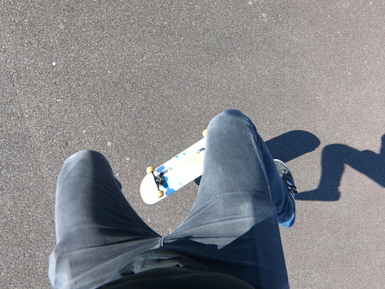
(Image 2)

(Image 3)
After looking at the images from the first shoot I thought they looked a bit plain, so I decided to try and recreate the same shots but have the shadow of me in the shot as well this will make the images more interesting by eliminating all the empty space in the rest of the frame. These photos were inspired by a photographer called J Grant Brittain as he has a lot of photos which were taken in black and white and focus on a skateboarder and his shadow. I will be focussing on the POV shots when using this style as it will make my photos stand out from J Grants.

(Image 4)
However this was very hard to try and recreate the same shot that I liked (Image 3) as there is a lot that can go wrong when trying to skateboard and take the photo at the same time. There was also the issue where in a lot of the photos the shadow was getting half cut out of the frame. I got a lot of good photos in this second test shoot but I was taking too long trying to recreate image 3 but with a shadow that it was delaying the overall production, so to make sure everything was on track to finish on time I had to settle with not getting the perfect shot and move on to taking the rest of the images.

(Image 5)

(Image 6)

(Image 7)
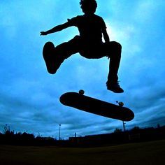
I was very happy with the shots that I managed to get in the second shoot, even though I couldnt recreate image 3 I still think image 7 turned out really well. there was one shot (image 6) that I think could look really good if I cropped it a bit however I dont think I will be using this as it wont really fit in that much with the shadow theme and it might not fit in with the rest of the images. I got inspiration for image 5 from a proffesional skateboarder/youtuber named Aaron Kyro. he has an image set as his youtube channel profile picture for braille skateborading of him doing a kickflip in the dark and you can only see his silhouette. I really like how this image looks and im really pleased at how image 5 came out as I think I did a good job at re creating it and adding my own unique twist to it.
for the next photo in this project I decided to do something a little different by just having a picture of me walking away with my skateboard. I decided to crop this down massivly so that only the bottom half of my legs are showing, I did this because I wanted the focus of the photograph to be the shadow and me to be in the background.

I really like how thi shot turned out but I wouldve liked it if the shadow was a lot bigger but due to the unreliable weather at the time this couldnt be achieved.
As it came to the end of the project I was really struggling with how to get the final two pictures as only being able to go out and take pictures alone was becoming a bit of a struggle. I thought about how to change up the project to fit in with isolation and had the idea of doing 3 photos of skateboarding and then 3 photos of me not being able to skate in the house. However I decided not to go down this path as I really wanted to stick to my original idea as it is something I am passonate about. I had two back up images (image 3 and 6) that I wasnt sure I was going to add into the project but even tho these photos didnt focus on the shadows I really like them and think they look really good, they still fit in to my original idea which is capturing unique points of views within an action sport.

Originally I planned on having someone help me take photos for some parts of this project but due to COVID-19 I had to shoot alone. I didnt actually own a tripod and couldnt use the student loan store so to capture this shot I made a make shift tripod by filling my backpack with a big coat and then putting a Gopro attached to a selfie stick into the bag. This was succesful but at the same time it was very hard to try and line up the shot then remember where I had to skate and then succesfully do a kickflip in the right spot. which is why I think this shot couldve been better if you couldnt see the houses in the background but I cant crop it out as it will then cut out half of the board.

0 notes
Text
Developments in Photography Industry #6
Over the recent years digital photography has been developing at a rapid pace. One of the most recent developments being drones, and as drones get cheaper and cheaper more photographers will start using them. Drone photography has spiked in popularity as it allows photographers to capture great content with ease that they never used to be able to get before. Photo Editing has become a lot easier in recent years as well with the introduction to free software such as canva and Fotor, even if you don't want to edit your photos yourself you can easily get the desired look by using presets which a lot of professional photographers release and sell. There's even specialised companies that offer photo editing services. Due to smartphones and the increase in social media advertisement vertical photography has become more and more popular, mainly because this takes up the most screen space on apps like instagram. And online apps like instagram have started to become a more mainstream way for photographers to advertise their work and some people could argue that instagram accounts can be a photographers main portfolio.

Action cameras such as GoPro and DJIs OSMO action are becoming a lot more accessible with new models coming out with cheaper prices and also the camera's quality is always increasing to the point where they can rival professional cameras. They are also used for a lot more than action sports as they are pocket sized influencers tend to use them a lot for travel photography as they are easy to carry around. This then led to the development of 360 cameras which allow photographers to capture 360 degree photos which can be really good for panoramic photography and they can also be used to create some really creative shots such as small planet shots.
Very recently Gopro released the GoPro max which is a 360 camera as well as having all the functions of their other action cameras, this camera would be very useful for capturing unique POV shots especially now that it can take 360 photo and video.
0 notes
Text
Website Development #5
After researching into other photographers websites it has become very clear what is going to be required in my own site. The website will have to have a minimalistic design to put the main focus on the photos being displayed on the website and not clutter the site with useless information. Another key thing is to make sure that the navigation is really clear and easy to use so that the users can easily find what they want on the website. This is the same for social media icons because social media is essentially going to be a second portfolio so it is really important that icons/links to my social media sites are really easy to find. When creating my website I wanted to have as few pages as possible to put the main focus on the work being displayed on the site. So I added a home page, about me and contact me page along with an additional page for information on each image as it will look too crowded if I wrote about all the images on the same page. So as I wanted the photos to take center stage I decided to go for a collage as the very first thing below the title of the website. I based this website layout off Chris rogers and Kevin matalliers websites which I reviewed in my case studies.

However I didn't think this look did the pictures justice as they were really small, so I decided to change it around so that the images were going down in a strip just like an instagram feed. I added a navigation bar to the top and the bottom of the web page to ensure that people always have an easy way to change between pages, this was only done on the homepage to give the users an easy way to get back to the top or go to a different page rather than scrolling all the way back up. I kept the colours of the site very plain consisting of black, white and yellow for the rollover states on the buttons. Personally I think this works really well especially seen as my photographic project is in black and white.

To make sure that the images take center stage on the home page I added seperate pages for each image which had a small paragraph talking about them. This page contained other images showing the progression it took to get the final image. The about page had a simular layout to this page as I wanted to keep consictency throughout the site, the about page contain an image of me and a brief paragraph talking about myself. I also made sure that my social media icons were very clear and at the top of the home page so its one of the first things people will see. These social media icons were put on every page so people always had the option to click on them.

This website was made using a template from wix and I just slightly changed a few things to get the desired look. However wix ended up causing some issues as it wouldnt let me use my domain name which I currently have on Godaddy, which was jamesoverton.co.uk and I also have an Office 365 email which is also jamesoverton.co.uk. So I didnt want to pay for another domain name as I am happy with the one that I currently own, and the website being used for this project is currently a temporary site as I want to move this work into my main portfolio site however it was easier to set up this site with a template as there is a lot of work to be done on my main site and I didnt want to present this project on a website that is half completed.


0 notes
Text
Camera and Settings #4
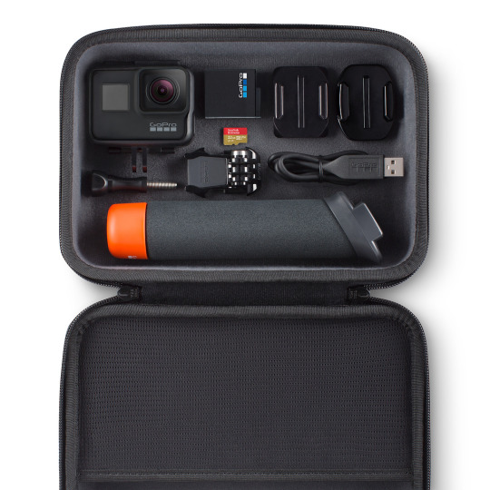
For this project I will be shooting with a GoPro Hero 7 as this is a great camera for capturing action sports and getting the POV shots that I want. The reason I chose a Gopro over a Osmo pocket or any other camera is because im a massive fan of Gopro as a brand and really like their cameras and think you can capture some really good content using a Gopro.
To best capture these photos I will be using the burst mode on the GoPro, I will also be turning on the Protune option so that if necessary I can change the white balance and shutter speed manually but seen as a lot of the shots will be taken moving it will be better to have these options set to auto. I will be changing the colour to flat, this means that the colour won't look that great straight out of camera but this setting reduces noise in low light and gives you a lot more freedom when it comes to editing the photo in softwares like Adobe Lightroom. I will also be switching between linear and the wide/extra wide lense depending on the shot, for the POV shots I will be using wide or extra wide as this will better simulate the point of view of the person riding the skateboard. For the landscape type shots I will be using linear because if I use wide it will make the subject look really far away and it also curves the horizon giving it a fisheye filter look. To capture these shots I will use a GoPro Mouth mount as I think this will be in the perfect spot to create the most accurate POV shot, I will also take a head mount along with other items to help mount to the skateboard or parts of my body and just experiment to see what makes the best shot.
Camera settings:
Shutter Auto
EV -1
MIN ISO 100
MAX ISO 400
White balance Auto
Sharpness Medium
Color flat
I used the video below to help find out what the best settings were to capture photos.
youtube
0 notes
Text
Location #3
Throughout this project I will be shooting within two main locations, these locations being Portsmouth and Southampton. When looking for locations I need to consider lighting and if that location has good natural light as I want the light to be natural and don't want to be using external lighting.One of the locations in Southampton will be the guild hall square as this is a common spot for people to go and skateboard and the area is really open so there will be a lot of good light and room to experiment with different shots. I will mainly be using this location to shoot the POV shots and some shots of people skating with the guild hall in the background.

For the portsmouth locations I will be filming around old portsmouth and the seafront as I want to find some interesting background for the shot, so I will try to incorporate the sea wall into a shot and use some of the old roads in portsmouth to get a 3rd person shot of someone riding a skateboard. Due to the current issues with COVID-19 I will have to restrict the locations that I use to just Portsmouth and will be mainly filming around the seafront in southsea. I will be using the seafront as a location as I will need flat and open locations in order to skate with ease and to give me enough room to capture the shots without anydisturbance as I will need to set up everything on my own.

The second location used in this project was the car park behind the Eldon building, this location was only used as a last minute option to retake shots as these photos relied heavly on the sun being out for them to work and Eldons car park is a big flat area and is closer the sea front so it was easier to access.

0 notes
Text
Case Study, Kevin Matallier #2
Kevin Matalllier is a travel and action sport photographer that also does brand photography. Website URL, http://kevinmetallier.com/ .
Kevin has a minimalistic logo accompanied by his name. The logo is very good as it is simple and not over complicated and the font matches the style of the logo so they both go well together. The logo is consistently used across all his social media platforms and on his website, the main downside to the logo is the wave texture in one of the circles as they are so close together when you view it on the website it looks blurry which makes the logo look low quality. Kevin's website is very minimalistic and has a very simple and easy to use navigation that puts the work at the center of attention by having a big gallery taking up the whole of the home page and the use of very little text throughout the website allows people to focus on just viewing the pictures.

Another good feature about this website is that once you are on one of the project pages there are buttons for the user to switch back and forth between projects rather than having to go back to the work page and scroll down to the project they want. Kevin doesn't write about any of his projects on the website but there is a page called Diary which says coming soon. Kevin describes himself as a traveler on his about page and talks about his passion for surfing and skateboarding and mentions that he's always working on new projects as well as collaborating with international magazines. This about page is really good because it shows that he is passionate about photography and that he is hardworking and a sought after photographer. Kevin has Instagram and Tumblr which he uses as another version of his portfolio and to advertise his work as people are more likely to stumble across his work on instagram and Tumblr compared to his website. Kevin has a skateboarding project called unexpected playgrounds where he captured skateboarders skating in unexpected places. All of the shots used were wide shots and focused a lot on the environment around the skater, I really like the style of these shots as they combine landscape photography with action sport photography.


Kevin also adds a grain to some of his photos which I think looks really good on certain images. This might be something that I use on my project. However if I do use it I want all the images to have the grain as I want the photos to be consistent throughout the project. This project is really useful to me as it has helped me understand how I can make skateboarding photos more interesting by focusing more on the environment around the skater rather than just focusing on the skater.
0 notes
Text
Case Study, Chris Rogers #1
Chris Rogers is a travel and action sport film maker that uses Gopros to film/capture photos with. Website URL, https://chrisrogersblog.com/.
Chris Rogers doesn't really have a logo he just uses his name in the same font used on his website and Youtube channel, Chris uses his reputation as a filmmaker/photographer to be recognised rather than having a logo. The pros to using his name as a logo is that people will instantly know it's Chris Rogers as it will be clearly written out on his website/social media sites and people who don't know chris rogers will be able to see his name and hopefully remember it. Where as if it was a logo people unfamiliar with it might just just glance at it and maybe they will remember the logo but they might not be able to remember who the logo is associated with. Chris Rogers has a really minimalistic website design which allows his work to take center stage with a grid layout that displays all of his big projects.

The website displays a link to Chris’s social media and youtube channel on the hero images of the page. This is really good as it allows people to easily access his youtube channel where he outputs most of his work and his Instagram which he also uses as a portfolio.

The website is very easy to navigate as the navigation bar is very clear and the text has good contrast to the navigation bar which makes it easy to read. There is a really good section on the website where Chris shows what equipment he uses for different types of projects and his essential gear he takes around with him. The main downside to this website is that there's no “about me” page so it is hard to find out a lot about Chris unless you watch his youtube channel. Chris doesn't have an about me page on his website but he has a brief description on his Youtube channel where he describes himself as a “travel and action sport filmmaker. Currently shooting and shredding the world, always travelling, my only constant is change”. Chris Rogers uses social media to post pictures and video clips to promote/tease the videos that he releases on his youtube channel and projects that he works on for clients. One of Chris Rogers projects that is really useful for me to look into would be his Gopro Hero 6 wakeboarding video as Chris uses Gopros to get POV and third person shots of people wakeboarding. This will be really useful for my project as I can use some of the techniques he uses and apply it to my skateboarding project. This is one of the few projects where Chris has written about it in his blog where he talks about the project and shows the gear he used for it. This project is really good for me to learn how to create these POV/third person shots and use them within my project.


1 note
·
View note