Welcome to my page! I am Jana and I am currently studying Animation at NUA (Year 1). Here I will share and update my progress regularly. I hope you enjoy viewing my work just as much as I love creating it!
Don't wanna be here? Send us removal request.
Photo

FINAL RENDER
Within the composition final render, I believe I should have taken more care to keep an eye on blending things together, I am happy with the result but it feels a little too illustrative for my liking. I originally wanted the fairy to truly blend into the background, however I ended up with a result that makes it feel a little too “fantasy”. Mixing photographic elements with digital art elements can prove challenging and it should be something to aim to improve in future projects. The concept however was really fun to develop and felt personal to me
0 notes
Text
Visual Thinking Panel + Concepts

Here is my visual board and concepts in preparation of my final outcome. I want to approach something inspired by the wildlife and magical properties that could be surrounding the wildlife around. I personally practice Wicca, so these are themes that surround my everyday and as I was taking these pictures on my usual walks I thought it was a good subject matter.

I want to hide these crystal pieces throughout the final concept, I always find myself looking out for pretty rocks as they can often bring good luck, however I am going to incorporate some of my favourite crystals. It wouldn’t be likely that I would find a piece of crystal on my walk, however it is a nice touch and a key element to who I am. I love carrying crystals on me at all times.

FLUORITE : https://www.amazon.co.uk/Natural-Fluorite-Crystal-Therapy-Polished/dp/B076F4VKTT

AMETHYST : https://www.amazon.co.uk/CrystalAge-FBA_ACS-M-Amethyst-Cluster-Medium/dp/B007C31K8Y

QUARTZ : https://en.wikipedia.org/wiki/Quartz#/media/File:Quartz,_Tibet.jpg

CITRINE : https://www.amazon.com/Zentron-Crystal-Collection-Citrine-Stones/dp/B01CF6JSKO

Above is the key factor to my final concept, wildlife animals. I want to sprawl these around the final concept. I often see squirrels and other wildlife animals sprawled around the areas I usually visit. I consider them to be like guardian animals, they are extremely important. Seeing animals when I’m on walks absolutely makes my day!

Within Wicca we believe in the existence of faeries, much like in stereotypical media these guys can be quite the daredevils (much like Tinker Bell (1904 play Peter Pan)) however even though they can cause quite the mischief, they also belong to wildlife and nature, they are guardians to nature and protect everything around it, however you don’t want to get on their bad side.
I want to incorporate faeries into my final concept as I also consider them as a key factor to my theme.
0 notes
Text
MIDSOMMAR (2019) - COMPOSITION

I recently watched Midsommar (2019) for the first time and thought it would be a good thing to write a small review/analysis on the general story and how composition accompanies this. I found the pictures within Midsommar (2019) to be quite striking, it really carries the movie.
The story begins with Dani (Florence Pugh) and Christian (Jack Reynor) who are a young American couple with an extremely unstable relationship ready to break apart at any moment, however due to family tragedy they keep together. Dani, who is grieving this invites herself to a once-in-a-lifetime trip with Christian and his friends in Sweden.
Midsommar (2019) directed by Ari Aster is a psychological horror based around a midsummer festival in Sweden, but what seems to be an ideal retreat quickly devolves into an increasingly violent and bizarre competition at the hands of a pagan cult. Everything spirals from here. I would like to analyze a few images from the movie and talk about how composition lets us see the story spiral apart.

Within the image above is the first time Dani and Charlie’s friends all get together for their first meal in Sweden, you can immediately tell just from looking at the image who exactly Dani and co are meant to be, theyre painfully out of place within the composition. This is very deliberate, I believe it creates a sense of discomfort as it breaks the compositions pattern. You can immediately tell something is off. This is a reoccurring theme within the movie, it illustrates a narrative.
I would also like to mention the yellow hut in the background, throughout the movie it is mentioned that it is a sacred space that may not be entered, and by placing it within in the middle of the image really makes it stick out, it creates an extreme sense of mystery. It reoccurs often within the movie as a reminder that it is an important part to the plot.

Eventually as the events unravel, there is a final event held. Within this women dance around the Maypole until they all become extremely tired, the last women standing is crowned the May queen for having the most stamina, after this she has to bless all the crops in order to have a successful harvest throughout the year. This is actually an accurate representation of the Pagan holiday Beltane, despite the horror-cult side of things I was extremely surprised how accurately this movie represents pagan traditions.
To our surprise though our May queen becomes Dani, from here out she is essentially manipulated into also becoming a cult member. She even makes the decision to sacrifice Chris.
Within the image above there is a sense of pattern, however much like the previous image this time only Chris isn’t hard to spot, he still sticks out. At this point and time Chris is the only person remaining. Dani has been converted and Chis’ friends have all been killed behind their back.

Within the image above is directly after Dani wins May queen, everybody is waiting for her call to start the celebratory meal held after the dance. There is a sense of discomfort, however it is different to the first image provided. I believe its because of Dani, she is still unsure of the situation and how it will unravel, she doesn’t feel in power, despite being in power in the moment. The way everybody is looking at her to make a new move is discomforting.
This image easily uses symmetry and pattern, the movie throughout uses these principles.
Overall Midsommar (2019) is an amazing visually appealing movie that I highly reccomend. I only skimmed over the movie here (and excluded the extremely violent parts) so I really reccomend you watch it to get the complete experience! This is only a small snippet of what you can expect.
1 note
·
View note
Video
tumblr
AFTER EFFECTS WEEK 3
This exercise took me a while due to technical difficulties, Adobe is infamous for crashing. I did enjoy this task overall, especially the helicopter! I would have liked to have done better on the assault course though, it feels extremely jittery for my liking and not as smooth as I would have liked it. I will attempt to revisit this soon.
I did a little research for the helicopter segment and would like to include it within my post. I based my research off this video : https://www.youtube.com/watch?v=P0XSkt86U_A&t=74s
Below are my written notes, I tried illustrating my point with little visual pointers throughout, which I believe helped me a lot within the final process!

0 notes
Video
tumblr
AFTER EFFECTS - HALLOWEEN
I attempted to apply the after effects knowledge I have gained over the past few weeks to make my own little animation piece! This was a good practice and I had fun doing so, I think I am at a stage now where I can confidently say I understand the basics of the program. I can’t wait to continue working with it.
0 notes
Text
COMPOSITION 101
There are a lot of of values to be covered within composition. I want to list my top 8 within this post...
(based off my notes in this post : https://jananuaanimationba1a.tumblr.com/post/633324773605343232/drawpile-27102020-composition)
1. Narrative + Mood
Narrative is extremely important when it comes to composition, if not the most important part. It sets the mood and the story into place so that the viewer can perceive the image without much thought. Narrative should make clear what is actually happening.
2. Perspective
Perspective is also a vital piece within composition. It can also set the mood for a narrative scenario. If from above, below, left or right, all these angles link into one another, creating a perfect atmosphere. A good example of this is the famous hallway from The Shining.

Image source : The Shining. (1980).
3. Rule of Thirds
The rule of thirds is a "rule of thumb" or guideline which applies to the process of composing visual images such as designs, films, paintings, and photographs. The guideline proposes that an image should be imagined as divided into nine equal parts by two equally spaced horizontal lines and two equally spaced vertical lines. This point ties into all the other points made (Narrative, Perspective, Visual Balance etc) It is considered a key part in composition.
4. Visual Balance
Visual Balance is the sense that a design is equally weighted on both sides of its vertical center. A balanced design feels complete and comfortable where a lack of balance can feel unfinished, however this can depend on the result you are trying to achieve. Chaos within an image can also give a sense of “balance”
5. Repetition/Pattern
Repetition is the repeated use of visual elements and techniques within a composition. I find this element often ties into visual balance as it often helps support an image. It can create a symmetry suitable for any composition.
The image below (The Ballet Class (Degas, Musée d'Orsay)) is a good example of repetition, the way the ballerina’s dresses flow are all quite similar and visually come together because of this. They are repetitive, however they harmonize with one another.

Source : The Ballet Class (Degas, Musée d'Orsay)
6. Symmetry
Symmetry within composition is a key factor that also, like many of the points listed harmonizes with one another. Symmetry is when elements of a painting/image balances each other out. (Repetition/Pattern, Visual Balance)
7. Tone
Within an image tone refers to a the relative lightness or darkness of colour. It can create balance and symmetry within an image. This is another point that ties into previous points mentioned.
8. Golden Ratio
The golden ratio, also known as the divine proportion, is a special number (equal to about 1.618) that appears many times in geometry, art, an architecture. It is the idea of the “perfect” proportion/composition and is surprisingly found everywhere around us. It links in deeply with the rule of thirds, however it is its own standalone point. Da Vinci worked a lot with the golden ratio.

Image Source : Leonardo Da Vinci, Virtruvian Man.
1 note
·
View note
Text
Image Pile (For Composition)
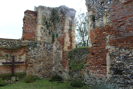


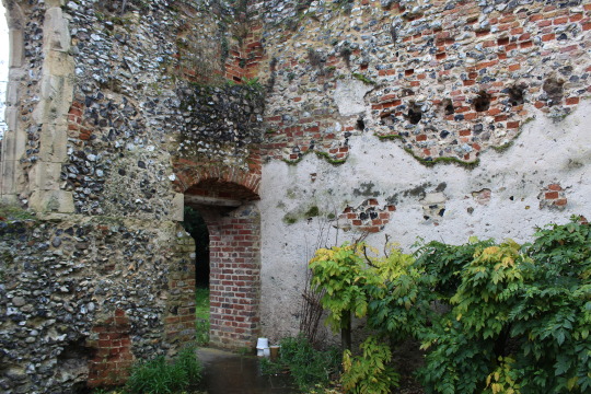
Church Ruin
Above are images of a local Church Ruin (Bowthorpe Church, Norwich). I want to collect images of all a similar background. My specific thoughts are to create a folklore-like scenario within these images. As I practice Wicca I often visit these places and they are very personal places to me. I want to “bring to life” and explain why I go to these places. (Faeries, Spirit Animals etc.) I will explain my thought process in more detail in my next post.


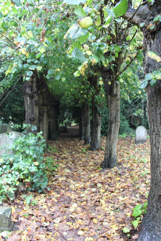

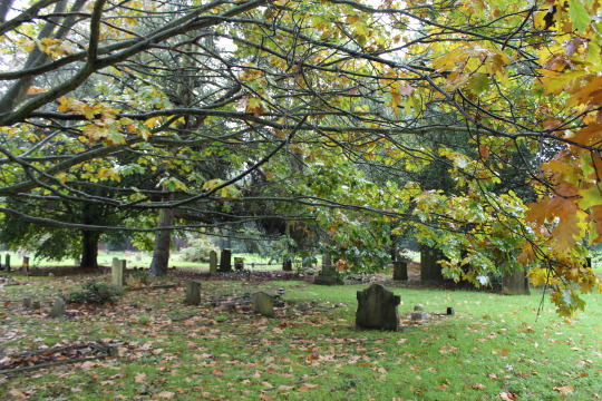
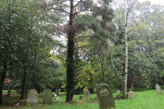
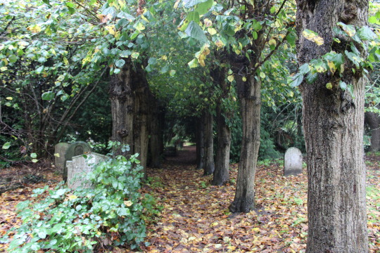

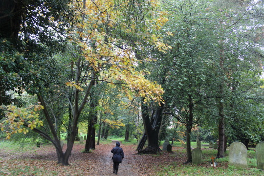

Cemetery
This is my local Cemetery (Earlham Cemetery, Norwich) I visit extremely often, it is one of my favorite places to visit. Surprisingly there is a lot of wildlife in this location. I often see lots of squirrels and even baby deer’s! It is a wonderful place to visit and feels extremely suitable for my current thought process.
Although these places don’t follow a specific “journey” they definitely follow a narrative for me, which is why I believe these images could really work for my compositional project.
0 notes
Text
Drawpile (27/10/2020) Composition


This week I experimented with compositional imagery. I thought this was quite an interesting attempt, however I think I personally should have focused on something more observational. I think I got very carried away on the man depicted and it ended up becoming something very stylized, however it is still a valid compositional attempt, therefore I am happy with it. I will continue to practice & upload my compositional attempts.
The notes within the first image are bullet points on what to keep focus on during composition, they could be considered principles. (I have also noted a few artists within my notes which I will be covering soon!)
0 notes
Text
Drawpile (Lifedrawing 06/10/20 - 13/10/20)
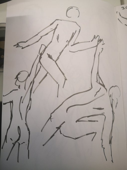
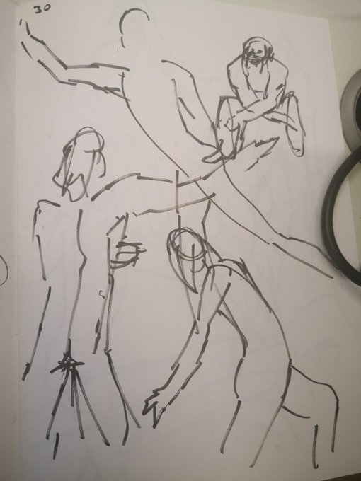

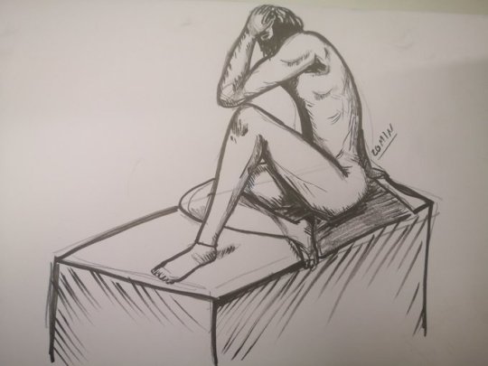
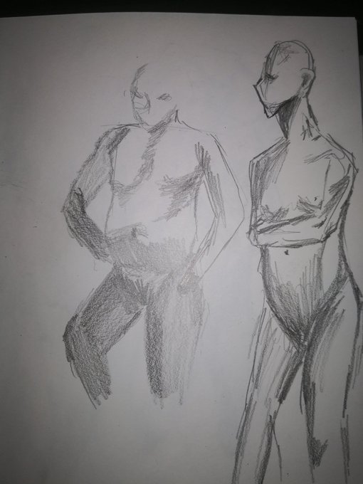
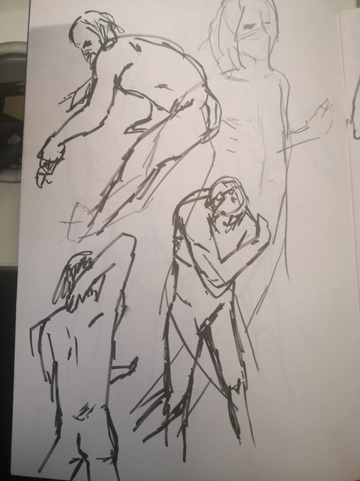

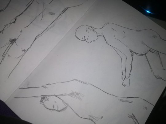


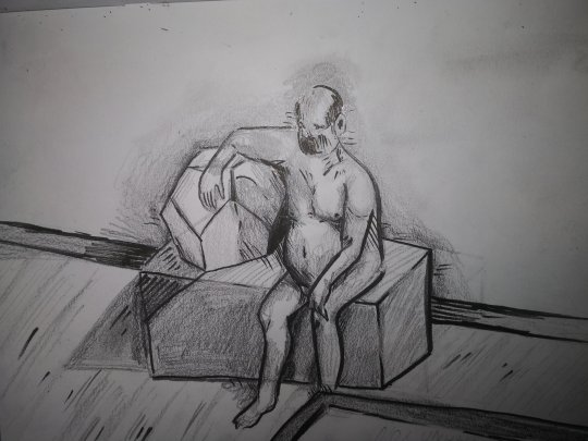
Over the past 2 weeks I have been doing a lot of life drawing. I have learned and experienced from this a lot. I was familiar with life drawing before in this manner, however I had never drawn men anatomy before these sessions so it was definitely a new experience! I hope to continue this. My main criticism to myself is to pay more attention to perspective as I often warp it easily. The last picture provided is my main example of this. The perspective goes from large to small when it should be the other way round. Apart from that I am really happy with these drawings!
0 notes
Video
tumblr
STEVEN UNIVERSE - SECONDARY ACTION
This scene shows a good example of secondary action, each action follows through in a way that accompanies the previous action which makes it visually appealing. It sets a “stage” for the follow-up of events. I really enjoy the effects of secondary action within this scene. Steven Universe all-together is a wonderful series I cannot recommend enough.
SOURCE : https://www.youtube.com/watch?v=6OWq38TikzU
0 notes
Video
tumblr
BEASTARS - STAGING
This clip demonstrates an excellent example of staging. The composition leads the viewer through each scene and is generally a good opening of what may happen next, this clip is an opening to a cartoon/anime show called Beastars. I believe it stages in a manner that foreshadows the events within the series, it is done in a quite smart way. The composition/staging is excellent in this small scene alone even if you may have never seen the show itself (which I really recommend you should!)
Source : https://www.youtube.com/watch?v=bgo9dJB_icw
0 notes
Video
tumblr
JOJO TORTURE DANCE - POSE-TO-POSE
I believe this clip is a good example of pose-to-pose. The dance is planned out in a way where makes this obvious, if the method had been straight-ahead it’d look completely different. You can see as the viewer that the movements are very direct and choreographed in a way that makes it visually pleasing, this would only be possible through pose-to-pose animation.
SOURCE : https://www.youtube.com/watch?v=AQx_KMoCgJU
0 notes
Video
tumblr
SHELTER - SOLID DRAWING + APPEAL
The dimesional solid drawing within this clip is excellent, it really forms a visualisation of the world of Shelter (see source). This also creates appeal, not within the main character but in the world she lives in. It creates a story and a dynamic within a short period of time in a way that makes it extremely visually entertaining for the viewer. I really recommend shelter in general. It creates a beautiful story and world just within a music video. It’s wonderful.
Source : https://www.youtube.com/watch?v=fzQ6gRAEoy0
0 notes
Video
tumblr
DHMIS - SOLID DRAWING
DHMIS is one of my all time favourite webseries, I have been following it ever since the first one came around, however this is one of the scenes that haunts me the most. The drastic dimesional change between the puppet-world and the animated-world. I also love the method of solid drawing within the animated scene and the idea of having a “nightmare” within that set of dimension. The yellow guy goes scene to scene until it ultimately gets worse by “drowning in oil!” which leads yellow guy to awaken from his nightmare.
Source : https://www.youtube.com/watch?v=dbL-NSkXnl8&t=76s
1 note
·
View note
Video
tumblr
ENA - APPEAL
This clip is taken from a webseries from youtube (see source). I personally have never really looked into the series, however I am extremely intrigued by the dual personality of the main character “ENA”. I find they have an extremely unique design in a manner that truly captures the viewer even if they are an outsider. ENA goes through multiple twists and identities through voice changes, suttle appearance changes but its done in a manner where it becomes incapsulating
Source : https://www.youtube.com/watch?v=Td7CBNu0914&t=138s
0 notes
Video
tumblr
FLCL - TIMING + ARCS
Within this scene is both a great example of arcs and timing. The arcs are represented within the buildup of the scenes explosion and the timing is show within the explosion itself. I like the scene for scene buildup towards the final explosion and find it quite accelerating as the viewer.
Source : https://www.youtube.com/watch?v=ceTgUezZIc0
0 notes
Video
tumblr
NAUSICAA - FAMOUS GHIBLI HAIR - FOLLOW THROUGH AND OVERLAPPING ACTION + STAGING
This is probably my favourite thing within ghibli movies, how they use hair to express emotion is beautiful. This clip is a great example of follow through and overlapping action. The way the characters face expression changes with the hair rising creates a certain level of deliberate dramatic and exaggeration. The staging here is also very prominent in the sense that you really feel the emotion within the characters expression.
Source : Nausicaa of the Valley of the Wind [MOVIE]
0 notes