
A blog by Havering Sixth Form tutor that focuses on Graphic Design, Photography, Illustration, Printmaking, 3D, Typography, Art, Sculpture and general design. This blog includes tutorials, artists, exhibitions visited, design briefs, inspiration and other information related to Graphics and illustration. You can click on the links above to navigate to particular posts ^^ Personal folio: www.jonnyleigh.com
Don't wanna be here? Send us removal request.
Statistics
We looked inside some of the posts by jonnyleigh and here's what we found interesting.
Average Info
Notes Per Post
11
Likes Per Post
11
Reblog Per Post
0
Reply Per Post
0
Time Between Posts
2 months
Number of Posts By Type
Text
15
Photo
2
Last Seen Tumblr Blogs


Fun Fact
There are dozens of funny blogs to kill time on Tumblr.


Text


Yiting Nan is a designer and animator originally from China and currently based in NYC. Having a graphic design background, she creates bold, graphical, and vibrant work.
website: https://www.yitingnan.com/
2 notes
·
View notes

Text
Ryan Atkinson


Group Creative Director at R/GA New Yorkwww.behance.net/gallery/106917361/Project-Zero
1 note
·
View note
Text
Saxon Campbell


Branding specialist, conceptual strategist and accomplished graphic designer based in Brooklyn, New York with a focus on consistent design solutions for established brands and new startups.
1 note
·
View note
Text
Amber Vittoria


Amber Vittoria is an artist working in New York City. Taking advantage of the fluidity of her ink and acrylic paints, Amber creates aqueous rainbow gradients that dominate her compositions. Punctuated by simple graphite line drawings, her work draws on her relationship to femininity, emotion and societal expectations.
0 notes
Text
Klawe Rzeczy


0 notes
Text
Paul Blow


Paul Blow is a Dorset-based illustrator who has worked for a wide variety of clients. His bold conceptual illustrations mix contemporary themes with touches of humour and a healthy sense of the absurd.
1 note
·
View note


Text
Animating your Logo in Adobe AfterEffetcs
The next part of the project involves After Effects – animating your logo in some way.
This could include
- basic lighting effects,
- moving your logo across the screen
- more complex deconstructing and moving different parts of the logo to join together
- more complex where shapes and patterns are animated to mix with the logo
The tutorials far below are reminders of the summer work we did in After Effects and I suggest you only start these if you have completed the summer task.
If you did not do the summer task or watch the tutorials then I suggest you sign up to Skillshare and follow the indepth tutorials they have on there – these are professional standard tutorials but are slower than the ones further below. This link is for the 2 month trial.
https://www.skillshare.com/signup?via=site-banner&redirectTo=https%3A%2F%2Fwww.skillshare.com%2Fmembership%2Fcheckout%3Fcoupon%3Dsite2free%26via%3Dsite-banner&clickid=xJJQ923ZYxyLRMDwUx0Mo3EtUkEQm4S1B2Sy2M0&irgwc=1&utm_content=4650&utm_term=Online%20Tracking%20Link&utm_campaign=1321282&affiliateRef=6595003&utm_medium=affiliate-referral&utm_source=IR
After signing to Skillshare do the following tutorial:
https://www.skillshare.com/classes/Animate-a-Logo-in-Adobe-After-Effects-CC-with-Motion-Graphics/1090627352

Only try the tutorials below if you have the basics of After Effects and watched the guides on SkillShare.
When completing the tutorials below remember to show your workings on your Sway and the different things you have tried. Watch number 1 and 2 and after that you can choose which ones you want to do.
Tutorial reminders:
1 Reminder of basics of after effects
https://www.youtube.com/watch?v=hb2bbfiNBXA
2. reminder of basic movement and opacity
https://www.youtube.com/watch?v=jS1YMWkm4DQ
3. Basic logo effects
https://www.youtube.com/watch?v=McASqbIan_8
4 Basic logo movement effects
https://www.youtube.com/watch?v=IJF6uoKZLXw (he talks really fast)
These channels have many after effects techniques that you could choose from to help you come up with your final design
https://www.youtube.com/c/SonduckFilm/videos
https://www.yo utube.com/channel/UCjJk212xU15y_NPYKuCsKQA
0 notes
Text
Branding for Impossible object brief - lowers 2021
Branding and Advertising for an Impossible Object
Duration: 2 lessons a week for 6 weeks (lessons with JOL)
Duration: 6 weeks
Final Requirements –
1. Logo and branding created in Adobe Illustrator
2. Research into branding using the links
3. A pattern – using drawing and Adobe Photoshop
4. Adobe After Effects – putting a moving logo against the pattern
5. Adobe After Effects – putting a logo against a video filmed on your phone
Week 1
Brainstorm ideas for ‘impossible object’
Finalise object
Research current logos based on theme (minimalist logos) – see links at end of project
Week 2
Begin drawing logo on paper
Drawn ideas for logo and branding (at least 6) include alternatives
Adobe Illustrator 4 designs – + 4 different colour considerations for each (16 total)
Week 3
Finalise illustrator piece.
Final Branding for the designs – including put on Photoshop template
Pattern design square (for homework)
Finalise Pattern in Photoshop and watch tutorial (if forgotten from induction)
Week 4
Finalise pattern and put on templates and packaging
Learn Aftereffects using tutorial (for homework if needed)
Week 5
Begin After effects practice
Move logo against background using AfterEffects
Film a moving background for homework
Week 6
Final moving logo in After Effects
Final moving background with static logo
Finalise project
Evaluate
Example of logo work:


Week 1
Brainstorm (in pairs) an impossible object – this is an object that cannot be created yet.
either because of technology advancements or it is not naturally feasable.
Use the following categories to help – try at least 4 in each
1. Technology (e.g.: x-ray specs)
2. Medicine/Health
3. Transport
4. Gaming/fun/sport
5. Education
6. World Peace/helping the world
7. Fashion
8. Food
9. Irresponsible/devious/bad
10. Other
Upload the brainstorm, with some secondary images to each category that is relevant
Homework – research into existing branding and logos. Try to find sophisticated logos that are not too complicated. Use Behance to help find branding or ‘google’ - minimal logos.
Example: https://sway.office.com/9GxbFf35sBaBpSgx?ref=Link
Research Branding links:
Websites that have good branding:
http://www.anagrama.com/portafolio
http://www.theplant.co.uk/
http://www.behance.net/search?field=109
https://www.trendhunter.com/branding http://www.arthistoryarchive.com/arthistory/feminist/Barbara-Kruger.html
https://www.behance.net/gallery/110284157/De-volta-pro-agora?tracking_source=project_owner_other_projects
Help with logo analysis
1. Try and find out what the company does. Its important as a brand will cover two criteria – function and form. If you cannot find this information, try and suggest what it would be might be used for. First try to establish what the logo suggests in regards to mood – is it formal, serious, fun, natural, organic, business, conservative, fun etc – why do you think this
2. Write about the shapes used – rounded, curved, geometric etc. what does this suggest in regards to the feel of the company
3. Write about the colours used – or if black and white, the amount of black and white or space. What do these colours represent or show?
4. Try to establish more what the company does and how that is reflected in the logo – example – technology, security, finance, educational
5. Any other interesting features of the brand – does it convey meaning quickly, is it memorable or generic, are the elements well balanced visually and legible, will it size up well and work in all sizes,
6. Write about the font used if applicable – sans serif, lower and upper case, thin, bold, italics etc.. what does this suggest?
7. Last point – what impression does it leave you with – is it appropriate and accurate (this will be easier to answer if you know the company.
0 notes
Text
Comparing and Contrasting Artists for Essay 2020/21
Comparing and Contrasting Artists for Essay 2020/21
As part of your essay you need to compare and contrast artists to find a conclusion to your question. You will need to answer your question when you are comparing your artist – this will include your research and your thoughts on the artist. This should happen throughout your essay and not just in the conclusion. However before you start your essay, you might want to find some similarities and contrasts so that you might find a common thread to help with your essay question.
These similarities can be divided into the following:
- Media/medium – are the artists working using the same techniques (photoshop manipulation, text, photography, digital illustration, watercolour, etc)
- Themes – is there a similarity in the subject matter, the messages that are coming across? The ideas? Do they tackle them in a similar way? Remember to link to your question if possible
- research – from the quotes you have found on each artist do you find a similar (or very different) ideas or approaches to their work. Remember to link to your question. This is a research based essay
- Emotions or feelings – intimate, threatening, loving, confusing, etc
- Age, sex, ethnicity, sexual orientation of the artist or subject matter
- Narrative techniques – single image (monoscenic), multiple images, etc (see previous powerpoint)
- Composition – rules of thirds, one-point perspective, central, artist included, metaphoric, etc
- Editing (especially important for video – but could also be seen in the edit of the photo) – short or long takes, change of perspective, length, animation etc
- Size, scale, practical work
Now go through the same sections but seeing if there are any differences that are worth noting.
You shouldn’t list every difference but it might be worth noting for example that both artists are working in manipulating photographs and changing them but the difference is that one does it digitally and one does it by cutting up photographs. You can use words like ‘… in contrast…’
Or another example might be that both artists are showing a mother and sons’ relationship but one artist is showing a loving and tender scene and the other, in contrast, is showing a broken and argumentative scene. ‘in contrast’ is a good word to use when showing these differences.
Write up these notes and findings on your sway. You will also have to do this to your third artist. When making a note of these differences and similarities consider how this might relate to your general theme of your essay. Remember when doing this to your third artist you will be comparing all three artists.
Vocab suggestion to use:
Comparison: similarly, comparable, in the same way, likewise, as with, equally, just as.. so too, in contrast, also, in common, and yet
Contrast: however, on the contrary, even so, alternatively,at the same time, otherwise, instead, nonetheless, conversely
Additon: further, furthermore, moreover, in addition, additionally, besides, also, too, again, first, secondly finally ,last
Summary – in short, on the whole, to be sure, clearly, anyway, in summary, after all, it seems
0 notes
Text
Youtube Pattern tutorial
Please find a link to a new shorter video explaining how to make your own pattern in Adobe Photoshop
https://youtu.be/rZ_cCRl1DXU

0 notes
Text
Using Quick selection, layer masks and the new Object Select tool Photoshop 2020
Some tutorials that will enable you to cut out quickly from your photos to then combine photos for your self interaction task.


First tutorial:
https://www.youtube.com/watch?v=VPtJ9fU2MHQ
Important Photoshop update 2020: using object select
https://www.photoshopessentials.com/basics/object-selection-tool/
Advanced: removing background or selecting subject quickly
https://www.photoshopessentials.com/basics/select-subject-vs-remove-background-in-photoshop/
0 notes
Text
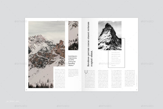
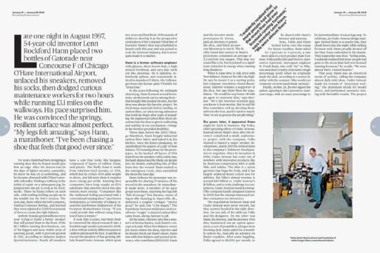
Indesign task - Sept 2020 upper
The main sections of type that you need to consider include your Heading, Sub-Heading, Paragraph & Description.

The first thing to check when scanning over your completed design is the spacing, the alignment of everything must be consistent, second on the check list is the Typography. Are all the headings, sub-headings, paragraphs and any other type sets the same as one another if not they will probably stick out like a sore thumb, and finally amongst other things your Image quality, ensure all of the images are properly uploaded.
1. Watch the following video on the basics of InDesign and basic magazine rules you should stick to
https://youtu.be/2lNUsauT66I
2.

Being inspired by the above double page layout. Create a layout in InDesign based on one of your chosen issues. The layout must have the following -
- A heading and subheading similar to the above - using the upper half of the composition/page
- A photo that bleeds into the margin on the left and takes up the 1st of the 3 columns on the right page. Doesn't touch the bottom of the page
- a three column grid with placeholder writing taking up only two of the columns. Include mini subheadings in this placeholder text to break it up (like above). the text needs to align with the photo
- choose a bold primary colour as background
- include some sort of experimental text that partially goes over the photo. Doesn't have to be a speech bubble.
3.
Being inspired by the above layout. Create a layout in InDesign based on your chosen issue. They layout must have the following:
- a four column grid
- a Heading that is rotated, that takes up one of the columns (see above)
- a subheading that takes up part of another column
- a photo or image that goes over 3 columns and is ‘eaten’ by a bit of text (see left page)
- a quote within a square
- 3 images within the layout
4.

Being inspired by the above layout. Create a layout in InDesign based on your chosen issue. They layout must have the following:
- this is an experimental layout so the column in the middle does not seem to conform to a grid - however you can see that there is the central column and then a side column to the left of smaller text. Make sure your heading, sub heading and body text all align
- use blocks of colour that overlay into the photo
-mix up photos so they break into the image, along with text (see right side)
- create a line of colour within your design that links your text and image
- make a subheading of text break into your body of text (see left page and text highlighted in yellow)
5. Last editorial layout - choose one more layout from below and do your own interpretation, being careful to stick to a grid system still. Instructions are more loose.


(if choosing the last option - you will still need a sub heading and one column of text in the design somewhere)
0 notes
Photo

Lesson 2 - Adobe illustrator. Using the pathfinder tool from lesson 1, complete the above using your name
Homework -
Logo research
Research into ‘minimal logos’ – choose 5 different examples.
1. Try and find out what the company does. Its important as a brand will cover two criteria – function and form. If you cannot find this information, try and suggest what it would be might be used for. First try to establish what the logo suggests in regards to mood – is it formal, serious, fun, natural, organic, business, conservative, fun etc – why do you think this
2. Write about the shapes used – rounded, curved, geometric etc. what does this suggest in regards to the feel of the company
3. Write about the colours used – or if black and white, the amount of black and white or space. What do these colours represent or show?
4. Try to establish more what the company does and how that is reflected in the logo – example – technology, security, finance, educational
5. Any other interesting features of the brand – does it convey meaning quickly, is it memorable or generic, are the elements well balanced visually and legible, will it size up well and work in all sizes,
6. Write about the font used if applicable – sans serif, lower and upper case, thin, bold, italics etc.. what does this suggest?
7. Last point – what impression does it leave you with – is it appropriate and accurate (this will be easier to answer if you know the company.


0 notes
Photo
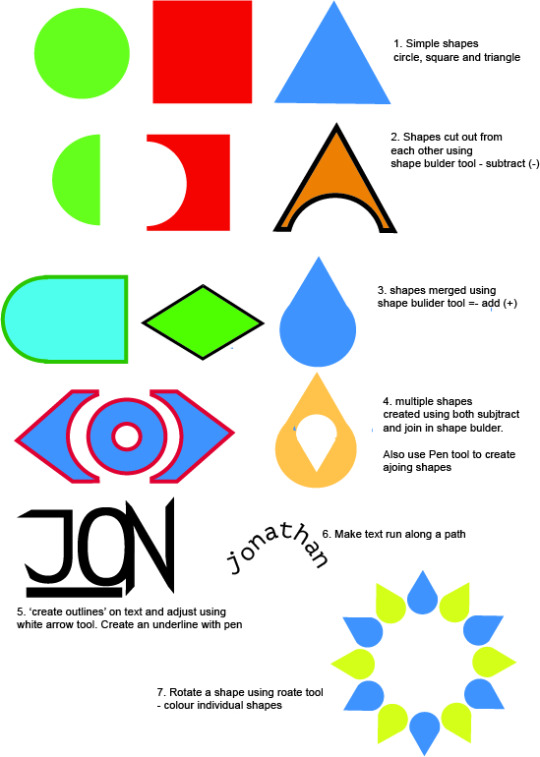
Please watch the 2 videos - https://www.youtube.com/watch?v=OxliuLzUD7E
https://www.youtube.com/watch?v=kKwlJOV1r_8
Please make sure the work you save looks something like this page (you can have different joined/subtracted shapes)
0 notes