
Don't wanna be here? Send us removal request.
Statistics
We looked inside some of the posts by jordanstanger-blog and here's what we found interesting.
Average Info
Notes Per Post
0
Likes Per Post
0
Reblog Per Post
0
Reply Per Post
0
Time Between Posts
4 days
Number of Posts By Type
Photo
12
Text
5
Last Seen Tumblr Blogs


Fun Fact
25% of US internet users with an annual income of $80-100K use Tumblr.
Photo

This is my photograph of my work and artist's statement in our exhibition. I've evaluated the project and analysed the posters. I found the project challenging at times and enjoyable. I am pleased that my final project artwork is hung up on my board. I am very happy and excited that a lot of people will see our work. I'm hoping that my work will go on display to the homeless service communities in Carlisle.
0 notes
Photo


The top one shows it is coloured in completely but I wanted to put a black margin around it to look more professional. The two posters work together successfully. The viewer can tell it is all about Carlisle, the great historical city. The banners welcome the people into the posters. My creative intension was to create a colourful, bright, vibrant, expressive and unique looking artwork. I believe these posters have achieved.
0 notes
Photo


Development of final piece
1. Focusing on the main roads, rivers and train tracks. I have traced it on top of acetate. I needed the light box to trace it on paper for my posters.
2. I have used pencil for the marking line and have drawn my posters designs. I have even included special places and text.
3. I then started to colour in which is the best part of the project. I even worked on some experiments if I wasn't confident enough to colour something in.
0 notes
Photo

After I drew my initial ideas I incorporate maps into my designs. I created different designs. Putting buildings in different places. I also experimented with different fonts. I chose the fonts that were most suitable to the places. I did a lot of material exploration. This helped me decide which materials worked the best i.e. colour pencils and sharpies/ felt pens. I created my final design by taking the best parts of the different designs.
0 notes
Text
Artists statement
1. An artist statement is a written explanation of the work, like an introduction to the piece. It helps the audience understand about the artists work explaining what they did and why they did it. It can also tell the audience when it was done and how it was done.
2. It needs the artists name on it who produced the work. The tittle of the work is important so that the people would know what its called. The materials used to create the piece and a brief explanation of the process. What inspired the project and why they want to do it.
3. Clear - easy for the audience to understand what is written about the piece.
Concise - simple information that's straight to the point, again making it easy for the audience to understand .
Consistent - all need to have the same layout so it looks professional. It will also make the presentation of the gallery look neater if every one uses the same style and font.
4. A simple paragraph up to about 200 to 300 words maximum. The audience won't pay any attention and would get bored if it was too long.
5. It is written from the view of the artist which is 1st person. You explain what you have done not as if it is something else. For example, "I've completed..." or "I did...".
6. The font must be clear and simple so it is easy to read.
0 notes
Text
Research/Initial Ideas
RESEARCH /INITIAL IDEAS/ PLANNING /PROGRESS/ MOVING FORWARD.
My primary research was very helpful, taking photos around Carlisle doing quick sketches. This is what I said I was doing in my brief. My artist research (See artists research printout) were very helpful with my initial ideas sketches. I looked at all the artists I said I would in my brief and also looked at Nathan Coley's work. My primary research was very helpful with creating my initial ideas.
I want to develop my ideas now. This matches up with my timetable. At the moment I am thinking of creating two A3 posters (with two portraits together to turn out as a landscape). I'm going to experiment with different colours and outlines for rivers and roads including paths. I have already decided what buildings, places, rivers, roads and words to include in my poster. I'm going to practice where I will place everything thinking about the overall composition.
0 notes
Text
Review of my project so far
Through my project I tried keeping up to date with my work and have been successful in doing this. I have produced a lot of work so far and I am on track with my time table I produced at the start of the project. My plan was very detailed and has helped me to know what I can plan for the different weeks. I've tried to follow my plan but there has been a few changes. Some things have taken longer than other things; this can happen in projects.
0 notes
Photo


These posters were in the National Museum of Scotland. I took these photos because they are special places. I like the white margin and think that I could include this in my own poster. These are framed behind glass. I don't know if I want to frame mine or not.
I find that the information beside the posters are useful because it tells me all of the information about the poster. I might want to include all the information about my exhibited poster.
The third poster's style is simplified in a realistic way where you can see shadow, pattern, texture and it looks 3 Dimensional. Whereas the other two are more realistic. I want to use a more simplified style for my poster. It won't be so time consuming and will appeal to both children and adults.
0 notes
Text
Connections Presentation
The reason for doing this presentation is to allow the people who run the homeless services in Carlisle to see my ideas for my artwork to be hung in their premises. I presented to Paulo (Head of teacher training), Gemma (Artist) and Jenny (Artist). I couldn't present to the panel from the homeless services because I was attending a funeral on the day when they were in college.
Paulo agreed that the banner was a good idea and gives the poster for the artwork a friendly welcoming feel. The rest of the panel agreed with this. I want to include the banner for my final piece.
Gemma suggested that I could explore the use of maps more e.g. collage. I am exploring the use of maps in my posters at the moment.
All the panel agreed with the "Where's Olga" idea and thought it would appeal to all ages.
I was asked why Carlisle was special to me. It's special to me because I was born there and I said where my special places were.
The positive feedback I received was that I have showed my journey well.
I have done good research and used interesting images. The panel felt my initial ideas were interesting.
I could improve by not using 'like' and 'erm' so often. They also suggested that I shouldn't add too much explanation that isn't relevant.
My presentation is printed out and is called 'Carlisle Connections'.
0 notes
Photo


I wanted to take a photo of it as it has plenty of detailed and simple parts in a drawing. It shows pattern and colour in the artwork and the style of drawing appeals to me. Its obviously a drawing of a church which is similar to Carlisle Cathedral. The lighting was adequate and there was no other work on the wall.
0 notes
Photo


This is an example of a collage which I'm going to experiment with I liked the fact that it is in a frame. It looks more professional in a frame. The label that went with the artwork was lacking quality and I was very disappointed with it. It was just a piece of paper stuck on a wall.
0 notes
Photo
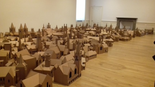


Visit to Scotland National Gallery of Modern Art.
Artist - Nathan Coley
What inspired and interested me about his work.
The first display looks like a cityscape. I'm creating a cityscape for my work. By taking a photograph of it, it would look more of a 2D work. He placed his individuaI buildings randomly. This gave me the idea to do the same in my drawings. With the first work he displays it on the floor with the space for the people to walk beside it. The lighting is ideal.
I like the way Nathan Coley did his measurements accurately when he made the model of St Pauls Cathedral. This work is displayed on a table and the viewer could walk right round it.
The artists statements are mounted on foam board and looked very professional. They gave the artist's name, the title of the work, what it was made from and explained the work. I found this really helpful. It is a good example of an artist statement.
0 notes
Photo


Idea 5 - I've used the idea from one of the posters from "100 Years of Magic Posters." My viewers eyes are drawn to the centre of the picture and the electrical sparks made the viewers eyes looked to the building. One negative aspect is that there aren't many buildings.
Idea 6 - I tried out different fonts and inspired by Jenni Sparks. I managed to come up with a range of fonts which I think makes the picture quite interesting. It also helps people who don't know Carlisle.
I am now going to come up with a couple of ideas which include maps of Carlisle.
0 notes
Photo


Idea 3 - I took the idea of the artist, Charles Fazzino of drawing buildings scattered all over the place. He leaves a bit of sky above the buildings and includes a lot of objects in the sky which I've done in my drawing. I like the way that I have drawn the road leading into the picture. The banner at the bottom makes the picture more interesting and lets people know that it's Carlisle. It is like a welcoming banner.
Idea 4 - I was inspired by Jenni Sparks with the creative font she uses in her pieces and I think it works well on my drawing. I would like to incorporate my text in my final piece because it adds contrast between drawing and text.
0 notes
Photo


These two ideas were drawn before I did any artist research.
Idea 1 - Some of the buildings are just made up but I got more photographs of Carlisle so that I can do real places in Carlisle. I think that the horizontal road and park stops the viewer from looking into the main part of the picture.
Idea 2 - There is too much empty space in the foreground and lacks a lot of the older buildings in Carlisle.
0 notes
Text
Over the Easter holidays I researched about ink washes, biro and photomontage. This can be seen on the print out material and techniques research. Also I did several quick sketches for my initial ideas while thinking about different artists. I've still to incorporate maps into my initial ideas.
I completed my powerpoint presentation on Tuesday to present a panel of professionals.
0 notes


