The story of my art is that I discover my inspiration from the environment. Then I capture that moment by developing new ideas with a meaningful purpose.
Don't wanna be here? Send us removal request.
Statistics
We looked inside some of the posts by jpowssbcu and here's what we found interesting.
Average Info
Notes Per Post
2
Likes Per Post
2
Reblog Per Post
0
Reply Per Post
0
Time Between Posts
5 days
Number of Posts By Type
Text
17
Last Seen Tumblr Blogs


Fun Fact
Total funding amounts to $125.3M.
Text

Here is a typeface that me and my Art & Design class designed to use in our production manual. The letters are not completely readable unless you have been told that they’re letters. I really like the typeface and it will be interesting to use this more.
0 notes
Text
Black Lives Matter Lecture Overview
“The ambitious six-part documentary series examines staggering racial injustice in America with skill and packs an almighty punch”
https://www.theguardian.com/tv-and-radio/2018/jul/30/rest-in-power-trayvon-martin-jay-z-review
Police Brutality: Alicia Garza -”Black people. Love you. Our Lives matter. #blacklivesmatter” As of July 2018. This hashtag has been used on twitter 30million times. Institutionalised behaviours from police towards innocent black men and women. Project Row Houses: “Project Row Houses is a community platform that enriches lives through art with an emphasis on cultural identity and its impact on the urban landscape. We engage neighbours, artists, and enterprises in collective creative action to help materialise sustainable opportunities in marginalised communities.” They offer Care, Freedom, collective spaces and help to grow the chapter of ‘Black Lives Matter’.
People have been exploiting the black live smatter campaign by printing this on clothing and making profits. Not giving the profits to the charity, but claiming it for their own uses. 5 years on from #Blacklivesmatter: Started as a digital movement on Twitter. Now starting to absorb culture and bringing in artist to take this into their own hands to copyright their brand so it can no longer be exploited. https://blacklivesmatter.com
This lecture was a great lecture for those whom are uneducated on black history and racism towards black people today. Most people believe that racism has been banished and is no longer a thing today. However, all those things that we used to learn in school are still happening... Selling black slaves and forcing them to do things they aren’t willing to do is still happening today but not enough people are talking about it on the news because apparently we are not relevant.
0 notes
Text
Feminism Lecture Overview
There are 3 waves of feminism... First wave: 1800-1960s, overturning legal inequalities. Second wave: 1960s-1980s, overturning cultural inequalities + gender nous Third wave: 1990s-now, a continuation and response of previous.
The feminism art movement began during the second wave feminism. Georgia O’Keeffe, a famous feminist artist. https://www.theguardian.com/fashion/2016/jun/30/tate-modernist-how-georgia-okeeffe-shaped-feminist-style
Yoko Ono cut piece 1965: To include a women’s prospective https://www.bing.com/videos/search?q=yoko+ono+cut+piece&&view=detail&mid=9CF0179D99E958653B419CF0179D99E958653B41&rvsmid=62A52A3E1A13BE74871862A52A3E1A13BE748718&FORM=VDRVRV
A.I.R Gallery established in 1972 as a first not-to-profit arts organisation. https://www.airgallery.org
Artist Judy Chicago http://www.judychicago.com/gallery/
“Why have there been no great woman artist?”
I really enjoyed this lecture and it was quite interesting to see women who were once considered irrelevant are actually now empowering. It’s ashamed to think that some women are ashamed to follow the social standards and have social rules. It’s great to think that because of these women standing up for themselves and wanting equal to what men have is why most women and young girls today are becoming confident with themselves and feeling equal. The world is evolving!
0 notes
Text
Glossary of Terms:
Provenance: I unfortunately lost the powerpoint I made for this term. However, here is an overview on the word.

Provenance is important as it is a form of identification or even proof to confirm whether something is authentic. It’s like buying a designer brand from the original store, it’s provenance and you know what you’re buying is genuine. However, buying designer goods from a market store or flea market, you aren’t entirely sure whether that product is genuine as there’s no provenance of that product.
Hans Ulrich Obrist: By clicking the link below, you will see the group presentation details of the specific glossary of terms word.
https://drive.google.com/file/d/1dbPBY5HWeKLcX0-ZF5ep8zr-lwZ0c9op/view?usp=sharing
Collective: By clicking the link below, you will see the group presentation details of the specific glossary of terms word.
https://drive.google.com/file/d/1FpnV8KwWkuWmAPHT-2HExTUq3LKLXStD/view?usp=sharing
Superflex: By clicking the link below, you will see the group presentation details of the specific glossary of terms word.
https://drive.google.com/file/d/1SH5lZ82X39jwJq9OXA7IbegqH9kPk6M0/view?usp=sharing Superflex was my least favourite term to research due it not being relatable and I couldn’t relate back to this in any of my projects. I feel that It’s important to to research things that you are generally interested in rather than researching things because you’ve been told to.
Humour: By clicking the link below, you will see the group presentation details of the specific glossary of terms word.
https://drive.google.com/file/d/1tGeJ1NQGnxHzmsWvkJECjIOJZJ90i45N/view?usp=sharing Humour was my favourite term to research as it is the most relatable theme today.
0 notes
Text
Top artists/art references that I really liked in this semester:
Luigi Serafini – Codex Seraphinianus
https://www.rizzoliusa.com/book/9780847842131/

Joe Tilson – Earth Ritual
https://www.tate.org.uk/art/artworks/tilson-earth-ritual-p05225

Hannah Höch
https://www.artsy.net/artist/hannah-hoch

BBC Fast Fashion Documentary
https://www.bbc.co.uk/bbcthree/article/5a1a43b5-cbae-4a42-8271-48f53b63bd07
https://www.bbc.co.uk/programmes/b0bn6034
Tom Phillips – Humans
https://www.audible.co.uk/pd/Humans-Audiobook/B07DJS6NV7?qid=1547485777&sr=sr_1_1&ref=a_search_c3_lProduct_1_1&pf_rd_p=c6e316b8-14da-418d-8f91-b3cad83c5183&pf_rd_r=TH002TM9R7TH2MER1XQ4&
Erik Ferguson
https://erikferguson.cargocollective.com

Ken Barthelemy
https://theartofken.com

0 notes
Text
Producer as a Storyteller
We were all assigned a story to read and break down. I was given Hansel and Gretel. This story in particular was about a poor woodcutter who had two children with his first wife. He then re-married and the second wife wanted rid of the children and to take them to the forest to abandon them. The dad finally agreed with the step-mom that they should leave the children in the forest. Hansel made a trail of pebbles which they followed the trail home. The step-mom took them back into the woods the next day, this time Hansel made a trail using bread crumbs. However, the crumbs had been eaten by birds and couldn’t find their way back. They found a house made of candy and they started to eat the candy as they were hungry. An old lady—a witch came out of the house and invited them and fed them all the food they wanted. She told Gretel her plans. The witch was forced to fetch the water to cook Hansel as Gretel wasn’t putting any weight on so the witch didn’t want to eat her. Gretel was made to test the oven temperature with intentions to trick the witch and to push the witch into the oven. The witch is now dead. Hansel, Gretel and their dad now live a rich happy life. The step-mom is no longer seen.
How it relates to the modern day:
· A story that shows sibling love and loyalty
· A family that have very little money, the children go out and find a way to support their family.
· The step-mom is an example of step-parents in the modern day. Children typically hate when their parents split and remarry, there’s always an evil step-parent.
· Child neglect
· Stranger Danger
· Kidnap
Morals of the story:
· Protect and love – always protect each other.
· Hard work
· Intellect will make you rich
· Be careful who you trust
· Be smart to survive
We were given a chance to switch stories. I changed to The Cinderella Story.
Idea generating:
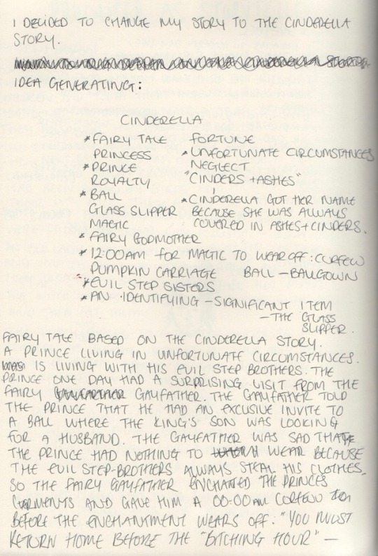
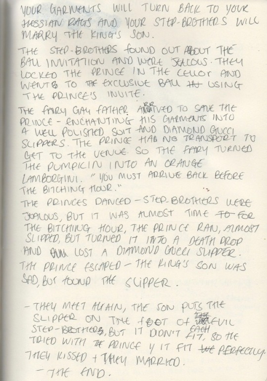
Fairy tale based on The Cinderella Story. A prince living in unfortunate circumstances. Has 2 evil step brothers. The Prince received a VIP invite to a ball from another Prince. He had a surprising visit from a Fairy Gayfather. The Fairy was sad that the Prince didn’t have any clothes to go to the ball in, so he promised to enchant the Prince’s garments on the night of the ball so that he had something to wear. However, magic wears off and there will be a curfew. The step-brothers found out about the ball and were jealous. They wanted to marry the other Prince. They found the invitation and locked the Prince in the basement so he couldn’t go. The step-brothers got ready and went instead. The Fair Gayfather arrived to save the night. Helped the Prince to escape and enchanted his garments. The curfew was set for 00:00. The princes danced all night and the young prince had to run before his garments changed back to the rags. He left his Gucci Glass Slipper behind. The other prince found it and searched for him for days. He found the Prince, they married and lived happily ever after.

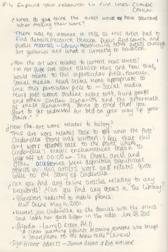
I decided that this story wasn’t modern enough with the changes we have experienced over the past 10 years. So, I decided to do a digging deeper exercise.
https://www.tate.org.uk/art/artworks/cahun-untitled-p79320
It seems like Cinderella and her prince had too much fun. Her garments and shoes are on the stairs, leading to the bedroom.
https://www.tate.org.uk/art/artworks/althamer-self-portrait-as-a-businessman-t11913
An image of significant items a businessman uses every day.
Suit, tie, shoes, newspaper, phone, briefcase and passport.
https://www.itsnicethat.com/articles/frieze-london-masters-2017-round-up-art-051017
“Sex work: Feminist Art & Radical Politics” Curated by Alison M. Gingeras. “Focus on explicit sexual iconography combined with radical political agency”. Highlights include work from Penny Slinger, Richard Saltoun, Betty Tompkins and Dorothy Iannone, whose vivid paintings tell intricate stories in vivid colours.
Can you find any online articles and books that relate to your keywords?
https://www.dailymail.co.uk/news/article-45763/Youngsters-addicted-mobile-phones.html
https://www.dailymail.co.uk/femail/article-3134575/Cinderella-dances-prince-loses-glass-slipper-stunning-film-tells-classic-fairy-tale-eyes.html
https://www.amazon.co.uk/iDisorder-Understanding-Obsession-Technology-Overcoming/dp/0230117570
https://www.goodreads.com/book/show/14475327-significant-objects
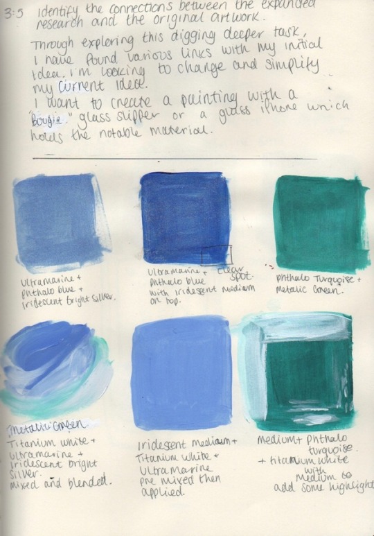
Through exploring this digging deeper, I have found various links with my initial idea. I’m looking to change and simplify my current idea. I want to create a painting of a designer glass slipper or a glass iPhone with Cinderella influences.
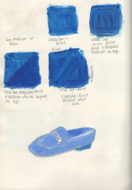
I started to swatch some colours and using mediums such as Gloss Gel Medium and Iridescent Medium by Liquitex. I really think that the Iridescent Medium worked so well to achieve an almost glass finish which relates perfectly to the glass slipper from the Cinderella story.
Thinking more about modern technology.
Mobile Phones – Dating apps – tinder – New developed idea:
Cinderella is a dating app. A prince looking for his true love on Cinderella after dancing all night with a handsome prince at the ball.
Sculpture of a mobile phone with the ‘Cinderella App’.
Unfortunately, when making this… It broke in half and I had no time to fix this. So, I had to resort to making a painting of the app. Here’s what I came up with.
This project was too short for how creative I could have gotten. I would have loved to create at least an A1 painting with more of a storyline rather than having to think carefully about my time management. I did however enjoy practising with Liquitex mediums to achieve different paint outcomes.
To come to an end with this project, we were split up into groups of 6 to criticise each other’s work. The rules were that for 10 minutes the person who was getting their work reviewed, they couldn’t speak or answer questions – then after they had 5 minutes to talk about what their work was exactly about.
Oliver’s review:

We guessed his art work to be from the story Red Riding Hood. This drawing was out of composition and had too much white on the one side of the drawing. However, the use of text worked really well, “Don’t you trust me?” in the colour red. We assumed that the text was in red because the story is called Red Riding Hood, there’s actually a deeper meaning as to why this was the colour red (to be explained later). The rest of the drawing is in black and white which can be quite affective however, because the character is wearing a hoodie sweater, it would be cool to see if she’s wearing a red hooded sweater and to have the rest of the drawing in black and white. Because the character is on their phone having a conversation over text message, I felt that the text “Don’t you trust me?” should be a bubble coming from the mobile phone so it looks more of a texting conversation, rather than a caption of the image.
The actual meaning behind this was:
Phones are used too much and it’s an example of the dangers behind the screen. People aren’t educated enough about the dangers of the internet; catfishes, paedophiles and other dangerous things. Red Riding Hood believes she’s texting her nan, but is actually the wolf who wants her to come over. Red Riding Hood was being led to her nan’s home where she will be killed. The red text was to resemble Red Riding Hood, but mostly blood and about her being killed by the wolf.
In my opinion, I liked the idea of the work, but there were so many unfinished things about it which could be easily changed. The composition of the drawing could easily be changed by finishing some parts where the anatomy has been missed out, whether Oliver draws an outline, but not to completely polish the section, but to show an impression that Red Riding Hood’s waist is there. This would also add to the story by saying that It’s a metaphor of Red being killed and being erased from the world.
Amber’s Review:
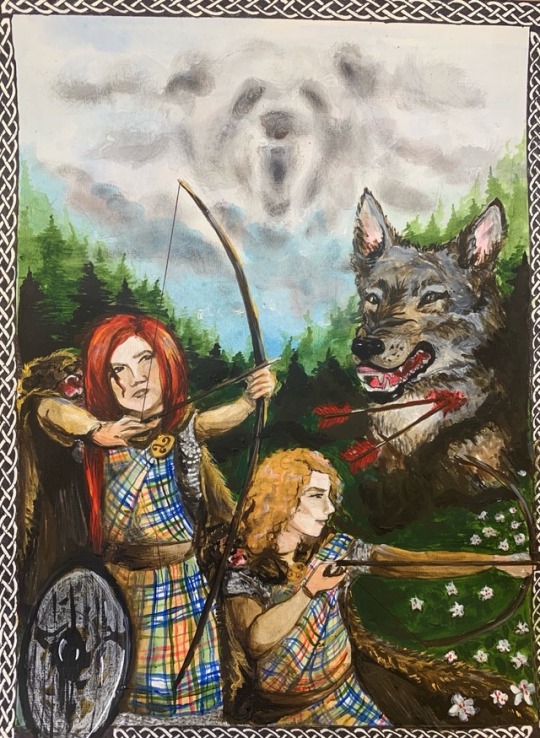
Amber created a beautiful delicate acrylic painting which we thought was also Red Riding Hood. She really researched every detail in this painting as it was obvious to us that there were Celtic influences (the boarder around the painting and the clothing on the characters). We could easily guess that the location of the work was either Scotland or Ireland. The boarder around the painting also gave a tarot card aesthetic which was quite nice to see as I have been looking into tarot cards in some of my projects. When looking at her painting, the first thing I looked at and was mesmerised by is the bear in the clouds. It was really well done and captured the audience’s attention. I see bear as a spirit animal that lives in the clouds to protect the person who wears its amulet of protection.
She shown her inspiration of the piece so clearly:
· Disney Brave
· Celtic history
· Protection and bravery
· Strong warriors
I really liked the small details of this art work too, the image has a great composition and really nice textures: the hair, skin, clothing and the vegetation. There was great use of vanishing point too. The main wolf is being haunted but is still showing signs of strength and appeared to be the alpha.
The actual story and details:
Original story are Snow White and Rose Red.
Snow White and Rose Red are dangerous ruthless killers. Amber didn’t want to create perfectly groomed characters with the typical female stereotypes and wanted to create them into fierce characters. She explained how she searched into her own family history and her surname. It leads back to Ireland and she related this into her painting. Her family history ‘O’Sullivan’ where she found out that they had their own song, their own shield and family crest. The most interesting part is that they had an omen which is a bear: That’s why there’s a bear in the clouds. This shows hidden symbolism in her work which was nice to learn. She wanted the main wolf to be a boar because that was her family crest. She said that she didn’t paint a boar because she didn’t have any references to paint one. However, she could have found references on the internet which could have made this more relatable.
My work being reviewed:
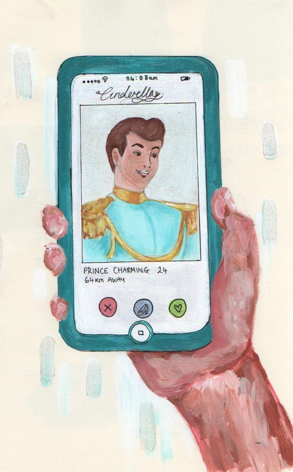
· Cinderella apparently feeling sorry for herself, so she resulted to Tinder at 04:08am to find a midnight hook up.
· The time on the phone is because the prince is trying to find their date from the ball and didn’t take their phone number so they’re trying to find them on the dating app.
· To express that people are so caught up with finding their own Prince Charming on the internet.
· Photos are easily photoshopped.
· Classical aesthetics
· Clear inspiration
· Clear definition between the hand and the phone.
· Some proportions are a bit off.
· The small details work great – the Iridescent Medium
· Time was the enemy in this piece as it was evident that I didn’t have much time to do exactly what was planned.
· A background to give a sense of environment
· The marks in the back ground is rain?
The actual story/details:
Cinderella is a LGBTQ+ dating app where the user can find their own true love with people who have the same intentions. The Prince had left the ball without leaving his number with his date. His date (another Prince) was searching for his true love on the Cinderella dating app at the early hours of the morning. The rain in the back ground is a metaphor to express that the Prince is sad that the other Prince didn’t leave his number.
Key features of this painting:
· The glass slipper has replaced the super like, which the guys had mentioned was a really nice detail. Brings relevance from the story and the inspiration from Tinder.
· The use of the Iridescent Medium which shows influences from the glass slipper.
· The colour of the smartphone brings inspiration from Cinderella’s Ball Gown and Glass Slipper.
· Why the Prince Charming on the app screen has a blurred looking face is because in today’s modern culture, people are using photoshop to make themselves look blemish free and beautiful.
I really enjoyed this project. However, it is sad that there was such a limited time frame which didn’t allow me to get into greater details with a painting. I would love to have made a much bigger painting – scenery and more story; experimenting with other paints such as oil paints and layering different paints – acrylic and oils.
0 notes
Text
Producer as a Designer: A brand called Purity Brewery Co (award winning beer) were called in to ask us Art & Design students to develop a piece of art work/design to represent one ,two or all of the Purity Brewery pillars, ‘Pure Eco, ‘Pure Community’ and ‘Pure Quality’ which meet the size guideline ‘115x115mm’. About Purity: They are a brand that craft vegan beers which is very important as a lot of the population are now becoming vegan. They craft beer with conscience: saving their waste water and having a wetland system which naturally recycles their waste water. https://puritybrewing.com Before I started to start generating ideas, I searched the internet for ‘beer labels’ and came across this: https://www.theguardian.com/lifeandstyle/2017/sep/03/brew-period-craft-beer-labels-works-of-art

I started this project with the word association technique. I took the values of the brand I’m designing for (Purity Brewery Co) ‘Pure Eco’, ‘Pure Community’ and ‘Pure Quality’. Which I then came up with a collection of words which have been expanded from other words in these brainstorms. I then made a selection of sentences; picking a word from each value which helped to form a sentence which gave me a new starting point.
Government evolution is the future.
Be the end to Earth Pollution: Create sustainable designs.
Vegan friendly memes to help the quality of nature.
Fictional agricultural creatures.
Witches purify land and protecting endangered species.
Animals love vegans – vegans love animals.

I then started with “Witches purify land and protecting endangered species” to start developing my ideas. I started to think about tarot cards for my design and their uniqueness which help get the message across to the reader. I started to illustrate and combine some images within my sketchbook to create a somewhat mood board.
‘I came up with the idea to conceptualise with tarot cards as a way to express the current state of Earth and my feelings towards Earth. Thing’s I currently like as part of this project development: Illustration, limited colour palette, text, sci-fi, human anatomy and collage’.

Developing my tarot concept by changing some key features of the card ‘The Star’. This card has 7 eyes in the sky of the tarot. I change these stars to eyes which are a symbolism for the eyes of Mother Nature – She’s always watching. I thought that this would be a nice feature to add as it’s making my design relevant. I also used the method of collage and illustration to create mood. I collaged artist work and layered my own drawings on this page.

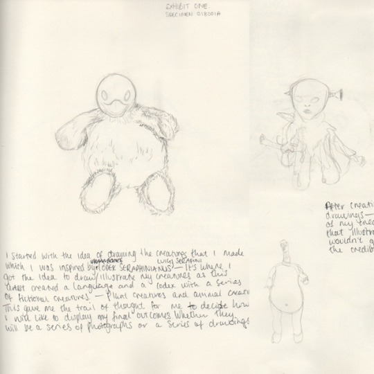
I moved on from this idea (also keeping it in mind). In my previous project, I created sculptures of mutated creatures which were brought to the Earth by Mother Nature. These creatures had a purpose to replenish/cleanse the Earth from pollution and to give genesis to the Earth. So, I thought that it could be an idea to re-introduce these mutants into this project with new intentions. I feel that a good idea is to make drawings of these in a comic book sort of way?
I also started to look into more artists such as Ken Barthelemy. He created his own creatures and characters. He is mainly known for the character design in the movie, ‘Maze Runner’. I feel that his work relates to mine in a sense of fictional character design but created with a purpose. Are these character designs actually what will be living among humans/preying on humans in the future? Post-apocalypse?

After illustrating one design idea I began to like the new concept – especially the eyes in the background which give the impression that someone is watching. However, when we were critically analysing work as a group, my peers found that this theme, concept and drawings was too dark and wasn’t appropriate for the brief. So, I decided to revisit the tarot card idea and to develop that further.


I found a tarot card that I really liked and found that I could easily manipulate and play around with the image, colour and crop. I found that blocking in the bottle made it seem more like a ceramic bottle rather than a plastic bottle. Printing out an image and sticking it on my illustration was more affective and was a nice way to include collage.

I took a break from thinking about illustrations and started to think about daily waste which has an impact on the Earth: Flyers, candy bar wrappers, receipts and gift wrap. I decided to create a collage of these materials which could then be used as backgrounds for my tarot card design idea. I then traced the Purity drip mat on my collage background and then cut it out to see how it would look. I like how this design looks and it works quite well with the concept.

Likes:
I like the texture that the collage in the background of my design which creates a crispy aesthetic which actually contradicts what the sky in the real world looks like. I like that there’s a sense of fiction in my design as well as fictional details.
Dislikes:
I dislike the shape of the drip mat which wasn’t in my control. The drip mat limits me in ways I had to manipulate my own art work and limited what I could do in terms of bigger details and parts of the drawing would be cropped out due to the big random corners.
I dislike the river that I illustrated. I chose the clean water vibe which is blue, rather than expressing plastic pollution through better choices of colour such as purples, greys, greens and blacks.
Things that helped me develop my work:
Speaking to my peers and asking what they like, dislike and what they would change. I believe that always asking people around you is how you can usually make the best choices. Even if you don’t take what they say 100%, you are able to manipulate what they say to something that works for you.
0 notes
Text


Studio setup induction & photographing my mutants for the activist project:
Stupio Induction was great, it allowed me to understand why we use specific lighting, quantity of lighting and what type of back drops when we photograph our work.
The technician shown us how to safely use the studio and to be aware of specific obstacles that obstruct you while working in the studio: to be aware of loose wires, tripods that could possibly be behind you and lights.
As soon as I knew how to set up the studio space, it became really easy and to play around with trial and error; to see what works best with your subject. I thought that it would be a good idea to use this studio induction to take a photo of my previous project’s work so I would have professional shots of my sculptures. It gave me a chance to take advantage of the technician as he was there if we needed him.
Some artists that use the photography and some articles on photography. https://www.tate.org.uk/art/art-terms/p/photography “A photograph can be either a positive or negative image. Most photographs are created using a camera, which uses a lens to focus an object’s visible wavelengths (the light reflected or emitted from it) into a reproduction on a light-sensitive surface of what the human eye would see.”
https://www.vogue.co.uk/topic/photographer
I’ve noticed that the photography studio isn’t always used to make photography. The environment outside has become a lot more popular to take photos of subjects for the natural light and natural props. I personally like both methods of making photographs: studio and environment. But that also depends on what I want to photography. A lot of magazine covers are photographed in studios to have that clean finish rather than a raw environmental finish.
0 notes
Text
Producer as an activist My project commenced with “what do I care about”. I listed a few things that I care about and followed it with a brain storm. Gathering and developing ideas about the environment allowed me to trigger genius ideas. I used a mixture of quotes; companies that are helping the environment and questions relevant to my project. I found this as a benefit as I could relate back to these when I needed to.
I then created some logos for my protest party to help gather ideas for my protest banner that I was working towards. I created some 1 sentence manifestos/rules to initialise more ideas to allow myself to dig deeper. This also allowed me to visualise what I would like to see on my protest banner.
I wrote a longer manifesto about my developed political party which was about the ocean and putting the humans in the sea life’s position - swimming through plastics and other foreign bodies of the ocean. I felt that my next action was to start drawing out ideas for my banner which I would then prototype a few times to get it right. I prototyped a rectangular-basic shape banner and a ‘H’ Kind of shape design using bits of scrap materials so that I wasn’t wasting materials contradict my work. I wasn’t really for the ‘H’ design as it just didn’t flow so well with my theme. A simple design seemed to fit well. With my banner design, I was planning to use a layering technique and to create my own embroidery logo to represent my protest party.
Moving on, I started to develop a mind block towards my idea as I had too many ideas all in one place which meant I needed to narrow down to only 1 idea with its purposes. This is when I decided that it would be appropriate to start another ‘digging deeper’ task. Some of the websites I used were Tate.org.uk and It’s nice that. This was a good benefit to introduce new motives. I realised that a book called Humans by Tom Phillips that I’ve recently started to read is actually very relevant to my work and I should start generating new ideas that are unambiguous. The book is ‘a brief history of how we fucked it all up’. It is quite an eye-opening book to read as it goes into depth about precious locations of the world that have been destroyed and how the government could do better and how we could do better. It makes you realise how selfish we are as human beings. Some examples of the book are ‘Cuyahoga River – Cleveland Ohio. A river that is so polluted that it caught on fire no less than 15 times in the past 100 years’. ‘Electronic waste mountain in Guiyu China – mountains of old thrown out electronics. 20 square mile graveyard of unwanted gadgets, piled high with out dated laptops and last year’s smartphones.’ Imagine the impact these events have on the environment alone. The Cuyahoga River can’t be used as a drinking water source by nearby habitants and can’t house aquatic species either due to the pollution. The Electronic Waste Mountain could be a habitat for vegetation and wildlife which saddens me. I believe that the local authorities and government are mostly to blame as they’re not providing the correct ways to recycle and dispose of waste; they’re the cause of deforestation and they aren’t helping to create a sustainable environment.
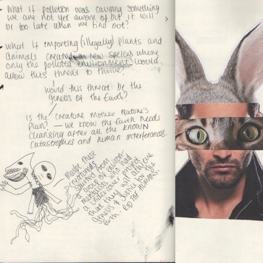
· What if pollution was causing something we are not yet aware of, but it will be too late when we find out what that something is?
· What if illegally importing plants and animals created a new species of animal where only polluted environments would allow this creature to survive and would this creature be a threat to humans?
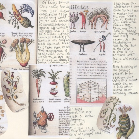
I started to look into artists with similar ideas such as Luigi Serafini who created Codex Seraphinianus. This artist originally published this illustrated encyclopaedia of an imaginary world in 1981. This project was created over 30 months, between 1976 and 1978. It approximately has 360 pages and is written in Cipher alphabet. The language was completely made up which makes this codex valuable. The artist used coloured pencils to create plants, fauna, anatomies, fashion and foods.
I like how the illustrations are often surreal and a mockery of the real world. Such as birds in their nests with human legs bleeding fruit and a range of foliage twisting into itself. I particularly like the handwriting which gives the codex authenticity. After decided on my projects progress so far, I believe that using this artist alongside as other artists I will research seem quite relevant to relate to during my practise.
I’m still considering how I could publish/broadcast my work. I’m not sure if I want to create a series of drawings or photography. I’m not really familiar with photography but this will challenge me and allow me to develop a new skill during this project.
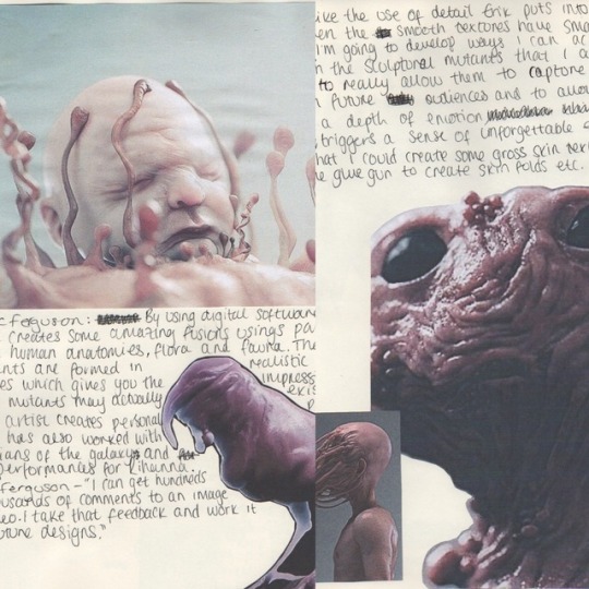
Another artist I have been looking into is Erik Ferguson. A digital artist who uses soft wares to create some amazing fusions – parts from the human anatomy, flora and fauna. These mutants are formed in realistic features/textures which gives the impression that these mutants actually exist. This artist creates person works and has worked with ‘Guardians of The Galaxy’ and live performances for Rihanna. Erik Ferguson – ‘I can get hundreds or thousands of comments to an image or video. I take that feedback and work it into future designs.’ I really like that he engages with his audience to develop his own work and to create work that the audience want as well as pleasing himself to combine what he wants.
I adore the use of detail Erik pits into his work. Even the smooth textures have small details. I’m going to develop ways I can achieve detail in the sculptures of the mutants that I will be making to capture attention and to create a depth of emotion that triggers a sense of an unforgettable experience. I think that I could create some gross skin textures by using the glue gun to create skin folds etc.
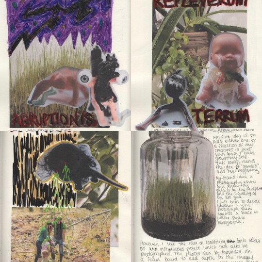
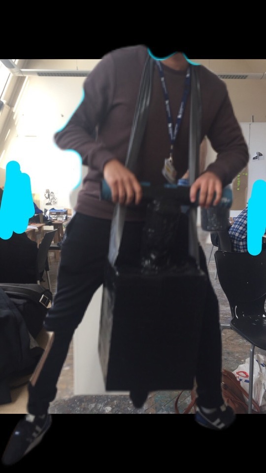
I created a collage to generate the idea of hybrid creatures that would come cleanse the earth. This then gave me the idea to scrap the idea of creating protest banners and to create sculptural works. I took old toys and re-assembled them using hot glue. The hot glue also gifted these sculptures with additional details. The oozing liquid texture made these creatures appear a lot more threatening than they would if they were perfectly glued together. I decided to completely/partially paint some of these to add extra threatening features and textures. I then drew my sculptures to consider how I would display these when protesting for my party – whether these will be displayed as illustrated designs? During this time of planning, I moved onto photographing my designs to see how they look in natural lighting. I felt the natural light gave them a natural ambient look and it seemed a lot more realistic rather than toys glued together and photographed.
I used my photos to create collaged posters to create mood and to consider another way of display. Maybe I should create a multi-media poster collection of these creatures?
Mother Nature’s Revenge
Note: Mundane – Non- spiritual (in this script human(s) will be replaced with mundane).
Purgatory: 100 years ago, the Earth became heavily polluted that scientists and the government could no longer do anything to save the planet. So, it was Mother Nature’s plan to do something about this catastrophe. Objects were documented falling from the sky – Juveniles were caught recording on their smartphones and recording live on social media which justified this apocalypse. The mundane are the reason why this Earth is so corrupt which is why Mother is seeking genesis.
As the UFOs fell from the sky and were getting closer to the sight of the mundane, it was that moment when they realised that they were in danger. The creatures began wiping the mundane out of existence with lashes from their huge monstrous hands and other uncanny limbs. The only thing left was vegetation, wild natural fauna and other natural forms. It’s time to start again. Will there be a new race? Or will some of the mundane revive with intellect?
Post-Purgatory:
After days of cleansing the Earth from pestilence, the minions slowly began to perish as the Earth is becoming so pure that there’s no more pollution left for the minions to consume. Vegetation began to grow, and extinct species are revived into existence. Locations such a Cuyahoga River has become cleansed so thoroughly that only the most sacred aquatic life populate there. Slowly, fauna began to establish and the rare are becoming habitual and the place once known as ‘The Electronic Waste Mountain – Guiyu China’ is now a sustainable habitat, populated with variegated vegetation and fauna. Let us hope that the new mundane population will not be what they were before.

Final Protest Banner:
Now that I decided how I wanted my poster to look. It was hard to figure out how exactly I wanted to display my protest poster. After researching, I came across stickers. That’s when it hit me, my protest poster will be a stick which can easily be mass produced and placed around different locations to spread awareness of my protest. Purgatio Clamoris. Save the Earth. Be the genesis. In the images, you will notice how the environment in my photography clearly captures evidence of human interference with nature. The location of my photography is no more than 2 miles away from my home -- so literally on my door step. It’s unfair that the environment is always brushed aside and business is put first. My protest stickers are definitely something I will continue to use to spread awareness of my campaign.
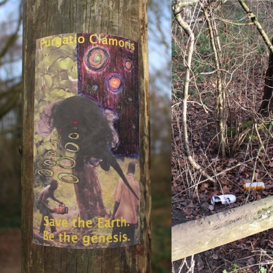
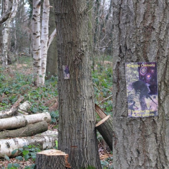
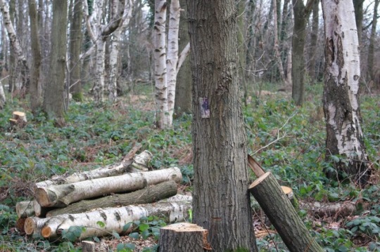
I really enjoyed this project because it allowed me to play around with collage again. I felt that working with collage worked really well as I could reuse old materials which complimented the cause of the protest (cutting down on waste and pollution). When finding a location for these protest stickers, I originally wanted to stick them in public toilets and notice boards. However, on my way to those locations, I happened to across deforestation which was so serendipitous as the stickers themselves have a sci-fi fantasy inspired deforestation scene on them. I placed my stickers in this location and took some photos to document this. The photography worked really well and I captured some nice compositions which worked quite well. One thing I would like to change is the size of the stickers. I feel that from a distance it’s pretty hard to notice the A5 sticker on the tree. I think an A3 or at least an A4 size sticker would be more affective as it would capture the attention of the public causing them to approach the scene.
0 notes
Text


Metal Workshop Induction:
Metal induction was quite daunting. I’ve never work with metal before and it’s very easy to hurt yourself if you don’t know what you’re doing. Luckily we had the induction from the technician to help us meet the health and safety guidelines and shown us around the machine and environment. We were able to practise using some techniques such as cutting, bending, curling, filing and welding material which was quite fun.
Some examples of artists that use metal within their work:
https://www.tate.org.uk/art/artists/sir-jacob-epstein-1061
His work is mainly sculptural. I really like his uniqueness to his work and you can see that he is confident with this media.
https://www.tate.org.uk/art/artists/dusan-dzamonja-1048
This artist created a sculpture called metal sculpture 14. This sculpture was made with nails, which were nailed into what was thought a wooden core, but is actually a clay core — then the head of the screws were coated and fastened together with lead and then the clay was removed.
I don’t particularly like this piece as it’s not very unique. It’s something I see quite often when visiting art galleries. However, I do like the process of making the work, it’s just unfortunate that the outcome is very common. I feel like this artist could have developed this piece a bit more by experimenting and exploring with metal.
0 notes
Text

Lens Based Media:
In the LBM workshop induction we were inducted on how to use the computing facilities used to create video, gifs, image and other creative design. I wasn’t so into this workshop as I’m not comfortable in this field. However, I did have a go at using the media in previous project to try and leave my comfort zone.
Recently I have decided to create a YouTube channel to become more comfortable with using Adobe Premier Pro. This also links to a previous project called Producer as a Curator. This is because I have used YouTube as a curated material.
https://www.youtube.com/channel/UClLUPQZa_E63AqPrYZjVXXw
Some artists that use LBM in their work:
https://www.tate.org.uk/art/artists/steven-pippin-2408
“Laundromat-Locomotion (Walking in Suit)”
This is quite an eye catching piece. As I was searching for artists whom use LBM I came across this, I was about to continue scrolling but I couldn’t stop looking at it. The photographic piece draws you in and kind of hypnotises you.
Medium(s) used:
Photograph, gelatin silver print, on paper.
0 notes
Text


The New Art Gallery Walsall,
My Art & Design class took the train to Walsall to visit the new art gallery to visit the exhibitions there. The moment I stepped in, I hated it because of the heating! Why is it a thing that when autumn/winter comes, the heating is turned on to a redicilously high temperature. Moving on from a negative, I was looking around and admiring the architecture. I noticed how the concrete walls were matching the grains of the wood which was quite an interesting detail. The details of this building included leather handrails for the stairs; the elevator had a continuous window view to see the outside landscape and high ceilings with concrete beams.
We then went to view the art works that were exhibited. Elizabeth Magill on Floor 3 was a collection which caught my eye the most. Beautiful, elegant decorative pieces where displayed so well. The lighting of the room also justified how beautiful the layers, brushstrokes and details were alluring.
I didn’t get a sense of what the work was about, but it was nice to just stand close to really look deep into the pieces.
Here’s a link to the gallery website to find out about current and future exhibits.
http://thenewartgallerywalsall.org.uk/visit/
0 notes
Text
Plaster work shop induction!
So, I attended a plaster workshop and I will tell you it was so fun! I have experience with plaster and similar materials from my previous university experience. However, being a part of this induction taught me a few skills that I've never knew from before. For example, ‘The flicking method’. This method is used as a base coat for the plaster, it allows the plastic to penetrate ever tiny detail of the product you want to cast, but be warned... It’s a really messy job. During this induction we had the task to create a plaster tile of any shape and to use mark making techniques and to leave impressions in the clay to be then plaster casted. So, the first instruction was to dampen the fabric sheet which prevents the clay from sticking to the table/fabric. I tore out the appropriate amount of clay and used the wooden guides to roll out the appropriate thickness of clay. I sliced the extras off to create a square and began to make spontaneous marks which then lead to a face. I wasn’t satisfied with my initial design, so I repeated the first few steps to create a clean slate. I started mark making again and came out with a new drawing/impression. I played my design on a coated wooden board to allow easy mobility just in case I wanted to come back to this project at a future date -- it allows anyone to move it if it’s in the way too. I then built a clay wall which would allow the plaster to remain in the shape it should be. I then began to mix my plaster to the consistency of my desire. I decided that a thicker consistency would be more beneficial as it will hold better and dry a lot quicker. Mixing the plaster with my hand is more effective as you can feel whether there are lumps in the mixture -- you wouldn’t know this if you were to use a spoon/fork. As soon as it was ready, I began to flick the plaster onto my work which allows the details to be picked up (as explained earlier before): I then began to fill my mould with the remaining amount of plaster and then left to set for approximately 20minutes (this will vary depending on your mixture and the temperature of the room). I left a decent amount of mixture in my mixing bowl which allowed me to judge whether my plaster work was ready or not. Now that it is ready, I removed the clay walls and released my tile. I gently swilled my tile under cold water to remove any clay residue and used tools to clear any of the smaller spaces. I was really happy with the outcome of this product. It was a really nice way to experiment with this media and I will definitely be using this again. I feel like plaster is easy to manipulate and could be used in so many ways.
Here are some artists that use Plaster in different techniques: Sir Eduardo Paolozzi https://www.tate.org.uk/art/artworks/paolozzi-plaster-relief-t14303 https://www.tate.org.uk/art/artworks/paolozzi-michelangelos-david-t06944
https://www.tate.org.uk/art/artworks/paolozzi-plaster-for-mr-cruikshank-t03765
Rachel Whiteread https://www.tate.org.uk/whats-on/tate-britain/exhibition/rachel-whiteread
Pablo Picasso https://www.tate.org.uk/art/artworks/picasso-head-of-a-woman-fernande-l01712
Through searching for artists who have used plaster to create work or as part of their work, I found Sir Eduardo Paolozzi to be my favourite as there were a collection of different complexities within their work. I particularly liked: https://www.tate.org.uk/art/artworks/paolozzi-michelangelos-david-t06944 because of the weights, textures and layers.


This image is to capture the lettering process, ‘LUNA’: BUT the how not to do the lettering. I didn’t realise this mistake until after the process... please see the finished project to understand what I mean.


As you can see, the text on my image says ANUL or CANUL. This really was an accident as I miss judged how to place the lettering during the wet process. However, this unconscious act actually turned out to be very serendipitous as I now read the moon symbol as a letter -- reading the art as CANUL which sounds to me like some tribal name/word. I like how sometimes making these stupid mistakes turns out to create something really cool.
#art#artist#university#university blog#art and design#artists on tumblr#plaster#plaster relief#tribal
0 notes
Text


Drawing machine commenced with artist discussions: talking about artists and researching artists whom used drawing machine to construct art. We looked into a variety of artists such as Rebecca Horn (she created many drawing machines such as a giant balloon with charcoal-pencils attached to the outside which would then draw onto the walls as the user would move around inside the balloon). Rebecca also created a drawing machine which included the user to wear a helmet (strapped around the head) with pencil attachments to it. Click the link to see the YouTube video: Rebecca Horn Performance II – YouTube
We then looked into the idea generating strategies such as selecting keywords: ‘Drawing’ and ‘Machine’ writing down words that relate to each one of these keywords. We also brain stormed propositions from Drawing Machine and came up with many ideas such as, ‘Performance: Orchestra and tools of the trade’ and simple ideas such as ‘filling water balloons with paint; gravity-based machines and mirrors and reflections.’ We also developed a few of these ideas by extending on them exploring methods to achieve additions such as adding restrictive wear, extending limbs and asking what if questions to try to gather new interests/ideas.
We settled with Tools of The Trade. Evolving this idea further by creating lists and adding additional ideas to it. We wrote a list of tools and started to draw some tools which we thought could be interesting and could add some interesting features in terms of mark making. Items such as drills and a jackhammer were what first came to mind which we then started to discuss how we could get them to operate.
Reminding each other of new what if questions and jotting them down, we finally came up with a what if question that suited the team’s work.
‘What if an Art degree was taken as serious as Industrial Degrees?’
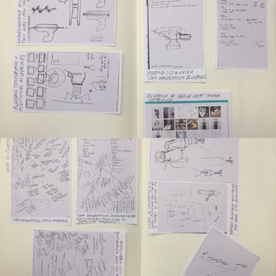
A drill could be manipulated quite well by taking advantage of its rotating facility. Adding a 3-way function or a 4-way function where 1 extended body could be holding a brush, the other a pencil, a sponge and the other filled with something. We started to sketch this idea out and then discussing our ideas and sharing the ideas between our group. We also took advantage of creating a group chat to help with planning/idea generating when we were at home or unable to make it into the studio at the same time as the other group members.
We then started to make prototypes of our ideas. I made a prototype of a jackhammer and put it to the test. I wasn’t completely satisfied with the prototype, so I thought of ways that I could make this more interesting. So, I added a restrictive band to add more effort into the mark makings when I push the jackhammer down towards the floor. I felt that this would have an effective/serendipitous way of making different marks on the drawing surface when we decided to film our process of the Drawing Machine. I used duct tape all around my Drawing Machine to hold the shape and to allow people to see the design clearly. This also added strength to the machine when testing.
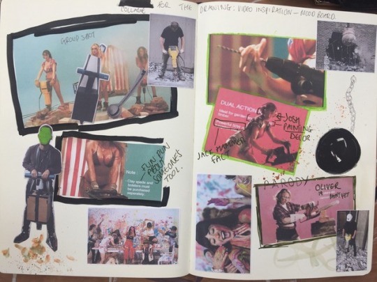
The idea of creating a mood board/collage of our ideas was a great way to boost inspiration. We wanted to produce something that is a performance rather than a documentary type of product something that has inspiration from current/past videography. We research many works that used tools/’Drawing Machine’ in video performance. Benny Bennasi - Satisfaction Foxes - Let go for tonight
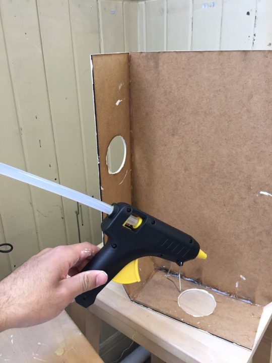
After thoroughly planning our work, putting methods into place and discussing what our plan/outcome was, it was time to put together our Drawing Machines. I used the workshop, CAD/CAM and Laser Design. I drew out my idea as a rough sketch in my sketchbook with measurements. The design was then drawn onto Adobe illustration and transferred to a different software, ‘Rhino’. I then drew the drawing on Rhino and turned it into a 3D drawing with the help of the Laser cutting Technician. The drawing was then transferred over to the Laser cutter and the process then began onto MDF wood.
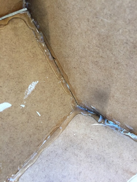
I then painted all the individual pieces of MDF wood cuttings with white acrylic paint, but these needed many layers as I found that MDF is very thirsty and like to draw in all the moisture from the paint. I then started to fix these pieces together with the glue gun which was a fiddly situation. During this process, I realised that I needed to find out how to get the handles and the hammer attached to this build. So, I used my PVC piping and made some simple cuts in the Wood Workshop. I used a 3-way attachment elbow to hold them all together. I hot glued them securely so that they wouldn’t fall out of the elbow. I then fixed them into position (inside the machine) and continued to hot glue the machine together.
I felt that the drawing machine would be too fragile if I just hot glued the sides, so I made the decision to hot glued the seams like you would if you were sealing with silicone. This added to security and kept a firm body to the product.
The team then started to collect together resources for the project. Creating additional collages and collaged timeframes, but we felt that we didn’t want to create a complete timeframe as we wouldn’t completely follow it and the video would look better with organic ideas rather than a structured idea.
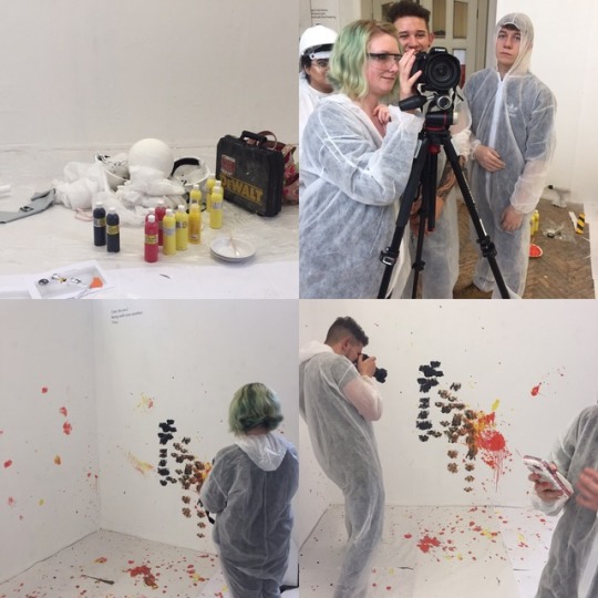
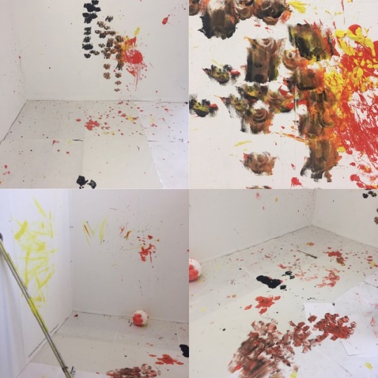
The first shot we filled was the Wrecking Ball colliding with the wall, covered in paint. It was very successful and created some beautiful marks, textures and weights within the surfaces of our space.
We progressed to filming and photographing each section of the set up. I also was taking some photos/videos from my phone to capture some interesting shots. Creating a Gif of the saw was a nice touch and also close ups if the drawings. Each drawing we made with the Drawing Machine was simply beautiful and would look amazing as a drawing on its own; an installation or even a collaborative product. I love the contrasting marks the machines left behind each press and movement. I particularly like how the drill made nice smooth, curved and opaque marks and how the paint filled tube made a thick splatter across the wall, producing a new weight to the drawing. Once recorded and the video was slowed, it was amazing to see the paint particles move through the air onto surfaces where they came into contact with to create interesting markings.
Unfortunately, I didn’t like the final results of the saw. I felt it could be developed to a further level where it could have extra properties such as: restrictions, drawing outcomes and the size of the saw, could it have been made bigger or heavier? However, I do love the idea of replacing a blade with brushes which still has the traditional painting influences.
I also wish that I developed my jackhammer by adding a section to my design where paint will dispense when the design was pushed down, a longer distance between the base to give clear significance of a jackhammer. I think being more rigorous with the designs would also help to improve either the machine performance or the quality of print making the machines make: Suspension (making the movement of each press smoother which could possibly mean smoother markings or rougher depending how the suspension was made) and Pressure (increasing pressure or reducing pressure to change/play around with opacity).
Filming time:
Following the video plan, we started to organise the set up and where we needed to stand during filming time and what space each of us needed. After practising what we wanted to shoot (without paint) we began with the filming. We were overwhelmed with how well the tools were working; trying to control our excitement as the paint covered wrecking ball collides with the wall and the beautiful patterns every other tool was making. We didn’t expect the results to be this way. The paints we selected had a beautiful juxtaposition to the white drawing surfaces, allowing the drawing to stand out vividly.
Documenting each scene was a great strategy because we were able to see how interesting the drawings are now that they’re starting to develop into one giant collaborative drawing.
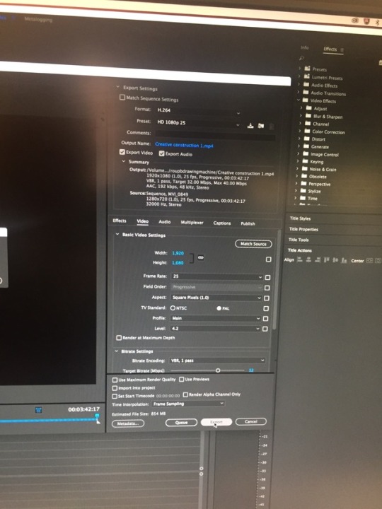
Post filming, we took the footage to the Lensed Based media suite to begin with editing. Although we had attended the induction for this workshop, the group still found it daunting. We decided to not do the obvious and to just begin editing so we could find our own way around the software (Adobe Premier) we were using to edit and produce our film. Being mindful of the scene transition editor, we used a selection to introduce and end each scene in the footage was a great way to make the footage to appear finalised and professional. Each step we made in progress for the video, we had to deeply consider the placements of each clip and any photos we wanted to add as this would determine the quality of the video. As soon as the music was added to the footage, everything just started to fall into place and began to run smoothly. Day 2 of video editing, it was decided that added credits then a ‘slug’ (a blank space between 2 scenes) would be an effective way to make the audience think that the show has finished, but when the ‘bloopers’ start playing, the become excited to see more. Adding the bloopers was fun, but we also had to consider the placement and the correct music. Using the music from the music video that inspired the video was a practical way to significantly link artist work to our work in a less obvious way. It finally began to feel rewarding.
In conclusion, I’m exhilarated of the final outcome of the video as it broadcasts the drawing machines by perfectly exhibiting the drawings the machines create. Working with the use of highbrow and lowbrow was a fun way to make the project fit accordingly with potential audiences and sharing amusement. Presenting our film to the class was exciting. Everyone collected chairs together in front of the big screen with snacks ready for teams to share what they have made. When it was time to stage our video, the combination of tension and excitement was the current experiences for our team members. As soon as the video started to play, I could see how well the video engaged every individual in class. After the title displayed on the screen, the giggles started to begin. The relief. Receiving positive feedback by class members and lectures, it made the group so fulfilled and eager to create more videos! I will be taking skills that I acquired from this project into every future project.
Now here’s the link to ‘Creative Construction’, enjoy.
0 notes
Text
Producer As A Curator Crit: In today’s session we were split into 2 groups to make the session more organised. We were booked into the theatre so we can see everyone’s blogs on the big screen. Displaying the blogs on a big screen was so affective, it allowed us to see the fine details too.
I curated 3 blog spaces: An instagram; A YouTube and A Spotify playlist. My favourite one being my Instagram account. Instagram: This account was about my plants and sharing with people the variety of house plants and other plants that I have in my living space. In the middle section of the feed I had products that I recommend for people to have/use in their living spaces. It was kind of a way of promoting work to audiences whom follow. https://www.instagram.com/brujovegetal/
Youtube: I chose to create a YouTube playlist which expresses personality on the internet. I believe YouTube is a great way to broadcast so many different genres in the video world. YouTubers I regularly watch are Jenna Marbles and Mark E Miller. Jenna is great in terms of comedy, which is great because it doesn’t require your brain to work while watching her videos: just simple, easy watching or even listening. YouTube Mark E Miller creates content that he wants to create. He does road trips, life updates, interviews/inspirational talks and much more. It’s really nice to use this platform as away to communicate to people. This is why I created a playlist to express my favourites. https://www.youtube.com/playlist?list=PLt82P787kxjHv28QWnJyAShfzj7BWJi1-
Spotify: I curated a Spotify playlist because I thought it would be a good idea to share feeling of a ‘Vivid Dream’. This Spotify playlist consists of songs that have feeling and talk about being trapped, broken, hurt and at one point safe and happy then it all gets taken away. It’s literally how you feel in a vivid dream. https://open.spotify.com/user/215z67ua5yy276qmsqdyknukq/playlist/7zxsWypIHdpcd7WEvhnBJY?si=dHFZLx1QQRaq9FRx-rNhzw

Blog above is by Amber: https://pin.it/5ewvl2sdg7tz2d It’s a collection of garments made in a fairy tale theme inspired by Japanese, English culture and other western countries fashion/culture.

The blog above is by Victoria: https://www.instagram.com/opaqu_/ It’s a blog about black and white, how humans should work together and love everyone, regardless of their colour. She used a lot of white space which worked really well on this blog which also created texture.


2 notes
·
View notes
Text
Curating an Exhibition:
During the Producer as a Curator project, we were set a little task to exhibit our books. We had to consider how we wanted the books to be placed and whether there will be a theme to it. We started by grouping the books that had similar/same meanings to understand the numbers of each pile. We repeated that process a few times with different questions to create equal piles. For example, ‘Whoever has a book is about the history, place in one spot’ and ‘whoever has a book about the future, place in the other spot’. Eventually we came to ground of having the historical pieces at the start; the nether historical/futuristic pieces in the middle and the futuristic pieces at the back.


0 notes
Text
The East-Side Project Exhibition Visit: When I first walked in, I thought “is this it?”. My brother and I were so disappointed as the exhibition was spoke about like it was a new iPhone product launch. But when I started to look deeper into the work exhibited, I started to understand and grasp the smaller details.
My interpretation is someone from the future, post disaster where Mother Nature cleansed the Earth with water. In the videos, the person was explaining how and why we have to protect our planet and why we should reduce waste and use more sustainable methods. Right now, our planet is neglected, tormented and drained. I really like how the artist used methods of image layers/collage on the videography. I particularly liked the use of text. The Keywords used were: We conquered; we polluted; we desecrated; we raped; we dried her; aquatic revenge; remember we disappeared (referring to dinosaurs and using dinosaurs as a reference to what could happen to our animals today how our future families won't ever experience the animals we have today). After these keywords were displayed, it was followed by “water healing” meaning the Earth was cleansed to a fresh start, wiping the Earth from the toxicity that it contains.
The art work details:
There were a small variety of other works which gave me the assumption that this was possible a solo exhibition. The first work I seen was an installation of silver painted shells and approximately 9 natural coloured shells. I didn't understand this piece, but I did really like it. I assumed this piece to be fossils of the history (from the post Earth’s water cleanse) of how the fossils were no longer fossilised in natural rocks and soils, It’s more of an idea of being fossilised in pollution and non bio-degradable products such as plastic.
There were also small details located on the floor. The most interesting one was resin pour puddles. They just looked like the building design at first, but when I actually got down and looked, there were bits of cans, batteries, bags, plastics and other non natural elements captured in this work. It is a clever way of expressing and capturing exactly what’s happening in the world now. Oceans and seas today are losing its fish due to human waste populating the seas. Fish are disappearing and plastics, cans, tires and other items that don’t belong in the sea are appearing.
In my opinion, this space could have been curated much better as the art works didn’t have text next to them to explain what they’re about; the artist name and the dates. Also, upon entry there were no flyers handed out to me which would have been an effective way to promote the artists and to explain a little about the exhibition. The area around the exhibition out side the building could have had posters to let the public know that there’s an active exhibition on. It would have also helped me to find the exhibition easier as I found it hard to locate.


0 notes