
first year BEd art and design// Exploring movement of teeth through the electives: Print, Painting and Photography
Don't wanna be here? Send us removal request.
Statistics
We looked inside some of the posts by k00282871 and here's what we found interesting.
Average Info
Notes Per Post
104
Likes Per Post
102
Reblog Per Post
2
Reply Per Post
0
Time Between Posts
2 days
Number of Posts By Type
Text
17
Last Seen Tumblr Blogs


Fun Fact
Users from the US are the majority of Tumblr visitors.
Text

This semester I explored the theme “Movement” through three electives, paint, print and photography.
I began my project by observing the movement of teeth, specifically movement aided by braces as it’s relevant to my own life right now.
Soon after I started adopting a bit of a graphic pop art style, so I decided to lean into and research another kind of movement- the pop art movement.
Taking inspiration from artists involved in the pop art movement was a big turning point in my project. It really helped me to step out of my comfort zone and include a range of bright colours in my work.
I would have loved more time to explore the electives that I chose further, but even in the short amount of time available to do that I learned so many new things.
19 notes
·
View notes
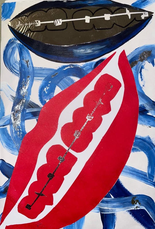
Text
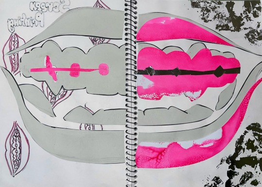
Experimenting with Lino printing and pattern.
After completing my artist research on Keith Haring I decided to explore pattern. I also wanted to include print as it was my favourite elective explored and orthodontic rubber bands because they are the most effective part of the braces when it comes to moving teeth.

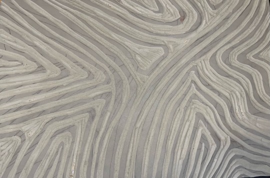
I loved the way that the bands were round and overlapped each other but I didn’t want to make a print covered in circles, so I created a curved design. I carved the shape into the lino leaving the raised parts of the design to catch the lino ink for a print.

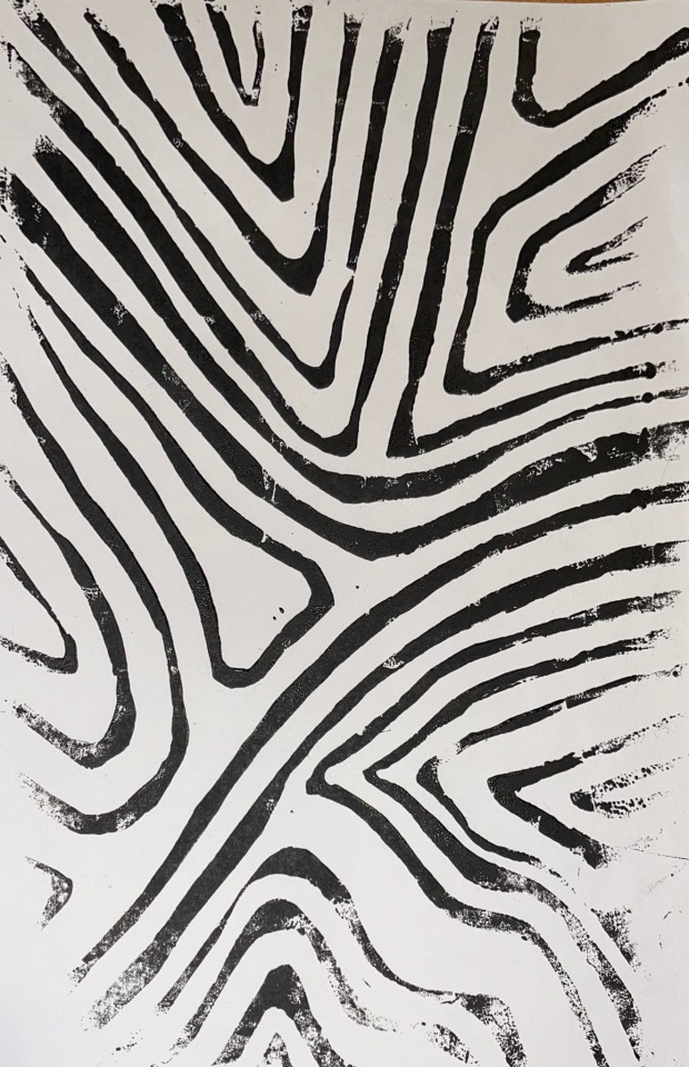

I used bold black lines in my print inspired by Haring.Haring had printed on top of colour before and it really stood out to me so I used a screen print from a previous workshop to print on top of.


Once I had completed the print it reminded me of another artist, Andy Warhol. The curved black lines made the pattern more of a zebra print which featured in the pop art movement.
4 notes
·
View notes
Text
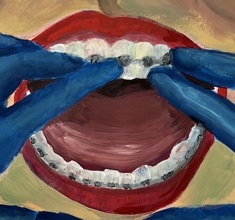
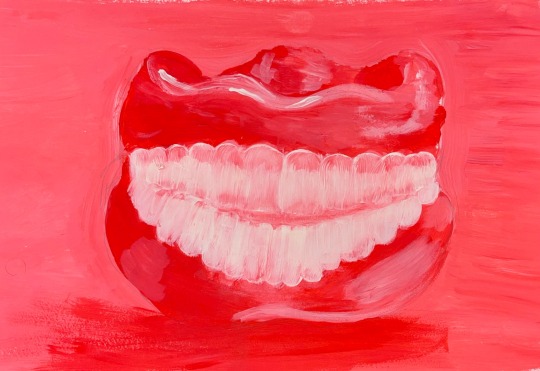
Acrylic on paper, 11.7 in x 16.5 in
I decided to try paint this from a dentists perspective looking into a patients mouth.

I wanted this piece to look slightly pop arty, so I continued to utilise bright colours. I painted the gloves blue to contrast against the red lips. I also under painted the teeth with an array of tertiary colours and added a layer of white on top to make them look more natural.
6 notes
·
View notes
Text
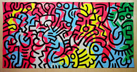
ARTIST RESEARCH-Keith Haring.
Keith Haring is an American artist best known for his recognisable pop art style. His fame is remarkable considering his short career as he passed away at only 31 years old.

Haring used bold lines and vibrant colours in his artwork. These characteristics were also associated with the pop art movement during the 1960’s. No wonder Haring, Warhol, and Litchenstein’s artwork is still unparalleled in popularity, featuring in high street fashion and interior design today.


The part of Harings work that I will take inspiration from from in my project will be his use of bold black lines and repeated pattern. The uniformity and intensity of the patterns really interested me when I first saw them. The way that Haring also layers these patterns over previously created artwork with bright colours is something that I’d love to try in my own project.
4 notes
·
View notes
Text
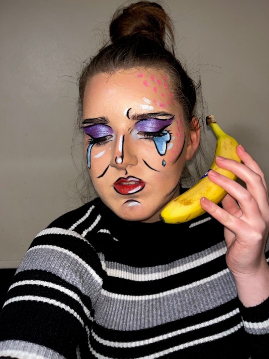
I decided to experiment over the weekend and paint my face like one of Roy Lichtensteins crying girl images.
Like Lichtensteins images, I added black lines to my face to define some raised features. I also added spots to my face to incorporate another key feature of Lichtensteins artwork.

I added a banana instead of a phone to give a nod to Andy Warhols artwork and added filters in photoshop too.


10 notes
·
View notes
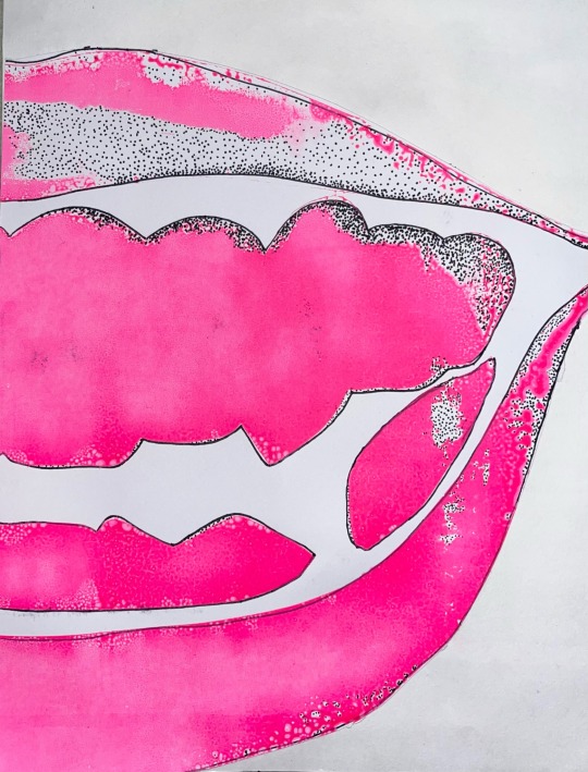
Text

I added photoshop filters to the painting of teeth that I did to create more of a pop art effect.
I also put them into a 3x3 grid as all of the different colours reminded me of Andy Warhols prints.
8 notes
·
View notes
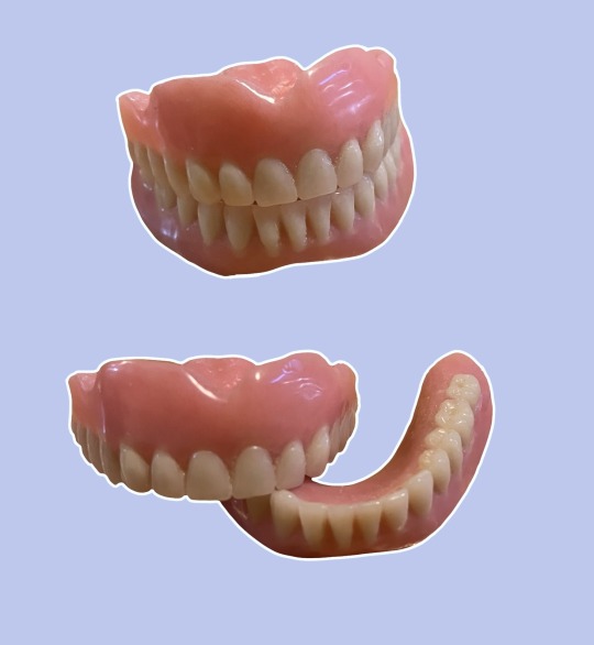
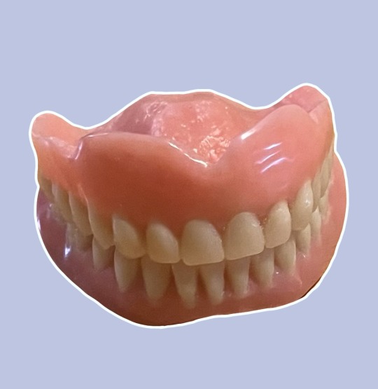
Text
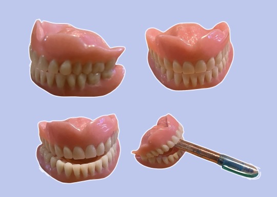
After the painting workshop I attempted to do a still life painting of a set of dentures.
Similar to the workshop I lightened my paint twice with white paint, so I had light, medium and dark shades to work with. I decided to just use one primary colour (red) instead of mixing three to give the image a more vibrant pop art feel.

I also used one large brush for the painting as that’s what we did in the workshop.
I set up the teeth and then I identified that the teeth were the lightest so I filled them in with the lightest shade, I then noticed that the gums were darker so I filled them in with the darkest shade and used the middle shade for the background.
After the initial layer of paint had dried I added shadows and highlights with the three shades.
3 notes
·
View notes
Text
20/2/23 Painting workshop
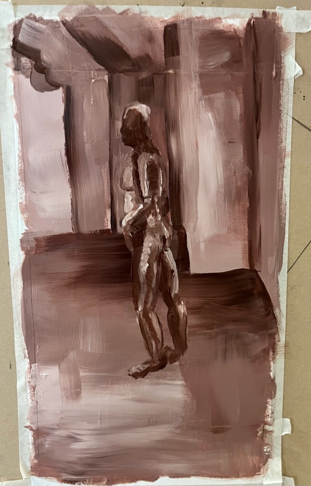
On Monday I attended the painting workshop where we painted a live model.
We first began by mixing acrylic paint to create a brownish shade from the three primary colours, then using 1/3 of the paint we lightened the shade by adding white and repeated that process again to make a third and final shade.
We then looked at the model and the room together and decided what was the lightest shade, middle and darkest. I chose to make the wall behind the model the lightest as it was white and the light from the windows was reflecting off it. The floor the middle shade and the model the darkest.


After those base layers had dried we added shadows and highlights to the background and model to add dimension. I ended up using the three shades of acrylic on the floor, wall and model.
I’d love to incorporate some of the things I’ve learned in this workshop into my own project. I think I might try doing it with more vibrant colours like I’ve seen from pop artists.
1 note
·
View note
Text
Repeating patterns-
Pop art/ Andy Warhol inspired
I looked back on images of my braces I took over the last few years to document the movement of my teeth and chose a few to draw out on procreate.
I drew the mouths in quite a graphic style taking inspiration from Pop Art and the red lips from the Rolling Stones logo. I kept all of the colours of the mouths the same and varied the shape of the mouth and position of the teeth.

I then copied the mouths resized them and flipped them on the canvas to create a repeating pattern with small differences.

2 notes
·
View notes
Text
Gestural Drawing- using Soft Pastels
I decided to use soft pastels instead of charcoal to add a pop of colour to my sketchbook.
I initially did eight 30 second gestural drawings. I layered two drawings of the teeth in the same position in different colours creating movement and a glitch effect. The layering of bright colours was also inspired by the pop art movement.

I then moved onto 2 minute gestural drawings. Which turned out to be my favourite as I just got enough detail onto the page without going overboard. I also think that the green and blue colour scheme is my favourite of all of them that I’ve tried.
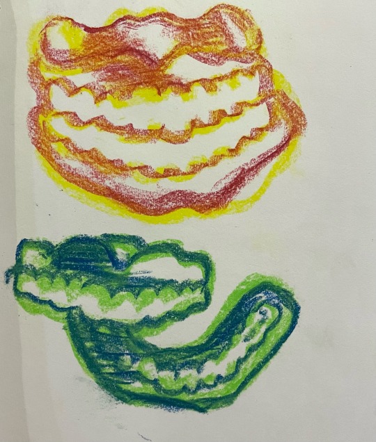
Finally I spent 4 minutes on each layer of this final drawing, which was too much time. I put down too much colour which left me with a muddy dark result.

6 notes
·
View notes
Text
ARTIST RESEARCH- Andy Warhol.
Andy Warhol was born in Pennsylvania U.S.A. in 1928. He is one of the most famous pop artists that has ever lived. He was also a key artist in the pop art movement in the 1960s.
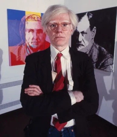
Warhol mostly used the medium of print to create his artwork. By using this medium he could create uniform prints of a repeating pattern.The repeating pattern seen in his artwork contained slight differences, like a changing colour scheme.

Unlike Lichtenstein who mainly used primarily colours, Warhol primarily uses tertiary colours (eg. Magenta, teal, amber, chartreuse etc.) leaving his artwork less busy and uncomfortable to look at than a repeated pattern using loud colours. Even though his artwork is colourful the tertiary colours soften the final pieces.

Andy Warhol was clearly interested in celebrities and pop culture. He created screen prints of Elizabeth Taylor, Grace Kelly, John Wayne, Muhammad Ali and perhaps most famously Marilyn Monroe.
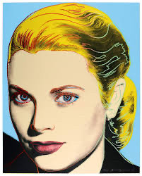
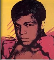


Ideally I would love to try portraits or use the silkscreen to create a simple repeating pattern possibly in tertiary colours.
5 notes
·
View notes
Text
ARTIST RESEARCH-Roy Lichtenstein.
Roy Lichtenstein was born in America in the 1920’s. He greatly contributed to the pop art movement in the 1960’s.

After seeing his piece “Whaam!” In the Tate Modern I fell in love with Lichtenstein’s work. His artwork is bright and courageous, the kind of pieces that stand out in a room and commands everyone’s attention.

After researching Lichtensteins other pieces it’s clear that that effect spans across his catalog of work.
Lichtensteins pop art is bold and shows confidence. There’s nothing “wishy washy” about the artwork, the intense pops of colour are unapologetically daring. His art has a fabulous comic book style, the artists use of dark thick lines and the primary colours leave his work instantly recognisable.

The way that the artist captures expressions using so few details is amazing. It’s something I’d love to experiment with and attempt in various mediums.


4 notes
·
View notes
Text
ARTIST RESEARCH- John Pasche
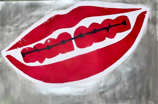
John Pashe is an English artist, most well known for creating the iconic Rolling Stones logo in 1970.

Pasche originally created the logo in black and white. The iconic bright red colour was adopted later as it’s the colour of the Hindu goddess Kali’s mouth. The band decided to base the logo off this goddess as she represents darkness and death but also power.
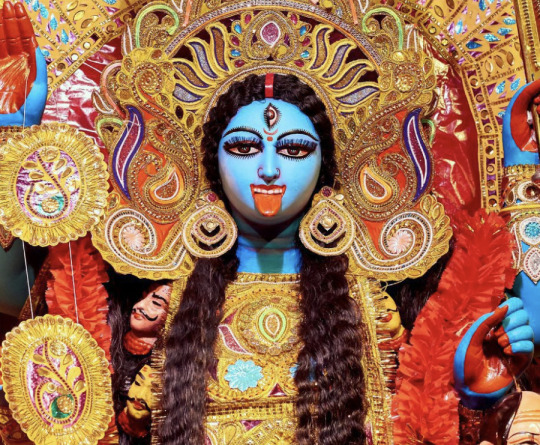

The tongue sticking out is cheeky and anti authoritarian, nearly like a child sticking out their tongue in protest.
The use of red is dangerous, powerful and eye catching. Red may be considered trashy and gaudy when not used sparingly but the simple shape and design leaves us with an impactful pop art design which has stood the test of time.
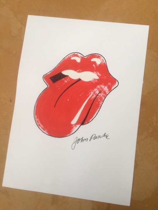

Even those who aren’t fans of the Rolling Stones still wear Passes artwork on T-shirts fifty years after it was initially created. I definitely took inspiration from Pashe’s design when creating my screen print of a simple red mouth with metallic braces.
5 notes
·
View notes
Text


7/2/23
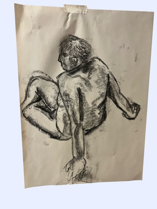
This week I attended the life drawing workshop, where we used charcoal to do gestural drawings of a nude model in various poses.
We were given different timeframes to draw the poses- thirty seconds, five minutes and finally ten minutes. Working quickly forced us to sketch the figure loosely and not focus on the details.
I’m not sure if I did the sketches correctly and there is a lot of room for improvement but I think I could capture movement relating to my project by doing gesture drawings of facial expressions that show teeth.
7 notes
·
View notes
Text

Pinhole photography workshop
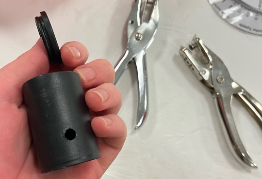
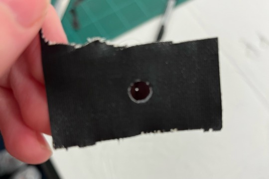
At the beginning of the workshop Gemma gave us an introduction to pinhole photography, showed us pinhole photography artists and transformed the room into a giant pinhole camera to demonstrate how a small amount of light can reflect an image.
After that we were shown how to make our own pinhole cameras which we brought outside where Gemma explained and demonstrated how to use them.


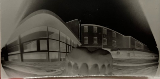
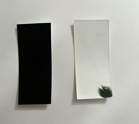
We then went into the dark room to develop our images where we found out by the darkness or brightness of the developed photos wether we kept the pinhole open for too much time or not enough. (The left photo below got too much light and the right photo didn’t get enough.)
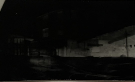
Finally we inverted the colours of the pictures in photoshop where we were left with our final results. Unfortunately only one photo came out clearly for me, I tried to experiment with opening the teeth in the image below but as the timer was so short it just left the image blurry.

9 notes
·
View notes
Text
ARTIST RESEARCH- Justin Quinnell.
Justin Quinnell is a pinhole photography artist from Bristol in the U.K. Quinnell has been working and experimenting with cameras for almost 35 years.
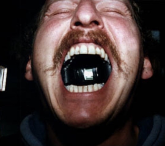
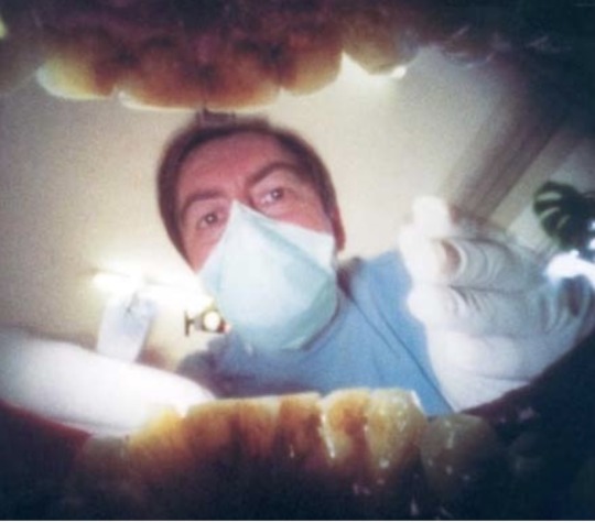
Although he has experimented with many different ways to capture a unique image (like disguising a camera in straw or leaving a camera out for months to capture a long exposure shot.) he is most famous for his pinhole photographs taken from inside his mouth.

His style of photography is very raw, personal and often unsettling for the viewer as he is documenting his life looking through his mouth.
Quinnell’s photography is quite invasive and would definitely be difficult for me to recreate. If I take inspiration it may be easier to use a fake set of teeth and tape them open in-front of the camera lense.

7 notes
·
View notes
Text
Screen printing sketchbook pages


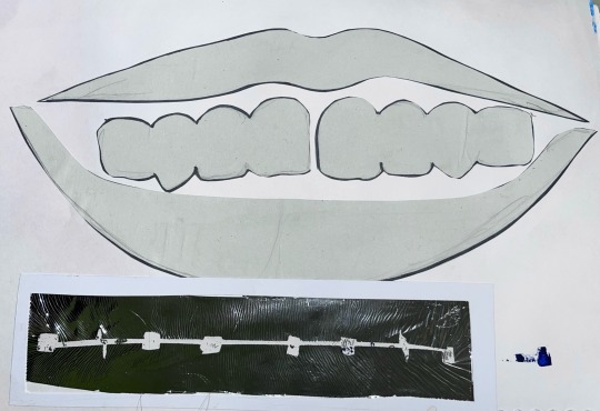
I primarily used my sketchbook during this workshop to… 1. Document the process of screen printing. 2. Come up with and develop a stencil that would help create an even print. 3.Experiment with different shapes,colours and materials.
4 notes
·
View notes