
Statistics
We looked inside some of the posts by kaixinsoh and here's what we found interesting.
Average Info
Notes Per Post
2
Likes Per Post
2
Reblog Per Post
0
Reply Per Post
0
Time Between Posts
7 days
Number of Posts By Type
Text
12
Last Seen Tumblr Blogs


Fun Fact
Tumblr has 16.74 million mobile monthly users in the US.
Text
Masterlist
In-Lecture exercises: A, B, C, D, E, F, G
Assignments: 1 (Abstraction), 2 (Storytime), 3 (Infographic)
Final project: Brand style guide
0 notes
Text
Final Project: Personal Brand Guide
Date: 31 Mar-17 Apr 2021, Week 11-13
Brief: Work on brand identity by creating a publication in the form of a brand style guide. You have two options to choose from: 1) Self-Identity OR 2) Department of Communications & New Media. Create a Brand Style Guide that includes 3 collateral: logo, business card, 1-2 page resume.
Introduction:
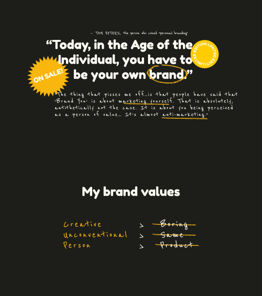
The person who originally coined the term "personal branding" was Tom Peters, who wrote an article called "The Brand Called You" in 1997. In the article, he wrote:
Today, in the Age of the Individual, you have to be your own brand...You’re branded, branded, branded, branded.
However, since Peters wrote that article in 1997, personal branding has evolved, developed and morphed in something wholly different from what he expected. Today, everyone and anyone has a social media page with their own manufactured "brand" or persona. In an interview with AIGA, Peters said:
“The thing that pisses me off about the interpretation of my article is that people have said that ‘Brand You’ is about marketing yourself...That is absolutely, antithetically not the case. It is about you being perceived as a person of value… It’s almost anti-marketing.”
Note: click on the images to enlarge and see in higher resolution if they appear blurry
Thus, inspired by Tom Peter's concept of "personal branding" as well as my own personal values of being creative, unconventional and personal, I wanted to create a personal brand that cheekily subverted how we commonly "package" ourselves to create a manufactured, commoditised and inauthentic image or identity of ourselves.
Developmental process:
Logo
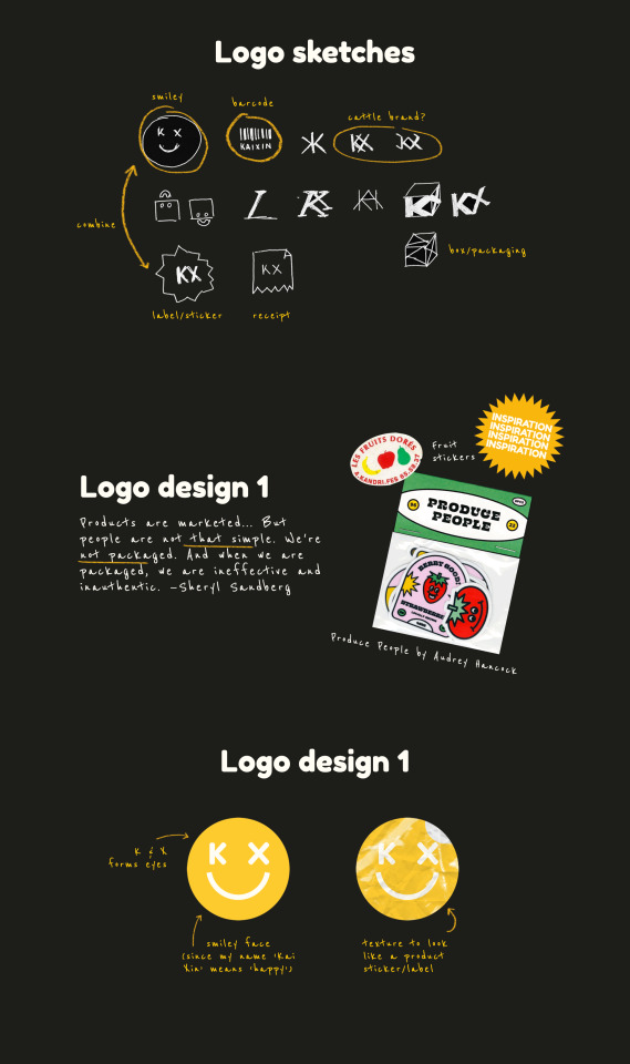
For logo design 1, I was inspired by Sheryl Sandberg, who said: Don't package yourself.
"Products are marketed... But people are not that simple. We're not packaged. And when we are packaged, we are ineffective and inauthentic."
Inspired by stickers and labels pasted on fruits, I thought - why not design my own personal logo as a sticker, as a reference to product labels and stickers? Since my name "Kai Xin" means happiness in Chinese, and my cheerfulness and optimism is one of the most important traits of my personality, I wanted to infuse that same form of cheeky sense of humour and sunniness in my brand. Therefore, I designed a yellow sticker with a smiley face, with the eyes formed by my initials "K" and "X". For the font for the letters "K" and "X", I used Fredoka One, as it was a rounded, modern-looking typeface that conveyed the quirky, friendly and fun personality I have.
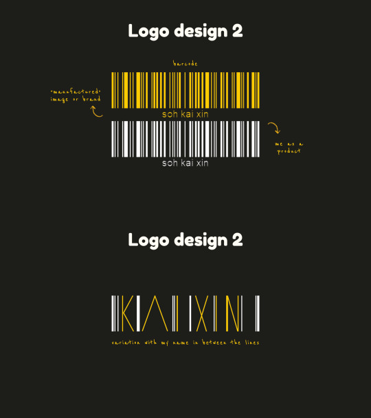
For logo design 2, I wanted to design a barcode for myself, to reinforce the idea of me being a product for sale. (Fun fact: the lines on the barcode actually spell out my name "soh kai xin" if you scanned it with a barcode scanner.)
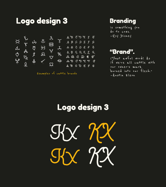
For logo design 3, I was inspired by the following quotes by Roy Disney...
"Branding is something you do to cows...Branding is what you do when there’s nothing original about your product."
...as well as Austin Kleon, who said:
“Brand.” (That awful word! As if we’re all cattle with our owner’s mark burned into our flesh.)
Therefore, after researching on the design of cattle brands used by cow ranchers to brand on their cows, I thought the way that these brands had the initials of the owners was quite interesting, and designed a cattle brand of myself for myself, spelling out my initials "KX".
However, I did think that the concept behind logo design 3 would probably be difficult for people to understand and the design appeared quite simplistic.
"For logo design 3," Sun Yee said, "I couldn't really grasp if there was any concept or quality of yours that you had intended to portray other that it being the initials of your name." Charmaine also added, "I personally feel that logo design 3 would not be in my list."
I agreed with my tutor Aaron, who said, "The barcode logo concept seems to work the best in unifying the ideas that you have for the name cards and resumes."
Iwani said, "Since the barcode plays a crucial part in your logo, you may want to consider imbuing your name in it?" and Ning Zhuang added, "for the barcode, I think your name drowns out compared to the barcode since it's taking up way more space, maybe you can play around with space more."
Based on their feedback, I decided to go with logo design 2 - the barcode logo. I experimented more with different design variations by imbuing my name in the logo (as Iwani suggested) and by playing around with space and making the name more prominent (as Ning Zhuang suggested):
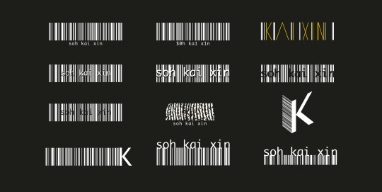
The original three logos are depicted in the 1st row above.
I tried incorporating my name within the barcode (2nd row, above), but found that it was a little difficult to read with all the lines.
I scanned a print of my fingerprint (which symbolises my identity and self) and cut a section out of it to resemble the lines in the barcode (3rd row, centre, above), but I felt that people seeing it might not understand clearly that it was a reference to my fingerprint.
I also experimented with typography, such as by using only a K in the logo (3rd row, right & 4th row, left), but I decided against it as (1) just a single K wouldn't be able to show my name and (2) it didn't resemble a barcode as much.
Finally, I decided to go with a more minimalist approach combining my name and the barcode.
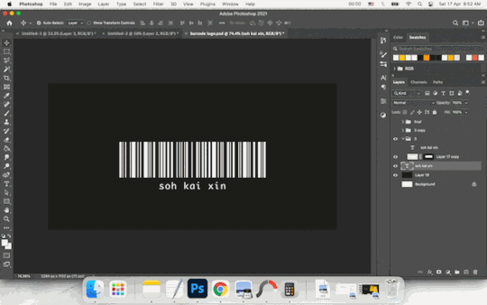
To make my name more prominent (as opposed to the original 1st design, where the name was placed at the bottom and the font size was quite small), I increased the font size of my name and adjusted the kerning such that it fit the width of the barcode exactly. To put emphasis on my name, I shifted it to the top of the barcode. To show that my self was inseparable from me as a product of society, I combined the name and barcode. Using the Rectangle Tool, I drew the lines on the barcode to combine them with the name, such that it looked as if the lines flowed seamlessly from the letters to the barcode. Finally, as the entire barcode looked a little too large and lacked a sense of balance (since the barcode portion was larger than the name portion), I masked the bottom of the barcode such that the height of the barcode portion was exactly the same height as the name.
Name card
I came up with three ideas for the name card.
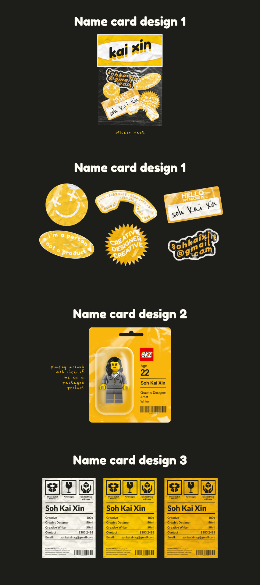
Name card design 1
For name card design 1, based on the initial concept of product stickers for logo design 1, I thought - "Why not use a sticker pack instead of a conventional name card?" I thus created 6 sticker designs that deconstructed the elements of a name card, including a logo, name, contact number, email, what I do etc.
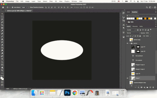
For the stickers, I experimented with a variety of shapes and text styles. For example, for the "I'm a person not a product" sticker, I began with the Ellipse Tool to draw a white ellipse. I then duplicated the shape and made a smaller yellow ellipse, to create an outlined effect. Then, I selected the shape of the ellipse and transformed the Selection to Path. Using the Move Tool, I transformed the Path and made it into a smaller ellipse within the larger yellow ellipse so as to type the text in the shape of the ellipse. I first typed the first half of the message "I am a person" on top, then created a new Type layer for the second half "not a product", using the Path Selection Tool to move the path so that the text would be aligned at the bottom of the ellipse. On top of that, I added a paper texture on Multiply mode and a plastic texture on Screen mode to make it look more realistic.
This was done for the rest of the stickers, such as the phone sticker, where I similarly made a Path from Selection in the shape of the phone and typed my contact number, or the "Creative Designer" sticker, where I began with a Custom Shape layer and adjusted the Live Shape Properties to increase the number of points on the star from 5 to 30 to get a starburst shape. Subsequently, I typed the text and used the Warp Text function to make the shape of the text follow a wave, then added textures on top.
One of my classmates Ning Zhuang commented that "for name card design 1, I do think it'll be quite hard to decipher as a formal business card if it's all going to layout in a sticker pack." Although I really liked the stickers and thought it made sense in terms of my personal branding concept, I agreed with her and thus decided not to use it as a name card, but instead as a separate collateral as a sticker pack.
Name card design 2
For name card design 2, I went with a more creative and unorthodox concept for a name card. Rather than a "card", why not represent me literally as a packaged product, like a toy figurine in a pack?
Name card design 3
For name card design 3, I used a more conventional format of a card, but instead of a regular name card, I designed it to resemble a product label. The name card would be printed with a product description of myself, with the product name (my name), product content, ingredients, as well as my barcode logo. I also used common packaging labels like "Boxed" or "Fragile, handle with care", but instead put a creative twist on them by changing them to "Thinks out of the box", "Anti-fragile" and "Handles things with care".
Ning Zhuang said, "Love the idea of name card design 3" but asked, "is there a meaning behind using the grams and ml?"
The original intention behind putting Creative (100g), Graphic Designer (50ml) and Creative Writer (50ml) was to play with the way nutritional information of products are usually presented, with units of measurements like grams and millilitres. It was meant to convey that I am half a designer (50ml) and half a writer (50ml) - put it together and you get 100% creativity. Based on the feedback, I thus decided to make it clearer by changing it to percentages - 50% Graphic Designer, 50% Creative Writer and 100% Creative.
Resume
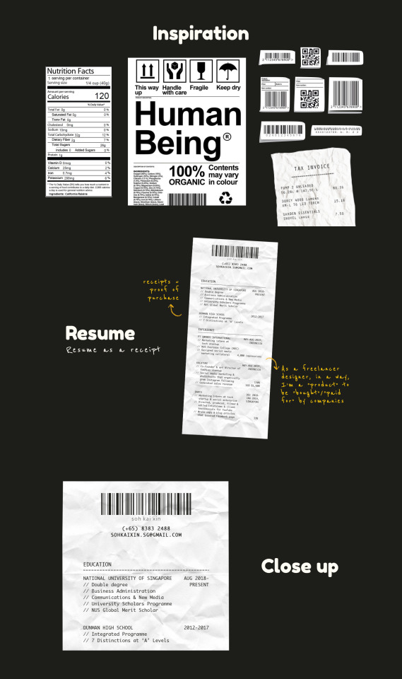
For my resume, I decided to present it in the format of a receipt.
As receipts are used to represent goods that have been bought and sold, and are a proof of purchase, I thought that it would be effective and appropriate to represent my resume as a "proof" of my qualifications. Also, it represents how designers/creatives like myself are often seen as "sell outs" who become commoditised products for sale or for hire by businesses.
To make it look like a receipt, I scanned a crumpled piece of paper and used it as a background. Then, using the Lasso Tool, I cut it to the shape of a receipt. Next, I added my barcode logo on top, along with contact details, like how the details and name of a shop would be on the top of a receipt. Then, I added the list of my education and work experience below and added the dates on the right (like the list of products and prices on a receipt). I chose to use the typeface Monaco, as it was a mono-spaced sans-serif font that resembles the font commonly used for printing on receipts.
Comments raised during the critique:
For the final critique in Week 13, Kai En pointed out, "just one minor thing that I wanted to point your attention to- all along your name has been rendered in lowercase, not sure if you want to keep to the same treatment for your name card that is currently in Title Case?"
Iwani said, "for your resume, you may want to consider bolding the headers/company titles to emphasize the visual hierarchy?"
How the work has improved post-critique:
Based on the feedback, I decided to change the title on my name card into all lowercase, as Kai En pointed out, to keep it consistent with my barcode logo. I also bolded the company titles on the resume to emphasise the subheadings, as Iwani suggested.
Syn Yee had also commented, "while I liked your logo idea as a barcode, I thought maybe your name could be slightly apart from the barcode itself just to make the text look clearer. Because it appeared to me a little cluttered when you put both elements attached to each other". However, as I had previously already played around with different compositions for the barcode logo (see above), and had deliberately combined the name and barcode together as a form of commentary to show how our personal identities and selves couldn't be separated from our identity or image as a product of society, I decided that I would stick with the logo composition.
In addition, even though this wasn't explicitly mentioned in the feedback, I noticed that the handwriting font I had used for captions and sub-body text in my initial presentation, Reenie Beenie, was a bit difficult to read. I had originally chosen the typeface because I wanted to give a sense of authenticity to my personal branding and include a handwritten sort of feel that made it feel as though the brand was created by a person, not a product. However, for my final brand style guide, I decided to remove the Reenie Beenie font and use Monaco for my body text, as it was (1) more in line with my brand identity and (2) more legible.
Finally, this resulted in the final brand style guide.
2 notes
·
View notes
Text
As. 3: Infographic

Date: 17 March 2021, Week 8
Brief: Identify some dataset(s) to work with. Apply necessary techniques to communicate complex information quickly and clearly through visual representation.
Introduction:
I've always been fascinated by charts, figures and data visualisation. Bar graphs, pie charts, donut charts... And eureka! I had a sudden stroke of inspiration - why not create an infographic with a donut chart on donuts?
(Initially, I also considered bar graphs about chocolate bars or pie charts about pies, but decided to go with donuts as I thought it would have the most variation in flavours, colours and toppings for visual variation and interest.)
Data set:
I researched various statistics about donut flavours and used Ranker's list of donuts, which contained a list of the number of upvotes/downvotes for each donut flavour.

I then compiled the data onto a spreadsheet, and calculated the overall score (by deducting downvotes from upvotes) for each flavour. Subsequently, I calculated the percentage to find out the proportion of votes each donut flavour garnered, and sorted them from highest to lowest.
Developmental process:
I explored various compositions and styles for the infographic poster, first with each donut's size being in proportion to its percentage of votes. In my sketch, I had originally laid the donuts out in two structured rows, but I played around with different arrangements, such as by placing them in different positions or placing them in a box to resemble a box of donuts.


Finally, I decided that it would be the best if I represented it with just one large donut in the centre of the poster. Although it may seem a little simple, but I think by having just one donut, viewers would be able to focus on it without having their eyes moving all over the place. After all, simplicity beats complexity, especially when distilling a complex set of data in an infographic. Furthermore, it would also be a clever concept to represent the donut data using a donut chart.

I first created a base of the donut chart, then split it into different segments for each flavour.

I used a variety of tools and techniques to illustrate each donut flavour. For example, for the powdered donut, I used splatter brushes to create the powdered sugar effect. For the double chocolate donut, I used the Curvature Pen Tool to draw the frosting. and for the Chocolate Sprinkles donut, I used the Rounded Rectangle tool to draw little rainbow sprinkles all over the donut. For the base of the donut, I added texture and depth by using multiple layers on Soft Light and different opacity, such as to create shadows or glossy highlights.

Using layer masks, I masked out the rest of the donut, leaving only the specific segment visible.

I added the title, text and a border in a frosted, pastel pink shade, as it reminded me of candy and fit the theme of donuts.

Comments raised during the critique:
During the critique, Aaron said that it was an "interesting idea about donut flavours because the thing is presented as a donut...I think it's quite clever." However, he also pointed out that "the shape looks a bit like a lifebuoy, rather than a donut" and a classmate, Jing Quan said, "Maybe the hole in the middle could be smaller to look more like a donut."
Aaron also said, “After looking at the pink colour for a while, it's a bit straining on the eye. Same for the border as well.”
How the work has improved post-critique:
Based on the feedback from Aaron and my classmates, I decided to tweak the shape of the donut by making the hole smaller, so it would look more like a donut. I also removed the border, and changed the font and line colours to a dark chocolate brown similar to the chocolate donut so that it would be dark enough to be legible, less bright and straining on the eyes, and also cohesive with the overall colour scheme and theme.
Reflection & Learning Points:
Even though the idea of infographics and data analysis may seem complex or intimidating at first, I found that I had a lot of fun creating this infographic.
This assignment taught me that being a good designer isn't just merely about visuals and graphics, but also being able to research, analyse and synthesise data.
In the 21st century, it is critical that we are able to comprehend big data, and carry out data analytics and data visualisation. Even though the data set I used for this assignment wasn't huge or complex, the skills I learned (such as compiling data into a spreadsheet, doing statistical analysis and designing a chart to present data in a simple yet compelling way) are lessons that will inspire me to learn and explore more about data visualisation even after completing this assignment and class.
0 notes
Text
Ex. G: Pattern

Date: 10 March 2021, Week 8
Brief: Create your own pattern using elements of design. You should range it from the lightest (1) to the darkest (6).
Inspired by the ketupat or rattan weave pattern found in Southeast Asian crafts, I designed a pattern composed of lines and rectangles of differing weights.

0 notes
Text
As. 2: Storytime

Date: 9 March 2021, Week 8
Brief: Tell a story through 6-9 photographs.
Introduction:
It all began with a single thought—how can I tell a story using colour?
Seeing as this assignment required us to tell a story purely through visuals (without words), I thought about how I could use colours to communicate a story. Why not craft a story where every image was represented by a colour, corresponding to a different emotion based on colour symbolism?
Storyboard:

The concept for my photo story was a love story between a Boy and a Girl.
Red - The colour of love, passion, desire. Girl meets boy, love at first sight.
Red evokes love, passion, blushing red cheeks and hearts. I created red hearts using paper as a visual motif to represent the love and passion between the characters.

Orange - The colour of warmth and excitement. Boy proposes to Girl.
For orange, I toyed with various compositions and techniques.

Initially, I used a wide shot and rule of thirds (bottom left) to show Boy proposing to Girl. However, a wide shot wasn’t close up enough to show the diamond ring in Boy’s hand, so I zoomed in for a closer shot. To evoke a more dream-like quality to fit the romantic mood and infuse hints of sparkle, I tried placing a jewel earring at the edge of the camera lens when I took the second photo (bottom centre), to try to create a diffracted sparkle, but it didn’t achieve the effect I was looking for. Hence, for the third image (bottom right), I used a glass to create a prism/crystal effect, which created an interesting mirror reflection. Playing around with different angles, I decided to go with a cleaner shot without a reflection, with just a slight sparkle to keep the focus on the Boy proposing to the Girl (top).

Yellow - The colour of happiness and sunshine. Boy and Girl stroll through a sunny garden full of yellow flowers, in the happy honeymoon phase of their relationship.
For yellow, I placed yellow flowers around and positioned my camera such that I was shooting through the flower petals. This created a nice framing effect that made it look as if the Boy and Girl were surrounded by a field of yellow flowers, evoking the bright feeling of sunshine and happiness.

Green - The colour of envy and jealousy. Girl realises Boy is having an affair with another woman.
For green, I placed a leaf on the edge of the camera such that the left side of the image had a vaguely blurred form of a leaf, to create an impression as if the camera/viewer was peering through the foliage to see the scene, just like how Girl was peering through the leaves to see Boy and the other girl.

Blue - The colour of sadness, coldness and depression. Girl is heartbroken.
For blue, I wanted to evoke a sense of coldness, depression and isolation. To do so, I played around with the composition.

Initially, I placed Girl front and centre of the image (left). However, it looked a little awkward to have Girl directly in the centre, and I thought that using the Rule of Thirds by shifting her to the side would work better to create a sense of isolation (bottom right). In my storyboard, I initially wanted to have Girl sit in front of a river, to parallel the motif of water (the river, her tears) with the colour blue and highlight the sense of blueness and melancholy. Therefore, I used a glass again and positioned it at the bottom of my camera to try to make it look like a reflective surface, with the reflection of Girl at the bottom (bottom left). However, I thought that it may not have been clear so I removed the glass and used a simpler composition of just the girl sitting alone in the right corner of the image (above), with the vast empty negative space stretching on the left side reinforcing the sense of loneliness and isolation.

Purple - The colour of moodiness, sensitivity and emotion. Boy and Girl go their separate ways. (I decided to combine Purple and Violet together, since both colours are quite similar to one another, and also have similar symbolic meanings.)
For purple, to evoke a sense of moodiness, I used a torchlight to play with light and shadow.

At first, I turned off the lights and used a torchlight and shine it into Girl, creating a strong contrast effect, similar to chiaroscuro (bottom left). But I thought that this alone didn’t bring out the effect of how Boy left Girl for another girl. While I was playing around with the light, I also realised that the light cast interesting shadows on the wall behind. Hence, I positioned Boy and the other girl standing behind the camera and the light source on the bottom left, such that it cast the a long shadow of Boy and the other girl, along with the shadow of Girl herself, separate and alone (bottom right). I played around with different positions and angles until I got one that cast the shadow directly in the centre of the image (above), with Girl in the centre. This has two layers of meaning: (1) it can be a symbol of how Girl is confronted with the departing shadows of Boy, who has left her for another girl, as well as (2) it could be Girl seeing the shadows of her own past relationship with Boy and herself.


All the images were edited in terms of increasing the Brightness & Contrast, tweaking the Hue & Saturation, Curves and Selective Color. For instance, for the Purple image, the original photo I had was more of a pinkish shade, so to adjust the colour to make it more purple, I went to the Magenta tab and adjusted the Hue slider to -34. Next, for Curves, on the RGB curve, I did a simple S-curve which brightened the highlights and darkened the shadows, upping the contrast of the image. I then went to the Red, Green and Blue (RGB) curves and made slight adjustments until I was satisfied. Finally, to tweak certain colours selectively, I used Selective Color, which allowed me to go to different colours like Magenta, Red, Yellow etc to adjust the amount of Cyan, Magenta, Yellow and Black.
This thus gave the following sequence of images:

Comments raised during the critique:
During the critique, it was suggested that the jump from the Yellow scene to the Green scene seemed to be a bit sudden, and that perhaps it would be better to include a transition scene in between the Yellow and Green scenes. Also, for the Orange scene, although it was understood that the Boy was proposing to the Girl, it wasn’t clear that the Boy was holding a diamond ring in his hand (as it was a bit small).
How the work has improved post-critique:
Based on the feedback, I decided to add one more scene in between the Yellow and Green scene (in light yellowish green) to show how another woman entered the picture.

To highlight the Girl’s sense of shock, anguish and despair, I changed the face to reflect her emotion through her facial expression. Also, to reinforce how the Boy was stuck in the middle, I literally placed him in the centre of the image and shone a spotlight down on them.

I also retook the Orange scene, trying to zoom in closer this time such that the viewer could see more clearly that the Boy was kneeling down with a diamond ring in his hand. I also shone a torchlight through the glass to create more sparkles to highlight the sense of sparkling happiness and romantic mood of the scene.
Finally, the end result was this:
Reflection & Learning Points:
The process of creating this assignment taught me that design is about clearly and effectively communicating and expressing an idea to your audience. During the critique, I explained that the rationale behind my concept was to use colour symbolism to show the spectrum of emotions (red=love, yellow=happiness, green=envy, blue=sadness etc), but I realised that if I had to explain something to my audience, then it wasn’t really good design, was it?
Good design is self-explanatory. Good design requires no further elaboration. Good design is understood immediately by the audience.
The colour concept may have seemed nice and clear to me, but not to my audience. If I had the chance, I would definitely have redone the story and assignment with this in mind — to design not just for myself, but for my audience.
0 notes
Text
Ex. F: Colour

Date: 1 March 2021, Week 7
Brief: Take a photo with your mobile phone. Create a colour scheme from it. Pick out 5 hues from the image and write a very short write up on the hues, what mood are they conveying, if they are working well.
Commentary:
To me, this picture is a great example of how fast food restaurants like McDonald’s employ colour psychology in their food, packaging and interior design. McDonald’s classic golden arches set against the backdrop of the iconic red packaging container, and also the golden yellow hue of the french fries and the bright cheery yellow walls, makes use of the analogous colours red, orange and yellow. The warm colours and pairing of yellow and red creates what some marketers have termed the Ketchup and Mustard Effect, with the colour red stimulating the appetite and yellow evoking feelings of happiness and satisfaction.
0 notes
Text
Ex. E: Typography

Date: 17 February 2021, Week 6
Brief: Comment on the following typeface. What seems to be off about this particular typographic representation? How would you improve this typographic representation (look into the 8 rules as guiding points for discussion)?
Commentary:
1) The characters are outlined in black and filled in white, which makes it difficult and disorienting to read. To improve the readability, I would remove the counter (the white space within the letters) and fill the entire type with one colour (e.g. black).
2) The typeface seems to be a decorative or novelty typeface, which is more suitable for headings. While the Title is acceptable, it is difficult to read the body text. Furthermore, as all the letters are capitalised, it makes it uncomfortable to read, as if the words are shouting at the reader. Therefore, to improve its readability, I would retain the typeface for the Title, but change the body text to a simpler, complementary typeface (such as a serif typeface like Garamond, which is good for body text) and make the body text un-capitalised. To further improve the hierarchy and distinction between the Title and Body, I could use the Golden Ratio to set the font sizes (for example, font size 36 for the Title and font size 22 for the Body).
3) The central alignment of the text also makes it difficult to read, since there is no clear edge for the eye to start from and follow, resulting in the reader having to jump from different points in each line break and making it very jarring. To improve on the readability, I would change the alignment to a left-alignment.
4) Another thing to consider is typeface communication. This typeface seems to be a decorative or novelty typeface with a rather sporty vibe/personality. Therefore, we have to consider what this text is for and where it is situated. If it was for a varsity poster, then it would be suitable. However, if it was for a business proposal document, then it would be more appropriate to use a more formal serif or sans-serif typeface (such as Times New Roman or Arial).
0 notes
Text
As.1: Abstraction

Date: 2 March 2021, Week 7
Brief: Take a picture with your mobile phone – this could be an object, a scenery, etc. You are to present a visual abstraction for this chosen image to best articulate the image in its most stripped- down version.
Introduction:
To me, when I think of abstraction, I think of it as breaking down an image into its simplest forms. And in its simplest form, images are made of shapes.
This also made me think of Cubism, which is characterised by objects and figures broken down into simple, geometric shapes such that they appear abstracted and fragmented. Some of my inspiration include the works of Pablo Picasso as well as Singaporean abstract artist Chen Wen Hsi.

I took the photo of the heron and tried to imagine breaking it down into shapes. Initially, on Photoshop, I traced out the outline of the heron with the Magnetic Lasso Tool, made a path based on the selection, then outlined and filled it with colour to create the silhouette of the bird. However, I thought this might be too simplistic.

So I tried creating a more “vector”-like image of the heron, by drawing individual shapes of the feathers using the Curvature Pen Tool and filling them in with colour. I used black for the darker portion of the plumage, grey (a slightly darker tint of white, so that it would be more easily visible against a white background, as opposed to using pure white) for the lighter portion, and orange for the beak.

This became the Stage One image as shown below:

However, I wanted to push the abstraction further by using simple geometric shapes. Therefore, using the Pen Tool, I composed the body, the beak and the feathers of the heron out of triangles. This became the Stage Two image as shown below:

I gradually made the form more and more simplified, reducing the intricate details while trying to preserve the overall shape of the heron, to achieve the third, fourth, and fifth and final stage of abstraction as shown below:


Comments raised during the critique:
During the critique, my tutor Aaron commented that he liked the abstraction, and how the image of the heron was eventually composed of nothing but triangles. I was happy because this meant that my abstraction was successful and I had achieved the effect I had intended. However, I was worried that the final image of the heron would be too abstract and not obvious enough, so I asked the class what they thought. Luckily, Aaron said that “it’s quite clear that it’s a bird with its wings spread out” and my classmates also commented that it was obvious. Aaron suggested that I could retain the black spot near the eye of the bird, which would make it appear more like a bird or a living thing.
How the work has improved post-critique:
Based on my classmates and tutors’ feedback, I edited the fifth image by adding in a small black triangle to represent the eye of the bird.

Although it is a small adjustment, I think it really made a difference as it gave a lifelikeness to the bird and make it more recognisable. When I asked my family members for feedback, they immediately identified that it was a bird. Therefore, the final stages of abstraction is as follows:

Reflection & Learning Points:
To me, this was a great lesson in the process of abstraction. As an artist, I often strive to represent things as realistically as possible. In art, the paintings that we admire most are usually those that have a high degree of naturalism, as a legacy of classical art from the Renaissance period or the 19th century Realism movement. However, this assignment taught me that you don’t necessarily need to rely on highly naturalistic or detailed renderings. A simplified, abstract image can communicate the same message across to viewers just as easily, if not more effectively.
As designer John Maeda said, “Simplicity is about subtracting the obvious, and adding the meaningful.” Achieving simplicity is something complex in itself. What this assignment in abstraction taught me was how to better appreciate the beauty in simplicity.
0 notes
Text
Ex. D: Composition

Date: 10 February 2021, Week 5
Brief: Use your phone camera, choose a subject and compose it in various shot sizes and camera angles, while demonstrating your understanding of visual composition. Take about 4-6 images. State the purposes of using these techniques and how does it affect your audience who perceive your subject.

Image 1: Long Shot
Purpose: I took a long shot to have a clear view of the entire character’s body, face, clothes etc. Also, I intentionally took it in portrait orientation, with the camera slightly tilted upwards from a low angle, and framed additional white space above the character, so as to make it seem as though the character is tall and heroic

Image 2: Close Up Shot
Purpose: I zoomed in on the facial expression of the character so as to intensify the emotion to the audience

Image 3: Canted Shot (with blur)
Purpose: I used a canted shot to add a sense of dynamic movement to the shot. I also intentionally moved the camera slightly when taking the picture so that the blur would add a sense of motion and action, as if the character was moving (or as if Thor was using his hammer to make the ground rumble and thunder)

Image 4: Extreme Long Shot (with Rule of Thirds)
Purpose: I took an extreme long shot to emphasise how small the Lego character looks (I also found it interesting that this enables you to see the reflection of the character on the floor surface, which adds to the reflective, pensive quality of the photo). Furthermore, I employed rule of thirds by framing the character in the upper right third of the image to create a sense of asymmetry, disorientation and alienation that reinforces how small and lonely the character looks
0 notes
Text
Ex. C: Semiotics

Date: 3 February 2020, Week 4
Brief: Review the print ad on the next slide. Write about the sign - what is the signifier and the signified. Essentially, analyse and describe what this ad is trying to say. Upload your brief yet succinct report on your blog.
Semiotic analysis:
The sign of a visual image of a Heinz ketchup bottle that resembles a tomato sliced into various pieces, with green leaves and stem on top instead of a cap, seems to signify that Heinz ketchup is fresh and made of real, natural tomatoes; implying that consuming its ketchup is just like eating an actual sliced tomato. Another sign is the copy, which reads “No one grows Ketchup like Heinz.��, which could signify that Heinz ketchup is healthy, made of all-natural ingredients (the word “grown” rather than “made” or “manufactured” creates the impression that the ketchup is natural, unprocessed). The bright red background could also be a sign, as the colour reminds one of a ripe, juicy red tomato and reinforces the idea of the delicious flavour of the tomato ketchup. According to scientific research, red also stimulates the appetite (Singh, 2006) and may thus increase the hunger, craving and desire to purchase the ketchup of consumers who see the ad.
0 notes
Text
Ex. B: Criticism

Date: 19 January 2020, Week 2
Brief: Apply constructive criticism model in evaluating a design OR artwork. You may choose any art/design on the internet or use the image in the next slide. Upload your brief yet succinct report on your blog.
Art/design work:
Election campaign poster by Singapore Democratic Alliance (SDA), 2020

The first thing I noticed about the election campaign poster by the Singapore Democratic Alliance (SDA) is the bright red colour, which immediately draws attention to the poster. The red colour, paired with white, may also be symbolic of Singapore’s national colours, evoking nationalistic sentiments.
The central focus of the poster is on three figures: an old man with balding white hair collecting dirty plates and cutlery and bent over over a green pail, an old lady with a mop of grey hair stooped hunchback as she pushes a trolley laden with cardboard, and a man lying on the ground with newspaper as his bed and blanket. The images call to mind common sights seen by Singaporeans (such as aunties collecting cardboard, old uncles clearing plates and cutlery at the hawker centre in order to earn a living), which are relatable and resonant to viewers. All three figures have their faces turned downwards, conveying a sense of in despondency, resignation or fatigue. Their unseen faces may also reflect the plight of the faceless "invisible poor" of Singapore; ignored, overlooked and disregarded. The illustrations paint a caricature of the pitiful plight of the poor and the elderly in Singapore. They also give a hand-drawn effect that imparts a human touch, a stark contrast from the usual sleek posters of other political parties, which are professional but impersonal. Also, unlike the conventional posters of other political parties which depict the politicians themselves, SDA’s poster depicts images of the common people, emphasising that their main focus is the issues of the everyday people.
The main copy of the poster is written in bold capital letters: “TOUCH YOUR HEART, ASK YOURSELF, WHY?”, which places emphasis and literally makes a bold statement. The use of the words “you” and “yourself” addresses and speaks to the viewer directly, making them feel involved and responsible. The images and words effectively employs pathos and evokes emotions. The text, coupled with the images, poignantly drives home the message of SDA’s slogan of having “A heart for the people”.
In conclusion, I think that the SDA’s poster makes effective use of various elements of art and principles of design to create an election campaign poster. Other than the pure aesthetic and functional purposes of communicating to the public about SDA’s political campaign, more importantly, it makes viewers feel something and shines light on important social issues such as poverty, ageing population and the plight of the invisible poor in Singapore. It’s not just a political poster, but also a form of social commentary and criticism.
0 notes
Text
Ex. A: Creativity

Date: 13 January 2020, Week 1
Brief: Sketch/design a machine/device that you think will enhance your creativity.
Thought process: Creativity to me is… thinking out of the box.
So I thought to myself, “How can I make myself think out of a box, using a box?” Boxes are receptacles that can contain many things. They can be gift boxes, enclosing a present. They can be mystery boxes, withholding a surprise. They can be anything and everything that you want it to be.

So I thought of designing a box that would seem ordinary on the outside, but once opened up, would unfold into a 3-dimensional space that would transport me to a new world. A place where I could sit, think, meditate. A place where I could be creative. A meadow, with verdant grass and cerulean skies. A forest, with a stream of cool water. A field filled with flowers and butterflies and birdsong.
Final design:

youtube
0 notes