
Don't wanna be here? Send us removal request.
Statistics
We looked inside some of the posts by krystal-mcgregor-blog and here's what we found interesting.
Average Info
Notes Per Post
0
Likes Per Post
0
Reblog Per Post
0
Reply Per Post
0
Time Between Posts
8 days
Number of Posts By Type
Photo
1
Text
16
Last Seen Tumblr Blogs


Fun Fact
In 2020, 44% of users from Denmark used Tumblr daily.
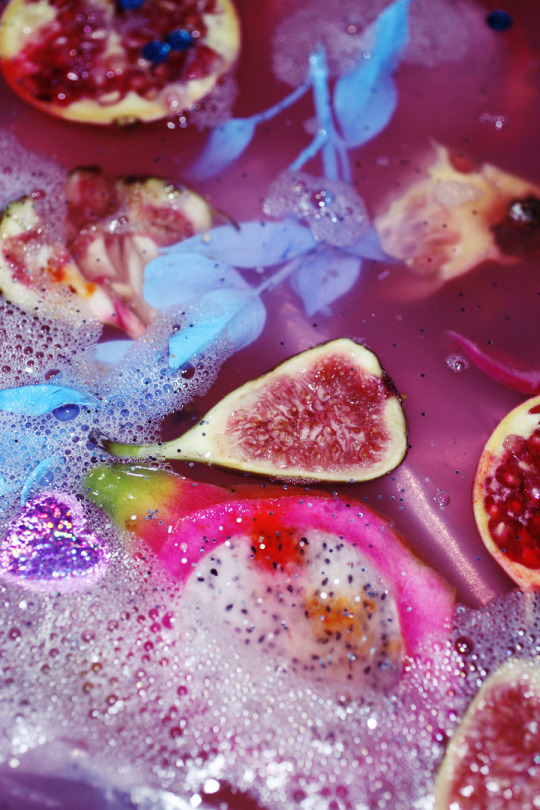
Photo


AFFLICTIVE DESIRES
For my portfolio I have created a concept that plays on the themes and feelings of:
- life and death and the relationship of the life cycle
- a romantic vibe
- melancholy and sadness
- and the beauty between all of these...
My goal was to play with textures, colours and tones, and the feeling each image gives to you on this same theme but from a different aspect.
Link to my website below:
https://www.krystalashlee.com/
0 notes
Text
2807QCA Assignment Part 4
Final Image:
I am quite happy with this image surprisingly!! I hated my first set image and this one is actually pleasing to me.
This image fits in with my concept by playing on the idea of having ‘the light’ to walk into once you die.
This low viewpoint and blurred effect make it more mysterious and contemplative if you want to walk into the light or not...
The thing I would do differently next time is to possibly add a few more features such as cute little red and white spotted mushrooms or a charcter in the bushes or something else to continue that narrative a little bit more in depth. Other than that I like where this image leads you, and lets you make your own narrative what may be beyond that door as well.

Post Production/editing:
For post production I added more contrast and clarity and took down the vibrancy to help with the more edgier dirty feeling I was going for.
I didnt edit this image until after I had all of my folio images to make sure the editing would flow with the rest of the images.
I didnt really want to edit this one too much as not much is in the image already and I wanted it to simply be focusing on the door. I like having that simplicity within all my work and I like getting most of the details in shot and not having to do a lot in post.
Other Compositions tried:


Settings and Equipment:
My camera settings were:
ISO 100
1/5 SEC
f/ 3.5
Lens: I used my sigma art 50mm because its amazing and got a great effect when playing with my focus and depth of field.
During the shoot I wasnt happy with how dark the leaves were so I shone my phone torch on different spots for different exposures to bring out the shapes and the greens in the garden around the path that wasnt in the direct light coming through the door.


Developing my concept/the idea process:
As I struggled with the first ‘set’ image in the previous task, I wanted to create a concept I will be inspired by and somewhere I wish to be.
I love plants and nature so something involving a garden would be great, and would also tie into the ‘life’ part of my life and death concept.
From this I came up with the idea of looking down to something narrowly and playing with my depth of field.
I had the idea to create a golden chair or throne to be at the end of the path but I didnt see how that could play into my folio concept, so I then came up with the door process that is leading to ‘the light’ as talked about when you die.
this would also be a good way to light it. By having the door i will only need really one light source which will be coming through the door.
Inspo:


0 notes
Text
2807QCA Assignment Part 3
Final Image:
This image was the last image i took of the folio and I have to admit i had a time crunch and i just wasnt in the groove as much as i was with the others.
My female model pulled out so i had to incorporate my boyfriend into this image which just wasnt how i wanted this image to go. I then couldnt shoot it in the uni studios because they were fully booked so I had to get the aurora kit out of av again and do it in my spare room!! It wasnt meant to be i dont think... but i am happy i got something in the end

Post Production/editing:
In post I played around with the colours but I really didnt like the look of the colour of it all when it was put next to the other images. I tried a black and white filter and of course I loved it. I edited the front logo to make it clearer and not blown out as much as it is a shiny texture. Apart from that I left it, once i saw it in black and white i was happy with the mood of it.
Other Compositions tried(in extremely bad quality):


Settings and Equipment:
F/ 1.6
1/80 sec
ISO 320
My 5D and Sigma 50mm helped me get the great depth of field and blurred background in my final image

Developing my concept/the idea process:
My ‘fashion’ image will be more based around the idea of animal products and exploitation within the fashion industry that is turned a blind eye on.
This is a big aspect of death and the life cycle for me as IT ISNT NECESSARY yet it is still happening.
I have found a great bag that is beautiful but to me is surrounded by negativity and death. i want this object to be the focus of my image and I will use a model to compliment the disassociation with this process of getting to this end product of something beautiful and not considering what has happened before this objects final form.
This image is based on the idea of the disassociation of the sacrifices made so you can have a ‘beautiful’ object. I have drawn inspiration from hand bag commercials where they use models to sell that idea of wanting it and being better with it. I am trying to show that sacrifice of owning things and consuming products that has cost something its life.
Inspo:
As my female and original model pulled out i have had to change where i got my inspo from.
Although still around the same object I do think the male presence will change the feeling of the image.
I am looking at more feminine and abstract editorials and other fashion images that have incorporated bags provocatively but also sort of ‘awkwardly’ like in the last image below.


0 notes
Text
2807QCA Assignment Part 1
Final Image:

Post Production/editing:
In post I didnt too much. I cropped it so it had an even boarder, and changed the vibrancy to fit into the other three images more harmoniously. But I actually like how the colours are, as it portrays the feeling I originally had in my head for this image!
Other Compositions tried:

The above image was in my final two between itself and my final image. I asked about 8 people which one they preferred and they all agreed to this one.
I am stubborn and just had a feeling so I stuck to my gut and still decided to go with the other one hahaha


Settings and Equipment:
For this image set up I wanted a soft light to compliment the texture of the satin underneath the objects. I also wanted the colours of the fruit and flowers to be delicate and evenly lit so a soft box from above worked perfectly.
I played with camera settings to see how far I wanted textures, colours and lighting to go.
For my final image my settings were:
ISO 100
1/5 S
F/ 3.5
These settings gave me the colours and textures I wanted, and having a tripod made everything run smoothly.
Lens: 50mm Sigma Art
I did try multiple lenses throughout this assignment for my images, but this lens is golden and I always went back to it!!!


Developing my concept/the idea process:
My concept for this image out of the whole concept, is the contrast between life and death. The dead flowers and fresh fruit contrast each other and still appear beautiful and sit harmoniously. This is a look at the life cycle and the beauty and acceptance of it.
I am planning on gathering a heap of items and experimenting with them all. My list of things below:
- fruit
-flowers (dead/alive???)
-satin
-food colouring
-glitter
-bubble gun!!
-crystal vases/ash tray? (search op shops) Love the texture of these!
-coloured cardboard for different backdrops
Inspo:
I got some of my inspiration from the renaissance flower images, where the paintings arent actually a representation of real life, as all of the flowers within the painting do not exist in the same seasons and locations. It is a bit of a lie and makes you question the beauty of it I think.
I also got it from Petra Collins still life images from the collection ‘Girls and Guns’, she uses contrasting colours and pastels and I love the aesthetic of them.


0 notes
Text
2807QCA Task 04
Final image:
Title: Money Hungry

Post production/editing:
For this image I didnt really want to edit it much in post as it doesnt have many objects in the shot anyhow. This is done on purpose to really highlight the meaning behind it.
I brought up the contrast and lowered the vibrance to give it a more dirty feeling and to make the money seem gritty and I think thats as much as I like.
I do like how everything around the money is obviously fake and I see that as being another part of the idea of the money being the most important and valued item within the shot. I also love the idea I had about making the window look like prison bars with the theme of being trapped.
What I would do differently next time:
I honestly dont like the image that much at all. I do like the message and I believe that the message is obvious but a part from that this is the first image I have taken anything close to this and I just struggled creatively to produce an idea that I felt motivated and excited about.
Other compositions tried:


Settings and equipment:
As I orginally had a large amount of props I decided to shoot at home in a makeshift studio I have in my spare room.
I hired out the Aurora light kit, tripod and gels from Av dispatch and felt quite excited to have this all set up in my own space where i have all the time in the world to try new things/change things around.
As i developed my concept and decided the composition I wanted i really liked the idea of having the light source as natural as possible, and only having it come through the window, therefore I placed a strobe to shine through the window directly to create a bright white light symbolisng ‘freedom’ and ‘the outside world’, and shot into that from the other side of the set.

equipment:
Canon 5D iii
Sigma Art 50mm
Aurora light kit - one light head with snoot, facing down into the window and through crepe paper.
(the images below were taken after i had taken the black out curtains down and disassembled the set)


The equipment needed was actually quit small, as the feeling was mostly conveyed through the props i made.
Developing my concept/ the idea process:
So my ideas for this brief changed dramatically about four times until I ended on my final image.
My first idea was to create a 1920′s themed vanity scene with a mysterious figure in the reflection of a mirror. This image is still probably my favourite, but it more ‘still life’ than a ‘set still’ so wasnt suitable for the brief. I am still holding onto this shoot concept for a future assignment.

It took me a while after this to accept that and actually come up with a new idea.
I thought about topics that are close to my heart and an idea that would allow me a lot of creativity and I came up with the idea of using small toy animals in various scenes. The first was under water, so I did some research on under water shoots and movie stills and painted the inside of a box very painterly and abstract and gathered other props such as blue satin, a bubble gun, the animals etc.

MY SET ^^^


Though once I started to put it together I wasnt happy with the feeling as it didnt set an obvious feeling to the scene.
So i started looking at other scenes..


So I thought about what other scenes the little animals would fit into and it struck me a good one would be a kitchen scene. I drew great inspiration from previous students work that I had seen in the lecture.

I felt this would be a great scene to get across my passionate stance on animal agriculture (I am a vegetarian/vegan) as the small wild animals would juxtapose with a stereotypical yet slightly abstract hand crafted miniature kitchen set.
I started to make all of this; cutting, painting, glueing etc etc (the day before due date) and as I slowly started to create this set I knew I wanted it to be eerie and dark to provoke thought. I painted everything dark shades and created a window frame resembling prison bars. I knew I wanted the light from the window I cut out to shine directly on the table where some animals will sit on a plate. But I also created a fridge (wasnt easy) where I had placed some animals poking their heads out that needed light to illuminate them. As I put this together and finalised the set I wasnt happy with it...


It didnt have the right feeling and I hated the furniture I made.
I annoy myself sometimes. If Im not liking a shoot Im working on, i just stop and just dont want to go ahead with it. I just need to feel something coming out of it as Im working on it.
I paused and just looked at the scene I had created, I took away the bench, the fridge and the chair and I rathered the simplicity as it made the intention of my image more obvious and also more angry I think. Just the table, knife, fork and plate in front of the illuminated window looked better and it felt more like everything had a purpose.
I took a few photos of just the animals on the plate and didnt mind what was happening but then I thought about other objects that are exploited that could all work on that plate. I went into my room emptied my money jar and got a few coins and started to shoot that... and i just knew this was the shot.
I tried many many angles, gels to portray a deeper feeling (eg. red for greed). But my favourite is the original coloured image, from a slight above angle showing the coins and table clearly.
This was the longest process Ive had to go through to get an image for this course, I hope this never happens again and I would not recommend.
Inspo:
I drew a lot of inspiration from naturally lit dining room scenes that had a light source coming through the window.
Next I drew inspiration from the Corpse Bride movie, where the whole movie is a miniature set. With either natural looking light sources or just white lights conveying another space outside of the shot, I liked how even though the whole movie was pretty dark, the light sources worked perfectly to light just the right areas to make the scene.
I love the simplicity from my chosen inspiration images, and the eeriness of another world, even though they do seem slightly realistic. i also like the freedom of how i could create the window to allow a certain amount of light in, to create a pattern in the shadow, to give the light shape etc.


0 notes
Text
2807QCA Task 03
Final Image:
I quite like my final image! It is portraying the feeling I wanted and is exactly something an image that I wanted to get out of this shoot and for this Task.
I like the higher contrast black and white image, although I am having a lot of troubles with my computer and photoshop at the moment so it wasnt very easy to simply edit it. I had to edit everything up to the black and white filter in photoshop and then had to do that in lightroom, after doing this it wouldnt transfer the data over to photoshop properly. I am having troubles in other applications on my laptop so I blame it on the computer and not Photoshop itself... Im working on fixing this asap

Post production/editing:
It was pretty hard to take the movement poses with such a narrow back drop so I am definitely going to have to take a while to fix that as well as the dint on the left hand side. I will also slightly brighten the feet.
I also want to play with a black and white filter to make it feel more dramatic and to pop the highlights out a bit more.
Original final image:
I realise that it isnt in sharp focus but I love it for the reason that it emphasizes the movement and makes her hair and skin have this soft look.

Other compositions tried:
These were the other top picks of the shoot where I really like the shapes, movement and tone.


Settings:
Lens:
I played around with a 50mm and a 24-100mm. They were both great and are good for studio fashion shoots. I love having to move around to get the shots as it helps me see new angles and get new ideas as I am working. The 50mm is always great for this and was the lens I ended up capturing the final image with.
f/4
ISO 160
Shutter 1/100s
Studio:

For a lot of the shots I did change the lighting around to try different things and I didnt get a photo of the set up I had with my final image.
Developing my concept/shoot plan:
I am loving the over sized suit trend that is happening at the moment, and once I locked in my model I knew that the style would suit her!
I am going for a clean, stylish look with a tied back pony tail, simple make up with lipstick and then the chosen clothing/suit. I want to try jumping poses with a lot of movement and then a few sitting down poses.
This is a classy, confident shoot where I will be trying to capture strong facial expressions with poses to match.
I have bought a few different types of suits from op shops, and will be bringing a range of tops, bras, shoes and lipsticks and am very excited to execute this shoot concept that I have been working on for a while!!
I will be working with an octobox to create a nice light upon the models face. For some shots I will keep it above where i am shooting facing down to the model, and in other shots I was to keep it off centre and use a reflector on the other side of the model. I want it well lit, but I do want shadows to create depth.
I will also have a light with a grid on it facing the background to create a halo in certain shots.
Inspo:
I am drawing inspiration from high fashion editorials where they use movement and power.


0 notes
Text
2807QCA Task 02
Final image:
I am quite happy with my final image. It conveys the personality of the happy and quirky person within the image and emphasises her hair which is what I wanted to do in the first place because it is a big trait of hers. I also really like the warmth of the colours coming through, helping it seem like a very happy image.

Post production/editing:
In post I cropped it to help emphasise her hair and make it take up the frame. I created a vignette to really help the focal point be her smile and it really helps to draw you in. I made it warmer to make the happy energy come out a bit more and to make it a little vintage which is a style the character loves!
I also did NOT want to remove the blemishes in the image as I think that takes it away from being a true Character portrait. I feel by changing the teeth or skin etc, would stop it from truly conveying the person within the image.
Original Image:

Other compositions tried:
I tried to emphasise her hair in the other compositions I tried but they didnt seem as natural and as fun as the final image.


Settings:
Camera:
f/ 5.6
ISO 200
Shutter 1/160s
Lens:
I used a 50mm Sigma lens as it is a great portrait lens and allowed me to stay at a good distance between myself, the lights and my model
Studio:
For the lighting I used a beauty dish with a diffuser over the top, this was placed at a 45 degree angle facing down on the models face, leaving me space underneath to shoot from. Then I placed a strobe facing the background to create a lit background, but not too bright to make it seem too ‘sterile’ or flat. I wanted the lighting to create a bit of a glow so the background isnt just a dark grey, just so it adds to the energy I am trying to create.

Shoot plan:
I am basing my whole concept off my model. Therefore, I have told her to wear whatever she likes so I am letting her show as much of her personality as she wants.
I have an idea of just playing around in the shoot, and then hopefully capturing a great big smile of hers. I think a natural smile is a big part of someones personality and seems personal to see in a photo.
Inspo/concept:
I am mostly just drawing my inspiration for this shoot from the model herself.
She is someone who has a big personality, stands out in a crowd, and has a contagious smile. The first thing people notice about her is her big hair and its practically a part of her personality. These are the traits I will be trying to capture.


0 notes
Text
2807QCA Task 01
Final image:
Below is my final image and I am pretty happy with how its turned out. I really like the shadows and the different tones throughout.

Post Production/editing:
Below is my final image before any editing. I want it to come across as more abstract so I am going to get rid of the folds and blemishes in the paper, create a higher contrast and play with the black and white settings to take the blues out that were in the paper. Also to create more of a separation between the lighter and darker areas that the shadows create.

Other compositions tried:


Settings:
Camera-
I wanted to have a little separation from the back and front but also wanted the objects to be seen as connected, not necessarily literally but just in their forms and purpose.
f/ 14
Ap
ISO 200
Lens- I used a 50mm 1.4 Sigma, as it allows me to have a good wide angle crop that I was after and allowed me to get physically close to the subject so I was able to move around it and play with the lighting angles and camera angles.
Studio-
I used a standard strobe light with barn doors so I was able to direct my light to more particular areas and to keep the light less able to fall off.

Shoot plan:
I have drawn lots of inspiration from the below images and have created lots of strange shapes out of paper. I feel that I do want to try lots of different things though during the shoot, as paper is so malleable and versatile and I may find new ideas just as I am moving the paper to create a composition and find something I like better.
Therefore I am booking in a couple light shapers, and taking in my 50mm lens and plan on experimenting with the shape and shadow that I can create.
My end image is going to be very abstract with hardly any sense of scale or colour. Really working off the shapes and lines that I can create.
Inspo:
I drew inspiration from the curves created by paper and the lines the shadows and sharp edges can create...


I also drew inspiration from the architecture of two well known buildings. First being the Sydney Opera house where they use repetition of the same shapes. Secondly the Guggenheim Museum in Spain where architect and artist Frank Gehry creates a huge building that to me resembles free flowing paper moving and curving to create an unstable yet grounded looking structure:


0 notes
Text
2806QCA Assignment Commercial Portfolio
HIGH KEY
Final image and critique:

I am very happy with the way this image turned out. I got to play around with the macro lens and managed to get the unfocused, dreamy sort of look I was trying to go for.
I was going for a pretty and soft look maybe with a wedding type feel. I wasnt trying to go for an oriental look but it does sort of portray that message.
Post production:
I didnt want to have to do much editing in post as it is more of a natural image. I brought up the contrast a bit and added more definition in the flower stalks to bring a bit of difference in, but I am happy with the way I have left it.
Although the image just didnt fit into the original crop, I was suggested to play with different shapes and the circle just really helps the image pop and focus on the best part of the image. The image isnt really made around one focal point, it is an image you can look at for a white to take in all of the different flowers and the different focuses on each. I think because of this the circle boarder helps draw the veiwers eye to wherever you place the circle and it lets the magazine add a lot of text around it. I couldve also added colour to the boarder but I like the simplicity of white.
Shoot details:


Proposed set up and settings:
I would like to get light on most sides of the flowers, leaving a bit of shadow to help with shadows and to create shapes but apart from that I want a lot of light.
I have brought a few different materials to use as a background behind the flowers, although the flowers will be the focal point I would like to have an interesting texture behind them since it will be such a simple image.
Camera settings and lens:
Lens: 60mm- From my concept development I obviously needed a macro lens and I chose the canon 60mm 2.8 and it turned out exactly how I wanted. I borrowed this from AV and loved it and really want one of these of my own.
F/stop: 4
Shutter speed: 1/80
ISO: 100
I needed the camera settings and flash settings to suit the fact that the lens was macro and I had to be very close to the subject, and to create separation between the foreground and background as they were both white. I didnt have particular settings in mind coming into the shoot as I wanted to try different things to create different feelings and effects with my subject. I had a few different flowers and wanted to get different shots for each flower.
Concept development and considerations:

Reference images:


0 notes
Text
Assignment 2, Image 2
LOW KEY
Final image and critique:

As this brief was ‘black on black’ I feel that I am pushing the brief a little even if the image still is mostly black. I love the colours that have come out of it and the smooth porcelain looking skin I have created.
I feel I could have edited a few of the white specks out that have come out from the fluff on the jumper as that does take a bit away from it.
Post production:
I made this image brighter, to really get her face to stand out and almost look unrealistic. I also lightened and brightened the eyes and lips so the two colours in this image being blue and red really stand out and look obvious.
I smoothed over the skin and got rid of the stray hairs to create a very groomed look as well.
I very much like this image in black and white but in colour it allows for the models lips and eyes be the focal points of the image.
Shoot details:

The lighting was very basic, but I just wanted a single light source that was harsh and sun like as I was trying to get a good shadow to form a solid line.
Lens: SIGMA 50mm ART 1.4
Camera settings:
Shutterspeed: 1/125sec
ISO: 250
Ap: f/14
Proposed set up and settings:
Because for this photo I want to try a range of different techniques and angles I want to have a few different pieces of equipment ready to play with.
I have barn doors, grids, the normal flash heads and even gels.
Concept development and considerations:
I really want to get a more abstract portrait of a person to move towards the fine art side of this magazine, whereas for my first image I went for the design aspect.
I want to play with shadows and shape and the beauty and simplicity of the body.

Reference Images:


For this image I want to play with shapes, shadows and fairly direct and harsh light
0 notes
Text
2806QCA Assignment Commercial Portfolio
Transparency
Final image and critique:

I am quite happy with the turn out of this image. I wasn't sure I was able to construct the image I really wanted but I managed to get the right details in the wine and objects, angle of the glass and wine bottle and the lighting worked wonderfully.
Post production:
Post was pretty difficult as there was actually water splashes and marks all over the glass that I really struggled to get off with out noticeable brushing and graininess.
I manipulated the glass and bottle a bit to make the glass look larger next to the bottle. I didn't want it to look too artificial though so I decided to leave the water flow alone and leave it as realistic looking as possible.
The lighting already gave the set a yellow ‘glowing’ feel which I love, so i decided to keep it in colour but to turn down the vibrance slightly for a more sophisticated edge to the fun glow.
Shoot details/ studio set up:


Going into the shoot I wasnt planning on creating a lean with the glass, but after taking some upright shots, I used random objects from my bag to prop the glass up on an angle and it really added another dimension.
Lens: 50mm
Camera settings:
Shutterspeed: 1/200
Ap: 3.5
ISO: 500
i used a low Aperture to focus on the pouring wine and rim of the glass, and to create a blur on the wine bottle (as the glass is the product I am selling)
Concept development and considerations:

For this photo I really want to play with aperture and a small focal point. I want to see how small a focus I can have on the image with it still looking good. I am aiming to use this to show the viewer where to look and to make the scene look elegant, charming and inviting. I am also considering making it black and white to add to the classy look, but also wouldnt mind a very soft yellow background to use against the yellowness of the white wine.
Reference Images:


0 notes
Text
2806QCA Assignment Commercial Portfolio
PORTRAITURE
Final image and critique:

Post production:
In post all i really wanted to do was brighten the eyes to make them pop, bring more definition and contrast into her face and to add a vignette around her to really create a focus on her face.
Shoot details:

I originally wanted a beauty dish but since there wasnt one available I used a gridded octobox. I created a box type thing with a black panel on the left, white on the right and another white panel underneath for my model to lean on. I placed the ocotobox above myself and had it facing down and straight towards the model. i also had another light facing the backdrop to create light behing her.
Lens: 50mm
Camera settings:
Ap: f/8
Shutterspeed: 125
ISO: 100
Proposed set up and settings:
I will be using black and white reflectors all around the model including underneath her face to bounce the light back up to her chest. I am planning to use a beauty dish on her face and a small rounded light on the back drop to create a slight highlight and graduation around her.
This set up will allow a good amount of light on the models face with a small amount of shadows and slight shadows under her chin to create shape. I always want a good round light in her eyes which makes them sparkle.
Concept development and considerations:
Because my portrait in my development portfolio was a very business and straight edge I do want a move prettier model so I am going to try and get a girl this time.
I also want less shadows in this portrait so I can have experience with using two different portrait lighting techniques.

Reference Images:


0 notes
Text
Critique, Assignment 1 Task 4

I ended up getting exactly the sort of image I was aiming for. I am happy with the pose and crop of the image as I think it works well into the composition I was going for.
I was tossing up between black and white or colour, but I feel that the colour version keeps it slightly more professional and focused on the whole image, rather than moody and darker.
I also think that the halo around the head is at a good volume, that it doesnt become too dramatic but it is highlighting his face and figure.
Post production:
I put a graduation from his torso down to create more of a focus on the top half of the image containing his face. I also highlighted his face to create a ‘pop’ and to really just make the focus obvious.
I also had to even out the spreading of the halo as it was spilling onto one side more than it was on the other.
I cleaned up the face of some of the blemishes, but not too much to make it seem cosmetic as the aim isnt perfection, its professional and clean.
0 notes
Text
Shoot details


Everything ended up working really well, and because I did have an exact idea of what I wanted the shoot was over pretty fast and that helped me look more professional infront of my model.
Lens: 50mm
I used this lens as it is great for portraits and is my preferred lens when photographing portraits of people. It let me shoot from a perfect distance from the subject; not too close, not too far away and it got great detail in the face.
Camera settings:
ISO: 125
Shutter speed: 1/125 sec
Ap: 16
0 notes
Text
Proposed set up and settings
I am planning to create a bold lighting set up, that is well lit but also has shadows. Set upon a darker background that will portray a powerful, masculine and confident person.
To do this I am going to have a black backdrop to create more of a contrast between my model and the background. I will also use a reflector on one side of the model to keep details across the whole figure, yet not having it extremely front lit.
I am going to use an ocotobox to create a nice rounded light across the model and within their eyes. I am also going to get grid sets for both the octobox and back light, so I have more control over the lights.
I am going to have a circular narrow light faced towards the back to create a halo around the models head. I’d like to do this so the background isnt just a block of colour but so it also presses importance and helps the model pop out of the picture a bit.
0 notes
Text
Concept development and Considerations
I thought for my first commercial portrait I would take a standard business portrait as I feel they use basic lighting and settings and it would be a great start as I saw a demo in a lecture.
I also like more simple business portraits as it is more suitable for their use, being their head shot on the subjects own work portfolio and for networking and business purposes.
I feel like powerful poses, darker and slightly moody lighting, and a halo around their figure portrays a powerful and respectable person but also approachable and these are the things I want to come across in my portrait.
I will also need to ask my model to wear a darker suit to not be too bold against my chosen colour background of black. As I want to focus of his face and posture. I do want to crop it from the mid stomach up if not more of a crop, to keep it more as a head shot.
0 notes
Text
Reference images


I like these portraits as they are simple with their colour and concept but are also clean and professional. They are backlit with the ‘halo’ around the model and I want to include this in my own portrait for assignment 1.
0 notes