
Don't wanna be here? Send us removal request.
Statistics
We looked inside some of the posts by lccdps2015-blog and here's what we found interesting.
Average Info
Notes Per Post
4
Likes Per Post
4
Reblog Per Post
0
Reply Per Post
0
Time Between Posts
1 hour
Number of Posts By Type
Photo
17
Last Seen Tumblr Blogs


Fun Fact
After the announcement of the deal with Yahoo!, there were 170K signatures of unhappy Tumblr users petitioning to prevent the sale in 2013.
Photo


Internship - Ico Design (April 2016) | Jenelle Law
My final internship in London for DPS year was at ico Design for one month. Most of ico’s main projects were responsible for developing identities for small startups and entrepreneurs. They had an evident passion for branding food businesses such as SNOG and Benugo, which meant a lot of their work was featured on the high street. They also worked with large clients such as Topshop and London Luton Airport. I loved their whimsical and vibrant design style and was thrilled to be involved with their projects.
During my internship, I created illustrations for Beltane & Pop’s push pop packaging, as well as the design and prototyping for icoEx’s first kickstarter project, Kernel Cards, a handy tool to brainstorm for digital content strategies. One of the days, I also assisted the photographer in a food photography shoot at a Benugo store for their online ordering platform.
The friendly atmosphere at ico Design made work very enjoyable and I got along well with everybody in the team. The were around fifteen employees and I found that I enjoyed working in a studio of that size. I am definitely grateful they valued my design input and involved me in fun and creative projects. I learned a lot as the month flew by and wished that my internship could have been extended, but I had already scheduled a summer internship with Apple California. Since then, the team has been updating me on the progress of the projects I participated in. It’s very cool to see how my design work has manifested in the real world! ico has been brilliant and I am possibly thinking of returning, as the creative director and I have kept in touch with regards to future opportunities.
0 notes
Photo


Internship - Landor Associates, London (March 2016) | Jenelle Law In March, I joined Landor Associates at London Bridge for a five week internship. As I knew that Landor was one of the most corporate branding agencies in the industry, I wanted to experience what it would be like to work in such an environment.
The environment at Landor is professional, face paced and definitely demanded efficiency and importantly, involvement in studio culture such as discussions and work drinks. Their office had around eighty people and it was mainly split into designers, brand strategists as well as HR.
Landor has quite a structured intern program with a high turnover rate of approximately three new interns per month. One advantage of Landor’s mentoring system is that each mentor will go through a list of feedback written by the various people their intern worked with during the placement. Unfortunately as I did not work with my mentor for any of the projects I was put on, I did not talk to her very much throughout my internship.
As an intern, I did research and design to brand their internal event, “Think China, Think Again” along with another intern. I also helped Landor to prepare visual materials for their client strategy workshops which involved image sourcing as well as creating huge spreadsheets and printing them in large format. I also worked on presentation slides and visuals with other designers for a branding pitch for a luxury hotel corporation.
During my third week, I met Jihye who was a DPS student in the previous year who decided to intern at Landor during her easter break - for the third time! One of the days, Jihye and I went to a photoshoot in a warehouse near East India and we modeled for the Portrait of the Year competition sponsored by BP. Quite an interesting experience and we were able to see all the competition entries before they were released to the public!
0 notes
Photo


Internship - Pentagram, London (February 2016) | Jenelle Law
I interviewed for Pentagram at the beginning of DPS year. Excited about being accepted for the opportunity, I hoped to begin my internship during November or December. However, even though it had been advertised as an “autumn internship”, the project manager concluded that they did not have enough work to hire an intern to help out. In the end I began my internship in February and worked in Angus Hyland’s team for a month. For the past decade, Angus has been consultant and creative director at Cass Art as well as Laurence King Publishing.
In Angus Hyland’s team, I mostly worked with three designers and a project manager who mostly worked on branding and publishing projects. One of the first tasks I received was to repair and optimize artwork from their Upside Down Map in Pentagram’s 2015 Christmas Card, which sharpened my Illustrator skills. Throughout the rest of the internship, I was involved with in-depth brand and market research, but most of my tasks were to image source for comps and presentations for branding projects. Towards the end, I worked on arranging art deco floral patterns for a Laurence King Publishing Dreamday Pattern Book using some archived illustrations.
One another aspect I enjoyed about Pentagram was that employees would have daily lunch together cooked by an in-house chef. It was a pleasant get-together in the office!
Although the ladies in Angus’ team did ask me to stay longer, I had scheduled internships ahead and was not able to extend the contract.
0 notes
Photo


Internship - Small Fury (January 2016) | Jenelle Law
I interned at a small Hackney based studio called Small Fury led by Oswin Tickler for three weeks in January. During my time there, I met two other LCC alumni named Arvi and Sean who were working as freelancers that assisted Oswin with LCC’s very own ARTEFACT. All three of them were very friendly and we had a lot of laughs and banter in the cozy studio space.
Initially I was very interested in helping out with ARTEFACT, however since there were enough people working on the layout and art direction, I mostly assisted with image sourcing and did some illustrations with the other freelancers for one of the articles. One of the other main projects I worked on was creating layouts for articles in Southwark magazine. Through working at Small Fury, I was able to witness the behind the scenes process of putting an issue together and gained a deeper knowledge about the publication techniques using the capabilities of Adobe InDesign. There were many helpful tools and functions that created visual consistency and helped organise text within the document that I did not existed prior to this internship. These tools would definitely be of gooduse as I design publications such as research documents in the future. Oswin is definitely a master of InDesign and we would constantly say that he should publish his own best-selling book of InDesign tips and tricks!
2 notes
·
View notes
Photo


Molecule Aroma | Jenelle Law
Last summer during my internship at On Your Mark Laboratory in Hong Kong, I designed a logo for Samko Asia’s line of air purification machines, Molecule Aroma. The logo design represents the atomic structure of fragrance and air purification molecules that envelope the space we are in. Since then, the logo has been applied to their first product, the car aroma diffuser and there will be more to come!
0 notes
Photo


August-ongoing
These are some experiments and sketches related to the Senegal trip which unfortunately could not attend, however it inspired a project which is going to be a collaboration between me and two other dps students, hopefully it will be a self initiated project (children's non-fiction book) about Senegalese craft. The images are collages watercolour and ink drawings, we have not yet decided the content or materials we will use, but it has been fun drawings from images which a outgoing dps student provided as she went on the trip herself. It sometimes difficult to draw from images as images can become stiff, to take the project further I will visit British museum and other sources to draw the crafts from life.(sorry if images are a bit blurred I do not own the best scanner)
Laylah Amarchih
0 notes
Photo


August-designs for ‘multinational consumer goods company’
I cannot due to legal reasons name the company or post the final images on the blog, here are some of the images I created as part of a packaging design. The florals became part of a dense tropical background image and the characters were then put in the foreground of each design. The task was to create 3 different packages, I created 2 with characters and one with just the tropical pattern. This was a extremely quick project which was split over 2 days. 1st day was brainstorming ideas for the client the second day I spent drawings all the Images by hand (ink&brush) and then editing on Photoshop to add the colours. I enjoyed the process and would love to be involved with more quick turn around projects.
Laylah Amarchih
1 note
·
View note
Photo


#9 | ieva misiukonyte
time spent at pentagram london was really precious, and i'm so grateful for domenic lippa and his team — not only because of the feedback, help and patience, but also all the jokes, conversations and many great moments.
i helped domenic with his personal project which he introduced as part of the london design festival. words by voices was a typographic installation that explored words of social justice – displaying quips, quotes and speeches from eleanor roosevelt, nelson mandela and muhammad ali amongst others, it was presented throughout pentagram's office.
i worked on the designs together with domenic, and sometimes it was more like a collaboration rather than the typical intern work. being slightly surprised by domenic's trust, i became a bit more confident with what i do, and it was one of the best things i've experienced at pentagram. we have also worked on the newspaper — designed for the exhibition night, it was a nice touch to the whole installation.
pure typography for six weeks and a few nightmares (strangely enough, pleasant ones) about dashes and wrong tracking made me rethink my creative practise. i'd like to continue exploring typography; continue seeing letters 'being alive, dancing in their seats, sometimes rising and dancing in the margins and isles', as robert bringhurst put it.
cancan, jack & i were invited to the reception of london design biennale and the party at the v&a to celebrate london design festival: two beautiful nights, and lots of great memories that will stay for long.
to be honest, i didn't expect pentagram to feel that way — small and independent, even though it's a big company; homey (it could be the dog in the office, communal lunch or maybe occasional ice cream in the kitchen...) and very dear.
so happy for cancan & jack who did an amazing job for the london design festival/design biennale, and also sam who worked on marina willer's projects!
0 notes
Photo


October- They made this Art fair/print fair
October marks the start of a new year, lacking some forms of motivation lately I decided to gain some inspiration through visiting exhibitions and art fairs. Protein studios in Shoreditch held one of their first Art/Print fairs with works by artists such as John Booth, Nouvous collective Lakwena Macivier (who I helped to paint murals in April) and many other well known illustrators. It was very inspiring and the space was small, the walls were covered in framed prints and it felt intimate. This has made me want to better my print and drawing skills and has given me some inspiration to start the new year.
Laylah Amarchih
0 notes
Photo


Internship - Dieckertschmidt (Berlin, Germany) | Jennicka Sapigao
First and foremost, the people in the agency were really welcoming and that they treated me as if I have been working there for a long time. I am grateful to the amount of responsibilities and opportunities they have given me, because I really learnt how I can handle myself as designer working with clients through the accounting team and internally with the other creatives and the founders.
I also gained confidence in working with videos, applying the knowledge I have learnt in a 10-day course. This I would like to push forward in my final year.
Placement Tasks
Bild and Bild am Sonntag, etc.
The tasks for Bild, Bild am Sonntag and its other sub-brands are mainly on a business-to-business design, advertising and marketing solutions. The tabloid newspaper wants to ecourage more potential companies and services to book ads with them.
Die Grünen
“Alliance ‘90/The Greens (German: Bündnis 90/Die Grünen) is a green political party in Germany, formed from the merger of the German Green Party (founded in West Germany in 1980) and Alliance 90 (founded during the Revolution of 1989–1990 in East Germany) in 1993.”
The agency won the pitch in creating all advertising and marketing materials for Die Grünen for the upcming Berlin elections on the 18th of September.
I think that the tasks I performed under Die Grünen has been the most influential to me in my three-month stay with the agency. I really had the chance to see ideas pitched internally, receive feedback from the two highly experienced founders of the company, develop under tight deadlines, client presentations and submissions for the final production companies.
Design outcomes I have produced for Die Grünen are as follows:
10-second videos for TV and the U-Bahn’s Berliner Fenster,
Information mailing materials for households all over Berlin;
Poster advertisings;
Design mock-ups for car branding;
15-second online banners.
Amazon
The tasks for amazon were more on developing ideas has already been generated London agency for the UK Audience. The client approached dieckertschmidt to tailor the visual elements of the idea to be applied in three other european countries (i.e. Germany, Spain and France).
Personally, I developed a lot on my technical skills within the Adobe Creative Suite, mainly on creating mockups through Phoshop and animating design elements in producing videos through After Effects and Premier Pro.
0 notes
Photo


September - Science Museum workshop
This is the second time I have completed images for the ‘Science Museum lates’. They offer Workshops for adult only events. It a strange experience to no children at the science museum but one which is a must to go and visit. I created images this time about food and they were a combination of risograph and screen print. I had not attended the other workshop which was screen printed bags but I loved the atmosphere of people telling me that they loved the work and couldn't wait to have the prints hanging on their walls. I have to thank Josie Malloy a prior Dps student who has asked me now to do illustrations for her and I can see that hopefully I will continue to make work for her. She runs a portable screen printing business known as screen grab London.
Laylah Amarchih
0 notes
Photo


Internship - Wieden+Kennedy (New Delhi, India) | Jennicka Sapigao
Before arriving in India, one project that I was eager to be a part of was the government initiative called ‘Make in India’. The project is about showcasing the various industries that operates in India. When we arrived, we were lucky enough to be there just in time for one of their busiest times of the year - ‘Make in India Week’. Our first main task was to create stencil designs. Thierry and I, together with a graduate intern from CSM created simple illustrations that will be hand painted by the Bollywood Art Project on to public spaces within Mumbai (i.e. walls, roads, pavements, etc.) for the week-long event.For our second main task, we had to translate powerpoint presentations brimming with statistical data about the growth and development of eight focused sectors into designed documents. The greatest challenge of this task was that each presentation was comprised of an average of 35 pages, 15 of which are identical for every sector. The rest contains various data that needed reconstructing and redesigning to better understand its content and message.Some minimal tasks we did were creating online marketing designs for ‘Make in India Week’ and during the ‘Republic Day’ last January 2016.
India in itself has already captured my excitement, and I am grateful having been able to intern in such a vibrant country. I particularly love the fact that culture is still present and not as an option compared to my birth country – the Philippines.
My experience working for a renowned advertising agency like Wieden+Kennedy is a mixture of emotions. Firstly, majority of the people we worked with were helpful in explaining to us how some aspects of the advertising industry operate. We were also warmly welcomed by them and were treated as professional designers. Secondly, Thierry and I realised that we have to be proactive in seeking work within the office and really make ourselves known that we are available to assist on projects. Lastly, like most creative industries, deadlines are tight. For us to be able to submit design tasks on time, we had to work late nights, early mornings, and even weekends.
All in all, I think that three months would have been a more substantial time working in W+K. This would have allowed us to really see through the projects from ideation to production.
0 notes
Photo


Intership - Port Magazine (London, UK) | Jennicka Sapigao
I produced illustration content for two of their Whiskey Week articles. One article was about four favourite whiskey recommendations by London’s oldest whiskey shop – Milroy’s of Soho. The bottle illustrations were hand drawn with black ink and were digitally rendered with watercolour textures.
http://www.port-magazine.com/food-drink/milroys-of-soho-four-essential-whiskies/
The other article that was not approved to be published online was a breakdown of the whiskey-making process. I constructed single image illustrations of each of the steps of the process. My only restriction for this brief was to match my illustration style with Port’s clean and well designed visual language, whilst matching it to the specific article content.
I found the internship not as challenging as I thought it would have been, mainly because I wasn’t interning with them around the time they are preparing for their next issue. I did get asked to stay for January onwards in preparation for their 5th year anniversary issue, and would have loved to stay but my joint application to work for Wieden+Kennedy India has been successful.
0 notes
Photo

Freelance Work - JLL (London, UK) | Jennicka Sapigao
Having worked with JLL in 2014, I was fortunate enough to have been invited to apply and be selected again for both the Summer and Autumn term of 2015. I worked on two proposal pitches, namely JLL Agri-Consultancy and JLL Flex, creating the brand+identity and digital presentations.
What I enjoy the most working with JLL is the variety of ideas generated by their staff in making their company thrive in the constantly changing demands of the real estate industry.
The teams I worked with at JLL were also confident in giving me the creative freedom to visualise their ideas. My only issue would be the lack of a unified feedback from the members of the team before they impart any changes that needed to be made.
These projects have thought me alot how to communicate my ideas to clients who don’t understand design in a deeper sense in simple terms that would make sense to them.
Based on the typographic identity I designed for JLL Flex, I decided to extend the project and is currently working on creating a full display type.
0 notes
Photo


#8 | ieva misiukonyte
what i find amazing about being a designer is the need to embrace so many different kinds of thoughts and knowledge – seeing everything as a whole makes me adopt a curious mindset and deeply engage with the world. i believe that science of design is built around the research in other fields and designer’s cultural awareness ranks higher than the set of technical abilities – this is why i feel the urge to listen and hear, see and perceive, touch and feel. the qualitative and unified aesthetic experiences take shape of moods and atmospheres, snippets of cinematic moments and snapshots of recollection through which the world comes into being.
maybe it doesn't even matter where or when, but these aesthetic experiences – whether they are musical performances or afternoons spent in nature – brought so much energy and light.
brian eno’s music has always led me while walking, cooking, sleeping and dreaming. i listened to the shimmering sounds of his latest album in charlottenborg palace, where sounds filled not only the installation space, but also the whole building. lying down on sofa and being immersed into warm waves of sound, i've never paid so much attention to where i am in time before, and never noticed that music could be perceived as sculpture.
another dear moment was listening to philip glass’s music in twelve parts in helsingør. the entire extended cycle of music was played in about four hours, with a few breaks to get outside, breathe some fresh air and spend a minute or two looking at the ferries, kronborg castle and the water surrounding it. the whole day felt like one big aesthetic experience, where every single detail – grey skies, dark tunnels of the castle where 'hamlet once lived' and the short, hardly-there pauses between parts of music performed – had great significance.
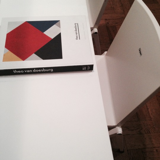
i have also travelled a little bit during dps year, and saw many inspiring visuals in museums and gallery spaces. exhibition theo van doesburg: a new expression of life, art and technology at the bozar center for fine arts in brussels was among the most interesting ones. having found the art movement de stijl in the netherlands with piet mondrian, van doesburg promoted their abstract visual language internationally, and the exhibition showcased everything from his dadaist poetry to pieces of furniture. his influence on some bauhaus students and the modernist typography was also highlighted, as evidenced by various print ads and magazine covers.
— —
1 note
·
View note
Photo


#7 | ieva misiukonyte
during my stay in denmark, i attended copenhagen fashion summit, world’s largest event on eco-fashion. organised by danish fashion institute and the copenhagen school of design and technology, the conference brought together more than 1200 people from the world of fashion, media, politics and business. themed ‘responsible innovation’, the summit focused on the urgent need for environmental change and innovation in the world of fashion. the speakers addressing the issue included the new york times fashion director vanessa friedman, vogue international editor suzy menkes, livia firth from eco-age and rick ridgeway, patagonia’s vice president for environmental affairs.
since the studies at the royal danish academy had a strong focus on sustainability, i had done lots of research on the topic before the summit and got quite upset by my findings. the fashion industry is one of the largest on the planet (think of the steps during garment’s lifecycle…!), and now it’s threatening not only for the planet, but also for the people – their health and safety. there are many things behind the glamour of fashion: toxic dyes, pesticides used on cotton crops, unfair wages and non-human working conditions – and all contribute to the environmental degradation.
prior to the conference, i took part in youth fashion summit workshops on how the fashion industry can work with policy makers to promote environmental sustainability within the industry. being around 120 fashion and communication students was really stimulating and brought new insights into the areas of studies that i might be less familiar with.
the points made by speakers and addressed issues from gender equality and economic growth to poor working conditions and new business models left me thinking about the ways i can minimise my personal impact on nature. i started to focus more on the green aspect of graphic design – paper, ink, printing, packaging, binding are integral to my creative practice, and natural curiosity leads me to trying new technologies as graphic design is dependent on them. by constantly testing, prototyping, printing and embracing new production ways, i’m also facing many challenges. the choices i make have great impact on the future, and i realise that i’m responsible not only for the artefact i design but also for the choices that are involved in the design process in order for the design to become socially, environmentally and economically sustainable.
0 notes
Photo


UPDATE 3 | Hilma Sassa
After Wallpaper Magazine, I took a much needed break but also worked on other things, I took part in events which is something I am very much interested in due to the interaction with people as I believe you can make connections and it a way of networking but also to improve my communication skills.
I worked at ICA:Art Night for Jennifer West, was a long night as I was based in Covent Garden and had to interact with people non-stop as the installation was interactive with the public. Afterwards I worked for Vibes on the Roof, in which I was “lucky’ enough to be a stage manager but also had other roles, was a long day too and I was able to see the event form beginning till end being involved from conception was a good feeling since it was a great turn out and made great connections, that have offered me some jobs to do as a freelancer.
During July, I went back to Marby & ELm for a week, and afterwards I joined Duchamp and Sons Bootcamp at Whitechapel Gallery, which was a whole week full of activities and was also ran by Hato Press, which I also got the chance to visit Hato Press and do some Riso Printing, was a fun week with diverse design activities from book binding to printing and exploring the gallery.
0 notes