
Statistics
We looked inside some of the posts by le-graphisme and here's what we found interesting.
Average Info
Notes Per Post
260K
Likes Per Post
147K
Reblog Per Post
112K
Reply Per Post
277
Time Between Posts
2 months
Number of Posts By Type
Photo
11
Text
6
Last Seen Tumblr Blogs


Fun Fact
Tumblr was attacked by a cross-site scripting worm deployed by the Internet troll group GNAA on Dec 3, 2012.


Photo
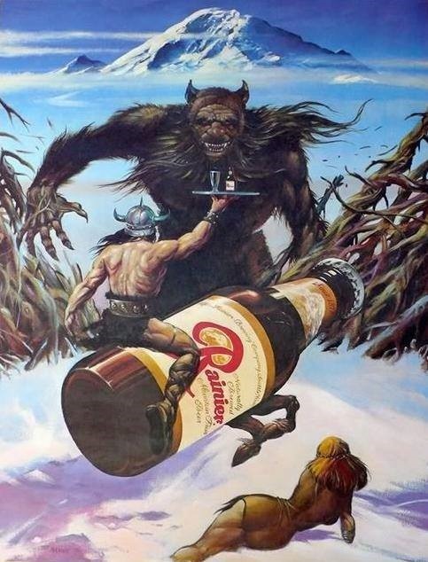
Art by William Stout for a Rainier Beer Advertisement, 1976
2K notes
·
View notes
Text

ngl i'm amazed of how this commission came out
⭐️ want to commission me? slots are open!
16K notes
·
View notes
Photo
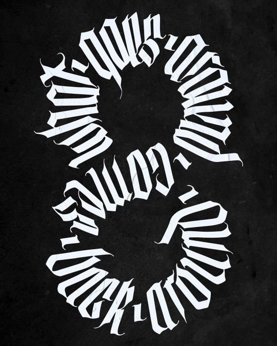
[What Goes Around Comes Back Around] 🥀 . Another commission finished 👽 Originally hand-drawn, then cleaned up in Procreate ✍🏻 . Thank you for the trust and for this figure-8 shape request @beezie_rox 🙏🏼 It was a fun one to experiment with! . #script #calligraphy #blackletter #design #handmadefont #orkaydia https://www.instagram.com/p/CdSi9mXpxhN/?igshid=NGJjMDIxMWI=
3 notes
·
View notes
Photo
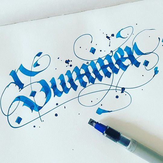
Summer ☀️ . . .
#fraktur #calligraphy #typography #typespire #type #handlettering #lettering #handmadefont #graphic #goodtype #calligraffiti #blackletter #modrencalligraphy #typographyinspiration #typographydaily #gothic #handwriting #thedailytype #dailytype #graphicdesign #designspiration #typegang #letteringdaily #letteringchallenges #calligraphymasters #typematters #artoftype #calligraphyart #summer https://www.instagram.com/p/CfHIaZcJca4/?igshid=NGJjMDIxMWI=
3 notes
·
View notes

Photo


Typography Tuesday
BLACKLETTER
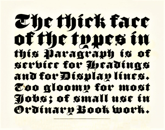
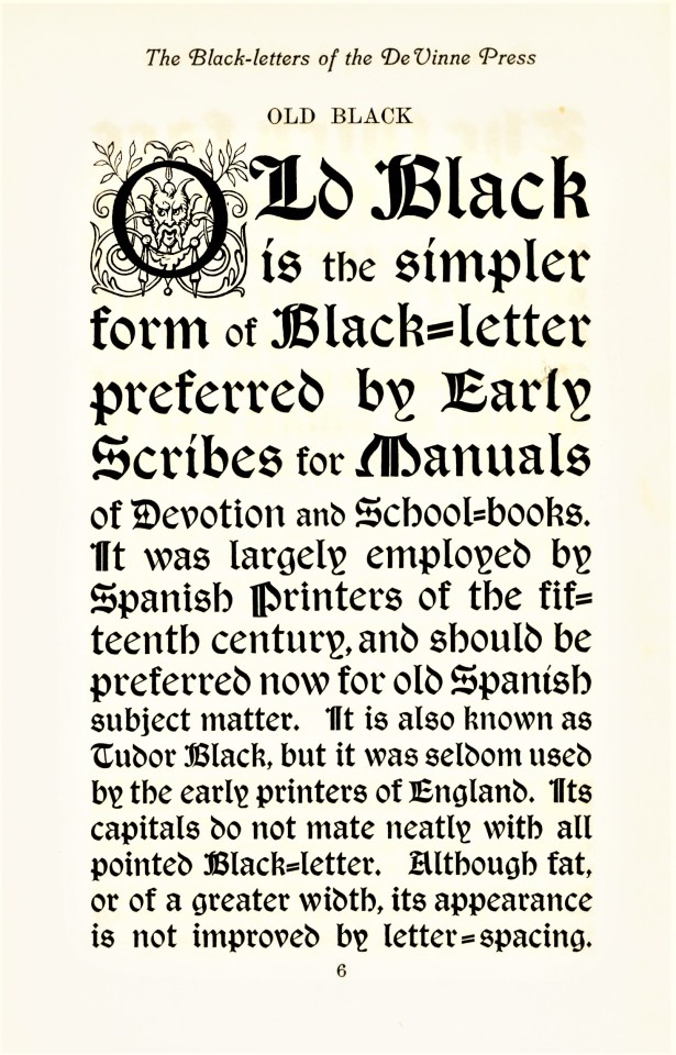
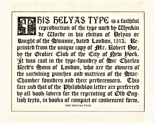
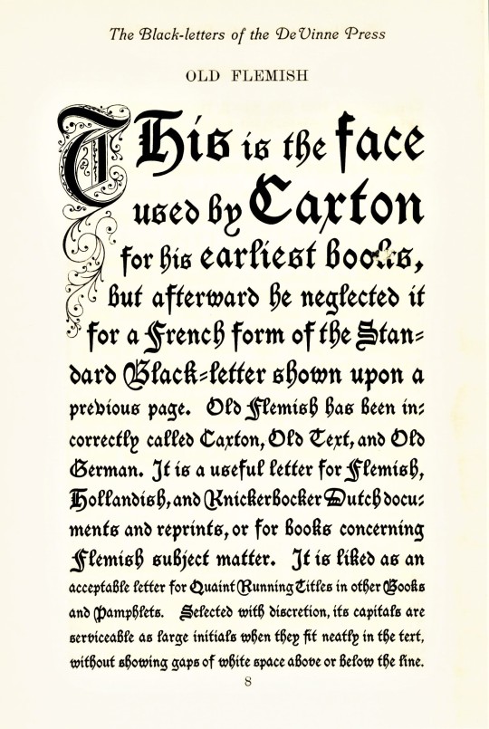
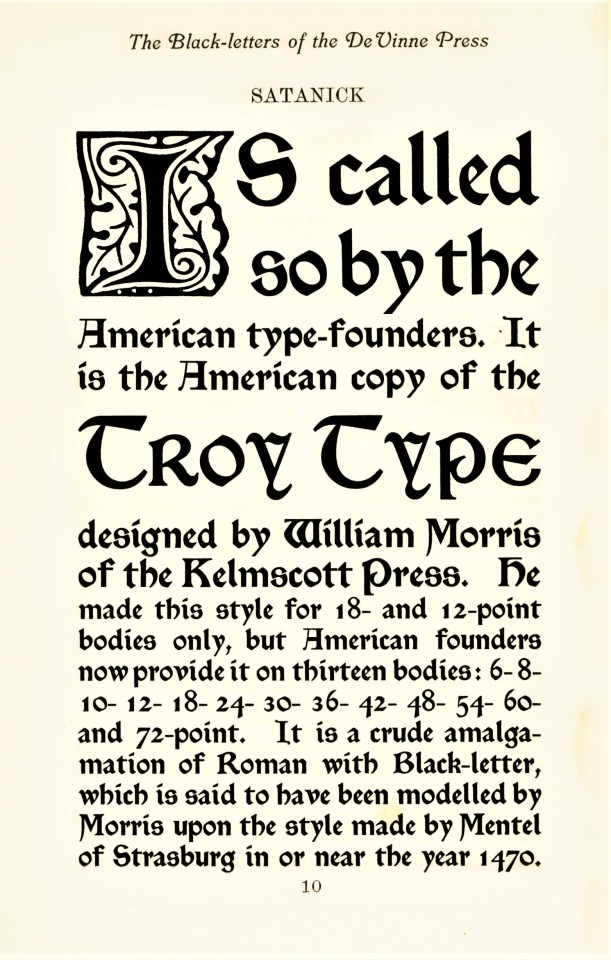
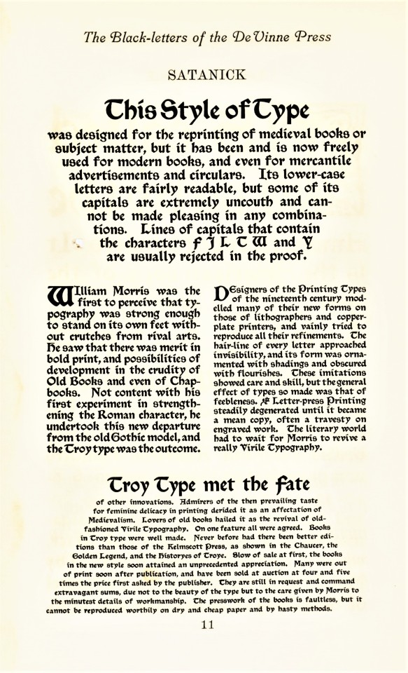
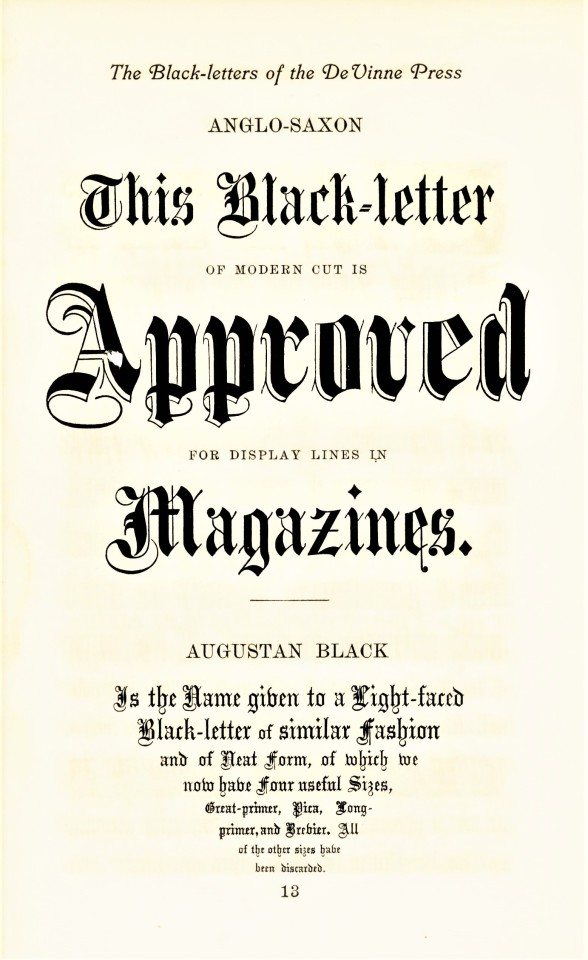
Blackletter, also called Gothic, was the first typographic form to be founded in metal type by Johannes Gutenberg in the mid-fifteenth century. The first book printed in English was in blackletter, as was the first book printed in England (both by William Caxton; the first printed in Bruges in 1473, which was also the very first book printed in Bruges, and the latter in Westminster in 1476). It is called blackletter because its narrow, condensed forms produce a darker appearance on the page than do Roman fonts. By the late 16th century, most Western national printers had dropped blackletter in favor of the arguably more readable Roman-style fonts, except for some Scandinavian countries which held onto blackletter forms until the late 18th century, and Germany being the last holdout until 1941.
Blackletter fonts are still used today, however, as display faces, for ceremonial use, and for certain kinds of emphases. That’s certainly how Theodore Low De Vinne (1828-1914) would have used it at his De Vinne Press in New York. These examples come from Types of the De Vinne Press, published in New York by the De Vinne Press in 1907. Theodore De Vinne founded his press in 1883. He was also a co-founder of the prestigious Grolier Club and one of the leading commercial printers of his day, whose enterprise had a profound influence on American printing and typography. This book was intended as a promotional specimen book “for the use of compositors, proofreaders, and publishers,” to demonstrate the wide variety of typographic possibilities that could be available to their clients.
View more posts from Types of the De Vinne Press.
View more posts on Gothic/Blackletter type faces.
View more Typography Tuesday posts.
243 notes
·
View notes


Photo

TAN AESOP Font by TanType
Download here.
Follow WE AND THE COLOR on: Facebook I Twitter I Pinterest I YouTube I Instagram I Reddit
42 notes
·
View notes
Text
some of you may've heard about that fancy "bionic reading" typefont thats supposed to be easier for neurodivergent people to read (if you're unfamiliar, it bolds the first few letters of each word to make it easier to follow)
well guess what, its locked behind a $500 a month API to write in because fuck you!
introducing, Not Bionic Reading! it is literally just the bionic reading typefont but for free. god bless neocities
anyone who can, pls reblog!
88K notes
·
View notes

Text
le-graphisme is now 10 years old!
When I started this blog in October 2010 I was still a university design student in Tempe, AZ. Now, I’m a creative director and senior designer in San Diego, CA. In the interim, I’ve had the chance to be an art director, junior partner, and design instructor as well—not to mention a live musician! Who knows what the next 10 years have in store! Thanks to anyone who still follows this ode to design inspiration. I plan to keep posting these visual delights!
0 notes