
Don't wanna be here? Send us removal request.
Statistics
We looked inside some of the posts by livgadenne-blog and here's what we found interesting.
Average Info
Notes Per Post
5
Likes Per Post
2
Reblog Per Post
3
Reply Per Post
0
Time Between Posts
7 days
Number of Posts By Type
Text
11
Photo
6
Last Seen Tumblr Blogs


Fun Fact
Tumblr was named as a finalist in Lead411’s New York City Hot 125 in Aug 2010.
Text
Evaluation
When I had read through and analysed the brief I understood that the task we were set to do was to provide a campaign or outcome that has a large positive impact on young adults. Whatever we designed had to be an empowerment of the development to our target audience both socially and culturally. The aim of the brief was to promote a campaign or composition that ultimately beacons positive mental attitude and not a shred of unnecessary negativity. Our aim was to remain unattached throughout our campaign and consider views of my peers in order to deem my outcome successful. I thought the task of this brief would be a good chance to talk to other people my age about positive mental health and attitudes and what they do on a regular basis to keep themselves happy and motivated (socially and culturally). To try and enable myself to engage with the subject at hand and how I felt about it, I being a young adult myself looked at what motivates me and drives me to work hard and to the best of my ability and also, what I ENJOY doing. Following on from this I came up with a few basic ideas, one being tied with my job as a makeup artist. I love my job, it motivates me, makes me happy and is extremely rewarding, s I chose to flip the subject matter and make my composition about natural beauty. I wanted to try and encourage people enough to feel as comfortable and powerful and beautiful without makeup as they do with it.
A couple of months ago we went on a street art tour in Shoreditch, London. Going on this trip as well as other trips we had been on together as a class was really beneficial to me as it unveiled the personalities and opinions of my peers that perhaps hadn't been shared or seen before. It was really useful for me to be able to see what my peers were like outside of a classroom and in a totally different environment. It was a completely new experience for me since as a class we hadn't gone on a trip to solely look at casual art before. It quickly became apparent who took a genuine interest in the art work and the process and timeframe of it being produced, they asked questions which I thought was general, however facial expressions of people I had spent next to three days a week with for seven months was also interesting, like a whole different chapter to that specific person. I found my peers opinions, expressions, language bodily and verbally just as interesting in the art work and it became clear to me that I wanted my final outcome to be firstly of people, but secondly in a natural state in which they don't feel vulnerable about how they look or about how other people may perceive them. I wanted my final piece to be about how you can feel your most comfortable in public. On the street art tour I thought about the complexity of the compositions, what colours I saw first if they even did have colours, what kind of scale the composition was, what element of the composition first captured my attention. The variety of art work was so incredibly vast that some of the art works were more structures and 3D then stereotypically painted on a wall. So seeing the differentiation of art work was very interesting. To me, a lot of the productions that took my eye were almost of a poster like/pin up appearance which led me to another element of my final outcome. The 'poster' like effect.
The main influence of my artist research was a conceptual artist and collagist from America called Barbara Kruger. My first initial opinion of her work was that I didn't like the feminist vibe I got off of her work. However through more research I found that the way she elevates female empowerment in society was very interesting and refreshing. Her work typically consists of black and white pictures which happen to look very much like photographs that have been printed and manipulated through a Xerox effect, a red banner running through intersections and a empowering slogan which involved an element of humor. Instead of experimenting with my own pictures and my own slogans in a digital sense I decided to go all out with experimenting in a way Barbara Kruger would of, which was taking pictures of myself, my sister and my mum all completely natural with no makeup on being totally comfortable and pushing the pictures through a photocopier. I didn't want my developments outcomes to be the same as Krugers so I thought how can I manipulate these pictures further to make them even more so my own and specific to me. I thought about achieving different effects for each of the developments. I specifically decided not to add slogans to my developments because in all honesty I hadn't thought of a slogan I found completely straight up empowering.
My final outcome is a combination of the pictures of my mum, sister and myself which I like as instead of it being completely separate it included all of us which to me was personal as a kind of generation shift, it being family, we are all female and typically we all wear and do like to wear makeup. Also I thought of my slogan, 'You Are Fucking Beautiful Natural'. I think my slogan is successful because in a modern way it leans towards being slightly crude and inappropriate, however the aim of my campaign was not to be appropriate it was to do what was necessary to make young people feel comfortable about the way they look. The brief stated that we were to make a composition or produce a campaign that showed the development and empowerment of young people socially and culturally, and I think by showing that small amount of crudity, and antisocial language makes it all the more social and it also draws peoples attention even if its for the wrong kind.
If I were to redo or change anything to my final outcome it would be that I stepped outside my comfort zone and experimented with more texturizing elements for example ink, and also different kinds of colour. I would also try and come up with different eye capturing ways of texturizing placement with more pictures of not just women I know but of random people of all different ages. I would also do a makeup video which would show how much effort it takes to feel like you look beautiful for wearing makeup when actually sometimes its a lot better to not wear any and you also feel more confident for not having any on. I think that could be another big step in producing an outcome or development, by turning to the internet.
0 notes


Text
‘Popaganda’ - The Brief

‘Popaganda’ - This final project is about independently developing and constructing our own project and brief. I must create, record, plan and present a visual outcome that promotes and positively encourages something that I think will have an outcome of empowerment and development of young people both socially and culturally. ‘Popaganda’, the project title, but what does it mean? ‘Popaganda’ is use of two terms, pop culture and propaganda. It is used to suggest and reassure that the project needs to modernise current trends in the form of propaganda. My own interpretation of propaganda generally relates to world war, specifically WW2 where propaganda first rose to fame and became noticed and used as a weapon. Propaganda according to definition is ‘visual information that is of a biased or misleading nature, used to promote a political cause or point of view’ so already it depicts a relatively negative imagery in the eyes of a targeted young audience. I want to be able to turn the stereotypically ‘negative’ idea of propaganda into something positive that young people and young adults can learn from, aspire towards and create their own definition of what propaganda means personally.
Prior to this mind map I have read through, analysed and annotated the brief I was given. From reading the brief, many questions, ideas, checklists and artists came to mind which lead me to start thinking how I was going to approach this FMP, what I was going to do with the resources I had been given and how I could use them to my on advantage. I looked at 2D and 4D problem solving and combined, artists, what I wanted my brief to be based on and more importantly what kind of a target audience I was to have, what themes did I think they would be interested in. This mind map was a very successful way of me consuming what information I had been given and planning it out into categories, breaking it down into sections. From there I was able to start planning, recording and creating my initial ideas.
0 notes
Text
Facial Features
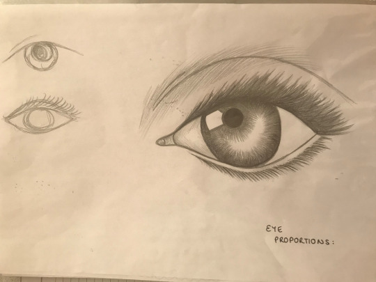


Here are a few sketches I have done of an eye, a nose and a mouth, I have drawn these features based on my sisters. I decided to focus on up close drawings of facial features because facial features are a main contributing factor of my final major project. I am starting to look at the anatomy of bodies, their structures and how no single facial feature has an exact replicate, this makes us unique and identify us as individuals. In planning my final outcome, I want the outcome to include a full face, a face that screams positivity and self empowerment that isn't covered by makeup, semi-permanent makeup or tattoos. This face along with expressions, mannerisms and individuality will be a symbol of embodiment. It will resemble and remind all of its audience to embrace the way they look naturally. I want my final piece to be a reminder of what being beautiful is actually about and what it means. To the people of my generation, confidence and recognising your own value is the best kind of beauty. These sketches are starting points of what I could use as primary research for my final outcome, I want to incorporate a slogan with a visual element. I personally feel like the two elements in a combination gives an undoubting, clear message to anyone who may view it. Because the brief states that we must create an outcome that successfully complements a campaign that signifies the empowerment and development of young people both socially and culturally I think it is really important that the message I put across is brass an straight forward.
0 notes
Photo
For this task I had to compare, contrast and conclude three images from three artists that I had researched. The image on the far left is a painting by Dimitra Millan, I compared it to the image on the far left by Marion Bolognesi because they generally are both colourful, bright and draw attention easily. The image in the centre, by Barbara Krueger is where I started to contrast the images together. The image in the centre is totally different to the other two contrasting against it being in monotone, it being abstract and also the use of typography thats included. When I analysed these compositions I looked at how in some ways they were all very similar to each other, one reason being to me that they symbolise female empowerment. The image in the middle screamed feminism to me, looking at other of Krueger’s compositions I can see that promoting positing mind sets to and in women is incredibly important to Krueger. I plan to use some of the techniques, materials and processes used by thee three artists in my own fine out comes and experiments in preparation for my hand in.

DIMITRA MILLAN
BARBARA KRUEGER
MARION BOLOGNESI
1 note
·
View note
Photo
DIMITRA MILLAN
BARBARA KRUEGER
MARION BOLOGNESI
1 note
·
View note
Photo

WIEDEN & KENNEDY
Wieden & Kennedy are an American independent advertising agency duo formed by Dan Wieden and David Kennedy, who met both working for Nike campaigns in the 80′s. In analysing these compositions, it was clear to me that these were artworks that the duo had made for Nike. Out of the compositions that I analysed, the larger one on the far left stood out to me most as I was able to unpick it and understand the relevance more. Nike is a sports brand that has gained high popularity from the moment it hit global stores. It promotes, health, fitness, exercise and looking good wearing the appropriate gear while you're working out. In the back of the picture you can see that there are bill boards with motivational writing that mainly reflect back to the theory that mind is over body. Wieden and Kennedy are stating it doesn't matter what kind of mind set you have, just do it. 'Just Do It' has become the most recognisable slogan for Nike, along with the swoosh tick as its icon and trade mark. This composition stood out most to me as I know that Nike is a sports brand as I myself wear it. From basic knowledge about the company I know that they really try to drive fitness, so I thought the fact that people were walking in front of the pictures, perhaps on the way to work or just taking a casual stroll made a big impact on the composition. It gives the illusion that the people pictured are running so instead of it being a stereotypical gym picture, it shows how you can incorporate exercise in your every day schedule. I think the use of primary colours is really affective because they are easily recognisable and they are bold and striking. I also like the height of the artwork. It stands out and fits in with urban culture.
0 notes
Photo

JEAN JULLIEN
After analysing these compositions by Jean Jullien, I thought that the general genre of the artworks he creates are fairly similar to those of a comic strip. They represent adult humour while looking like the genre is supposed to lean more towards children’s attention. For example the image on the far right is generally crude, you see the bigger, closer man first facing away from us, and because you can't really interpret a facial expression our eyes are drawn to the hand gesture he is making. This is used as a greeting that everyone is aware of, however because you can't really see his facial expression you automatically think that the man he is sending a greeting to also does not have one, so your eyes are immediately drawn also to his hand gesture (even though he may not be making one). Which is rude and totally shuts the ‘conversation’ down making it humorous. The colours of this piece are all generally monotone, they are all different shades of red, to us red signifies anger and unavailability. I think the colour suitably fits the composition as the man furthest away is obviously unavailable and also his facial expression shows lack of interest and enthusiasm. I don't think that Jullien has a particular concept and deeper meaning to his work besides humour, I think the majority of it is generally creative randomness, but whatever he is doing, its gained a lot of popularity and obviously works.
0 notes
Photo

JEAN JULLIEN
Jean Jullien is a French graphic designer and illustrator, in these specific posters he has created I can see that they are sponsoring Childline awareness. Jullien has a unique style of work, his compositions generally are of cartoon like figurines. I analysed these three pieces of work and it became aware to me that he is trying to reinterpret real life childlike situations, things that happen on an every day basis in children's lives. The main message that came across to me after reading these posters that he is trying to state that talking to Childline does not make you feel vulnerable and you won't experience embarrassment. The cartoon like form takes the formality away but also underlays a serious meaning and also the bigger writing is initially humorous. The slogans are really important in these posters, they help gain recognition and clearly interpret that whatever the situation is, Childline are not there to judge you they are only there to help. The colours are also very important, the majority being primary colours which are easily recognisable and draw attention. It is highly likely a child will look at a colourful poster rather then a black and white one. I think these posters are successful and eye capturing.
0 notes
Photo

ANTHONY BURRILL
Anthony Burrill is a graphic artist, print maker and designer, best known for his typographic, word based compositions; some of which are now globally famous for their originality and empowering, positive quotations. Some of his most famous work includes ‘This is who I am’ ‘Make your mark on The World” and ‘I am happy’. I specifically analysed theses pieces and it became obvious to me that Burrill in creating these pieces wanted the audience of his work to be drawn in by bold, striking colours and typography rather than pictures like many other graphic artists. I think this was his gateway to recognition and popularity, because his work was unique. Also I noticed looking at more then just three pieces of his work that he tends to use the same font in the majority of his compositions. I think his work is effective and doesn't beat around the bush, it draws peoples attention, is eye capturing and the complementary colours in the posters also make it more appealing to look at.
3 notes
·
View notes
Text
Artist Research
IAN MCQUE
Ian Mcque is a wee known artist and illustrator who was born in Edinburgh. He has dedicated over 20 years to work in the video game and illustration industry. He has featured as head artist and director of the popular video game GTA which assists has evolved drastically since as early as 1997 of the first release. He excels in creating modern illustrative futuristic and science fiction themed digital animations and characters in both digital art and paintings. As demonstrated in many of his artworks, his creations are filled completely with detail and characterisations with no space for any evidence of modern technology. Alternatively the worlds and spaces he creates are of post modern war fare, apocalyptic scenarios and futuristic elements, this include mostly floating spacecrafts, ships and scrapyards full of weird and wonderful things.
He starts off creating his work firstly by sketching out the rough ground upon his ideas are based on, he sketches are incredibly detailed and precise, and contribute to further precision he draws the sketches in ink to get a feel of the density of them, he then goes on to paint them again in great detail. He then scans his sketches and paintings in digitally to alter and manipulate them. Looking at his work generally I find his illustrations and artwork’s very interesting and unique. He achieves this effect through use of great detail, I am inspired by his work and would like the Iron Man i create oreally like the idea of apocalyptic vision within his work and the machine like, technical style.
LAURA CARLIN
Laura Carlin is a British artist, illustrator and ceramicist who started her career with graduating from the Royal college of Art in 2004. She lives and designs works of pure creativeness and imagination in London and is represented by Heart Agency for illustration work creating unique sculptures and attention capturing designs. Her work is recognised internationally and was the first British illustrator in the last 20 years to win the Bratislava Children’s Book Illustration Awards.
Carlin featured in designing a version of ‘The Iron Man’ which coincidentally is the book I am recreating a cover for, I’m using my own illustrations and designs to feature on it. Carlin’s interpretational designs of ‘The Iron Man’ are unique and of her own style. The use of simplicity in her work is highly effective I think as the target audience for this book is Key Stage 2 students wo are generally between the age of 7 and 11. The illustrations on the book cover need to be of a standard that the meaning of them can be successfully communicated across to children. So the illustrations need to be fairly obvious in what they interpret. The simple silhouetted design of he Iron Man on the front cover is an effective insight into the book. To me it gives an impression of what they Iron Man looks like without giving too much away. Also to younger people, it is important characters don't loo intimidating or over complicated, in this case Carlin has attained both of these objectives by making the silhouette soft shapes which to a child may signify that it is friendly. Carlin also focusses on the colour of the illustrations, they are generally primary colours which again add to the simplicity of the front cover. All in all the colours and designs give off the impression that the iron man is friendly before even reading the book. After analysing Carlin’s illustration I came to the conclusion that I think the design has been created by screen-print, it gives off an almost neatness, clean, natural look which contradicts what the book is about, the Iron Man for example is entirely made out of a combination of different metals.
In conclusion, looking at the kinds of work Laura Carlin produces I think her designs are effective and hit the general criteria for the target audience of the book. In creating my own book cover I think I would like to incorporate the same level of simplicity and effectiveness. I found the use of typography on the book cover interesting, it looks like the text has been hand written in a child like manner, this could be to connect with the children to show them its a fun friendly book. It is also in grey tones, this could be the same representation as the Iron Man as he is all metal which is shown in grey.
JEFFREY ALAN LOVE
Jeffrey Alan Love is an author come artist come illustrator who is relatively concealed in the types of art work he designs, he is not an outgoing artist however manages to gain a huge amount of recognition and popularity out of the work he produces. He is generally seen as an all rounder specialising in writing his own books and also being talented enough to illustrate them himself also. He has a very unique style of work which circulates around a kind of morbid atmospheric approach. He didn't design an illustration for ‘The Iron Man’ however I have previously looked at Love’s style of work and I feel like his style of work would fit suitably into the kind of illustrations needed for the cover of this book.
In creating my own cover I think I will include certain aspects of Love’s work for example the colour palette he uses, generally black’s, red’s, and different tones of grey. I feel like this supports the whole metal approach so the colour wont look out of place, I like the randomness of primary colours, for example how the red makes an appearance. However looking at the shapes Love uses, I think the silhouettes would be slightly intimidating for a child and may not transfer the right kind of communication I want the book to represent through illustrations.
0 notes
Text
Block Printing Workshop


In this workshop, the aims were to create unique figures of what we thought the ‘Iron Man’ may look like by block printing, we would then condense the block print outcomes into later animations.
Tools/materials:
-Palette Knife
-Water based ink
-Wooden blocks
-Perplex plate
-Cartridge paper
-Ink Roller
-Newsprint
Method:
1. Firstly, I collected a variety of wooden blocks that I wanted to work with which were various shapes, sizes and depths. I also got 3 pieces of A4 cartridge paper, a perplex plate, ink roller and some black and red water based ink.
2. Next I rolled out the black ink onto the perplex plate using the ink roller until it sounded like undoing Velcro. Once I rolled out the ink I used the roller to apply it to the blocks I wanted to use to print with.
3. When I had rolled the ink onto the wooden blocks evenly, I put the block ink side down onto the paper, and trying not to smudge the ink into a different shape I pushed the block onto the paper putting my weight on it to try and get the majority of the ink off of the block revealing my print on the paper. I did this multiple times using a range of shapes and sizes to create my own interpretations of ‘The iron man’. I had to adapt to the way I put the ink on the block as through trying to apply ink to the block sometimes the ink was too thick which lead to the block sliding around the paper, also sometimes there wasn’t enough ink on the block which lead to a very faint undefinable print.
I created a range of 3 basic block prints, a challenge I had to overcome was the creativity of the print I made. I found it hard to come up with different ways of creating something that had one specific brief outcome.
EXTENSION TASK

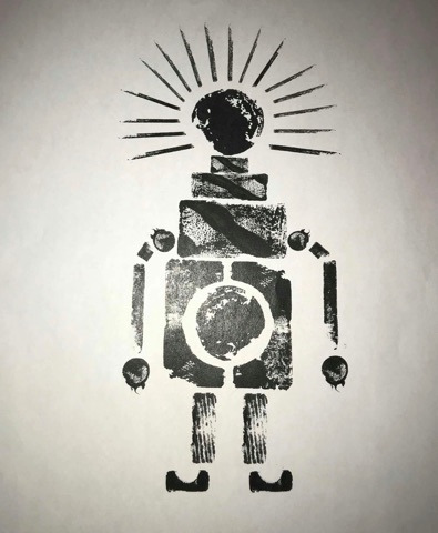
For the extension task we were asked to use the block printing process but in pairs to create an A3 print of ‘The Iron Man’. This time however we were to think more about the colours that may be used and how much ink we should apply to create a king of texture. We were read the description of The Iron Man from the book by Ted Hughes, it was then up to us to create our own interpretation and how we were going to manipulate the descripted image. In order to have a symmetrical print, Hannah and I drew out the design we wanted to achieve to avoid having an uneven outcome with random parts in the wrong place.
For the plan we had created Hannah and I came up with our own ideas and when it came to planning he final outcome took certain aspects of our designs and moulded them together to come out with the Iron Man we had finally created. We wanted to create an Iron Man that could be related to the book however we wanted to put our own twist on it, for example in the book it says how the Iron Man had eyes like headlights, we took that description and changed it, instead of having beaming headlight eyes our Iron Man has a red crown, this to us stands out as well as its the only asset of the Iron Man that has a predominate primary colour in it. We decided on the shapes we anted to use and if there wasn’t a shape we had planned on using we adapted to it by using a different shape or making it ourselves by using a variety of smaller shapes. We also decided we wanted him to have long legs and big feet to try and distinguish the scale he is labelled as in the book.
After the initial planning of our Iron Man we started to discuss a potential colour palette, gun metal grey was non negotiable, we knew we were going to use a grey like the Iron Man in the book. But we wanted to throw our own interpretation into the mix too, which is why we went for the bright red triangles on the head of our Iron Man to symbolise some sort of authority too.
0 notes
Text
Rigged Animation Workshop
In this particular workshop, the task we had to complete was to create a basic rigged animation. We did this by constructing our own interpretation of an ‘Iron man’ figure using pre-printed textured shapes which we animated into a gifs in Photoshop using ‘Puppet Warp’.
Rigged animation: In the simplest of ways, ‘rigging’ is the general process of creating a ‘skeleton’ for a model so it can move. In terms of animation, characters are normally ‘rigged’ before being animated, the rigging can be used to break up a skeletal foundation, this allows the character to move as if it has joints. If the character doesn't have rigged points it cant be manipulated deformed and moved around.
Tools: (Photoshop)
-Timeline
-Polygon lasso tool
-Blending option
-Puppet Warp
-Move tool
-Layers window
Method:
1. Firstly, I started the process by opening a new A4 canvas in Photoshop. I then started to construct select, cut, copy and paste what shapes I wanted to use in beginning to make my ‘Iron man’ character, then placed the shapes onto the A4 file. I began to put the shapes together not having a particularly clear ide of what I was actually going to animate or how it would look. I did this and gathered the shapes from a pre-printed texture canvas on a Photoshop file.
2.In order to remove the shapes from the canvas I used the polygonal lasso tool, I did this by cutting out the shapes, then by copying and pasting them into the file. I layered the shapes up into the character I was creating, to make this more practical for the next step I labelled each shape individually and made new layers for them.
3. After starting to process and create my textured ‘iron man’ character, I was prepared to start making a rigged animation using it. Before dragging it into the timeline window I had to create each stage in my layers using the puppet warp tool.
4. In my animation my characters head has spike like rods coming out of its head, I wanted each rod to flicker individually and carry on flickering in reverse to keep the animation going. To do this I needed to make sure the body parts were at the correct proportion to be able to fit the spikes in the frame.
5. To be able to do this I had to duplicate each layer and manipulate it to create a frame for each stage of the flicker. Once I had duplicated the layer I was going to manipulate, I had to select each rod, cut, copy and paste it back into the duplicated frame to create the flicker effect. I had to do this with each rod so my timeline consisted of about 34 individual frames. Each new frame created only moved a small amount to give the appearance of a smooth transition in movement throughout the animation.
6. Finally after creating each stage by stage layer I placed them all into the timeline window. In the timeline window I made sure all the frames were in the correct order and that the transition of frames looked professional in order to make m flicker effect look as smooth as possible.
KEY TERINOLOGY
Frame, Timing, Timeline, Space and Pace, Squash and Stretch, Repetition, Sequence, Cut-out, Rigged, Additive, Subtractive, Staging, Narrative, Flapping, Transition, Stop Motion, Looping, Extremes, Tweens, Chattering, Pose to Pose, Business, Brightness, Story Board, Polygonal.
- What did I learn?
In this workshop I definitely developed my digital skills, adapting to them every time I did something new, in this case it was the rigged animation I learnt how to make a GIF and how to lace frames into a timeline in attempt to make a animation that actually worked. I learnt how to create a GIF using Photoshop, consisting of multiple duplicate layers which I manipulated in stages to create various frames. I then placed them in the timeline window in chronological order of how I wanted the animation to work. I learnt that using more frames is best as it creates a smooth transition instead of an animation tat has less frames and I jolted.
- Potentials of creation
Potentially, I could reuse the skills I have learnt in making my rigged animation in other situations where I'm looking for a similar effect. It is good to document what I’ve done and how I’ve done it to practise it and in future when I use these skills again I will be able to do it quicker and to a better standard.
- How could this be linked to the research you have made?
I could link this to research by looking at other more advanced animators who work with different kinds and methods of generally hand rendered animation, but then follow it through with digital implications. For example Dr.Seuss who created the ‘Cat in The Hat’ characters and story line.
(FINAL DEVELOPMENT OF ANIMTION AT THE BOTTOM OF BLOG POSTS)
0 notes