
Statistics
We looked inside some of the posts by lizarddream and here's what we found interesting.
Average Info
Notes Per Post
4
Likes Per Post
3
Reblog Per Post
0
Reply Per Post
1
Time Between Posts
5 days
Number of Posts By Type
Text
17
Last Seen Tumblr Blogs


Fun Fact
In Q3 of 2020, 31% of US users access the Tumblr app daily.
Text
Project 3 Final + Semester review


vimeo
521 Project 3 presentation script:
1.) Hello, and welcome to my presentation on Project three of ArtGr 521. For this project I choose to explore animation with a focus on narrative storytelling in frame by frame animation.
2.) As I covered in my last presentation I decided to change up my last two projects, adding in a project on illustration, removing a project on java, and moving the animation project to last.
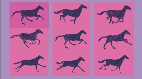
3.) In my initial research on animation I found myself really drawn to animations with a handmade, more tactile feel, especially college base stop motion. With this in mind, I wanted to avoid the flat animation style that is very popular right now.
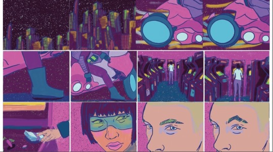
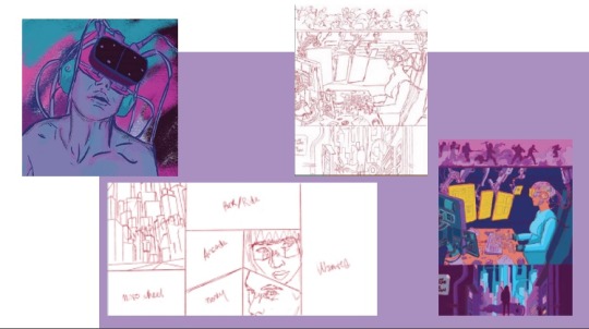
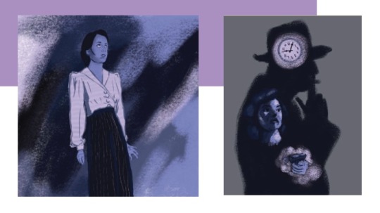
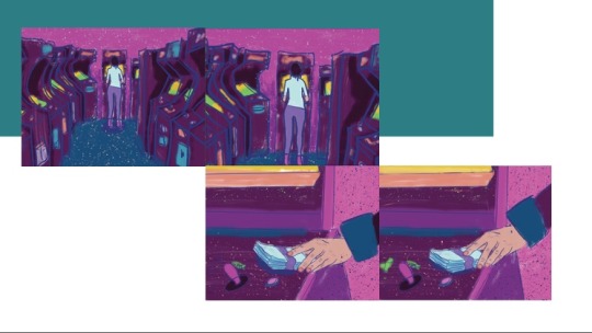
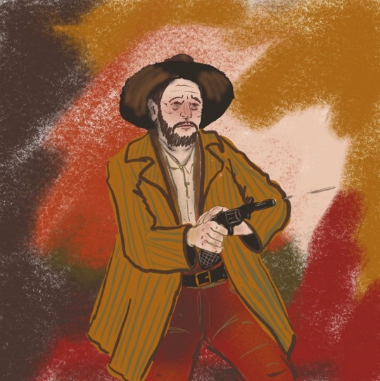
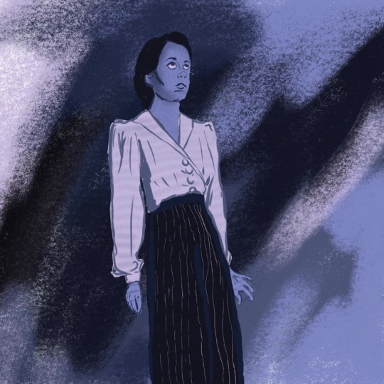
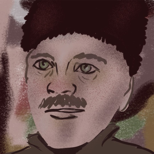
4.) I decided to continue the theme of the last project and work within the genres of western, horror, noir, and sci fi. I began with these assets, imaging a cowboy walking through a desert and into an old west town.
5.) However, the figure proved to nearly impossible to work with in AfterEffects, so I redesigned it in Illustrator to be more simplified and with distinct pieces that could be easily moved in AfterEffects.
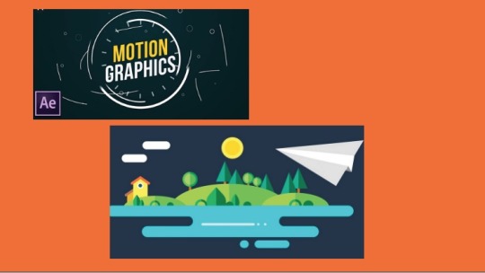
6.) The results were…underwhelming, and I was having a really hard time achieving the look and style I was looking for. So I went back to the drawing board and tried to do more research, and what I found is that AfterEffects is great for creating motion graphics but not as great for more naturalistic animation.
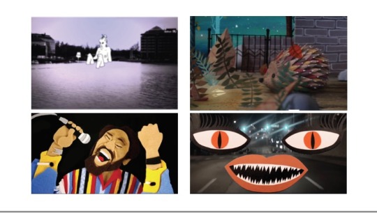
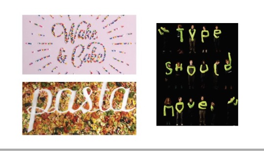
7.) In my research I noticed that a lot of the animations I connected with were made using frame by frame animations in either Procreate or Photoshop. So, I thought I would give it a try to see if this was feasible and was pleasantly surprised.
8.) This style was not only much more comfortable for me and moved significantly fasted than using puppet pins in AfterEffect, but also allowed me to experiment more with mark making and texture.
9.) This freedom was the real draw for me, that I could not only mimic mixed media or traditional media animation, but also consider how those colors, textures, and layers can add to the storytelling and support the communication of a message.
10.) While frame and frame can sound daunting, I found working with all these frames actually helped me understand where you can simplify and economize, that the eye fills in a lot of information for you.
11.) I started my animations with what I called a framework but was essentially a shot by shot storyboards with line work only. This helped me layout what I wanted to show and how I would get from one frame to the next.
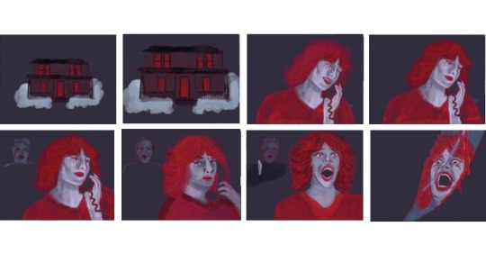
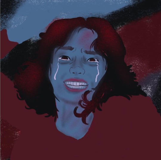
12.) Once I had animated all my frameworks I went in and added color, texture, and backgrounds. The horror animation was the last one completed but is first in my sequence. I was probably the least happy with this one but I’ll cover that later in the presentation.
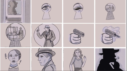
13.) For my noir animation I was able to work off of a storyboard I had created during project 2 but choose not to move forward with. This was helpful given the short timeline to complete these animations.
14.) For sci fi, I had a clear idea of what I wanted for my storyboad, but I struggled to create the depth in each frame that I wanted. And while I like the finished project, I realized at the end my palette was a little too pink focused, which worked in the illustration but was a little overwhelming in the animation.
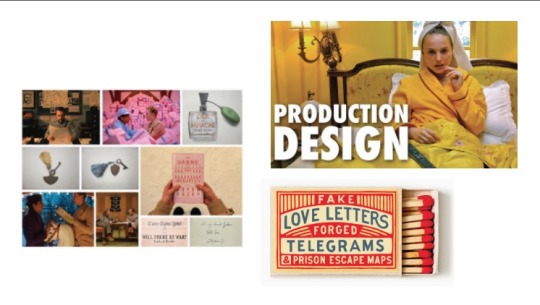
15.) The western animation was the first one I completed, and while because of that it is a little herky jercky in spots, I actually find it to be my favorite because I took more time to play around with details, making more nuanced in spots that the others.
16.) I knew I wanted to compile all of these animations into one video, but I wanted the transition between the videos to feel purposeful and not just cut to the next. So I went in and animated short transitions to tie the first and last frames together creating a less harsh transition.
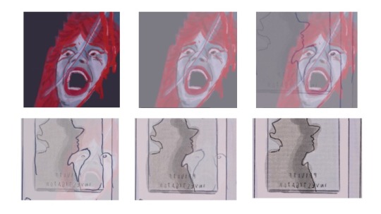
17.) There are of course lots of things I would change given more time. The horror animation especially has some odd frames where a layer was accidentally deleted, or where the face doesn’t move as smoothly as it should. By the time I was animating this one it was crunch time and I just need to finish.
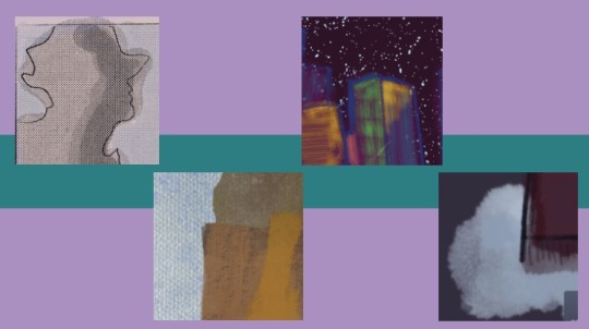
18.) I also can see that textures and marks got sloppier and less thoughtful the further along I went. The top two here are great examples of using marks in interesting ways to create a feeling, where the bottom two really missed the mark.
19.) I do feel like I learned a lot on this project, even with some rocky starts, and would really like to continue working on animations, exploring more tactile mediums like collage and stop motion, as well as giving Aftereffects and motion graphics a second chance.
20.) Overall, despite a few bumps, I feel like I learned a lot that I can implement in future projects and I think I’ll continue working with animation and pushing what I can do further as a gain comfort with the medium.
21.) I’ve uploaded the full final animation as a separate video, but I would so appreciate if you could watch it and provide feedback. So now that we’ve covered the basics of Project 3, let’s turn our attention to an overview of the semester as a whole.
22.)At the beginning of the semester I presented 3 projects, all of which I felt doable and little concern over, However reality set in fast and I found that the best laid plans oft go ary. Despite this I feel I still managed projects that pushed me and allowed me to explore arenas I am interested in.
23.) My research at the beginning of the semester was focused on Typography, a mix of illustration and animation, and generative art through coding. In the end the only topic that got the boot was generative art, which I’ve been exploring in another class, so the changes weren’t seismic.
24.) Despite changes to projects and unexpected hiccups along the way, I did try to maintain structure and timeframes, which not only helped me finish the projects and stay on time, but I think have helped me develop better independent work and project management skill.
25.) My exploration of Type in Project 1, lead me to reframing my initial goals, of become proficient in type, to more manageable ones of understanding how good typographic structure is designed and typeface identification.
26.) While this project didn’t yield elegant results to put in a portfolio I think it actually did something more for me, which was get me to think about type critically. What makes good typography? How do you think of type as system? As a structure?
27.) Was this project successful? I think so, I completed the goal – to create master copies of famous posters, and in completing that goal was able to gain a greater understanding of type than I had from several weeks of reading about type and blindly testing ideas.
28.) For Project 2, I chose to dive into a topic I feel a lot of affection for, illustration. I think this passion for the topic made the work that went with it easier, I enjoy drawing and painting which in many ways’ illustration is an extension of.
29.) this project gave me a chance to sit down and think critically about illustration, not just what I like about it, but why I like that and what is the intent of the artist. It gave me to time to consider how we use imagery to communicate, and where you can push those boundaries of communication
30.) With all of these projects time was an issue, given more time or at least more dedicated time would I have changed things, given more though to details and really honed these images, of course! But just like in the real world, there are deadlines you need to meet, so I feel pretty satisfied with the results.
31.) My project was focused on animation and narrative storytelling. I continued my genre exploration framing from project 2 and chose to work with a frame by frame style of workflow.
32.) I enjoyed working on these animations, it was a struggle, but each discovery felt like an “aha!” moment. It also allowed my to pursue ideas from project 2 that didn’t translate as well into a still image, looking at camera movements and cinematography.
33.) This project felt rushed, I can’t lie, I had some personal things going on that set me behind and I feel like I never really caught up. My biggest regret is that I was so rushed to finish this that I didn’t have adequate time to experiment, to try alternative and to explore abstraction.
34.) So now that we’ve reached the end of the semester, with all that I’ve learned and explored, and gained …. What’s Next?
35.) As implied earlier in this presentation, I’m not done with animation. I feel like I’ve just touched the tip of the iceberg and I now I really want to take some time to explore more experimental animation, to take things in a more playful, personal direction.
36.) I’m also looking to work more on taking what I’ve learned and applying it to less traditional means. I’m hoping to explore tactile and kinetic type, and thinking of ways to merge type and imagery. I’m also interested in exploring the interaction of design with fields like art, cinema, and theatre more.
37.) With this intersection in mind, I’ve been exploring production design in my limited free time, and it’s something I want to dive further into, as I think this concept of creating a world not just a product could lead to some interesting design work.
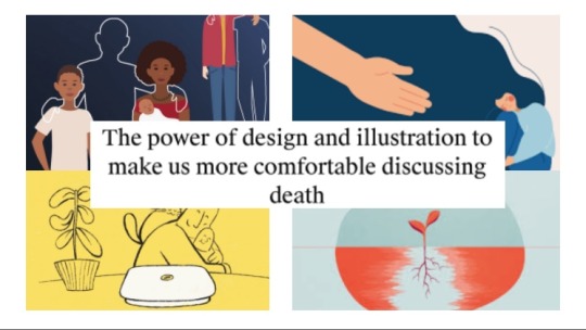
38.) While working though this semester I’ve been trying to keep my thesis, which is exploring de stigmatizing death and grieving, in mind and I was kindly sent an article that discussing how designers and illustrators are already looking at this issue.
39.) I think I’ll definitely be pulling from concepts explored this semester I look to understand how to approach difficult conversations in a non-threatening and participatory way.
40.) Thank you for your time. I look forward to reading your comments and question.
1 note
·
View note
Text
Project 3- Progress Monday 4/27
Continuing to work on animation
vimeo
0 notes
Text
Project 3 Progress - Friday 4/22
After struggling though some basic animation in AfterEffects with results I felt pretty ‘meh’ about, I decided to try out a different method. After some research I realized the style of animation I found myself drawn to, a more sketchy hand drawn look, was almost always done using frame by frame animation either with traditional media or programs like Photoshop or procreate. So despite warnings that this would take a lot of time, I decided to try some tests. I found that not only did I enjoy this process significantly more that working with AfterEffects, it gave me more freedom to explore styles I was more interested in. Below are 2 short tests, and one longer one, first as just the outline frame work( Edit: for some reason Vimeo won’t finish uploading this video, I will try again tomorrow) and then with full animation.
vimeo
vimeo
vimeo
0 notes
Text
Project 3 Progress - Monday 4/20
Honestly this week has been rough and my progress is not what I’d hoped it would be. My husband lost his job due Covid-19 closures so figuring finances and next steps has consumed most of my time and brain power for the last week, leaving little time to work on animation.
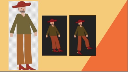
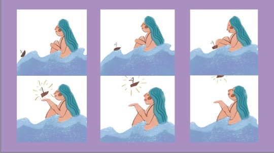
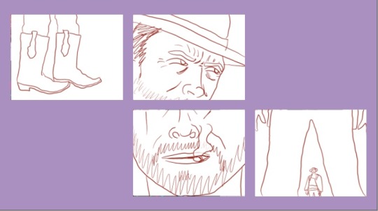
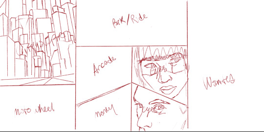
I had planned to work on a short panning shot, showing an old west town in the background with a cowboy-esque figure walking through. Here are the images I drew for that animation:


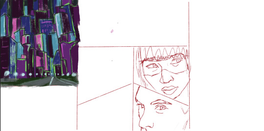
However, as I troubleshot the animation and watched tutorials I realized that the figure was not broken up into enough pieces to effectively use ‘puppet pin’ to move the figure. So I re-drew the figure in Illustrator to allow for more clearly defined pieces to move :

This definitely worked better and I was able to get ‘puppet pin’ to work and movement similar to walking to be created.
vimeo
This obviously has a ton of issues still and is very short, but I’m starting to understand the basics and to be honest with everything going on I just didn’t spend a ton of time on animation this week.
0 notes
Text
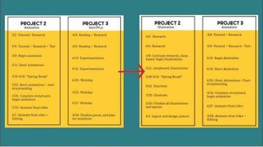
Project 3 - Monday 4/12
For the next project I’ll be exploring animation, continuing with the imagery from the last project. I’ll be starting with a series of experiments, trying out a variety of methods from abstract geometric study of colors and movements to more straightforward animation of using illustrative elements from project 2. With this in mind, I’ve rewritten my schedule to the following:
W4/8- AfterEffects Tutorials, Experimentation
M4/13- Experimentation
W4/15- Experimentation, begin Storyboard
M4/20- Storyboard /Animate Final Video
W4/22- Animate final video
M4/27 - Finish animation /Editing/ work on Presentation
W4/29-Project due
Here are some videos I’m watching now for research:
https://youtu.be/jlLjvRtV2jk
https://youtu.be/yloHKCrwZhY
https://youtu.be/olEi7Do86-Y
https://youtu.be/xC55MRRiwio
0 notes
Text
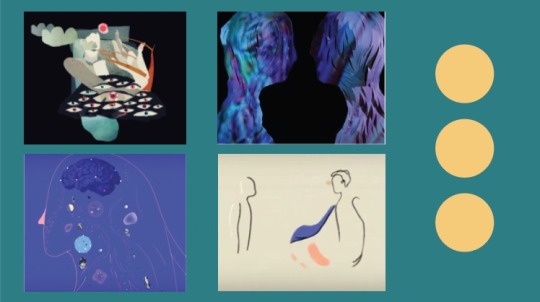
Project 2- Final Thoughts
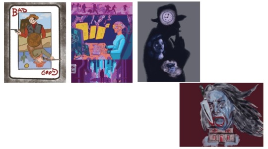
I really enjoyed this project! I love illustration and this gave me a great opportunity to really focus on and work on improving my illustrating skills. It also really helped me think about how we use certain images, especially in combination with each other as shorthand for stories and narratives. I found the analysis portion of this project to be a key turning point to really understanding not only the stories being told in each genre, but how they are told. With this context and having taken the time to write out my thoughts on each I found the illustrations came to me much quicker and (I feel) better defined. The one exception being the Western Illustration, which I didn’t give enough time and feels sloppy and not as clear in narrative. I hope to carry what I learned in this project over not only to my future illustrations, but to all design projects, taking the time to really analysis and think about my research and my intent, as well as considering what visual shorthands exist to tell a story as succinctly as possible.
Final Illustrations:


0 notes


Text
Project 2 update - Monday 3/30
After my last post, I was given feedback to include a genre analysis. Of course anyone who knows anything about film is aware that Genres are extremely subjective and you will always find someone who disagrees with your encapsulation of a genre, so these aren’t bulletproof but for my purposes they have worked to allow me to narrow down what I’m watching and reading into distilled observations. At this time I am cutting Historical Epics due to time and focusing in on a subgenre within each genre to narrow my focus.
Film Genre Analysis-
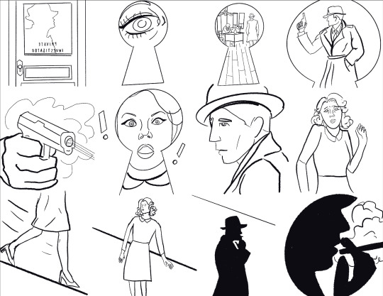
Noir: Detective/Crime Stories-While, like all the genres I’m covering, Noir films are often tied to together and identified by visual elements and tropes seen time and time again, Film Noir is also identified by the narrative structure of a central protagonist and their downfall through a series of events they seem dragged into and unable to control. There are a few major tropes that make it easy to identify classic Noir films such as, low lighting schemes with stark contrasts and heavy shadows, Dutch Angles (low, tilted shots), the common use of non sequential narrative through use of flashbacks or voice over narration, and dream like transitions between scenes. Noir films are heavily influenced by the current events of their day, in Noir films from the 1930’s you see a down beat, more nihilistic take on the genre as American society worked to recover from the Great Depression, where as by the 1950’s the focus had turned to tales of espionage and paranoia as the Cold War raged.
Inspirations : Detective novels (Raymond Chandler, Dashiell Hammett), French Poetic Realism, German Experssionism, American gangster films,
Scifi: cyberpunk/dystopia- The phrase “High Tech, Low Life” is often used as a quick encapsulation of the genre of Cyberpunk. Cyberpunk films often depict a dystopian future marred with omnipresent advertising, corporate authoritism, and personal isolation. When most people think of cyberpunk they think immediately of a certain aesthetic: a dark, cramped mega city ablaze with neon and holographic advertising. These aesthetics are pulled heavily from early cyberpunk media of the 80’s like Blade Runner and William Gibson’s work. Cyberpunk of the 80’s was a direct reaction to Ronald Regan and the rise of capitalism and corporate power. While these visual tropes are unlikely to go away anytime soon, they are starting to give way to new aesthetics and plot devices driven by current events like climate change, AI, and robotics. At its core though, Cyber punk is about Anxiety and Isolation, a world on the brink of collapse where technology has made humanity less human as technology and capitalism push us apart.
Inspirations: French Comics (Jean Giraud/Mobius), Film Noir, New Wave Science Fiction,
Horror: Slasher- Horror as a genre is all about The Intersitial, what lies between. Whether it is exploring what is between the living and the dead, the known and the unknown, the seen and the hidden, visually and narratively Horror is preoccupied with the space between. While slasher films have generally a pretty bad reputation, they can be executed extremely well and really successfully play on our greatest fears. While researching Horror I found a great description of the Horror Genre as “Externalizing how is feels to struggle”, Horror takes things we all feel like struggle and pain and develops them into a physical manifestation, in this case in the form of a ‘psycho killer’. The slasher genre takes this manifestation and places it reality, often in places we feel like we are safe in – our neighborhoods, vehicles, and homes. While the other genres I’m exploring are very male oriented genres, Horror is almost always based around a female protagonist, the “Final Girl”. She is given room to develop as a character, you are meant to know her and sympathize with her. All 3 of the films I watched gave ample time at the beginning of the film to their female characters before the formless, untangible, faceless killer arrives. Another major tie in between Slasher films is the emphasis put on murderous impulses being tied to sex and sexual pleasure, purity and viriginity (often seen in the “final girl”) will protect a character, while engaging in any sexual activity dooms others. Slashers are also marked by tropes such as POV shots, the use of cars as claustrophobic spaces, the filtering in and out of “reality”, and perhaps most importantly the idea that the monster you can’t see is scarier than the one you can.
Inspirations: Italian giallo films, Exploitation films, Psychological thrillers, True Crime
Western: -WIP
Next steps: While I know I’m really starting to cut it close, taking the time to really sit and think (and think, and think) about each genre has altered how I want to approach these illustrations a bit; Namely the structure I’m using. I’m moving away from the framed comic book like look and approach (which is just frankly not working) and focusing instead on a single image, more like an editorial illustration or film poster, that encapsulates what I’m trying to show as an illustration, NOT a storyboard.
2 notes
·
View notes
Text
Project 2 Update- Friday 3/27
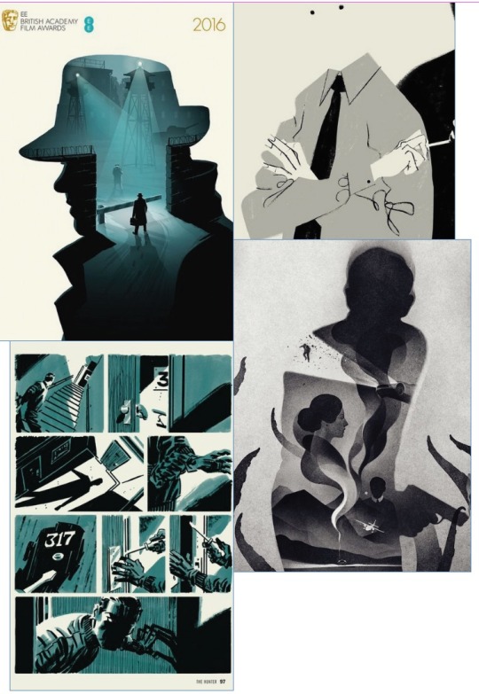
I’ve been working on sketches for Noir and Sci Fi this week, as well as continuing to work through my film list. Below is my sketch for the Noir illustration and the line work below it, I’ll be going in this weekend to add more layers of color and texture to fill it out. I’m leaning more towards a traditional pen and ink style comic for this illustration to complement the content.

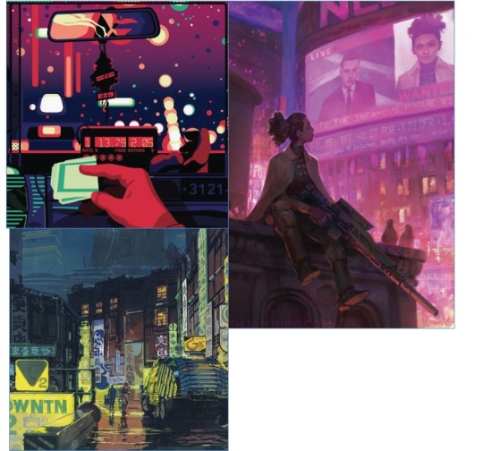
Below is the rough sketch of my Sci Fi illustration and a text of a potential execution of the illustration. I’m not totally sold on this, it needs some refinement, but given the time frame I’m just trying to push forward with what I have and go from there.
1 note
·
View note
Text
Project 2 update Monday 3/23
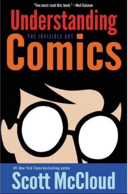
It has been an extraordinarily weird week, but I’ve been trying to work forward on this project despite the seemingly endless distractions. I’ve been working my way through my movie list and am about 2/3’s of the way through Scott McCloud’s book. I’ve found reading and watching simultaneously to be ready helpful as it guides me to think about what I’m seeing, how framing and transitions are used in film. I did some sketches for each genre, mostly to get warmed up and start thinking about color and imagery for each. I don’t intend these to be a part of the final illustrations, as I want to explore more how different illustration styles can be implemented with specific genres. But I do find this was a good exercise to get started.

0 notes
Text
Project 2 - Planning, What I’m looking at.
As I dive into Project 2, a series of illustrations exploring time and narrative story telling though 5 film genres, I though I would share what I’m doing now to research and prepare before I start sketching.
What I’m reading:
What I’m Watching:
What I’m looking at:

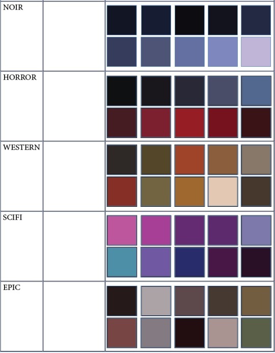
Color Palettes:
0 notes
Text
New Project Proposals
After finishing the last project I decided to really consider how I wanted to move forward with the next few projects. What I realized was, 1. I’m not really that interested in learning Java right now and that learning animation for the second project would make for awkward posters. Instead, after seeing other peoples projects and feeling more freed to explore areas that really interest me, I proposed moving Animation to project 3 and instead exploring illustration and narrative for project 2. My dream job is to be a full time illustrator, that is where my heart is, but I feel like as my design skills are expanding and I’m growing as both a designer and a person through grad school I’ve barely had any time to spend working on new illustrations, and I’d like to apply my new skills to here. Below is my new project proposals and timelines:
Project II-Digital Illustration
-Steps: Research: “Understanding Comics”-Scott McCloud, Watch 3 Films per Genre, plus clips.
-Project: 5 Film Genre illustrations sets (Noir, Horror, Western, SciFi, Genre Epics,),
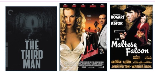
Noir: The Third Man, LA Confidential, The Maltese Falcon
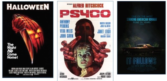
Horror: Halloween, Psycho, It Follows
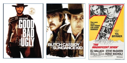
Western: The Good, The Bad, and Ugly, Butch Cassidy and the Sundance Kid, The Magnificent Seven
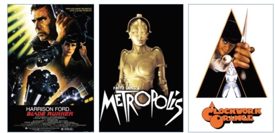
SciFi: Blade Runner, Metropolis, A clockwork orange/ or Fifth Elements
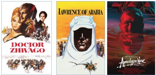
Genre Epics: Doctor Zhivago, Lawrence of Arabia, Apocalypse Now
How does each genre depict time and narrative within its genre + a study of semiotics in film
Project III: Animation (previously Project II)
-Steps: learning Adobe AfterEffects, 2 short 30 second animations, explore storyboarding- visual narrative in film
-Project: long (3-5 minute) mixed media animation
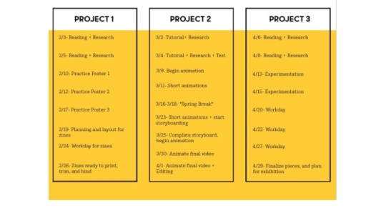
New Timeline:
W3/4-Research
M3/9- Research
W3/11- continue research, storyboard, being illustrations
M3/16-W3/18-spring break- Illustrate/storyboard
M3/23- Illustrate
W3/25-Illustrate
M3/30- finalize all illustrations and layouts
W4/1- Layout and design posters
M4/6-project 2 due- poster/ tutorials, research, and tests in AfterEffects
W4/8- short animation
M4/13- short animation, start storyboard
W4/15- Storyboard done, begin animation
M4/20-Animate Final Video
W4/22- Animate final video +Editing
M4/27 – exhibition preparation- editing/finalize pieces and plan for exhibition
W4/29-finalize pieces and plan for exhibition
0 notes
Text
Project 1- Reflection
While certainly this project got off to a rocky start, I found the over all project to be extremely helpful. Coming from a studio arts background I’m use to learning via masters copies and it’s a style of learning that works for me. Being able to breakdown the elements of a successful piece and understand how they come together to create a whole was a more direct way to understand what I wasn’t seeing before hand. I will admit with 5 posters, at times it felt a little repetitive, but in retrospect, I see that I was building up muscle memory so that by the end I was able to work though the compositions much more quickly and confidently. Do I feel like I know everything about type now? That I can have the ease with it that I see more experienced designers have? No, of course not. This was a three week project, not nearly enough time for those skills to fully develop, but I do feel like I gained skills that make me less fearful of type, and feel like I have gained a jumping off point for working with, rather than fumbling in the dark.
Final Posters:


0 notes


Text
Project 1- New Direction, Master copy posters
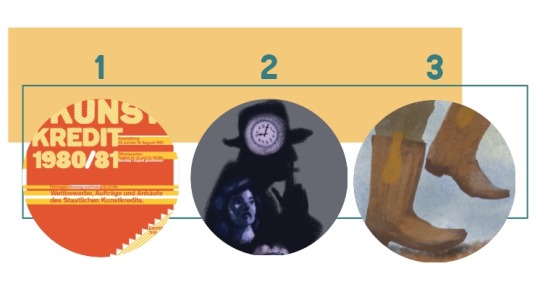
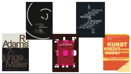
After last weeks discussion with Maurice, I’m changing tactics for project 1 and will be attempting to create perfect master copies of 5 type heavy posters designed by well known and respected graphic designers. Here are the 5 posters I’ve selected to move forward with:
1. Josef Muller-Brockman “5th Spring concert of the Acoustic Society”

2. Armin Hofeman “R.Adams, Skulptur, 7 Junge Englische Maler”

3. Philipe Apeloig “ABF, Postcard” -This is technically a postcard, not a poster, but I really like so I’m hoping I can use this as one of my 5.

4. Jacqueline Casey “Mediums of Language”

5. Paula Scher “Shakespeare in the Park 2019″

I’ve also selected two alternate posters just in case:
1. Josef Muller- Brockman “Konzerte der Tonhalle Gesellschaft Internationale Juni Festwochen 72″

2. Paula Scher “Best of Jazz”

David Carson was also suggested to me as a designer to look at, but honestly I really don’t like his work and feel much of it has aged really badly, I also wanted to include more female designers as male designers are already over represented generally.
0 notes
Text
Progress Project 1- failures and re configuring
After reading through the type books I had complied as resources I started working on a few posters, meant to serve as warm ups before the final project of a zine. I wanted to challenge myself to work on posters that didn’t have the clear levels of information that you might find in say an editorial spread or an event poster, so I choose film dialogue and poetry as the copy for my posters. For the first poster, a portion of a poem by John Donne, I tried a few a versions, but felt stuck. I could tell it wasn’t working, but the challenge of teaching yourself is it can be hard to identify what specifically isn’t working.

I talked with Kayla about the poster, as she is significantly more proficient in working with type and she pointed a few things, like orphans, widows and type size that were contributing to the problem, but it still felt off.

I decided to keep moving forward and start on a second poster, this time using dialog from the film Parasite. I had just started on this one when I sat with Maurice to talk about the project. I could see that things weren’t progressing quickly enough and that I was still really struggling with the basics like grids and hierarchy.

He suggested that perhaps my goals and plans were a little too broad for a 3-week project and that I should switch gears to something more manageable. He suggestion was instead to create 5 master copies of famous posters by designers known for their type work. This is a method that was used frequently in my undergrad program when introducing new materials, this is how I learned to use pen and ink and how I learned to oil paint, so I’m familiar with the concept and see how it can be used to help a student understand how to break something down into manageable pieces. I’m currently working to narrow down to 5 posters that are manageable and do able in the time frame given, but will still challenge me to learn more about type and dynamic layouts.
0 notes