
Statistics
We looked inside some of the posts by lizzietylee-op and here's what we found interesting.
Average Info
Notes Per Post
0
Likes Per Post
0
Reblog Per Post
0
Reply Per Post
0
Time Between Posts
3 days
Number of Posts By Type
Text
17
Last Seen Tumblr Blogs


Fun Fact
Tumblr’s website traffic is steadily declining.
Text
Fundies — Reflection
During this course I learned the basics of Illustrator, Photoshop, and InDesign. I didn’t know much about any of these programs before I started — I’d dabbled in them before but hadn’t worked on them intensively. I found the class activities particularly helpful, especially following along with Toby (like the penguin and Photoshop bird activity). I think the pace of the class was great, and Toby was really good at reiterating key information and recapping the material.
I found it was easy to get behind on my workbook for this class. I completed some of the homework tasks a long time after we’d covered the material. While this wasn’t great time management, it was useful to recap the course material and retain the information we’d learned.
I feel like I learned the most in Illustrator. I feel confident using the pen tool, drawing vector images, manipulating Bezier curves and creating swatches now. This was also really useful for my other classes. I feel like I struggled the most with Photoshop, as it seemed harder to wrap my head around. I feel like I have an okay grip on the basics of Photoshop, like how to create adjustment layers, but I would like to keep practising to feel more confident.
During the course, I enjoyed working in Illustrator the most. Our Show & Tell assignment was my favourite. I also enjoyed creating the penguin. I found the Photoshop classes the most interesting, as this was most out of my comfort zone. I found the InDesign module interesting, but I felt confident formatting text and creating spreads already. The shortcuts we learned helped me a lot in my graphic design class.
If I did this course again, I would want to spend more time working on the homework assignments. I would try to take more detailed notes, and keep on top of them as the weeks went by. I also want to work on my file management, as this rapidly snowballed out of control by the end of semester.
0 notes
Text
Week 12 — Final Book
This was my final book. When I updated the background colour it covered my page numbers, and I didn't realise until after I'd exported my PDF.


0 notes
Text
Week 12 — Exporting
Today we went over exporting, recapping PDFs, printing colour (RGB vs CMYK), and Adobe Acrobat.
⌘E — export Export .indd book as high quality PDF
We downloaded templates and opened these in Photoshop to create a mock-up. We opened our PDFs in Photoshop, and selected Crop to media box.

First we opened the smart object layer by double-clicking on it.
We imported one page, selected all (⌘A) and copied it (⌘C) and then pasted this into the smart object layer.


0 notes
Text
Fundies Final Project — Pt 4.
Next I created my endpapers. I decided to use the spots from the mittens illustration.

I designed my cover pages to match the end papers. I kept it quite simple, but added illustrations as it is a children's book. I used the same childlike typeface for the title, headings and page numbers for the same reason. This also created contrast from the main typeface, Optima, which I chose because it is simple and easy to read.


I decided to change the background of my internal pages to a colour that suited the cover and endpaper colours too.

0 notes
Text
Fundies Final Project — Pt. 3
Next I added the illustrations into my book. I created another swatch pattern for the mittens in the 'Three little kittens' illustration.


I made sure my text was snapped to the columns I'd chosen for each rhyme. I used mainly three and four column layouts for the main spreads.


Next I decided to add some colour to the background of the pages. I went for something neutral that would match all of the illustrations.
I formatted my contents page using my body paragraph style, and then I adjusted it to make the text slightly bigger. I used the same font for the page numbers in the contents as the actual page numbers to keep the style consistent throughout the book.

0 notes
Text
Fundies Final Project — Book Pt. 2
Next I drew the illustrations for my book. I decided to create vector illustrations for all 5 nursery rhymes. I traced reference images for some of the more detailed images. These were the finished results:


I created a pattern swatch for the bricks in the Humpty Dumpty illustration. This was the perfect opportunity to use the 'Brick by row' setting.


0 notes
Text
Fundies Final Project — Book
For our final assignment we had to create a 12-page book. I chose nursery rhymes for my topic. First, I found the nursery rhymes I wanted to include in my book:
Humpty Dumpty
I'm a little teapot
Three little kittens
Hey diddle diddle
Hickory dickory dock
Next, I set up my document in InDesign. I created three master pages with page numbers and 2, 3, and 4 columns. I made sure the margins were consistent.


Next I created character and paragraph styles for my text. I created one for body copy, one for headings, and one for italics, which I used for the speech in 'Three Little Kittens'.


0 notes
Text
Week 11 — Illustrator Patterns
Today we looked at creating a pattern for endpapers. This was the process:
We drew a square, and then an object for our pattern. Then we dragged this selection (the box and the bird) into the Swatches panel to create a new swatch.


We drew a shape to fill with our pattern, practising our Bezier curves once again.


This is what the shape looked like once we filled it with our pattern swatch.

Double-click on the swatch to edit the pattern settings (brick, number, position).


Next we created a hexagonal pattern. First we drew a hexagon with the pen tool, and copied the bird into the new shape by holding down option. We created a hexagon border by duplicating the shape, and holding down shift + option at the same time to resize the new shape from the centre so it was exactly aligned with the original shape.

Once we'd created our swatch, we edited the settings to 'Hex by Row' to make it appear as below.


Finally, we learnt how to edit all the objects in the pattern, instead of one bulk pattern. Select Object -> Expand to do this. You can see below in wire frame mode all the individual options are now available to edit.

We also recapped how to do this with type. (Type -> Create outlines).

0 notes
Text
Week 10 — InDesign
We began this week by going over basic book design. For a 4-page A5 book, you need 1 x A4 page for printing. Because of this it's good to create pages in multiples of 4.
For books, use facing pages. To add these after you've created a document, go to Document Setup.

We went over parent/master pages. We've been using these in graphic design, but it was good to recap. The master page can be used for applying formatting to large groups of pages, for example, columns, or page numbers.
The [none] option can be dragged over a page to apply [no] master formatting.

To add page numbers:
Add 'page 1' to master page.
Select the number '1'.
Go to Type -> Insert Special Character -> Markers -> Current Page Number.

These will display on the master page as 'page A', but will appear correctly on the actual pages. SHIFT AND COMMAND to scale both the object and the frame.


We also recapped columns again. Toby recommended using six columns to provide a grid to work from.
0 notes
Text
InDesign Keyboard Shortcuts
(T) — type tool
(W) — preview
Shift return — soft return
0 notes
Text
Week 9 — InDesign Part 2
For the next part of the class, we looked at images.
InDesign defaults to linked images (similar to how we placed them in Illustrator) so it is extra important to keep your images in a designated folder.
As the images are linked, this results in smaller file sizes too.
Add images by using File -> Place. If you change an image and need to update the link, these settings are found under Windows -> Links. Here you can update the file path, and refresh the link if needed.


When you are editing an image, you need to be careful as InDesign automatically applies a mask to the image, so it's hard to scale the image.
The key thing I learned from today was holding down SHIFT COMMAND to scale the image and mask/frame at the same time.
I have definitely run into this problem in the past with InDesign, so it was nice to know why this was happening to my images!
If you click on the centre disc, this lets you move the image within the frame. If you click on the image this will let you move the entire frame, but you need to select SHIFT COMMAND to scale the whole thing.

We looked at text wrapping images too. These options are available in the toolbar. Use the arrow keys to move the image around.
Select Windows -> Properties -> Text wrap to find more detailed text wrap options.

To change the fill/stroke colour to 'No fill' hit the / button
We filled our image into a shape by drawing an ellipse over the top, cutting the frame, right-clicking the circle, and selecting 'Paste into'.


We used 'bounding box' and 'wrap around shape' options today.

Again, I found all these settings quite similar to Microsoft Word, but it was good to put these into practise in InDesign, and pick up some helpful shortcuts along the way.
0 notes
Text
Week 9 — InDesign Part 1
This week we started learning about InDesign. InDesign is best used for large documents where you need to combine text and images, for example, a cookbook, magazine spread, or annual report.
It's important to consider visual hierarchy and alignment.
To bring up the control toolbar, select Window -> Workspace -> Advanced. There is a useful function on this toolbar to change the number of columns.

First, we created a text box using the type tool (T) and filled with placeholder text (Window -> Type -> Placeholder).
Click outside the text box before trying to use keyboard shortcuts like V and A.
Next, we learned about paragraph and character styles. I was familiar with the concept of these, as I use Word styles a lot for work.
InDesign recognises a paragraph as the text between two carriage (hard) returns. A paragraph style will effect the entire paragraph.
To create a paragraph style, select text and apply the settings you need. Then, open the styles window (Window -> Styles -> Paragraph Styles) and hit the + button to create a style. Character styles are created the same way, but these apply to individual characters or words.

In the Styles window, you can edit any number of settings. These are summarised under General.

Today we explored Indents and Spacing, Bullets and Numbering, and Basic Character Formats.


InDesign hyphenates text automatically, so this function needs to be turned off under Paragraph in the Properties tab, or under Style -> Options -> Hyphenation.
To create a bulleted list, we created another Paragraph Style. A key function here was under 'Indents and Spacing'. By selecting 'Space between paragraphs using the same style' we could change the spacing between bullet point lines.

We also learned about soft returns. By holding shift + return, this actions a soft return, allowing you to move words to a new line without creating a new paragraph.
Here are some examples of my document after adding a paragraph style, a character style, and a bulleted list. I didn't find any of this too difficult, as I am very familiar with document structure guidelines for work (sometimes it feels as though I live and breathe our style guide), although it was my first time using InDesign to do it.


0 notes
Text
FOX AND GOOSE PART 3
Next it was time to add the background circle. I used the Pathfinder tool to chop away the bits of the fox and goose that I needed out of the circle. I realise now I didn't need to cut around the fox — I could have placed this directly on top of the circle on a new layer, but it was good to practise using the Pathfinder tool.


Here's how it was looking by this stage.

Back to the pen tool. I drew in the sparkles, and practised my broken points to create the flowers. To achieve the final look, I grouped the flower shape, and duplicated it over and over to make it look like it was full of petals.


I played with the Gradient tool for my flower centre, but in the end I changed it back to a simple filled ellipse. Check out this beautiful layer labelling though!


Here is my finished results, with and without shading. I was really pleased with how it came out. This was a great project to familiarise myself with Illustrator.
I definitely feel like I made things harder for myself at times, but overall I feel really confident with Bezier curves, and the common keyboard shortcuts. I am getting the hang of the Pathfinder tool, and using the Swatches panel to create colours.


0 notes
Text
FOX AND GOOSE PART 2
Next I worked on the face details, starting with the beak of my goose. More pen tool! I am definitely getting better at drawing Bezier curves.

I used ellipses to create the fox eyes, nose, and cheeks. I realised one of the cheeks needed to be cropped to fit the curve of the fox's face. I could have drawn the shape with the pen tool, but I decided to use the Pathfinder tool to practise. It worked quite well, but it was a bit fiddly!


This was the finished result:

Next I drew the ears and mouth. I reflected the left ear for the right, but realised they weren't symmetrical, so I needed to adjust the anchor points to get it looking right.


0 notes
Text
Week 8 — Illustrator Show & Tell
Part 1
FOX AND GOOSE PART 1
I chose to recreate this image for the second part of our show and tell. I found this image on Pinterest. It was produced by an illustrator called Anna Lunak.
To begin, I opened the image file in Illustrator and lowered the opacity so I could trace the image on a new layer. I made sure to lock the background so it wouldn't move while I was working.

Next, I used the pen tool to outline the main shape of the fox and the goose. I was really pleased with how these turned out. I kept my handles short, and I kept them horizontal or vertical (where possible).


Next, I needed to separate out the white and orange colour sections in the fox. To do this, I used the pen tool to draw the arm shapes, and deleted the bulk of the body shape for the top of the head. Then I connected the head shape with the pen tool.


Now, where the magic really happens. I used the body shape, and these three shapes with the Pathfinder tool (minus-front) to isolate the orange pieces.


Then, I could go ahead and colour my goose and fox. Look at it coming together!

0 notes
Text
Week 8 — Illustrator Show & Tell
Part 1
I drew an image of a goose. Then, I marked in where I thought the anchor points and handles would go:

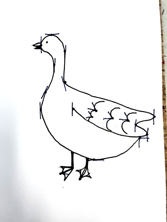
Next I opened a new Illustrator document and drew a rough outline of my goose with the pen tool. I made an effort to keep my handles straight where possible, and followed my drawing as a guide (this was actually really useful. It made it much easier to visualise where to add anchor points). This is how it was looking first go:

Next I tidied up the points using the direct select tool (A), tweaking until I was happy with the shape. I added in the wing detailing using broken points, and drew a beak and eye (ellipse).

For the final part, I created different layers for the feet and detailing. I wanted the feet to appear behind the body, so I placed this layer at the bottom. I found the feet really hard to draw, and it took me ages to get it looking okay.

I used the 'details' layer to add in the white highlights on the feet. I don't think this was actually necessary, as it was white on black anyway.


Finally, I coloured the goose to make it a silhouette. I could select the shapes and change the fill colour to black. Overall, I am happy with how this turned out. I am still not 100% happy with the feet, but I like the rest of the goose. I think I drew the shape of the neck and body pretty well, and I like the wing detailing. I enjoyed this activity!
0 notes
Text
Week 6 — Homework Task
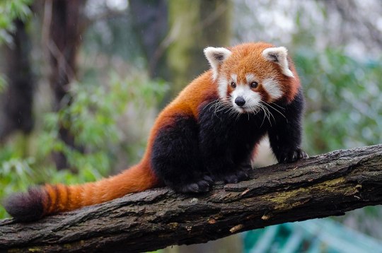
This week we had to continue editing our jumping man image, but we had to had two more clearcut elements. For mine, I chose a butterfly, and a red panda:

To start with, I opened the jpg files in Photoshop, duplicated the background layer, used the direct select tool to select the main interest, and created a layer mask. The results were actually pretty good first go:


I tidied up the butterfly a tiny bit, and fixed the red panda's tail.

Next I imported these files into our jumping man image and placed them where I wanted them. I didn't have to do much to the panda and butterfly, but I did go around the edges with the darken tool to blend it into the background a little better.

I added adjustment layers to the jumping dude, as the original photo had a lot of red in it. Using Curves, Colour Balance, and Hue/Saturation, I was able to bring the redness down. This was my final result:

As you can see it's quite green, but I wanted it to look very jungle-like. I found this exercise helpful, although I'm still finding it tricky to make clear cut images look genuine and not 'pasted on'. I think using some more blending tools and adjustment layers would help — and more practice!
0 notes