
Don't wanna be here? Send us removal request.
Statistics
We looked inside some of the posts by lrcnyc-blog and here's what we found interesting.
Average Info
Notes Per Post
0
Likes Per Post
0
Reblog Per Post
0
Reply Per Post
0
Time Between Posts
6 days
Number of Posts By Type
Photo
1
Text
16
Last Seen Tumblr Blogs


Fun Fact
Mobile Tumblr US users spend an average of 4.04 minutes per session on the app.
Photo

*** SORRY I am having a Hard time rotating the photo***
From the Exhibition: The collection, painting sculpture department 4th floor
At the: MOMA
Courtesy of: The Andy Warhol Foundation for the Visual Arts, 1994
Artist: Andy Warhol (1928-1987)
Title: The Last Supper 1986
Material: Synthetic polymer paint on canvas
Size: 9' 11 1/4" x 21' 11 1/4" (302.9 x 668.7 cm)
Surface Qualities: same texture of paint against canvas
Color: black, white, blue, red and pink
subject: A take on Leonardo da Vinci’s the last supper but have recognized logos such as GE, Dove and a cent stamp
location: 4th floor of the moma
Intended audience: Museum Goers
emotional effect: Having an iconic painting such as Leonardo da Vinci’s last supper coincide with iconic brand names. This makes the audience feel as if they truly know the photo because it is this that they are relatively easy to understand the implicit meaning
This late work of Andy Warhol’s is displayed on the 4th floor of the moma placed along with other pieces 50′s work that aligns more in the 80′s into the 00′s. This can be compared to the other collection gallery on the 5th floor with other art pieces like Monet and Van Gough since Andy Warhol is an iconic painter and soon enough his name can be compared to these great artists especially for artists in the 20th Century. But this is similar to a steal like an artist kind of rendition because this is da Vinci’s work, as well as the ads used in this, are made by artists that were not Warhol.Obviously, the other collection artists on the 5th floor would have not taken an attempt like this especially since this style of art was not popular 100 back.
This can also be compared to the fashion exhibit on the 6th floor especially if you want to take a look at the graphic tees. Some of the tees are types of art taken by other artists which are copied and pasted onto clothing similar to the way Warhol copied and pasted the last supper and the GE and Dove logo. The graphic tees do not display a message a copy of the Nirvana or mickey mouse does not have an exact meaning or message it is just a brand people would wear not something you have to think about.
The American surfaces and photobook on the 3rd can be compared to this by the style of photos can be similar because a lot of the photos that were taken outside in regular towns which displayed ads and pieces of work people know such as a gas station and a war and peace shirt. But these are photos and the last supper is a painting made by hand and making paintings has more of an intricate thought process compared to photographs.
0 notes
Text
Hockney vs. Modigliani
If I had to compare David Hockney’s work from anything we have seen this semester it would probably be Amedeo Modigliani. I feel like this would be the easiest comparison to do due to the fact that both artists had their own shows showing there life’s works and progression as artists. Both artists have gone through different phases in their careers, for example, Hockney went to make more realistic art taking place in his Long Angles and English home’s in the 1970′s to make more abstract landscapes 20 years later. Modigliani made more European styled portraits in the beginning of his career later he began making Egyptian inspired sculptures and portraits. It is ironic that these two men can be so similar due to that Hockney has over 50 years of work on display but Modigliani died at age 35 only making art for only 15 years. This shows that Modigliani was, in fact, a madman making so much work that you can see a growth and progression so fast. With Hockney, his phase’s took longer to develop but with that being said he could have focused more on his style of work versus Modigliani who just made art whatever he was feeling in that very moment.
0 notes
Text
David Hockney #1: Portrait of an Artist

From the Exhibition: David Hockney
At the: Metropolitan Museum of Art
Courtesy of: The Lewis Collection
Artist: David Hockney (born 1937)
Title: Portrait of an Artist (Pool with two figures) 1972
Material: Acrylic on canvas
Size: 214 x 305 cm
Surface Qualities: textures produced by paint
Color: Blues, Whites, Salmon, Brown, Tan, Green and Purple
Subject: Clothed Man sees himself in pool but only with underwear on
Context/Location: 2nd floor of the met inside the David Hockney exhibit
Intended Audience: Museum Goers
Emotional Content or Effect: Seeing yourself in a different perspective one second you are looking over a pool then you are in the pool. It is representative how David Hockney wanted to move to LA when he became more successful and he watches others go down to LA and then he sees himself In that pool once he became successful.
The late 60′s to the early 70′s resonated with me the most out of David Hockney’s eras of his work. It is amazing that he changed up his styles and influences so much throughout his career but every era is successful in different ways. I love what he does during the period when he first moved to La in the late 60′s. The photos look extremely realistic as he adds every detail he tried more of a realistic approach in his work versus abstraction which he used previously and then again later in his career. When I saw Portrait of an artist I resonated because Hockney makes you feel like you are in the same location of the photo. I felt I was transported to early 70′s LA, I never been to LA nor was I around for the early 70′s but I felt how the setting would exactly feel like despite not being there. The way he paints just catches people’s eyes since the colors and the styles he used makes someone feel they are in a different city and time period where they actually are. I love that time travel effect this has because time travel has not been invented yet nor it probably never will be. Art forms are the closest thing we have to time travel its easier for TV and Film to transport you but a painting to transport you is a harder thing to do, and David Hockney successfully does that in this period especially in Portrait of an Artist.
0 notes
Text
Art Assignment : Never Seen, Never Will
I have never seen the Terracotta Army and I probably never will but with the help of wikipedia I will give a brief history of this great work of art. The Terracotta Army is a collection of terracotta sculptures depicting the armies of Qin Shi Huang, the first Emperor of China. It is a form of funerary art buried with the emperor in 210–209 BCE whose purpose was to protect the emperor in his afterlife. The Terracotta Army was discovered on 29 March 1974 by farmers digging a water well approximately 1.5 kilometres (0.93 mi) east of the Qin Emperor's tomb mound at Mount Li (Lishan),a region riddled with underground springs and watercourses. For centuries, occasional reports mentioned pieces of terracotta figures and fragments of the Qin necropolis – roofing tiles, bricks and chunks of masonry.This discovery prompted Chinese archaeologists to investigate, revealing the largest pottery figurine group ever found in China.
I find this so fascinating because something so massive was not found until 43 years ago. How and why did it take this long? Though it was dug up from the ground how could no one in China realize what was actually there? It's like if something about a country’s culture was hidden without anyone knowing it but literally stepping all over the ground not knowing what is hidden underneath. But China was a mysterious and low context culture so It is not surprising something like this would happen in China.
Every soldier is made differently representing each soldier's feature and individuality which is strange coming from a culture that was and is known for embracing collectivism. Even in a unit every person is unique, which reflects to a person that they are in fact also unique and not a part of some sort of machine which adds to its artfulness. It is unfortunate that this beautiful piece of work I will probably never see in my lifetime but I can just picture what each and every soldier would look like

0 notes
Text
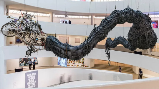
Art and China after 1989 in the Guggenheim
For this exhibition that really appealed to me is that it was taken place at the Guggenheim. It felt like as if the museum was a part of the show, I felt like a lot of the Chinese style really coincided with the way the museum was built. The way the Guggenheim was built and the way the birdsnest was built they have similarities since the shapes are circular and not your typical kind of architecture. I felt going through this show just walking through history then realizing I went two stories up from the ground the way that the museum is built makes the movement to 7 floors so peaceful and calm. If this show was at the Met or any other NYC museum I feel like it would be less interesting for the museumgoer and make the goer would feel less involved in the show.
0 notes
Text
Guggenheim museum : Just What is it that makes Today’s Home So Modern, So appealing?

From the Exhibition: Art and China after 1989: Theater of the World
At the: Solomon R Guggenheim Museum
Courtesy of: Yu Youhan and ShanghART Gallery
Artist: Yu Youhan ( born 1943)
Title: Just What Is It That Makes Today’s Home So Modern, So Appealing?
Material: Paper Collage
Size: 47 x 45 cm
Surface Qualities: Magazine texture made by paper
Colors: pink, tan, blue, black, red, brown, green and yellow
Subject: A paper collage of a house taken place in modern day China
Context/Location: 3rd Floor of the Guggenheim located in the left-hand corner of another larger exhibit
Intended Audience: Museum goers
Emotional Content or Effect: The effect this piece has is that it shows what the modern home in China not only looks like but also feels like due to popular culture taking place in this modern era.
I choose to talk about this piece because I feel the connection this piece has to modern China. Everything in the collage looks modernized despite Mao being in the middle, the lady in the back ( I don't know who she is but she may be someone relevant in China) and also the television with the news on also brings in this modernization in the photo. I really love how Mao Zedong is literally in the middle of the living room taking up most of the space in this picture. This represents his huge impact on China even around 25 years after he passed away.There is a lot going in this photo it takes a lot to really realize what is exactly in the photo I feel as if Mao takes up most of the attention in the photo which is ironic because when Mao was alive everything was revolved around him since he was a powerful dictator. Though this time in Chinese history is over his impact is still relevant in the modernization of China.
0 notes
Text
Steal like an Artist part 2
1. Stranger Things is my favorite TV show at this very moment, though it is popular and almost everyone watches it this show resonates too me more than the average person. When I started the first season I was in a tough spot in my life going through a breakup with my high school boyfriend. This show reminded me of everything I truly love visually, narratively and aesthetically in film. Being a film major prior to this show one of my biggest inspirations for heading into my industry is 80′s film and tv especially films like ET, Goonies, Gremlins and Star Wars. Everything about this show is perfect to me and it means so much more than just a show it is a true inspiration in what I want to do in the future.

2. The Red Hot Chili Peppers 2002 album, By The Way, was the first album I truly fell in love with. When this album came out I was obviously a little kid. My parents really showed me how amazing RHCP is, as a child we took a lot of road trips to Montauk, The Outer Banks, and Vermont. Especially going to the Outer Banks I would get nervous traveling so far from home, having an anxiety disorder my nervousness would double than the average child. My parents would always play this album it was the perfect storm because half of the songs were slower and the other half is upbeat, even when I'm nervous sometimes upbeat music makes me feel better. I still listen to this album regularly especially when I am upset this is just the ultimate album that has to be on any playlist of mine.

3. About 3 years about I fell in love with the legend David Bowie about 9 months before he passed away. I decided to give Bowie a try when I got sick of listening to Katy Perry and pitbull almost every day. I decided to get into more classic rock and pop, David Bowie is an amazing combination of both. His life story is something incredible especially during his height of fame in the 1970′s the photos were taken of Bowie and his eccentric style really turned me on to the concept of contemporary art. His music really changed my life, who I am and how I see this today.

4. This is my favorite street Manhatten, just minutes away from Pace in Tribeca. When I was visiting Pace college hunting walking in the area after my tour I found this street, I thought the name Duane was hilarious because there is an online meme I am obsessed with a dancing blonde hair kid name Duane. Even today passing the street either on my way up to Tribeca or to Chinatown I would always have the dumbest grin on my face while screaming “Duane” everytime I pass it.

5. My favorite musical of all time and my favorite movie as a child was Annie. I do not think I would be the person who I am today without it, especially heading into my industry and even being an obsessed theater kid in high school. I think the plot of Annie and the entire script is simple, perfect and easy to comprehend for a young girl. I would watch the movie 1000′s of times and even reenact it in my room. I did not have many friends as a child so Annie made me feel like I actually had something worth living for also lifting my spirits when I needed it the most. This show is my definite safety blanket and my ultimate guilty pleasure.

6. For me, memes are an art form and this is the meme that started it all for me. Most meme trends die out within weeks making it more of a fad. But Hey Scotty Jesus Man is my personal hood classic. I found it in 2012 going into my freshman year in high school I don't know why but I play it over and over again at least once a month. Something about it makes me laugh so much, cheesy 90′s religious films are definitely a hilarious aesthetic. 90′s straight to VHS films are aesthetic, especially how grainy the film’s look, that is a kind of style I am obsessed with. This is a meme that will be played at my wedding and funeral, Hey Scotty Jesus man is my life.

7. Penn Station is important to me because this is my connector from my city life to my home life. This was the start of me visiting NYC at age 16 alone without my parent's supervision, this was a huge step for me especially having stricter parents growing up. My travels would always be to time square since its 10 blocks from Penn but once I started college and got more familiar I went all over Manhatten, but whenever I need to go home or pick someone up from Long Island I would always find myself at Penn Station.

8. This is the Walt Whitman Mall approximately 5 minutes from the house I grew up in on Long Island, this place has so many significant memories for me. I would always be here as a child, then as a middle schooler going on awkward dates or awkward hangouts with friends then in high school going to the mall to actually shop then eventually working at two locations at the mall. This place was the epicenter of my hometown where everything happened. In 2013 the mall reopened with brand new renovations and a stunning statue of Walt Whitman (his birthplace is directly across the street from the mall). My town is famous for a poet being born and to make money off of that, of course, they would build a mall around this area because this is America and America loves capitalism.

0 notes
Text
Steal like an Artist part 1
Steal like an artist I found as a very relational text not only for this course but for my life as well. This is very different to Believing is Seeing since this text was solely based on art and nothing beyond that means the thing I would compare the most on the texts is how style is being used but interpreted differently. During the Renaissance a lot of these artists used similar themes especially regarding religious aspects, for example, Michaelangelos take on religion in art is very different than Leonardo Divinci’s. Also, Andy Warhol did this in his pop art taking brands he knew and putting his own spin on it. The use of mixed media is another aspect of taking other pieces in making it your own we saw this in Jersey City this Tuesday.
This very well inspired me as a film major because I have ideas but I never put it down yet but the way I think and show my creativity I borrow from different media, style, and aesthetics that I like. This past summer I made music on my Bandcamp mixing music I made with my friend and using audio ripped from youtube. It was a weird interpretive experiment I tried but it was what I wanted to create at this time. While making an album cover my friend suggested me to make my own album using my own artwork with my hands and paint. I decided against this because I love using photos and media particularly from things between the 1960′s to the early 00′s either if its advertisements, movies or film. The thing that was most relevant in my head during this creative process was the 1980 Gene Wilder and Richard Pryor film Stir Crazy. I decided to take a still image from the film of both Wilder and Pryor and began to warp and edit the photo myself to add my own interpretation on the photo and also relating the feelings added for my experimental album. This relates to the text from taking other media and making it my own which is the kind of artwork I personally love to make in my free time.

0 notes
Text
My Mmuseumm Experience


At :Mmuseumm
Current exhibitions at Mmuseumm 1: ISIS Currency, The Fake U.S Fast Food Franchises of Iran, Personal Objects of Immigration, Donald Trump: The Message is the Medium, The Life of Sir Dr. Yoshiro NakaMats, Lineage of the Body Bottle, Corcraft ProductsThe Cornflake Taxonomy,2015: A Year in Cookies, Objects Designed for the Blind, The Last Text Message Received, Nothing, Embalming Accessories, Not Bombs, The Bad, The Good, The Ideal, Modern Religion, Fitting In, Looks can be Deceiving: Unintentional Heroes, Looks can be Deceiving: Unintentional Villians, Green &Clean and why so cheap.
Located: In an unused elevator shaft on Cortlandt Alley, New York, NY 10013
Intended audience: Museumgoers and anyone interested in the avant gaurde style of journalism.
Emotional effect: How simple objects can be put on display and shown as pieces of object journalism.
This was by far one of the strangest experiences not only in my academic career but also in my personal life as well. When we walked into the alley it looked like one of those sketchy alleys people would do illegal drugs as similarly like dutch street right next to my dorm. When the museum curator with his fancy mustache walked in and opened the door of this “museum” I was legitmently confused and somewhat freaked out. It was a an old unused elevator shaft just filled with random objects. At first, I was extremely confused especially when I saw a wrapper of taco bell I said to myself “How is this art?” At first, I felt ripped off and personally did not understand this museum at all. Later I realized every shelf had a different explanation and why it was there. My most notable favorites Include the Unintentional heroes, unintentional villians, Why so cheap? and the Fake US fast food franchises of Iran. The fake fast-food franchises of Iran I do consider art because someone had to design the boxes to look similar and make a concept art to the boxes of happy meals from McDonald's, Starbucks and Hardees/Carls Jr. I am taking graphic design this semester so someone had to create the typography for the boxes matching the same style of text to these big US franchises. Later when the curator was talking and explaining each of the little exhibitions each shelf had the more it clicked and the more I ended up actually loving this museum. As a communications major and also being a fan of the arts this really connected with me since this was object journalism in my point of view I saw this as a cross breed of journalism and art. Stories can be told by objects which is the biggest concept I took away from this museum. In my lifespan, I probably will never experience another exhibit or museum like this so I found this as an amazing experience which I know I probably will not experience again since Mmuseum is so unique and unlike anything else.
0 notes
Text
The Red Cube

Located on: 140 Broadway
Artist: Isamu Noguchi (1904-1988)
Title: Red Cube (1968)
Materials: Welded sheet steel, polished aluminum
Size: N/A
Surface Qualities: One smooth steel texture around the cube.
Color: Red
Location: in front of 140 Broadway, between Liberty and Cedar Streets.
Intended Audience: Anyone passing by Broadway.
Isamu Noguchi’s Red Cube is a giant red cube just blocks away from the world trade center. The Cube is in front of a typical New York City Building. This is fascinating due to the location because why would a giant cube with a hole inside of it be in front of a random building in lower Manhatten. It is as if Noguchi wanted your typical businessperson or tourist to stop and take a look at it for a couple seconds before heading to their destination. For some people the first thing people see in the hole maybe signifying that this is a die, but for me, I see all of the red and the cube dimension surrounding the whole. I really like how Noguchi uses red because it really catches the attention of the typical passersby. The cube is also on a diagonal in which everyone can see all of the cube while most sculptures you can see only see the top not what is underneath.
This can signify that you are one person in this giant busy city you are the hole and the red is everything around you moving around not staying in one place since it is on a diagonal.
I think the location was the most successful part of the piece If this was more in a low key area or another city but especially in a hustle bustle area where the person is feeling more of the surrounding and not the dot.
0 notes
Text
Chelsea similarities and differences


From the Exhibition : Ruth Asawa David Zwirner/ Ghosts and UFOS
At The: David Zwirner/ Luring Augustine
Artists: Ruth Asawa/ Tom Friedman
Context/Location (Hall, Office, Subway, Park, on ceiling?): Ruth Asawa 2nd floor of the David Zwirner on 20th street/ Tom Friedman’s Ghosts and UFOs is located on west 24th street.
Intended Audience : Museum and gallery goers.
In the different art galleries, we saw in Chelsea we saw many different kinds of shows that have different types of contemporary art. Two of my favorite was the Ruth Asawa show and the Tom Friedman show. On the surface you can tell by the photos that the styles are very different Friedman’s art is based on ghosts and ufo projection’s the whole show were different projections. The Ruth Asawa show were mostly sculptures made of looped wire. These types of methods completely different , also noting the fact that Asawas’s art took place around 60-40 years ago while you can tell that Friedman’s art is brand new due to the way that the show was made and a fact he had a piece of the projections of the different Presidents that including our new President Donald Trump. Both of these pieces do not take place on a typical canvas or even a typical sculptures that require a stand to put the piece on instead they are both free hangings and take up a lot of the open space in the gallery. This relates back to readings because the author does explain throughout the book what makes something art and something, not art. These shows are both a unique and abstract take on art that does not require a paintbrush pencils and canvases per say but using a whole new medium to make something that can still be considered under the umbrella term of “art”.
0 notes
Text
Head in profile
From the Exhibition: Modigliani Unmasked
At the Jewish Museum
Courtesy of: Laure Denier Collection, Paul Alexandre Family: courtesy of Richard Nathanson, London
Artist: Amedeo Modigliani (1884-1920)
Title: Head in Profile 1911-12
Material: Black Crayon on paper
Surface qualities: rough crayon on drawing paper
Color: white, grey and Black
Subject: an Egyptian like profile of a head
Location: 2nd floor of the Jewish Museum 3rd room of the exhibit
Intended audience: Museum Goers and Art Historians
In the third room lined up with a bunch of other Egyptian head drawings this drawing, in particular, caught my eye the most. I absolutely love how he really sketched enough in the back of his head to make this shadow effect which he did not do for the previous similar sketches of the heads. I really love when artists do this to make a gritty like drawing but also making a shadow for the photo which I felt like was the exact intention Modigliani had for this drawing. Looking through the museum His process is he has one type of concept and changes it to see what the other outcomes or styles would look like.

0 notes
Text
Jacques Lipchitz Death Mask of Amedeo Modigliani
From the Exhibition: Modigliani Unmasked
At the Jewish Museum
Courtesy of: The David and Alfred Smart Museum of Art, The University of Chicago, Bequest of Joseph Halle Schaffner in memory of his beloved mother, Sara H.Schaffner
Artist: Jacques Lipchitz (1891-1973)
Title: Death Mask of Amedeo Modigliani 1920
Material: Cast Plaster
Size : (8 3/4 x 5 15/16 x 4 1/2 in.)
Surface qualities: rough plaster cast from Modigliani’s face
Color: white, grey
Subject: The mask of Modigliani's face right when he died to show viewers what he looked like
Location: 2nd floor of the Jewish Museum last room of the exhibit
Intended audience: Museum Goers and Art Historians
This part of the show was so fascinating to me because all of the sculptures he made were very Egyptian like. I found this somewhat eerie is because this was what the artist of this show actually looked like. It was as if his casket was in the actual exhibit among all of his artwork. I enjoyed how they put this in the last room of the museum because no one really expected this at the very end and it's something the museum-goer really sticks out in their mind after the show.

0 notes
Text
Criminal Being Executed

From the Exhibition: Delirious
At the Metropolitan Museum Breuer
Courtesy of: Blanton Museum of Art, The University of Texas at Austin, Gift of Mari and James A. Michener,1991
Artist: Peter Saul (1934)
Title: Criminal Being Executed 1964
Material: Oil on Canvas
Size : 75 × 63 1/10 in
Surface qualities: slick oiled paint on canvas with the same type of texture throughout the painting.
Color: purples, reds, yellows, oranges, blues, and greens
Subject: Showing the madness of American execution in this loud painting.
Location: 4th floor of the Met Breuer in the very center of the last room
Intended audience: American Museum Goers
Emotional Content or Effect: That the cartoon being executed looks helpless and is forced to be put on death row by this Donald Duck character. The colors Saul uses really pops out at the viewer even having the viewer have a deeper connection with the painting.
I chose this painting to put on my blog because part of me loves the cartoonish styles, the texts and especially the art style and color. But I do not like the message being used in this painting that really takes away for me. I believe that execution in prisons under certain circumstances is 100% necessary. I feel if you did a heartless crime you should be put on death row for that. I can see Saul's different point of view but it's something that is near and dear to me which I think should be necessary for our corrupt society. If the message was more abstract and less blatantly obvious this could have easily been my favorite piece in the exhibit.
0 notes
Text
Structural play : Sex

From the Exhibition: Delirious
At the Metropolitan Museum Breuer
Courtesy of: the artist P!, and Simone Subal Gallery
Artist’s Name: Brian O’ Doherty (1928)
Title of Artwork: Structural play: Sex
Date created: 1968
Material: Paper and Pencil
Size: 5x5 grid
Surface Qualities: flat paper with grid drawing and text.
Color: Black and white
Subject: This systematic structural play on the sheet of paper is based one or more phrases structured like a dialogue and are inscribed from A to B on the left and right sides of the paper.
Location: 4th floor of the Met Breuer in the Second room on the right side.
Intended Audience: Any contemporary art goer
Emotional Content or Effect: O’Doherty shows how the structural approach from A to B and the dialogue in each photo how each scene can be easily played out and pictured in the intended audience’s head
Personally, this was my favorite piece in delirious I really caught myself staring at this piece the longest playing out the scene from A to B beginning to end.
0 notes
Text
Fearless Girl
located on: Broadway & Morris St, New York, NY Courtesy of : State Street Global Advisors Title of Exhibit: Fearless girl Artist: Kristen Visbal (born 1962) Title of Artwork: Fearless Girl March 7, 2017 Material: Bronze Size: 50 inches (130 cm) tall[1] Surface Qualities: Made of bronze similar texture throughout the sculpture Her hair has different texture than the dress or her skin Color: Bronze Subject: A small latina girl looking fearless among wall street. Context/Location (Hall, Office, Subway, Park, on ceiling?): Broadway & Morris St, New York, NY Intended Audience (why is this institution showing this here now?): The Fearless Girl is for everyone since its in the middle of the street. Emotional Content or Effect: The Fearless girl shows that women big or small can make it in this country. It shows true empowerment for women and young girls Other Observations: The Bull is very popular among the tourists of NYC.

0 notes
Text
The Charging Bull
located on: Broadway & Morris St, New York, NY Courtesy of : Arturo Di Modica Title of Exhibit: Charging Bull Artist: Arturo Di Modica (born 1941) Title of Artwork: Charging bull December 15, 1989 Material: Bronze Size:11 feet (3.4 m) tall & 16 feet (4.9 m) long Surface Qualities: Made of bronze same texture throughout the sculpture Color: Bronze Subject: The bull is charging through wall street. Context/Location (Hall, Office, Subway, Park, on ceiling?): Broadway & Morris St, New York, NY Intended Audience (why is this institution showing this here now?): The Bull is for everyone since its in the middle of the street. Emotional Content or Effect: The Charging Bull shows how powerful New York and America is. It also shows how strong of a capitalist country we are. Other Observations: The Bull is very popular among the tourists of NYC.

0 notes