multifandom artist • he/him • 20yo • !!! page may contain blood/gore/suggestive themes !!! commission status: closed!more info: https://lunehowls.carrd.co/
Last active 60 minutes ago
Don't wanna be here? Send us removal request.
Text

this is what you get
3K notes
·
View notes
Text


frostbite
4K notes
·
View notes
Text

what if they did this
2K notes
·
View notes
Text

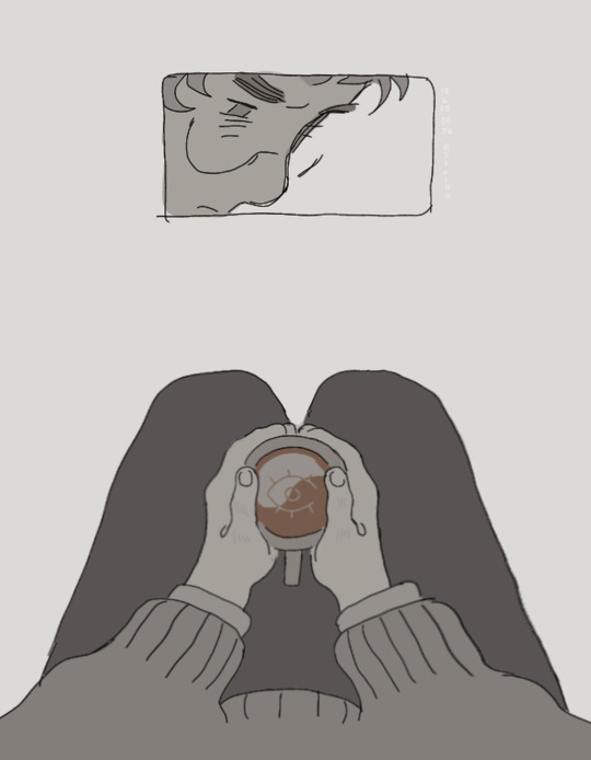
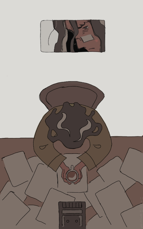
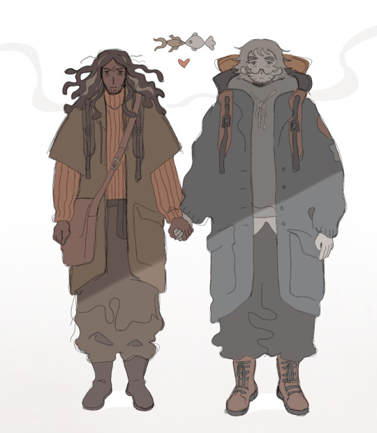
They are done Beholding, now they are just being held <3
Bonus art under the cut:


Nils Holgersson my beloved
(Base credit to _sexy_pan on Twitter for the second one)
2K notes
·
View notes
Text

lost
#tma#the magnus archives#jmart#jonmartin#teaholding#jonathan sims#martin blackwood#i love their bickering so much
3K notes
·
View notes
Text

dog wants shish kebab
#tma#the magnus archives#jmart#jonmartin#teaholding#jonathan sims#martin blackwood#what if they kept the dog
2K notes
·
View notes
Text

nuzzle
3K notes
·
View notes
Text
this is so bad, I need to (remembers suicide jokes worsen my mental health) be distributed by rusty quill under a creative commons attribution non commercial share-alike 4.0 international license
7K notes
·
View notes
Text


i love when he mutters to himself
7K notes
·
View notes
Text
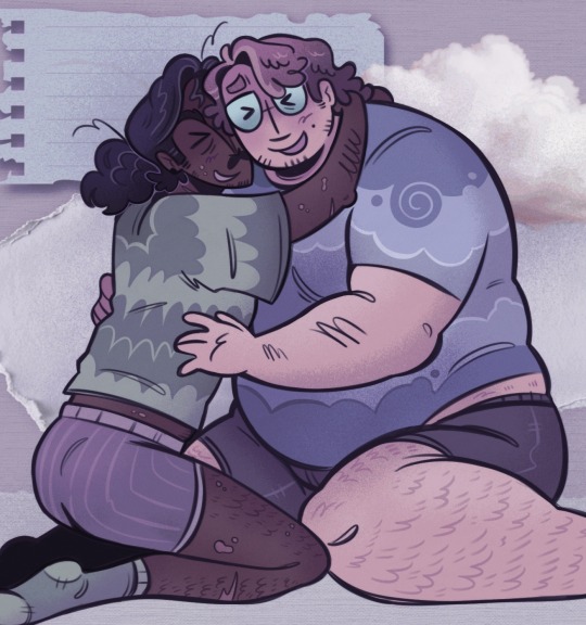
100 servings of jmart slop come and get it.
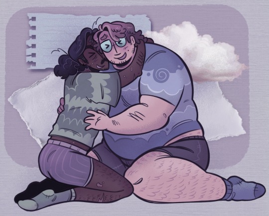
full uncropped version
3K notes
·
View notes
Note
hello! I was wondering if you have any tips or are willing to share your process of compositioning (is that a word) the panelling for your comics? (basically how to you choose the size and placement of the boxes) this is something I struggle with and your art is gorgeous so please bestow upon me your wisdom, thank you!
hihi!! thank u for asking me! apologies in advance for the ramble that will be my answer whenever i plan a comic, i usually already have the idea for how it should look in my head. sometimes it doesn't turn out 1 to 1 with what i imagined, but having it down mentally first definitely helps! when actually executing the idea, i try to make sure to utilise the space on the canvas effectively. areas where boxes aren't necessary can contain text bubbles to fill in the empty space. for more clustered comics, i.e., this one, it's also important to make sure text bubbles don't eclipse characters, as they are usually the primary focus! as for the size of the boxes themselves, my planning can get pretty sporadic as i typically aim for what looks best visually before i even sketch in the characters themselves. sometimes i will place a rectangular box with the intention of fitting two characters into it, and then realise later that they could fit more pleasantly within a square box instead. personally, i find treating the boxes as if they're bricks helps visualise the shape and composition needed to keep the reader's eye going in the right direction. at the end of the day, experiment and see what looks best to you! and it's always okay to see how other people place their panels and take inspiration ^_^
73 notes
·
View notes
Text
This has absolutely been done before but hey!!!! Here’s another!!!! Yay!!!!!
Anyway companion piece coming (hopefully) soon

4K notes
·
View notes
Text


prematurely greying
13K notes
·
View notes
Text

catching up
4K notes
·
View notes
Note
WEEPING I LOVE THE WAY YOU DRAW MARTIN AND JON BOTH DJHKSKHSJHGAHHHH Curiously, would you mind other people drawing your designs of them or taking inspiration off of them? They are SO cute, I was wanting to draw them the way you did! It's okay if not though, totally understand :] !! <3
thank you so much ahhh!!! i don't mind when people take inspiration/draw my designs at all! it makes me happy whenever people like my designs enough to incorporate details from them into their own designs :D thank you for asking!
129 notes
·
View notes

