
Don't wanna be here? Send us removal request.
Statistics
We looked inside some of the posts by makingthecolorgrade and here's what we found interesting.
Average Info
Notes Per Post
2
Likes Per Post
2
Reblog Per Post
0
Reply Per Post
0
Number of Posts By Type
Text
1
Last Seen Tumblr Blogs


Fun Fact
Forty percent of Tumblr users are between the ages of 18 to 25.
Text
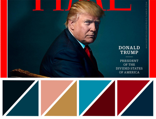
Trump’s Kodachrome of the Year
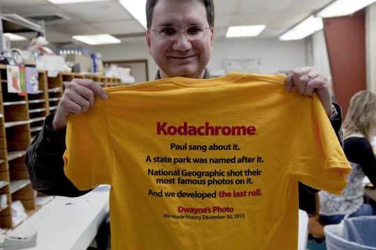
This year Time magazine put Trump on the cover as their man of the year (shot by Jewish Photographer Nadav Kander.) The first thing that struck me was the familiar color grading. The thalo green. The kodachrome.
It didn’t take me long to find an article vividly articulating the implications of these artistic choices.
“Notice how the colors appear slightly washed out, slightly muted, soft. The palette creates what we might call a vintage effect. The image’s sharpness and detail reveal the contemporaneity of the picture, but the color suggests an older type of film, namely, Kodachrome. Kodachrome, the recently discontinued film produced by Kodak, was designed to create accurate color reproduction in the early 1900’s. It was immensely popular between the late 30’s and 70s, and its distinctive look defines our common visual concept of nostalgia.
By reproducing a Kodachrome color palette, the Time cover makes us reimagine the cover as if it were an image from the era of Kodachrome’s mass popularity. (Where your mind goes when thinking about leaders from the era of World War Two, segregation, and the Cold War era is up to you.) This visual-temporal shift in a sense mirrors a lot of the drives that fueled Trump’s rise. Trump ran a campaign based on regressive policies and attitudes — anti-environmental protection, anti-abortion, pro-coal, etc. This election was not just about regressive policy choices, but also about traditional values (defined primarily by the Christian right), about nostalgia for American greatness and security, about nostalgia for a pre-globalized world.”
Read more: http://forward.com/culture/356537/why-times-trump-cover-is-a-subversive-work-of-political-art/
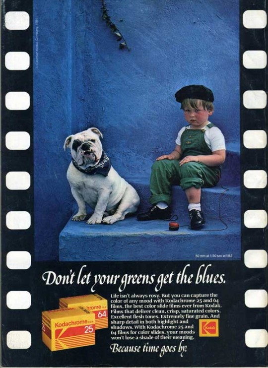
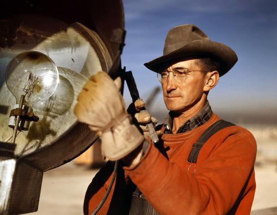
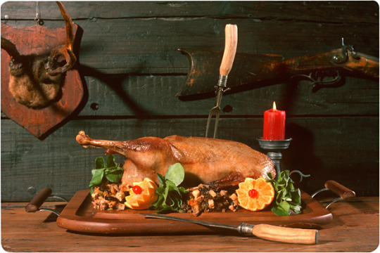
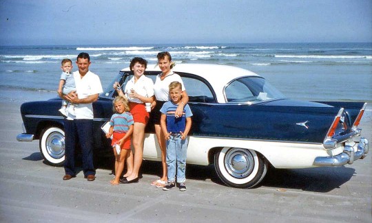
In my opinion the hallmarks of kodachrome are:
Insane reds which can seem almost poster flat and lacking dimension. They often pop off the composition in an unnatural and stylistic way.
Muted overall with pops with all blues being pushed towards cyan/Thalo
Excessively rich contrast.
Yellows inch towards mustard.
Rich warm image.
An overall sharpness of image with shadows travelling swiftly to black.
Here is a short 10 minute documentary on Kodachrome. It gets pretty nerdy.
I would be remiss to not mention that Paul Simon made a song dedicated to Kodachrome.
Kodachrome They give us those nice bright colors They give us the greens of summers Makes you think all the world's a sunny day I got a Nikon camera I love to take a photograph So mama don't take my Kodachrome away
2 notes
·
View notes