
Statistics
We looked inside some of the posts by mariyavasilkova and here's what we found interesting.
Average Info
Notes Per Post
29
Likes Per Post
29
Reblog Per Post
0
Reply Per Post
0
Time Between Posts
2 days
Number of Posts By Type
Text
17
Last Seen Tumblr Blogs


Fun Fact
Users from the US are the majority of Tumblr visitors.
Text
Life Color Post Week 16:
I can’t believe this is the last color post of the semester!


Alright so the first picture is from the same pub in the post for week 15. I just love all of the colors of the flags, flowers, all the decor, and the crest shields! They’re all so vibrant and happy and it looks like such a cute little pub!
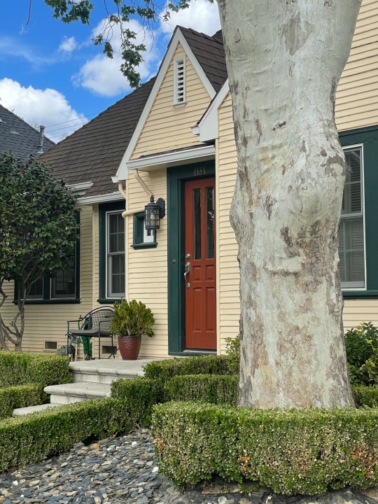
I made 2 color palettes this week because it’s the last life color post but also I wanted to see both of these as color palettes! Both of these houses and the plants around them were so cute. And look at that beautiful cat! Such a chill cat, he was just laying there enjoying the warm weather and all of the beautiful nature around him. What a vibe.
1 note
·
View note
Text
Life Color Post Week 15:


The first picture is of the sunlight rays shining through my Arizona iced tea and I thought it looked glorious so I snapped a quick picture. The colors also look so rich.
The second picture is from a walk I went on with my sister and friend. We were passing by a pub and I really liked the look of this poster especially on the emerald green wall.
The third is from the same walk. We passed by this pretty house and I loved the color palette of it. I actually took this picture with the intent of putting it in the color palette generator and I love how it looks!
1 note
·
View note
Text
Question of the Week #15:
What art is most challenging for you? Why?
I find that painting is the most challenging for me. It just feels so foreign because I hardly ever paint. In fact, before this semester, I probably haven’t painted since I was in elementary school. However, I have been painting quite a bit this semester and I have actually really been enjoying it. Paint is just so different from pencil and paper or digital art, so it’s just something I’m completely new to.
What makes an artwork good or bad?
This is completely subjective to each individual. There are plenty of artworks that I just quite honestly think suck but there are collectors out there paying millions for that artwork. Then there’s art that I find beautiful and it’s hardly recognized by others. To each their own.
1 note
·
View note
Text
Life Color Post Week 14:


The first photo is a screenshot from an album by Coast Modern. I was drawn to the illustration and color use so I screenshotted it for future inspiration reference.
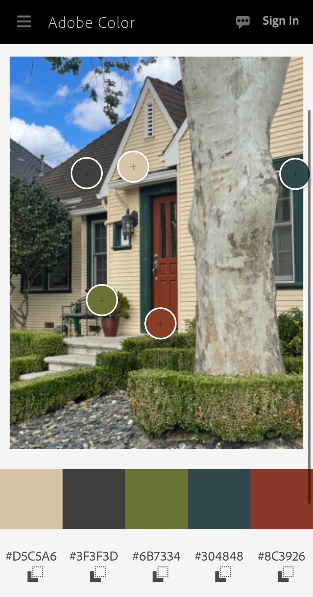
The second photo is of a chair standing on display at Ikea. I finally got to go to Ikea for the first time in like 2 years and it was so nice to be back. This chair really stood out and the yellow was just so bright and popped against the grays of the warehouse.
The third photo is another vase of flowers. Surprise surprise! The way the light was hitting these roses was cause for a little photoshoot of the bouquet. Also these roses are from my front yard! I found that out later that day when my mom told me. I thought they were store bought!
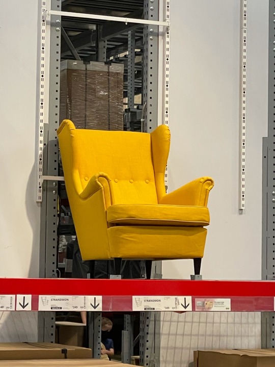
Fourth photo is a beautiful fabric headboard I saw on Instagram. It’s such a beautiful print and I’m in love with those colors, so naturally I made a color palette :) this too will be added to the inspiration archives
2 notes
·
View notes
Text
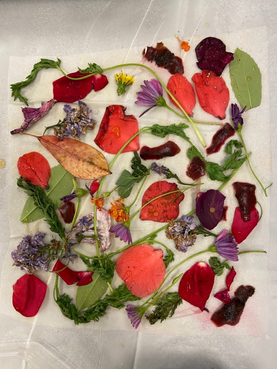
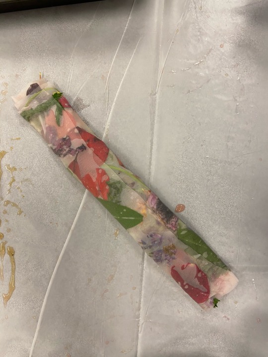
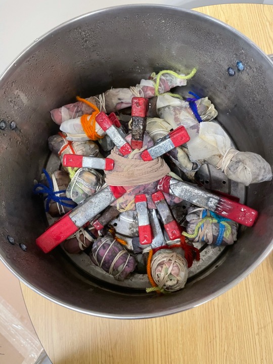
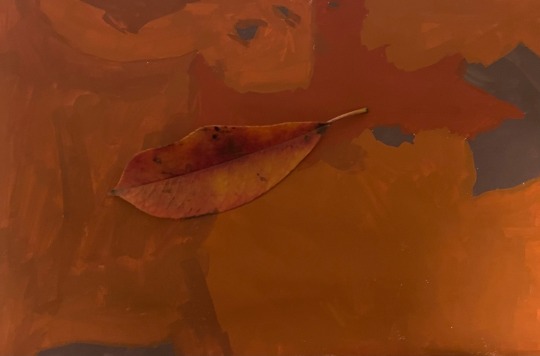
Eco Bundles Color Research!
I LOVED this color research! It was so fascinating to see how much color we can pull from things in nature, and I loved the whole process. It’s definitely something that I’ll be making more of at home, and my sister really wanted to join when I showed her what we made! My dad was also amazed how much color I was able to get from nature things. Overall a great experience and my family wants to try it too! Also the last picture is the fabrics hanging in my closet drying :)

3 notes
·
View notes
Text
Question of the Week #14:
What types of art are you most drawn to? Why?
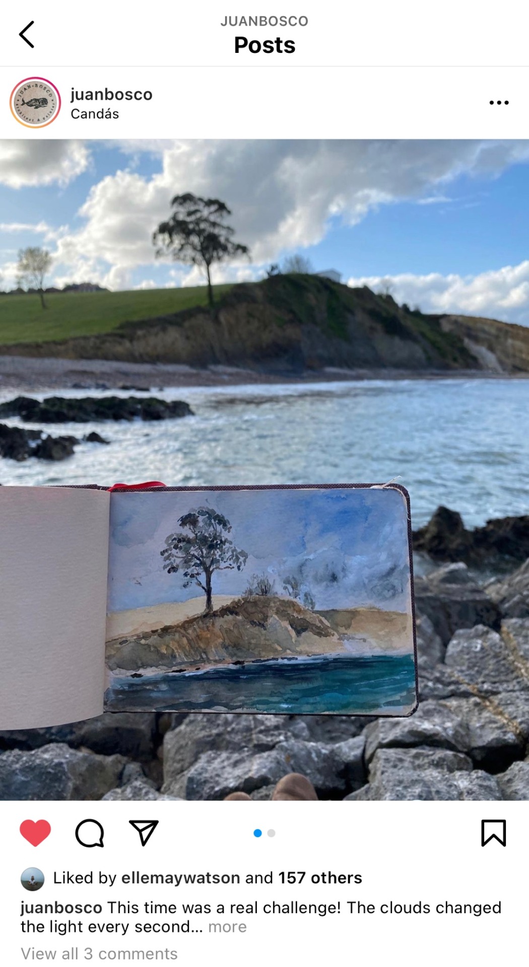
I’m drawn to a very wide range of art. The art I’m most drawn to also changes often. Currently I’m really drawn to James Coffman and Juan Bosco’s art. James does these cool minimalist digital pieces and Juan does beautiful watercolor pieces. I’ve included a couple of their pieces below :)
How would you describe your aesthetic?
I’m not sure if this is referring to my personal aesthetic or my aesthetic when it comes to which art I’m usually drawn to so I’ll answer both. I actually think it goes hand in hand because when I’m drawn to something it usually inspires me and I try to create my own take on the style. My aesthetic as a person is cozy and calm but also excitable I guess. I love nature’s colors and find most inspiration from them. It’s tricky to figure out my aesthetic because I like such a variety of things and draw inspiration from them, so it would actually be interesting for me to ask the people around me what they would say my aesthetic is.
James Coffman:

Juan Bosco:
2 notes
·
View notes
Text
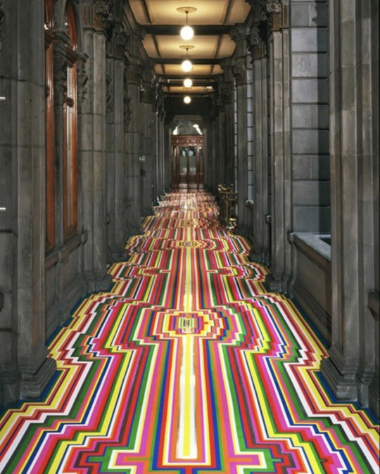
My Artist Response Piece:
My artist was Jim Lambie and the artwork I made was based on his Zobop pieces. I really liked the duality between the architecture and the flooring so I wanted to play around with that and see what I could make. I chose to do digital because that is my preferred medium as an artist and this is my response to Jim’s art.
The first picture is my piece and the second is Jim’s piece that I was drawing inspiration from.

3 notes
·
View notes
Text

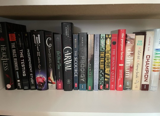
This was an especially fun exercise for me because I like to keep things color organized already. My closet has already been like that because I just love to look at it (seriously I have a few too many pictures in my camera roll of just this part of my closet). The books however were not color organized which is a little surprising to me. I organized them by color and there’s just some type of way it makes me feel. It’s just so pleasing to look at!
2 notes
·
View notes
Text
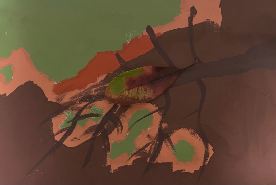
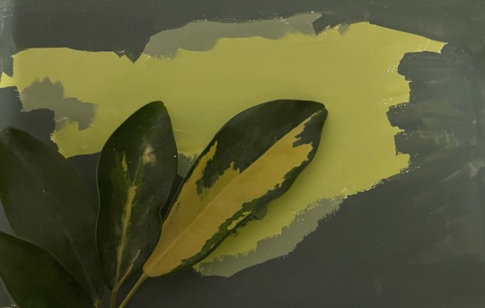
This was really fun to explore and make! It was interesting to look at something from nature and mix paints to find those colors. I think the 1st and 3rd are pretty good. The 2nd one I couldn’t get the colors just right and I realized that when the paint dried, however I think it’s kind of cool how the leaf gets lost in all of those colors.
2 notes
·
View notes
Text
I had a brunch with a group of friends at one of my friend’s houses on Saturday and it was such a lovely time and we painted! I took out my new gouache and for the first time painted something unrelated to homework and I enjoyed it so much. Not that I don’t enjoy painting for homework because that’s the best kind of homework. But it’s different just painting for fun and it was so nice to sit outside in the beautiful spring weather with my friends and just chat and paint. I highly recommend to anyone. You forget about time and all of your stresses for a little while and it’s just a really nice time. My painting is unfinished but I included a shot of my progress :)


2 notes
·
View notes
Text
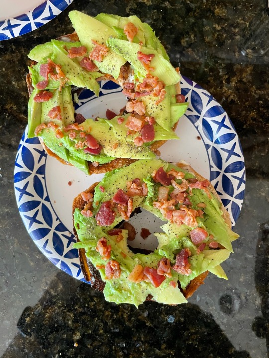
Life Color Post Week 13:
The first picture is of my breakfast from a few days ago. Just a stunning bagel. I love the green of avocados and I love how the colors of the bacon bits popped against the green
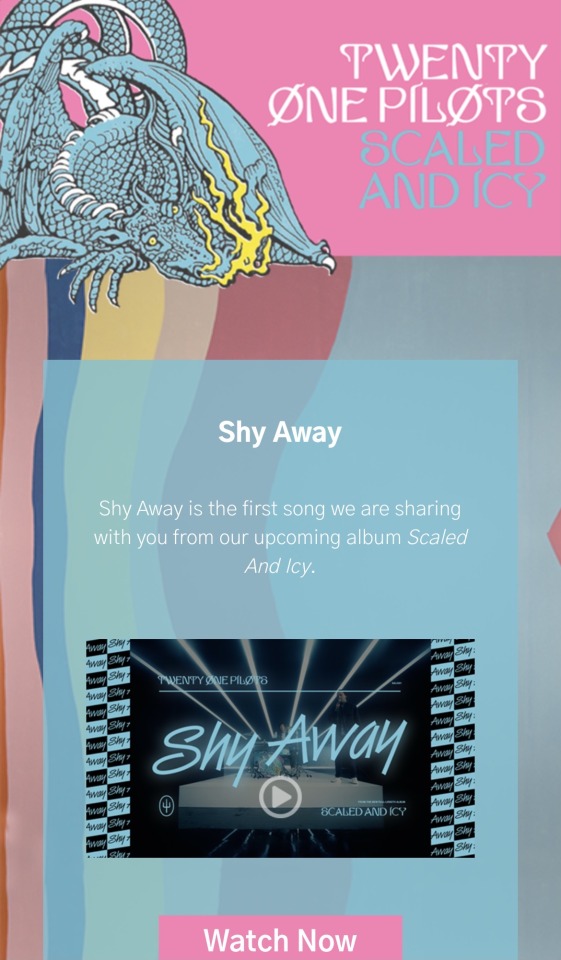
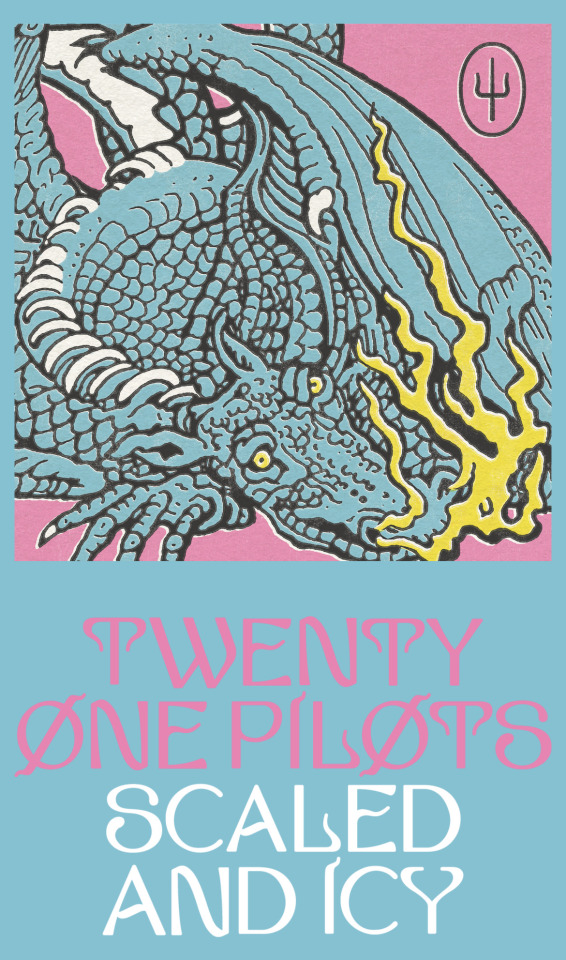
The second is from Twenty One Pilots’ new album cover and aesthetic that was released this week. I love the colors so much and I think it looks so cool and it’s so perfect for summer!
The third picture is just when I was doing some laundry and these three shirts were laying in my closet like this and I really liked the color palette so I took a quick picture.
The fourth is from Easter Sunday. I was setting the table and just thought it looked too beautiful to not take a picture. All of the colors are so springy and happy and the white tablecloth provided a great backdrop and made the colors stand out even more :)
The fifth is again Twenty One Pilots’ new album cover because I loved it so much I wanted to make it into a color palette and now I want to make art using those colors!


2 notes
·
View notes
Text
Color of the Week!
This week I chose to do pink! Pink was my favorite color as a child in elementary school, but I got tired of the color and haven’t paid it much attention until about 2 years ago. I realized that pink does not have to be childish. It can be childish in a playful sense, but it doesn’t have to stay in my childhood. I can use it in my adulthood. I don’t have much pink around me, but I have focused on pink this week and tried to figure out how it makes me feel. I have actually discovered a new fondness for it! It’s so light and happy and playful. And oddly enough it made me feel bold and confident but in a very comfortable way when I wore it. The first picture below is a dress I wore to church on Sunday and I just loved how it made me feel and how it looked on me! I now want more pink clothes because it’s such a fun color! The second picture is from Twenty One Pilots’ new album cover that came out this week and I loooove the colors and look of it! The other pictures are just pinks that I noticed around me and really liked.


2 notes
·
View notes
Text
Question of the Week #13:
What makes art successful?
I think the answer to this question differs for each artist, and each person for that matter. There’s the obvious success of fame and money where your art is selling very well for lots of money. But I don’t think that’s all that success is. That is of course a part of it, but I think if you’re making what you want to be making, from your personal and unique perspective and techniques, and you’re happy doing it, then you’re successful. As humans we are all very unique and we can use that uniqueness in our art. There’s no point in being a carbon copy of some other artist because you won’t genuinely enjoy what you’re doing because it’s their uniqueness and perspective at work, not yours. God created us all different for a reason and a purpose. We all have something unique to bring to the table that no one else will be able to do/make like we can, so we need to embrace that. That is what success is.
1 note
·
View note
Text


Color Research Week 12:
This was fun and somewhat therapeutic to do! I had no rhyme or reason for how I went about it, I kind of just decided on colors and emotions as I went along. For some of them, I thought of an emotion that I really wanted to put a color to and then searched and tried out different options until I got to the right one (you can see my scratch paper in the second image). And for others I would find a color or color combo and think of how it made me feel. I used colored pencils for all of them which was fun because I haven’t used colored pencils in a hot minute! I also like the look of the web and the different colors. Overall a very relaxing and fun color research!
2 notes
·
View notes
Text
Art Response Small Group Feedback Session:
I shared my idea for my art response and I got some good questions and feedback. For my piece I want to play with the duality Jim Lambie created in this exhibit:

I love the difference between the architecture and wild flooring, so I wanted to play with it. I plan on making my piece digitally, and what I want to do is create an outline of a Victorian era house or castle because of its prestigious architecture, and fill it in with these colorful stripes like Jim did with his Zobop floors. However I plan on doing the outside of the architecture rather than the inside. I’m pretty much coloring in the outline of the Victorian house or castle in crazy colored stripes. I hope that makes sense. I have started a Pinterest inspo board for it as well:
I got really good feedback on this idea and it seems to be a solid idea judging by the reactions. The main questions were regarding the format I’ll present it in. I originally said I’m planning on printing it, but now I’m wondering if I want to keep it digital. It’ll be something I’ll have to decide once the piece is done :)
1 note
·
View note
Text
Question of the Week #12:
Is art defined by particular boundaries? If so, what are they? How have they changed over time?
I think as time goes on and art progresses and grows, it has less and less boundaries. I think the main thing that places art within boundaries are genres. Every genre has certain qualities that an artwork needs to have for it to be considered a part of that genre. I think this has broadened over time, especially when we look at art like romanticism, neoclassicism, Renaissance, etc. Each of those had very specific qualities that the artwork needed to conform to. Nowadays, I think it is much more lenient with all genres.
What are the subjects, issues and themes important to artists working today?
There are hundreds if not thousands of things that can be considered important for artists to work on today. Everyone has their own unique life and perspective, and with everything going on in the world right now, there are a lot of subjects and issues to address. I think a couple of the main things are racial injustices, politics, and of course COVID. There are many others, but I think those are a few of the big ones currently, and I have already seen so much artwork done in response to these topics.
1 note
·
View note
Text

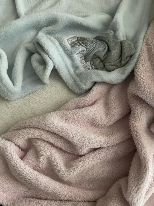
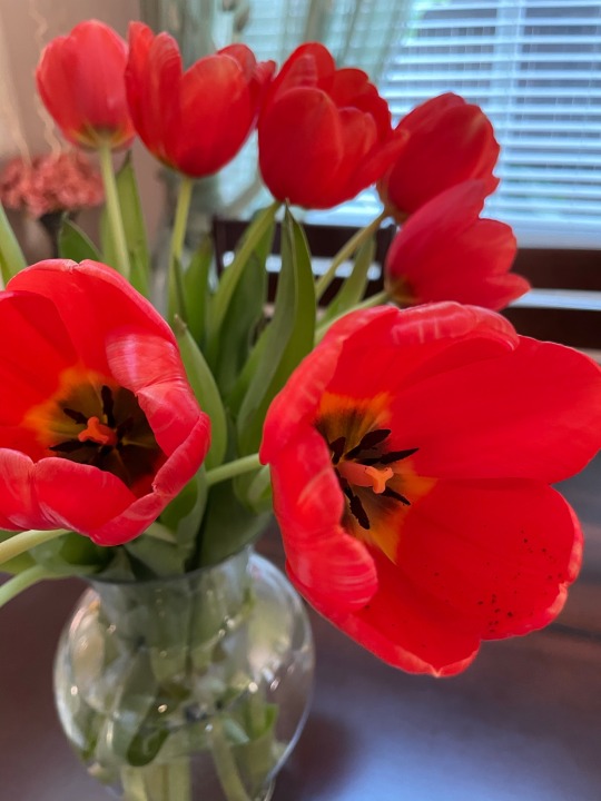
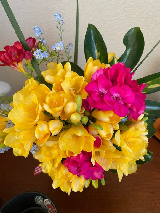

Life Color Post Week 12:
So many bright and spring colors this week!
The first pictures is from Sunday post-church lunch with friends. We went to Trademark Pizza where you can customize your pizza and it was so delicious, but I LOVE the colors on this thing! It looked especially beautiful in the sunlight and I couldn’t resist snapping a quick photo. The reds are just so vibrant and rich and beautiful!
The second picture is just blankets laying on a bed. I love how my nephew’s baby blanket looked with my parents’ white and pink blankets. It just reminded me of spring pastels and Easter and I am now realizing that this whole color post is very spring and Easter based!
The last couple of photos are two bouquets in our house and they smell heavenly! If you’ve never smelled a Freesia flower before, I highly highly recommend you do. It literally smells like a beautiful floral perfume! And also the colors of this bouquet are so stunning so I wanted a color palette of it, and I’m obsessed with the vibrant spring colors! Also, in the photo before, those are tulips and they just have such a rich and beautiful color! Tulips are one of my top favorite flowers, along with freesias because seriously the way they smell is unbelievable and I can’t get enough!
1 note
·
View note