
Don't wanna be here? Send us removal request.
Statistics
We looked inside some of the posts by mark5349399 and here's what we found interesting.
Average Info
Notes Per Post
34
Likes Per Post
17
Reblog Per Post
0
Reply Per Post
17
Time Between Posts
6 days
Number of Posts By Type
Text
11
Last Seen Tumblr Blogs


Fun Fact
Tumblr’s website traffic is steadily declining.
Text
Wk10 Final Post
Looking back on the semester there have been a lot of learning opportunities with this subject, and I've tried to fulfil the learning outcomes to the best of my ability. The range of model making techniques and materials we've used have been really enjoyable, and I've seen my skills grow a little which is encouraging. It's also a reminder of the long road that's to follow as I try and further develop these skills to a level commensurate with an ID professional. It's been interesting to see the ways these models can be used to explore different design ideas and how certain kinds of models lend themselves towards certain applications - for example the way foam models can be used to inexpensively explore physical form, or the use of perspective drawing to explore a wide range of ideas quickly and to communicate those ideas to others. It's also been fascinating to explore the progression of ideas, from engineering drawing, through perspective drawing, digital illustrations and CAD software through to laser cutting, I've really loved the flow and logic of the structure of this subject.
I found that the more freeform parts of the course (perspective drawing and foam model making) were my favourites and brought about the most enjoyment. The engineering drawing was the most satisfying but also the most challenging (due to the accuracy needed and the volume of new information to take on). The CAD software grew on me over time - initially I struggled to get into it but the more I saw of the software's capability, and the link to 3D models through laser cutting, the more interested I became.
There were 2 things that I really struggled with this term. The first was time management, and this is something I'll really need to address moving forwards. As a mature age student, and working 50+hr weeks over the last 6 weeks, it's been incredibly challenging trying to make time for uni and to give things the attention they deserve. I've also struggled under the weight of my own expectations - I've been pushing myself to try and perform really well with the hopes of studying on exchange next year. But this has resulted in a lot of anxiety and pressure around my grades and has led to a feeling of being burnt out. It's a shame, because in a way it's detracted from my enjoyment of uni this semester.
I really loved the way this subject was taught. From the way the syllabus was structured to the methods of teaching, everything was so enjoyable and I'm sad that the semester is already over. I also really enjoyed Tom's contributions to the class - it was genuinely so valuable to see his sketch work and to hear his opinions on things, from the reasons why engineering drawing is still important and relevant to hints and tips about creating sketch models.
Some of the things I've learned over this semester include:
- work is the best way to minimise anxiety
- perfect really is the enemy of good enough
- I need to continue to practice perspective drawing every day. I've been consistently doing this for 2 weeks now, but I want it to be a long term habit, and I really need to continue to build on these skills
- it's surprised me how things in life come full circle. The boat building TAFE course I did when I was 15, and the surfboard shaping I did through my teens and twenties meant I had some interesting knowledge and skills to bring to the physical model making part of this subject. I never would have guessed they'd have any relevance to this course.
The first point comes back to me realising that perfectionism is hurting my studies and isn't really contributing to the development of my skills.
The 3rd point kind of crystallised when looking in depth at the work of Begum Tomruk and Thomas Feitchner. Their drawing abilities are unbelievable, and it hit me that that's ultimately the level I'd like to be at one day. Whether or not that's achievable is another thing, but it's inspired me to practice as much as I can and to try and develop these long term habits.
These points are obviously in addition to all of the skills and knowledge I've learned from this course, which have been too many to list here.
Thanks so much to Rob, Gonz, Tom and all of the students this semester, I've loved this.
Mark


2 notes
·
View notes
Text
Wk09 Tutorial Exercises
The exercise for Wk09 was really interesting.
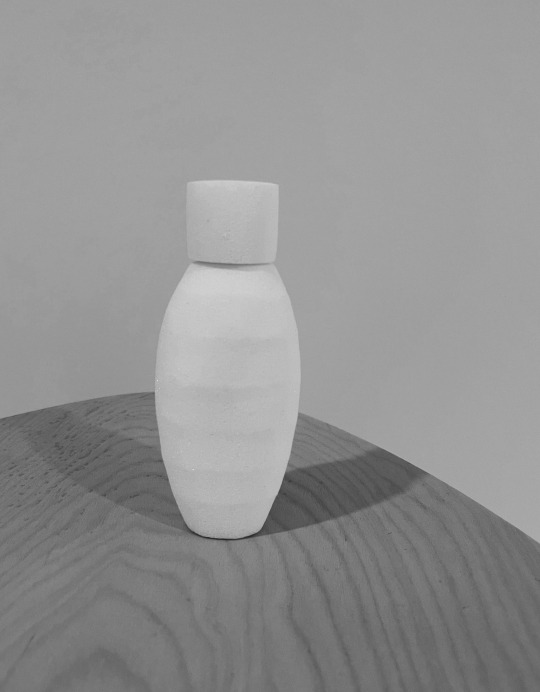
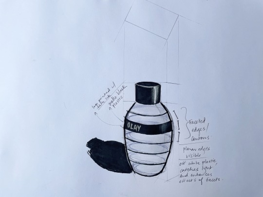
I had difficulties initially in figuring out how to approach the model. My bottle prototype has faceted edges and my initial thoughts were to create 7 or so cone shapes with a very slight taper in the outline, and then stack them on top of one another while aligning them along the X and Z axis . This had potential, but an issue was how to achieve an oval outline along the X/Z axis as cylinders are circular. I persevered with several attempts at this, and using different modifiers, but without success. I'd also considered using cylinders, one on top of the other, but again ran into the problem of the shape being circular rather than oval. I tried extruding an ellipse spline, then covering it in a shell but this also brought complications.
Finally I settled on using a spline with a lathe modifier just as Rob suggested, and this worked quite well. Again the circular vs oval issue appeared but I experimented with further modifiers until I was able to achieve an oval outline. I then created the lid using a similar process, and used the align function and then grouping to tidy things up. I explored animating the bottle, and was able to make it rotate which I thought was a nice way to show off the curves and facets of the bottle. However I ran into issues with exporting the animation, as it required me to render the scene and with the time constraints I wasn't able to work through the issues I had in time (it seems the lighting etc. can be quite fiddly and time intensive when rendering a scene).
I enjoyed being able to approach the exercise with a better knowledge of the software as compared with last week's exercise. I also enjoyed the problem solving aspect of this week's exercise - it's fun trying to figure out how to digitally re-create the product, and I assume this has many parallels with the working life of an industrial designer. I feel like concepts and ideas are reinforced more deeply through these kinds of exercises as well, and it's somewhat encouraging to see myself make some progress in my 3DS skills given I've been less than enamoured with the program. I still dislike how unintuitive aspects of the software are, it can be quite frustrating and time consuming to problem solve. I've watched dozens and dozens of videos trying to figure out possible solutions to some of these problems (e.g. issues with the different modifiers) and the've been helpful, but often I'd find a particular discussion or explanation wouldn't really touch on the issue I was facing.
Some of my key lessons this week are that often times solutions can be found within the software, but many times they aren't immediately apparent. They require you to dig and experiment, but in a way they're almost more rewarding because of that. The more I use the software the more I learn just how powerful it is, and I say that with an awareness that we're barely scratching the surface here. The rendering engines and the broader applications just seem so wide-ranging and technical, it's almost endless really. It raises questions for me though, because from what I've heard so far Solidworks appears to be the industry standard, so I'm unsure whether I should branch out and learn a number of packages in depth or instead try and focus my efforts on the 2 or so main ones. I think these are more thoughts for self-reflection as my studies progress.
Finally regarding the video of Andrew discussing the cup, I found the comparisons of presentation models vs sketch models quite interesting, especially his explanation of the lack of importance of the form of the sketch model as compared with it's weight and how that relates back to holding and gesturing. It speaks to the functionality and user experience of an item, and highlights that aesthetics are only one aspect to be considered in the overall design of a product. It was also interesting to hear that his final design used oak rods instead of brass - obviously that change in materiality affected the user experience in a positive way and it makes me wonder why that might be.


0 notes
Text
Wk08 Tutorial Exercises
The tutorial exercises for this week were challenging in a number of ways. First - it's always difficult learning new software and invariably the learning curve can be rather steep. I certainly found that to be the case with Autodesk 3DS. My initial impressions of the software are that it's unintuitive, slow, and quite fiddly, especially when it comes to making fine adjustments to an object. My computer is a Mac, so there's that aspect to things as well - the keyboard shortcuts differ to those using a PC (as alt and control are in different locations), and accessing the program through the UNSW remote Citrix login made things slow and delayed in use (the joys of tethering internet from a phone on a property in rural NSW). Even the instructional videos provided by Autodesk I found to be quite slow and that's always been a barrier to learning for me. If something doesn't grab my initial attention I can find it difficult to retain the enthusiasm to persevere with it. So this lead me to scouring YouTube for further instructional videos and I found a few great ones on offer on a channel called Simulation Lab. They delivered a great balance of being interesting and engaging and I found myself learning quite a bit from the videos on their channel (definitely worth checking out).
I believe I've covered the learning objectives for this week - the exercises and tutorials have built on my existing experience with CAD software to grow my understanding of the process of converting a physical model to a digital space, and particularly it's helped identify some of the benefits and limitations of the process, such as the difficulty in accurately digitising an object in terms of dimensioning and producing curves/shapes that are faithful to the original product.
I thought my explorations of the effects of modifiers on various primitives were successful and increased my interest in the possibilities of the software. It felt like it tapped into some of my creativity and was an opportunity for exploration. Worth noting that my first attempts weren't as successful, and it was after learning the software in more detail that my second attempt produced more satisfying results, and a more engaging experience.
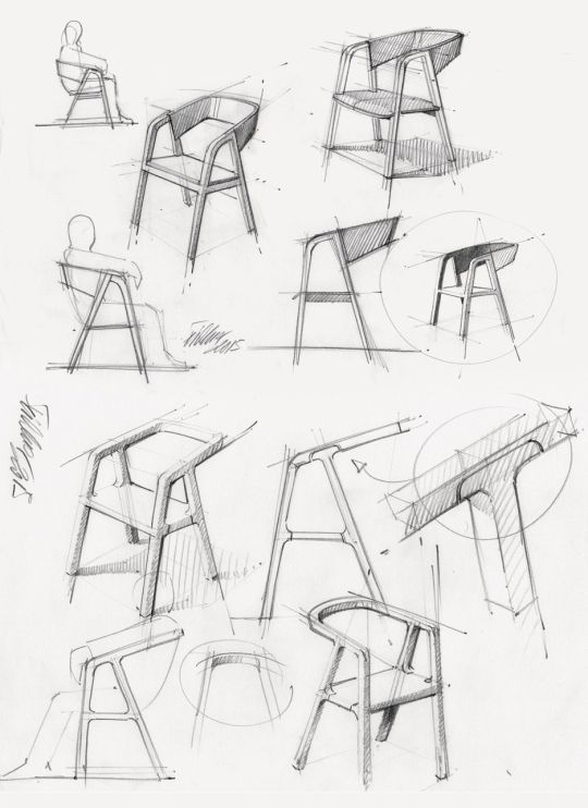
For my next object I decided to make a loose approximation of an Eames chair. I started by making a plane, then selecting the rear edge and extending that vertically. I selected the vertices and dragged into place, used the cut function to remove the corners, duplicated the shape and scaled it to create the lips at the top and bottom of the chair, added a shell for thickness and tweaked the outline to try and enhance the curved lines of the chair. I then added turbosmoothing (with 2 iterations for additional smoothness) and 4 subtle cone shapes for the legs, which also required making clones as instances and utilising the mirror function to maintain consistent spacing and angles.
In summary, I really honestly dislike this software. After learning Rhino last semester I have some experience to compare things, and at least for my tastes I just find 3DS so unintuitive. The interface is confusing, cluttered and let's face it, pretty unattractive (it shouldn't matter but it does to me). Even after watching the various introductory videos numerous times I found things just took so much longer than I wanted them to. And the workflow of using "Edit Poly" and the various Modifiers, how to move, rotate and scale objects, even just rotating perspective in a viewport, all of it was frustrating and really finicky (partially because of the equipment I was using, my mouse doesn't have a scroll wheel).
What are my takeaways? I've learned that despite appearances, the software is really quite powerful and has a lot of potential. I've found that the learning curve is quite drastic and will likely require many hundred of hours to become adept. I've also seen from some of the videos referred to above that the use of hotkeys and shortcuts help speed up the workflow dramatically. It seems that 3D work in CAD software, whether that's 3DS, Solidworks, Rhino or something else, is becoming more and more important in the Built Environment, and it's something that's shared by Industrial Designers and Architects among others. The advantages are of course being able to explore objects / products / forms / layouts / ideas in a quick and affordable manner but there are other limitations, and I'll explain this through an experience of mine. Last week I mentioned I've shaped surfboards in the past and as part of that I've explored the use of CAD software specific to that area (such as AkuShaper). Digitising a board and analysing curves onscreen is a fascinating process, but it's incredibly difficult to have any certainty about how a particular curve or shape onscreen will look in real life. Often I'd create a curve, say for a rail, then have the board shaped and find out that the way that curve looks (and feels) once it's been cut by the machine is subtly different, and that those subtle differences change things quite drastically. So I think it needs to be a back and forth process - creating an object digitally then printing it, then going back and adjusting, then reprinting etc. until there's certainty about how that final form looks in a physical space. I guess that's what iterative design is all about.


0 notes
Text
Wk07 Tutorial Exercises
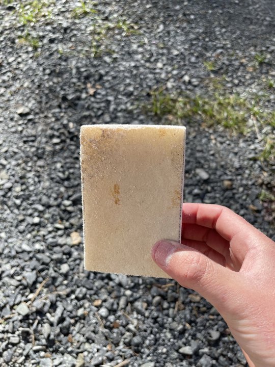
This week's tutorial exercise was once again challenging but enjoyable. I felt more confident about this exercise because I've shaped quite a few surfboards in the past and it seemed like some of those skills would be transferrable. This even influenced my choice of materials - where I live there aren't really any hobby shops to buy modelling foam, so that narrowed down my options. I could have chosen styrofoam, but I don't particularly like the way this material responds to shaping - it tends to come away in balls and doesn't allow for much accuracy or for a very nice finish. So instead I opted for polyurethane foam, which is what most surfboards are made from. I chose this material because I know it has an excellent combination of firmness and yet remains easy to shape. It also allows for a fairly smooth finish as the aerated parts of the foam are really small.
I drew up the initial orthographic drawings and a problem presented itself almost straight away - how to get an accurate curve for the top view when drawing the outline of the bottle? This was also a problem when drawing the bottle's outline from a front view, as the curves were mostly freehand. I used a technique from shaping surfboards which is to draw a Centreline down the middle of the object and take a template from one side only. The template is then rotated about the centreline when transferring the shape from the template to the foam material so that the shape is even on the left and right sides. This worked well.
I drew these templates onto the 3 axes of the foam box I shaped, and started working on all 3 sides to get a sense of general proportion for the bottle. I then focussed on the side and top views of the box which would require transferring the front view once the other 2 sides were shaped (as the outlines are of course removed during the shaping process).
Another technique I used from surfboard shaping was using bands to shape the corners when looking from the top view. On a surfboard bands are used when shaping the rails of the board and this seemed like a very similar application to me. Essentially you draw a line 5mm (or whatever dimension is suitable) in from the front and side edges of the shape, to give you reference points. You then sand at a 45 degree angle to connect these two points (see photo 3). This helps when trying to keep a sense of consistency for an outline or a curve in general. Another tip is to count strokes, so that whatever is done to one side of an object is similarly done to the other.
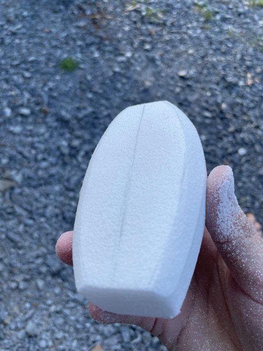
With the overall shape I really tried to challenge myself. The design I chose is curved overall but has faceted edges which I knew would be really unforgiving when trying to reproduce them by hand. I used a narrow rectangle of balsa and glued 180 grit sandpaper to it to assist with this process, and worked slowly and as accurately as I could. Another tip from shaping is that lighting is so important to see any imperfections in the outline and I really tried to focus on this whilst shaping. The finished product is by no means perfect but I'm happy with the effort overall. Working on such a small scale and with minimal hand tools means that the difficulty in creating a perfect finish increases dramatically. This exercise was a great way to remind myself of some of these important skills and I'm sure I'll get a lot of use out of them in future model making. One other point - what's great about making models is translating curves and proportions from a 2 dimensional perspective to 3D. There's such a difference and 3D models are able to communicate curve and proportion in a much more effective way (in my opinion).


7 notes
·
View notes
Text
Wk06 Tutorial
In my Pinterest board this week I've been mainly influenced by 2 designers - Thomas Feichtner and Begum Tomruk (which Rob linked to in an earlier post on Tumblr). Both designers are really fascinating. Thomas has a huge range of drawings available on his website (really helpful, definitely worth a look, way more available than I could find on Pinterest) and most of his work is completed in pencil. His linework is amazingly expressive and accurate, in particular when describing difficult curves. It's clear he's practiced an enormous amount and I find his work really inspirational. It's beautiful and accurate all at once, and his feel for proportion is exceptional. I discovered him in our communications class last semester and I've been a fan since.
Begum is a new discovery, and her skills in rendering are amazing (so much more work on her personal instagram than Pinterest). She's able to convey so much detail about curve / texture / material / surfacing, it's really impressive. She seems to utilise a combination of regular and wide copic markers to great effect, her sense for composition and reflections is excellent and she also has an interesting choice of angles, some of which I haven't seen too much of. The main thing that really impresses me though is how she's able to have so little bleed despite how much she uses markers in her work. I have no idea how she does this, whether she draws first with markers then later with pen, or if she has another approach altogether. I need to figure this out.
The biggest takeaway from looking at the work of these designers is the reminder of just how good their sketching abilities are, and it's also a reminder it's no accident. Clearly they've spent so much time honing their skills, and it really resonated with me this week. If I want to get anywhere as a designer I really need to focus on practicing drawing. I want to challenge myself to draw every day for a week, with the hopes of turning it into a long term habit. I need the practice, but also I really want a career as an industrial designer and it's such a competitive industry. If I'm not going to give it everything then what am I doing?
Further comments - I prepared the digital composition this week in Procreate, like many of my classmates. I've owned the app for about 6 months but never spent the time learning the software, but after this week I'm hopeful this will change - even over the course of this week's exercise I learned so much about the app's ability to use layering and grouping, brushes / text / colour selection and colour library management, and just how powerful it is. It's seriously impressive. I was happy with my linework this week, and some of the curves came out ok but with practice I'm hopeful my ability will really improve in this area. I feel like I learned quickly, especially regarding the advantages of layering and keeping linework on one layer and different colours etc. on other layers, making for a non-destructive workflow and ease of changing at a later point. Also I need to learn how to render light, curves and materials more accurately. My final work is still very basic and not particularly accurate, but I know I can do better


2 notes
·
View notes
Text
Wk05 Tutorial
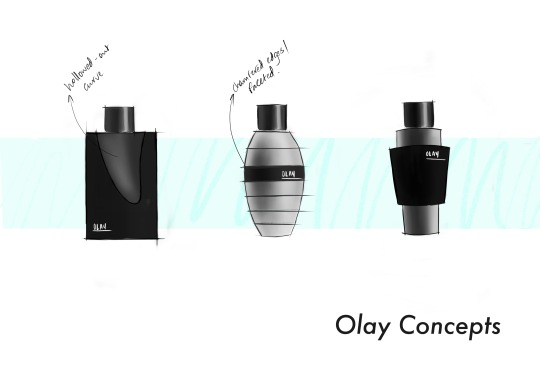
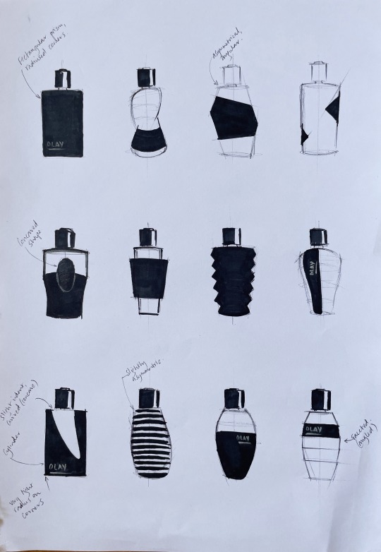
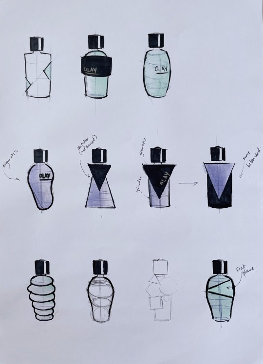
Following on from wk4 this lesson was so much fun. I was initially off to a slow start as I was trying to be pretty accurate when drawing up the sheet with blank boxes to use as an underlay - it seemed like everyone began progressing with the drawings straight away whilst I was stuck getting this prepared. It was a little frustrating but once that was sorted the actual process of visually exploring different bottle designs and concepts was really enjoyable.
It's funny to me how you can look at a blank page and think you've only really got one or two ideas, but as soon as you put pen to paper more and more ideas spring to mind and before you know it you've actually had quite a few creative thoughts. Not saying any of my designs are original or unique, but it was an interesting insight into the creative process. One curve or idea leads into another which I guess is what iterative design is all about. It also made me feel less self conscious about my own creativity - I always think that I'm not that creative when compared with other people but it seems to me that creativity can be sparked by the act of doing. Some people seem like these unique ideas strike them out of the blue, or just by thinking, but for me visually exploring and playing seems to be the thing that leads to creativity. It makes me want to develop a daily habit of drawing because who knows what that could lead to, certainly more than just daydreaming or thinking about design.
This was also a great opportunity to explore the more classic industrial design style of perspective drawing, as compared with the style examined in wk4 which seemed more formal and less expressive to me. This week's exercises seemed much faster and maybe that's also part of what sparks creativity - being able to explore ideas quickly means any passing thought could lead to the next design direction. Notes from this week's exercises - I really need to practice drawing ellipses. I was trying to focus on ghosting before putting pen to paper, which was helpful, but trying to produce the right curves through the ends of each side of the ellipse is quite difficult. I also tried exploring the idea of drawing various ellipses of different sizes and then drawing the outline of the bottle shape to follow those curves. I produced 2 pages of drawings - the first one was exclusively black and white, as I was interested by the idea of a white or black bottle with a contrasting logo. The second sheet of drawings I tried to explore the effect of different colours on the form and shape of the bottle and whether that lead to any inspiration or creative direction.
0 notes
Text
Wk04 Tutorial
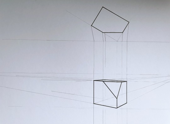
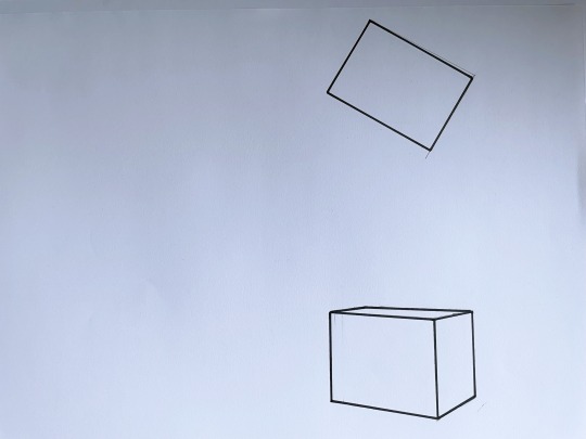
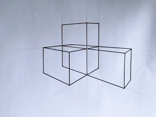
Out of the classes up to this point in time, this particular week has definitely been my favourite. I've been kind of fascinated by perspective drawing for quite a few years and it's really special to be able to study it formally (previously I've just bought books by Eissen et al and gazed in awe at the work of talented industrial designers). So heading into this class I had a vague awareness of the level of skill that perspective drawing can require and how useful it is in the design profession. Interestingly this week provided a slightly different approach to perspective drawing than I had seen before - it was more technical and accurate than I'd previously seen, mostly due to measuring the lines, angles and chamfers prior to and during the drawing process. It made things seem somewhat more formal but the end results were also really interesting. Instead of the looser / free-er / more stylised perspective drawing I'd seen this week's exercises resulted in drawings that looked more realistic and true to life.
As far as the tutorial exercises were concerned there were definitely areas that I struggled with. I've always erred towards visual explanations and I was left a little confused by the more wordy explanations of the different viewing and vanishing points. Not a reflection on the teaching, it's just that sometimes I need to do these things in my own time so I can go a little slower and figure out exactly what the descriptions meant. Once starting on the drawings and putting pen to paper the explanations seemed to make way more sense, and I enjoyed seeing the effects that changes in these points made on the final look of the box, how the perspective would change and the box would become more or less extreme because of it. This was particularly noticeable when extending the sides of the box in 3 directions - it looked to me like the perspective became more distorted, and it was really helpful using the technique of the diagonal lines to find a midpoint and drawing through those points to extend the box by the proportionally correct distance.
0 notes
Text
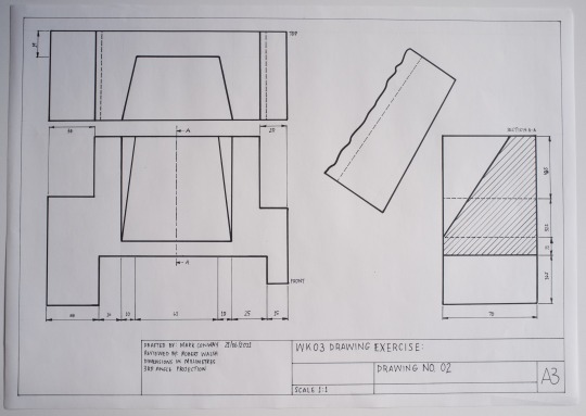
Wk03 Tutorial
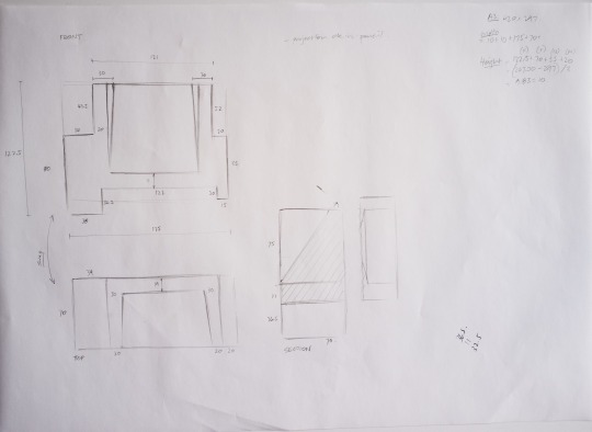
This week's exercise required completing a third angle projection of a geometric shape that looked quite straightforward to begin with. As I'm learning by now even simple looking objects become complex when drawn in this manner.
There were quite a few challenges I faced this week, and lessons I took away with me. First up was trying to size and place the drawings on the page. I drew at a scale of 1:1 which I knew would be tight given the additional auxiliary perspective which needed to be included, but after doing the relevant calculations I thought I had adequate space. However, I didn't factor in enough room for dimensioning and the results speak for themselves - the dimensions were crammed in and it severely limited my choice of where to show the dimensions. I had considered drawing on an A2 sheet prior to completing the exercise and on reflection I think this would have been a better choice, or drawing at a scale of 1:2 instead.
I had a lot of difficulties trying to interpret the auxiliary perspective, especially during class, but at the end of the tutorial Rob offered an explanation that made things slightly easier. It was also really helpful to look at other student's work and while there was some variation in the perspective shown it helped me make an informed decision about how I would illustrate it. I settled on a partial auxiliary view - you'll see I've attempted to indicate the centre line, and haven't completed the remainder of the auxiliary face (which is partially due to spacial limitations, again...)
Finally I had some difficulty with showing faces and edges behind the section - you'll notice the error in the section view where I've used a dashed line for an edge that I didn't need to indicate.
This subject is interesting but the perfectionist inside me really struggles with certain aspects of the drawings. I haven't been 100% content with any of my drawings so far but am hopeful that with persistence I'll make fewer mistakes and get closer to the level I'd like to be at.
Finally it's invaluable being able to observe the work of other students. They're really setting a high standard and it's been so helpful when interpreting difficult aspects of certain exercises.
12 notes
·
View notes
Text
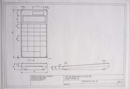
Wk02 Tutorial
Wow this was a difficult exercise! Based on other people’s posts it looks like they might’ve found it a little easier than I did. Where do I start. The object I chose was a calculator which at first glance looks quite ordinary and basic, however when it came to this exercise it definitely ended up being quite involved.
Constructing the box was simple enough to make, and helpful when considering how to set out the 3rd angle projection (I’ll keep this tool in mind for future projects). Next was the initial sketch in order to layout the final drawings, and this is where I got slightly confused. You might be able to see from my notes that I was considering rotating the right side projection from my original layout sketch, then I re-read the readings and figured my original layout was probably more correct. This is also when I realised that drawing the calculator was going to be more complicated that I’d expected. There are all kinds of lines, angles, chamfers and curves and I realised that drawing and dimensioning these was going to be a major headache.
After making (what I thought were) comprehensive notes I made a start on the final drawing. The initial layout wasn’t too difficult, but it was really time consuming trying to accurately draw things, even at a 1:1 scale. It took probably 8 hours of drawing to get everything down on paper, before I could turn my focus to the title box and dimensioning everything. This took a long time as well and there were a few takeaways. First I was unhappy with my lettering - I wrote everything out in pencil, using guides to ensure the text height was correct for each category, but then when it came time to inking these I was less accurate. I think the reason is because the ink from a fine marker tends to “bloom” when writing slowly or pausing, which I was trying to avoid at all costs. Because of this I had to write quickly, and consequently it turned out messy. Not happy.
Another aspect was the fact I still don’t have a circle template which is turning into a major pain point (haven’t been able to find one in any of the stationery shops around here). I ended up having to use my ellipse tool which was messy and inaccurate. Frustrating to spend so long on an exercise and have it ruined by using the wrong equipment.
Finally I found dimensioning the piece quite difficult. Space was cramped and as a result I had to place some dimensions back-to-back, which looks untidy and makes it harder to read. I also wish I’d moved some of the dimensions to other places to make things look better and tidier. Lessons for next time.
I realise things look a little skewed which is just the software in my phone, I’ll upload better photos tomorrow when the sun comes out.

4 notes
·
View notes
Text
Wk01 Tutorial
I feel like these exercises were deceptively challenging, but enjoyable. I studied tech drawing in highschool so there was some familiarity there but that was quite a while ago now and I’ve forgotten all the important parts. Anyway, for the first exercise the thing I found most challenging was maintaining my focus throughout the entire drawing. My line work with the mechanical pencil was fairly clean but then when it came to inking the line work my focus wavered and I made a number of small mistakes that impacted the look of the final work. I drew lines in some sections where there were meant to be spaces, and I also ended up with some minor smudging (which is insanely frustrating).
My lessons: One, pay the most attention to the elements that are permanent. A pencil line can always be erased, but a felt tip pen not so much. And second, if using a metal ruler to mark lines with anything other than pencil, make sure to wipe down the edge after each line to minimise the risk of smudging. I hope this is the last time I have to tell myself this 😅
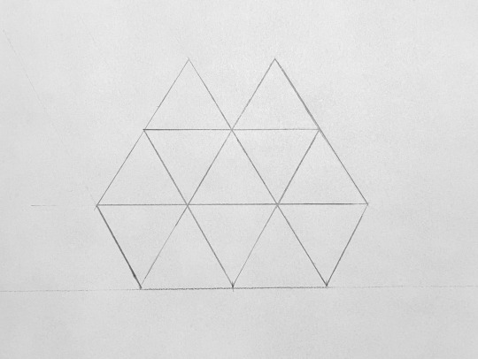
Part 2 of the tutorial work was also deceptive. The first section, outlining the triangles in pencil was easy. Then I began cutting out the triangles and realised the pattern had actually changed from the original drawing, with cuts on the corners of the triangles, which required drawing new lines and recutting. Given the scale of the triangles (my understanding is they’re 30mm per side, and equilateral) this was incredibly difficult to do with any accuracy. But again it was a learning experience. Next time I’ll pay closer attention to the finer details of an exercise before proceeding with any permanent changes like cutting. I guess there’s wisdom in the saying “measure twice, cut once”.

6 notes
·
View notes
Text
About me
Hi there, I’m Mark and I’m from Australia. I’m really passionate about industrial design, in particular furniture design, and predictably all my favourite designers are Scandinavian (original, I know). In my spare time I take woodworking lessons and surf poorly :)
1 note
·
View note