
Don't wanna be here? Send us removal request.
Statistics
We looked inside some of the posts by mars2cieranshippy and here's what we found interesting.
Average Info
Notes Per Post
0
Likes Per Post
0
Reblog Per Post
0
Reply Per Post
0
Time Between Posts
11 hours
Number of Posts By Type
Text
17
Last Seen Tumblr Blogs


Fun Fact
Post activity is at the highest at 4:00 pm EDT; notes peak at 10:00 pm EDT.


Text
how to make a one page booklet

Trying to find examples on how to make a one page booklet
youtube
process of making a booklet


0 notes
Text
SIZES FOR BOOK
using Chat Gpt (Be aware these sizes might not be accurate, however I am just having them as ideas or cosiderations of the size I want my book to be.
What are the sizes of Zines
Quarter size Zines (4.25 x 5.5 inches):
Half-Size (5.5 x 8.5 inches):
Full-Size (8.5 x 11 inches):
A5 (148 x 210 mm):
A6 (105 x 148 mm):
Mini-Zines:
0 notes

Text
RESEARCH
PHOTO ALBUM EXAMPLES - I am just looking for examples so I know how to structure the layout and have multiple trials of the designs. At the end of the day I ain't striving to have a small book, photo album and Zine but I am challenging to have one outcome or two of one of the possibilities, depending on time etc.


TINY BOOK EXAMPLES


ZINE


EXAMPLES - What I am looking for with the Zine is just how I can structure my pages and how the size matters to determine whether or not it can affect people in different ways.
0 notes
Text
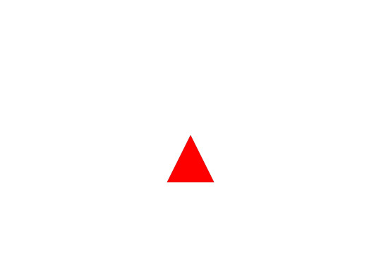
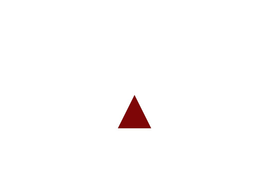
TITLE DESIGNS
What I have planned for the title of the book, plus the back cover of the book as well, is to be as simplistic as I possibly can get it. So I decided to do it without type, without the title itself and instead just have the shape and change the colour to indicate that it is the front and back. Mainly cause I want it to be a mystery of some sorts like you have no idea what you're going to get yourself into.


Variations of Different shade of Red
orignal
Variation one

Variation Two
Variation Three
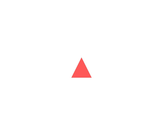
The one I like the most when I began considering just shifting the shade and colour tone of the shape in my opinion would be the top as there is a clear indicator that it is still red but slowly becoming darker, which works as the back cover is black so it is like the further you went through the book the more the red got darker and darker without you knowing it.
RESEARCH
Johannes Itten: Understanding his Colour theory and seeing how just a shift of the colours shade can impact the design and overall affect of the design.
basically grabbing examples from this digital book, to understand from a visual standpoint how colour and the shade and change of the colour itself can affect the design overall, make it make you perceive the design in a different light.


Notice how the colours almost work together to enhance others or make the others more noticeable or less noticeable, drawing your focus all around the place as if they're telling a story.
0 notes
Text
NEW DESIGNS / REFINING
REFINING DESIGN - Disassociation
What I am basically refining with this one is essentially the representation of this condition, as I know full well how it feels and what I've been through when I went through it. Even though I previously wanted it to be read and only have the affect of the condition behind it, I also needed to understand how it actually is in a form of a representation instead of something that can be read, something that can't as if you yourself are going through the exact same condition.
PROCESS


NEW DESIGNS -
One - Lost in Sea With this design I wanted to focus more on negative space, with a simple design somewhere on the page / Screen, nothing more, Nothing less
PROCESS


Two - Broken - Same with this one I just wanted to have the design somewhere on the space being enhanced by the space around it
PROCESS


Three - Unheard - This one different from the rest, I will be writing thoughts or words with in the middle a very ghostly looking sentence being a representation of how it feels to be unheard.
PROCESS


0 notes
Text
Personal Typography
With these designs I wanted to write and present my own personal issues in a form of art as I want to show the pain, the joy I went through at times within my life.
Title Process - Just a simple title design


That Day - This moment in my life, was when my nan's artery near her heart basically broke and if she didn't go to the hospital sooner she would have died, all because she was smoking. I don't look back here but I realise I should and look at it like an adult instead of looking at it like how I did before. Now when I heard the news I didn't know how to feel however because of that I blamed my nan for smoking in the first place and blinded by that instead of focusing on the fact that she could die in any minute, so I distance myself from her as I didn't want to see her or be there in case she does die. This is basically what was going on in my head
(WARNING THIS IS EXTREMELY SERIOUS)
Process


The Voice - During the times where I was sad and feeling down as if I could escape. I made a character called The Voice where I could just take every bad thing that has ever happened to me, shove it in the essence of the character and wait until my ignorance of ignoring them would dissipate. Some eventually did but at a cost, as I began to have resentment issues and anger issues led alone feeling empty at times. Now a days I see them not as a mistake but something to love; they're literally a side of me that I was afraid to show cause it was too unperfect, that if I did I could hurt others but now I am enduring myself to put up with their lies, their truths, their advice and learning to accept them as a part of me now and love them I am becoming more and more happier and I learned to love myself, because of it. (Just to note I will be focusing on the dark side of this coping mechanism, so to speak, during times where I was sad. not the part that I see it now which is a good thing instead of a bad thing. Why because this is what these designs are suppose to be, basically documents or my personal document of my mistakes and my struggles in life.
Process


Dissociation - This was a time in my life where I wanted to give up and essentially stay in my mind, focus on my thoughts and ignore everyone else and everything else; it lasted for a few months and let me tell you I was so mentally exhausted even talking was a struggle for me and it didn't help that most people thought I was being rude to them when in actuality I wasn't I was just struggling to keep up with the world, you could say I reached my breaking point.
Process - With this one as this one is specifically meaningful to me, I wanted to literally show how this condition (unhealthy coping method) looks like visually but also how my experience with it was like.


What my friends don't know - This is basically something I recently began to think about and recently started to remember. I act differently when I am around my friends and all those moments they never seem to realise when I am quiet that is where they don't know what really is going on (Now a days I am trying to improve on that and just accept I am different then them and don't really have much to say all the time, but this is how I felt throughout these moments)
Process


0 notes
Text
Leonardo Sketch Book
Just having a look. As instead he made this mainly for the sketches, however he added type to the designs and even though half the time they were purposefully made not to be read, it works in a way that acts like some sort of weird disturbing some what cool diary of all their interests or adventures seeing interesting things.


0 notes
Text
SANS SERIF FONT PROCESS / BOOK COVER REDESIGN


process


I am going to make multiple versions seeing how each one can affect the white of the page.

These are giving me ideas on how I could position them on the page the shapes and how many I need and what i don't need, especial with the type.

I Do now see what Kyrstie was saying and with advice from chris is to try and make the title not overaly centred and make it weirder and keep that balance of negative space and space that has the design
for example.

I will improve it and such and move it down a bit just to see how it looks shifted slightly including the type. I then got opinion by Chris again and he says it works, it is just missing an added detail like as if the shapes need to be a little bit bigger or smaller.


I will keep messing with it Making many versions of this exact one, just to see how I could make it work.
0 notes
Text
RESEARCH BOW HOUSE POSTERS
I will disagree with kyrstie to one thing I didn't forget about all the things I researched so far, I just wanted to have a finished trial to then compare it to the next.


But looking upon these design posters I do realise what she means, that on how they place the design and how they structure the type along with that. Needing to consider using the serif font to see how it works and maybe make the shapes less elongated, so with the type and see how it goes.
One more example - Seeing that balance of just negative and positive spacing with the designs.

Another example

Also going to mention the serif font, one thing I really must consider and that is how the shapes really sit on the page and why i am deciding to use the serif font for the title instead of another tyle and that is mainly cause it makes things look formal and I agree that it will work really well if it sits in front to the side or behind the shapes, to allow them to be easily noticed.
0 notes
Text
Me and Gracie discussions.
me and Gracie decided that we both focus on our own skill levels to show our interpretation of each others work, with Gracie focusing more on realistic ish 3D assets and me being abstract and geometric
0 notes
Text
TITLE
RESEARCH


PROCESS

I looked through the list took two words and added one other that would fit and begin putting them together to make one title.
The Shifting Enigmatic Kaleidoscope
I then begin designing the title for the picture book cover. I wanted the type to be a mix of unreadable, crap, but following that idea of abstract typography, with simple shapes just to give an idea of what the book is about.


0 notes
Text
RESEARCH
Early Type Writer Projections


This is another thing I can consider, cause understanding back then there wasn't really a proper way to fix mistakes as typewriters were not designed like computers now a days that can remove and go back, they were designed to exactly accurate, however if you made a mistake you could go back and place an X on that mistake, it may not gotten rid of it but it was a way, however if it happened so much your book, or essay must have looked like a glitch piece of art work. So that is what I may consider type sentences or even a story (Shot) and just put X's around on top of sentences even if they are or not poorly written and see how that can be seen by others.
0 notes
Text
TYPEOGRAPHY WITH DESIGN
Now Before I start designing these designs, that I will take my time with trying to represent some religious elements with it and psychedelic mind states. I will be finishing some blog posts I have left undone. finish those and research the new aspects also. But this is going to be just me playing around with how type can or cannot work with the design, how it can work in different sizes, colours 3D or not.
One - Abstract Psychedelic Representation of Exorcism.


What I wanted to show with this is the type mimicking that kaleidoscope element to it, giving an idea that it can go on forever without actually moving.


Two - Type with shapes behind it


Three - Circle Type Circle


0 notes
Text
MORE TYPEOGRAPHY ART / Tree Abstract art
WEAPON OF SIGHT


tree process


With these designs I wanted to try and have a frantic element to them, they start of consistent and then slowly over time are added with random shapes or random angles just to trial and see how that looks on paper and on the screen.
0 notes
Text
Abstract Designs / TYPE
Three new Fonts to use that I like
One

Two

Three

The Reason why I chose these fonts was mainly cause I wanted to focus more on simple font styles instead of picking random that I liked, so Instead I chose ones that looked either vintage or formal.
Trial Four - Vortex - With this design I am going to focus more on making a worm hole, a vortex like doctor who something that would lead you somewhere,
EXAMPLES

PROCESS


EXAMPLE

PROCESS


OUTCOMES So far

With all these designs I all wanted them to have a sense of mystery, infinity, fear, confusion, strangeness
0 notes