
Don't wanna be here? Send us removal request.
Statistics
We looked inside some of the posts by mattalesarts102-01-blog and here's what we found interesting.
Average Info
Notes Per Post
3
Likes Per Post
3
Reblog Per Post
0
Reply Per Post
0
Time Between Posts
7 days
Number of Posts By Type
Text
2
Last Seen Tumblr Blogs


Fun Fact
There are dozens of funny blogs to kill time on Tumblr.
Text
Project 2: Great Ideas (Part 1)
(Well, it happened again. Just like last time, I'd written a detailed explanation of my process and saved the post as a draft, and nearly two hours of hard work vanished. I'd hoped last time that it was just a one-time quirk of the app, but apparently it isn't, and it seems other users of this app have had the same problems. In the future, I guess I'll have to write my posts externally and paste in the text. I'm sorry if this post isn't particularly in-depth, but I don't have the time or mental fortitude to write everything all over again.)
For this project, our task is to choose from a list of given quotes and create a design illustrating the idea behind our chosen quote. This project is based on the Container Corporation of America's "Great Ideas of Western Man" advertisements which ran in magazines from the 1950s to the 1970s.

I chose the quote "Success is liking yourself, liking what you do, and liking how you do it." I initially wanted to literally illustrate my chosen quote's meaning in a comic or manga style. However, after some peer feedback, I decided to design an image of an ornate hand mirror with the quote on the glass to illustrate a dissonance between one's ideas of success and one's reality.

I took aesthetic inspiration for my mirror sketch from my mom's antique silverware and furniture. I started out using pencil and paper, the mode of creation I'm most familiar with. Then, I scanned the image and had to figure out how to best digitize the linework. I was heartbroken when I learned that my laptop's touchscreen isn't compatible with Photoshop, so I tried using an Intuos tablet. I... didn't like it at all. McMaster also had Cintiq tablets available for use, but they're only accessible in a lab that isn't always open, and they can't be taken home. I didn't have any more time to lose, so I had to come up with a different solution.
I've been using GIMP for many years (which is compatible with my touchscreen,) so I knew what paths were, but I'd never used them before. I read up on how paths are used in Photoshop, and after trying it out for myself, I was pleasantly surprised by how easy the tool made tracing over lines. When I finished the linework, I added text in a very light retro font and added a background of a purple-to-black gradient.

I got some feedback on my work-in-progress, and I've decided to go in a different direction for my design. The original had a sort of an ominous tone, and instead, I'm going to give it a more optimistic feel. In my next post, I'll detail my experiences in finishing this project.
1 note
·
View note
Text
Project 1: Snippets
Hooray, my first Studio Arts project! I had a great time working on this- I can't remember the last time I was so excited to work on homework.
For this project, our task was to think about weird things we've heard people say, favorite quotes, song lyrics, et cetera and create images based on those "snippets." Like the Emo trash that I am, all three of my "snippets" were song lyrics. My first one, "Is anyone there? Oh... hi," is a line from Sad Machine, my favorite song from Porter Robinson. The second, "His hair, his smoke, his dreams," is a line from Colors, my sister's favorite song from Halsey. The third, "I'm drowning in a lifeboat," is a phrase used often by death's dynamic shroud.wmv, my mom's favorite Vaporwave artist (you read that right!) I chose those lines for the second and third because I intend to give the final prints as gifts to my sister and my mom, respectively.
Here, I'll briefly break down my process for each of them:
"I'm drowning in a lifeboat"
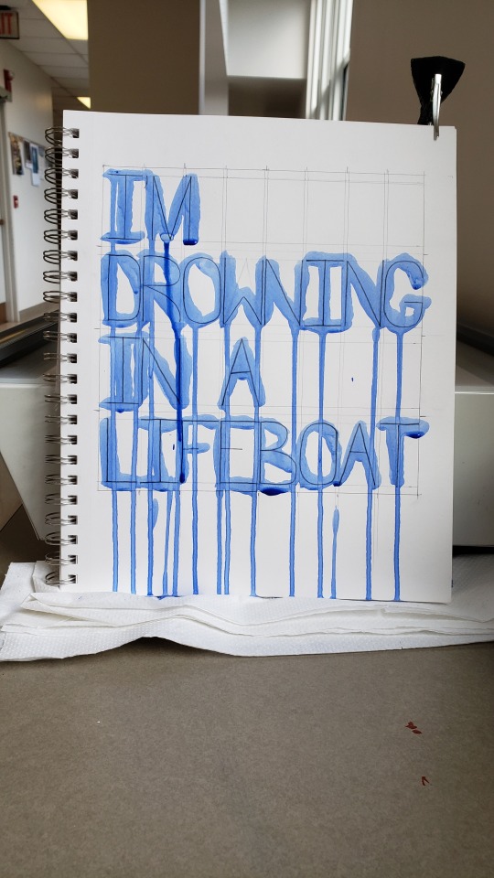
I started by creating a physical image. I sketched out the letters in pencil after very carefully drawing margin lines with a ruler. Then, I painted the letters vertically using heavy body acrylic thinned with water to make it appear like watercolor. While the paint was still wet, I photographed the page (using my hair clip to keep it from flopping over.) In Photoshop the following day, I resized and cropped the image, straightened it, added a Gaussian blur to smooth over the pixelation, then applied automatic color fixing operations.
The idea behind this image plays into my interpretation of the quote. I spent a long time painstakingly drawing out the letters and their spacing, but intentionally put very little effort into applying the paint neatly and even used the wrong kind of brush on purpose. Upon seeing this image out of context, one might think that the creator had a fair amount of skill with drawing, but next to no skill in painting. The point of all of this is to illustrate frustration. I interpret "I'm drowning in a lifeboat" to mean "I have the good foundation I need to be successful, so why am I still failing?" This image shows a good foundation in the drawn lines, but ultimately, it fails to be as neat and tidy as it set out to be.
"Colors"

I happened upon a stack of very old magazines someone left outside of McMaster and decided to use them to create a collage. I cropped the images and pieces of paper by folding and tearing, I arranged them in several different ways to see which configuration looked the best, then I pasted them in place. Despite the final image being in black and white, I used blue ink to write the text as an even deeper reference to the song. Then, I photographed the page in better lighting. In Photoshop, I resized and cropped the image, added a Gaussian blur, then applied a black-and-white filter. It didn't occur to me until days afterward that I needed to cite my images, and I'd put the magazines back in the pile where I found them! Would they still be there after several days of classes and rain? I'll cut to the chase: yes, they mostly were, but I had to do a bit of reverse image searching to find all the information needed. (This was about four days ago, and I'd written much more here, including the citations, but for some reason my post edits never saved so I've had to do all of this AGAIN.)
(Image sources: [top] Unknown historic photograph. [center] Moya, Rodrigo. "Che Melancólico." 1964. [bottom] Hopper, Dennis. "Double Standard." 1961.)
"Sad Machine"

For this one, I typed the quote into a Windows command terminal with the intent of the final image having a Vaporwave aesthetic. I tried photographing my computer screen for a more "lo-fi" look, but it looked unironically terrible and I decided to just use a screenshot. I used my computer's Snipping Tool to capture just the part that I needed, and I imported the capture into an 8"x8" blank artboard. To make the text clear and bright, I applied a very heavy-handed sharpening operation and turned down the saturation to get rid of color noise. Opening a new blank layer underneath the screencap, I created a two-color gradient and added color noise. I specifically chose to use blue with RGB values of 0, 255, 255 and magenta with RGB values of 255, 0, 255 (those colors probably have technical names that I don't know) because they're very popular in Vaporwave aesthetics and because I used those colors ad nauseam in my early days of making digital art in MS Paint and GIMP. I know that those colors don't quite print properly, though, but that's still in line with my intentions. Vaporwave aesthetics are characterized by mocking the technological ignorance of decades past and by imagery that can only truly exist on a computer. Imagine, if you will, someone amazed by the capabilities of their first home computer creating artwork to their heart's content using crazy full-saturation colors that simply cannot exist in the real world. They get their artwork printed and are disappointed in how their beautiful cyan and magenta turned out to be some sad pale blue and some dull reddish pink. And so the stark difference between the printed version and the uploaded web version of this snippet plays directly into its meaning.
2 notes
·
View notes