
Don't wanna be here? Send us removal request.
Statistics
We looked inside some of the posts by matthewhalesdigitalarts and here's what we found interesting.
Average Info
Notes Per Post
14
Likes Per Post
14
Reblog Per Post
0
Reply Per Post
0
Time Between Posts
3 days
Number of Posts By Type
Text
3
Photo
14
Last Seen Tumblr Blogs


Fun Fact
The most popular pages on Tumblr are about Minecraft, GIFs, and David J. Peterson.


Photo
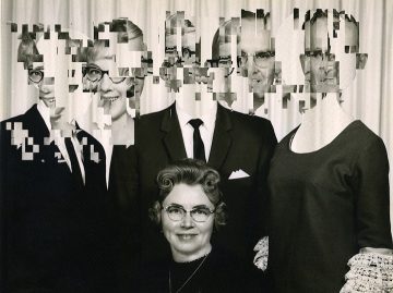


Contemporary, Keely Parks and Dave McKean Tarot Card designs David Szauder - Failed Memories
1 note
·
View note


Photo


The band had chosen to research was Plasticzooms, they’re a Japanese post punk band. Their album covers are always very different and normally relate to the EP or Album in some way or another.
1 note
·
View note
Photo
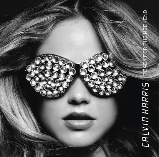
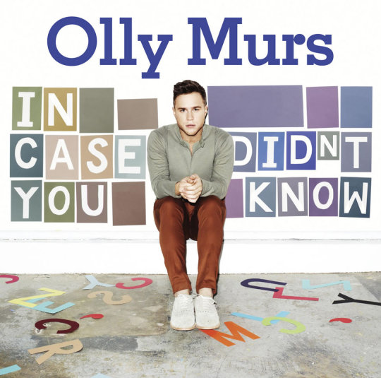
Steve Stacey’s work has been extremely successful being used by the likes of Olly murs and Calvin Harris’ respective albums. His work is always relatively simple but still manages to look extremely professional.
1 note
·
View note
Photo


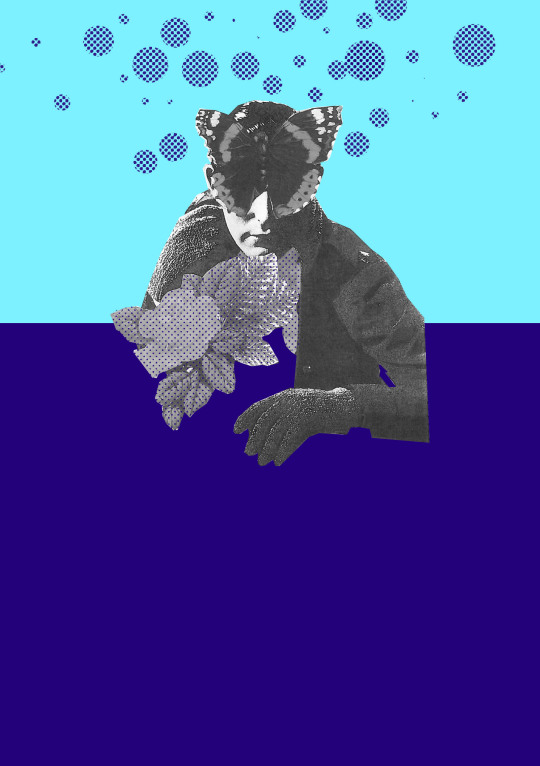
In this lesson we had to take images from vintage postcards and other things to edit them into something that would fit in our Zines, it had to match our colour scheme (in my case purple and light blue) I went for a sort of skulls and bubbles type of theme because it was simple and I think it looked quite good. Going for a simplistic design with these helped me keep them nice to look at but not too empty.
1 note
·
View note
Text

In Elanor’s lesson we had to do paper image weaving. This was done by cutting one image into vertical lines, cutting a second image into horizontal lines but leaving a 2-4cm part at the top so it didn't become a mess and have all the lines fall apart.
To actually get the effect desired you had to weave one strip of paper through the gaps in the vertical lines in differing ways, so one line would be start on top go under on top under etc, the others would be the opposite of that and eventually that would make a nice weaved effect
1 note
·
View note
Photo

In our second lesson with Sam we learnt how to draw basic bodies using a pear technique. What we had to do was draw a simple pear shape and put a head, arms and legs on it to make it look like a person. The reason this was effective is because if the large part of the pear was the top the character would look more powerful, if the bottom part was larger they would look more weak and sometimes perceived as fat.
After the pears we had to try and use different shapes for character bodies, a triangle would be used for a hero type because the top half would be wider than the bottom, a barrel would be for a comically fat type of character because of the way it expands outwards equally.
Once we had nailed the bodies next we had to try and give their limbs actual joints, this was done by drawing simple circles on the ends of two lines coming from the bodies, to emulate knees / elbows etc
1 note
·
View note
Photo

In our first lesson with Sam we were taught how to draw basic kawaii faces. They consist of a simple eyes and mouth but the mouth is in line with the eyes and normally squished to look cuter. The whole aesthetic of Kawaii art is that its meant to be squishy and cute, this is achieved in multiple ways but the main one is that all designs are simplistic and have very few complex features to them but are still expressive because of the way they add things like a drop of sweat or an exclamation mark above or around their heads to indicate emotion.
1 note
·
View note
Text
Apex talks
There were a lot of different people at the Apex giving different talks on many different things and they were all very interesting but there was one that stood out to me more than the rest and that was the one that Sam Read gave.
Its very coincidental that i enjoyed his talk the most as hes my teacher onj tuesdays. his talk interested me so much because h ewas one of the people that amde the popular indie game Gang Beasts, and i have played that a LOT. He had some very interesting things to say about not giving up even if the end product looks mediocre and to just do whatever you feel like because it all ends up as progress in the end anyway. The two games hes made in part that i knew about were Techno Kitten Adventure and gang Beasts, totally different in style and you really wouldnt be able to tell tht they were bboth made by him.
His work in gang beasts was very interesting because the characters are literally just small blobby crayon people but they can convey a lot of emotion with simple expressions.
1 note
·
View note
Photo


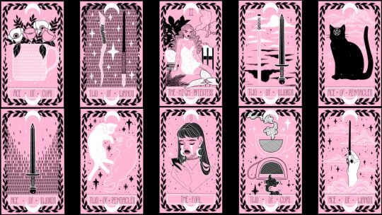
What are Tarot cards?
The Tarot pack is a pack of playing cards used within the mid 15th Century to play a variety of games including Italian Tarocchini, French tarot and Austrian Königrufen.
The cards within the deck consist of 78 unique cards, the 22 major Arcana cards represent Karmaic spiritual lessons while the 56 minor Arcana cards represent daily trials and tribulations people may face. Within the minor Arcana cards there are 16 Tarot Court cards that represent different personality characteristics.
Many people believe these cards are simply ink on paper while others believe they’re the gateway to inner knowledge and a better knowing of self.
The king of Pentacles
The first card I drew was the king of pentacles. This card symoblises abundance, prosperity and security. Reversed it means greed, indulgence and sensuality. The artwork for this card is usually a king sitting atop a throne with carvings of bulls showing his spiritual connection to the star sign Taurus. His robes are adorn with grape vines signalling his overwhelming wealth and abundance. In his right hand he holds his sceptre of power and in the right he holds a large golden coin symbolic of his material influence. At his feet are more vines and grapes representing the highest king of material success. Behind him is his castle showing the fruits of his labor and determination.
0 notes
Photo


Continuation of shoe brand marketing
I feel like my shoe brand marketing work was some of my best so far, with the Evolted brand i tried to go for a simplistic design and i think that was achieved very very well. The red / black / grey colour scheme lends it well to a simple design because of how well the red contrasts against the black and grey.
Actually putting my designs onto the mockups was a lot easier than i had thought. Having not used photoshop before coming onto the course i was weary of how complex it would be but its far easier than expected. Importing an AI file on top of the mockup was as easy as click click drag and i was really surprised by that.
Personally i think this work looks really good with the 4 colour restriction we had. Given more time i think i could have created some more complex poster designs but i’m more than happy with what i came out with.
1 note
·
View note
Photo


Examples of sticker sheets
With the sticker sheets i had a pretty simple goal to try and achieve, find things relating to flora or other forms of nature “life”, this was honestly a bit harder to achieve than i had first expected because of how over saturated the market for sticker packs is. Sticking to a colour palette theme would have probably made this look a lot nicer but there were so many designs i really liked so i couldn’t stick to just one colour set.
I picked these few as references because they’re both simple and complex at the same time. Simple in colour but complex in design and what they’re trying to show. The way some of these use the same colour but different shades really helps it when trying to sell to a potential customer / client because it draws their eyes in, it sort of works how stars do at night time, you look at one then you see another, and then even MORE appear etc etc. This is a really useful thing to try and use in marketing because it makes the buying view their options and look at everything in the image to possibly want the sticker pack more.
The simple colour design aesthetic lends itself well to the sticker packs, creating one with only a few very similar shades of say, blue, make it far easier to mass produce as it would cost less in printing ink and it would more than likely be easier to come up with designs for.
Overall i quite like these just because plain and simple, they look nice and i like the colours used. They generate a simple yet complex design with minimal effort and i think that is **very** appealing to most.
0 notes