
Deriving insights from data and visualizing using different software. This blog is all about using dataset to tells a story with the utilization of different analytics tools.
Don't wanna be here? Send us removal request.
Statistics
We looked inside some of the posts by mayorofdata and here's what we found interesting.
Average Info
Notes Per Post
2
Likes Per Post
2
Reblog Per Post
0
Reply Per Post
0
Time Between Posts
12 days
Number of Posts By Type
Text
2
Last Seen Tumblr Blogs


Fun Fact
12.7% of mobile users access Tumblr.
Text
Creating an Active report for Professional Presentation by Management/Executives
Tool Used: IBM Cognos
Over the past few weeks, I had the opportunity of learning and carrying out hands-on tasks using IBM Cognos in preparation for the IBM Business Intelligence Analyst Mastery exam. IBM Cognos Analytics is a web-based analytical and reporting tool that can be used to integrate data gathered from various sources and implement queries towards building business report. This tool is not limited to formatting and presenting data but also efficient for distributing corporate data using many different methods such as bursting, sending an HTML link and so on. IBM Cognos is highly effective for creating lists, crosstabs, charts, prompts, calculations, drill-through definitions, queries, macros, bursting report, Active Reports, and enhancing reports using HTML. One of the hands-on tasks that I really enjoyed working on is creating an active report for management or executives to be presented to their sales teams. The sample report contains key information regarding revenue, quantity sold as well as the gross profit for a country’s sales in the year 2011. The report was created using the active report template and formatted the desired display output. The key metric information was linked to the visualization to have an interactive report. All these steps are implemented in the Page design. The page design only displays the metadata as seen in the first image below.

A better insight and comparison of the sales in different quarters of the 2011 can easily be inferred from the report as seen in the second image below.

1 note
·
View note
Text
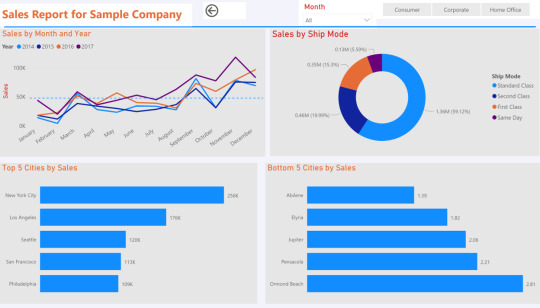
Insight and Visualization of Report for a Sample Company
Tool Used: PowerBI Dataset: https://www.kaggle.com/pruthvi1995/superstore-sales
The PowerBI dashboards shown in this post is created using data from an open source. The dataset was imported to Power BI Desktop and transformed using Power Query. In creating the dashboards, model relationship was created created. The visualization report developed highlights the Sales and Profit performance of the sample company based on different years, the shipping mode and the top five cities as well as the bottom cities with respect to their sales and profits values.

1 note
·
View note