
Don't wanna be here? Send us removal request.
Statistics
We looked inside some of the posts by medearadt2 and here's what we found interesting.
Average Info
Notes Per Post
1
Likes Per Post
1
Reblog Per Post
0
Reply Per Post
0
Time Between Posts
3 days
Number of Posts By Type
Text
15
Last Seen Tumblr Blogs


Fun Fact
12.7% of mobile users access Tumblr.
Text
Final Project - Conclusion + Thoughts .............................................................................
Okay so, usually I'm not very wordy with these parts since I find it hard to actively collect all my emotions from over the module and place it into a conclusion-like sentence. But I have so much to say about this! For starters, the freedom. Are you kidding? Getting to pick whatever the hell I wanted, getting to do something I love and cherish and make it into the fangame I have dreamed of making since I was eleven? That was so special to me. It felt like a moment of really just getting to make something I knew I would be proud of and would love regardless of the outcome or is some things were rushed. I did this one for me. Not for the grade, not for my social perception, but for me. For that nerdy tweenager who spent all day watching FNaF lets plays and drawing the animatronics (albeit badly). And though I did have to miss a few classes, I never felt like I was behind on much. The best teacher I have ever had in this course, has been strictly in the certificate and the first two ADT'ss of this year. Nothing quite beats the feeling of getting a passion and skill nurtured and seen too in a way that actually suits my neurodivergence, and actually feeling like I can make someone proud.
From the bottom of my heart, thank you for this experience. For letting me go a little off to one side and maybe not entirely stick to the brief so I can follow what my heart wants. It just makes me want to come back and do more and more. My only criticism? I wish it could have lasted longer. -Alannah

..............................................................................................................................
0 notes
Text
Final Project - Finished Shots! .............................................................................
Finally. It is time, for the hero shots. My favourite part. But I also decided to do something a little extra, so read to the end for a surprise! The hero shots:


I am really proud of this. I am so glad I got to do a Five Nights at Freddy's inspired game, and got to make it to my own standard. I did push myself with nine rooms and an exterior and interior, and at some points I was exhausted, but it was so worth it.
And here's the surprise, as promised! I decided to make an actual trailer to my "game"! There was this one audio I had all these ideas for, so I took some ingame recordings and edited them a little! I know that there was no need to do it, but I just fucking loved this so much and I had to show my ultimate love for FNaF. My trailer:
.............................................................................
0 notes
Text
Final Project - Lighting .............................................................................
For me, this is the cherry on top of the cake. I love a good bit of lighting. I started by going in a placing spotlights, which I coded very simply to flicker on a delay, to really give the pizzeria that 'abandoned but still spookily active' feeling. I had some out front, for the lamppost in the starting carpark and the billboard that displayed the pizzerias logo. The billboard ones were tinted red ever so slightly for a more dulled and off-putting appearance, whereas the lamppost ones were warmer and stronger, mimicking the real thing. The outside lighting:

The strongest light presence is in either hallway, ones that flicker to mimic the game hallway light, the bathroom hallway and the kitchen hallway. I purposefully left the main lobby area lightless, as the player character will also have a flashlight, and I don't want to to brightly light everything. I also have some electronic emissive textures that I want to stand out! So keep an eye out for those. The main light locations:


As you can see, I used spotlight for its good quality directional control. It's probably my favourite light to use out of the lot provided by the Unreal Engine. For fun, I also put one inside of one of the spare animatronic head-shells (masks) found on the prizecounter! This is in reference to the FnaF 3 bad ending screen. My lighting: The in-game reference:


After I was satisifed with the interior lighting, I moved onto my outdoor lighting, which was done using the Ultra Dynamic Sky and Weather system. Since the start I've had it in my head that I want to have it raining outside, and I did just that! I chose stormy weather and spent ages fiddling around with rain and lighting intensity, as well as puddle creation and sound design. The lightning storm:


I mean, look at this! Look at how moody and effective it is! Haters will say it's to dark, but I beg of you, play literally any horror game and do a dark segment, and you'll see that this perfectly fine (Until Dawn, Fallout, Little Nightmares, Resident Evil, any Chillas Art game, Lethal Company, Poppy Playtime, many indie games).
For a little extra, I gave my character a flashlight. Super simple and not too bright, but gives good vision. Flashlight in action:

..............................................................................................................................
0 notes
Text
Final Project - The Roof+Details .............................................................................
I'm going to be honest, doing the roof freaked me out a little. I had no idea how I wanted to tackle it. I usually suck at buildings rooves in The Sims, so I thought that it would most likely translate. But hey, I'm gonna give it a go anyway. I started by adding the textured paneling first. This will sit under my roof and create a sort of attic (that won't be accessible). It just means if you happen to look up to the ceiling while inside, you won't just see a solid color. This tiling is pretty damn classic, I mean it's even in this very classroom. So I dirtied it up a bit and slapped it on. The roof paneling:

Once that was in place, I had a very tedious task to do. Now in the first Five Nights at Freddy's, and many of it's sequels, there is these loving little ceiling stars that hang in the corridor and around the main lobby area... Can you see where I'm going with this?


So, I spent, far to damn long, placing tiny finnicky stars on the hallway ceiling. Alternating their height and sizes. By god when I say this was the hardest part on my hands- I MEAN IT! But, it was actually super worth it. Check out the before and after. Before ceiling stars:


After ceiling stars!:


It just gives it that little extra bit of detail that really makes it shine, in my opinion!
But, back to the roof. I ended up making mine in 3DS max (albeit to the best of my ability). I didn't want it to be a flat affair, and I really liked the idea of it being almost like the Pizza Hut roof! Since of course, you never see the original Five Nights at Freddys location from the outside. The 3DS roof:

So, I unwrapped it and threw it into Substance Painter to give it that little extra texture. Before finally adding it to the game. I even went the extra step further and made up a billboard sign that has the old worn out logo of the restaurant on it. The roof in place:

I'm aware the textures may look a little warped, but as you barely even saw the roof and it was going to be dark outside anyway, I didn't worry myself to much around it. After this. The next logical step would to be doing the final lighting touches. ..............................................................................................................................
0 notes
Text
Final Project - The Side Rooms! .............................................................................
The final bits I worked on, for decking out my area, was the kitchen, the bathroom (and it's hallway), and the outside parking lot. These are just little addons give the place just as much depth as the main lobby area and and corridors.
Starting with the kitchen, this was the place I got most free-will with. In the original game, the kitchen camera doesn't work! So I got to style this area according to how I wanted. I gave the front glass doors, so kids could see their food/birthday cake arriving! Fazbears would of course put on a full show for it's guests. But theres also a little corner to get to the main kitchen for minimal safety reasons (can't have to many lawsuits).
It is also the area thats been the most packed away. As even before fleeing, Fazbears took it's precious food making materials with it!
The kitchen:


Next, the bathrooms. This is a relatively sizeable area that I crammed a lot of stuff into. Theres a short corridor that connects the girls and boys toilets.
The bathrooms:


The only toilets you can explore is the girls. The boys door being mostly shut (though you can peak in through a crack). As you can see, it's goddamn filthy, probably one of the most disgusting places, for obvious reasons. There are toilets in the stalls (though they aren't easily seen), and it's clearly become a dumping ground upon the sites abandonment.


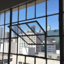
And, finally, outside. Before I implement the rain and the low light, here is a more decent look at what the start area looks like. It is a fairly big area, and I've tried to make it as detailed as possible. As even if it's not the main attraction, this is still where you start as the player character!
The outdoors:


There is clear construction (or deconstruction) going on- with the building (and surrounding permeameters) being entirely fenced off by chain-link. Shipping containers meant to help haul away more bulky items that Fazbear wants to keep (like its animatronic performers and the stages), litter the grounds- but it's eerily still, left and old, as if for some reason, the workers stopped before they had a chance to finish (or pack up).
You're car is also in the carpark. Its telling of your character, no? Covered in graffiti and clearly past it's best, you must be another youngen (who can't between the lines, it seems), seeking out the local legend of the haunted pizzeria, wanting to explore its derelict grounds for yourself, to see if it's really as scary as people make it out to be.
Story aside, here is a final birds-eye look at the building, before I add the last touches and the environmental factors.
The final bright birds-eye:

..............................................................................................................................
0 notes
Text
Final Project - The Main Room! .............................................................................
When tackling the building of this project, I wanted to go room by room. This would make the work-flow easier for me personally. And it gives me the ability to backtrack and do a full sweep after I've done the main building and add extra details here and there. I had a handful of models to use in this area, some with textures I altered and some that I simply used from the base.
This is what I started with:

The place is filled with trash-bags and boxes to show that before they had shut down, they had been clearly packing away to move. The tables are left in disarray, food rotting on the tables. as if there had been a panic to get out mid-party. There also seems to be a few missing children posters littered about...
You have three main attractions: - The Main Stage, where the animatronics perform. Closely modelled after what is viewable of the original stage set-up. - Pirate Cove, Foxy's own little area. Though, now the curtain railing is broken and the pirate is no where to be found. - And the Prize Counter, where kids would conceivably get parents to spend far to much money on Freddy plushies, and model replicas of the animatronics parts.
There is also a wall of appropriately animatronic themed arcade machines for each of the loveable mascots.
There are 11 distinct designs of 'children made' pictures on the walls. Pulled right from the game itself and crudely translated into more high resolution designs, that can easily be transferred to Unreal.
All 11 'kids pictures' and the rules poster:


I also went ahead and added the five missing children's posters. Now these aren't in the game, rather they are a fan-made edition. If you are unaware of the Five Nights at Freddy's lore, it essentially boils down to these missing kids being stuffed into the animatronics and haunting them! They do have canonical names, so those were used.
The missing kid posters:

I even braved Photoshop to adjust some textures from pre-existing assets. Such as this pizza box, which I felt need to be better themed to my pizzeria! I wanted it to look old and gross, like everything else in the building, so I took the liberty of messing around and making it look dirty.
Original texture: My revamp!:


Crowding out the main room was surprisingly difficult. I wanted the floor plan to make sense, but also seem kind of dodgy and not up to code, which meant sprawls of exposed wires, food and party gear being stored badly and a slew of hazards around every corner. The best part was getting to put stuff on the floor and tip of tables. I even ripped a door from the wall and made it look like it had been ruined by someone who had come before our player character.
Some shots of the room before I add the roof and it gets dark:


Area Highlight:


I really love this little hallway to the bathrooms. It feels nicely compact, busy in an understandable way (the old toppled 'slippery floor' signs and trash bags, also the fact that Freddy Fazbears Pizzeria would 100% put food near the bathrooms aka. The Gumball machines). I also like my little hand made bathroom icons- one being Freddy himself (for the boys), and the other being Chica (for the girls). On theme bathroom signs are surprisingly common in establishments!
.............................................................................................................................
The Hallways
Coming out of the main room are the two matching corridors that lead to the security office. These are places that aren't accessible to regular guests, so they've been closed off with more heavy style metal doors.
In the left corridor, you can find a storage closet imbedded in the wall, that is used for both housing cleaning products and any other amenities that might be required by the establishment.
The left hallway:


In the right corridor, you can find promotions for each member of the Fazbear band! As well as some old missing posters on the walls and a few paper clippings (that yes, are readable)... must be nothing!
The right hallway:


And at the end of these hallways is the office! The hub of gameplay in the original series. I actually tried my best to replicate the office with the packs I had, since I felt it was the most important part to get 'game accurate', since it's the only really environment we ever get to be in!
The office:


I mean, look at the poster placement! It's an exact match! You can't say I don't keep to the original material, huh? My remake: The original office:


.............................................................................................................................
0 notes
Text
Final Project - Outlining .............................................................................
I started with getting the foliage down, after implementing my level and pizzeria outline. I had a specific image of an older style pine forest, since pines at night tend to give me pretty ominous vibes. So I chose a foliage pack that was specifically centered around pine-tree foliage. Creating outside landscaping:

The terrain isn't massively important, since the majority of the game will be spent inside and when outside it will be dark, so it will be low sight levels.
I started with getting the foliage down, after implementing my level and pizzeria outline. I had a specific image of an older style pine forest, since pines at night tend to give me pretty ominous vibes. So I chose a foliage pack that was specifically centered around pine-tree foliage. Neatening the whiteboxing:


After I was happy with the foliage, I then neatened up the whiteboxing, using my wall meshes that I would then apply a texture to. As you can see, there is a clear outer shell and inner shell, this is so:
A. It gives the impression of the inside being smaller, despite the large exterior B. I can texture the internal walls separately from the outside ones.
For me, I find this makes more sense in my mind, compared to a double sided mesh texture, that and it is more adjustable to my needs. .............................................................................................................................. The flooring was the next biggest thing that I had to do. I made two floor variants in 3Ds Max and Substance Painter. One was based off the game franchise, and classis black and white chequered floor with confetti sprinkled across it, a remnant of the parties once thrown there, and two, the same chequered floor simply lacking the confetti.
Both floor variants side by side!:


It might have taken tediously long, but in the end it was very worth the hassle! Here is the top down of the floor! It took a bit of trial and error to find where I wanted either variant, but in the end I was pretty impressed with even just this.
Birds eye of the floor:

..............................................................................................................................
Then comes the walling. I made several wall variants plus a trimming in 3DS max, and then textured two in Substance painter, and used a material on the other. The two created textures:


The material I got from AmbientCG:

I then applied these walls to my whitebox to create a shell of the building! I also ended up adding some wooden panelling to areas I thought needed a little extra pizzazz (such as behind pirates cove and behind the prize counter). The main area has the most sparkle, with the confetti floor and classic Five Nights at Freddy's walls, whereas areas like the bathrooms and kitchen have a more sterile feeling with that white brick material. Main room, office and halls:


Kitchen and bathrooms:


But that was the main shell completed! Now I was going to focus on the extra fun part, the decorating and applying the static meshes!
..............................................................................................................................
0 notes
Text
Final Project - The Dreaded Lists .............................................................................
Here is the mundane part. Going room by room and writing down what is needed in both. I decided to technically give each room two separate lists, however:
-List one will be the objects that I am bringing in from the FAB store. Pre-made objects that I can fiddle with in Substance painter to add that really 'run down' feeling that I'm going for.
-Whereas list two will be what objects I myself am going to go in and make through 3DS Max. This list will most certainly not be as extensive as the other. Being able to differentiate what I need to get done sooner rather than later will be crucial to the process of making my level. And will keep myself from stressing out ..............................................................................................................................
Initial List
I began with making my rough draft. This list would change, grow or shrink overtime, but for now, it gave me a decent idea of what to look for in FAB, as well as begin making myself. Some ideas, you can see, are repeated, as they will be needed for a variety of things.
Initial (scrappy) list:

As well as making lists for assets that I would scrounge off the dark corners of the internet, I also began to make design ideas for my 3DS models. Which I would be starting off with (just to get them out of the way), especially since I'll be doing hand-drawn posters again.
3DS unique designs:

There are going to be more of course, but I think I'll do the same as I did last project and lay every model I make out in order once they are completed, since the list is pretty decently long.
There are going to be more of course, but I think I'll do the same as I did last project and lay every model I make out in order once they are completed, since the list is pretty decently long.
..............................................................................................................................
0 notes
Text
Final Project - White Boxing .............................................................................
The first step to building up this level, started with the white-boxing. White-boxing is laying out your map with plain cubes- to both give you a sense of scale but also a skeleton to work off of. I always do a white-box personally. It's good for me to be able to visualize what I'm looking at rather than simply winging it.
..............................................................................................................................
Making a Start
I dove right into the creation of my level. With a smallish landscape and a (rather bad) recreation of the layout I had gone with. Here it is more obvious to see the adaptions I made from the original- such as removing or changing around the locations of some of the rooms; Notably, the backstage and the storage room.
The birds-eye:


So here is the initial birds-eye view of the layout. It isn't pretty, but it's not meant to be. I landscaped only a little, since I have the player character starting outside in the carpark of the pizzeria. Fun Faz-Fact: I had to remake the building entirely when I play tested it and realized it was WAY to big. Always make sure to check scale kids.
A break-down of the rooms:


And here is a quick look at the main building, but a little closer this time. As you can see, I have very crudely created each room and it's respective doorway.
Another great thing with white-boxing all of this, means it's easier for me to go through each room and curate a list as to what objects need to be in there. Of course starting with the basics, and then slowly adding more and more decorations. Which leads me to my next step.
..............................................................................................................................
0 notes
Text
Final Project - Ideas/Inspiration .............................................................................
For my final project, I wanted to make a spin on one of my favourite game franchises: Five Nights at Freddys. I would be basing my game off of the original series, a 2D camera based experience which has you defending the pizzeria office from the animatronics wandering around.
In my head, my game, FNaF: Revisited, would be a 3D version of that original location, in a little bit more disarray than in the games. It will look old an abandoned, with the player character starting outside in a parking lot and walking into the building. There will be an implied horror aspect, done by ambient sounds and keeping it all relatively dark. I do plan to build the ENTIRE pizzeria. Which I will leave the map of below, as well as a few aesthetic examples.
..............................................................................................................................
Why choose FNaF?
Five Nights at Freddy's has played a massive part of my childhood. I adore those games inside and out, but in later game series, I have often come away disappointed with the experience. I want to make this not only as a love letter to the original game itself, but also to simply have my hand at recreating the original horror-style that FNaF used to have (which has since, sadly, been replaced by glazed and childish like content).
I've never actually modelled anything FNaF. I draw it a lot, but it excites me to think about trying and properly making a 3D replica of a 2D environment I grew up with.
..............................................................................................................................
Planning
The original location in the first game is rather contained. I found a few other recreation ideas online, as well stills of the camera layout in the game, all to get the base outline for the space I would be working with. I would of course take a few steps to make my OWN version with some updated features, which I will point out when it come to whiteboxing. Location visualization:

As for aesthetics, it is going to be DARK. I can already hear the complaints. For some reason, everything I make in this course always gets the 'if it was a bit lighter–' comment. But let me defend my case for a moment. Lots of older horror games have shit render distance, and a lot of modern indie games have you unable to see five feet ahead of you. This is an artistic choice, I WANT it to look like that, I want you to feel claustrophobic and blind in the experience. If you want to have a look at details, there is always unlit mode. But there is no aesthetic without diving headfirst in going overboard. Which is exactly what I plan to do.
Aesthetic visualization:

..............................................................................................................................
0 notes
Text
Second Class Task .............................................................................
This was the second workshop I was able to attend. Life got a bit in the way, and I did indeed miss a lesson. Though when I learnt we'd just been fiddling with a weather and lighting system, I was more than relieved- since that is something I can explain when the time is right and I'm working on my final project.
The task today was taking a deeper look in Materials. Materials are incredibly important to Unreal Engine artists, they essentially make up everything in a scene. Packing textures can help with the streaming pool size and be beneficial with how much is used. ..............................................................................................................................
Learning about the basics: We got initial textures from both Poly Haven and AmbientCG, which provide good quality free textures. We got two from each, just to understand how to download and unzip them properly. We also began to learn about RGB(A) and how to organize grey scale images when creating a texture for a material. It's essentially laid out as a formula like this:
RGB(A) _ORD (occlusion, roughness, displacement) It can also be _ARD (A for the ambient part of ambient occlusion).
..............................................................................................................................
Working in Photoshop
Once you've downloaded a texture, on Photoshop (or any other compatible software) it is simply a process of putting the three pieces together.
Opening in Photoshop and using channels:

First we load in our base texture. We then navigate to the channels panel on the bottom right, which is where we'll be doing all our work. We just have to make sure that we go and switch into RGB mode first! Using the drop down panels along top.
Switching to RGB:

The next part I did a little differently to how it was shown. For my own sanity, I ended up opening all the textures I would need into alternate windows. This let me keep track of what I had done and what I hadn't done. So many windows...:

From there, all we did was create layers in the channels panel and name them according. Then copy and paste each associated part of the texture. Sorting in the layers and exporting!:


..............................................................................................................................
Taking it to Unreal Engine
Hold on! We aren't done. Now that the ORD is exported, we have to sort it out into t=our Unreal Engine project. The files are easy enough to upload into our content folder, but there are a few extra steps we have to take once inside the engine. When our textures are entirely uploaded, we can go into them and half their texture display size, in the material editor.
Halving the display size in LOD Bias:


We can then switch over to compression settings, and switch it from default, to HDR compressed. Which is an RGB setting which will optimize our projects.
Switching over to HDR Compressed:

We can then shove our texture, which has now been fiddled with enough, into our Master Material. Converting it to a parameter to make the global textures on instances (so its easy to swap and change)!
Making up the Master Material:

We also get to add displacement here, which does something really cool... BOOM! Displacement on grass makes it look like actual grass! Its so fluffy...
Cool ass grass:

Then going ahead and adding up this little guy in the eventgraph, gives us the ability to adjust the displacement in the editor, so we don't have to constantly switch in the windows! We also placed a sneaky one between the ORD and the main control node. Adding tile scaling:


Then, as a final touch, we added the ability to tint and shade our textures, to be able to better fit it all into our scenes. Honestly it's just handy to have, as well as allowing for more creative freedom. Adding a tint-able node:

And that's our Master Material finished! I'm glad we got this out of the way, since it is pretty damn vital to our end goal projects.
..............................................................................................................................
0 notes
Text
First Class Task - Island Shots .............................................................................
I guess you could say the inspiration for this island was a bit of AC Odyssey, and other similar titles. I enjoyed meshing around with assets, and I probably would have done more, but I held myself back, knowing that it wasn't a project I should dedicate much energy into.
The hero shots:


..............................................................................................................................
NOTE:
This was one of the only classes I attended in the skill building portion of the module. Not only because I knew everything being taught but also because I got rather sick toward the end of it. I will try and make up for my lack of early content with showing my final project in good detail.
0 notes
Text
First Class Task .............................................................................
For the first ever class, we started in the engine right off of the bat. I do adore this approach to learning, since my brain often shuts down when all I'm doing is sitting and absorbing word of mouth.
We started with a pre-made asset pack world labelled as 'Temple Ruins'... I'm getting the strongest certificate nostalgia right now.
Mostly this seemed to be a day targeted to newcomers of the engine. Lot's of learning how the movement in Unreal Engine works, which I'll be honest I mostly zoned out for. I actually started up this documentation and these initial posts while the teaching was going on, apologies Morgan.
..............................................................................................................................
Temple Ruins
Starting off, we made a new map in a freshly opened UE project. Instead of starting with a blank map, this time we started with an empty one- so we could learn how to important our basic environmental lighting assets. You can choose what kind of level map you want to create using CTRL+N, or going into file and selecting 'New Level'. All you'll have to do is make sure it's root directory is into the right folder.
Loading up an empty map level:

Once the map is loaded, we can navigate to the windows top panel drop down, and find Env. Light Mixer. When selecting it, we'll be met with a pop up. All we have to do is press all the buttons that come up in the pop up, to load everything into our level. Here we can also bring things back if we accidentally delete them down the line.
Setting up Environmental Lighting:


Note how I have shifted everything into a folder labelled 'Lighting'. As an organized person already, I folder everything in my directory without thinking, but it is a nice habit to have, and I'm glad it's being more heavily drilled into us.
Next, we want to create the terrain. In the top left, we move up to our selection and pick the Landscape option. By clicking it, it will bring up this menu, which will allow us to generate the land we can work and sculpt. Opening up the Landscape dropdown option:

The most important menu in this area, is these options found in the left hand side directory. Here, we can adjust resolutions, with easily editable with dropdowns, that allow for many combinations. Once, we're satisfied, we hit create to make the landscape and bring up editing and sculpting options. The panel will look like this, as the landscape renders into a grid mesh (right panel). Setting up the landscape:


Using the tools provided along the top, we can create realistic looking terrain. Main tools used are Sculpt, Smooth, Flatten, Erosion, and Noise. - Sculpt will rise the terrain. - Smooth will smooth over any ragged edges - Flatten with make a flat plain wherever the cursors is directed - Erosion will give the landscape texture and more realistic slopes - And noise does a similar thing, but raises the land rather than erases it. Creating the landscaping:

Once satisfied with our unique terrains, we moved back into selection, and added in a plain. Upscaling it to a massive extent. This will act as our water that will surround our island.
Creating the water:


We then spent time fiddling and messing around, upping the tiling of the water so it didn't look so massive (easily accessed in the Material Instance menu), and adding smaller island outcrops. My final product looked like this, with a nice slope up to a flatter topped mountain that would soon hold my shrine. My uniquely sculpted island:

Now it's sculpted, we can add the material. Luckily the asset pack we're using comes with one, so it is a simple drag and drop. But uh oh, looks like we haven't added the material information in yet, so our island ends up looking rather... ominous. Takes after my own colour palette! Ah... not quite right:

Easy fix, however. Going back into landscape, we can switch over to the paint tab right next to the sculpt one. Here, down at the bottom, we can find the textures that make up the material. All we have to do is add them into the project, without altering anything in the pop-ups. Adding the material information:


Coming out of this and looking back to our island. It now appears far les ominous and far more normal. An actually coloured island:

Next is the fun part. Adding the static mesh assets that came with the pack we're using. With the topic being 'shrine' my main goal was one dilapidated building, with a lot of foliage. I did end up using the foliage tool after I hand placed half a dozen bushes, which is another drop down menu where you can add in the grasses you want and change their variation, before painting it over the island.
The foliage menu:

In the next post, I will be posting some of the shots I took of my island, after I had fiddled around with it for an hour or so.
..............................................................................................................................
0 notes
Text
Introductory Spiel .............................................................................
Welcome to my documentation for ADT2 Worldbuilding. I see this as essentially a follow up course to ADT1 3D Modelling, which is a goof thing, considering I'm in the games stream. For the first few weeks, we'll be doing class projects and assignments. Learning modules that will gear us up for the final project of our own.
The learning modules for ADT2 are as follows:
Learning real time game engines
Asset usage
Lighting and atmosphere
World building.
This isn't a bad list. For the start, I found I already knew the majority of what was being taught, since I was already comfortable with navigating Unreal Engine. It was a decent refresher, but mostly unnecessary. I have this strange feeling that that sentiment will follow for the next few classes, as the certificate I took two years ago covered this topic's basics rather nicely.
..............................................................................................................................
I am rather excited for this course. I already have a few ideas for my final project, but I'll try and keep it contained until after the holiday break, so I don't jump the gun too far.
So, let's dive right in!
0 notes